Go chromo: Piero Lissoni x Atlas Concorde
Brand story by Emma Moore
Spezzano di Fiorano (MO), Italy
26.10.20
Can we change the way we see and use colour in interiors? With its new Prism series, developed by Piero Lissoni, ATLAS CONCORDE certainly thinks so.

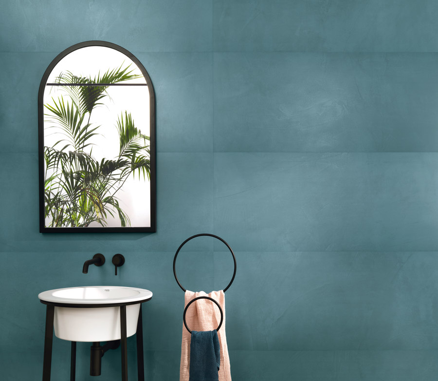
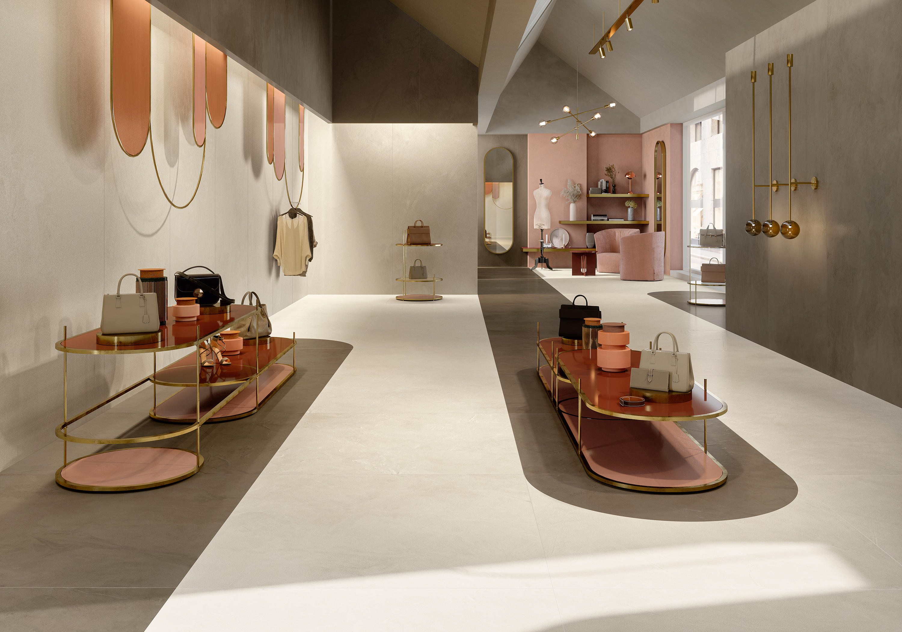
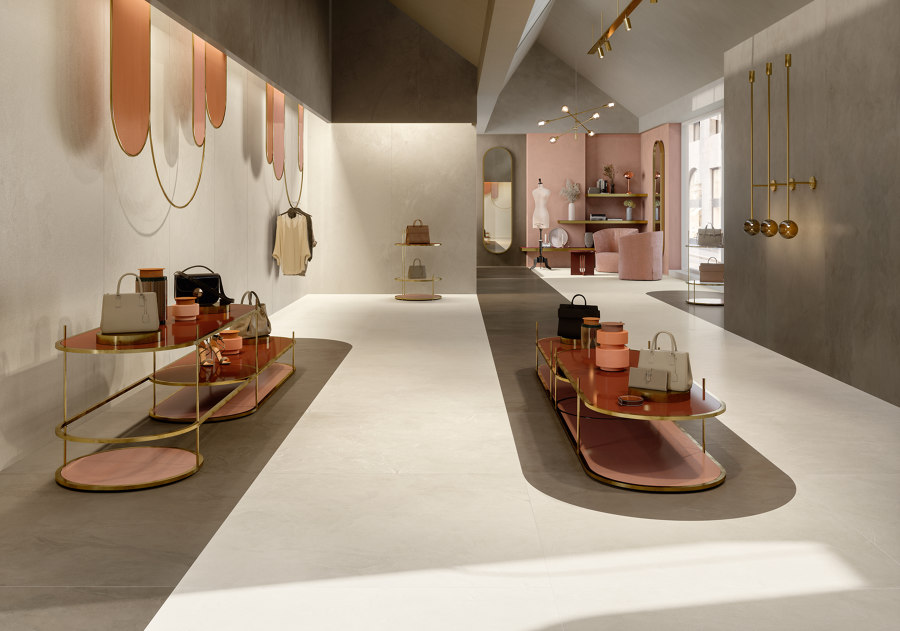
There are thirteen complementary colours making up the Prism palette. Here a silk-finish porcelain floor tile in ‘Cloud’ combines with large format wall tiles in ‘Dusk' and the ‘Bead’ mosaic in Midnight. ©Copyright 2020 by Ceramiche Atlas Concorde S.p.A.
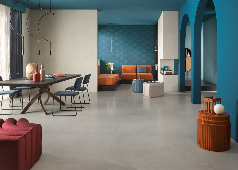
There are thirteen complementary colours making up the Prism palette. Here a silk-finish porcelain floor tile in ‘Cloud’ combines with large format wall tiles in ‘Dusk' and the ‘Bead’ mosaic in Midnight. ©Copyright 2020 by Ceramiche Atlas Concorde S.p.A.
×When Piero Lissoni starts talking about colour, you sit up and listen. For decades the Milanese design maestro has reigned over modern minimalism through his creative direction of leading Italian design firms such as Boffi, De Padova and Living Divani and his work for many more including Alessi, Cappellini, Cassina, Flos, Kartell and Knoll. He has taught generations of young designers and design enthusiasts how to paint with texture and transform interiors with carefully deployed lines and simple sculptural interventions.
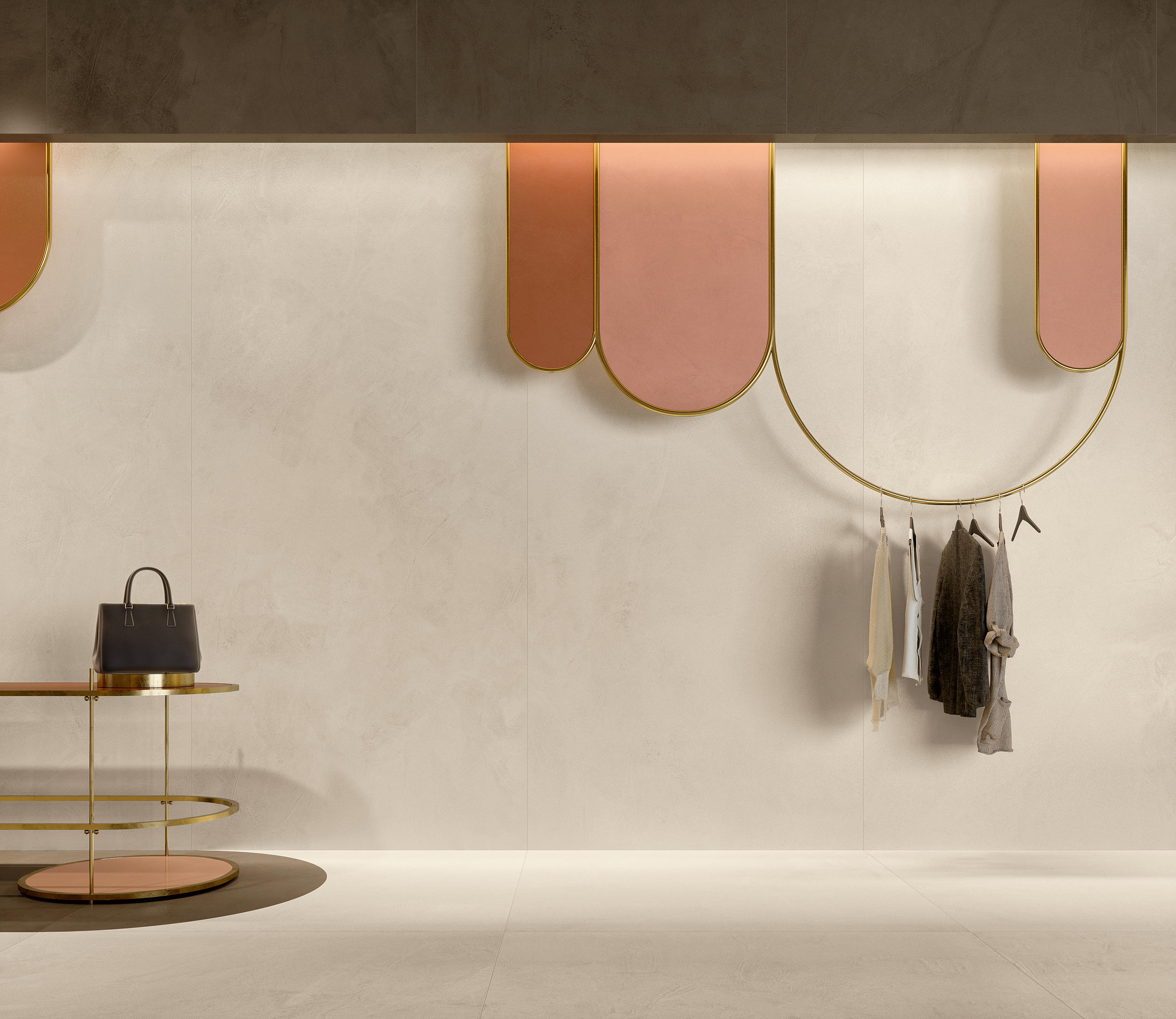
Prism tiles come in porcelain and white body, and a number of surface finishes including silk, grip and matte, so that they can be aesthetically and functionally optimised for different surfaces. ©Copyright 2020 by Ceramiche Atlas Concorde S.p.A.
Prism tiles come in porcelain and white body, and a number of surface finishes including silk, grip and matte, so that they can be aesthetically and functionally optimised for different surfaces. ©Copyright 2020 by Ceramiche Atlas Concorde S.p.A.
×As he takes on the role of colour consultant for a new line of tiles by the porcelain tile specialist Atlas Concorde, we discover a new side to Lissoni – one that perhaps represents the final death knell for the design industry’s decades-long love of Scandinavian neutrals and monochromatic minimalism. For the new range, Prism, Lissoni worked with Atlas Concorde to establish a colour alphabet that has the power to change how we see and use colour in our interiors.
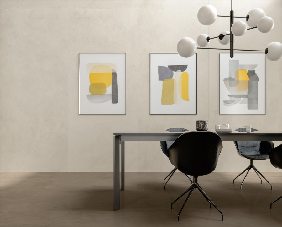

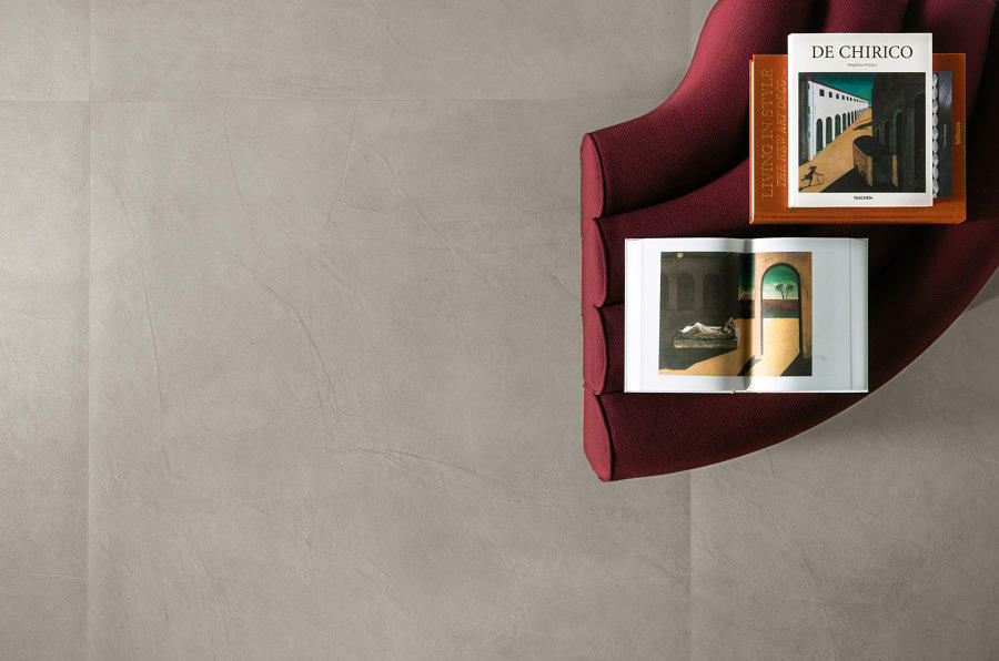
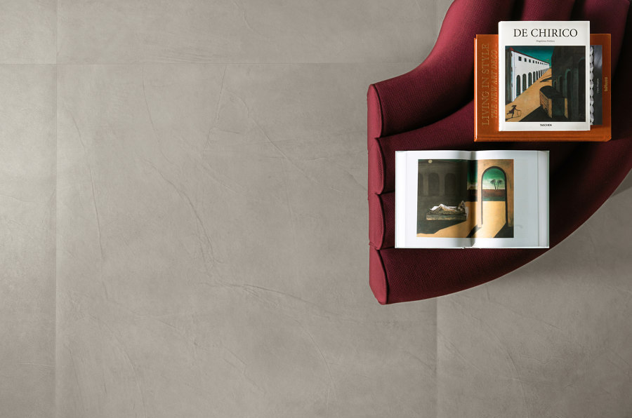
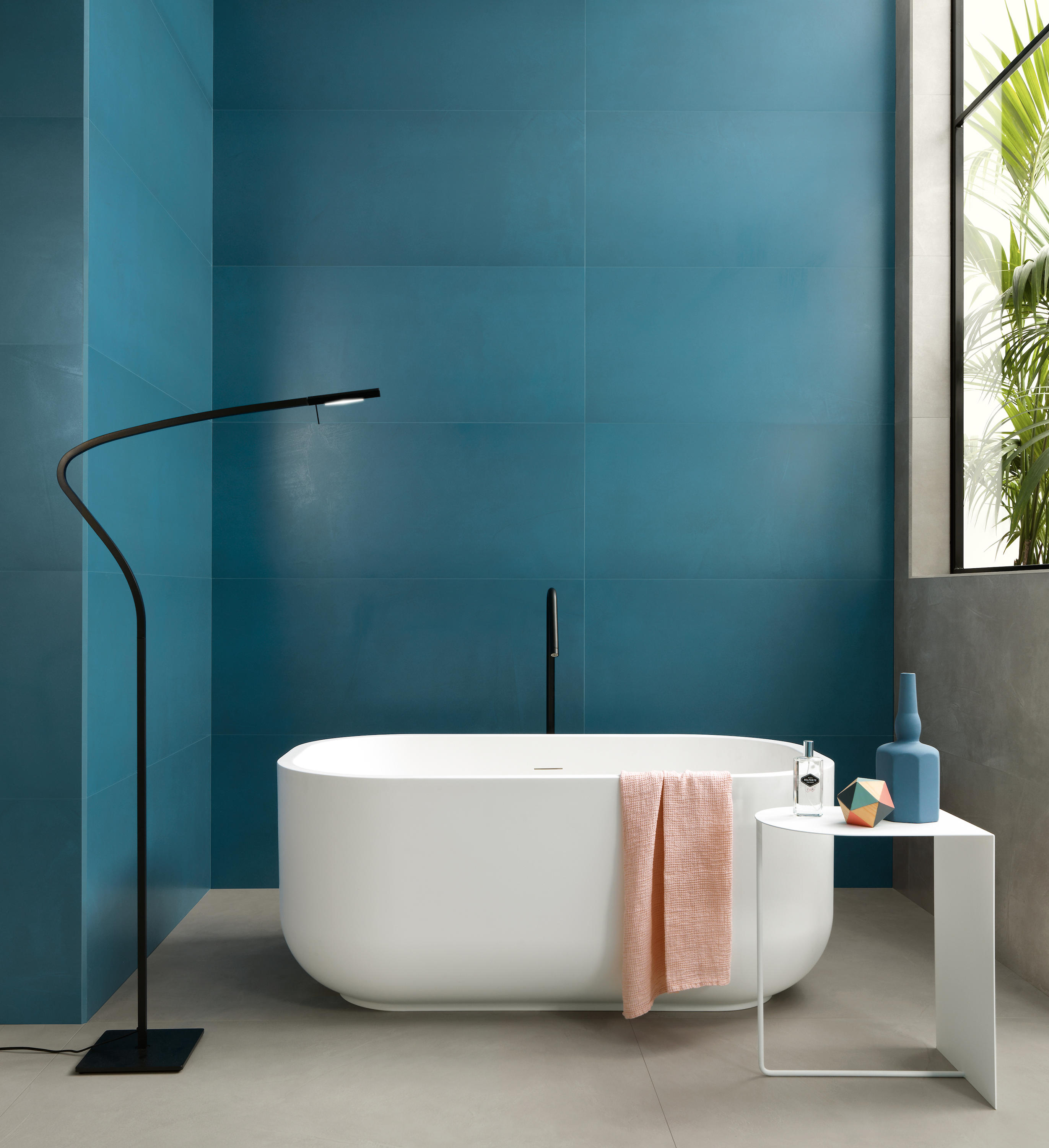
A system reminiscent of Le Corbusier’s Architectural Polychromy assigns certain shades to certain surfaces. The neutral tones of suede, graphite, cord, cotton, cloud and fog are recommended for floors. ©Copyright 2020 by Ceramiche Atlas Concorde S.p.A.
A system reminiscent of Le Corbusier’s Architectural Polychromy assigns certain shades to certain surfaces. The neutral tones of suede, graphite, cord, cotton, cloud and fog are recommended for floors. ©Copyright 2020 by Ceramiche Atlas Concorde S.p.A.
×Lissoni’s approach is to give colour substance, transforming it into a material itself, akin to his beloved marble, wood and glass. But he began by looking at colour in its purest form – as refracted light – and investigated, with his team, how best it can be edited and defined into a palette that works for today’s interiors.
'The prism breaks down light and enables you to see it in its true substance – this was the starting point of the project. We started imagining how these colours could engage in dialogue with a human being'
‘When we imagined a collection of colours, the starting point was an extremely simple element – a crystal prism on a surface. The prism breaks down light and enables you to see it in its true substance – this was the starting point of the project,‘ explains Lissoni. ‘We started imagining how these colours could engage in dialogue with quintessentially normal space inhabited by a person – a human being, so on a human scale and an architectonic scale.’
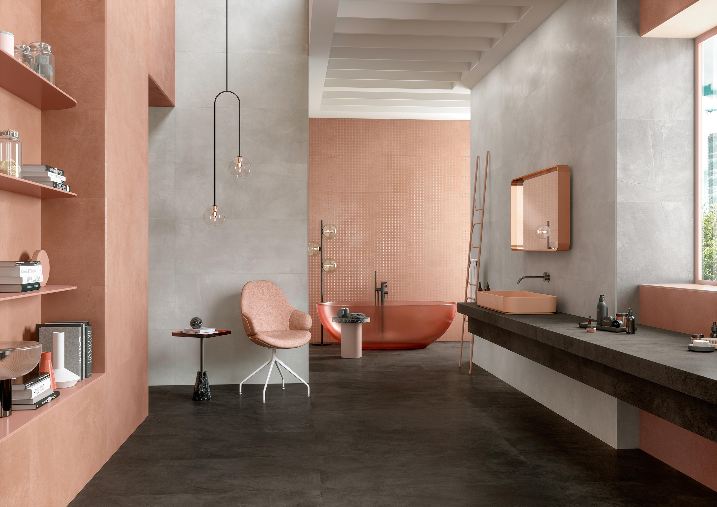
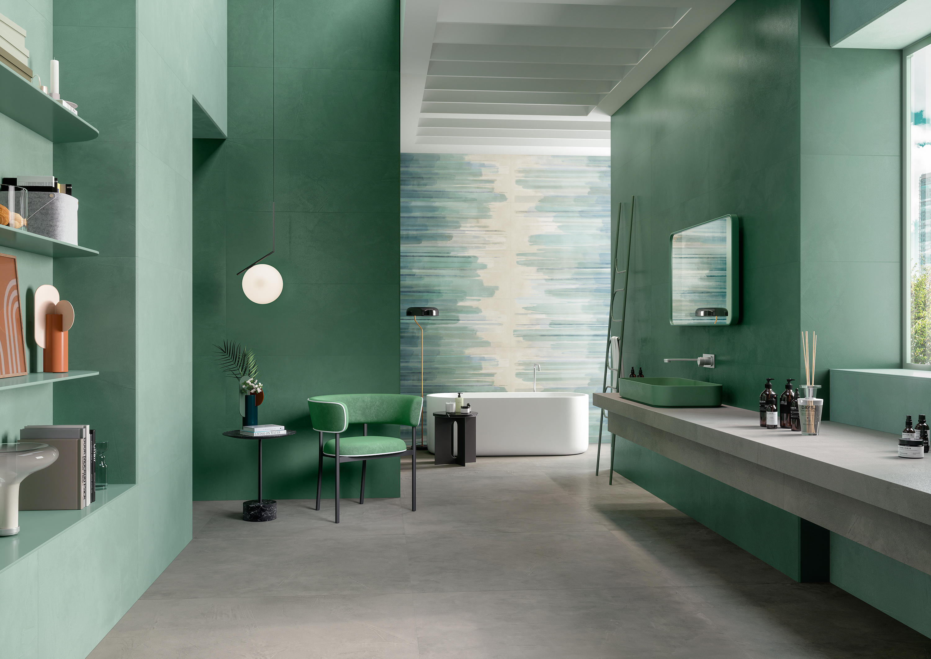
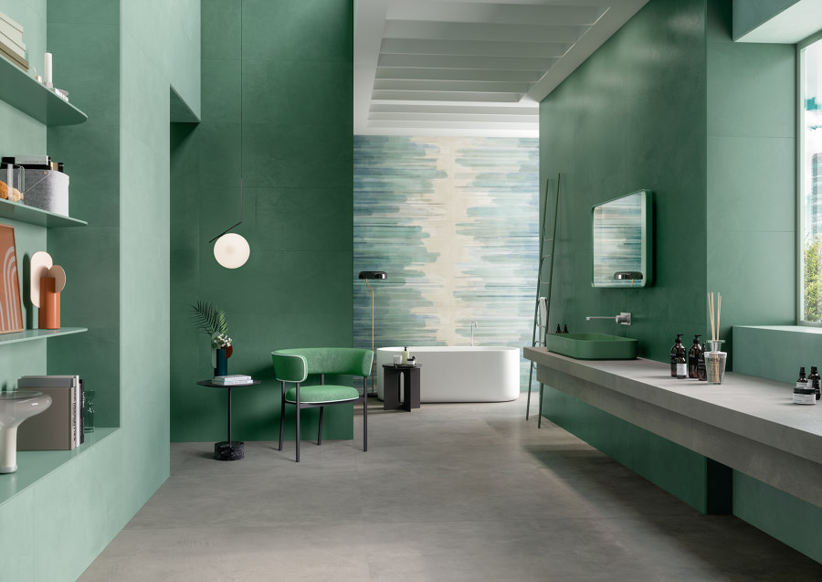
Atmospheres can be curated with complementary palettes. The warm tones of Bloom and Cloud on the walls of this bathroom, combined with Graphite on the floor, create balance and a sense of wellbeing. ©Copyright 2020 by Ceramiche Atlas Concorde S.p.A.

Atmospheres can be curated with complementary palettes. The warm tones of Bloom and Cloud on the walls of this bathroom, combined with Graphite on the floor, create balance and a sense of wellbeing. ©Copyright 2020 by Ceramiche Atlas Concorde S.p.A.
×How did a casual observation of refracted light then translate into the nuanced palette of porcelain wall and floor coverings with names such as Grape and Emerald, Cotton and Fog? The approach Atlas and Lissoni took was to integrate colour and texture in a way that was inseparable. Texturally, the surface of Prism tiles are designed to imitate hand-trowelled resin. They come variously in Matte, Silk and Grip finishes, manufactured in porcelain tiles for walls, and white body walls for floors. All the technical prowess Atlas has developed over decades is inbuilt – making them resilient to weight and stains and easily installed and maintained.
Ultimately, Prism is designed to allow people to paint with tiles. It encourages them to take on colour, while supplying the tools to devise complementary combinations for underfoot (the flooring palette includes all the neutral tones) and on the walls. In fact, the range recalls Le Corbusier’s colour system for different interior surfaces, Architectural Polychromy in which colours were assigned to different surfaces and charted in a way that married up the best combinations.


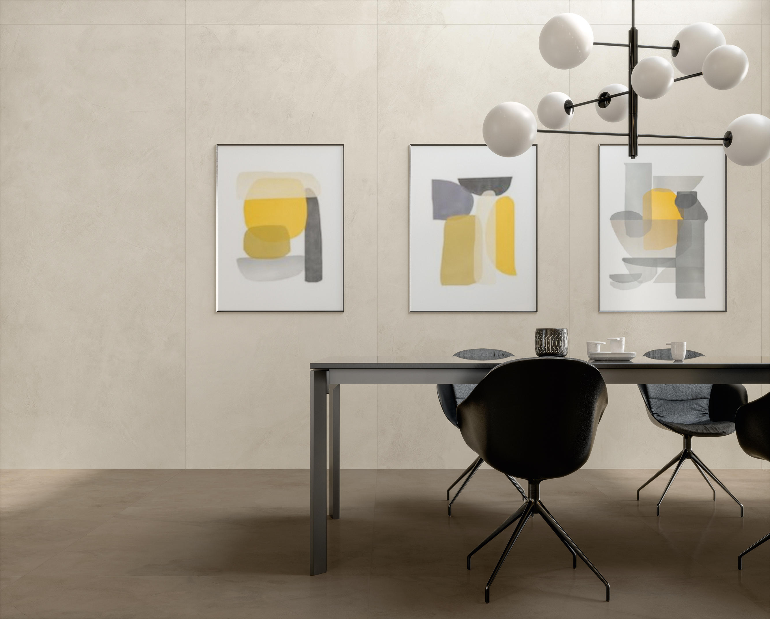
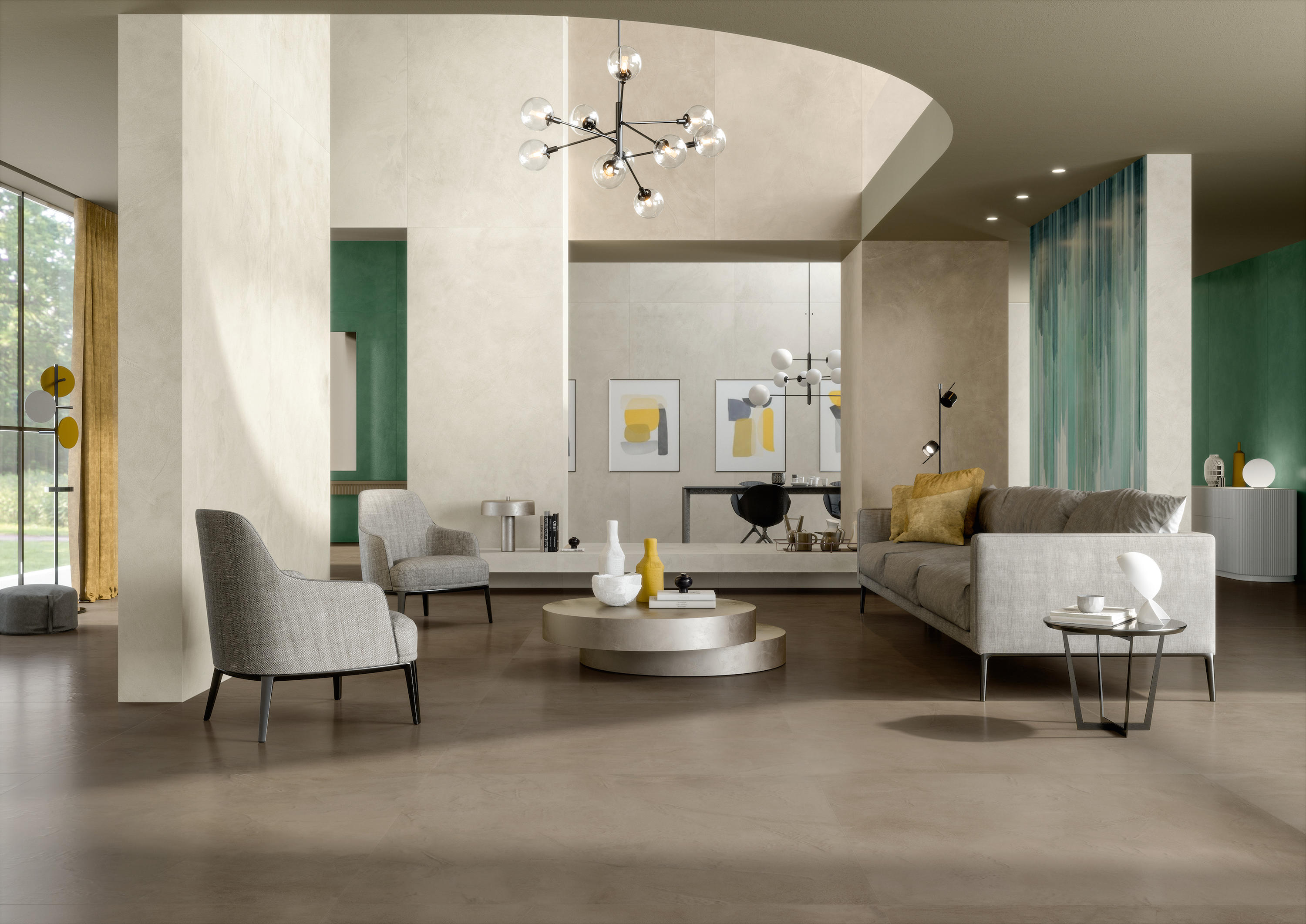
The large range of tile formats allows for contrasting patterns and colours across an interior’s surfaces, while the consistent resin-like texture of Prism ensures a degree of continuity across the space. ©Copyright 2020 by Ceramiche Atlas Concorde S.p.A.
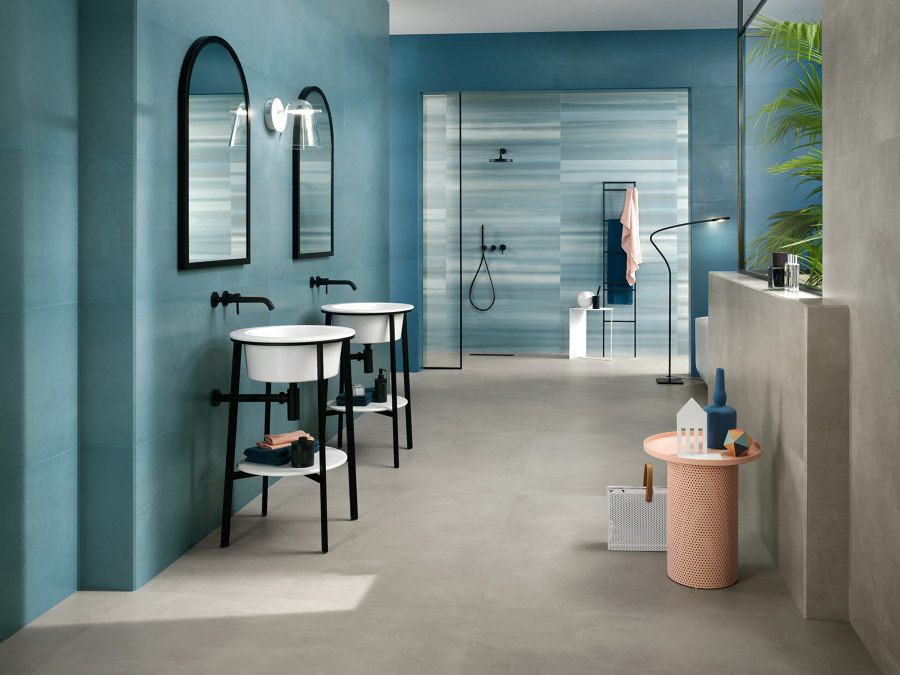
The large range of tile formats allows for contrasting patterns and colours across an interior’s surfaces, while the consistent resin-like texture of Prism ensures a degree of continuity across the space. ©Copyright 2020 by Ceramiche Atlas Concorde S.p.A.
בLe Corbusier’s Architectural Polychromy’ is still very valid and it was actually an inspirational foundation for Prism collection, where people can use the colour as a central element in their interior project’s design,’ says Fabrizio Storchi, Marketing Director of Atlas Concorde. Prism effectively takes classic codes of colour-combining and reinterprets them with unprecedented freedom.
‘We are always surrounded by colour – it’s a part of our lives’
The variables in the collection are not only colour and surface finish, but shape too. The offering stretches from small-scale mosaic to large format tiles, with a number of different graphic shapes and arrangements in between, such as Wiggle and Bead, which works the form of the Roman arch into the mix. The inventive forms further add to the character that can be built into walls.
Colour and texture fuse in the hand-trowelled resin finish of Prism, suggesting an uneven 3D surface, seen to great effect here in the Cotton and Suede walls and floor. ©Copyright 2020 by Ceramiche Atlas Concorde S.p.A.

Colour and texture fuse in the hand-trowelled resin finish of Prism, suggesting an uneven 3D surface, seen to great effect here in the Cotton and Suede walls and floor. ©Copyright 2020 by Ceramiche Atlas Concorde S.p.A.
בWe are always surrounded by colour – it’s a part of our lives,’ concludes our minimalist hero, Lissoni. ‘This extremely delicate vibration is a fundamental element perhaps even more important than oxygen.’ It’s true that we live life in colour. So perhaps it’s time to fully embrace it in our interiors.
© Architonic