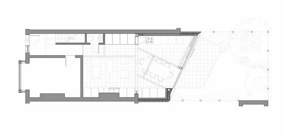
Paul McAneary Architects are delighted to announce the completion of the project Faceted House 1, an Edwardian terrace house located within a conservation area, in Hammersmith, London.
Brief
The project’s brief was to remodel and extend the three bedroom two storey house that was in a decrepit state and in need of considerable refurbishment and modernisation. The client asked for a contemporary design and functionality and he also expressed the desire to be able to perceive the garden as a continuation of the domestic space rather than ‘the outdoor’.
Concept Design: The 30º Faceted Angle
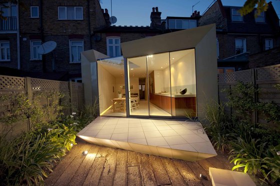
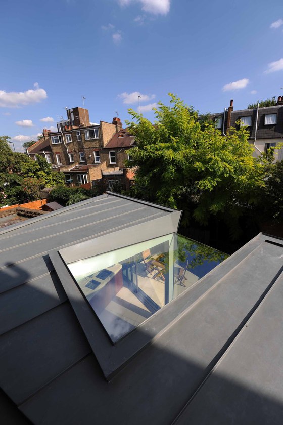
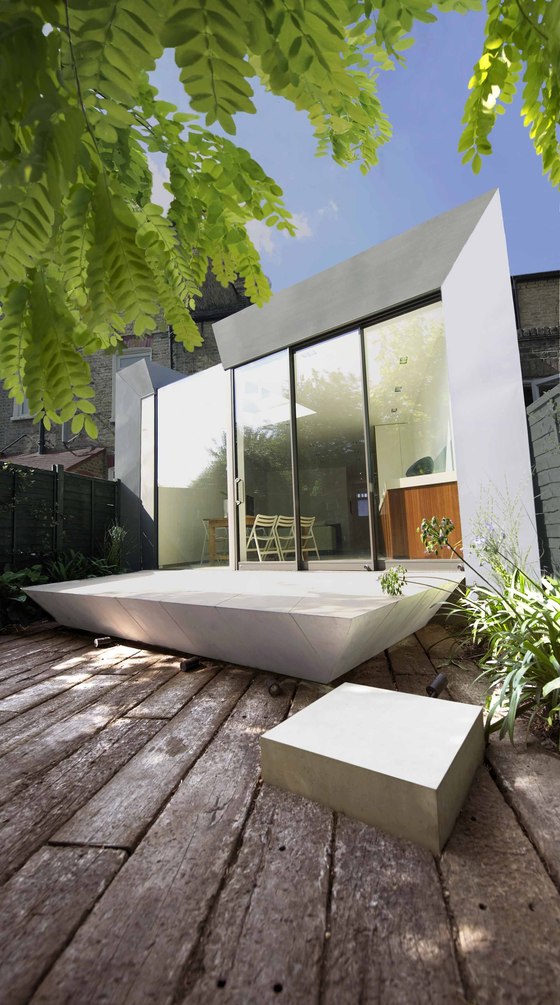
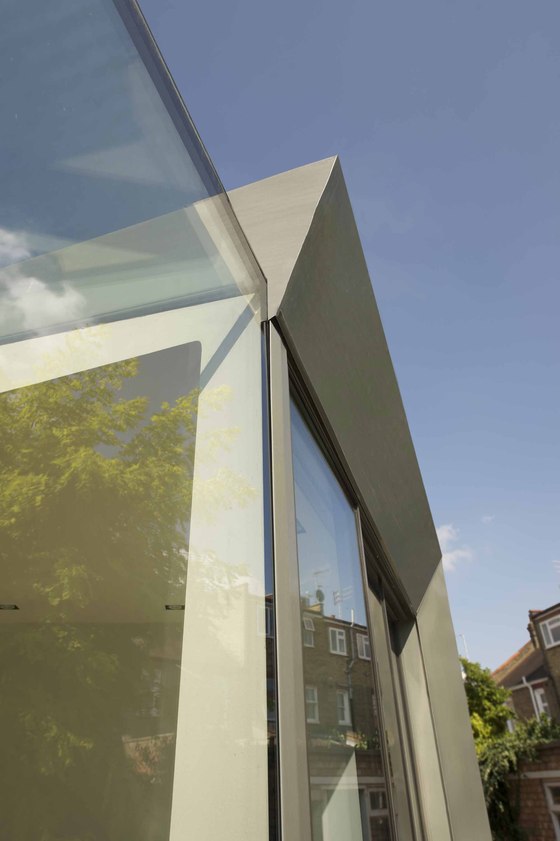
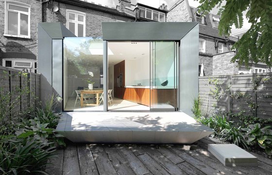
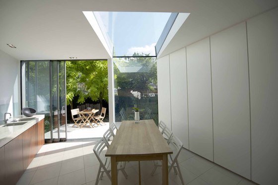
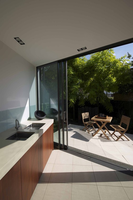
The concept driving the whole design is a 30° twist that allows physical and perceptive overlapping between the indoor and the outdoor spaces that dramatically improves the natural lighting into the house. In terms of spatial composition, there are two driving forces that compete and finally coexist: the kitchen-living area expands and transforms the external landscape, whilst the natural vegetation surrounds and perceptively invades the domestic space through the frameless glass skylight and open façade. The angle facilitates the overlap between the garden and kitchen thresholds - so whilst at the sink you feel the garden is actually behind you. This conceptual idea is manifest in the details of the faceted zinc facade and the floating external deck, being cut back to a fine angled edge.
Exterior
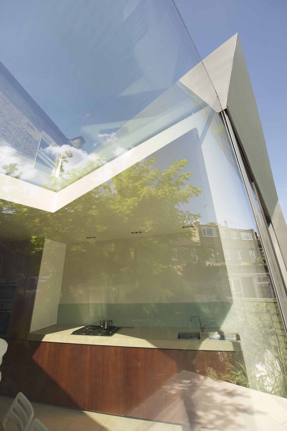
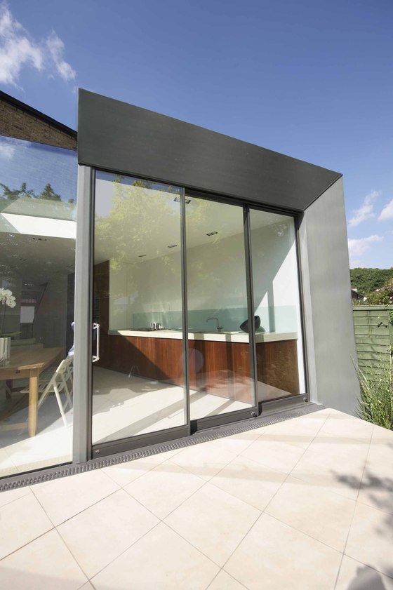
We responded to the brief by demolishing the existing 1980’s rear extension to the property that was crumbling and dilapidated. The design intent was to express the existing rear façade as the retained historical reference element, that is respected by not being altered. The new extension is added by a clean and clearly defined line to the rear that respects its heritage and gives this house a unique, uniform, contemporary aesthetic. The sculptural façade is visually striking and elegant at the same time. The self-healing zinc façade was designed to have the largest single panels that could be made without unsightly join lines. The fine faceting and the use of seamless glass panels create beautiful complex reflections. The use of the same material for the projecting external floor plane, in contrast with the highly worn timbers and the green garden walls, create a suggestive-relaxing space.
The garden becomes a vital ingredient of the space. We gave the garden a low maintenance surface treatment by covering it almost entirely in railway sleepers, leaving only a small gap around the perimeter for the green walls of the garden to sprout from. This maximises the space whilst ensuring the green spatial concept. The BBQ is integrated and concealed from view by folding the floor surface up, to create a position for the BBQ chef to perform from.
Interior
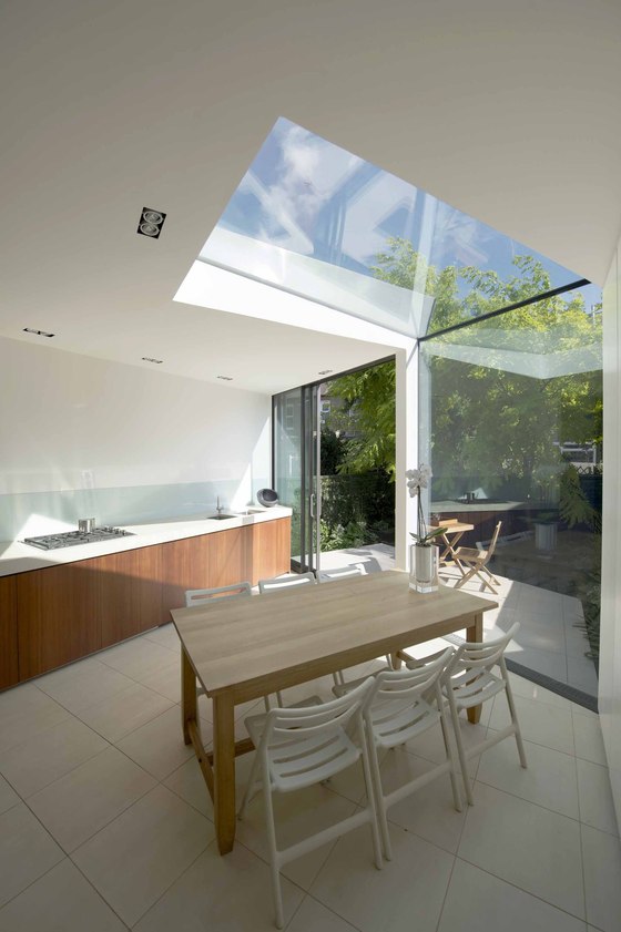
We reconfigured and expanded the existing space by designing a huge open-plan: we blurred the threshold between areas (living-kitchen-garden) to create a continuous space that is legible, functional and engaging. The kitchen stretches into the garden through a trapezoid platform which floats about 400mm above the garden level; the step-stone on the right side of the platform exhorts the access to the garden and BBQ area. To reinforce the perception of spatial continuity and connection we specified the same tiles for the living-kitchen area and the garden’s platform.
Kitchen & Storage
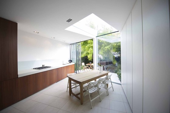
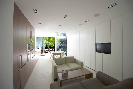
The client requested a clutter-free and practical house. We responded with our designed concept storage wall; a simple multi-purpose solution made of economical Ikea carcasses for the interior, and high quality lacquered handleless doors for the outer surface. We designed the kitchen specifying: antibacterial, reconstituted stone for the counter, with a wolf extractor which mechanically lifts from the counter top only when needed. We selected a warm FSC timber for the doors, as this specific shade of timber evokes the redwood forest of New Zealand (the client’s homeland) to create a dramatic contrast with the white lacquered wall doors and the lightly toned tiled flooring. We designed a concealed cupboard at the end of the kitchen bench top. This carefully hides the toaster, kettle and all the other kitchen clutter in the same way that the WC and utility cupboard design solutions hide away these occasional functions.
Light
Light floods into the house via the finest possible sections, making up the sliding doors, combined with the large fixed frameless panel of the facade that folds back into the depth of the building with a frameless folded roof panel. A “ballet of light” is the result, as the light casts a sharp beam into the depth of the house which dances through the space during the hours of daylight extenuated by the light coloured floor and ceiling which bounce the light to the other end of the house.
Lighting
Our lighting philosophy was to provide numerous options that could be tuned and saved to facilitate the multitude of uses of the space at any time of the day or night. The space is split into several zones that are all dim-able independently. We have task lighting that is flushed into the ceiling, the front lights angle out and double up as lighting onto the external deck - avoiding unsightly spotlights on the facade. The storage wall is under-lit.
This emphasises the clean line at night as the line reflects through the rear into the garden.
Technology
We aimed to hide the technology as much as possible, to fully integrate all requirements so as the space could remain as calm, uncluttered and contemplative as possible. The space has a fully integrated AV system including B&W surround sound speakers and an integrated monitor into the storage wall which facilitates the numerous and ever increasing types of media.
Kent Hoskins
Paul McAneary, Matthias Laumayer
Contractor: Sheppard Construction
Supplier: Fine Line Aluminium, Rheinzink, Vola
