A Railroad Runs Through It
Text by David Sokol
Washington, DC, United States
28.05.10
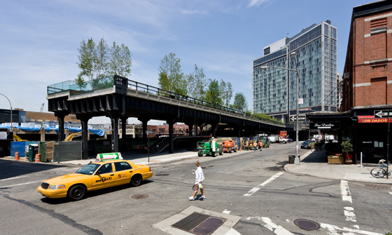
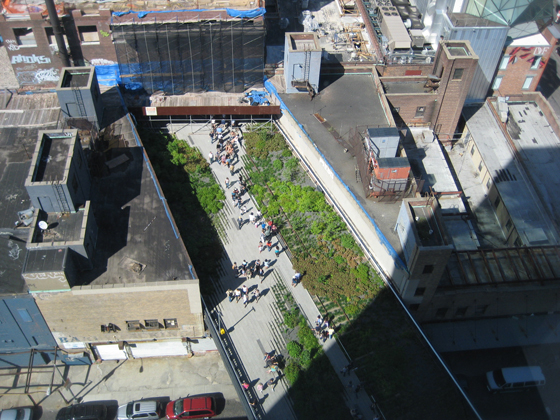
When Manhattan's High Line – a disused section of freight railtrack turned magical stretch of urban park – opened in 2009, New Yorkers took to the sky. But the innovative conversion of the former train corridor by James Corner Field Operations (Project Lead) with Diller Scofidio + Renfro and planting designer Piet Oudolf was always about more than just elevated promenading. To coincide with this year's ICFF, Architonic discusses the High Line's role as architectural catalyst for its environs with some of the key figures who've helped to shape its transformation.
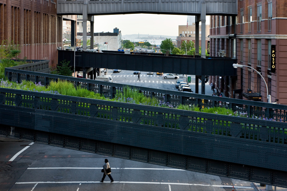
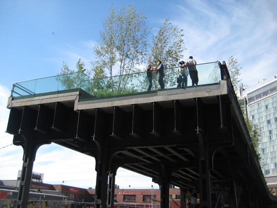
In New York’s Meatpacking District and West Chelsea neighbourhoods, the High Line has elevated everyday life: there’s something transcendent about glimpsing people strolling leisurely overhead, as you dart among appointments or head to the gym on terra firma. Many visitors to the recent International Contemporary Furniture Fair embraced the High Line experience from both perspectives, as they took to the skyway and then lingered in its shadow to attend the flood of off-site events organized by the Meatpacking District Initiative and ABE NYC.
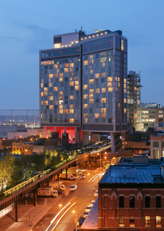
New York's High Line, with The Standard, New York in the background; photo Iwan Baan © 2009
In fact, the High Line triumphs many times over. Besides James Corner Field Operations, Diller Scofidio + Renfro and Piet Oudolf's radical makeover of this former elevated industrial-rail corridor into an innovative public park, the High Line phenomenon has involved the municipal rezoning of the adjacent areas, the architectural derring-do that characterizes much of the resulting new development, and the migration of world-class art and design galleries into the High Line neighbourhood. Arguably, each marvel mutually reinforces the singularity of the others.
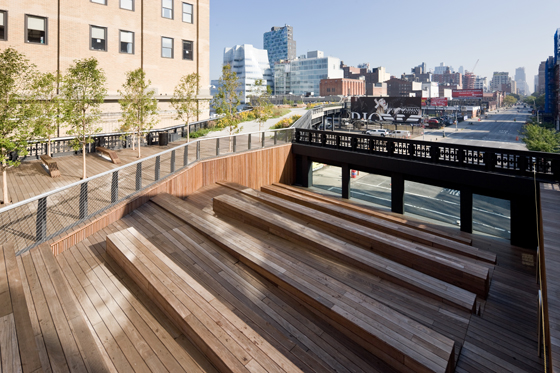
The High Line's 10th Avenue Square; photo Iwan Baan © 2009
Recently critics have argued that, despite the rise of the celebrity architect and a tremendous boom in construction, contemporary New York has remained largely unchanged and that the city skyline lacks a dynamism that hasn’t been present for decades. Even if that indictment withstands scrutiny, then the High Line and its environs prove the exception. Here we have asked several critics of another stripe – designers intimately involved in those wholesale conversions – to select highlights of the transformation.
The High Line's 10th Avenue Square; photo Iwan Baan © 2009
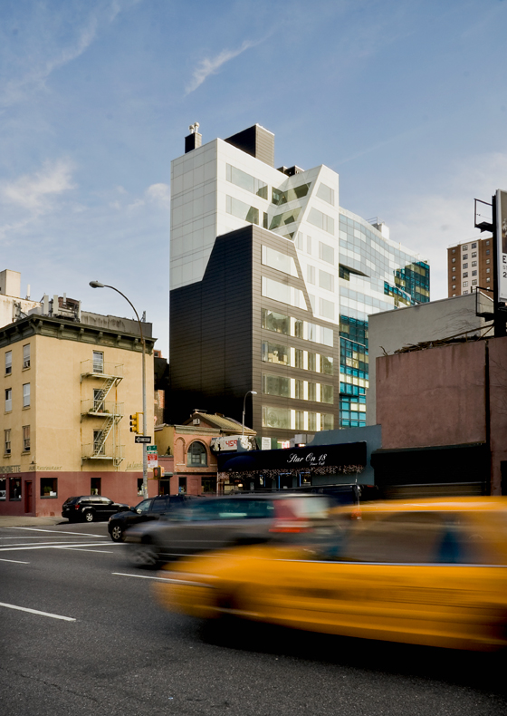
Of the High Line, Della Valle Bernheimer co-founder Andy Bernheimer says, 'Duh! It was, and is, the great generator – of both the zoning code that helped sanction the projects we designed, and of a truly remarkable public space.' The Brooklyn-based studio designed Four Five Nine West Eighteenth, a mixed-use condominium in which the upper floors appear as extrusions of the base. Della Valle Bernheimer is also responsible for 245 Tenth Avenue, the shape of which responds to the High Line, and whose shimmering skin comprises multiple materials.
Mixed-use condominium Four Five Nine West Eighteenth, designed by Della Valle Bernheimer; photo Della Valle Bernheimer

Mixed-use condominium Four Five Nine West Eighteenth, designed by Della Valle Bernheimer; photo Della Valle Bernheimer
×Bernheimer recalls, 'My first experience of looking across the city from above street level was a fascinating moment that is hard to forget, and the sense of ever-so-slight isolation is different from elsewhere. Beautiful architecture and landscape married with smart, reactive city planning: a great mix.'
Bernheimer also recommends 100 11th Avenue, the just-completed tower by Jean Nouvel that sports a kaleidoscopic facade made all the more so by the double-wall structure collaring the building’s base. (The rear elevations are much plainer, in a nod to the nearby women’s prison and to vintage neighbourhood buildings generally.) 'I love the histrionics – the cacophony of the facade – as well as the way it addresses the river, the West Side Highway, and celebrates the "brand-newish-ness" of the neighbourhood,' Bernheimer says of the faceted glass planes. 'It may well stand dated over time, or as a product of this boom-and-bust time. But as a piece of confident, modern architecture I really love it.'
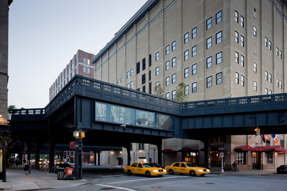
The Standard, New York designed by Todd Schliemann of Polshek Partnership Architects, straddles the former train corridor; © Jeff Goldberg/ESTO for Polshek Partnership Architects

The Standard, New York designed by Todd Schliemann of Polshek Partnership Architects, straddles the former train corridor; © Jeff Goldberg/ESTO for Polshek Partnership Architects
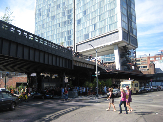
×Polshek Partnership Architects design partner Todd Schliemann also reserves his first favourite for the High Line, and for a reason similar to Bernheimer’s. 'We wouldn’t have made The Standard the way we did without it. The two seem inextricably linked and it is hard to imagine the southern end of the High Line without The Standard and vice versa,' he says. Indeed, Schliemann’s design of The Standard, New York is memorable precisely because it straddles the erstwhile train corridor, taking on a hinged shape that matches the muscularity of its exposed structure and of the neighbourhood’s rough-and-tumble past. The design, too, offers a more measured response to brand-newish-ness, by matching the glassy skin surrounding the guest rooms to the poured concrete and exposed stair of its gymnast base.
Above and below the line: New Yorkers gather under the former railway, while The Standard, New York rises above it; photo Architonic

Above and below the line: New Yorkers gather under the former railway, while The Standard, New York rises above it; photo Architonic
×On the corner of Tenth Avenue and 14th Street, a car wash comprising a glass skin over steel trusses sits directly beneath the High Line, practically hugging its predecessor. Todd Schliemann cites that well executed structure as another favourite neighbourhood moment, albeit 'Because it is such an active place that is not about shopping, eating, or drinking, as much of the neighbourhood has now become – it recalls, by its use, the old industry and activity of the meat market.'
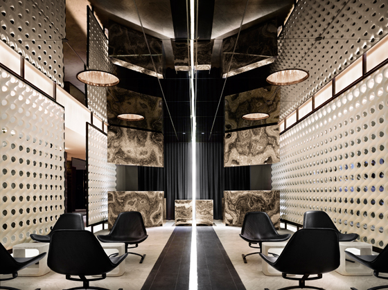
The lobby of The Standard hotel; photo Nikolas Koenig
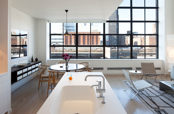
Schliemann’s keenness for the genuine past recalls Cary Tamarkin’s body of the work. 'I’m certainly not one to attempt historical pastiche,' Tamarkin says, but the architect-developer does note that his series of buildings, mostly condos located in wider Chelsea and the nearby West Village, have a historical bent. Designs like 456 West 19th Street could be considered straightforward yet quiet, and 'come from a belief in the purity of thought and clarity of form of early modernism, and seeing what that vocabulary can bear.' They’re made equally authentically, of hand-laid bricks and multi-pane steel windows. A causal observer’s comparison between that project and the Starrett-Lehigh Building would be 'taken as a compliment,' he says. 'Now I’m lucky to be within eyeshot of it.'
456 West 19th Street, designed by Cary Tamarkin; interior of duplex apartment, with view of the High Line; courtesy Tamarkin Co.

456 West 19th Street, designed by Cary Tamarkin; interior of duplex apartment, with view of the High Line; courtesy Tamarkin Co.
×Tamarkin’s commentary about his own work is reflected in his selections of High Line highlights. A respect for history shines through in his praise of the High Line’s greenery, which 'captures the rambling quality of the landscape that had crept in beforehand.' Meanwhile, Shigeru Ban’s Metal Shutter Houses – buildings that, true to their name, can vary their permeability – 'achieves conceptual clarity, which Ban does so well.'
'One of the wonderful things about the High Line is that it’s naughty.' Diller Scofidio + Renfro namesake Charles Renfro is responding to the flattery. 'It goes places where it shouldn’t, like through the middles of buildings and smack against apartments. Now it’s impossible to violate the space around the Line – no new tunnels or loading docks – and one fear is that the line will become too precious and lose the aggressive relationship it has with the surrounding buildings.
Northern spur of the High Line; photo Iwan Baan © 2009
'However, one project gives me hope,' he continues. 'HL23 by Neil Denari leans mischievously over the line like a kid looking to see if anyone noticed his misdeed. It’s the only new project that builds in the airspace over the Park, a product of negotiation with the High Line and with the City. Not only that, it’s beautifully proportioned and commands as much attention as any building put up in New York in the last 10 years.'
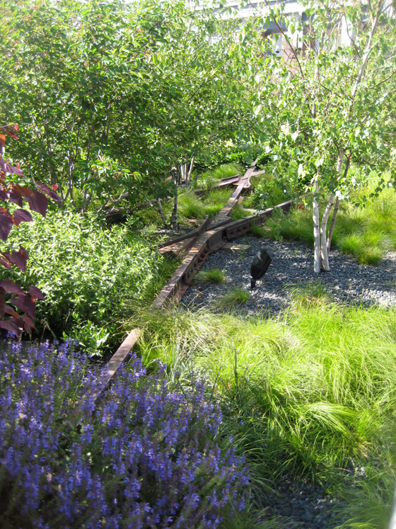
Detail of the High Line, showing the old tracks; photo Architonic
Renfro’s commentary is telling. In calling more attention to the subversive qualities of the historical High Line structure than to its contemporary makeover, Renfro is exercising graceful restraint, to be sure. It may also lead the casual observer to deduce that, yes, dramatic innovations haven’t rocked New York City since the period of late industrialization.
But, as exemplified by HL23’s interaction with the corridor, an artefact of the innovative past can at least drive powerful site-specific interventions. Powerful enough that defunct infrastructure elsewhere is promised rebirth. Washington DC recently released an RFP soliciting proposals to redevelop abandoned trolley-car tunnels below Dupont Circle, for example, and many more conversions of formerly industrial riverfronts are underway. The lesson served by the transformation of the High Line, then, is that reinvention – even of a smaller, seemingly obsolete neighbourhood – happens when modern place-makers working in and around relics engage in real dialogue with them.
