Going, going, (almost) gone
Text by Simon Keane-Cowell
Zürich, Switzerland
31.03.10
The Vitra Design Museum's latest exhibition examines the idea of simplicity in design, be it in terms of form, material or method. Rather than being a recent development in response to global economic and environmental concerns, 'The Essence of Things: Design and the Art of Reduction' suggests that the desire for a pared-down product culture is nothing new. Architonic visits the show and talks to its curator, Mathias Schwartz-Clauss.
'Simplicity does not just happen. The evolutionary trend is the other way round.' For Edward de Bono, the author who has made a career out of telling us 'how' to think (it was he who invented the term 'lateral thinking' in 1967 with his book 'The Use of Lateral Thinking'), the further society progresses, the more complex its systems become. His manifesto-like book 'Simplicity', published in 1999, functions as a call-to-arms to rationalise the way that we imagine our world, both in terms of how we think about it and the way in which we shape it materially. Complex ideas can always be expressed simply, he asserts. (I'm not so sure. Sometimes tricky ideas require complex language to do them justice.)
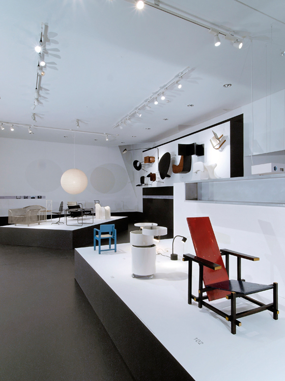
View of 'The Essence of Things: Design and the Art of Reduction' exhibition at the Vitra Design Museum, 2010

View of 'The Essence of Things: Design and the Art of Reduction' exhibition at the Vitra Design Museum, 2010
×A new exhibition at the Vitra Design Museum entitled 'The Essence of Things: Design and the Art of Reduction' suggests that, when it comes to design at least, there is and has always been a desire to do things as simply as possible. Featuring such diverse objects as Verner Panton's 'Barboy' drinks trolley, a scale model of André Waterkeyn's 1958 'Atomium' structure for the Brussels World's Fair, an iPod Shuffle and a Maggi stock cube, the show attempts to show how the idea of reduction, be it visual, material, technical or discursive, can be identified across a number of authored and authorless designed products.
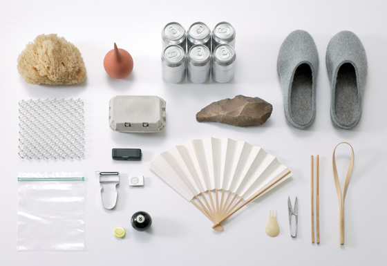
Everyday authorless objects as well as products by named designers fall within the purview of the exhibition; © Collection Vitra Design Museum, Weil am Rhein; photo Andreas Sütterlin

Everyday authorless objects as well as products by named designers fall within the purview of the exhibition; © Collection Vitra Design Museum, Weil am Rhein; photo Andreas Sütterlin
×The organisational structure of the exhibition (the objects are displayed under a series of headings that include 'Compaction', 'Lightness', 'Geometry' and 'Abstraction') works to communicate the plurality of means of reductive expression in design. Naturally, given the current economic and environmental times we're living in, the idea of material simplification is an appealing one. If ever there was a need for a bit of the old Miesian 'less is more', isn't it now?
I put this to the exhibition's curator Mathias Schwartz-Clauss. 'The economic crisis and the subsequent professional and public discourse about lasting values and the longevity of certain designs was the initial reason we thought of this exhibition,' he says. 'Cheap economic solutions in terms of production and well as for the consumer.'
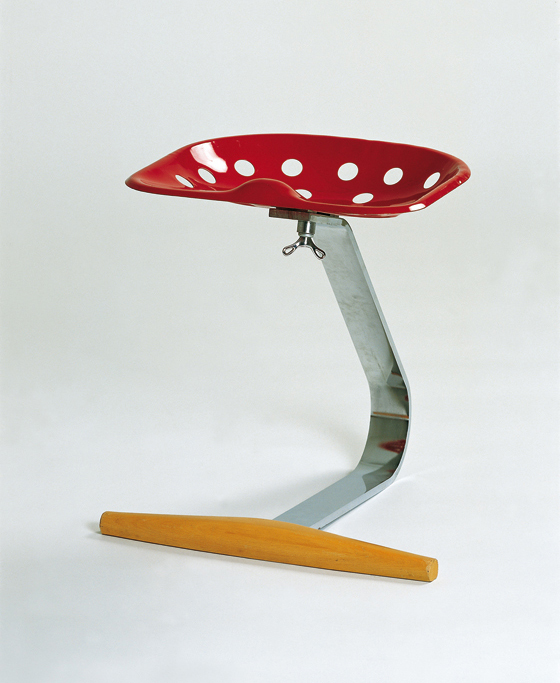
'Mezzadro' (No. 220) by Achille and Pier Giacomo Castiglioni, 1954-57; © Vitra Design Museum; photo Thomas Dix

'Mezzadro' (No. 220) by Achille and Pier Giacomo Castiglioni, 1954-57; © Vitra Design Museum; photo Thomas Dix
×Mies van der Rohe's axiom of 'less is more' was, Schwartz-Clauss tells Architonic, the working title of the show. Does that mean that there's some political motivation to the exhibition? 'I don't think so,' answers the curator simply, before going on to qualify his statement. 'Here and there there are points where you could easily detect a slight political statement, but in general the subject is of such broadness, historically as well as geographically, that I could hardly say the show is making a political statement.'
It's true that 'The Essence of Things' takes a broad historical view. A section called 'Model' presents a series of objects (most of them chairs, as is the case throughout the exhibition, which is no surprise given this is Vitra) that extends back beyond the advent of industrial production to include an ancient classical helmet. These objects, from a 19th-century Shaker rocking chair to Jasper Morrison's 1988 'Ply-chair', have been selected to communicate the difference ways in which simplicity can be performed.
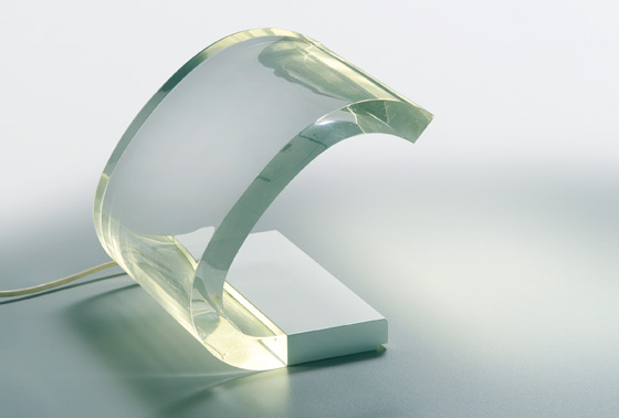
'Acrilica' by Joe Colombo, 1962; © Studio Joe Colombo, Milan; photo Andreas Sütterlin
An exhibition of this nature raises one very important question, of course. Who is to decide what's simple and what's not? How do your measure how rational something is? It's always going to be relative. Schwartz-Clauss acknowledges this, and points to a slide of a Baroque garden that's shown in the exhibition. It may display an complex design scheme, but it is also an exercise in abstraction, a simplification, when compared to the other gardens of the period. Ornament may be crime, according to proto-modernist Adolf Loos, but it doesn't, according to the logic of the Vitra show, exclude design that uses an economy of time and material. (The exhibition catalogue tells a different story, however, showing Japanese architect Shigeru Ban's highly graphic, materially minimal 2009 'Carbon Fiber Chair' in profile. It's fair to say that it's the kind of object most of us would think of when we hear the word 'reduction' mentioned in the context of design. And we often judge a book by its cover, in spite of the saying that urges us not to.)
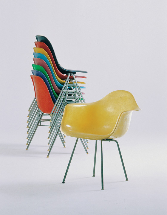
Stacked chairs made out of fibre-glass plastic, DSS (1954) and armchair DAX (1950) by Charles Eames, 1954; © Vitra

Stacked chairs made out of fibre-glass plastic, DSS (1954) and armchair DAX (1950) by Charles Eames, 1954; © Vitra
×Why didn't Schwartz-Clauss, given that the question of relativity is so central to the discussion of reduction, choose to show a series of object types (chairs, tables, and so on) alongside other objects of the same type, each exhibiting a different degree of reduction? 'I did this in one particular case to show the development of a particular product: the Eames fibre-glass chair. The solution is a very simple one; it's very versatile, and can be used as seating in different contexts. But the development to come up with this solution was a complex one. It required lots of research, the involvement of the University of California, the Museum of Modern Art, and many steps involving different materials.' This narrative of reduction, based on an iterative process, does indeed show how a relational context is needed to measure a product's claim, as it were, to be pared-down.
There's clearly an aesthetic function to reduction in design, particularly in formal terms. The, at the time radical, rationalisation that the Modern Movement promoted in the early 20th century (supposedly style-less, but naturally itself a style), witnessed in architecture, furniture and other objects, has since then directly informed the notion of what good design is, or, rather, what good design looks like. Visually uncomplicated. 'Clean'.
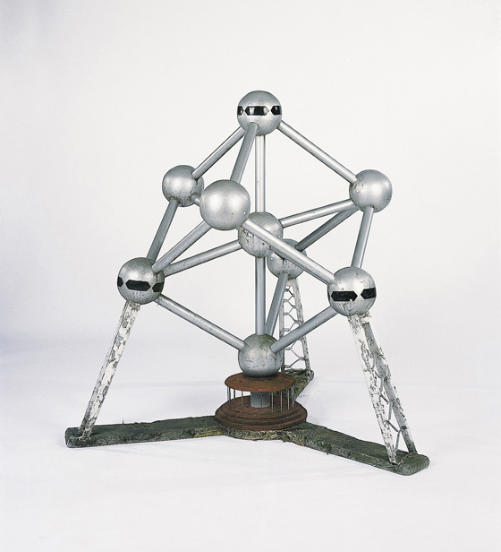
Model of 'Atomium' by André Waterkey, c.1958; © Christie's Images Limited; photo Andreas Sütterlin

Model of 'Atomium' by André Waterkey, c.1958; © Christie's Images Limited; photo Andreas Sütterlin
×There's an emotional valence to this, too, one which Schwartz-Clauss recognises and explores in the exhibition. 'As well as having a complex rational grammar the exhibition is trying to provide in order to make things more understandable, we've also tried to provide a certain feeling for the subject. Reading the texts is important, but with certain objects you get immediately an understanding of the message.'
What that message is cannot be guaranteed, however. Essentialism is open to interpretation. Not only does the individual as design user or museum visitor decide whether an object is simple or not, they also determine the meaning of that simplicity. Schwartz-Clauss, in his essay for the exhibition's catalogue, offers the example of elegantly minimal apartments. 'The starkness of these ascetic interiors is a deliberate choice – a superiority-signalling gesture of lofty renunciation, of concentration on the essential, and, perhaps, of an expectation of enlightenment. While such emptiness of space signifies an elite that speaks the same coded international language, elsewhere it means sheer hardship and deprivation.'
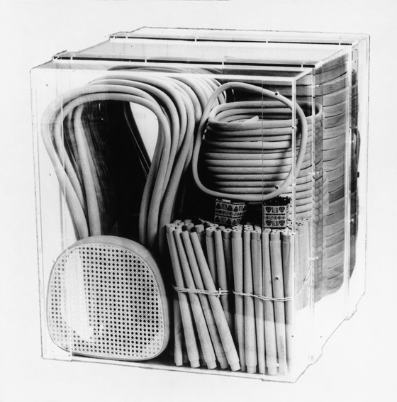
A further ambiguity can be identified in the relation between reduction and sustainability. In theory at least, the movement towards formal essence, bringing with it an economy of material, coupled with a rationalisation of the production and distribution process, should be good, right? In the exhibition's first room, a transparent crate containing three dozen disassembled Thonet 'No. 14' chairs sits alongside the best-selling IKEA 'Billy' flat-packed bookcase. The point being made here is one of logistics. The simplified, component-based design of both pieces means they can be transported easily and economically. But does the simplification of the design of a product, allowing a wider distribution of it, not mean that it is consumed in greater numbers? Is this not, in fact, the opposite of reduction? Less meaning more stuff?
One-cubic-metre box containing all the individual elements from 36 disassembled Thonet 'No. 14' chairs; © Vitra Design Museum; photo Thomas Dix

One-cubic-metre box containing all the individual elements from 36 disassembled Thonet 'No. 14' chairs; © Vitra Design Museum; photo Thomas Dix
×Schwartz-Clauss counters this suggestion in the case of the classic Thonet chair and the IKEA shelving system. 'Both are pieces of furniture that didn't replace others for just a short time. They serve a specific purpose. The 'Billy' shelf has served for so long in so many student apartments all over the world, for example. The Thonet chair was made for mass-seating in cafés, ballrooms and so on. I don't think these two are good examples of the consumption terror that I see in so many other objects.'
Undoubtedly, the Thonet chair's iconic status is due in no small part to its aesthetic and practical longevity. But the Swedish bookcase? It's still one of IKEA's mainstays (wherever you live, you're probably not that far away from a 'Billy'), and its relative cheapness means that it will always be consumed and disposed of with a certain casualness. Over 40 million units have been sold since its launch in 1978. Easy to buy. Easy to replace.
But this kind of uncertainty is all par for the course. A well-conceived, well-designed exhibition will always leave its visitors with as many questions as the answers it provides. The Vitra Museum's latest show certainly does this. When it comes to the art of reduction, 'The Essence of Things' proves that things are never simple.
