Skinning up: Old Buildings, New Facades – Part II
Text by Bettina Krause
Berlin, Germany
21.06.16
It's a wrap. More projects that demonstrate how covering up is the new way to gain exposure.
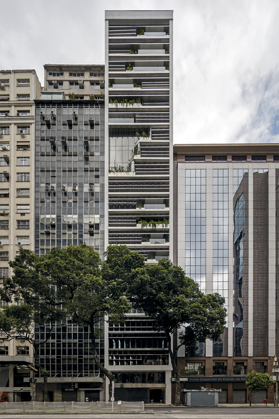
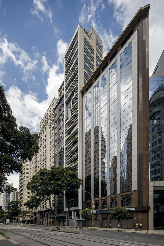
Architectural office Triptyque have transformed the 1970s RB12 office block in Rio de Janeiro into a contemporary and dynamic office complex

Architectural office Triptyque have transformed the 1970s RB12 office block in Rio de Janeiro into a contemporary and dynamic office complex
×Lawrence Public Library, Lawrence (Kansas), Gould Evans
The library in Lawrence, the sixth-largest city in Kansas, was built in 1972 in the brutalist style by the locally based architects Robertson, Peters, Ericson & Williams. To the west, the site is surrounded by residential development, to the east it adjoins the city centre, and to the south it borders a plaza. The existing building was plagued by problems including an outdated heating and air conditioning system, poor interior orientation, and insufficient daylight. The architects of the Missouri firm Gould Evans were commissioned to modernise and expand the building. Before they began designing, they spoke with residents of the city and users of the building, gathering their wishes for, and expectations of the library building. The designers used this information as the basis for their work. The citizens emphasised the civic importance of the building and suggested that it be established as a new urban focal point.
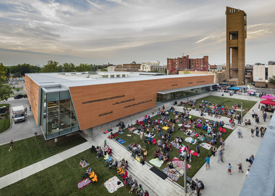
Gould Evans Architects have applied a striking orange skin to an existing 1970s brutalist library building in downtown Lawrence, Kansas, turning it into a civic meeting point

Gould Evans Architects have applied a striking orange skin to an existing 1970s brutalist library building in downtown Lawrence, Kansas, turning it into a civic meeting point
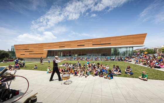
×The architects developed what previously resembled a book warehouse into a multimedia meeting place for the whole community. They gave the building a new look, inside and out. While preserving its 1970s brutalist charm, they added a structure of glass and orange-coloured terracotta panels, wrapping it fully around the perimeter of the original building like a cloak. This distinctive new envelope pays homage to the historic red-brick architecture of the surrounding area. From a technical standpoint, the intervention also improves the thermal performance of the library.
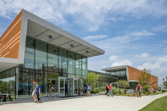
Areas in which the books required protection from direct sunlight were externally clad with the opaque coloured tiles. Skylights and slender horizontal openings on the outside bring natural light into the interior spaces. In contrast, the corners of the building open up to the outside with floor-to-ceiling glazing – allowing sunlight to stream in, and providing views from outside into the building, and from the inside out into the neighbourhood. In addition, the glazed entry is designed as a transparent and inviting gesture.
The new envelope is comprised of terracotta slabs – a reference to the traditional brick architecture of the region – and affords the building's interior new light relations and thermal performance

The new envelope is comprised of terracotta slabs – a reference to the traditional brick architecture of the region – and affords the building's interior new light relations and thermal performance
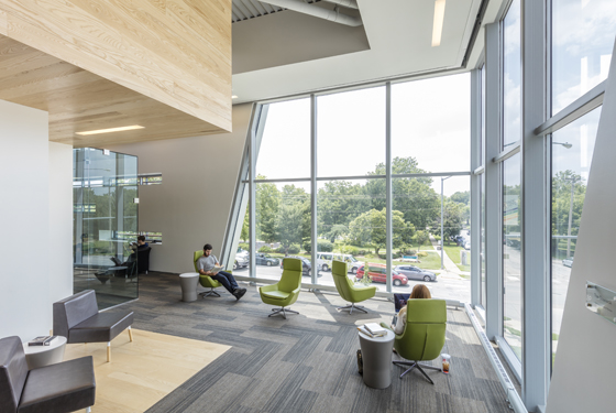
×In the course of the alterations, the architects also modernised the interior. Visitors are received in the centre of the building in a generous new atrium – an open, welcoming, light-flooded space reaching from the ground floor to the roof level. Functional additions include a music room with a drum kit, a recording studio, and a special children’s area for computer games and reading. The section containing books and electronic media for youth is visible from the street and lends the library a contemporary identity. Concrete walls, which formerly made for a rather sombre atmosphere, were panelled in wood to create warmer, more comfortable spaces. Outside the building, the site was enhanced by the addition of a park with an amphitheatre, a place for performances, and an ice rink. Through its renovation, the library has gained not just a new face for an old body, but also great popularity among the citizens of Lawrence. Since it reopened, visitor numbers have risen by an impressive 55% compared to the previous year.
RB12, Rio de Janeiro, Triptyque
The Avenida Rio Branco is a densely developed thoroughfare running through Rio de Janeiro’s central business district in the Porto Maravilha quarter. Numerous companies and public institutions are located here. Over five million square metres of floor space in this district are being revitalised as part of an urban renewal programme that began in 2010 in connection with the 2016 Summer Olympic Games. Among the buildings here that date from the 1970s is Rio Branco 12, or “RB12”, an 85-metre-high office tower with, until recently, an especially poor energy balance. So as not to have to tear down this ageing building, it was decided that it would be given a complete overhaul. The French-Brazilian architecture studio Triptyque was hired to find a “green” solution for RB12.
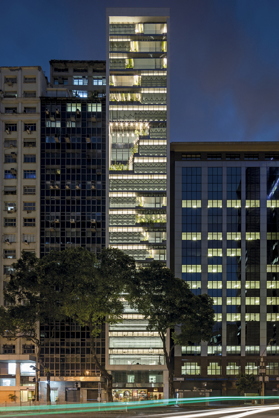
Triptyque have revamped the street-facing facade of the RB12 office block in Rio de Janeiro with a green, bioclimatic facade. Innovative, folding glazing and slats function as brises-soleil

Triptyque have revamped the street-facing facade of the RB12 office block in Rio de Janeiro with a green, bioclimatic facade. Innovative, folding glazing and slats function as brises-soleil
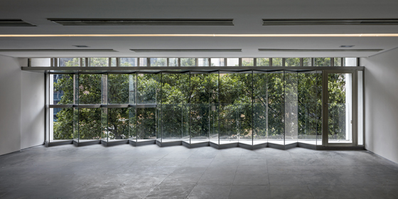
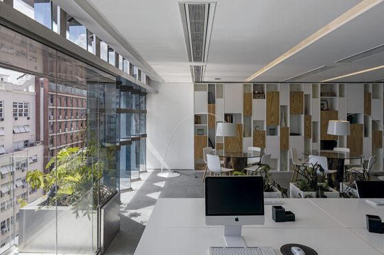
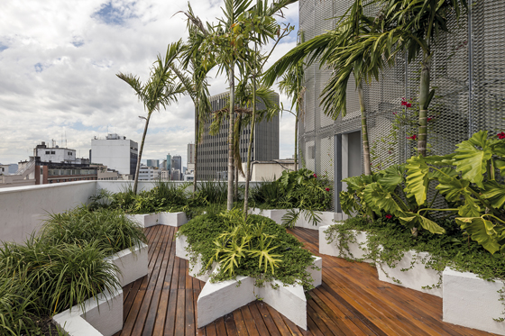
×RB12 is a further example of a project in which the architects opted for a new envelope for an existing façade. In this case, the design team added a “bioclimatic” façade to the glazed grid that fronted the 26-floor building on its narrow street side. The original structure now frames innovative, zigzagging, “folded” glass plates and lamellae that reduce the amount of sunlight entering the building. The intervention also gives rise to captivating visual effects, as the new glazing plays with the light “like a diamond”, in the words of the architects. On the north side, the building was fitted with photovoltaic panels so that it can generate its own power. Excess electricity is fed into the public power grid, giving the building a positive energy balance. Strikingly, RB12 is the first commercial building in Brazil that generates its own electricity by means of this sustainable technology. Moreover, the architects installed a water-recycling system. And the now lushly greened balc onies don’t merely enhance employees’ short breaks in the fresh air, but they also have a cooling effect. A rainwater-utilisation system provides water both for the plants and for flushing the building’s toilets. In the interior, a natural ventilation system was installed for the offices.
RB12 is Brazil’s first commercial building to produce its own electricity via solar panels, delivering any excess power produced through to the national grid. Further eco features include a water recycling system and planted balconies for shade

RB12 is Brazil’s first commercial building to produce its own electricity via solar panels, delivering any excess power produced through to the national grid. Further eco features include a water recycling system and planted balconies for shade
×Brazilians, the architects included, see upgrading old building structures as a pioneering idea. The showcase project RB12 is intended to illustrate how high-end technologies can be used to adapt existing buildings to current conditions as an alternative to tearing them down. It is hoped that the principles demonstrated in this commercial building will in future be realised in other building types as well. Just completed in May 2016, RB12 already enjoys an especially positive image, thanks in part to the high quality of the technologies that were installed. Combining an innovatively glazed façade with renewable energy sources has made this early-seventies-era building into an attractive contemporary office tower with a positive energy balance.
Whether driven by a concern for energy efficiency, aesthetics, or architectural heritage, these projects show that adding a new “skin” to parts of older structures can yield up-to-date, appealing solutions for problematic buildings. The interventions allow the buildings to be adapted to contemporary demands while preserving their original character. And when an expansion ideally complements an existing building, the result is greater than the sum of its parts.
© Architonic
