Time Machines
Text by Simon Keane-Cowell
Zürich, Switzerland
18.01.10
There's no better time than the start of a new decade to revisit the clock as a long-standing product type. Here Architonic examines innovative clock design, past and present.
2010. The new year. (Not to be confused with ten past eight, for those of you who are digitally minded.) If typography is anything to go by, it bodes very well. Such a beautifully balanced set of numerals. What’s more, there’s nothing like the start of a new decade to get you thinking about things chronological.
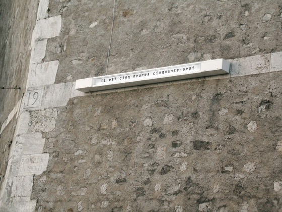
Public Clock designed for the City of Geneva, Nicolas Le Moigne, 2006; photo Nicholas Le Moigne
As technology continues to compel us to live our lives at an ever-increasing pace, performing this in part by embedding the very function of time-keeping in the material props of everyday life, such as computers, mobile phones and other hand-held devices, there is a nostalgia perhaps for the faithful old clock, as an stand-alone product category, a recognisable object-type.
Two of the 20th-century’s most renowned industrial designers - George Nelson and Dieter Rams - display different sets of concerns in their clock designs. In the American camp, we find a highly expressive, resolutely ludic series of wall and table clocks, while on the German side, a far more utilitarian, archly modernist, and, to use that problematic term, 'purist' design langage is articulated in his treatment of the timepiece.
Both designers have enjoyed renewed critical attention of late, with Rams currently the subject of a retrospective at London’s Design Museum and Nelson’s work being revisited at the Vitra Museum in Weil am Rhein at the start of last year.
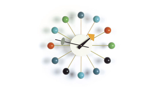
'Ball Clock', George Nelson, 1949; © Vitra Collections AG, photo Andreas Sütterlin
George Nelson’s first collection of clocks for manufacturer Howard Miller, which started its existence as a subsidiary of Herman Miller and Associates, was launched in 1949. The brief from the manufacturer: to create a distinctive product, whose fabrication didn’t require a expensive new tooling. Meanwhile, Nelson’s take on the clock as a piece of design was underpinned by two convictions: that the user reads the time on the clock face by identifying the position of the hands in relation to each other, without recourse to looking at the numbers, and that the advent of the wristwatch had displaced the clock as a primary device for measuring time, allowing it to function more as a sculptural element within interior spaces.
Sculpture is certainly in evidence in, for example, Nelson’s 'Ball Clock' of 1949, probably the most iconic of the US designer’s clock designs, and in his later 'Cone' from the mid-1950s, both of which are now produced by Vitra. What makes these two objects so compelling is that they not only tell the time, but also speak of the times in which they were conceived.
'Ball Clock', with its starburst of wire, each of the twelve rods fitted with a coloured wooden ball at its end, can be read as part of a post-war design discourse that fetished the visual language of contemporary atomic scientific research. This is the language of molecular modelling, with its spheres and metal interconnectors, and can be identifed in the work of other designers of the period, such as Ernest Race’s steel-rod-framed and ball-footed 'Antelope' chair for the design spectacle that was the 1951 Festival of Britain on London’s South Bank.
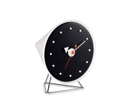
'Cone' clock, George Nelson, 1954; now produced by Vitra
The ball motif appears in a reduced form in Nelson’s 'Cone' clock of 1954, where, once again, numbers are dispensed with, this time in favour of round-headed map pins. But there’s a double rhetorical function here. While alluding to the atomic, the design also makes reference, in its tapering form at the back of the piece, to the styling and, by extension, the glamour of the jet age. (The first jet airliner, the de Havilland Comet, had only entered service two years before in 1952.) This is a design that seeks to capitalise on the technological and scientific advances of the period.
If Nelson was attempting to locate his work firmly in the now, in a specific period of history, you could argue that Dieter Rams was trying to achieve the reverse with his clock designs. Rams, as design director at Braun from 1962, and champion of a very rational, functionalist design ethos, was reponsible for designing a range of products, many of them electronic, such as the 1954 'SK4' radio and record player, which he developed in collaboration with Ulm Hochschule für Gestaltung tutor Hans Gugelot. If Nelson was about the playful, this was emphatically the grown-up and serious.
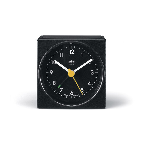
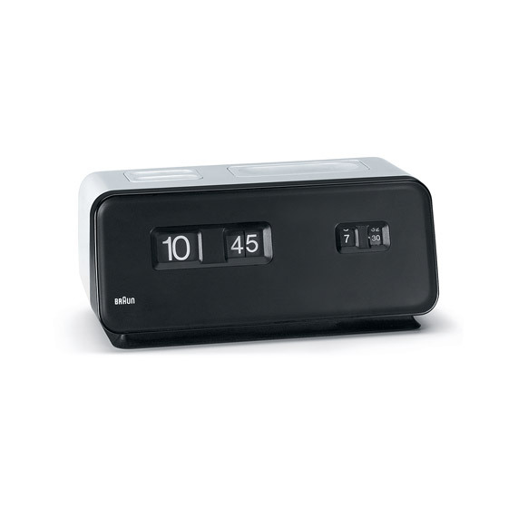
Rams’s 'Phase 1 Desk Alarm Clock', launched in 1971, was the first in a series of timepieces whose reduced form and limited use of colour, in keeping with the rest of the Rams oeuvre, attempted to eschew the historically specific and create a transcendent aesthetic. A number of alarm clocks, including the 'AB1', launched in 1987 and designed by Dietrich Lubs under the directorship of Rams, are still in production. What this appears to bear out is one of Ram’s published principles of good design – that it should be long-lasting.
'Phase 1 Desk Alarm Clock', Dieter Rams for Braun, 1971
The Braun clocks may not display the whimsy of George Nelson’s designs, but they certainly reject the idea of visual obsolescence. They are timepieces that appear, to a large extent, time-less.
If one of the functions of the clock is to regulate human behaviour in society, to tell us where we are supposed to be when, then it’s logical that they should not only be objects found in private, domestic spaces, but also be incorporated into public architectural schemes.
French designer Philippe Starck was perhaps making an ironic comment on this when he featured a large, inset, illuminated clock at the top of a central staircase at Café Costes, his mid-1980s Paris interiors commission, which was, for a time, the place to be seen. Surely a café is somewhere where you want to forget the temporal pressures of everyday life? This was, of course, the boom decade for a lot of us, which brought with it a new, possibly US-inspired work ethic, one characterised by longer, more profit-focused working hours.
Interior of Café Costes, Paris, designed by Philippe Starck, 1984
Not all public clocks are designed to function as commentary on the controlling effects of social time, however. There’s something decidedly human and comforting about Swiss product designer Nicolas Le Moigne’s clock for the city of Geneva, completed in 2006 but yet to be installed due to planning issues. Going by the highly literal title 'Public Clock', the piece tells the time in words rather than through analogue or digital means, the flaps of its rotary system fluttering every minute across its long, rectangular form.
Public Clock designed for the City of Geneva, Nicolas Le Moigne, 2006; photo Nicholas Le Moigne
Le Moigne’s timepiece takes pleasure in the telling of time, literally spelling it out in language, as if articulated by a human voice. The effect of this is to slow the user down in their reading of the time, to make them take their time, and in doing so to be aware of time passing. In our fast-moving society, it’s perhaps no wonder the good burghers of Geneva didn’t like it.
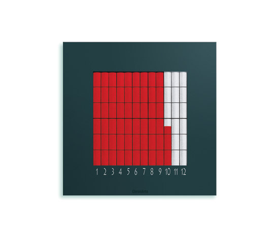
'Quadro' wall clock, Heinz Mutter for ChronArte, 2002
A number of other Swiss designers have approached clock design in an innovative way. Heinz Mutter’s 'Quadro' wall clock for ChronArte, with its highly graphic, flat-colour treatment, wouldn’t look out of place alongside a painting from the Zurich Concrete Art school by the likes of Max Bill or Camille Graeser. Coloured textile bands are formed over time, one band per hour, until the clock face is filled with colour. The product is radio-controlled and changes automatically from standard to daylight-saving time.
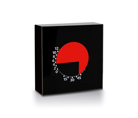
An equally graphic take on the clock can be found in Andreas Mossner’s 'Partime 1x1' for Partime. Pure abstract form – a circle and a right angle – interact to produce a novel means of telling the time. Both Mutter and Mossner invite the user to learn how to read time in non-conventional ways.
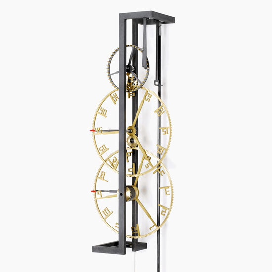
Also graphic, but more avowedly mechanical it its design, is the '2.79' pendulum clock, designed by Martin Fischer for Clockwork. Here, the traditional wall-mounted clock is reduced in form to a spectacular minimal construction, where the piece’s workings are laid bare. The contrast between the two main materials – untreated brass and matt-finished steel – serve to reinforce the idea that this product, while hand-made, looks to industry, rather than craft, in terms of its aesthetic.
'2.79' pendulum clock, Martin Fischer for Clockwork, 2009
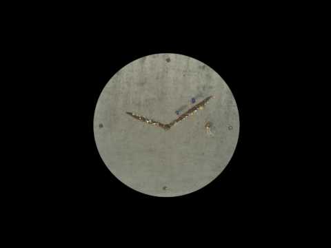
A decidedly conceptual take on the subject of time and how it is communicated within material culture, 'Real Time' is a series of three films that Dutch designer Maarten Baas showed at the Milan Furniture Fair in 2009. Each lasting a full 24 hours, the films foreground the very constructed-ness of time, that fact that it’s not a natural phenomenon, but rather, in the way that we measure it, a social invention. Baas does this by designing people into the mechanics of the clock, whereby the human hand is responsible for changing the time as it’s shown on screen.
In 'Sweeper Clock', two men with brooms, shot from above, push a pile of rubbish around an outdoor space, the debris representing the hands of an analogue clock. This is human activity as design, on film. 'Analog Digital Clock' shows a glass screen with digital numbers on it, replicating the face of the archetypal LED clock. Behind the screen stands a performer, who, every minute, either fills in some of the panels or wipes them clean again, thus modifying the time. The look of digital design is parodied here through a highly human, analogue treatment.
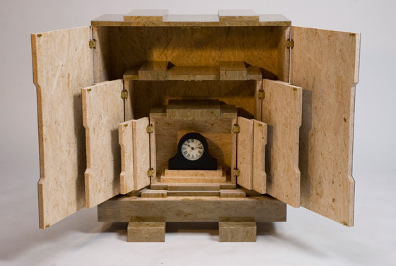
Italian designers Andrea Trimarchi and Simone Farresin, who together are FormaFantasma, have also examined the relation between time and its representation in design. As part of Dutch design collective Droog’s 'Hidden inlays' series, Trimarchi and Farresin have created 'Clock inlays'.
'Clock inlays' for droog by FormaFantasma (Andrea Trimarchi & Simone Farresin); photo FormaFantasma

'Clock inlays' for droog by FormaFantasma (Andrea Trimarchi & Simone Farresin); photo FormaFantasma
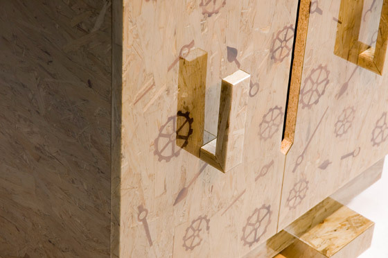
×Also shown recently at Milan, the design duo subvert the meaning of the mass-produced clock by taking an inexpensive product, purchased at a department store, and housing it in a series of chipboard boxes. Inlaid in this packaging are the shapes of various mechanical clock parts. While operating as a reversal of value, whereby the packaging becomes more precious than the object contained within it, 'Clock inlays' also speaks of the value of time itself: the value of craftsmanship, as expressed in the inlay work on the boxes, and of the time that it takes to open all of the packaging, only to find a cheap, bog-standard mantelpiece clock inside. For FormaFantasma, time, rather than timepieces, is what’s really precious.
'Clock inlays' for droog by FormaFantasma (Andrea Trimarchi & Simone Farresin); photo FormaFantasma

'Clock inlays' for droog by FormaFantasma (Andrea Trimarchi & Simone Farresin); photo FormaFantasma
×And, so, time’s up on this article. I hope you feel it’s been time well spent.
Further information on this subject:
