Unsung America: Less Callous in Calais
Text by David Sokol
Washington, DC, United States
26.11.08
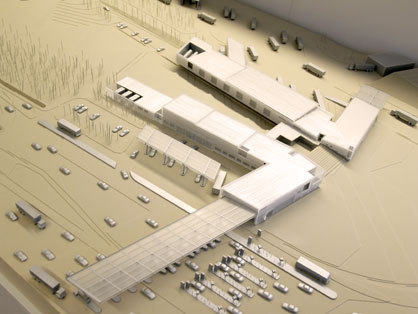
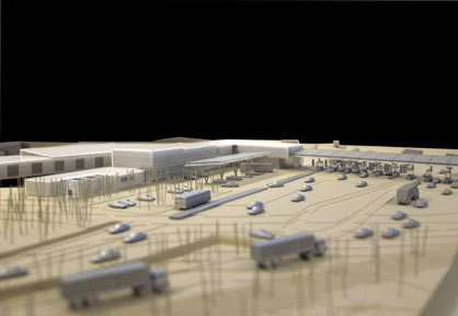
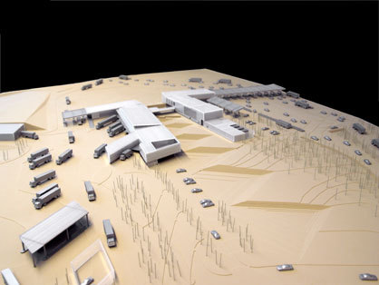
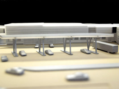
The new land port of entry in Calais, Maine, is designed by Robert Siegel Architects
For the first time on Architonic we present an article for the series «The Unsung» form New-York City based author David Sokol. David Sokol was recently managing director for I.D. magazine and taught at Rhode Island School of Design. He writes regularly for publications such as Azure, Interior Design and Mark.
In searching for an American design, one may as well start at a bookend. The sun rises over Calais, Maine, the easternmost city in the United States. But it has set here, too. Although forests blanket this part of the state, the lumber industry has dwindled, taking Calais with it. From the looks of the partly abandoned main street, "city” may be an overstatement.
And yet the vintage motels and faded gingerbread houses sit tensely alongside an inflated, vinyl-clad elementary school and a short procession of newer fast-food palaces. Calais, then, offers a portrait of one America—caught between an older, resource-based economy and a postindustrial present in which bigger may not be justified, but is usually perceived as better.
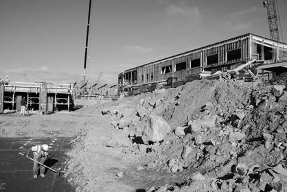
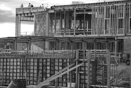
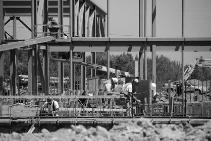
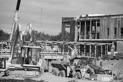
Calais also will be home to a new land port of entry—i.e., a border station—for Canadians and travelers entering the United States. The city has two of these crossings already, but those pastille-size structures date to Prohibition, when the government tried preventing lumberjacks from plying their mouths with Maple Leaf booze. The General Services Administration commissioned New York–based Robert Siegel Architects to design this forthcoming building just 18 months after 9/11. To be sure, this land port of entry is a product of the GSA’s renowned Design Excellence Program. But it’s also a symptom of fear institutionalized at a national level: In the wake of attack, worries of weak borders and penetrating terrorists rumbled through the media. The project should be realized about this time next year.
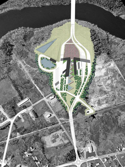
The specific construction site in Calais is endearingly counterintuitive. Thanks to the way the St. Croix River meanders toward the Atlantic Ocean, land masses here dovetail in a way that car and trucks must drive east to enter the U.S. Siegel’s design similarly breaks pattern. Although this is a building that could easily personify the post-9/11 fortress mentality that has made for long lines at airport security, tapped phone lines, and an astounding deficit, the architect has chosen to load it with different symbolic meaning.
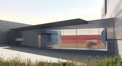
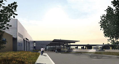
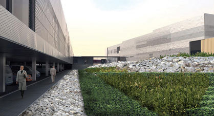
Dispelling fear means working with place rather than dominating it. Siegel (with landscape architect Sasaki Associates and engineer Arup) divided the building into two flared L-shaped volumes like futuristic chevrons, with commercial vehicles received at one building and passenger cars the other. Between the two lies a wedge of land that will be planted with the wild blueberries that fuel August festivals and define town identities here. This blueberry field rises to a berm rather than a wall, giving the impression to incomers that the landscape is more open than barricaded. The buildings themselves can’t hide the bays through which vehicles pass for primary inspection, of course, but try their best disguise: An outer sheath of metal mesh will wrap both buildings, its stamped facets suggesting the glacial boulders that percolate to Maine’s surface through freeze and thaw.
The design is equally considerate of the Americans who will work there. Take that berm, for example. Immediately behind it lies a courtyard with radiant-heated pavers that connects the commercial and passenger buildings. It will provide a respite from the noise and fumes of traffic, and from the annoyed voices and red tempers of put-upon travelers. This site plan also guarantees daylight admission to both interiors. And the semi-enclosed parking, located beneath the docks where trucks will unload their cargo for scrutinizing, is an amenity that will save the costs of shoveling, ice removal, and the accidents that attend the missed spots.
Despite the building’s function, which can’t help but intimidate, and inevitable value engineering, Siegel manages to execute a scheme that is, in a word, humane. It may not be as extravagant as the GSA’s celebrity-made federal courthouses, but it deftly advertises the quality of the Design Excellence Program. And perhaps modesty is the point. In one’s first interaction with the U.S. government, nowadays spectacle may be perceived very wrongly.
Welcome to «Unsung America». Inspired by Alice Rawsthorn’s critique that the U.S. lacks powerhouse furniture designers, this column observes the local communities and conditions supporting a variety of design disciplines. The «Maine Journal» entries are the first in a state-by-state exploration. Next time: A school at the end of the world.
