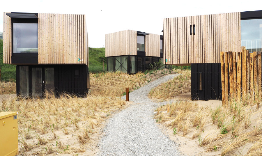
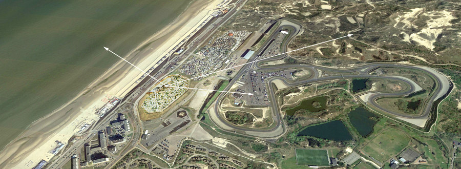
Mid July 2019 recreational park Qurios Zandvoort opened its doors. The park is situated between the Formula 1 track, the national park Kennemerland and the beach of the town of Zandvoort. It’s also conveniently close to the cities of Haarlem and Amsterdam. Because of its unique location the park will attract a very diverse group of guests. From city dwellers to beachgoers and from nature lovers to race fanatics. For the design of the park this meant that it couldn’t be a ‘1 size fits all’ concept and should be able to accommodate this diverse group of guests. The architecture of the park plays a key role in giving meaning and expression to this diversity.
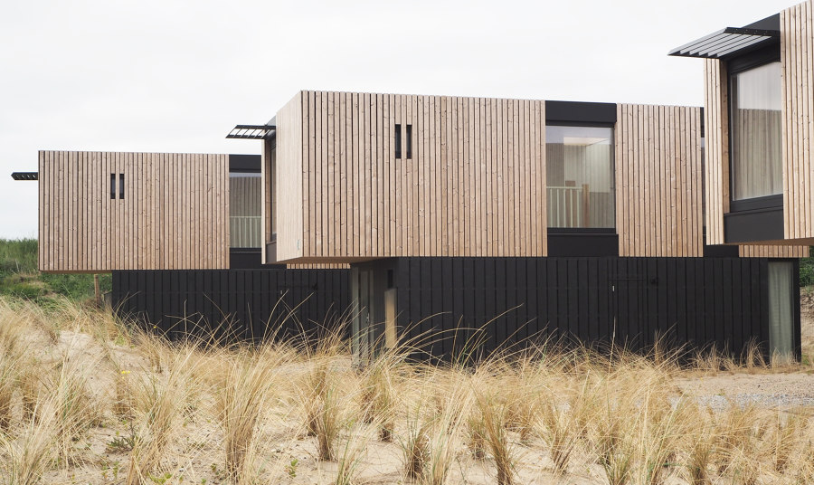
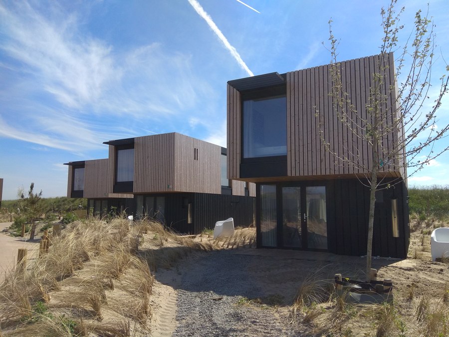
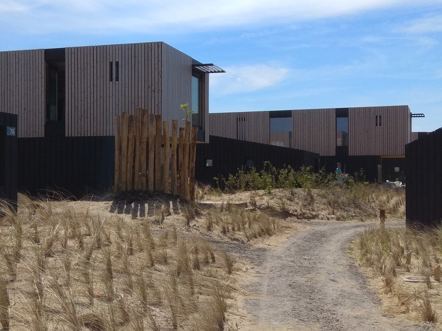
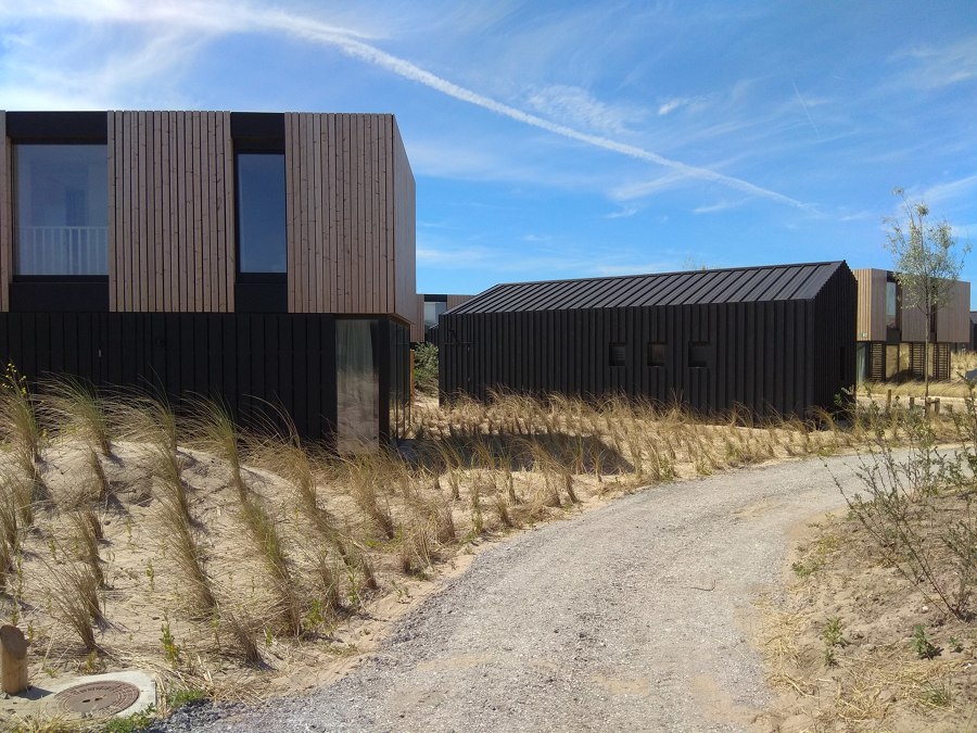
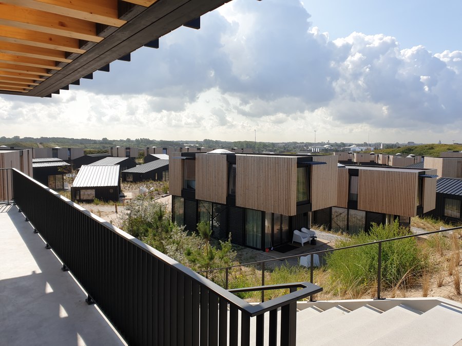
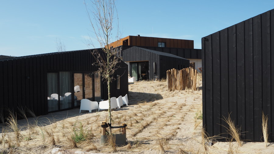
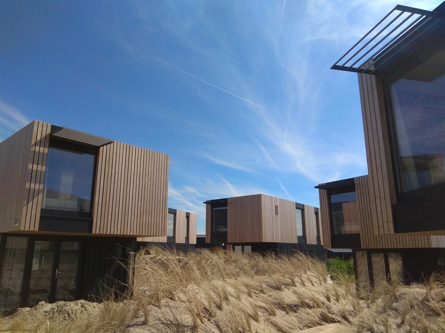
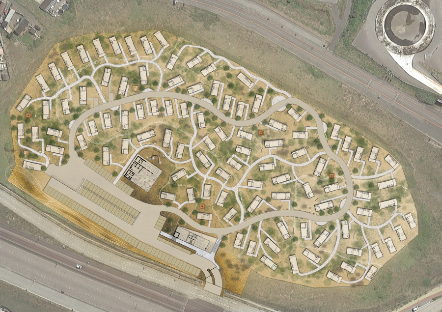
The park accommodates 100 cottages and 2 public pavilions and is designed like a dune park where the sand literally flows against the building. The cottages are situated on plateaus on different heights and all have a different orientation. This creates different atmospheres, sight lines and spatial experiences throughout the compact designed park.
The park feels very natural because of the rough dune landscape and unpolished wooden facades of the buildings. The buildings feel like they have always been there and, despite of their contrasting appearance, have become one with the landscape. The buildings don’t have a fenced off private space. The idea is that people are free to explore the park and kids can play in the sand where they want. To emphasize this wild natural appearance all cars are parked outside of the park.
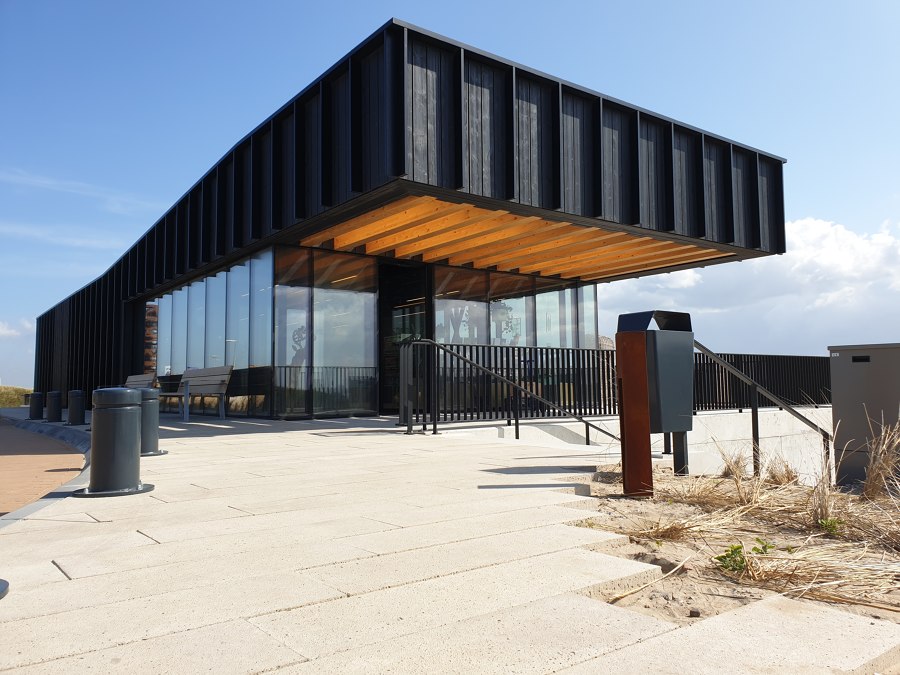
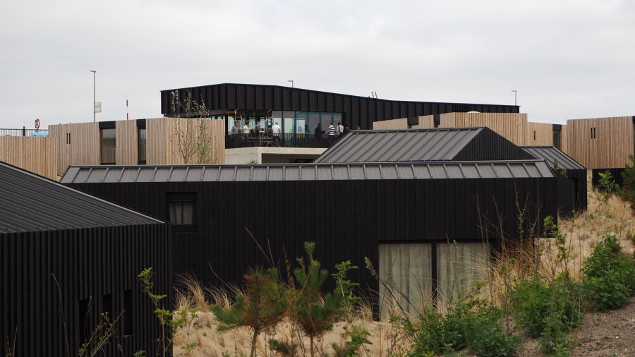
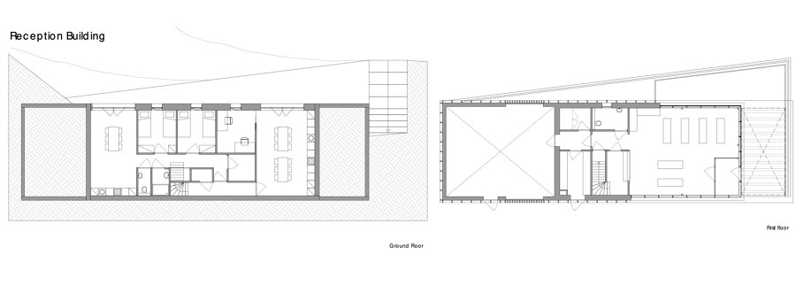
Guests enter the park from the Zandvoort boulevard. The first building they’ll see it the visitor center. With its floating roof this pavilion like building provides a panoramic view over the whole park. Inside guests can check in at the reception and there’s a mini shop. The shape of the visitor center is a clear volume made of black wood with vertical planks. The vertical planks give different expression to the façade based on the position and intensity of the sun. In the back there is a patio with bikes for rent. In contrast with the black façade the basement floor is made out of light concrete. The basement is houses bedrooms for the staff and a common living room. The concrete volume has sharp edges that cut into the dune like a knife.
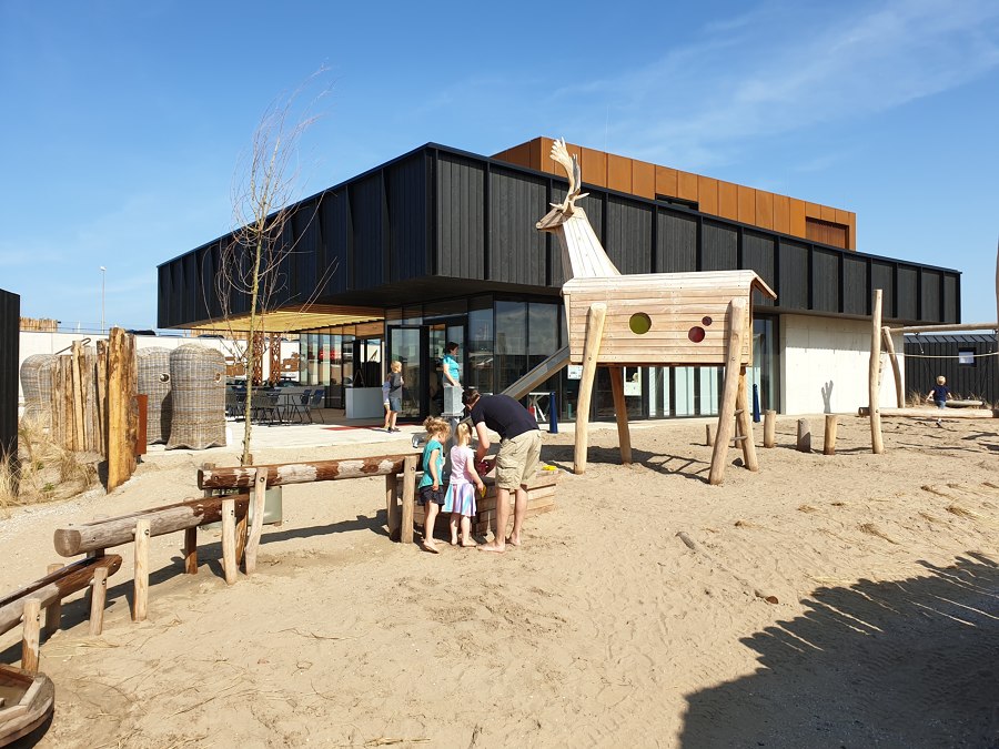
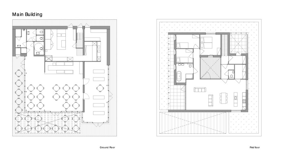
Coming from the visitor center guests make their way down to the main building that is in the middle of the park. This building has all the social functions like restaurant and animation space. The appearance is similar to the visitor center, but instead of having a solid concrete basement this building has a corten steel volume on the roof. Inside this closed volume there is the keeper’s house. The volume gives the sense that it has been there for ages and that the nearby sea has had a corroding effect on the material. The keeper’s house is only open towards the seaside, giving a magnificent view. From this side the keeper can access a roof terrace that runs around the whole volume providing views to the park, the dunes and the Formula 1 race track. In the heart of the house there is a patio that provides daylight for all the rooms. The social programs are located in glass volumes on ground floor that can be opened to create a strong inside-outside connection.
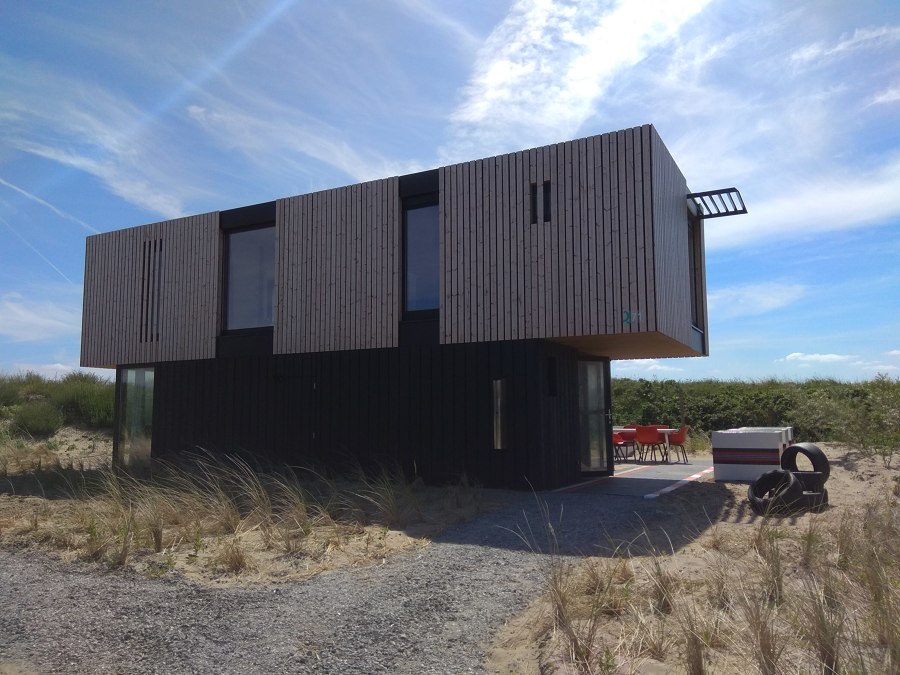
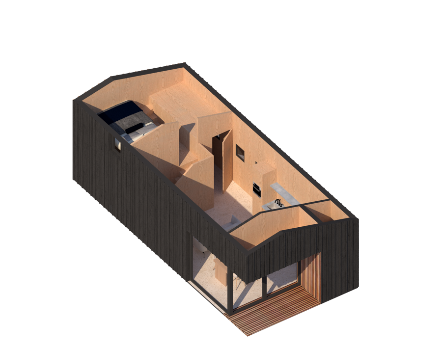
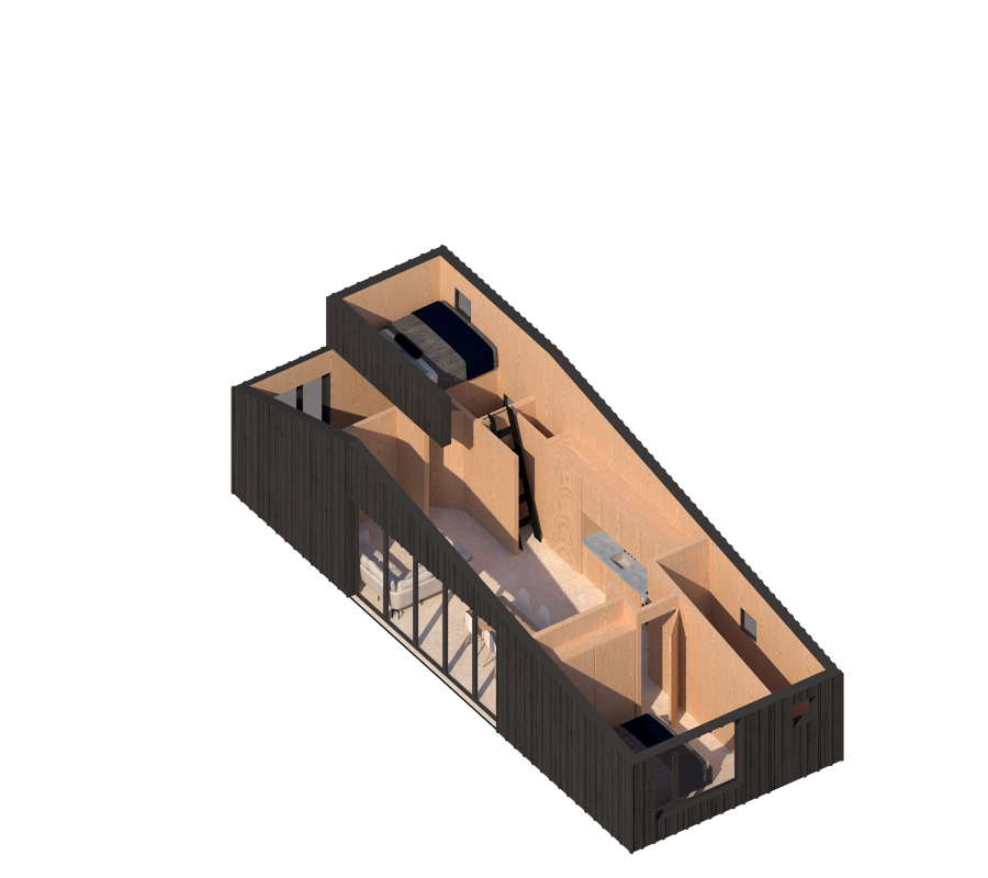
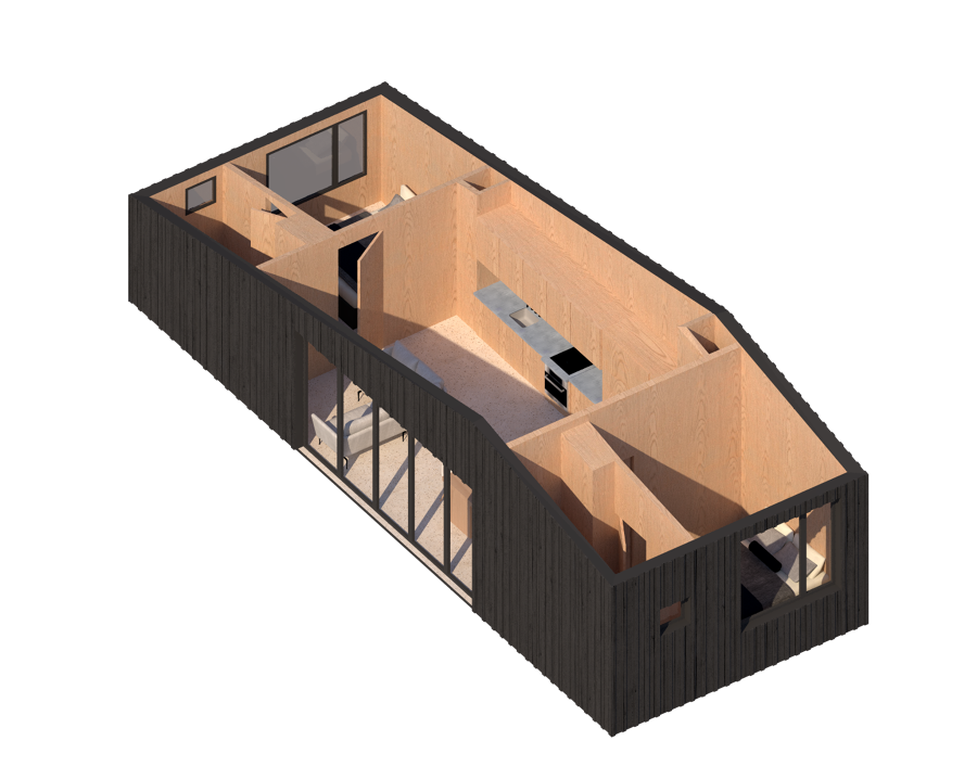
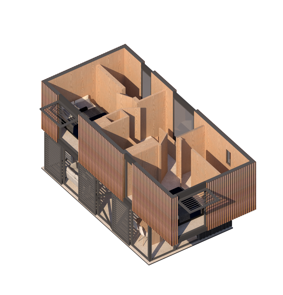
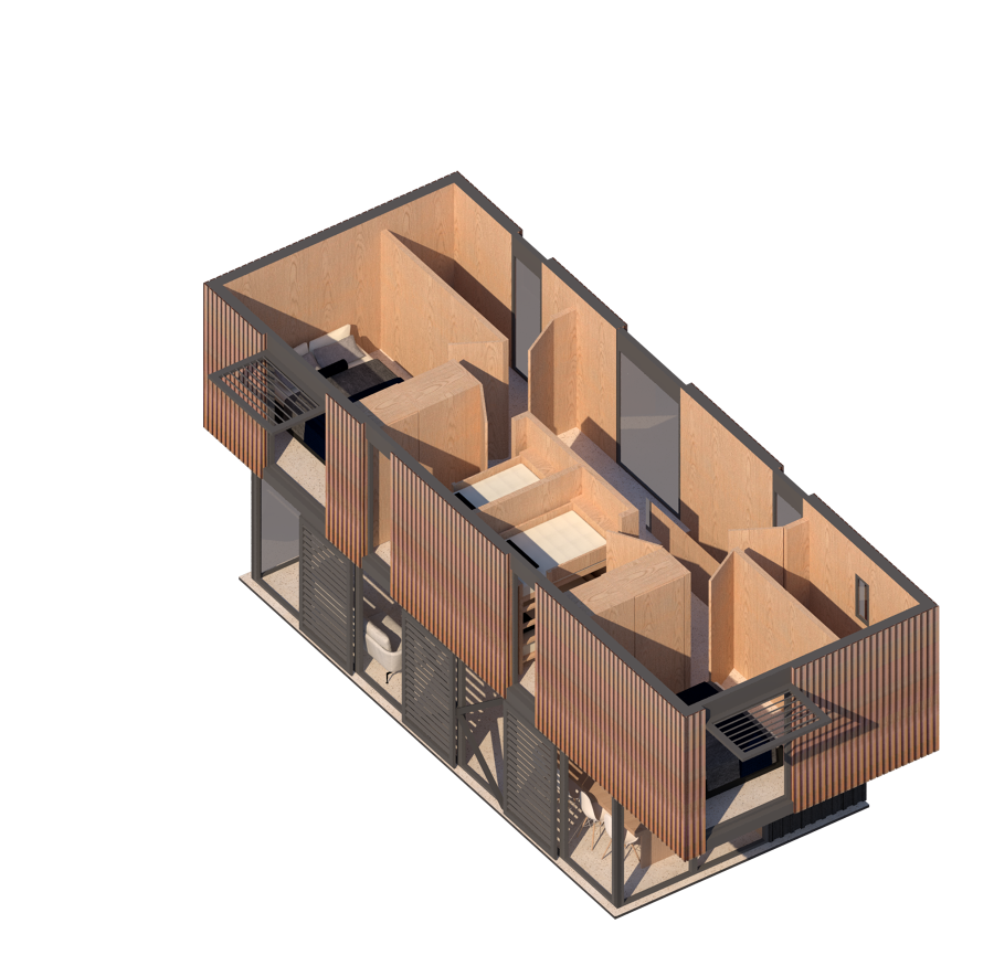
Inside the park guests find 5 different types of cottages. Each designed with a specific experience and theme in mind. The themes each attract their own kind of guests. The floor plan, interiors and facades of the cottages give expression to these themes. The adventure cottage is designed as a compact shed where people are stimulated to be outside most of the time. The family cottage provides a spacious living and dining room which can be completely opened to the outside. The Royal cottages are all about luxury and comfort. They are made of 2 floors where upstairs there are comfortable bedrooms and downstairs has a lounge like kitchen and dining room. The XL cottage is all about maximum space for large groups. Furthermore the interiors are designed with the themes ‘Denim’, ‘Clear Nature’, ‘Racing’ and ‘Coffee’ in mind. Although all the buildings are very different they do share the design language making them part of a bigger family.
Design Team:
2by4-architects
Team: Remko Remijnse, Agnese Argenti, Emanuele Saracino, Manfredi Guidi di Bagno
Landscape: Snoek Puur Groen
Interior: RH Interieurs
Contractor: Barli and Peter Peters
