Kiwiana cool - Aedas Interiors transforms a 70s hotel into a hip hotspot for the second edition of M Social in Auckland, New Zealand . The downtown waterfront of Auckland has morphed in the past decade into a lively community and entertainment precinct, with activity concentrated around the revitalised Viaduct basin and Britomart station. At the heart of the downtown waterfront between these two sites is the 12 storey high Copthorne Harbour City Hotel. Owner Millennium & Copthorne Hotels (M&C) decided that it would be the perfect venue for its second M Social, a four star lifestyle brand first launched in 2016 in Singapore.
For the Auckland location, it looked to Hong Kong based Aedas Interiors to continue developing its new brand aesthetic to reflect vibrant, young, socially engaging spaces aimed at targeted millennial and contemporary traveller markets. Collaborating closely with the Chairman of M&C and Executive Chairman of M&C’s parent company Hong Leong Group, Mr Kwek Leng Beng, Aedas Interiors strived to realise his vision of a standout lifestyle concept that embraces technology and allows people to socialise and interact with one another. “I envisioned M Social as a trendsetting venue that offers travellers and locals a place to both rest and play,” said Mr Kwek.
Aedas Interiors developed a concept to showcase a distinctly down under sense of place dubbed kiwiana. “This was a passion project for me,” admits Greg Farrell, Executive Director with Aedas Interiors; he grew up in Auckland and knew the site well. “We tried to weave a sense of fun, humour, art and culture—all key aspects of kiwiana—into M Social’s interior design. Creating sense of place along with social and community based spaces were key focuses for our team at Aedas Interiors. Here, we injected social spaces that connect the community with a dynamic new look for a 70s building that at the same time continued to develop M Social’s aspirations and brand DNA.”
The building was gutted down to its structure to allow for seismic upgrading; the subsequent renovation acknowledges the structure’s 70s vibe. Taking advantage of the long northern façade facing Quay Street and the harbour, the entry as well as bar and dining area were oriented towards this sea view. All public spaces were planned to merge and combine, creating the seamless socially interactive and engaging spaces at the heart of M Social’s DNA.
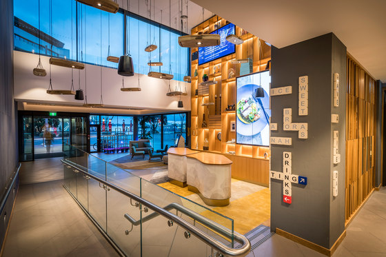
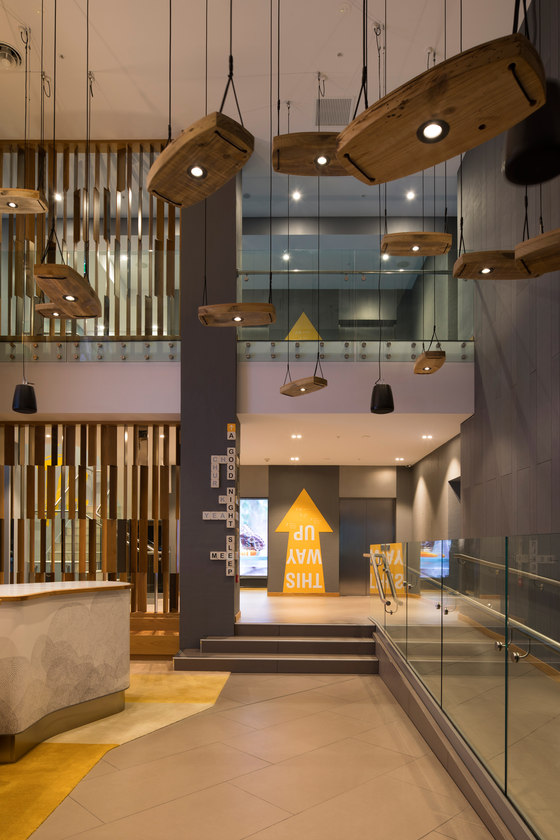
The entry leads directly into a double volume lobby area highlighted by a media wall and nostalgia paraphernalia selected to bring a slice of kiwiana lifestyle into the property. Pendants above the lobby were styled like swings that suspend from mature trees commonly found in front and backyards of Kiwi homes. Fronting the group check in kiosk is a cloud pattern inspired by cultural art.
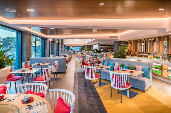
To the west of the entry, the reception and long bar leads into Beast and Butterfly: a development of the original Asian based F&B concept established for M Social and adapted to meet discerning expectations of local and international diners. Loosely separated into casual indoor dining, the restaurant offers open kitchens, more intimate banquets and tables at the rear, and a front al fresco terrace that faces the water.
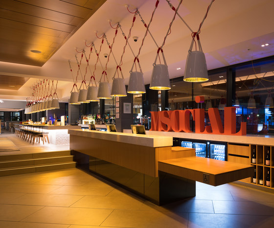
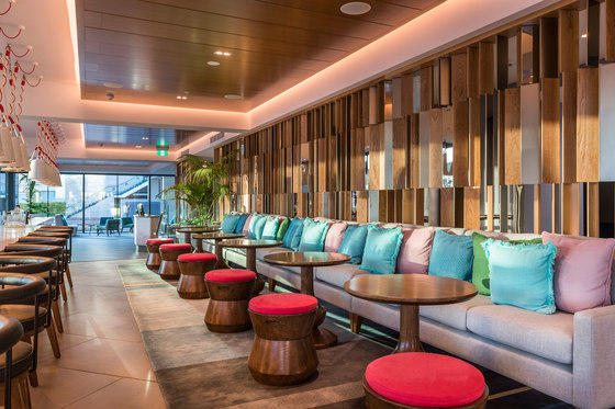
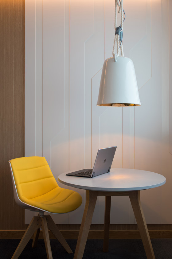
The latter area beckons workers from nearby offices to drop by for lunch or after work drinks, as there is a direct entry to the terrace from the street. Vertical wooden fins throughout the space diffuse the northern light while alluding to the nearby sailing culture with its nautical references. Above the reception and long bar, a row of ding pendants by Latitude 22N interwoven with crisscrossing ropes allude to the bells commonly found in shipping. Spindle back seating were inspired by 70s New Zealand residences and benches with wooden frames to give the F&B outlet a homely warmth.
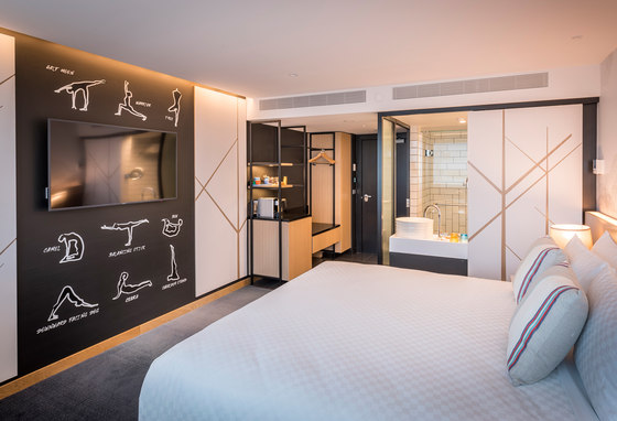
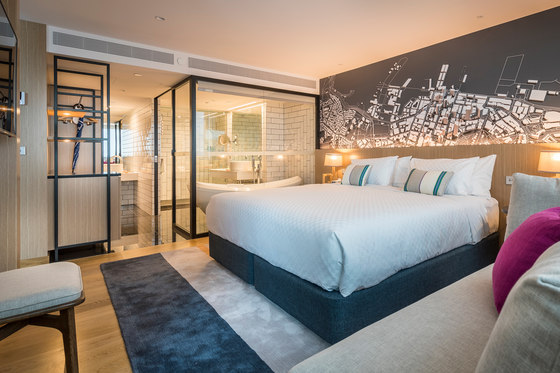
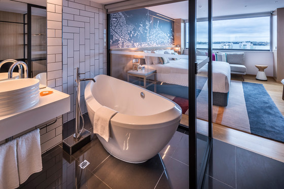
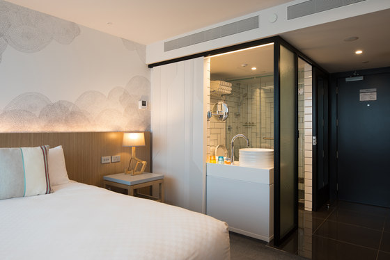
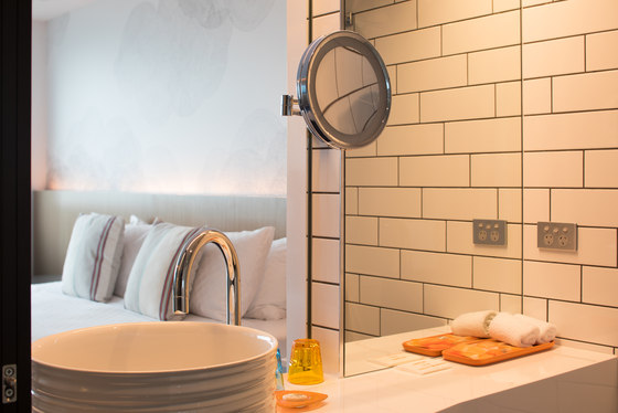
Single loaded corridors lead to 198 guestrooms consisting of King, Twin and Suite categories, with interconnecting Twin and Suite rooms that can be combined to form a two bedroom Super Suite. King and Twin rooms are 24 square metres and feature an open style bathroom with vanity oriented towards the room and view beyond, visible through a sliding door. Bathrooms are clad in white brick bond tile framed in black.
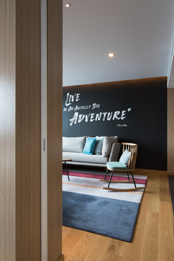
Three design schemes were developed for the guestrooms: the top three executive floors are finished with paddle, a nautical theme that includes prevalent usage of wood, while lower floors feature kiwi, a nature and fauna décor with whimsical messages on chalkboard-like backdrops as well as nautical, a container inspired scheme with shipping graphics and references. The suites contain striped area rugs and bold graphics that allude to the nearby Viaduct and Auckland Harbour.
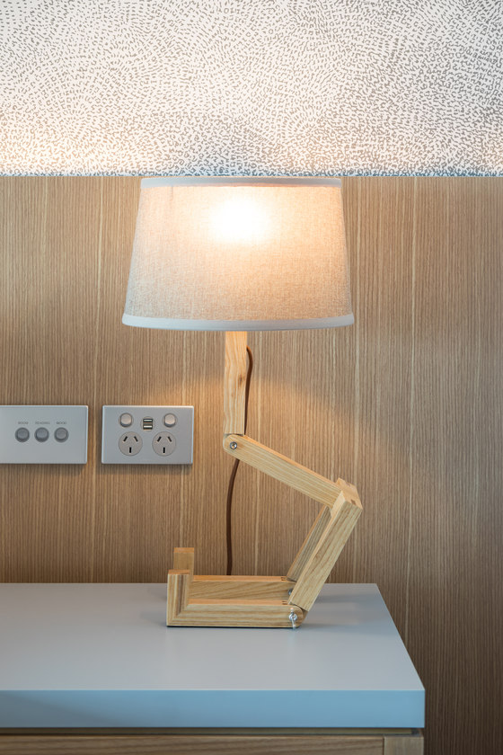
Materials were carefully selected to reinforce Aedas Interiors’ design concepts. Natural oak was used throughout as flooring, wall cladding and in custom furnishings. Wherever possible, reclaimed hardwood was utilised; this can be seen in the pendant swing lighting in the lobby. Aedas Interiors’ custom furnishings and lighting were realised by local furniture maker Furnwerks. Textiles were sourced locally through New Zealand weaver Maxwell Rodgers along with Elitis, Clarke & Clarke and Brentano, with an emphasis on fabrics that can be used both inside and outdoors.
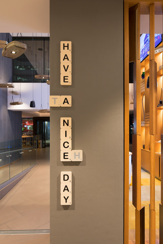
All of the property’s signage was custom designed by Aedas Graphics. A popular board game in New Zealand, oversized Scrabble tiles were used on columns as directional signage. The kiwiana concept continued in signage through the use of number eight fencing wire, another icon of New Zealand rural life.
Millennium & Copthorne Hotels (M&C)
Aedas Interiors
Director Greg Farrell
