Sina Plaza is the principal office in China for Sina Corporation, a Nasdaq listed company that operates Sina.com and Weibo social platform and has more than 85 million unique users per day.
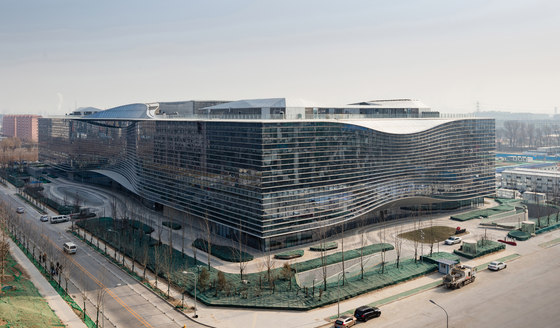
The project has an above-ground and below-ground gross floor areas of 76,500 square metres and 48,000 square metres respectively. It houses approximately 55,000 square metres of open office/R&D space, conference and meeting areas, corporation exhibition area, staff amenity areas which include entertainment and leisure facilities, canteens and a supermarket. The design also caters for maximum flexibility.
SITE DESCRIPTION
The project is located in Zhongguancun Science Park, a technology hub often referred as ‘China’s Silicon Valley’ in the northwestern part of Beijing. Situated at the corner of Zhongguancun West Road and Zhongguancun South Street, the project site is adjacent to many top tiers IT and internet/web-based companies.
The area is well connected with public transport and is planned to be low density. Most developments are required to sit along their site boundaries to reinforce a strong streetscape. Building height is limited to 32 metres.
DESIGN CONCEPT
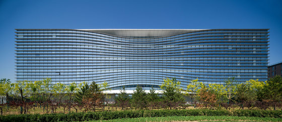
‘Limitless’ is the core concept of the design as advances in media technology and information flow have opened up unlimited opportunities in the digital world. The building is designed to reflect the infinity symbol ‘∞’ to express this concept of ‘limitless’. The objective of the architectural planning is to ensure maximum flexibility based on a modular approach that allows reshaping and adjustments as needed.
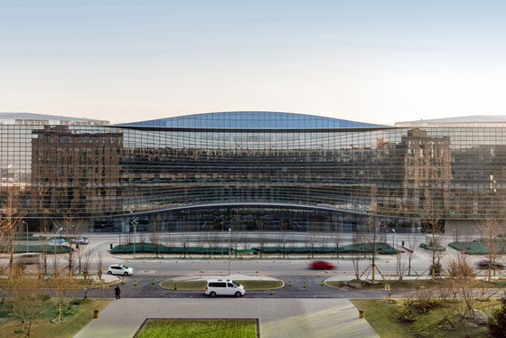
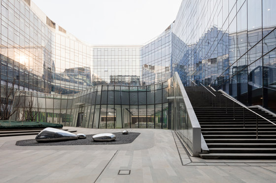
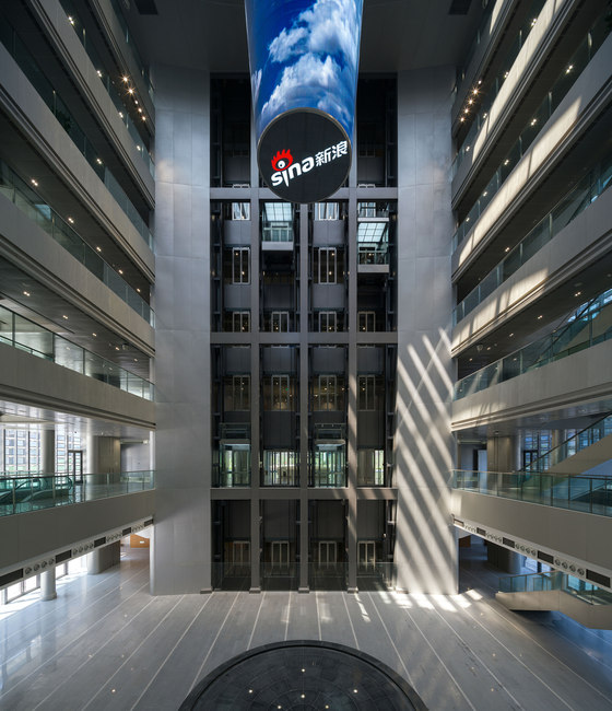
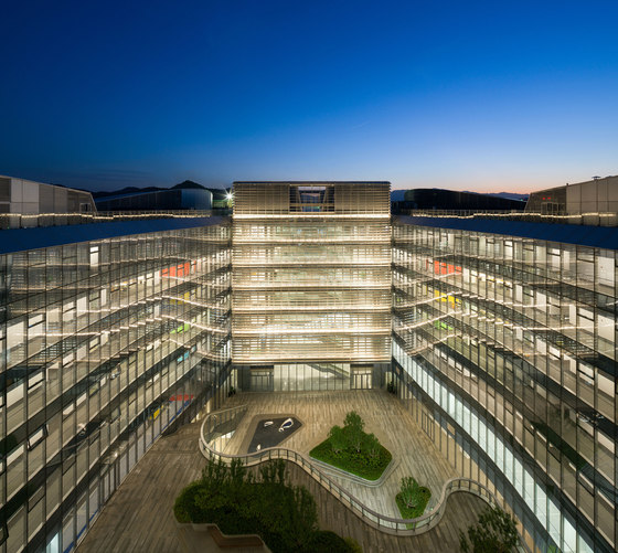
Drawing from the Chinese architectural heritage of courtyards, the building frames two major open courtyard gardens that brings natural light and cross ventilation to the interiors. At the intersection or centre of the building is the main entrance and a focal point – the ‘Eye of Sina’ – an atrium space that serves as the main vertical circulation hub and features a 12-metre high conical media screen which displays current media information by Sina.com and Weibo.
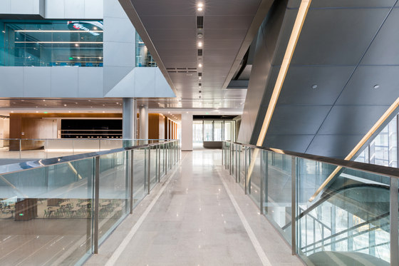
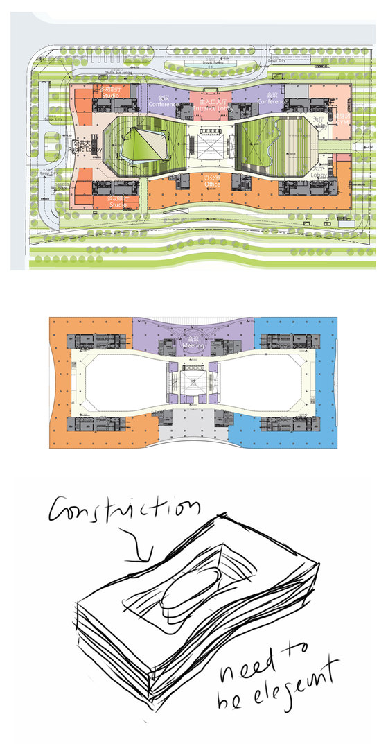
Vertical circulations and servicing cores are located at the four corners of the building and connected by the central atrium. The internal circulation route resembles the infinity symbol which allows users to commute efficiently from one end of the building to the other. Walking to the opposite corner of the building requires no more than two minutes.
Although the architectural form is rectilinear, the architectural moves religiously follow a special design discipline. The form was squeezed, kneaded and pinched to express entrances, balconies, special double height workspaces and skylights.
SPATIAL PLANNING
The company values its staff and this headquarters building features not only office spaces, TV studios and R&D facilities that are essential for work, but also a series of staff amenities to ensure a healthy and efficient working environment, including a fitness centre, shower rooms, a library, a staff canteen, self-served pantries, a clinic and baby feeding rooms.
Level 1 – Ground Level
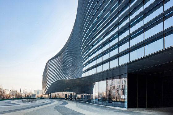
The north entrance serves as a formal and main entrance for visitors. The entrance is denoted by a massive curved canopy which is formed as part of a continuous gesture of the horizontal lines characterised in architectural language. Upon entry, the lobby space opens up into the main atrium, also known as the ‘Eye of Sina’, which serves as the main vertical circulation hub connecting all levels within the building with stairs, escalators and lifts.
Immediately adjacent to the north entrance lobby is a conference centre with meeting rooms. This level also comprises a staff fitness centre, recreation rooms and an exhibition area leading to the outdoor areas on the east and south of the building.
Level 2
Specialised circular meeting rooms with conferencing facilities and general office areas.
Level 3 to 5
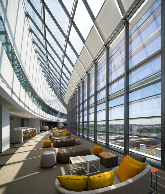
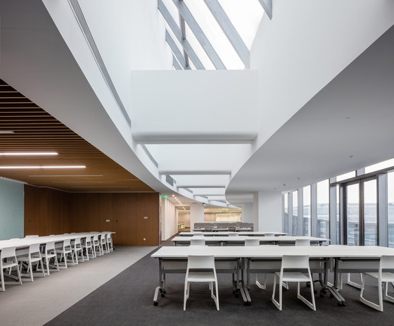
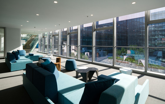
General office areas include staff training areas and collaboration spaces at each end of the building facing the internal courtyards. These levels also comprise open relaxation zones equipped with self-service pantries and softly furnish ‘chill out’ areas.
Level 6
Office areas for senior management and general staff.
Level B1
This level houses TV studios and interview rooms along with a 200-seat auditorium, a 1,300-seat staff canteen and sunken courtyards that connect the canteen with the main atrium.
Level B2
Parking lots, supporting services and MEP/ data centre.
SUSTAINABILITY
The development is targeted to be a green and user friendly headquarters building, in alignment with the philosophy of this major international online media company. It has received a Pre-certified LEED Platinum rating.
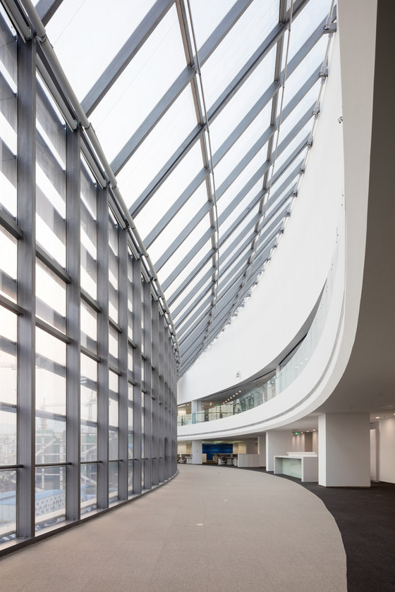
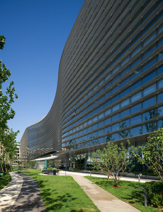
Optimised building orientation is crucial to minimise solar heat gain and maximise natural ventilation. Penetration of daylight especially in the lobby and peripheral office spaces can greatly reduce the amount of energy used for artificial lighting. The skylight also helps light up the corridor on the top level. Double Low-E glass is applied to minimise cooling energy consumption, while external shading fins are carefully used to provide effective shading to the building envelope.
Site area: 29,760 sq m
Gross Floor Area: 124,500 sq m
R&F Properties / Sina Technology (China) Co., Ltd.
Aedas
Director: Ken Wai
MEP Consultant: J. Roger Preston Limited
Curtain Wall Consultant: Jangho Group Co., Ltd.
Landscape Designer: ACLA Ltd.
Interior Designer: Aedas Interior / HASSELL / AB Concep
Lighting Consultant: Brandston Partnership Inc
Signage Designer: Fabio Ongarato Design
