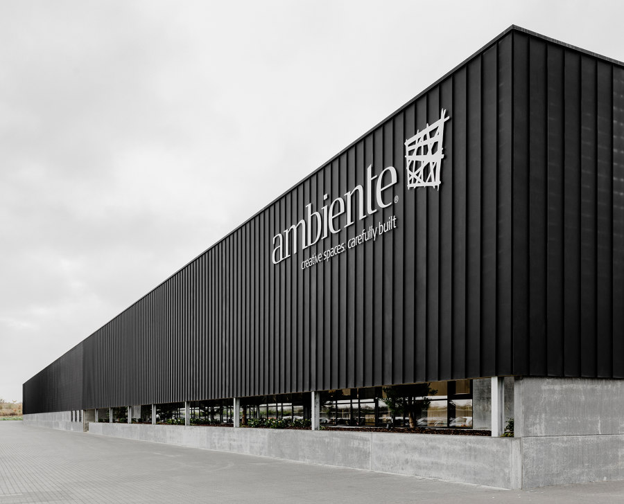
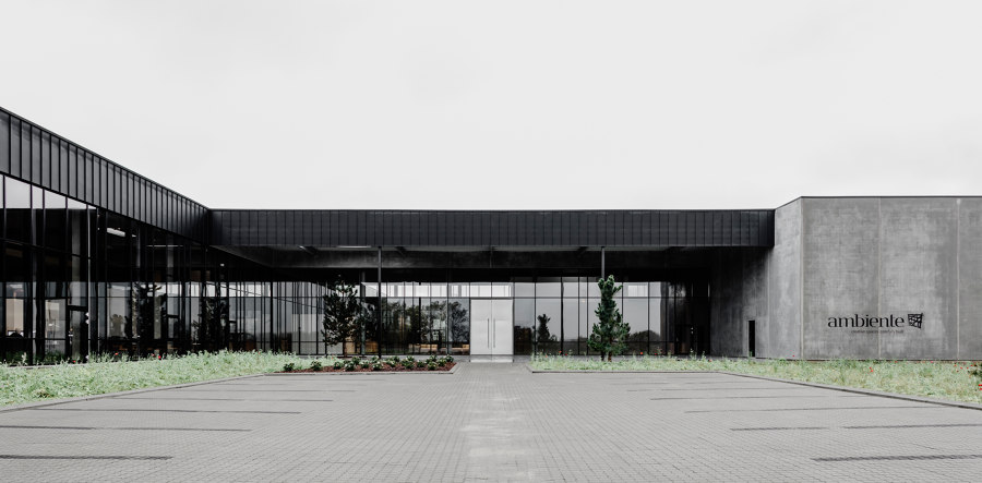
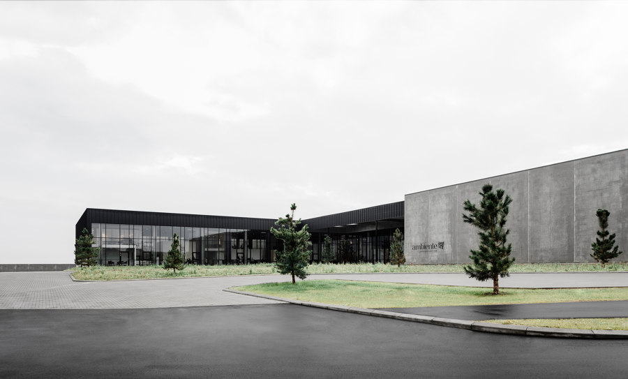
When you pass Ambiente’s new headquarters by E45 near Skanderborg in Denmark it’s not immediately visible that the minimalistic, black steel façade hides a building that in many ways sets itself apart from your typical company headquarters. But Ambiente’s customer promise ‘Creative spaces.
Carefully built’ written on the façade is far from empty words. The 11,500 m2 that make up the new surroundings for one of Northern Europe’s biggest exhibition and retail design companies cause most people to look twice. First of all, because of the creative and very spectacular utilization of the square meters - and next, when they find out that the price of the new headquarters is nowhere near as high as one might think.
Making design and functionality come together is not new to Ambiente who, for 20 years, has designed and built exhibition stands, retail stores and corporate office spaces for a wide range of renowned Danish and international brands- but this is the first time they do it on such a large scale for themselves.
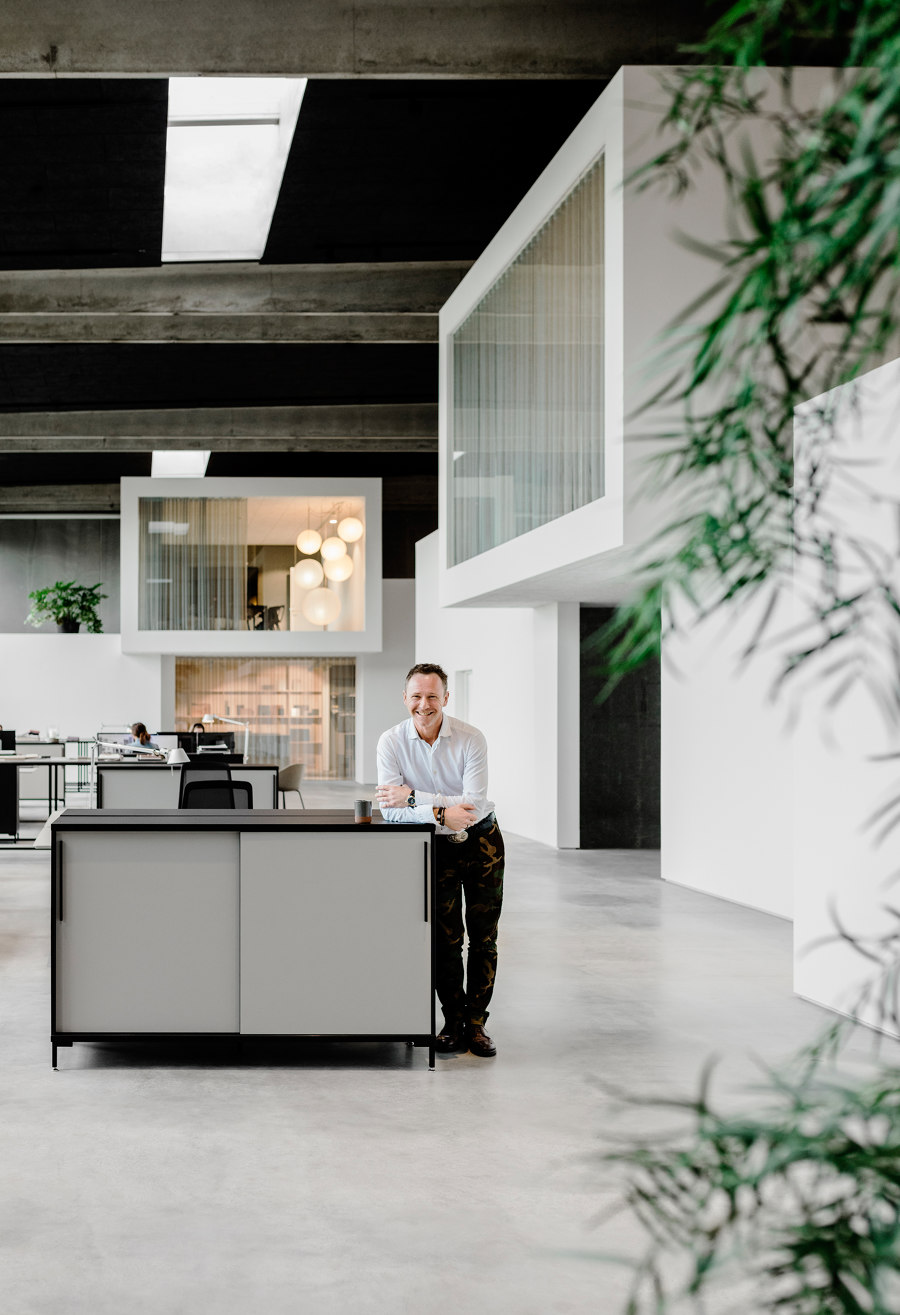
“I knew I wanted to build the headquarters of the future. Something that hasn’t been seen before and will make people go ‘wauw’. Above all, I wanted to build a great place to work and hang - with room for differences in every way. However, like everyone else we naturally had a budget to comply with. We just decided right from the beginning that we wouldn’t let that be a constraint but a chance to challenge and explore our own creativity”, says Ambiente’s owner and Creative Director Michael Skjoedt.
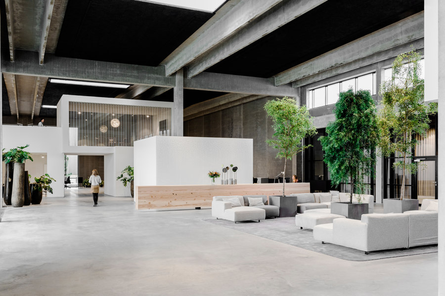
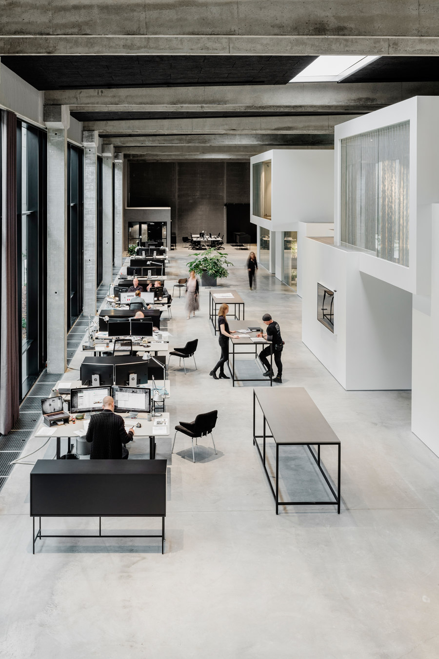
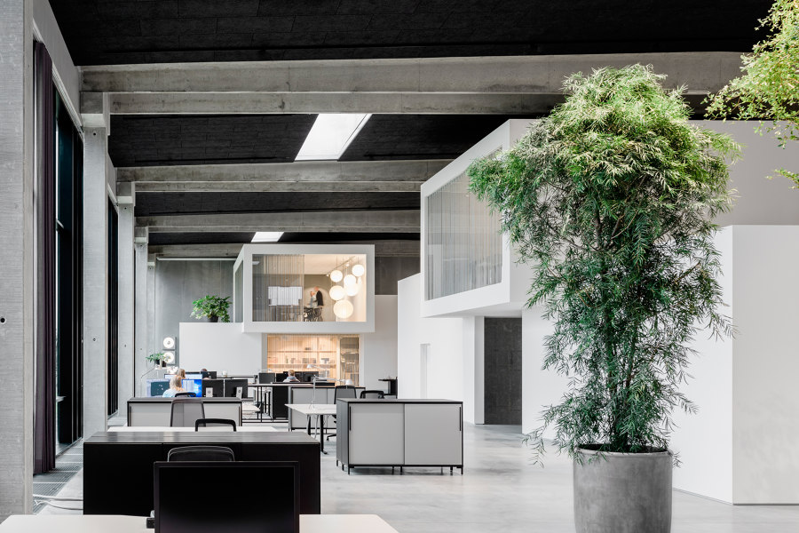
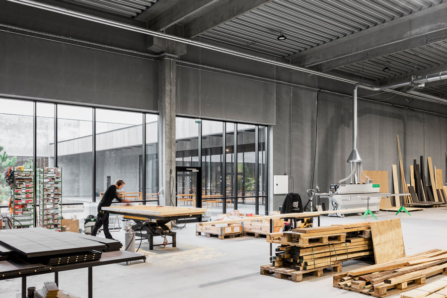
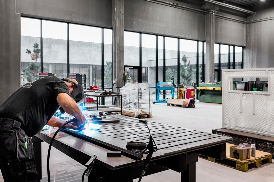
Consequently, there are no sunken ceilings and no time nor money has been spent on filling the walls - which are typical costs related to hiding ventilation systems and painting walls. Instead, the concrete walls and floors of the buildings are left untouched. Raw and honest and with all the flaws and cracks that concrete has. The height of the ceilings are an impressive 6,5 meters almost everywhere and the production hall, the warehouses and the administration fundamentally look the same.
‘White City’ - an architectonic statement
The lack of ‘refinement’ of the outer framework, in turn, has made financial room for creating ‘White City’ - a spectacular architectonic statement inside the administration building. ‘White City’ consists of 18 white ‘houses’ which visually look like displaced boxes stacked on top of each other, creating spatial experiences and niches in the massive open office space. Inside the houses are meeting rooms, design lab and offices - and as an interesting architectonic feature all staircases are hidden inside the houses, too, to complete the cubic look.
The décor of ‘White City’ and the rest of the new headquarters is predominantly modern in style but with touches of secondhand elements from exhibitions, little creative surprises and special fixtures produced inhouse. An example of the latter is the impressive 1.6 tons heavy desk in the foyer, made from 8 meters long Douglas pine.
Ambiente’s DNA is also visible in the 1,000 m2 outdoor atrium which forms a beautiful square oasis in between the production hall, the warehouses and the cantina. The inspiration comes from Nordic coniferous forests, perfectly complementing the raw buildings. And as yet another subtle proof of Ambiente’s creativity, the footpaths in the atrium are laid out in the shape of Ambiente’s logo.
Break with conventional thinking
Let’s return to the money issue. Because the price per square meter here is well under half of what it typically costs to build large prestige headquarters. This has been achieved through a consistent involvement in the construction process right from the very beginning of the design phase - along with an eye for solutions that break with conventional thinking.
“Of course, this is our home turf and what we do for a living. Thinking out of the box and designing and building creative spaces but it’s also important to have the courage to question decisions and challenge people who say: ‘That can’t be done!’. As an example, we don’t have cooling systems in the administration because the building was turned slightly so the sun is never directly on it. Also, we turned down a traditional main entrance with glass doors and instead opted for 4 meters tall steel doors because they give a completely different feel”, says Michael Skjoedt.
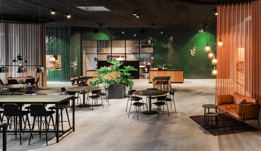
“Basically, we’ve cut back on exterior refinement costs and spent the money on creating an experience. Our new headquarters is really a raw exhibition hall we’ve filled with different concepts and universes, big and small - and that’s the perfect surroundings for someone like us”.
Design Team:
Interior Design: Ambiente A/S
Architecture: ARDESS
