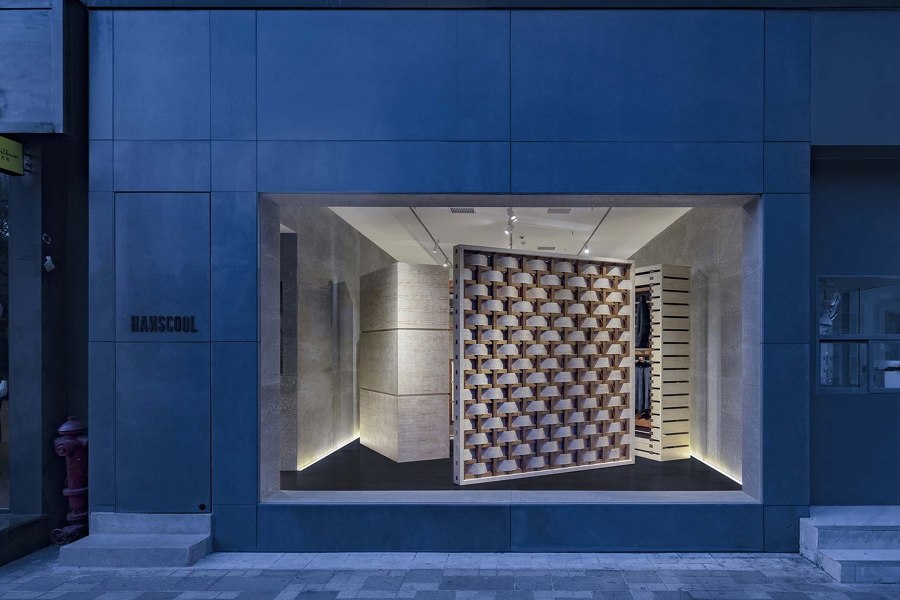
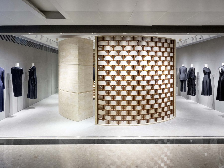
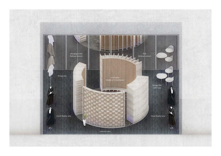
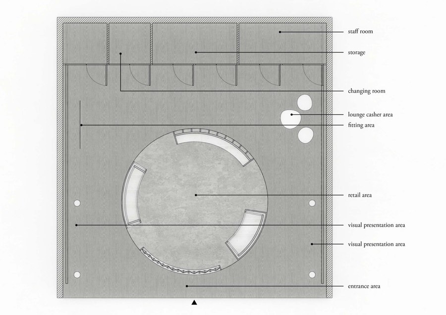
ARCHIEE has created a specific design code for the brand HANSCOOL. At present, two boutiques have launched variations of this concept for their retail spaces. Both boutiques have different declinations at their retail core, one square and the other circular.
This concept is meant to be adaptable to a series of boutiques for this new fashion brand based in China. Originally a fabric supplier for global fashion companies, HANSCOOL decided to launch its own fashion line. The brand not only distinguishes itself by producing and using high quality fabrics, but also by its ability to rethink details, such as new stitching techniques for its new brand, modernized some of its fabrications. Their expertise is the key element that inspired ARCHIEE’s design for the space.
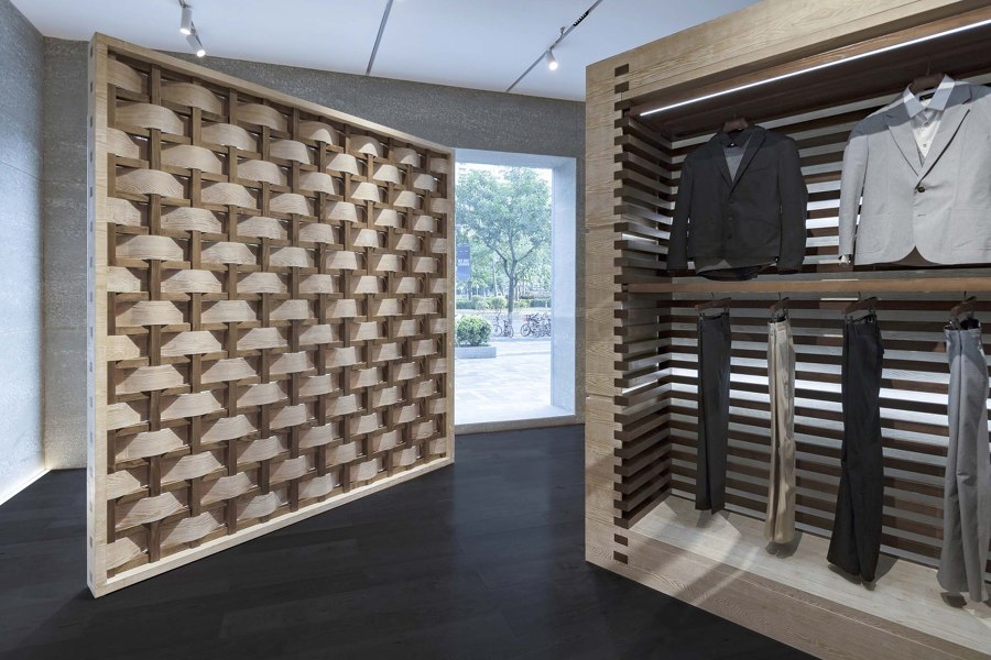
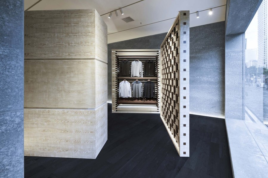
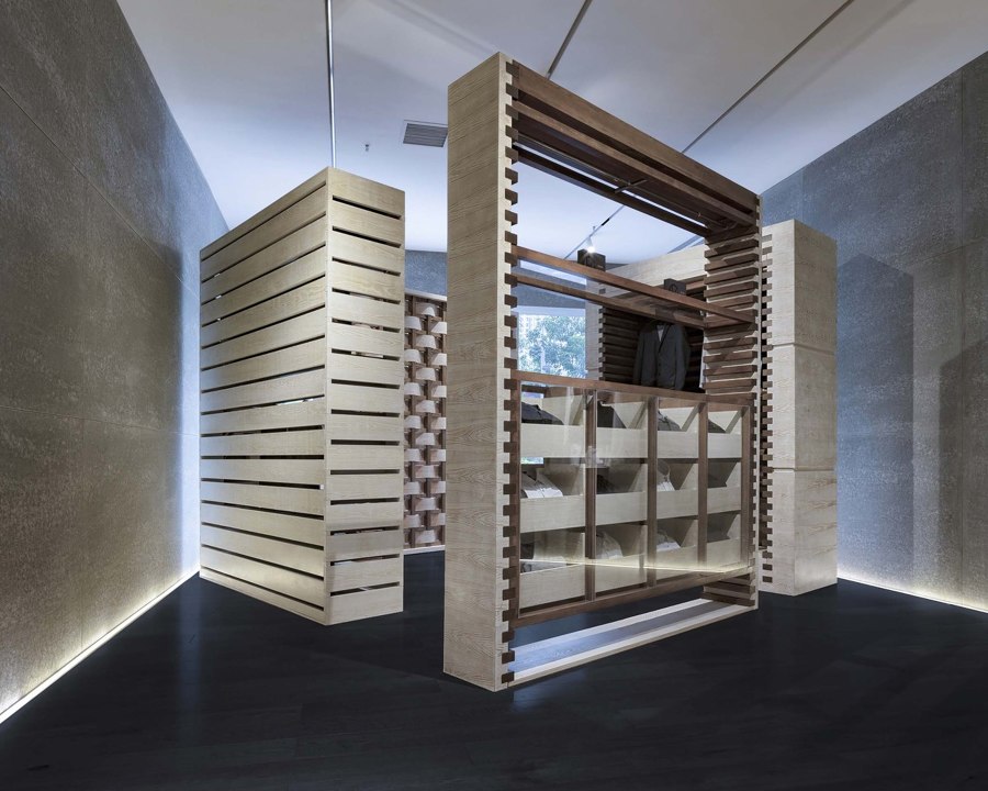
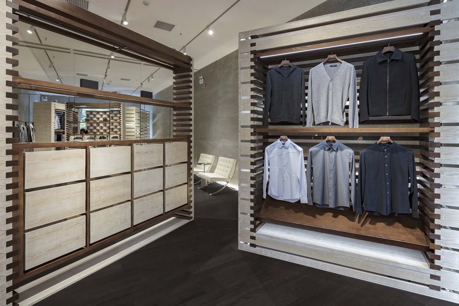
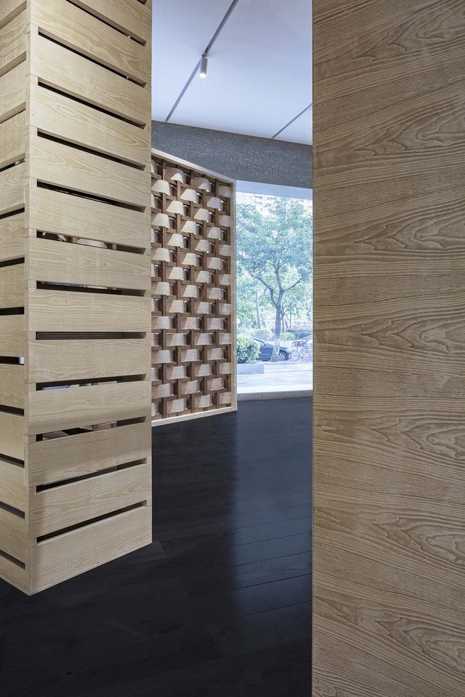
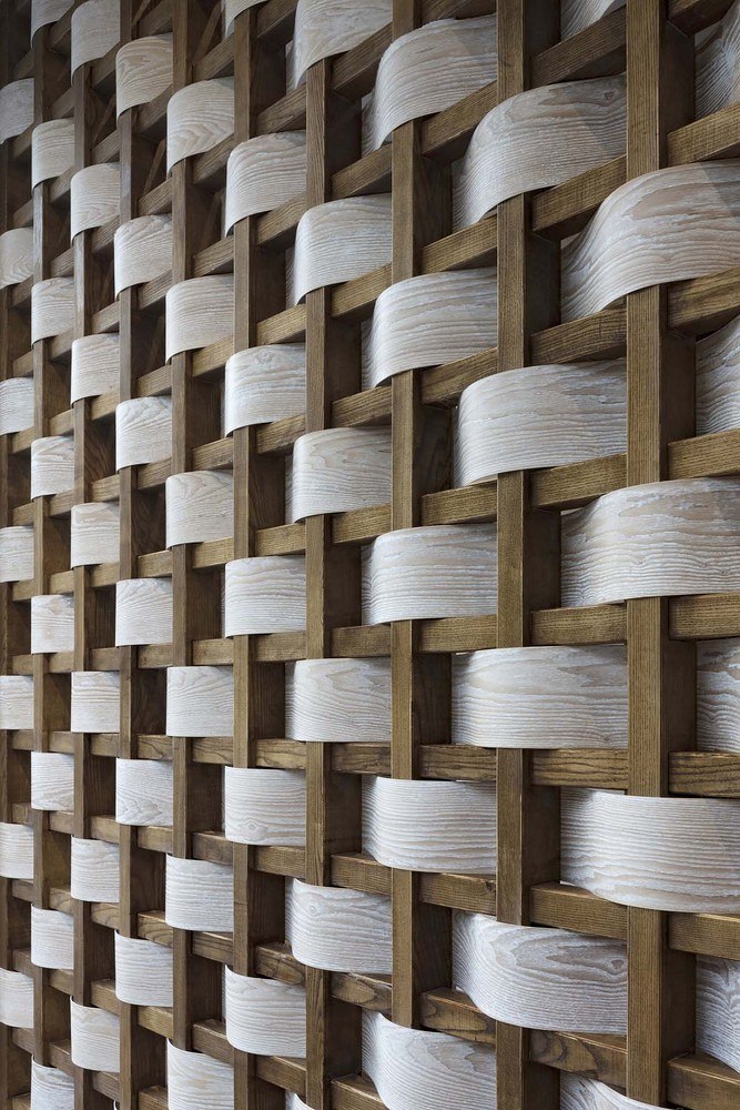
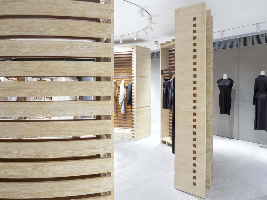
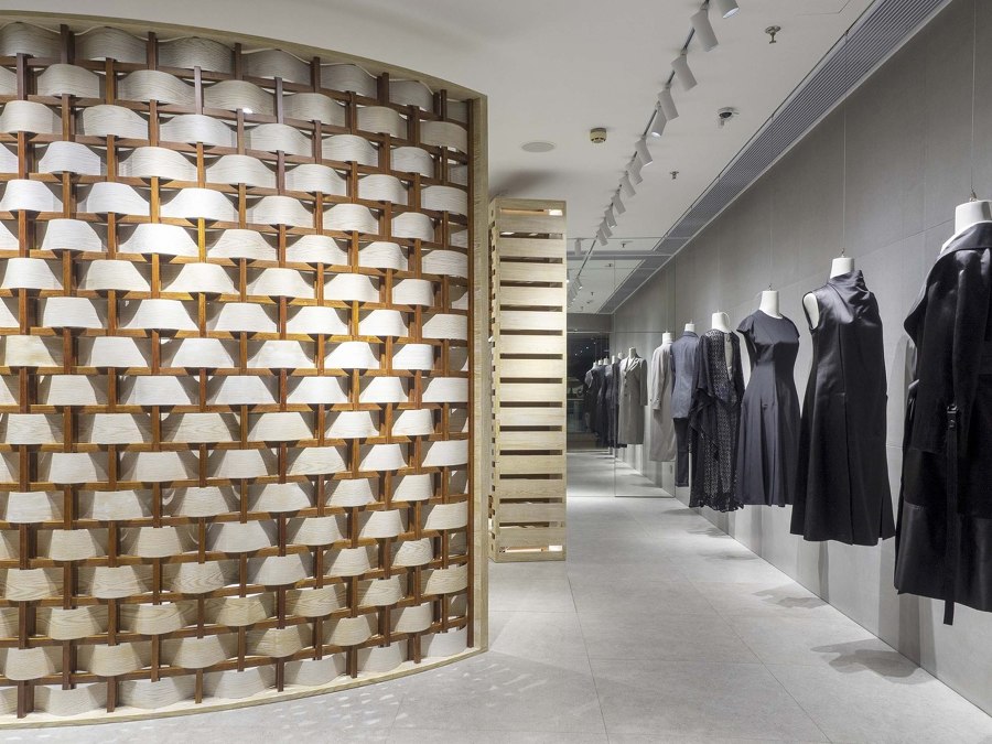
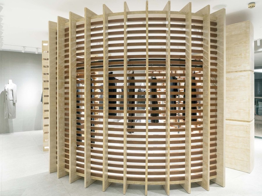
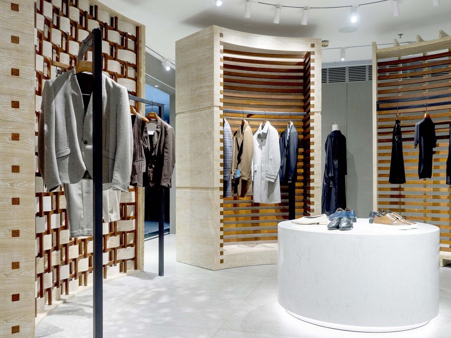
In order to express the brand’s identity visually, ARCHIEE reinterpreted woven fabric architecturally by creating a variation of wooden panels. One of the panels has woven strips of supple veneer around wooden poles, highlighting the grid elements resembling an enlarged piece of woven fabric. All of the panels are created with variations of wood, a material that was chosen to evoke Asian traditional architecture. A rich pallet composition emerges with several textures, tones, and finishes such as a traditional Japanese finish technique.
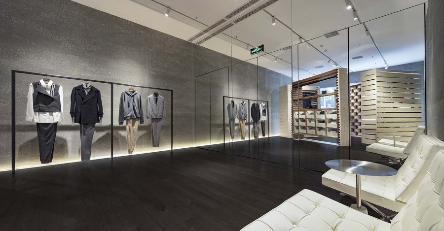
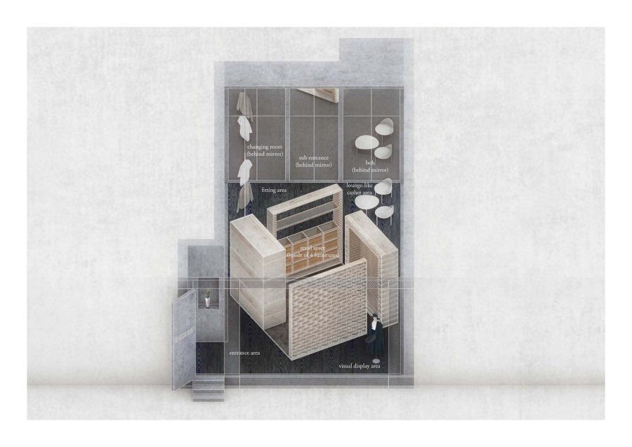
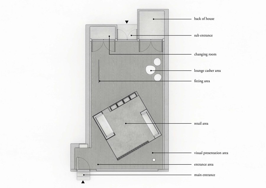
Reflecting upon the necessity of having a physical boutique in today’s digital society lead ARCHIEE towards creating an experimental space rather than a typical retail space. In order to achieve an unconventional store the team decided to enclose the retail space with panels and condense it in the center of the store. This resulted in the retail space covering about half of the total volume. Although this strategy can at first be considered counter-intuitive, it enabled the creation of a more hospitable environment to discover the brand, as well as a pleasant circulation through the space. This layout employs the usefulness of the useless defined in the ying-yang philosophy.
Our project embraces the benefits of simultaneously having condensed and lightened spaces. The visitors set foot through a mysterious entrance that leads to an elegant and comfortable fitting area as well as a 3-dimensional visual display section to finally arrive at a lounge-like cashier space. These different areas create an exceptional hospitable experience that not only highlights the merchandise, but also efficiently presents the brand’s identity to the customer.
Firstly, ARCHIEE’S focus was to create a narrative from the client’s perspective, overall imprinted with classic authenticity disrupted by the addition of small modern details. Secondly, the project embraces the benefits of having some spaces without merchandise, thereby welcoming lighter spaces with different uses for the design of a store. Retail stores should adapt to the demands of our modern society. The retail experience is no longer limited to just purchasing goods, which is why ARCHIEE’S design offers clients the alternative “useless” retail experience in addition to the conventional one.
Design Team:
ARCHIEE
Lead Architects: Yusuke Kinoshita, Ruofan Shen
