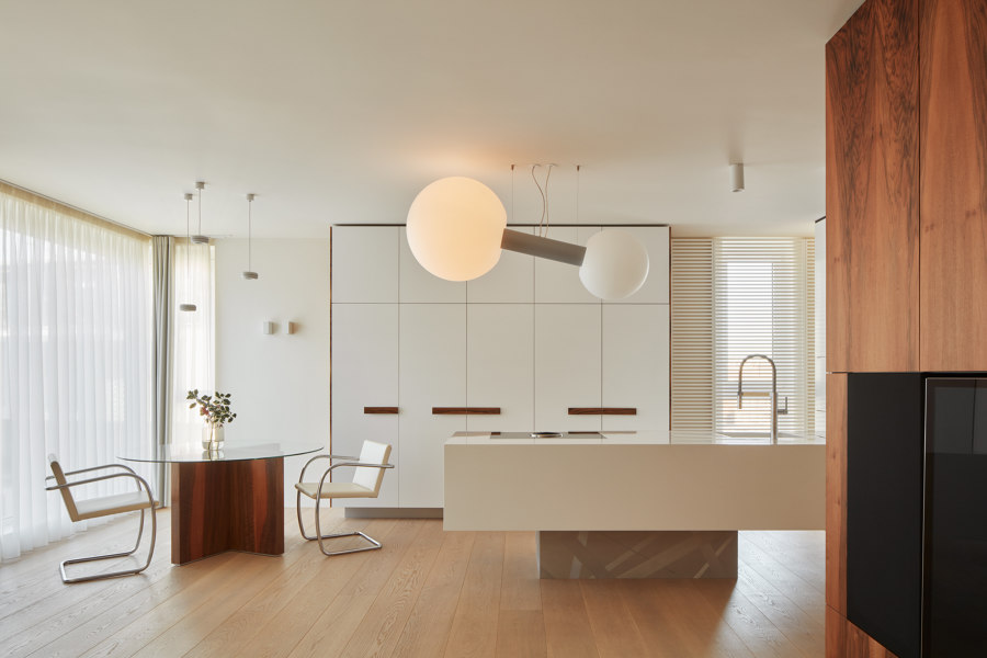
The assignment for me as the designer and my studio - as the implementer, was as follows - Recreate a relatively new, medium sized maisonette apartment in Prague city centre for the needs and level of cosmopolitan couple, while I got almost unlimited freedom as the author. Inspired by modernism and the love of the Tugendhat villa in Brno, I drew the concept from just these sources - not as formal as ideologically rather.
As the clients, constantly on the road, should use the flat as a point of contact and a haven, I had the pleasure to create it calmly and comfortably, with a spark of playfulness - what I was aiming for in a purely geometric scheme, simple to strict shapes and a noble material scale supported by uncompromising craftsmanship. The project originated as a Gesamtkunstwerk, a complete author craft - the same principle as the architect Ludwig Mies van der Rohe applied at the end of the 1920s just in designing the mentioned villa. All of the elements are related together, continuously follow each other or deliberately contrast.
The original layout of the apartment as well as the arrangement by the developer were not solved just happily. With regard to the potential of the residential building, I had to literally trench down the floor plan, adapt it to my intention and to the needs of the clients and create mutually overlapping functional zones. The floating space is oriented to the pair, their coexistence, communication and proximity. Clear forms are not disturbing, they provide functionality in an elegant habitat, and are a kind of painting canvass for life itself.
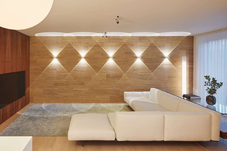
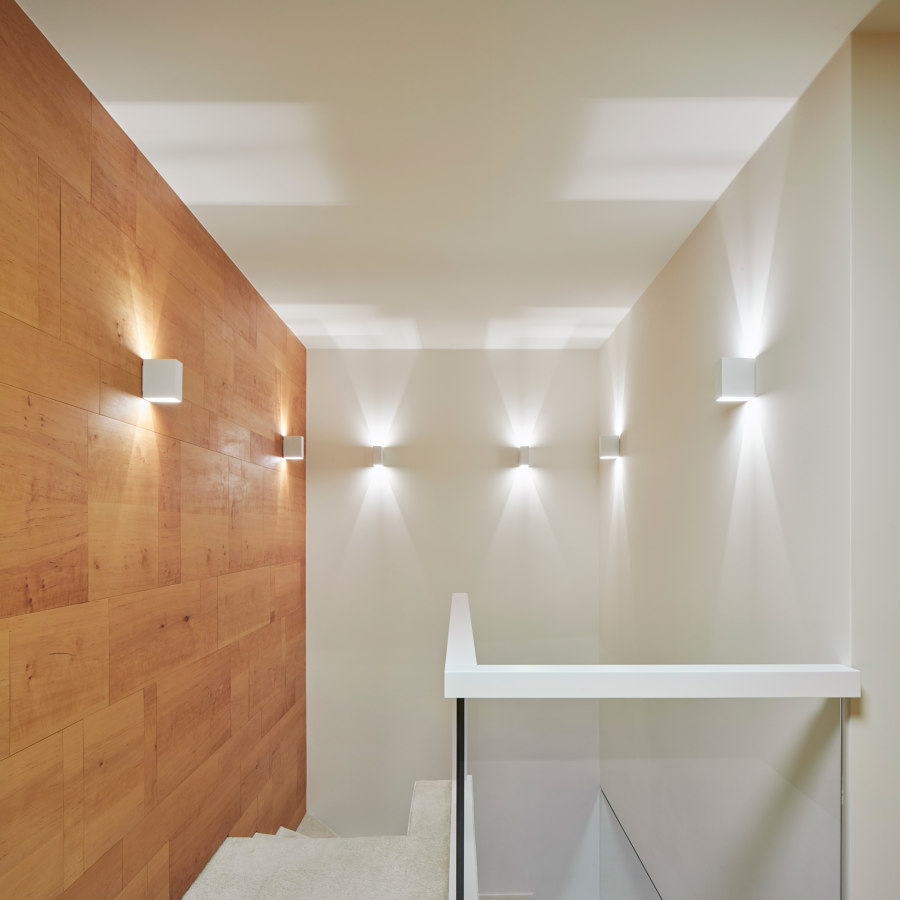
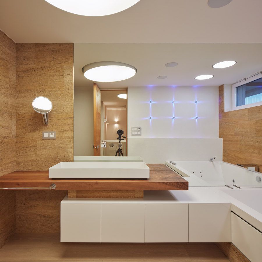
The light concept is an essential part of the whole project. It creates not only moods, but it literally breathes life into matter and celebrates materiality - from the stone wall in the main living room, for example, an original artistic installation is created by pressing the switch.
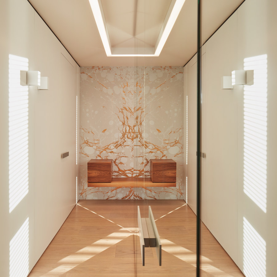
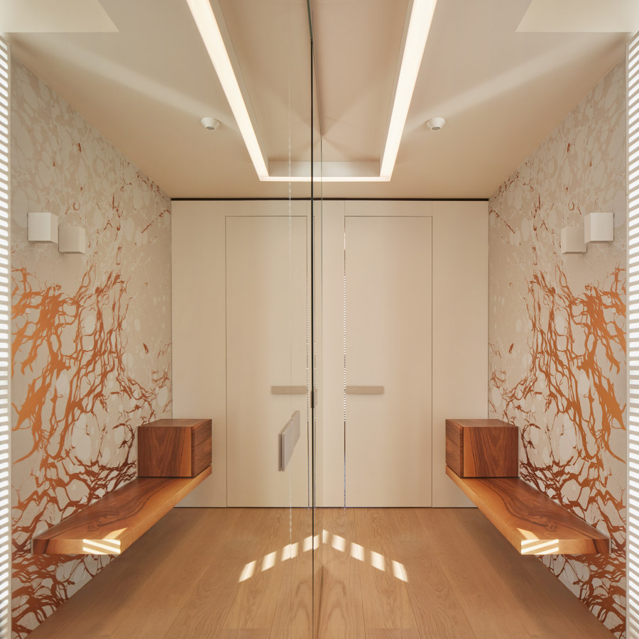
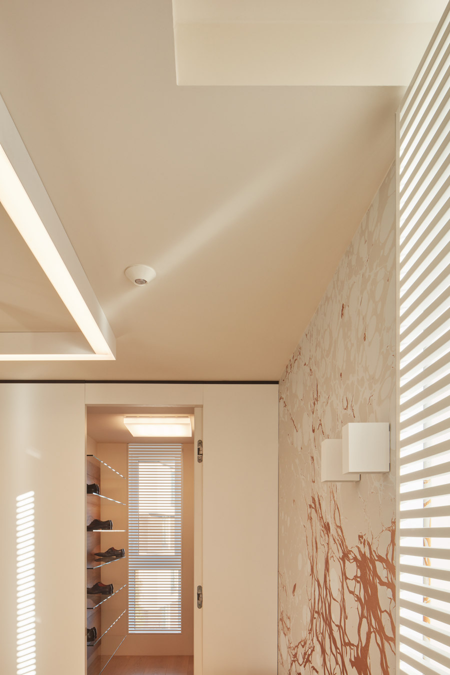
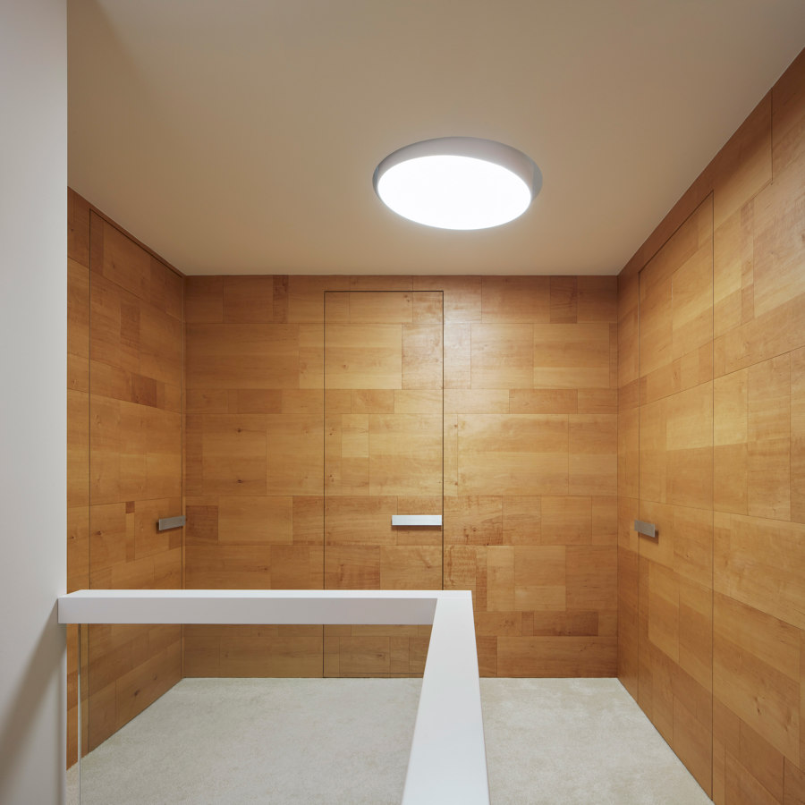
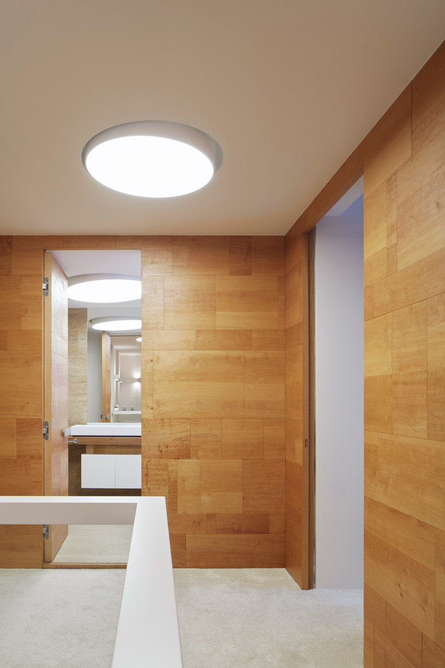
The zones in the apartment are multifunctional, and they do not always reveal their primary function at first glance - the mirror cubicle of the rectangular floor plan hides a built-in wardrobe and a toilet with a shower. The entrance is perceived as a welcome space - whether for the owners or their visits, so it is made as representative as the other interior - after all, it is the first impression of the whole work. The sunlight entering the corridor is dazzled by a raster that not only softens and disperses it, but at the same time prevents the unwanted view from outside. The raster motive is also used on the rest of north-east oriented windows of the apartment.
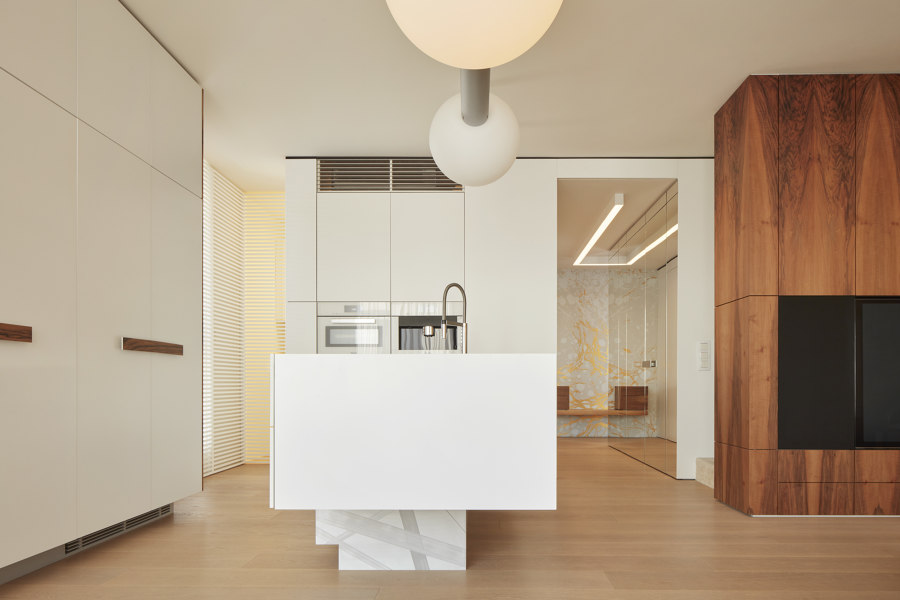
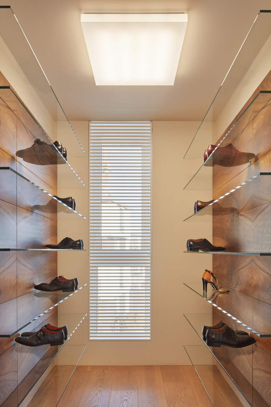
As in the whole project, the synthesis of the artistic and utilitarian function of the elements is valid here as well. The opposite side of the entrance corridor, united into the rectangular base the same way, is covered with a Hi-Macs facing and hides a walk-in shoe and handbag cabinet - both accessible from the entrance hallway. Part of the kitchen unit with appliances and a hidden pantry cabinet (separated by raster) with a smaller food preparation area and food storage are accessible from the kitchen space.
While the shoe cabinet acts as a Paris boutique scene, a kitchen island - a sculpture like processed monolith, air-balancing above floor level on a hand-cut aluminium platform - can evoke a luxurious yacht slowly sailing by a harbour. The kitchen area is a recognized and fully-fledged part of the main living area. The use of up-to-date technologies has given me occasion for a little joke - above the cook top, an outstanding light object hangs in the place where the cooker hood is usually located.
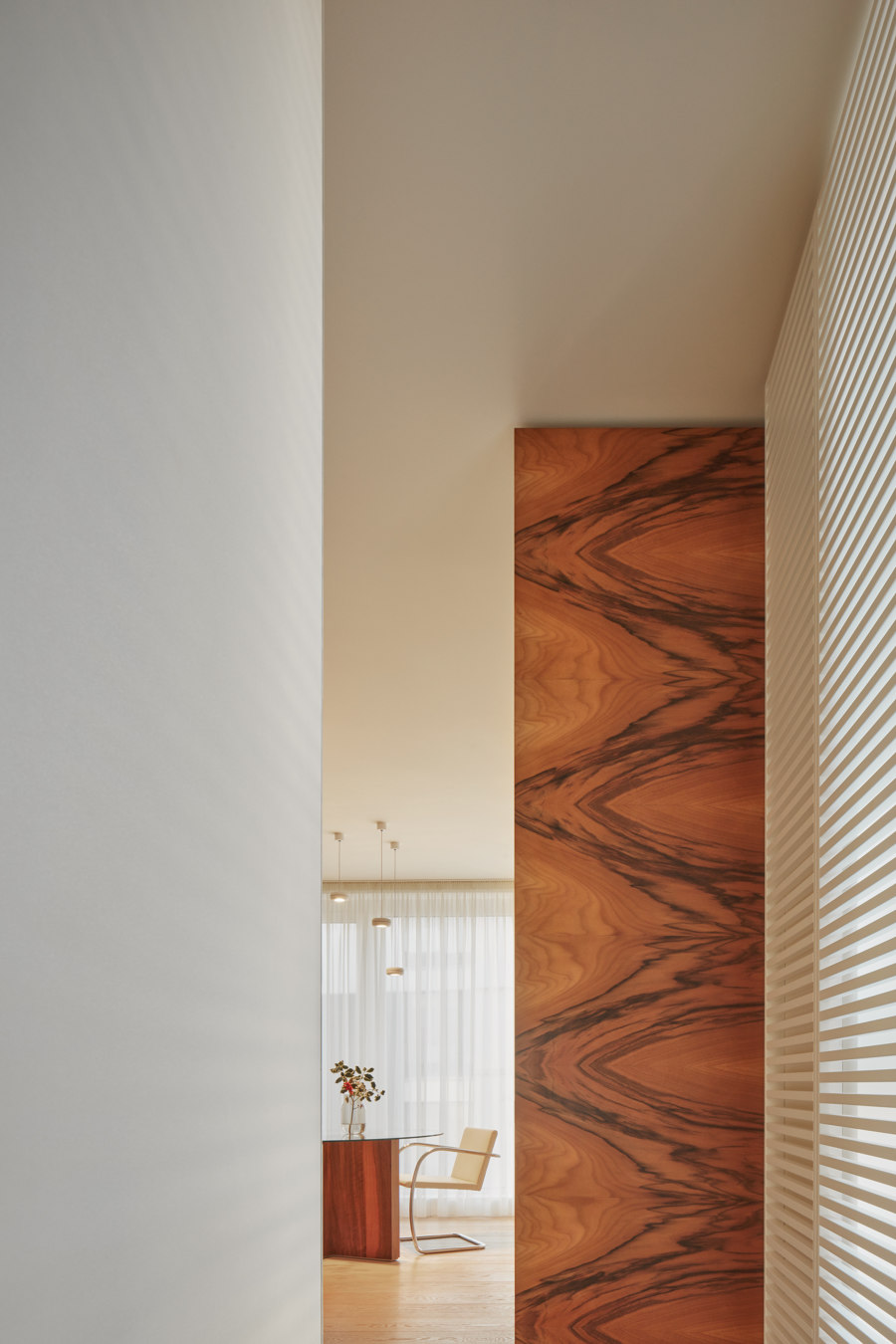
In the main living area, residents can spend an extravagant and regenerating "lazy-day" as well as a party with friends. As a status declaring element and artwork, the original solitaire carpet from Jan Kath is to be prominent here. Up to a few exceptions, all furniture and built-in joinery elements, including original details, were made by my studio, which has already become popular among the Czechoslovak cream of society, not only as a producer of original furniture solitaires, continuing in modernism bequest, but also as an art-craft entity in furniture made-to-order production. As a reminiscence of the famous villa and its author, the ensemble of the four signed stools by Brno Chair, grouped - how else - behind the DISCO circular dining table, serves in the project. The FLATPACK solitaire inconspicuously serves in the living area. Both pieces are my designs.
Modernism as a direction has confirmed its qualities and its recency for the "new man" of tomorrow. I call "contemporary modernism" the style that I began to develop myself. It is to build on these qualities and to connect them with the needs and technologies of today, but always in a strictly classic way. Casa Dolce Vita is my first comprehensive piece built on these principles.
Getting free in drafting a project is a dream and nightmare at the same time. Do not let oneself carry off by attempt for originality and do not create inordinate author gestures and positions, to think about everyday needs and preferences of clients, to create a peaceful and self-confident authentic work, which will also give it time for truth. With Dolce Vita, I wanted to create an advanced and mature project, a kind of habitable George Clooney - a modern gentleman with good manners and old-world noblesse, an adult who has not forgotten to play, the one you always feel safe and never bored you - the personality.
Design Team:
Atelier Michal Hagara
