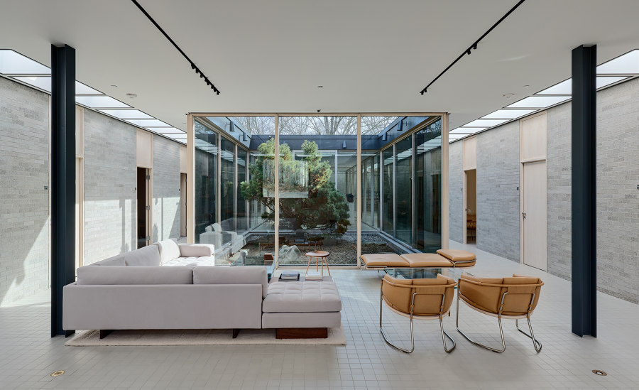
The Schlumberger Research Center Administration Building was Philip Johnson’s first non-residential building, designed in 1951 and completed in 1952. The building was commissioned by Annette Schlumberger (sister of Dominique de Menil, née Schlumberger) and her husband Henri Doll after touring Johnson’s recently completed Glass House. The building housed the executive team and an elite group of research scientists for the oil exploration and drilling equipment company.
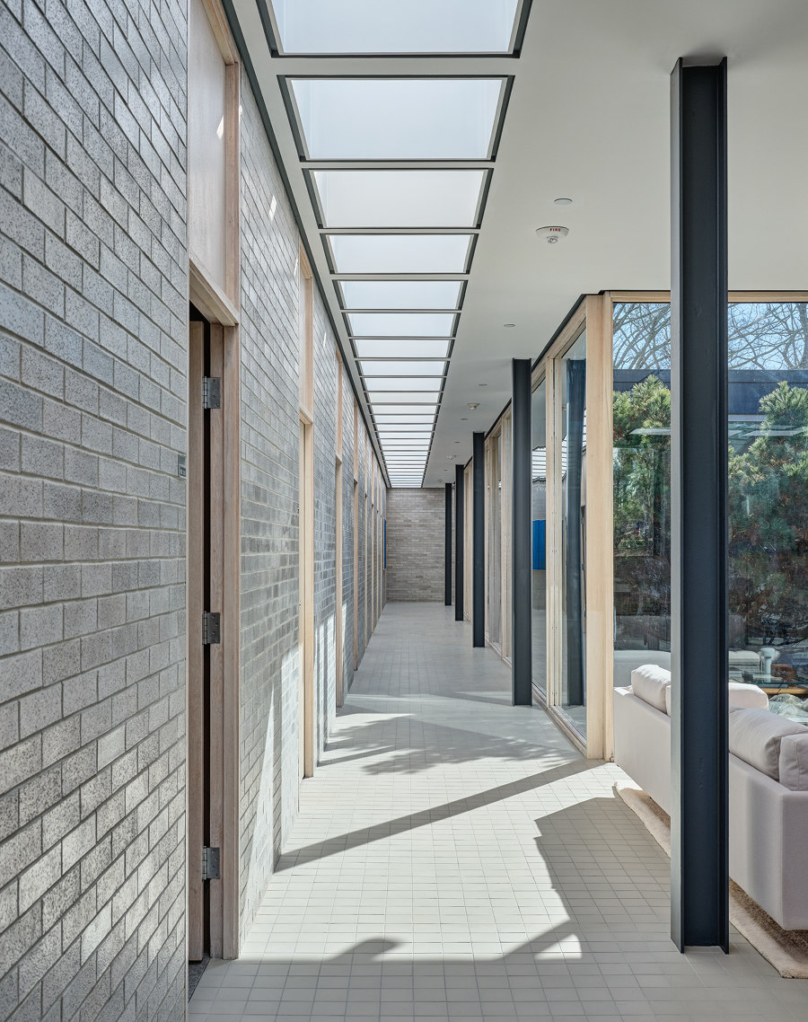
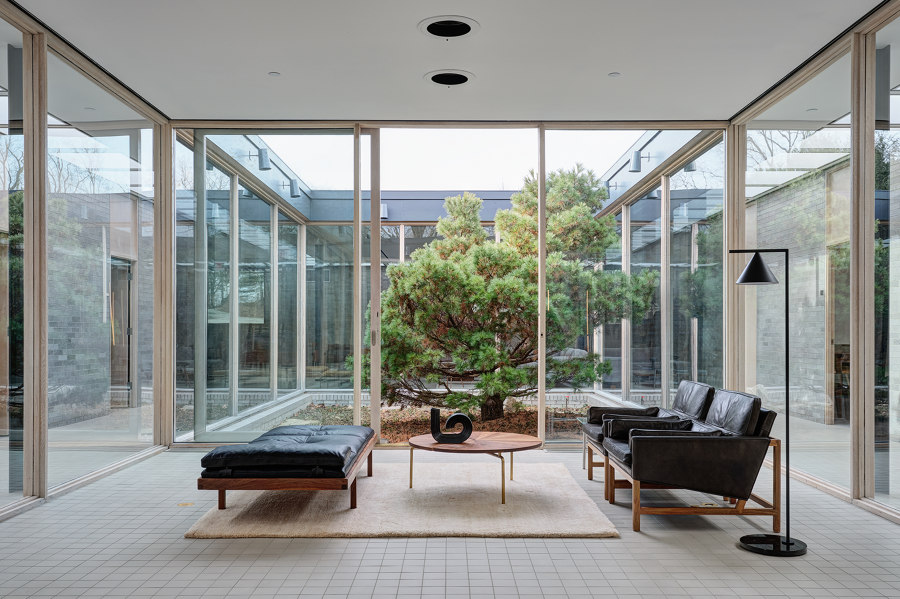
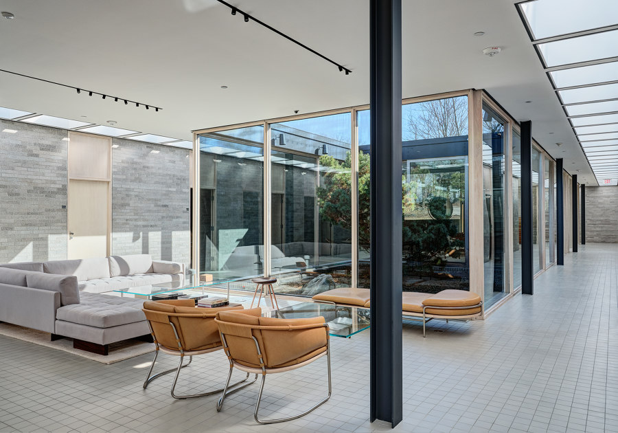
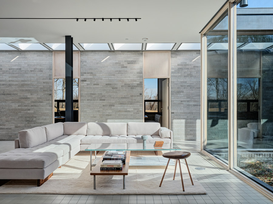
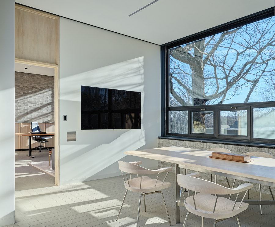
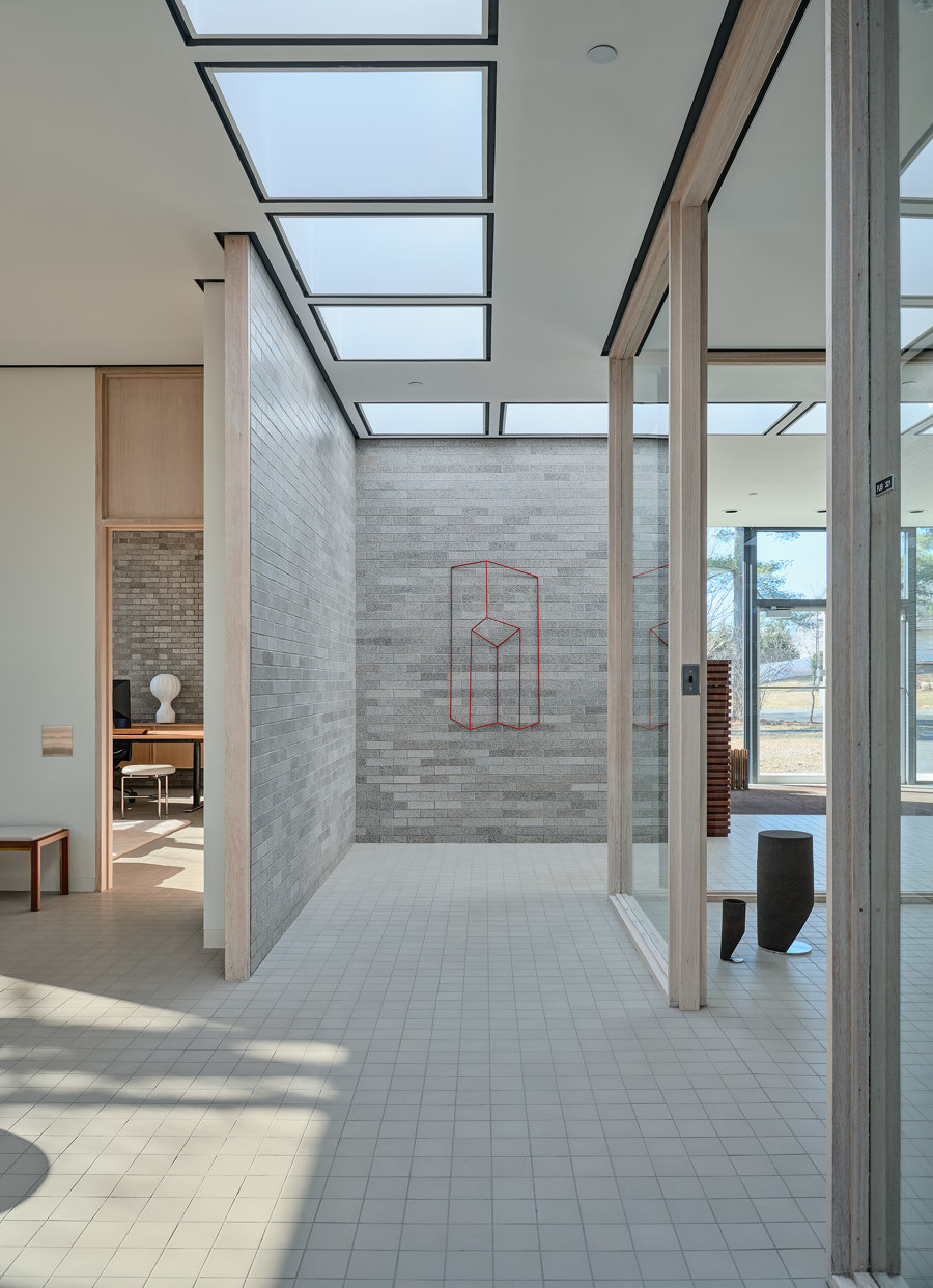
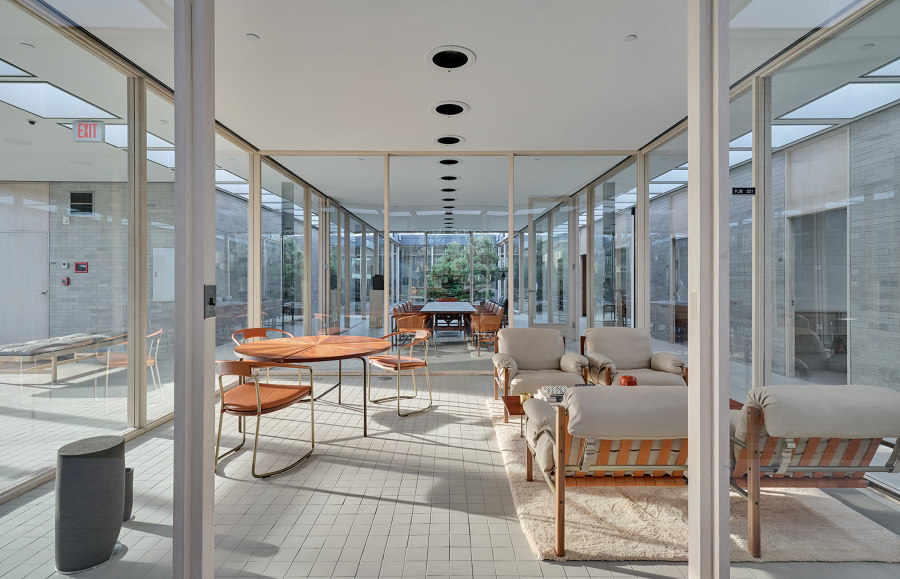
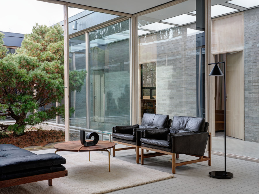
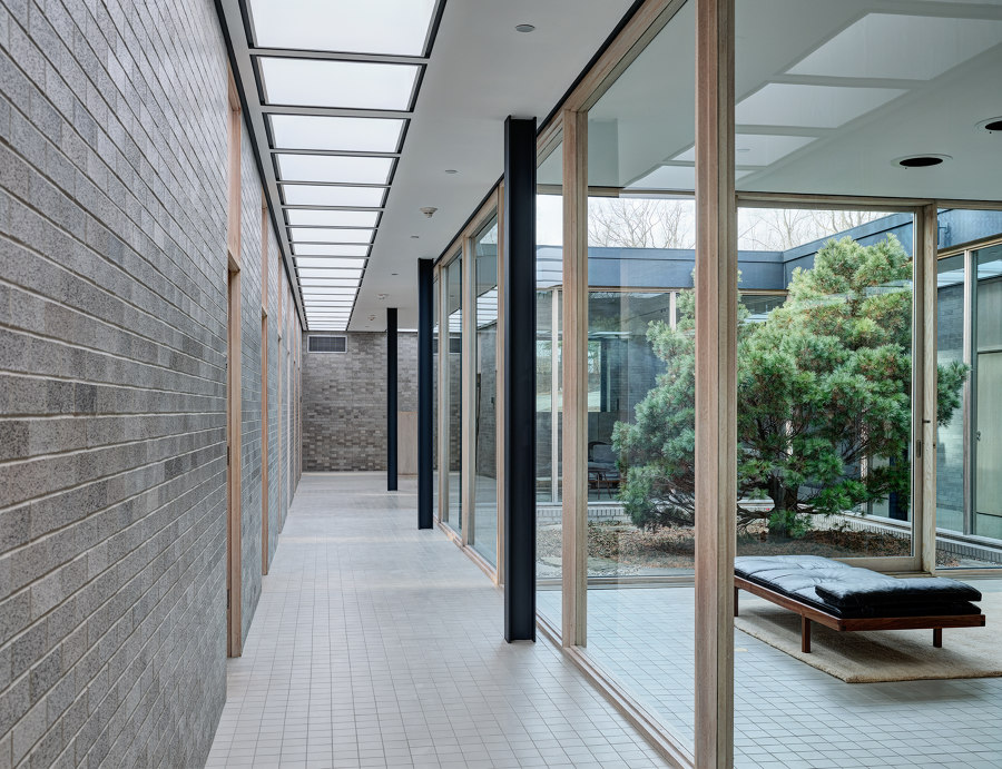
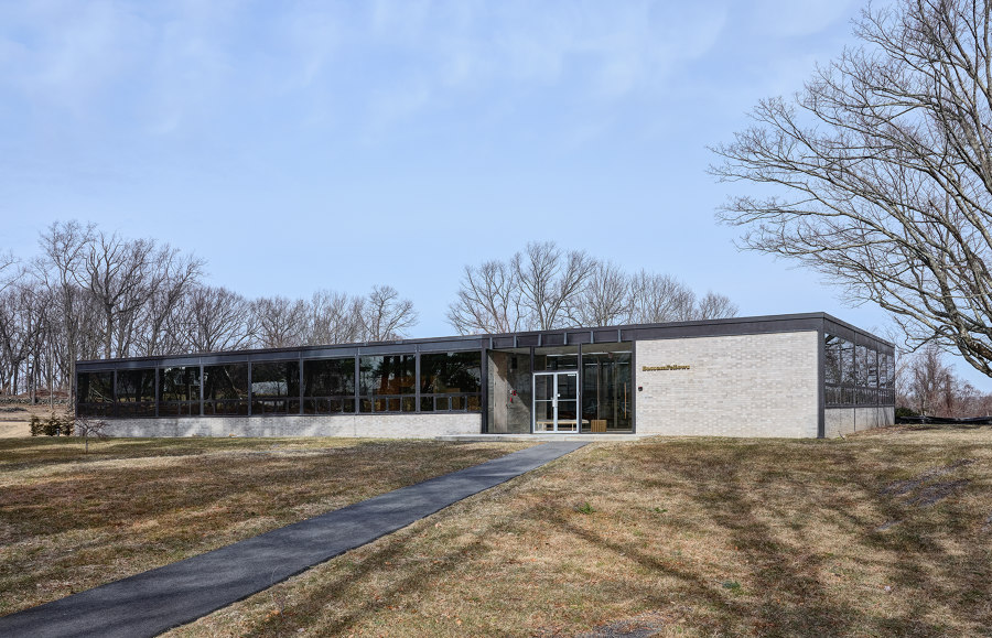
Now known by locals as “The Philip Johnson Building,” or “PJB,” it’s a single-story, steel-glass-and-brick building constructed over an underground storage/garage. The rectangular plan consists of perimeter offices organized around a central core that contains an open-air landscaped courtyard, glass enclosed conference room and library. Around the central core is a wide, skylight-covered corridor allowing circulation between the perimeter offices and bringing abundant natural light throughout the space.
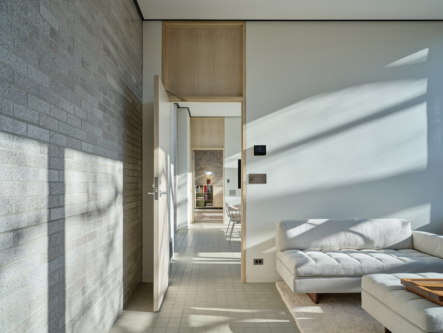
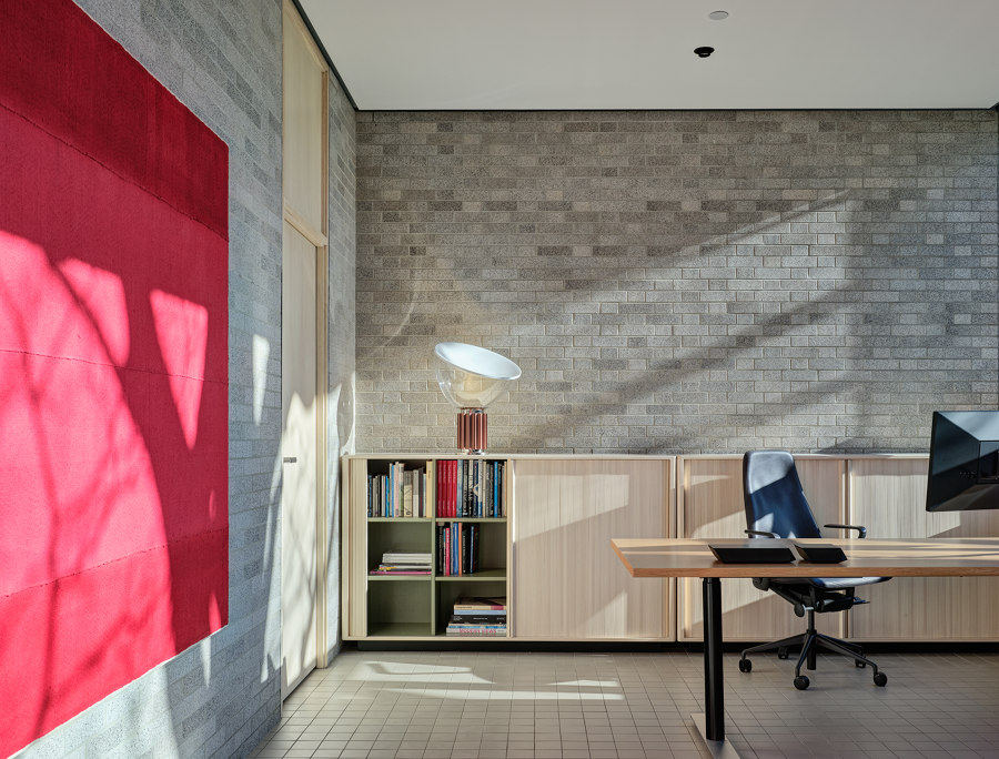
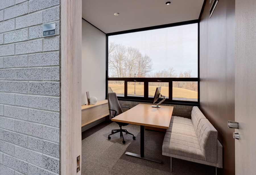
Each office has a solid infill wall of light grey iron spot brick on the interior corridor pierced by full height, cabinetry-quality doors made of oak. Exterior walls are brick below desk height with full height window walls above. Ceilings are 10 feet tall throughout.
The original design team consisted of Philip Johnson, Architect; Richard Kelly, Lighting Designer; James Fanning, Landscape Designer; and Florence Knoll, Interior Designer. The building was published in Architectural Forum, September 1953. In the article, the building was considered highly significant for four reasons:
Planning
In 1952, it was a totally new concept to place an administration building “in the Connecticut woods”, 65 miles from New York City. It was the beginning of suburbanization with dreams of more space, light, and better living and working conditions.
Architecture
It was an eloquent example of Mies van der Rohe’s (and Philip Johnson’s) austere aesthetic and the fine precision of steel-glass-and-brick architecture.
Engineering
A radical air-conditioning system utilized the floor, ceiling, and walls for air movement – substantially reducing the ductwork and allowing a high, unbroken ceiling and slim roof fascias. Johnson did not want environmental control devices seen, heard or felt.
Beauty
Johnson and Kelly wanted to create a bright cheerfulness indoors, regardless of the weather. Said Kelly: “We tried to get the effect you would have in a walled garden, roofed over with a canvas tarpaulin that doesn’t quite touch the walls. And that is just want we got.” Changing patterns of sunlight on floors and walls together with the planted courtyard are indoor reminders of the country setting.
Design Process and Approach
The design approach by BassamFellows preserved the original use of the building as executive office space with slight adaptations to bring the building up to current code and add needed services.
The biggest challenge of the project was to adapt the building for stand alone use. The corporate campus consisted of approximately 50 acres and included an original building built in 1949. PJB was the second building to be built and was designed to connect to the 1949 building with a glass enclosed corridor. Over the next four decades ten buildings would be built with a total square footage of approximately 130,000 ft2. Many of the buildings connected via over or underground walkways and virtually all major services were shared.
When Schlumberger failed to find a buyer several years after leaving the campus in 2006, the Town of Ridgefield, CT, bought the property in 2012 in order to control its development. All but three buildings were subsequently razed, leaving the Philip Johnson Building cut off from basic services. PJB was left empty and essentially abandoned for 11 years.
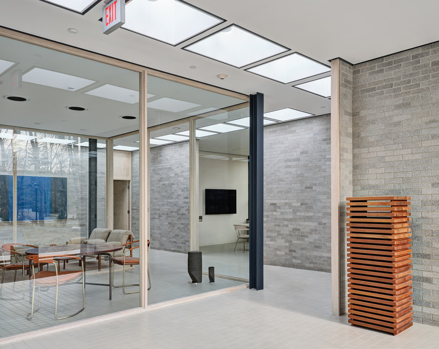
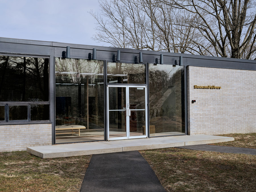
The design team replaced the interconnected glass corridor with a massive glass pivot door that maintained the size, scale and integrity of the original opening. The door provided egress while also opening the Norwest side of the building to a beautiful park land view where the former building once stood.
The innovative HVAC system, described above, was long abandoned and replaced with a forced air system connected to a central cooling tower that serviced the entire campus. The design team designed a new system to improve efficiency and add more flexibility and comfort to the building, surgically utilizing existing duct work and preserving Philip Johnson’s desire for invisibility.
Subtle plan changes were needed for the building to operate stand alone. Hospitality and other services that were originally found elsewhere on the campus, such as a kitchen and ADA bathroom, were added in converted offices along the perimeter. Original, open area secretarial pools were adapted to informal meeting/collaborative spaces.
Extensive water damage from a failed roof as well as burst sprinkler pipes created opportunities for the design team. Several layers of torch down roofing was removed to reveal the original steel roof fascia. Now fully restored and painted the original graphite color of all the exposed steelwork, the slim fascia returns the elegant proportions to the building’s exterior.
The destroyed interior ceiling was replaced with hung sheetrock allowing the design team to upgrade all electrical services to the individual offices and collaborative spaces and add contemporary lighting to supplement the original Richard Kelly lighting. The original Kelly lighting in the entrance, skylights, conference room/library were all fully demounted, rebuilt and restored offsite before reinstallation. All original ceiling reveals were restored in the process and painted the original shade of dark grey.
Oak interior millwork throughout was hand sanded to preserve the solid frames and fine veneer of the original fabric. Water staining was minimized by bleaching and finishing the wood with a sealer that creates a natural, “raw” effect. Much of the interior courtyard wood window frames and the courtyard sliding door were rotted and had to be replaced. In the process, the design team took the opportunity to restore the original window frame profiles that had been changed over time. Massive, oversized double pane glass was sourced from special ovens.
The original pale grey vinyl tile flooring was long destroyed and covered in wall to wall carpet. The design team took the opportunity to match the original color of the vinyl tile with a new French quarry tile sourced from the same company that Philip Johnson chose for the Hodgson House in New Canaan (1951).
Together with the original iron spot glazed brick, extensively cleaned and re-pointed, the timelessness of the material and color palette makes the building feel as contemporary today as much as it was groundbreaking then.
Design Team:
BassamFellows
