Fotograf: Roberto Ruiz

Fotograf: Roberto Ruiz

Fotograf: Roberto Ruiz
The apartment is located in a quiet and green passageway beside the Sagrada Familia ever-on-site temple and belongs to Andrea Serboli, one of the two founders of the architectural firm. It was therefore the perfect opportunity to develop a sample of the firm’s style, having as a single limit a maximum budget to invest, and to find place for a great number of objects and memories forming the owner’s collection.
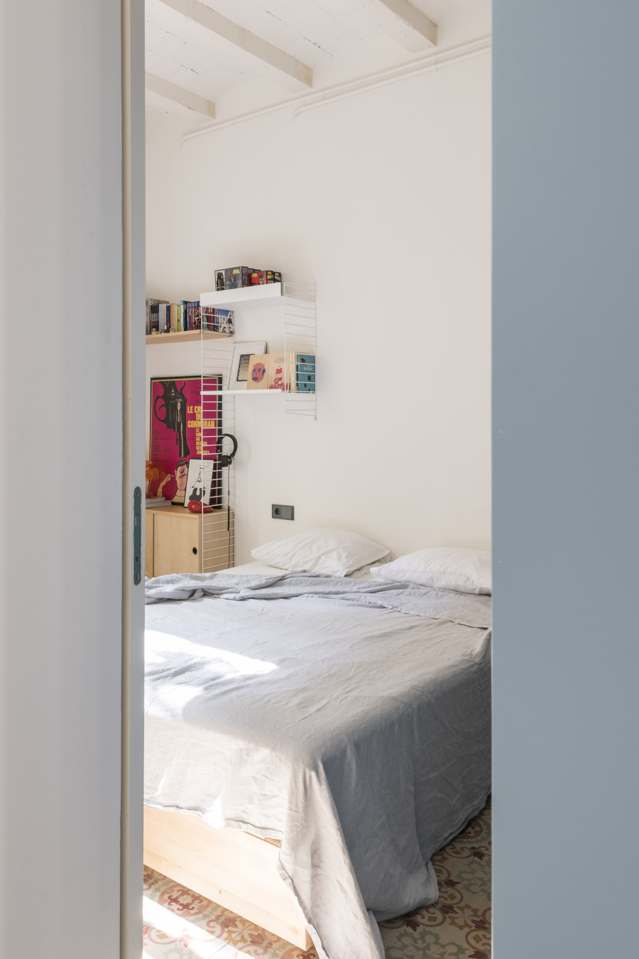
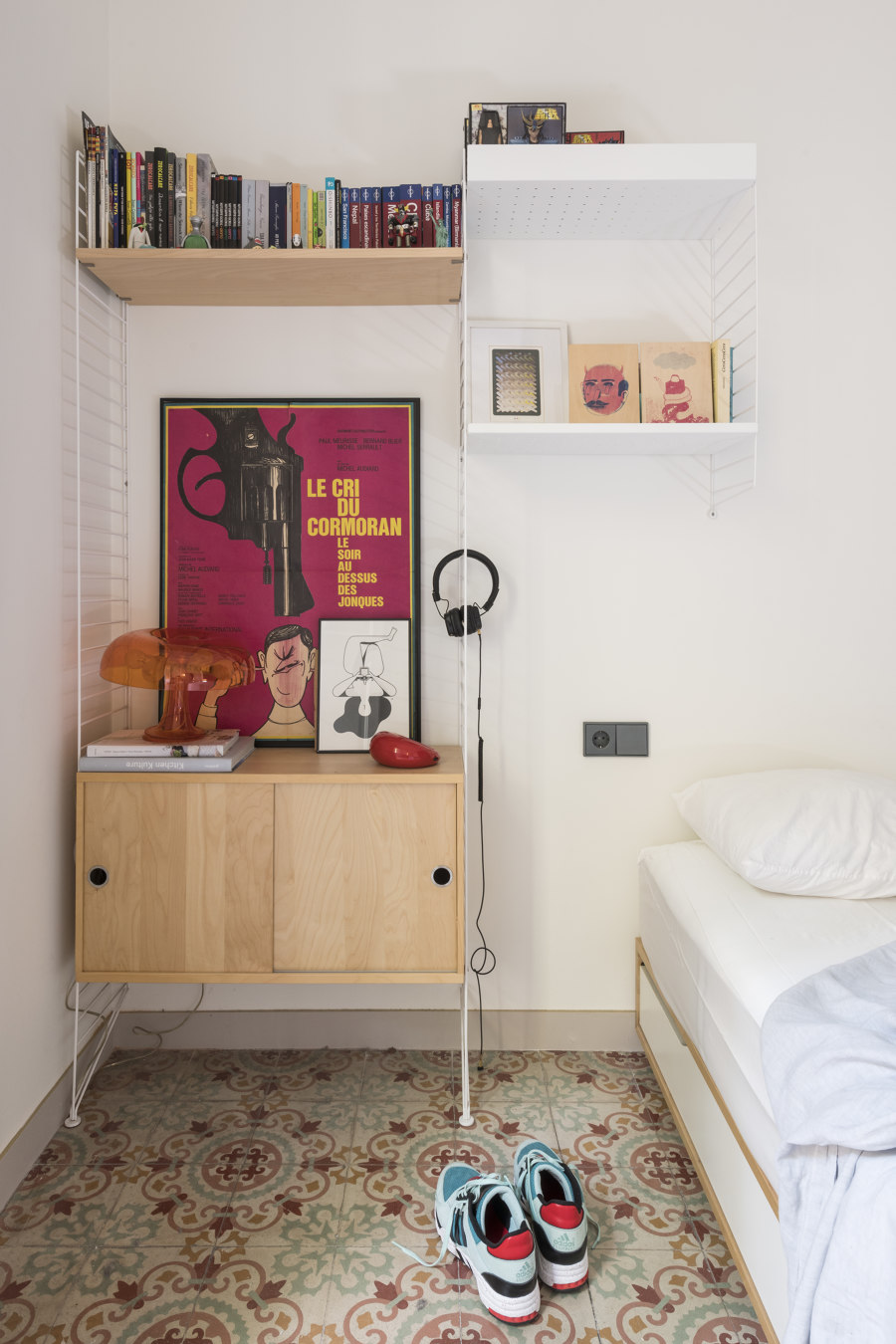
The simple brief was to turn the house into a wunderkammer, a quiet retreat full of emotionally charged objects, with at least one guest room besides the main one. The 1914 building is a fairly simple example of a modernist (Catalan Art Nouveau) building in the Eixample district. The apartment, bought in a state of neglect, presented some period elements, although most of them irreversibly compromised.
The original layout consisted of a series of partitions, in full style of the modernist period, which divided the apartment into six rooms. The gallery overlooking the interior patio of the block had been previously closed off with PVC windows; the original period gallery windows had been lost before the purchase.
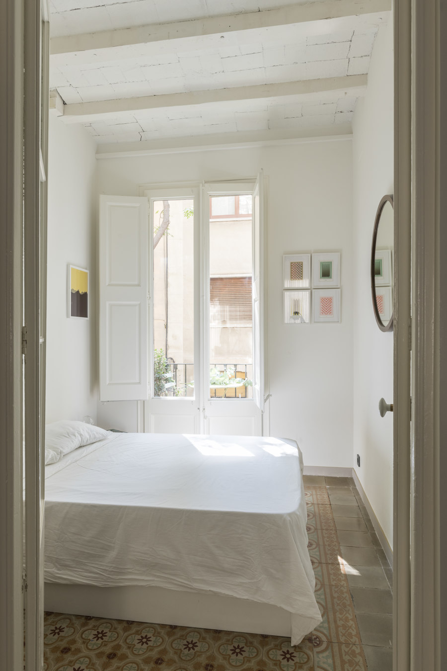
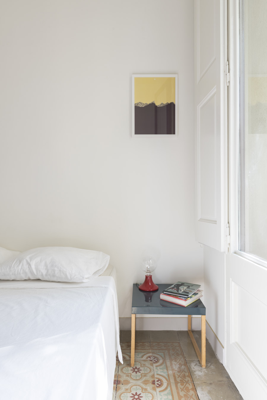
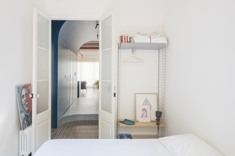
The challenge has been translated into the will to maintain the period elements that could be saved, without renouncing to a flat with a distinct contemporary character and as clear and diaphanous as possible. The two bedrooms adjacent the entrance had original features in good condition (floors and doors above all). The presence of a lineal balcony that connects them to the tree-lined passage has contributed even more to the idea of restoring and recovering them in their original layout.
In the rest of the apartment, the impossibility of preserving the original floors and the presence of bathroom and kitchen elements in a too prominent and unfavorable position, led to the decision of the total removal of the remaining walls, making it impossible to preserve the floors.
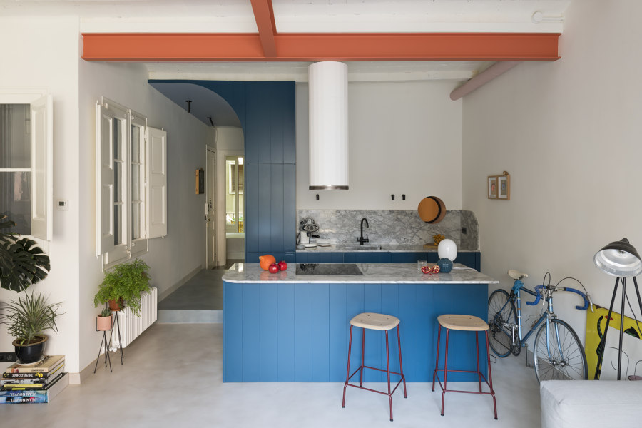
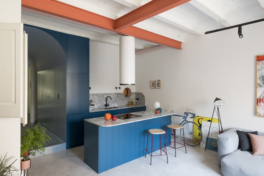
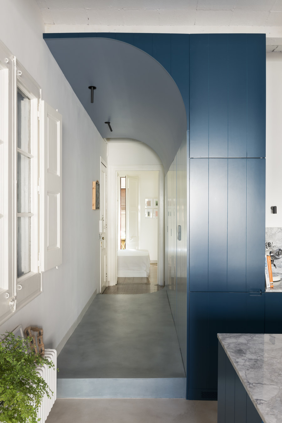
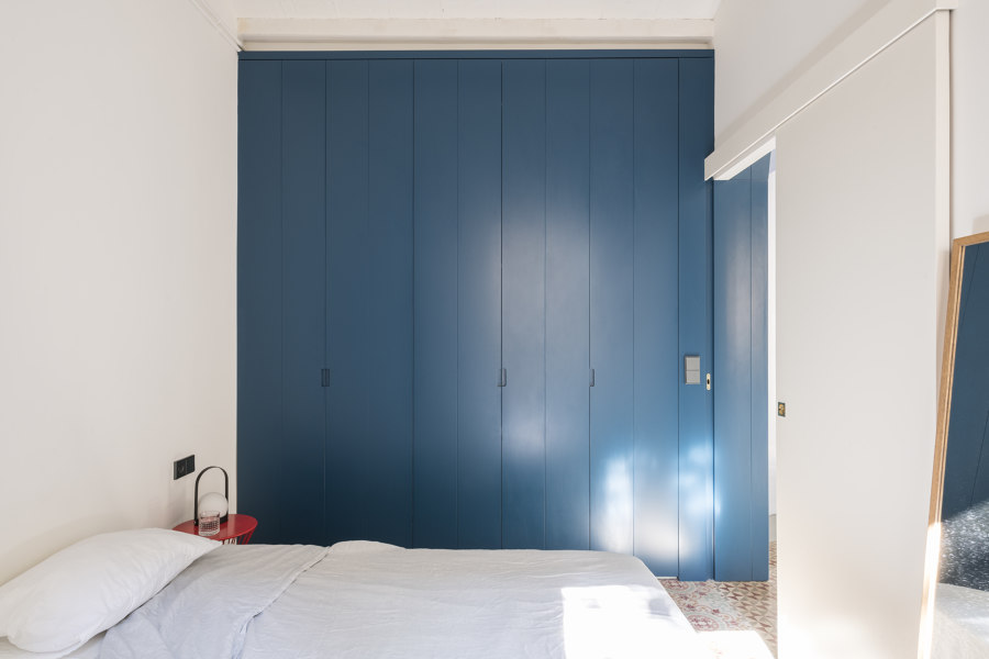
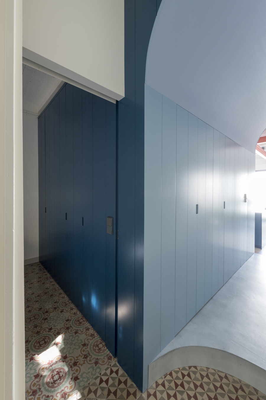
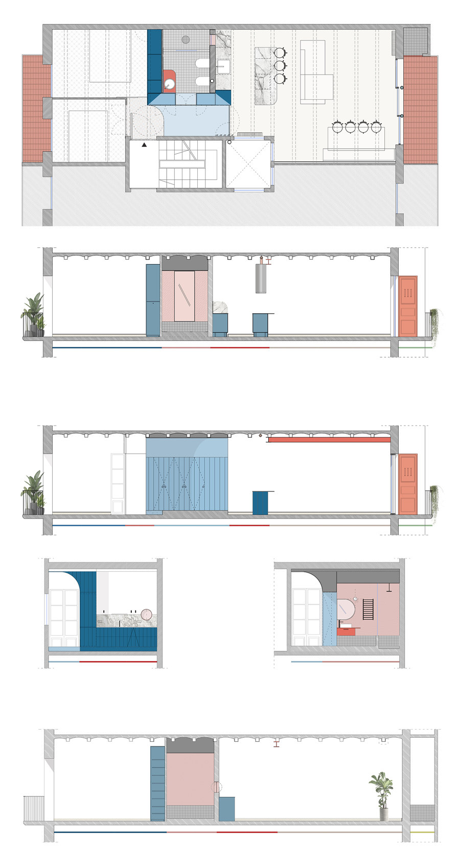
The concept of the project is therefore guided by the idea of emptying the apartment and inserting a lacquered, wooden-clad, groovepaneled blue box in the middle of the floor plan, modulating and redefining the spaces around it in a more architectonic way. The box contains a bathroom, designed more as a relaxing and intimate area. It is the sancta sanctorum of the entire apartment, its entrance hidden and camouflaged between the doors of the closets constituting the entire external facade of the box.
A semi-arc carves the blue volume transforming the corridor in an ample, curved ceiling hall that connects visually day and night areas, finished in a lighter blue. The box’s entire floor is raised to allow the drains of both kitchen and bathroom to reach the pipelines of the inner shaft. The wide corridor flooring is covered in micro-cement in a lighter shade of blue, matching that side of the box and by the entrance its step ends with a curve, exposing the original multicolored geometric floor.
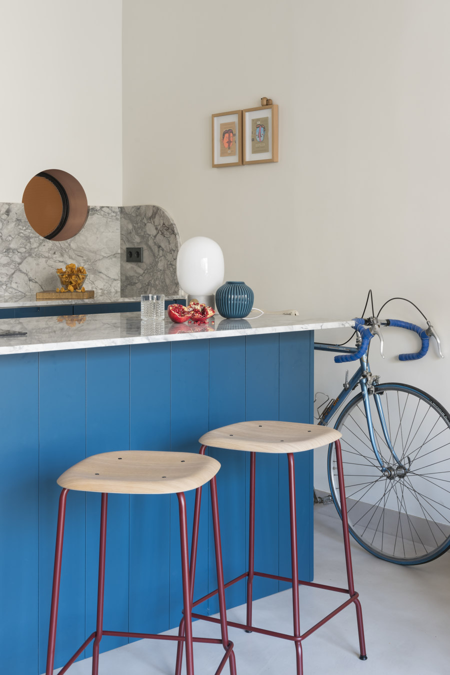
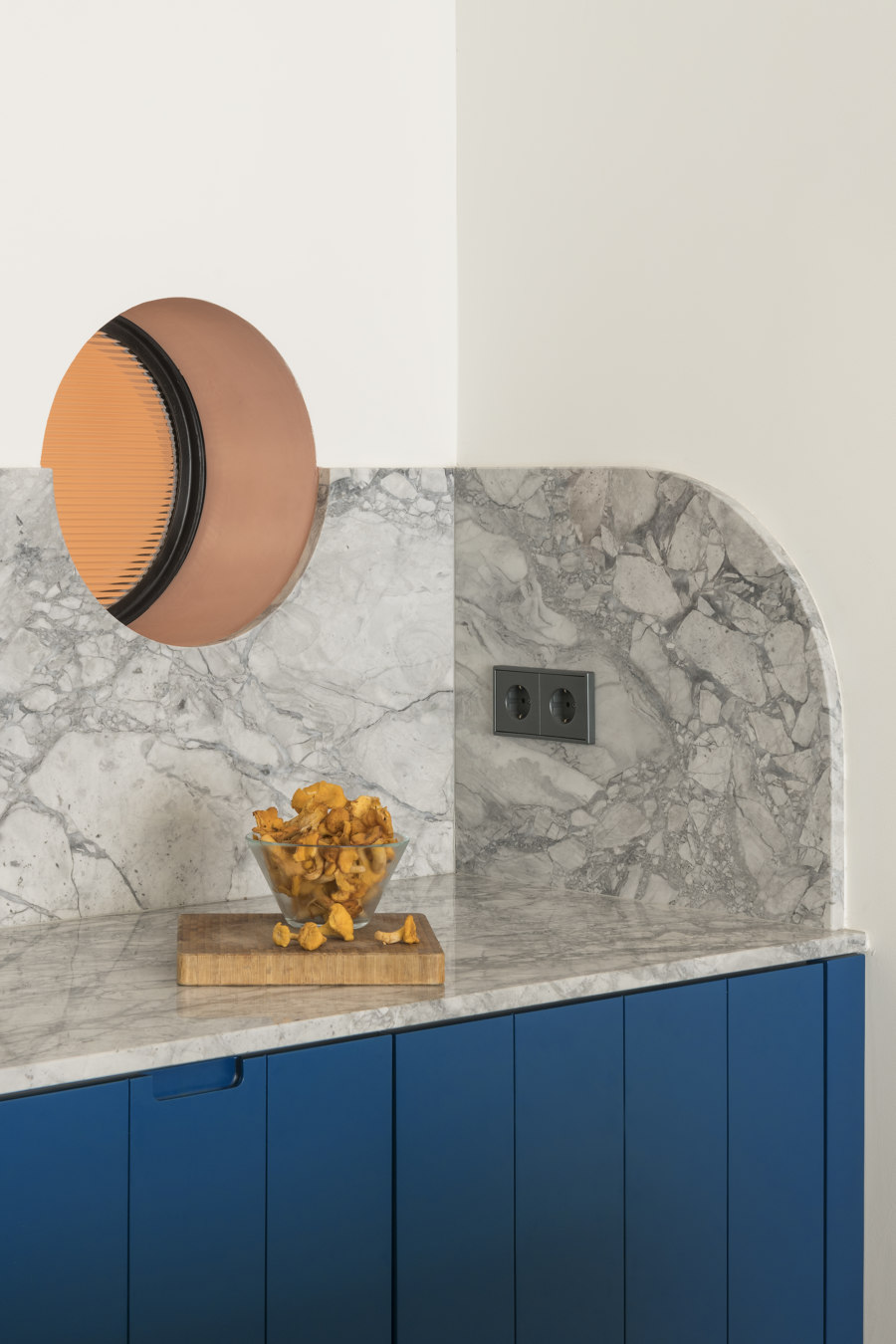
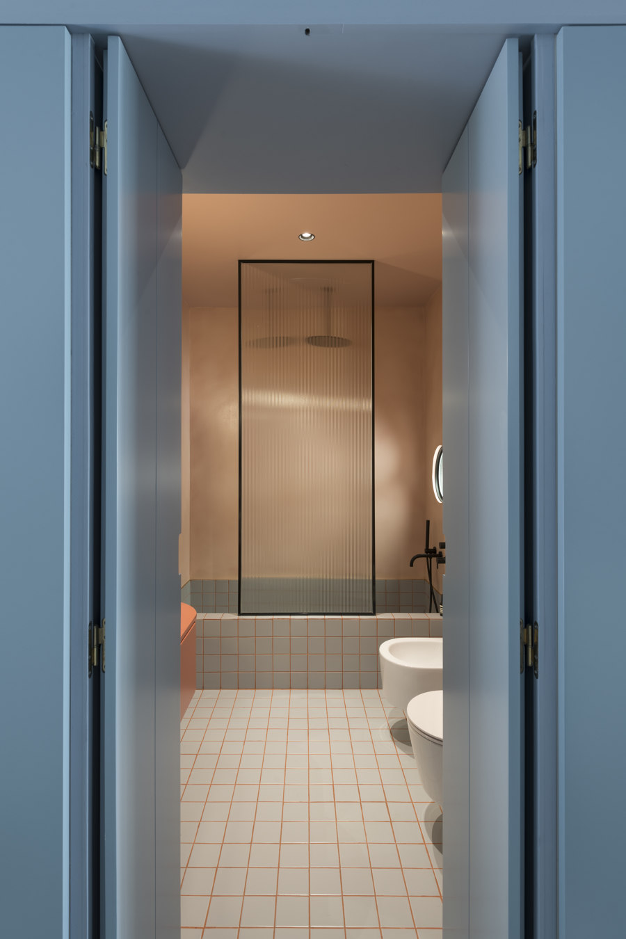
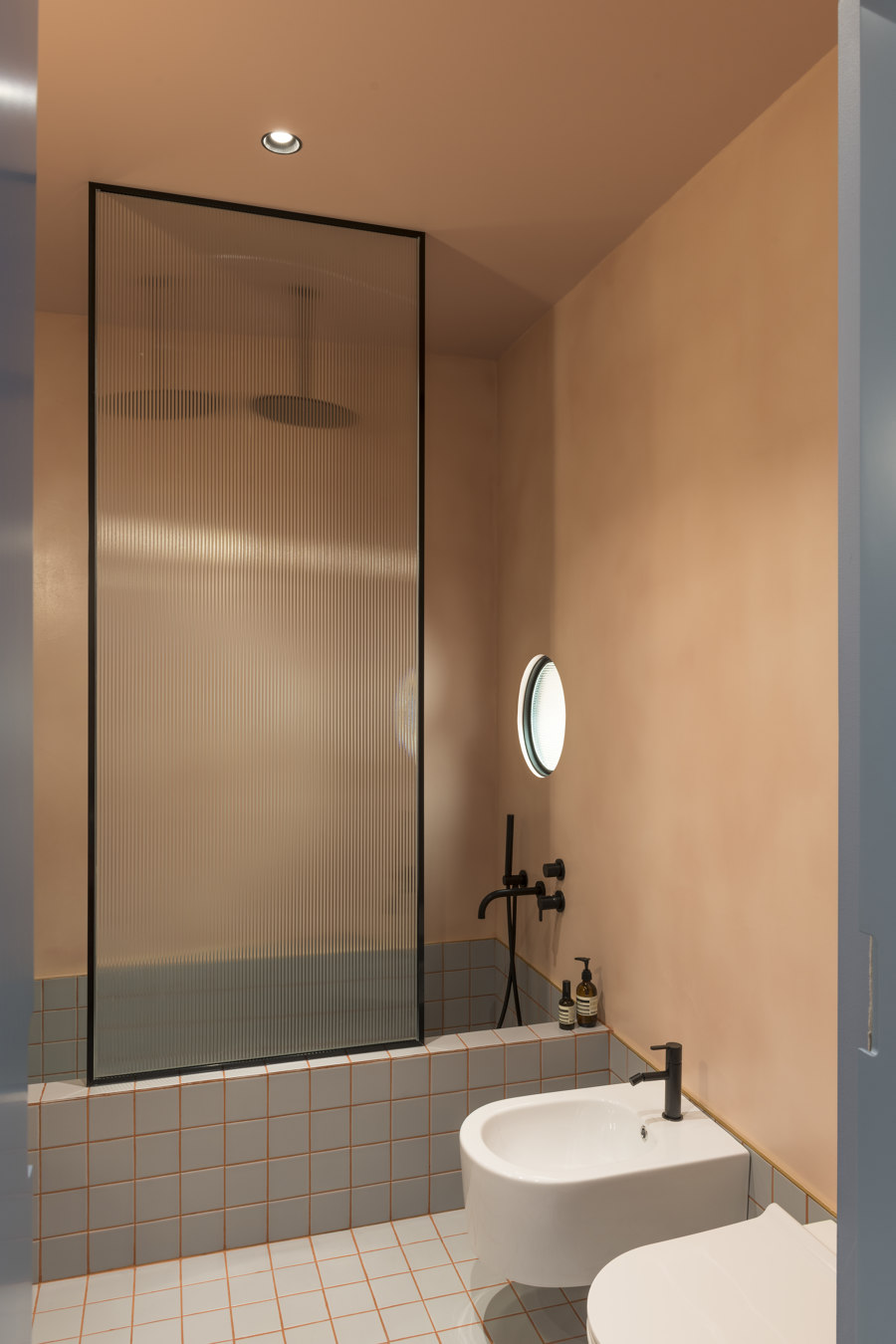
The box inner skin is a very warm shade of pink micro-cement, meant to contrast with its cold exterior tones, wanting to convey the feeling of having reached a secret place, the most intimate point of the apartment: the bathroom. From the outside of its concealed doors, this warm coating can be slightly glimpsed and deduced only from the living room through a circular funneled-glass window, placed above the kitchen counter (another element that generates both privacy and curiosity).
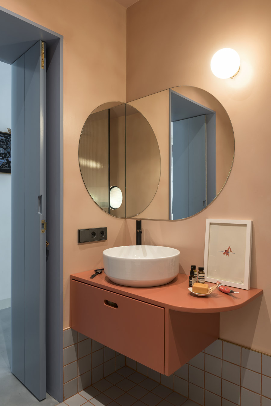
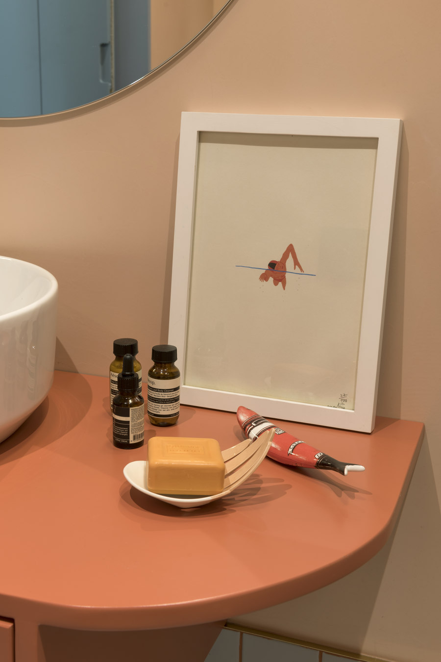
The same optical glass, framed in matt black matching the faucets, is used to screen the built-in bathtub and shower. The room’s floor is covered in square grey tiles, forming a high skirting board that shapes a masonry bathtub that doubles as a comfortable shower box. Tile grouts are in a terracotta shade and faucets are matt black. A bespoke sink cabinet, a custom-built, curved-shaped, angular mirror and a globe lamp complete the special relax room.
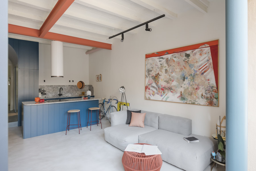
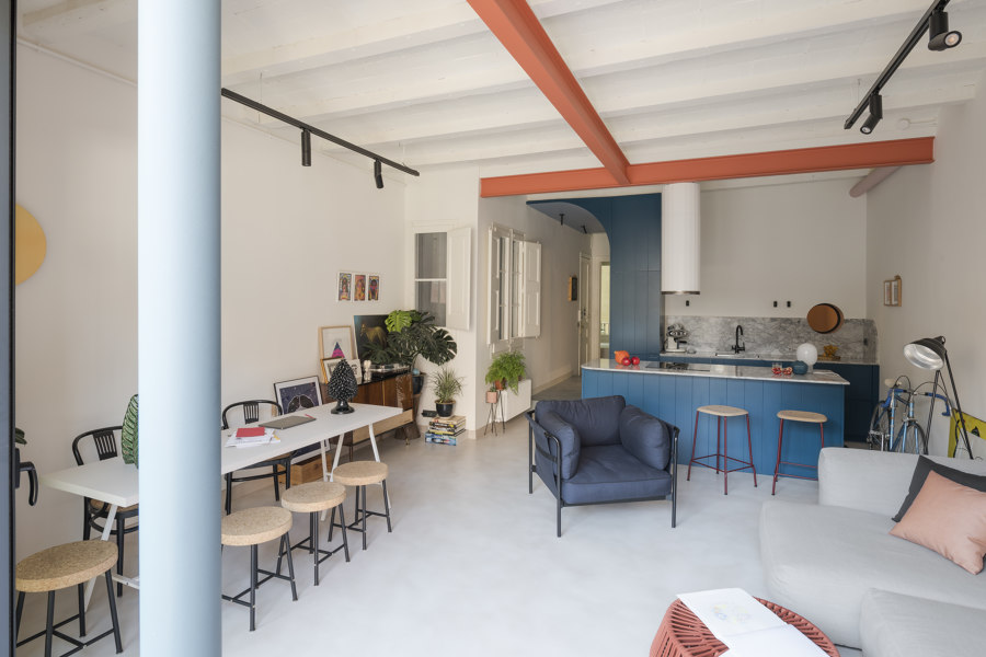
The blue box external surface, a boiserie of grooved panels disguising the wooden doors of storage elements, acts as 4-season cabinets on the side towards the main bedroom, whilst on the light-colored corridor side hides wardrobe, technical cloakrooms and bathroom doors and finally becomes kitchen cupboards towards the living room. In the living space, a large island hosting the hobs is designed as a detached piece of the box and doubles as a comfortable table for more intimate dinners or breakfasts.
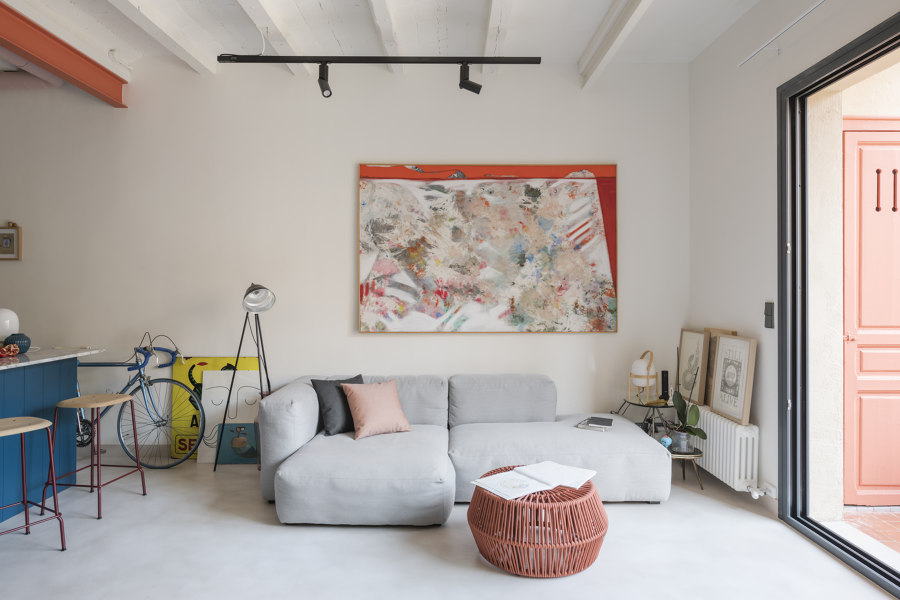
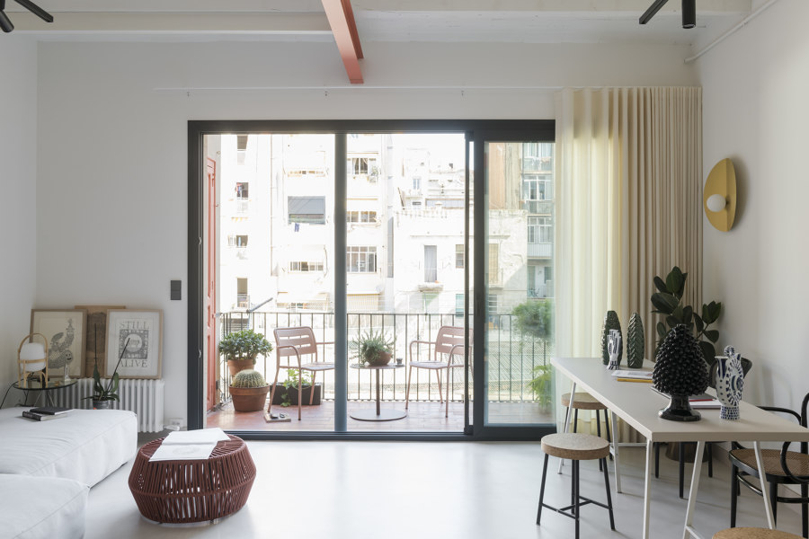
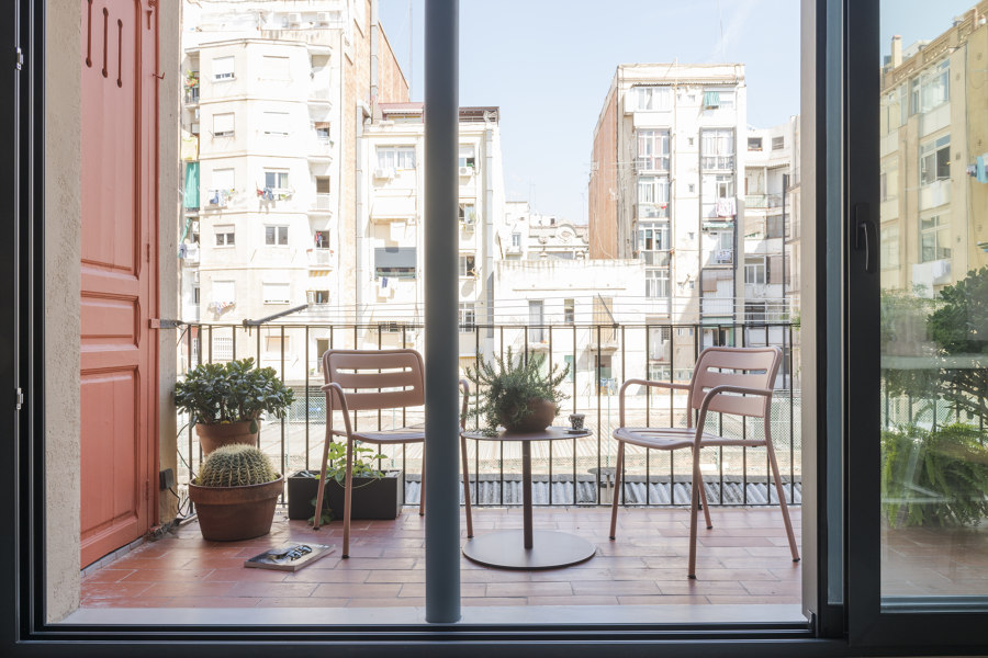
The airy and diaphanous living and kitchen space now benefits of the light of a new big French window that opens on the newly opened terrace, populated by plants. In terms of materials, the entire apartment is treated spartanly and as a single container, with very neutral elements and colors: where the original floor could not be maintained, an ivory-colored, continuous micro-cement has been used. All the false ceilings have been removed; Catalan vaults have been recovered and painted warm white.
The neutrality of the described elements creates a container aimed to make the lacquered blue box stand out. Dashes of color contrasting with the prevailing blues are the coral painted beams, which trace reinforcing (both structurally and metaphorically) the ancient partitions that used to divide what today is a single open space. The same coral shade is used for the bespoke, curved bathroom cabinet. On the terrace, the laundry door (rescued) is painted in coral, reappearing in the traditional ‘rasilla’ terracotta tiles of the outdoor floors.
Punctual elements of more precious materials are mixed with more basic elements and combined to generate a feeling of affordable luxury, not ostentatious but to be searched in everyday details. It is the philosophy behind the use of brass in small elements such as the top of the micro-cement skirting boards or the thresholds where floors change; or the choice of Portobello marble as the kitchen countertop, backsplash and on the curved island and all the bespoke furniture pieces all lacquered and handle-less.
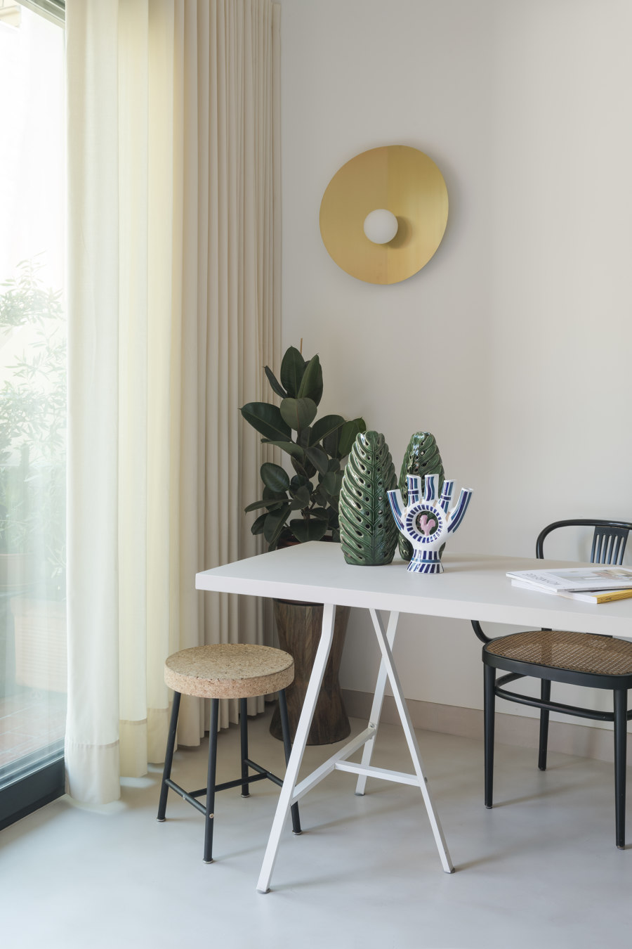
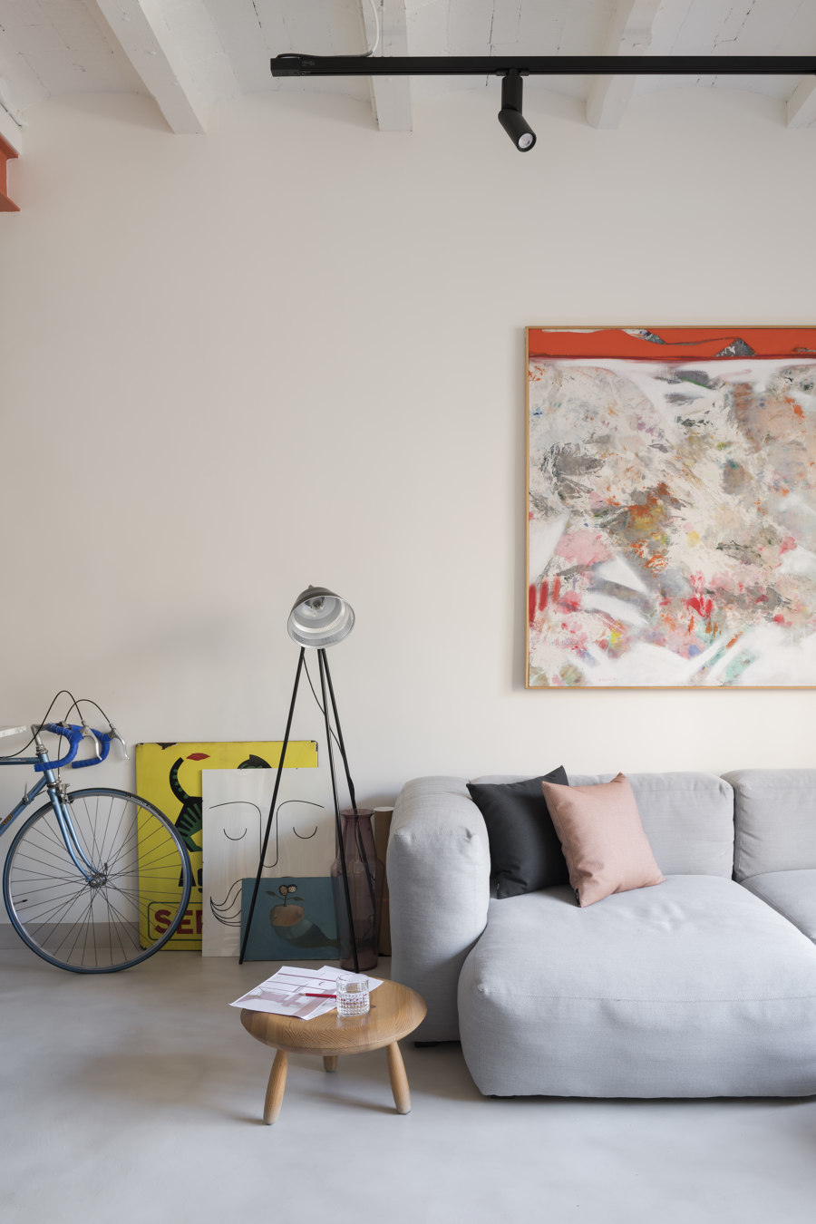
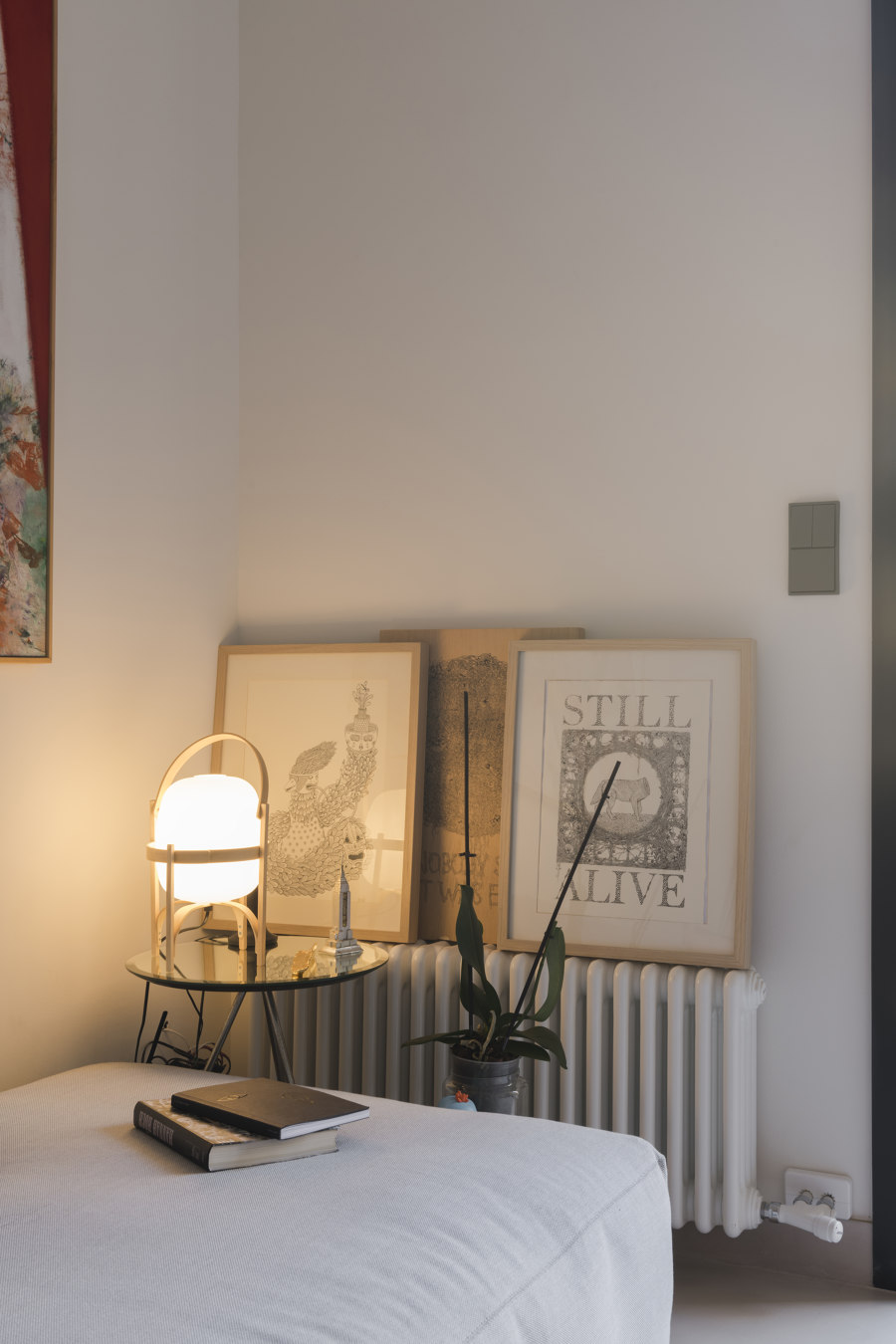
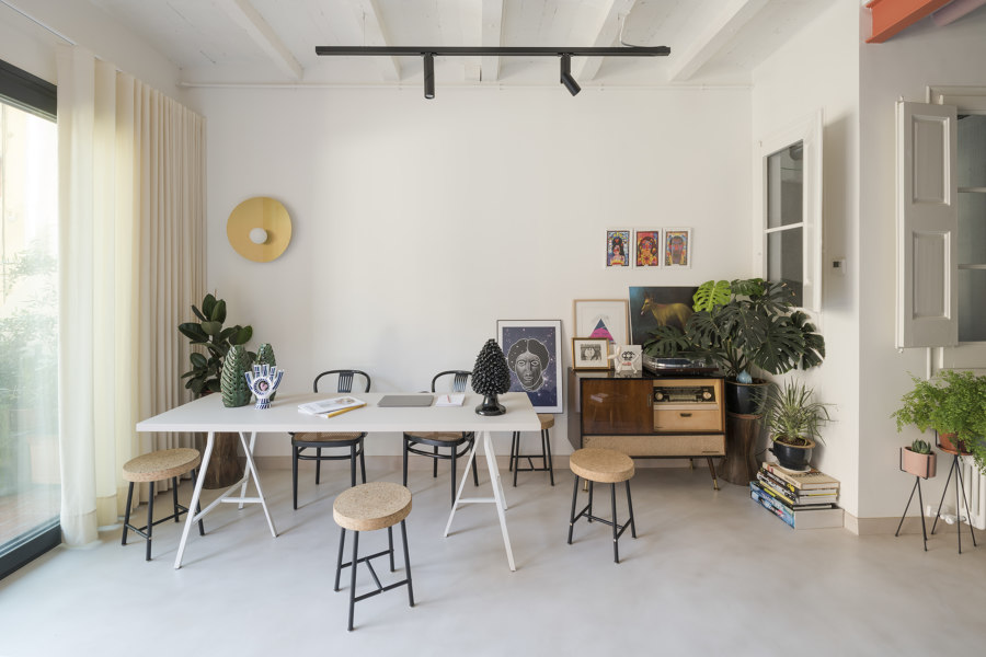
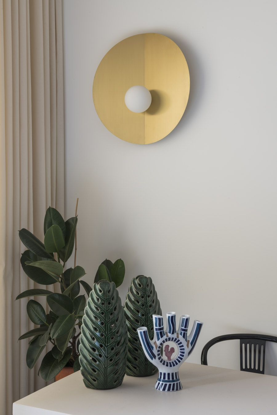
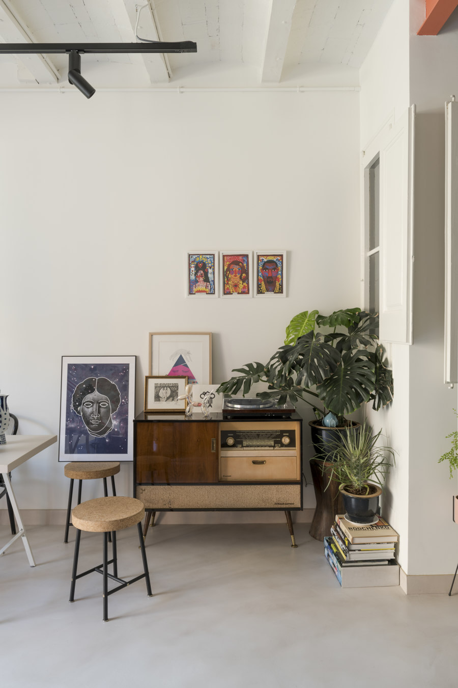
The idea for the furnishing reflects the same philosophy, mixing luxury furniture with vintage pieces: neutral colors, objects collected in travels and paintings with a strong personal emotional character. As the brass disc of Globe Fold Sconce that presides the dining area, designed by CaSA, the light is produced by Barcelona brand Metalware.
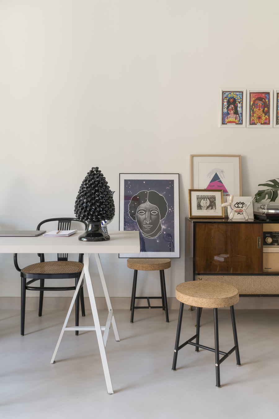
Below it, a long table used both as desk and dining, lacquered in ivory, sided by vintage, black Thonet chairs with wicker seats, rescued, sided by cork and black metal stools, a limited edition from IKEA. The living area is fitted with carefully chosen furniture: a Mags sofa and Bouroullec designed Can armchair, both by HAY. Of the same brand, the stools for the kitchen island: Edge 30. On the terrace, two Village chairs by Kettal and a table by the same brand.
Design Team:
CaSa - Colombo And Serboli Architecture: Andrea Serboli and Matteo Colombo for Colombo and Serboli Architecture, Margherita Serboli Arquitectura

Fotograf: Roberto Ruiz

Fotograf: Roberto Ruiz

Fotograf: Roberto Ruiz

Fotograf: Roberto Ruiz

Fotograf: Roberto Ruiz

Fotograf: Roberto Ruiz

Fotograf: Roberto Ruiz

Fotograf: Roberto Ruiz

Fotograf: Roberto Ruiz

Fotograf: Roberto Ruiz

Fotograf: Roberto Ruiz

Fotograf: Roberto Ruiz

Fotograf: Roberto Ruiz

Fotograf: Roberto Ruiz

Fotograf: Roberto Ruiz

Fotograf: Roberto Ruiz

Fotograf: Roberto Ruiz

Fotograf: Roberto Ruiz

Fotograf: Roberto Ruiz

Fotograf: Roberto Ruiz

Fotograf: Roberto Ruiz

Fotograf: Roberto Ruiz

Fotograf: Roberto Ruiz

Fotograf: Roberto Ruiz

Fotograf: Roberto Ruiz
