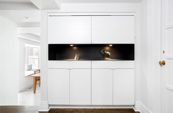
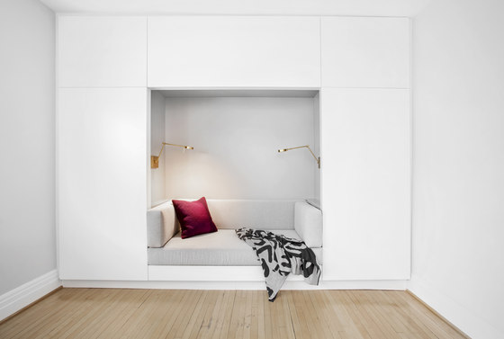
The option to downsize was not an option for the empty nesters who have resided in this home for over twenty-five years. Situated in a prestigious neighbourhood in Montreal, the sprawling residence has been the venue for many social events, dinner parties and family gatherings. With grandchildren on the way, the homeowners elected to embark on a renovation that included several rooms in the home. The objective was to inject a modern aesthetic into a new kitchen, library, master bedroom and en suite, while respecting the classic architectural details throughout the rest of the home.
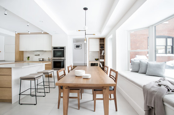
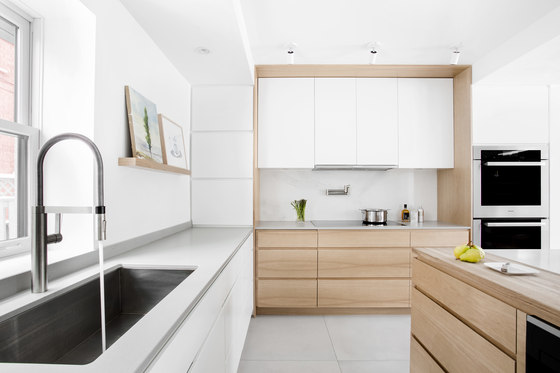
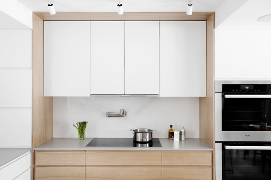
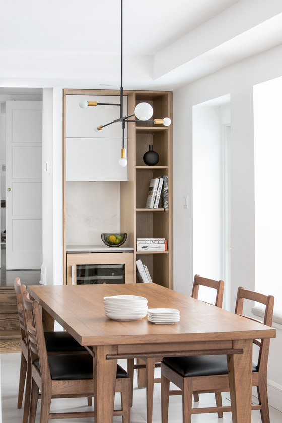
The kitchen had been relocated to the garage in a previous renovation, which presented several design challenges. Low concrete ceilings, ventilation ducts and cinderblock walls required diligence in achieving a plan that would create the illusion of height and light. Sombre cabinetry from the previous kitchen gave way to a brighter palette of white and bleached butternut. White surface-mounted monopoints add architectural interest and juxtapose a sculptural suspension with an industrial influence, over the dining table. Concealed LED strips add ambient lighting for evenings.
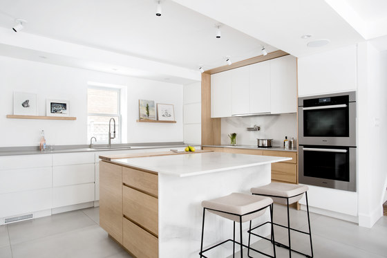
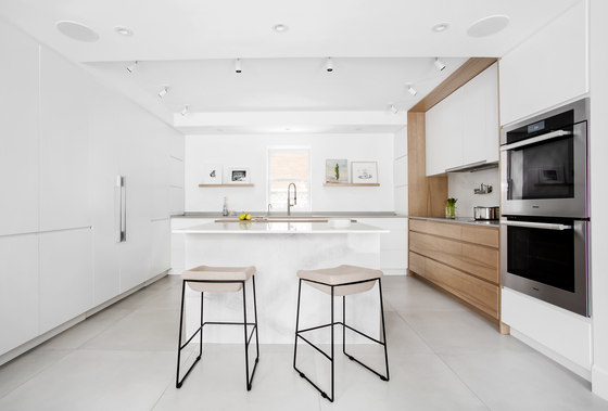
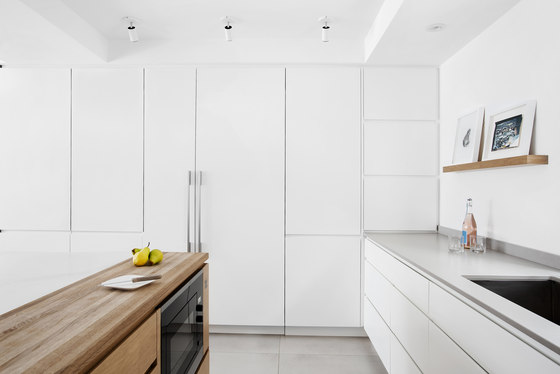
Creating a highly efficient space for cooking and an atmosphere conducive to entertaining both large and intimate gatherings were the primary design criteria for the kitchen. The floor to ceiling matte white cabinetry conceal appliances and an abundance of storage, while providing contrast to the warm hues of the blonde wood. Handle free cabinetry maintains a minimal design while an integrated ash butcher block in the island allows two people to simultaneously prep meals.
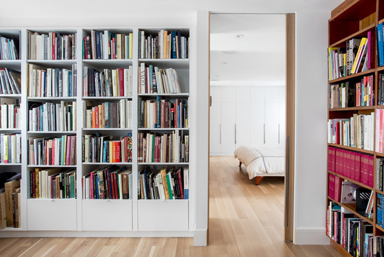
Floating wood picture rails create a mini-gallery that enable the homeowners, avid art collectors, to easily display and interchange different pieces of art at various times. Walls were relocated on the second-floor plan and reconfigured to include a library, spacious closets, and a luxurious en suite of dramatic proportions. The custom teak library leading into the master bedroom, stores a prolific collection of drawings and art books. To eliminate the feeling of separate rooms, all door openings were raised to full height and maximum widths.
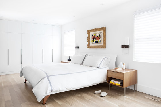
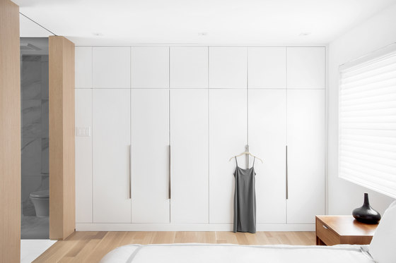
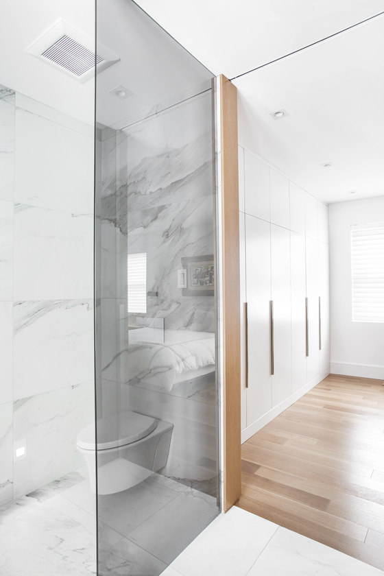
The minimal design of the master bedroom marries old and new, and is anchored by white oak engineered floors. A shortage of closet space had previously forced the homeowners to use other bedroom closets for storage. Reclaiming a third of the library, created a spacious walk-in closet for her, and a generous wall of closets for him in the master bedroom. Large white oak panels dominate the bedroom and wrap around the partition wall into the master en suite. Consistent materials create a visual flow and unify the two rooms as a single volume. The en suite is easily accessed from two entries, with full-height pocket doors providing privacy as needed.
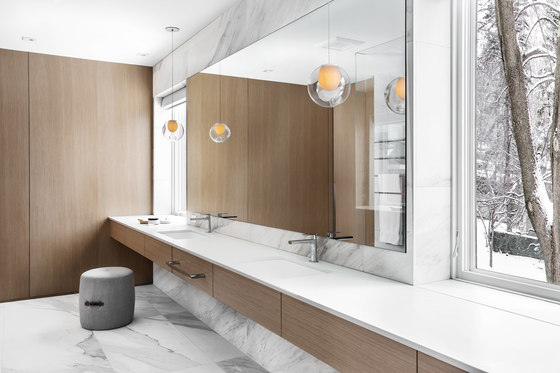
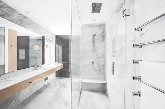
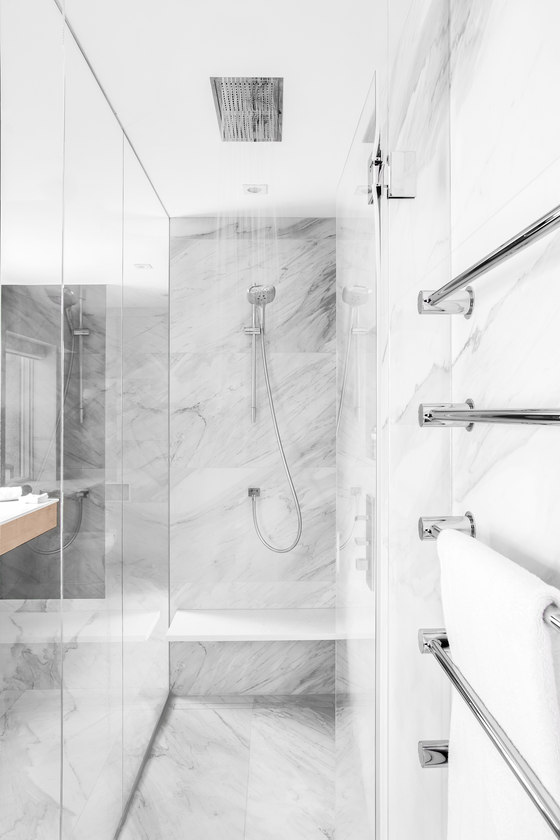
Spacious yet intimate, the master en suite features materials selected for their respective organic compositions, which enhance an inviting atmosphere. Oversized porcelain tiles maintain classic characteristics in a modern format. The veining of each tile was scrutinized in advance of the installation to ensure both a sense of movement and a seamless flow between the walls and floors. Radiant floors transition seamlessly into the European shower and towards a concealed linear drain.
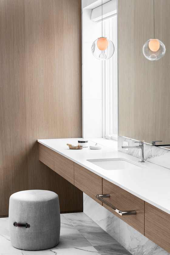
To create a sense of fluidity and openness, several elements were designed to float within the room. The vanity, cantilevered quartz bench, and hand-blown glass pendants feel weightless. The shower glass and smoked glass partitions, were meticulously recessed into the floor and ceiling to avoid visible frames. The elongated proportions of the fifteen-foot vanity were in response to the clients’ wish for separate sinks and an integrated vanity area. To create the illusion of a wider space in the gallery layout, a frameless, eight-foot-wide mirror sits flush between two large windows, which exploits the view of several mature maple trees.
The foliage on the trees change throughout the four Canadian seasons, which appear as ever-changing photographs from within the washroom. Smoked grey glass partitions provide contrast to the warm wood paneling and relate to the charcoal veining of the tiles. They also provide privacy in the toilet and bidet area, while maintaining both natural light and a sense of openness. A meticulous execution of the concepts was integral to the success of this renovation. Challenges presented to the team of trades were resolved with great attention to detail and precision.
Catlin Stothers Design
