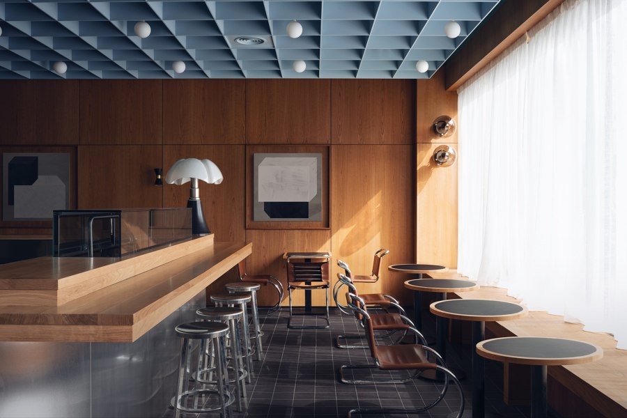
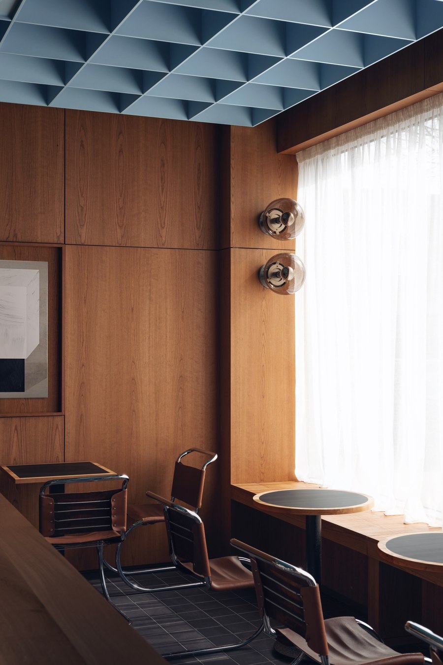
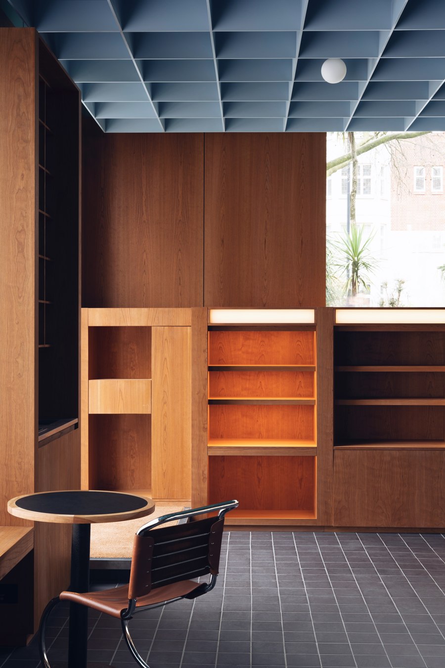
British design duo Child Studio has transformed a disused London post office into a contemporary Japanese restaurant. Located in Saint John’s Wood district near the famed Abbey Road crossing, the late modernist building provided a rich source of inspiration for the designers. The interiors present a subtle blend of European and Japanese design influences. ‘Our aim was to rediscover and celebrate the unique history of this building and the neighbourhood’ - commented Alexy Kos and Che Huang, the founders of Child Studio. ‘The post office was built in the 1960s and our design pays tribute to London's modernist heritage of that era.
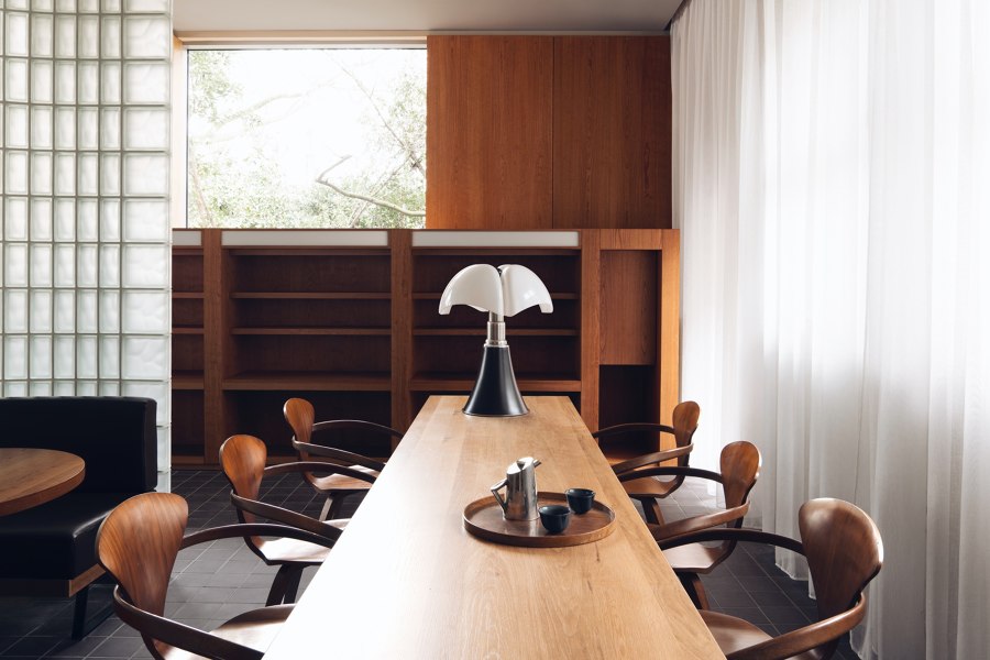
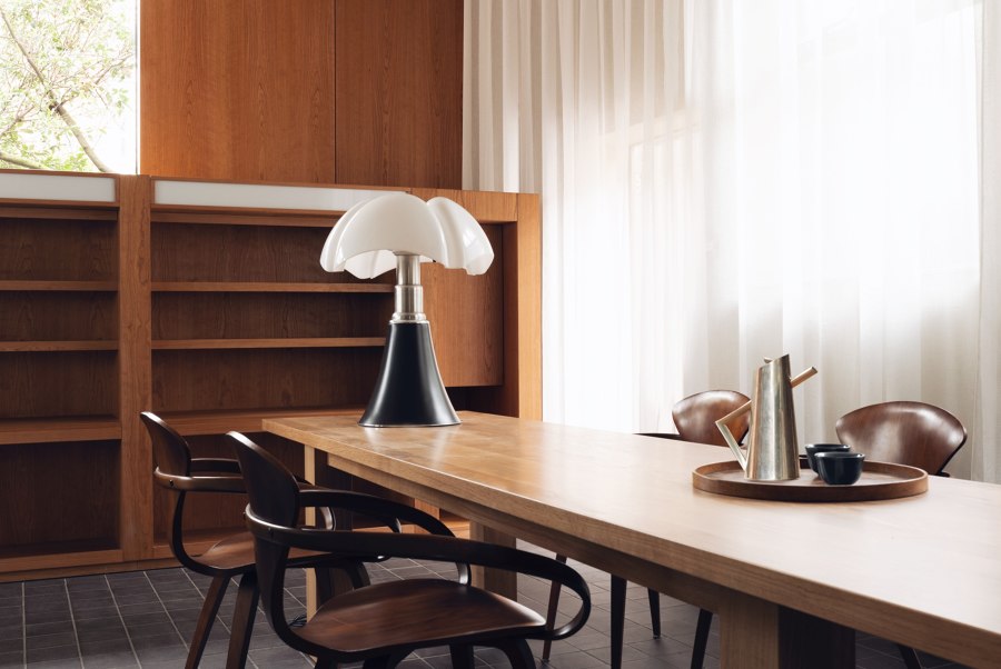
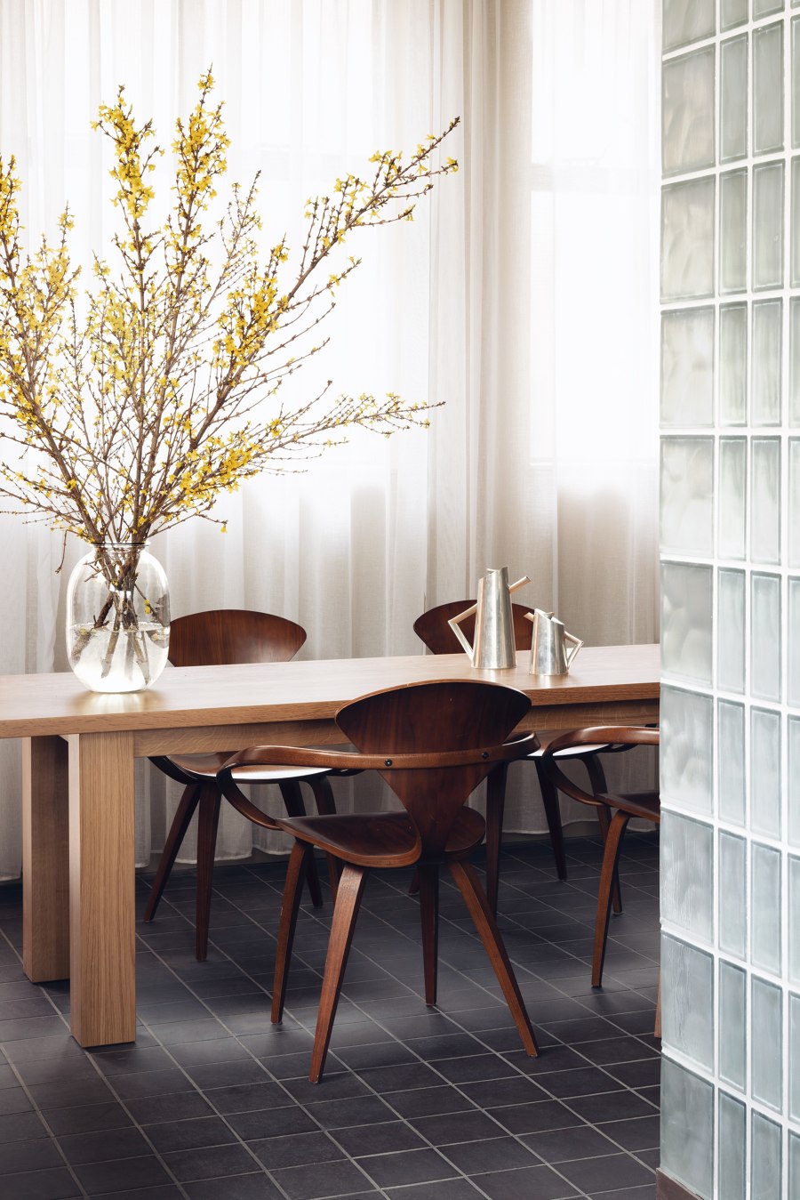
The Japanese references are subtle and present themselves through the choice of materials, the play of geometric patterns, and the hand-crafted woodwork detailing’. The dialogue between the East and West continues with the curated selection of antique and contemporary furniture: the iconic moulded plywood armchairs designed by Norman Cherner in 1958 are paired with the cast aluminium stools by the celebrated Japanese designer Naoto Fukasawa.
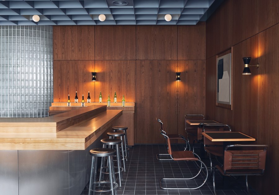
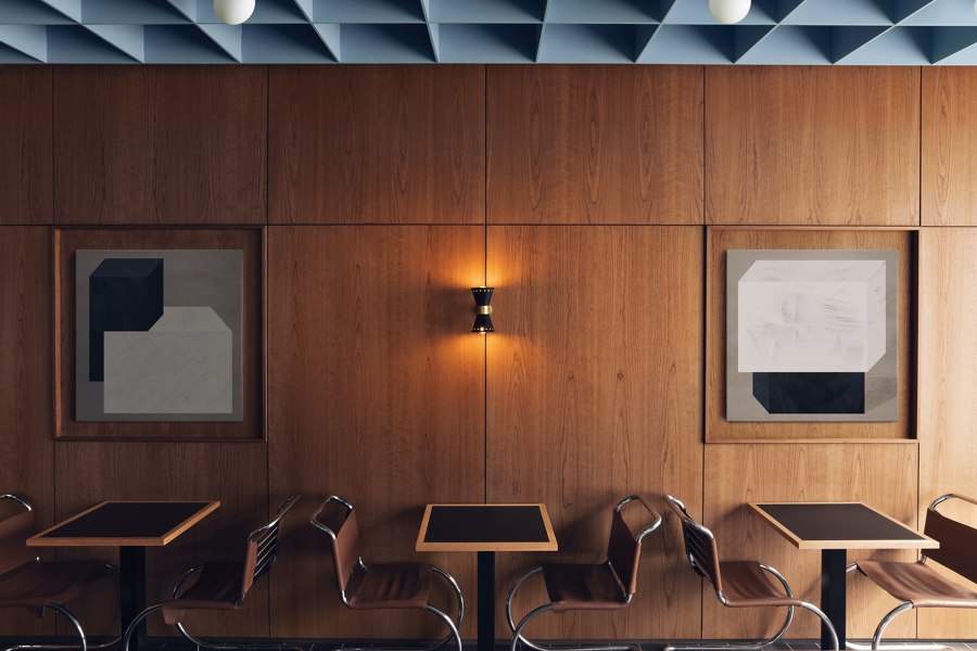
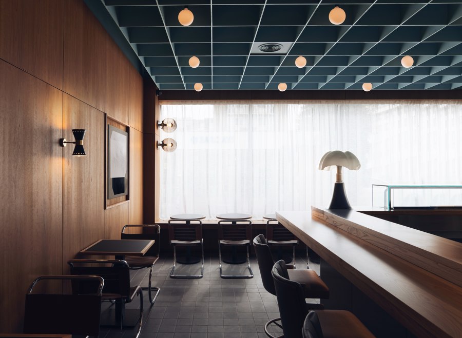
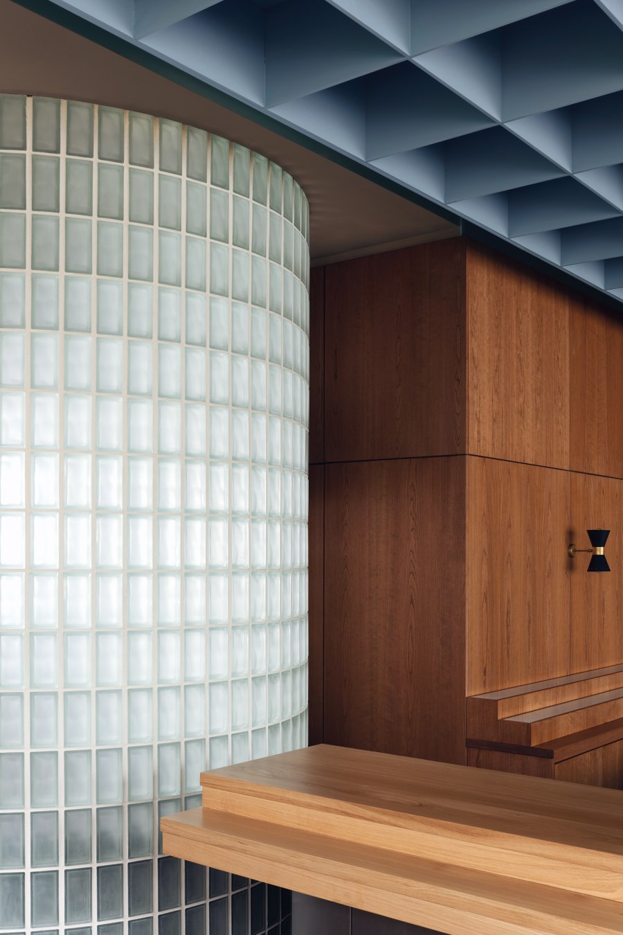
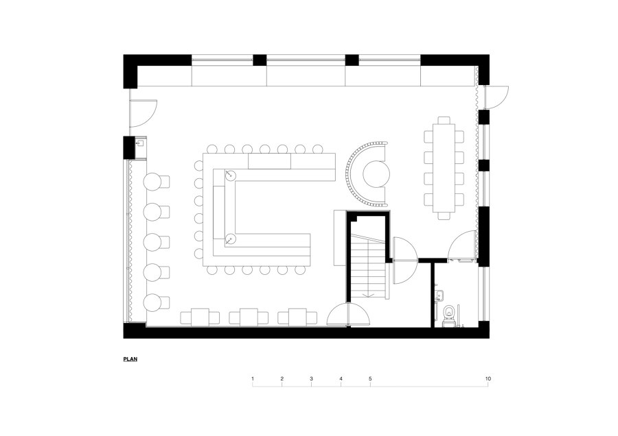
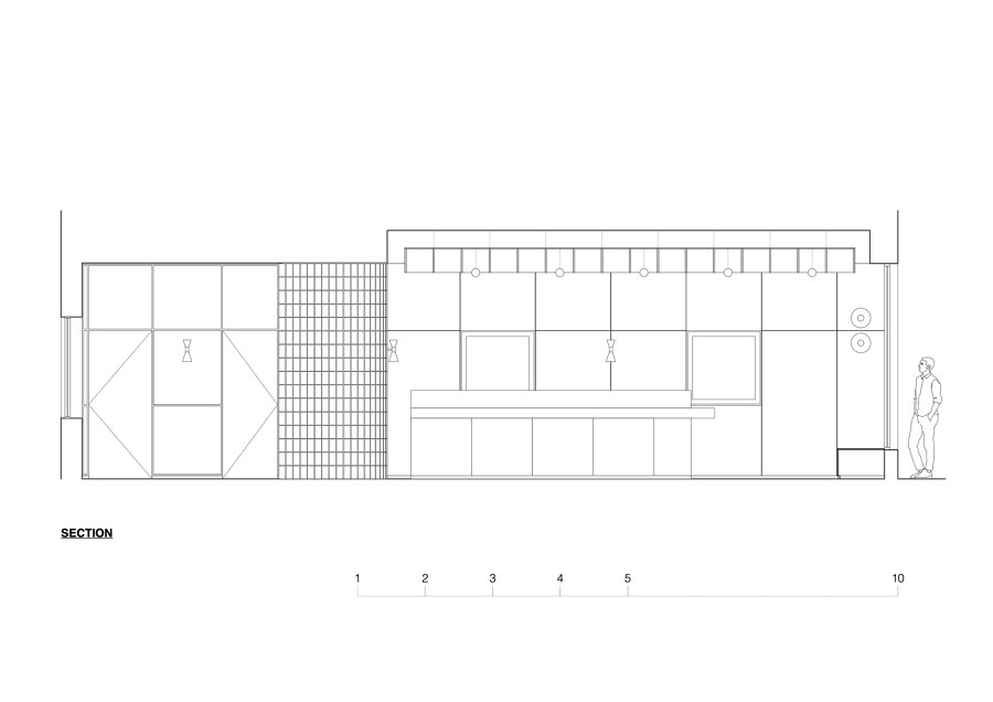
The walls across the entire space are clad in dark cherry wood panelling with antique brass sconces by Stilnovo, the Italian pioneers of rationalist design. The shallow alcoves are decorated with large abstract paintings. Child Studio devised a suspended coffered ceiling in a soft blue hue, and the refined geometric pattern motif continues on the quarry tile flooring. The focal point of the space is the central island counter where the sushi master prepares and serves authentic Japanese dishes.
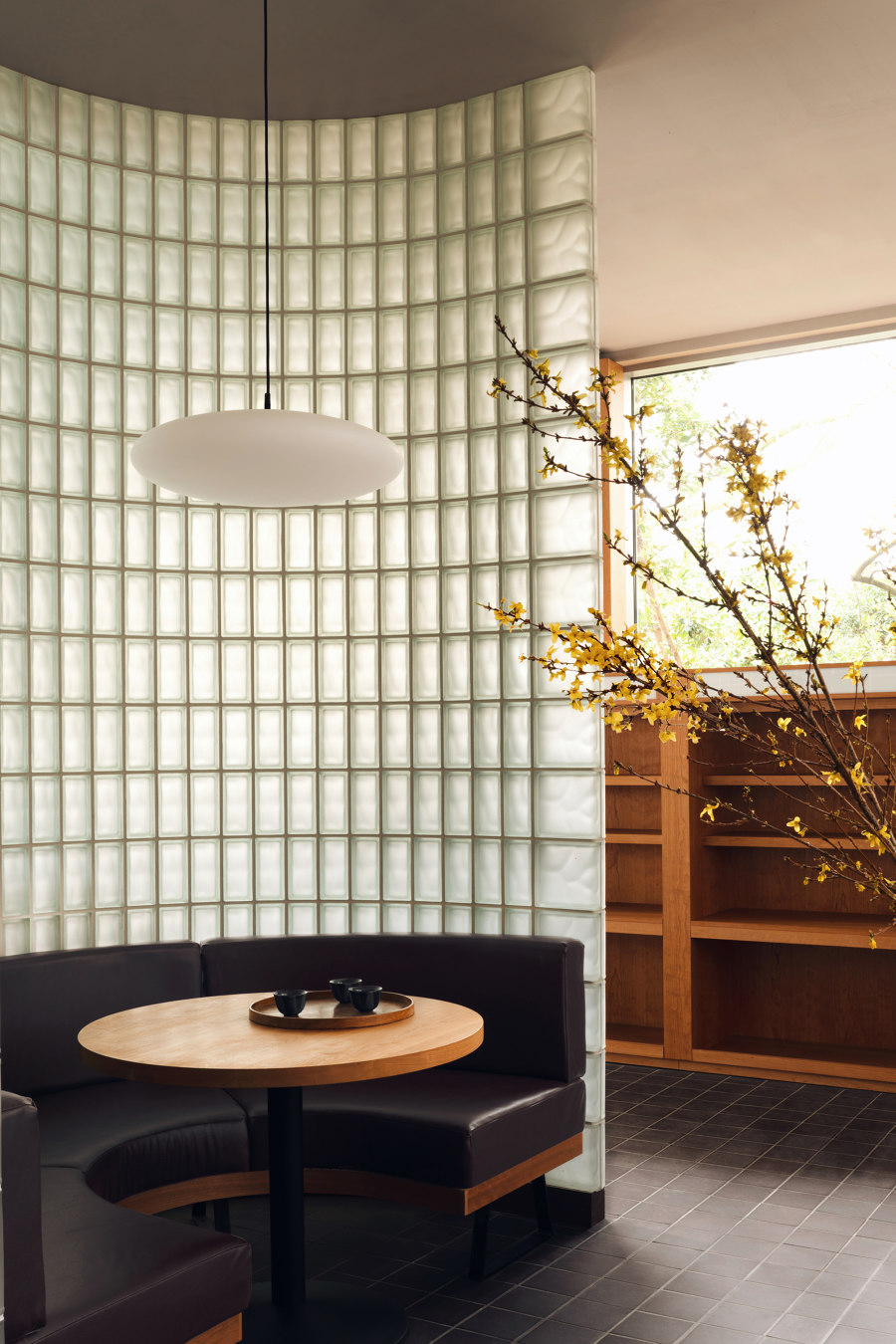
The reflective curved steel panelling of the bar is complemented by the sculptural table lamp ‘Pipistrello’ designed by Gae Aulenti in 1965. A large semicircular glass block partition subdivides the space into two, forming a quiet lounge at the back of the restaurant. The daylight filters through the textured glass, creating a calm and serene atmosphere. ‘The inspiration for this feature came from the facade of Saint John’s Wood Library, the next door building of the same era,’- explained Alexy and Che. ’It has a small and unassuming shopfront, but the library entrance is a beautiful combination of square glass blocks and dark wooden framework.’ Engaged with the local history and woven in the fabric of the neighbourhood, this restaurant demonstrates how a carefully researched and well-considered design can balance the contemporary sensibility with a touch of nostalgia.
Design team:
Child Studio
