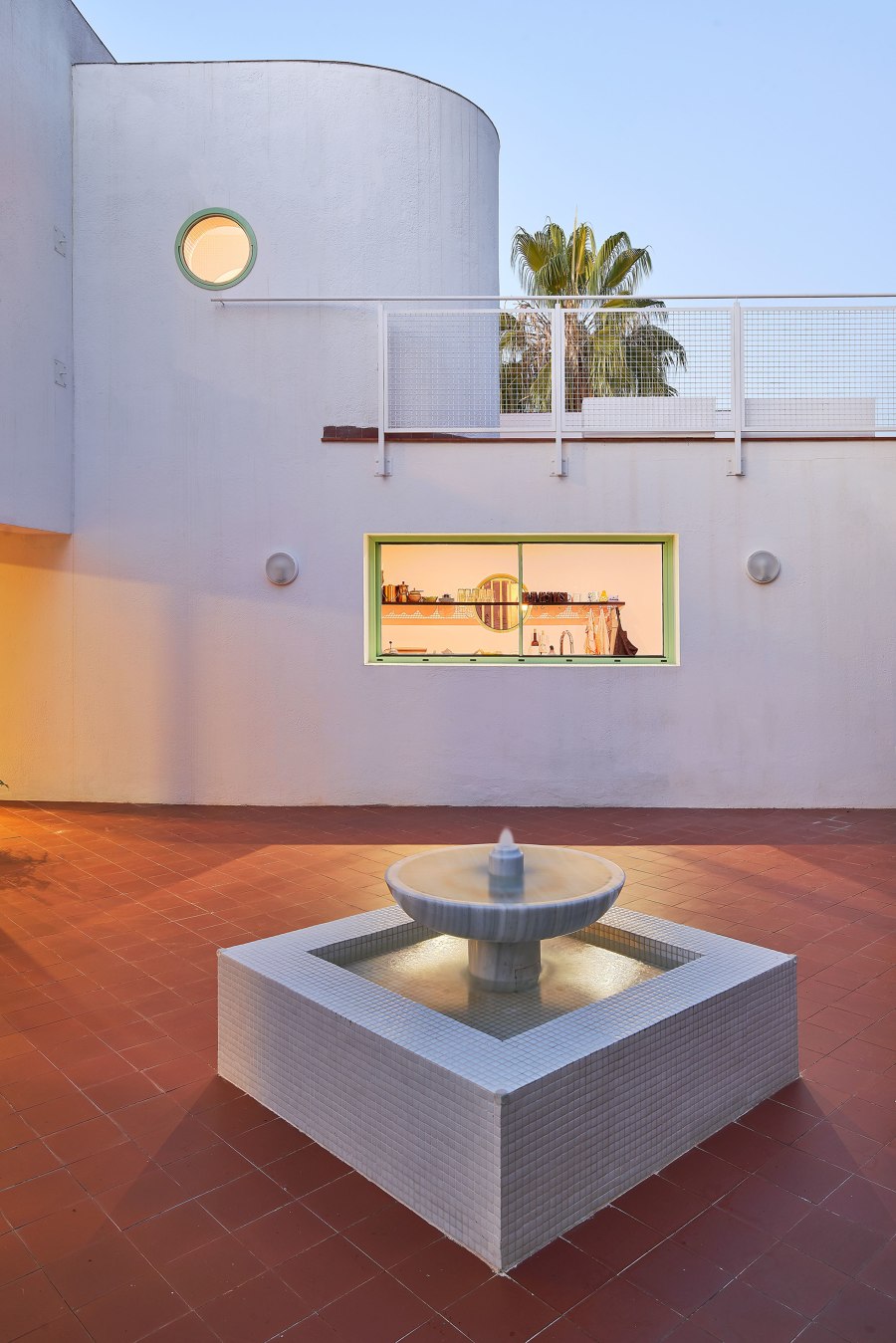
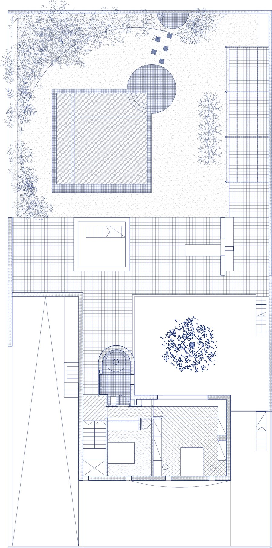
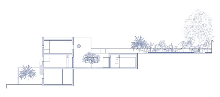
The reform of this house, designed in 1988 by architect and designer Antoni Roselló Til, starts from maintaining its essence and playing with its most distinctive attributes, such as primary geometries or finishing touches. It is an intervention that does not alter or modify the distribution of the house but acts at certain points like acupuncture.
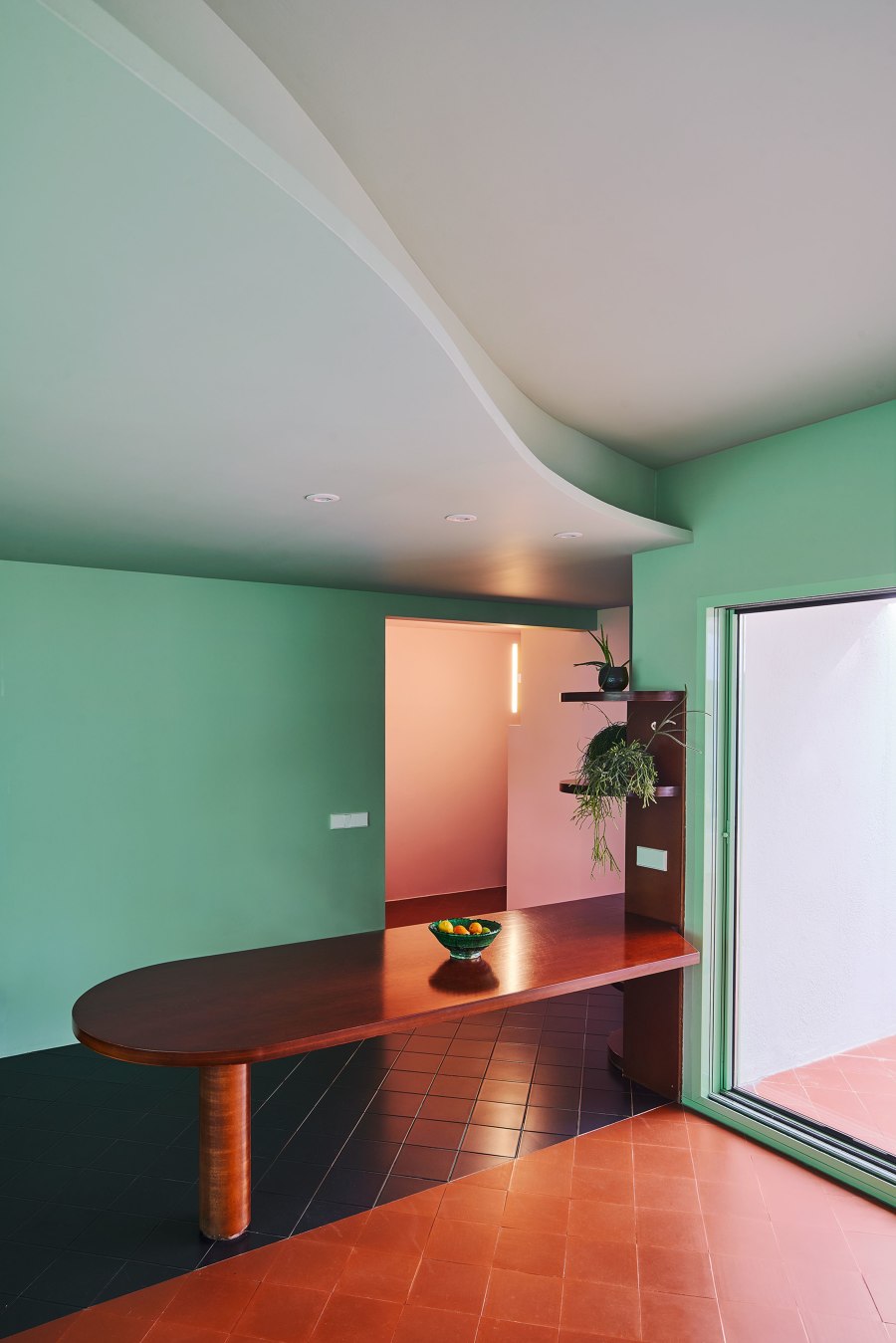
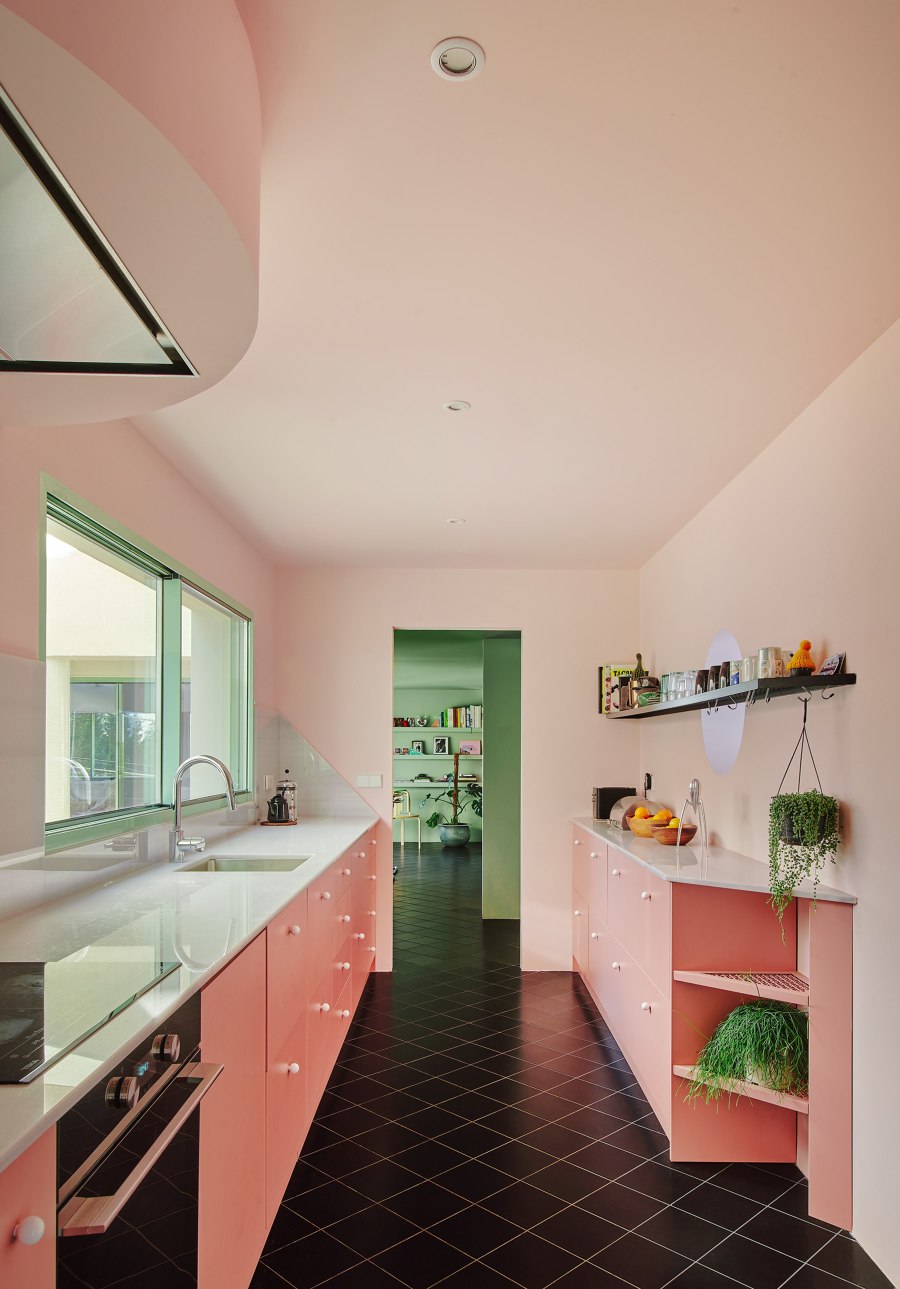
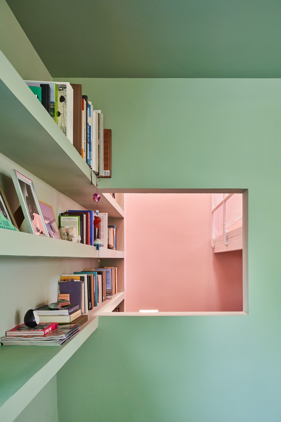
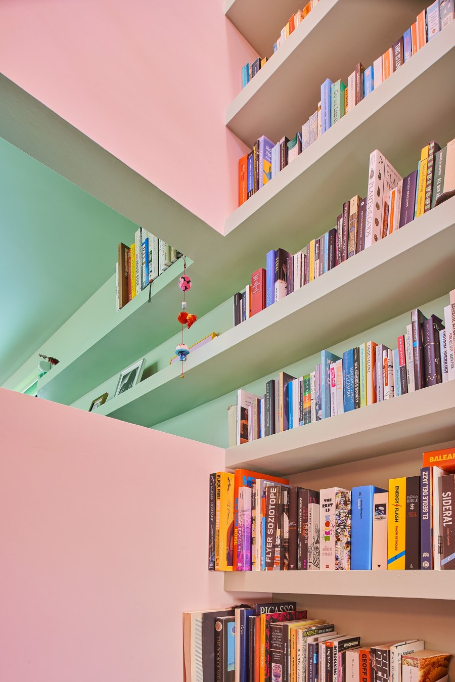
One of our intentions was to use color as the main tool to create new spatial relationships, playing with contrasts and superimposition. The new chromatic palette starts from the original tile and black colors of the floor, according to the first client's taste, and adds pink and green to represent its new inhabitants: Sergio, Katie, and little Hope.
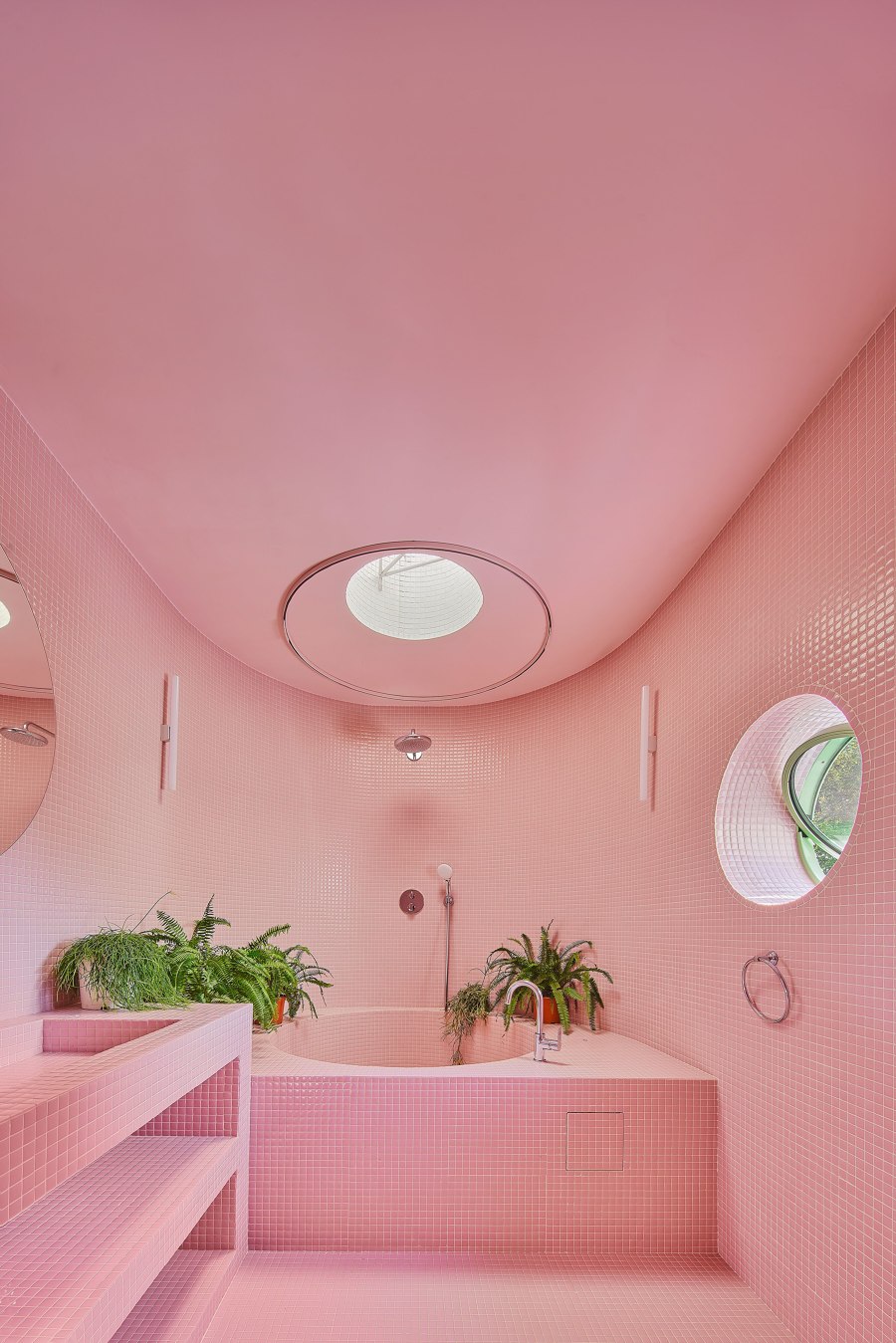
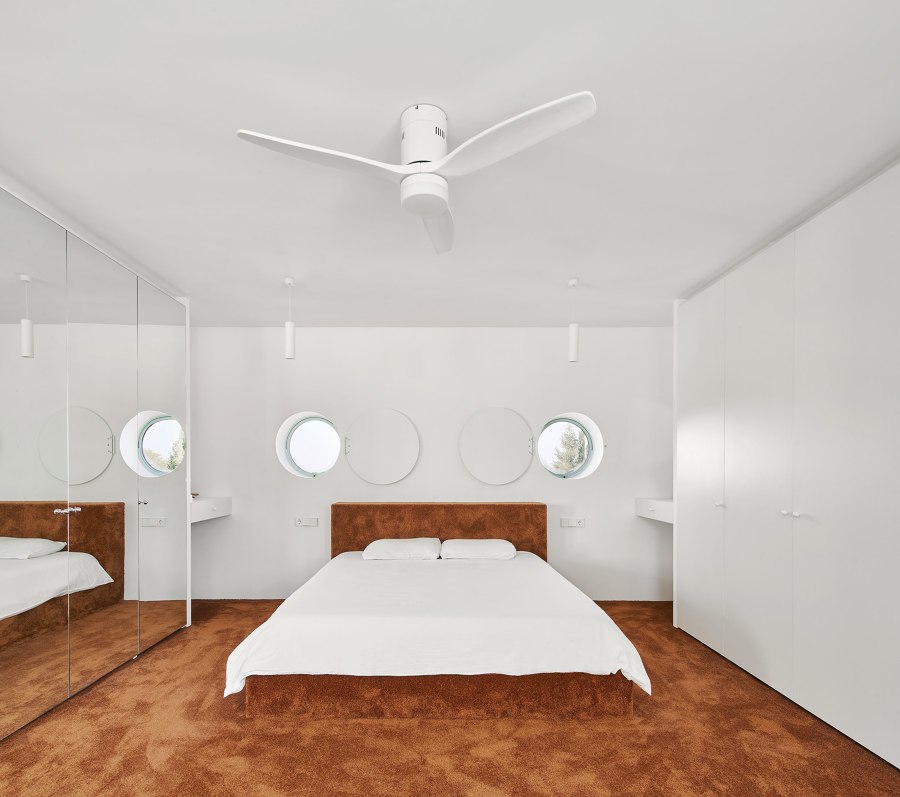
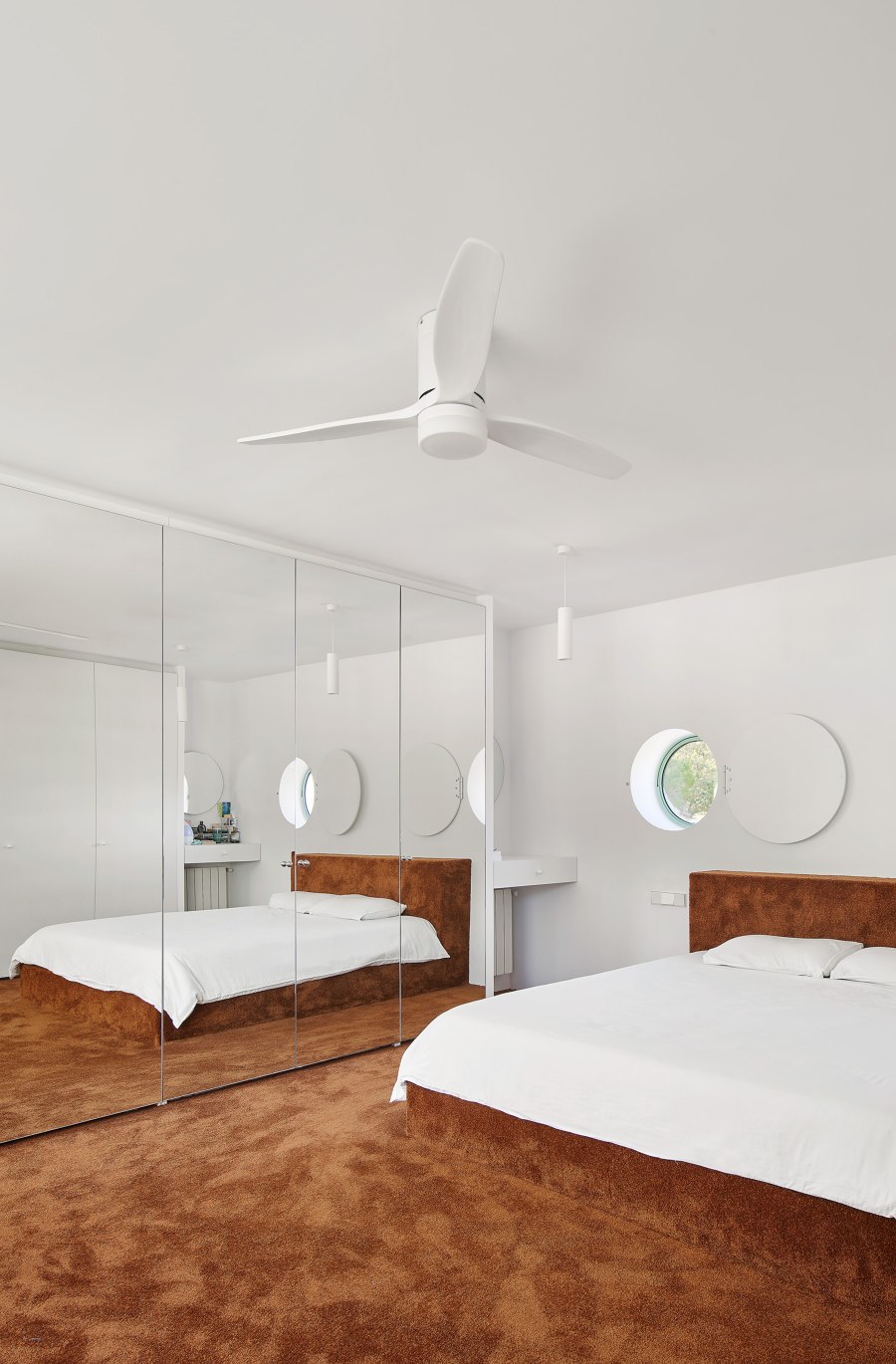
Also, the use of materials in the reform is sensitive to the existing ones in the house, such as mosaics for the bathrooms or tramex meshes for the kitchen shelves. Without complexes, it is decided to extend the original black ceramic pavement of 20x20 from the living room to the kitchen to generate continuity between the two spaces. The bedrooms, on the other hand, demand the comfort of a new material: a uniform and fluffy brown carpet, inviting to walk barefoot or play on the floor.
On the other hand, contact with the outdoor spaces is enhanced by expanding some openings, but without modifying the original composition of Roselló's facade. In this way, the views towards the garden, the patio, and the distant surroundings are emphasized.
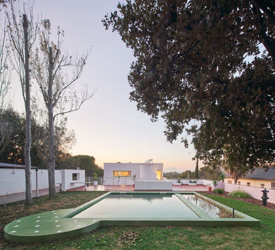
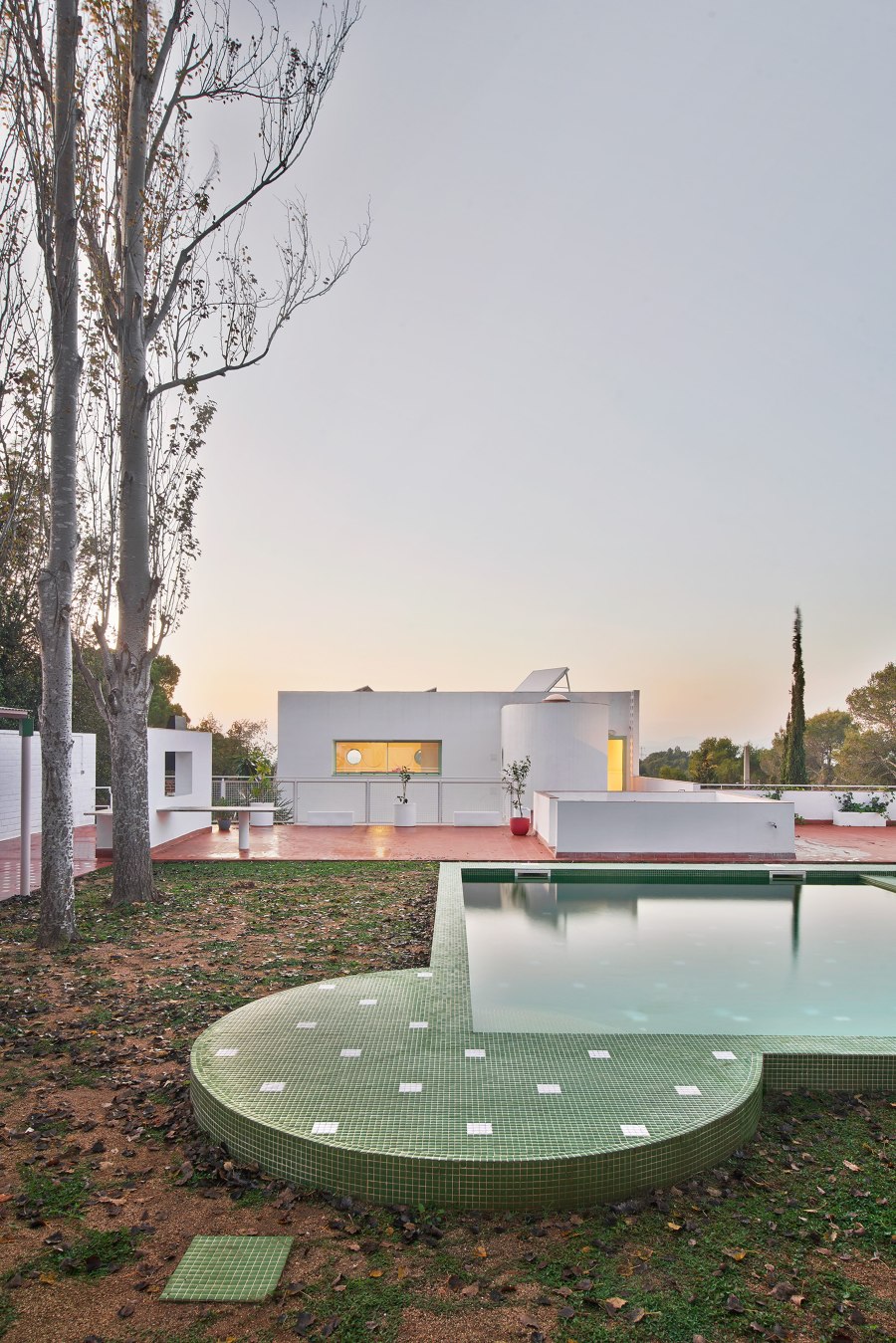
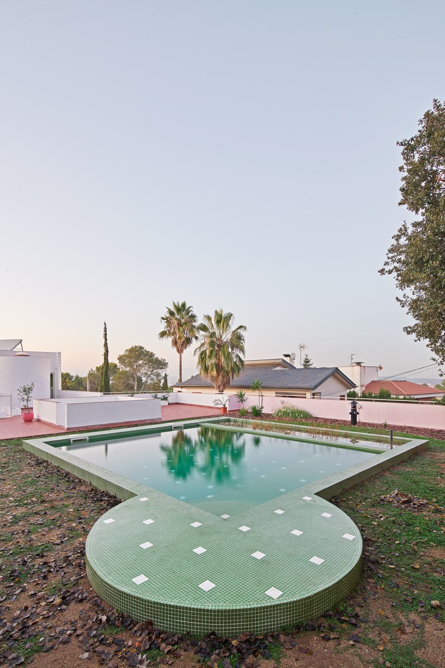
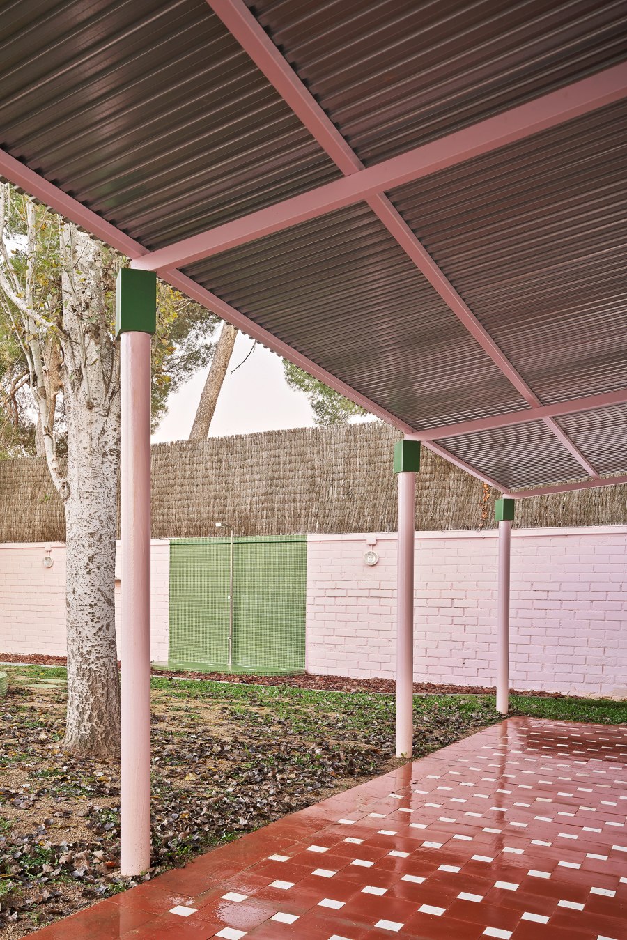
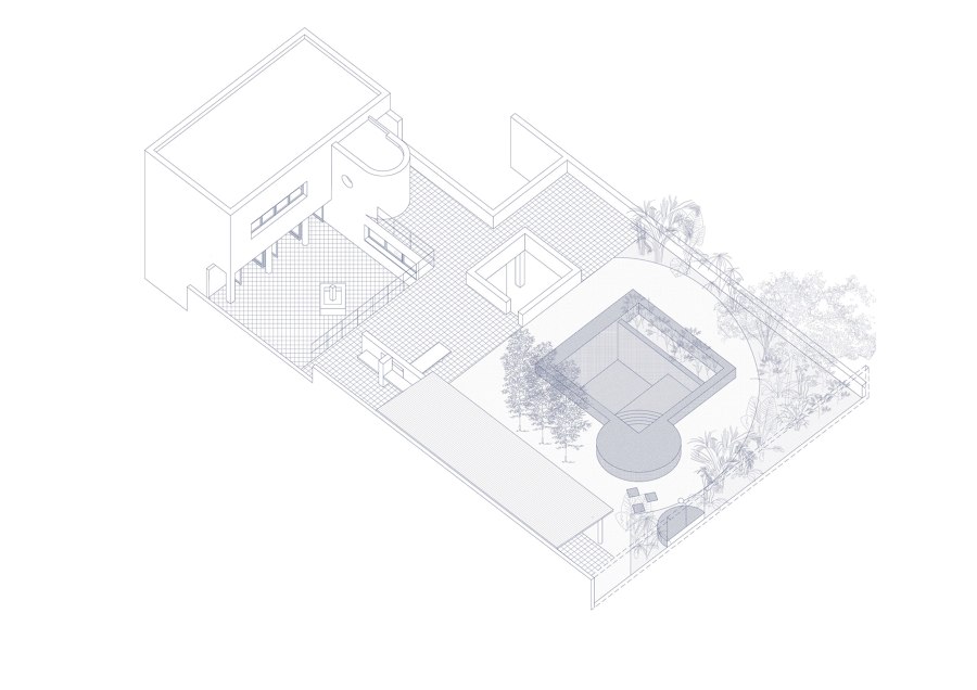
Finally, a landscaping intervention is carried out in the garden: a biological pool is located, treating the water through aquatic plants and reflecting the rear facade of the house. The existing pavilion is intervened by transforming the pillars and opening it as a pergola towards the garden. Finally, two differentiated green areas are generated, a circular lawn surrounded by a perimeter of dense vegetation that envelops it with large plants.
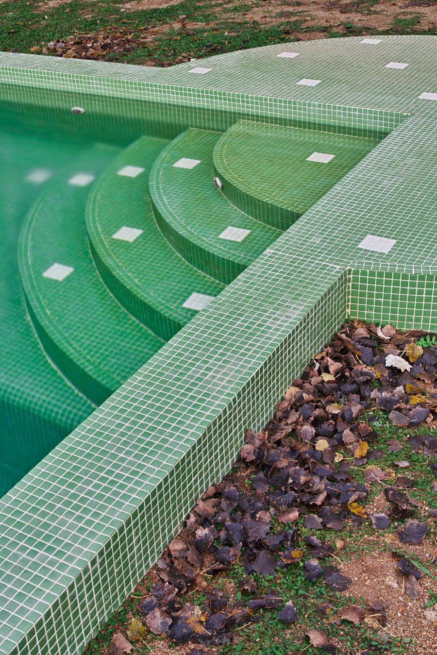
This exterior intervention plays with simple geometries that recall those of the house facade itself. Once again, mosaic is used, this time adopting the same pattern as the existing mosaic on the pavilion floor for the pool.
Games, mimesis, contrasts, and superimpositions. In Hope's house, fun is not lacking!
Design Team:
Cierto Estudio
