Fotograf: © Roger Frei

Fotograf: © Roger Frei

Fotograf: © Roger Frei
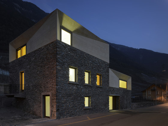
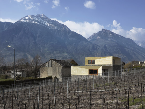
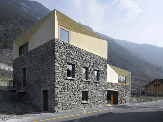
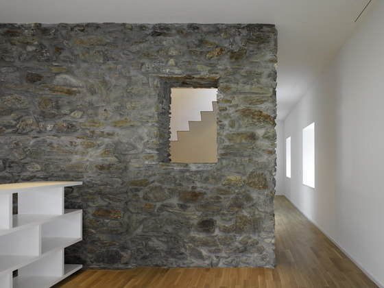
Situated away from a small village in the middle of the Swiss Alps (Canton of Valais), this 19th century house included an adjacent barn and had a too vast volume to be renewed in its totality. The existing building had no special qualities apart from the thick stone walls hidden by external plaster cement. The double-sided pitched roof was too low to allow us seeing the surrounding landscape from the garret floor. The existing windows were small; a large part of the volume was blind, half the building was being used as a barn. Consequently, we preferred to intervene directly on the existing building, walls and roof included.
We kept what was useful for the project, cellars, first floor and half of the second floor of the old house, demolished the remaining elements and rebuilt according to new rules that was made especially for the project. We wanted to create an ensemble that could communicate with its environment, vineyards, stone walls and the Alps. This way of intervening was as well a response to the client, not to transform the totality of the existing building, cost-wise. We were able to reduce the existing 320 square meters down to 230 square meters.
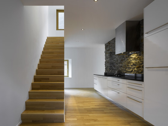
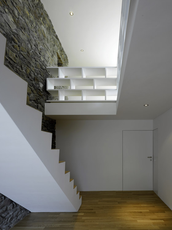
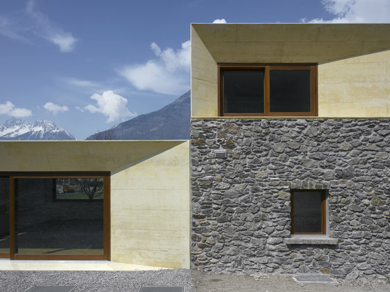
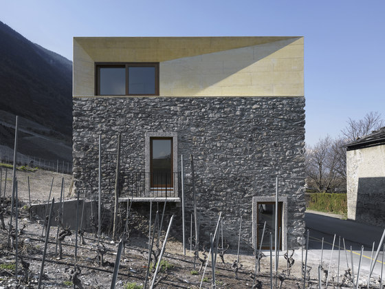
We wanted to create a strong contrast between the remaining part and the new structures. We chose to oppose clear geometric lines with existing rough old stone walls. Volumes of visible tinted concrete replaced the double-sided roof and the transformed area. We tried to create an ensemble, to establish a dialogue with the existing. That was the reason why we opted for a massive construction made in reinforced concrete, with a stone-like color. The oxides added in the concrete made the hue similar to a tuff, stone found in a very small quantity in the stone walls. Both of the new concrete volumes are sitting atop sixty centimetres width existing wall. By adding insulation and lining, you reach eighty centimetres tick! This thickness issue has motivated us to work on the wall depth and became as well a response to a formal desire. Thus, the idea of sloped walls were chosen to erase, at least visually, the thickness of wall; to be opened outwards while maintaining a solid appearance with the existing structure. The various-slopes faces enhance the highly varied game of the shadows throughout the day.
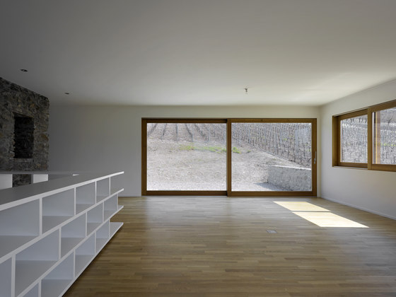
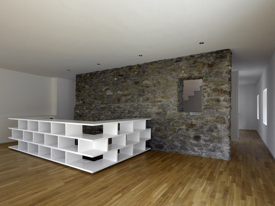
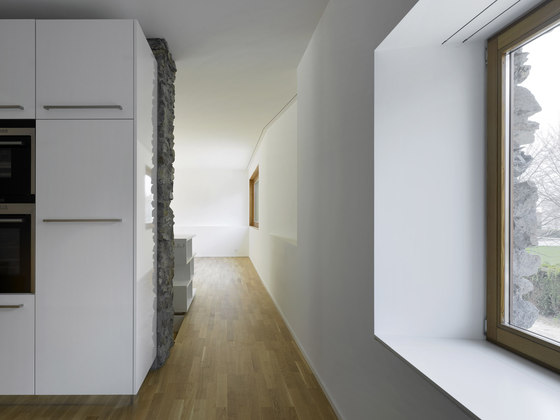
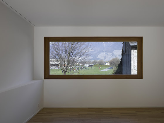
The openings in the existing part were small and vertical. We kept them to accentuate the contract with the newly created on top. We made large horizontal windows, thus becoming frames on the landscape. We chose to make a single front opening on each concrete facade. This desire of openness is also visible in plan. Interior walls are not touching the facades. This system allows us to experiment in each room a transversal views onto the landscape. There are no corridors. Circulation is made along the external wall, from room to room. The overall view continues beyond the windows, opening onto the surrounding landscape
Architect: clavienrossier architectes hes/sia
Design team: Valéry Clavien and Nicolas Rossier

Fotograf: © Roger Frei

Fotograf: © Roger Frei

Fotograf: © Roger Frei

Fotograf: © Roger Frei

Fotograf: © Roger Frei

Fotograf: © Roger Frei

Fotograf: © Roger Frei

Fotograf: © Roger Frei

Fotograf: © Roger Frei

Fotograf: © Roger Frei

Fotograf: © Roger Frei
