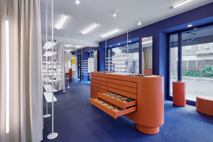
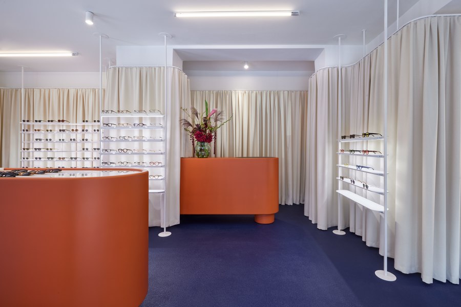
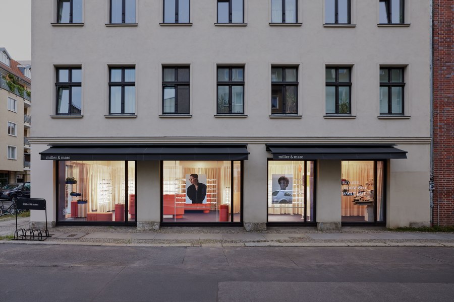
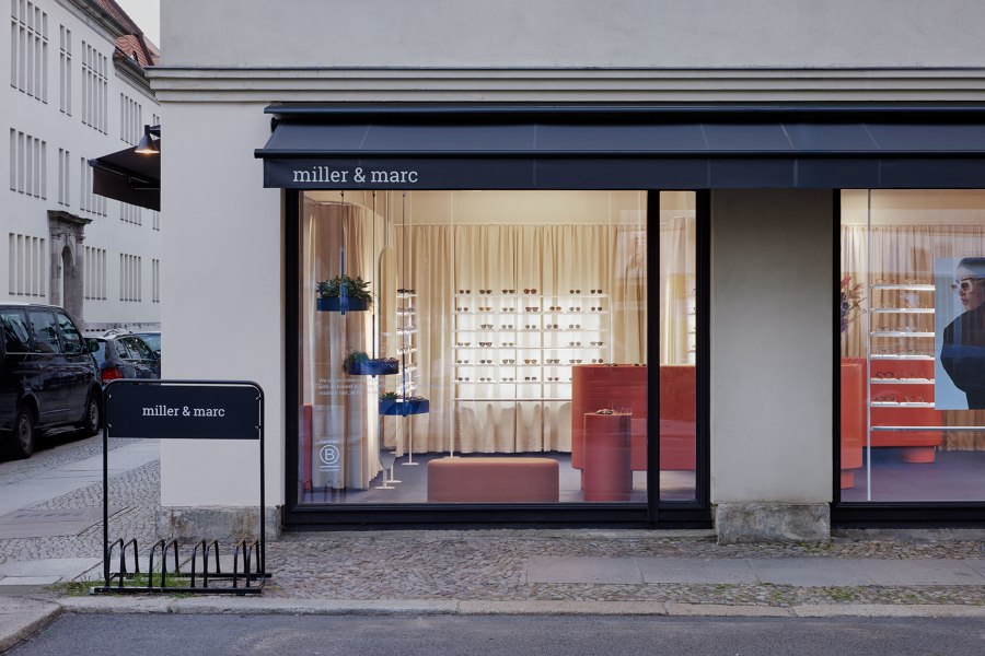
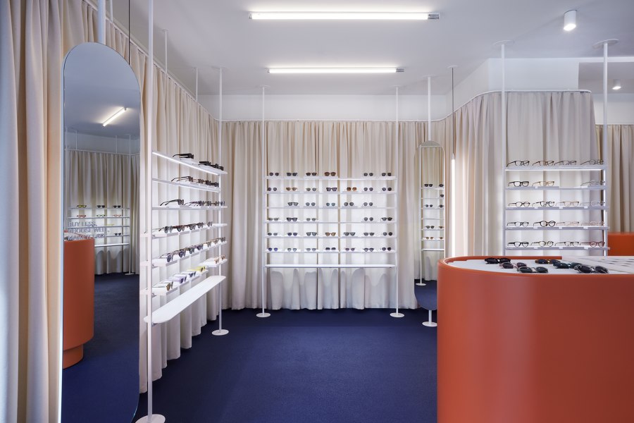
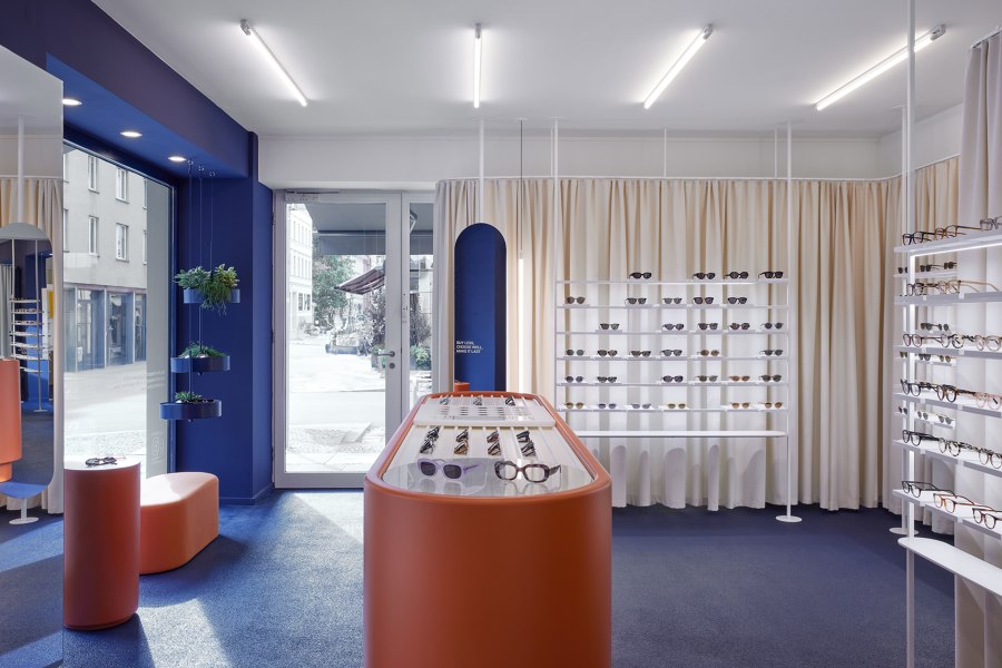
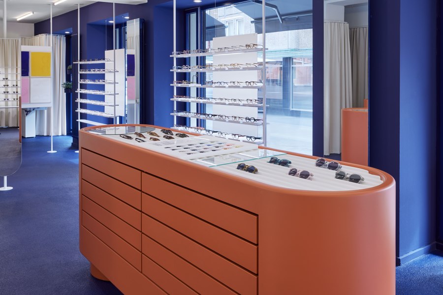
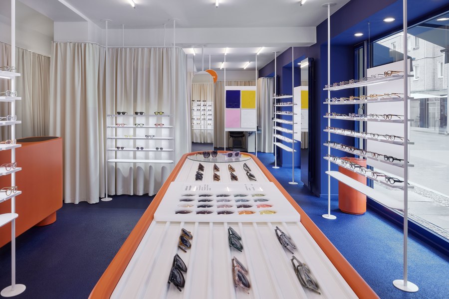
The Berlin-based studio COORDINATION has completed the first German flagship store for the Spanish eyewear brand MILLER & MARC in Berlin. On Auguststraße — a well renowned hotspot of Berlin Mitte — the office for interior design and architecture has created a distinctive retail design that invites visitors into a stimulating and authentic space celebrating the brand‘s Spanish roots and the cultural heritage of the city of Berlin. Inspired by the vibrant terracotta and blue hues of Spain as well as the contemporary brand image of MILLER & MARC while nodding to the Berlin Brutalism of the 1970s/80s, the design elegantly showcases the brand‘s range of contemporary eyewear in an accessible way.
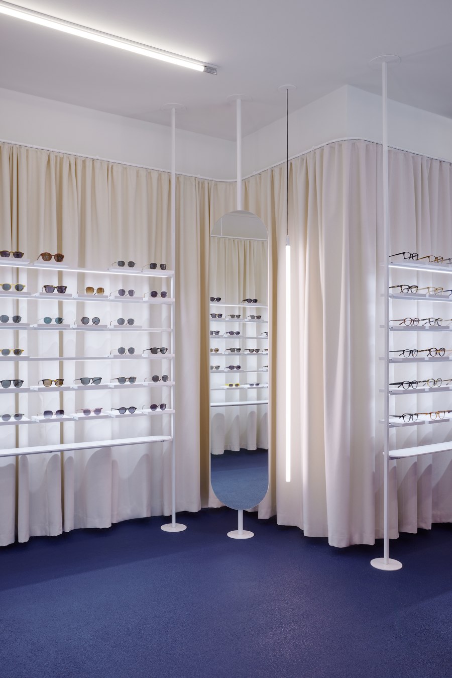
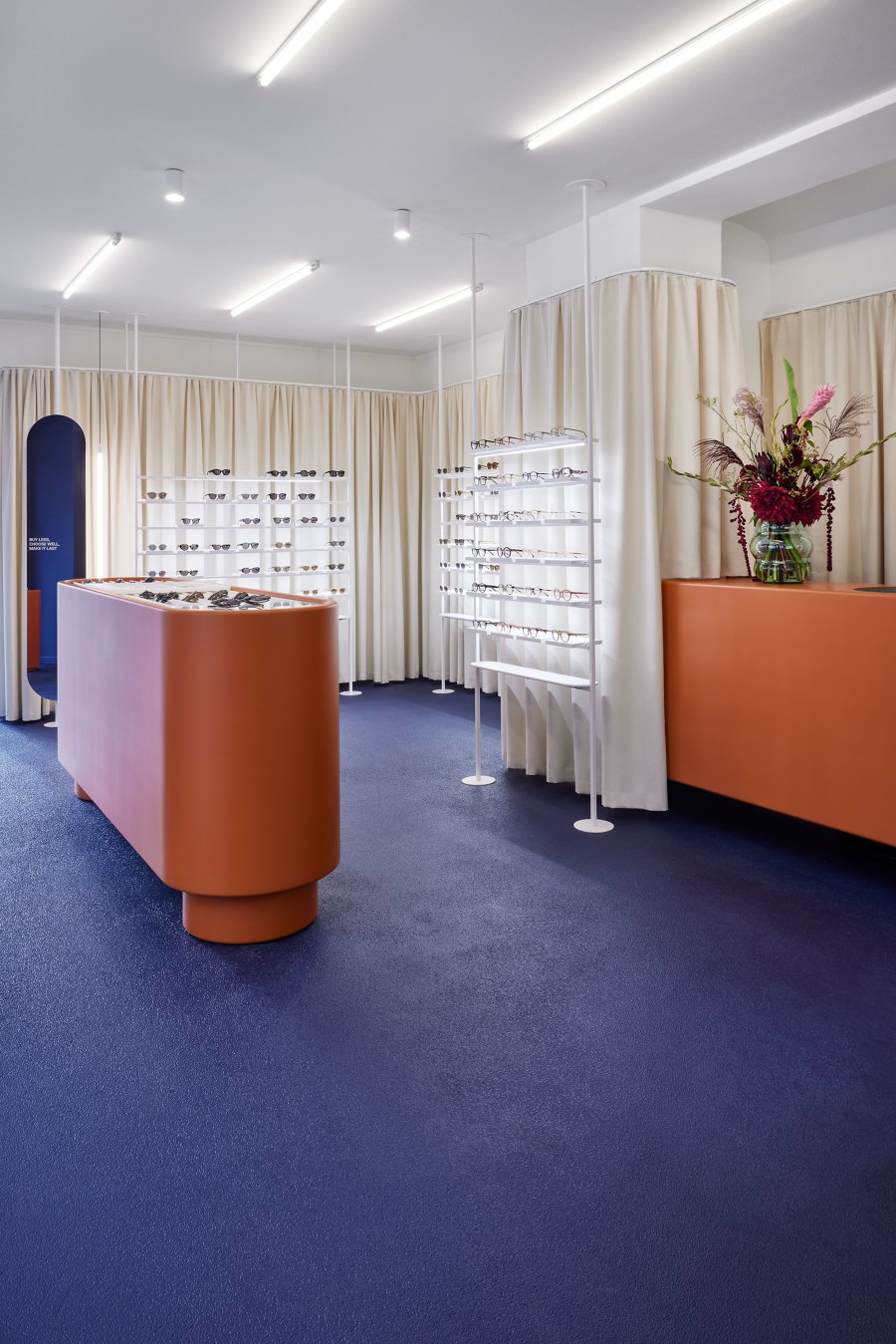
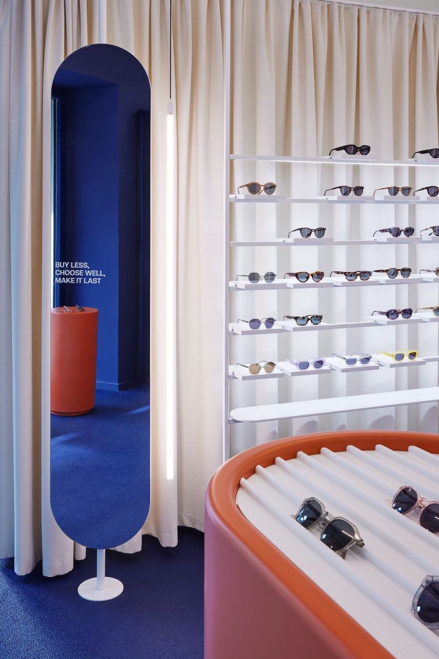
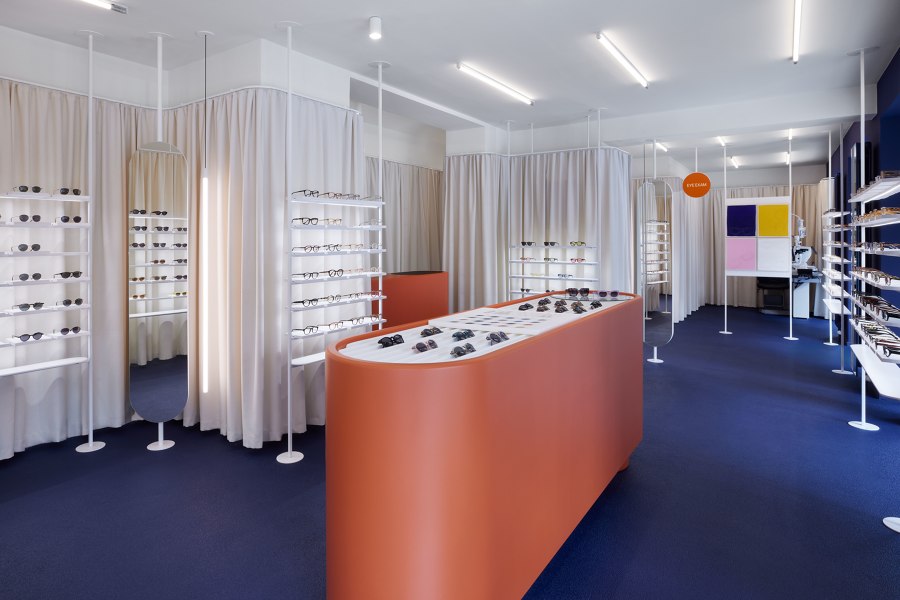
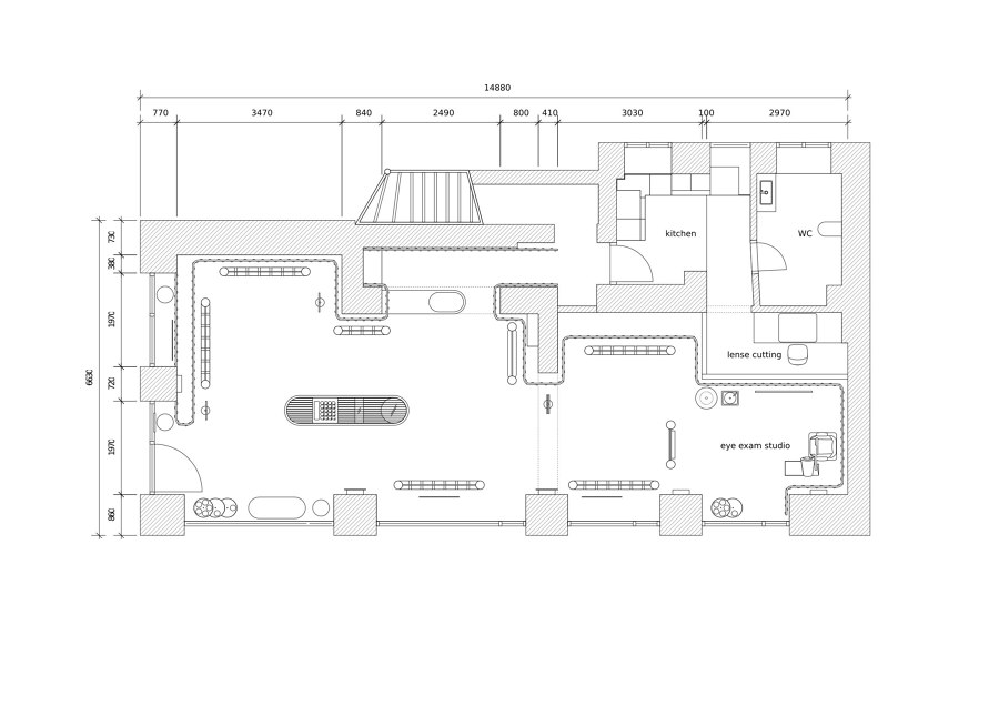
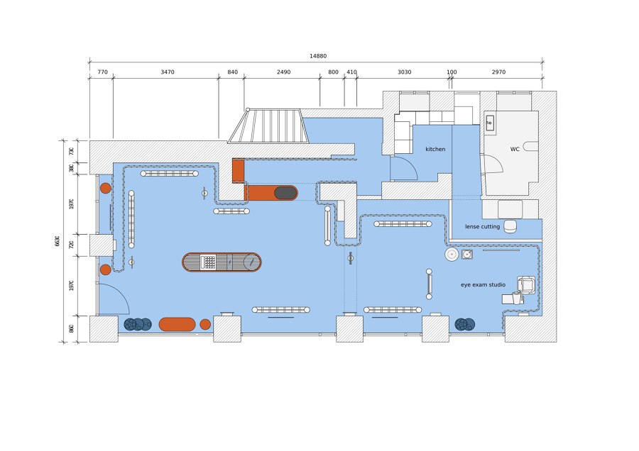
Reflecting the brand identity - Founded in Madrid in 2016, the Spanish eyewear brand MILLER & MARC designs contemporary and high-quality handcrafted eyewear. The brand‘s first flagship store in Germany covers 88m2 and is located on Auguststraße, in close vicinity to many art galleries, shops and restaurants. The large window fronts provide a first glimpse of the unique interior of the boutique from the outside: A vibrant colour range that sets warm terracotta shades against a deep cobalt blue attracts visitors to the open-plan retail space, creating an elegantly Mediterranean feel with a neo-brutalistic twist. The retail design thus refers to the Spanish brand‘s origins and illustrates COORDINATION‘s core competence — reflecting brand identity with creative sensitivity and expressive spatial concepts. The centrepiece of the interior design is the custom designed terracotta-coloured retail furniture, which has an almost sculptural appearance due to its oval shape. It serves to display the current MILLER & MARC collections and is centrally located in the open salesroom. Delicate, white shelves are set against a sand-coloured curtain band that wraps itself around the space, with carefully placed lighting elements. The clever zoning with free-standing furniture creates open lines of sight for visitors, who can be inspired by the brand‘s large variety of glasses and receive comprehensive consultation from the responsible optician on site — from eye tests to frame selection and lens cutting. A controlled mix of tactile and textile surfaces and the rich colour palette create a reduced and elegant spatial impression that centres its attention on both the products and the visitors. „The aim of our design was to create an atmospheric space that allows the Spanish origin of the MILLER & MARC brand to enter into an exciting dialogue with Berlin while using as few means and interventions as possible“, explains Flip Sellin, project manager and creative director of COORDINATION.
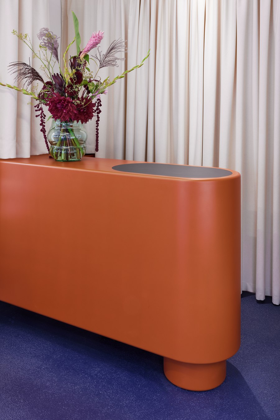
Bespoke furniture designs - For this boutique COORDINATION has designed custom-made retail furniture, which was produced locally in Berlin. Objects such as the central horizontal display and the cash desk, which stand out with their terracotta-red lacquer finish and comic-like maximalist shape, guarantee a luxurious retail experience thanks to their smart functionality. Other designs, such as the cobalt blue plant hangers, seating furniture and strategically positioned full-height mirrors create a coherent spatial experience. In addition to local production, COORDINATION also focusses on reusing materials. The vertical displays, which originate from a former store in Spain, were lacquered in bright white and repositioned in front of the sand-coloured curtain. This sustainable design approach also reflects the corporate philosophy of MILLER & MARC, which has been focussing on recycled materials, shortened supply chains and durable products since its foundation. With their distinct understanding of user-centred architectural concepts and their expertise in colour and material combinations, COORDINATION has developed a retail design that reflects the core of the brand in an unmistakable way. The studio has conceptually succeeded in introducing MILLER & MARC to Berlin and providing customers with a visually appealing retail experience that focuses on the clear presentation of the product range.
Design Team:
COORDINATION
