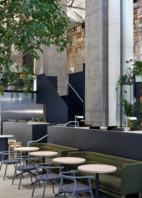
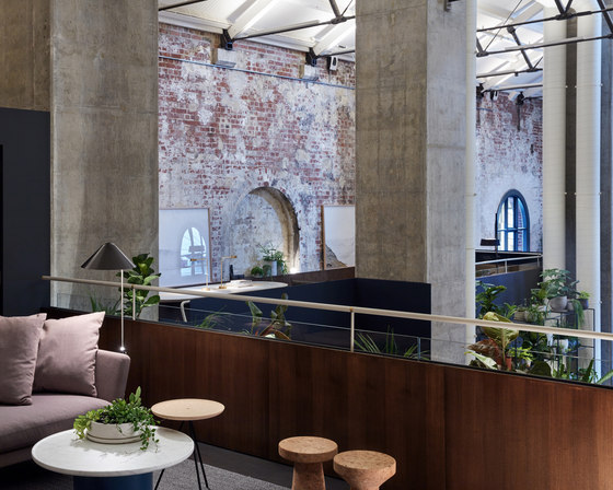
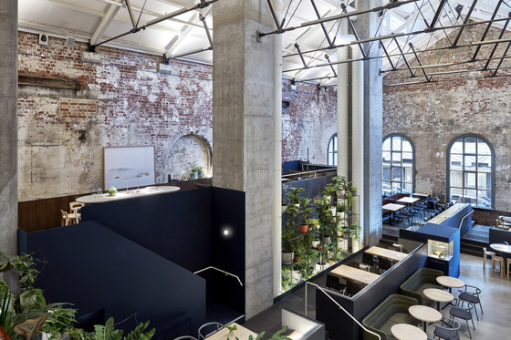
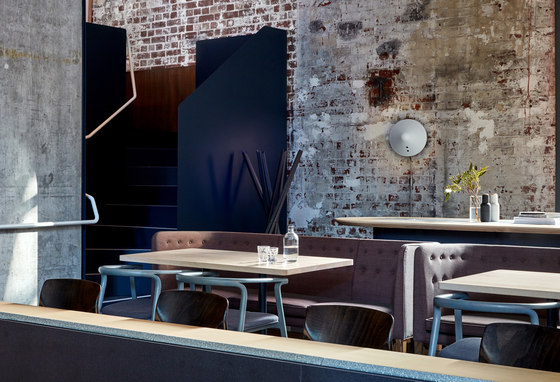
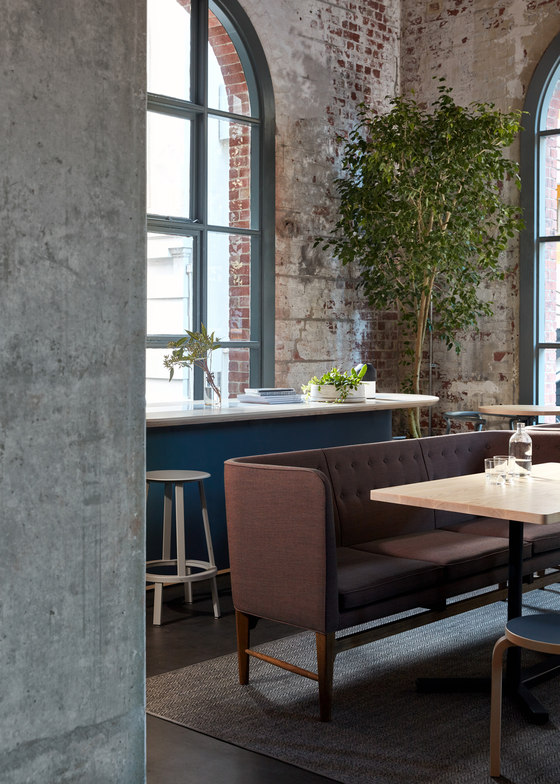
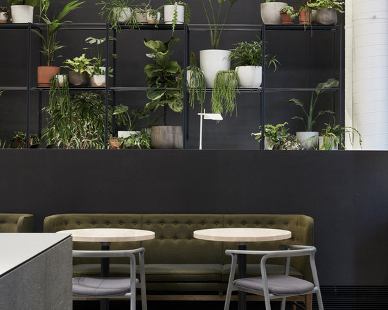
Higher Ground is an all-day dining destination on the western edge of Melbourne’s CBD. The empty brick shell of the former power station was inhabited to create six new connected levels which wrap around the perimeter to form a suite of intimate tiered platforms.
Describe the design project
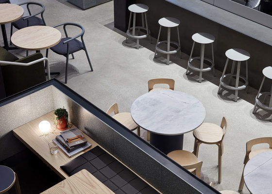
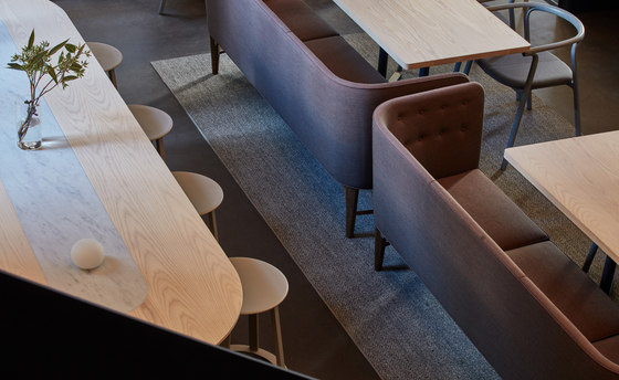
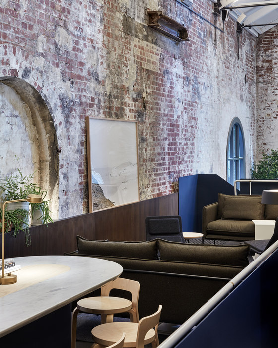
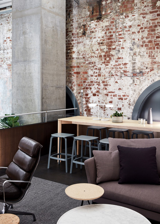
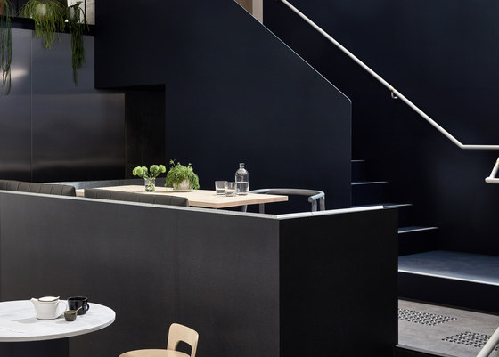
DesignOffice were commissioned by Nathan Toleman and the team behind Top Paddock and The Kettle Black to create a new all day destination for food and drink near to Melbourne’s Southern Cross Station. The existing site had no base building services and called for a complex and considered integrated fit-out to provide a kitchen, toilets and meet the mechanical and hydraulic needs in a way which was sympathetic to the environment and allowed the spatial qualities of the volume to be enjoyed from every seat. The rich and tactile palette combines terrazzo, cork, painted steel, stone, black fibre board and solid timbers to define and anchor each setting. Layers of planting, rugs, furniture and lighting inhabit the levels to provide a range of seating options for customers from morning through to the evening.
Describe the way the space responds to the hospitality or retail offering
The client’s brief called for a design response which would retain the volumetric impact of the existing site but allow for a wide range of different intimate settings for eating and drinking, continuously, from early morning to late night. To facilitate this seamless transition, and inspired by the client’s analogy of a hotel lobby, the design of the individual levels, the lighting and each of the furniture settings is considered from the specific viewpoint of the customer, with the aim being to provide both intimacy and layered perspective within the extensive volume of the site. Each level is considered in response to the client’s ideal service zone size, with the platforms working both separately and collectively, animated by the continual vertical movement of both staff and patrons. The visibility of the kitchen and simplicity of the central stone bar provide familiar anchors around which the various settings and levels cascade.
Explain why the project is an example of innovative and excellent design practice
The design approach was anchored around the creation of a series of tiered platforms positioned and related in order to create a dynamic environment, providing intimacy and fostering intuitive and convivial vertical adjacencies. In order to determine these levels, a series of temporary platforms were created in the empty site at the outset and the relationships between the levels tested accordingly. The resultant platforms and their physical connections are designed to provide a sense of theatrical animation from day to night. Architecturally, the design response has a deliberate confidence and weight, aiming to create a venue which feels anchored and permanent within the original brick shell. The selection of materials and furniture consciously takes cues from residential settings to foster the aim of establishing a tactile, intimate and convivial suite of spaces.
Client testimonial
When we stumbled across this amazing site more than 2 years ago, we knew that transforming the space from a cold, stark, decaying shell into a warm, intimate and life filled cafe was going to be tough. We needed an architect to understand our needs and also be able to honour the integrity of the building. To embrace the history, but take the building into the future. DesignOffice was chosen and have in our opinion, exceeded on all fronts.
Our brief was pretty big and actually changed along the way. In the beginning, it was intended to be a regular cafe, maximising seats and tables. After our trip to London, inspired by Soho House and the Ace Hotel, a more ‘hotel’ style cafe with lounges and workspaces was the brief. We wanted to create a new style of cafe the likes of which Melbourne had ever seen. Not a cafe, not a restaurant. To create a hotel with no rooms. A space that can transition from morning to night (coffee to martini, porridge to dessert).
The creation of a layered environment of animation and intimacy. We wanted our guests to return day after day and discover new and exciting elements every time. To feel transported to another world the minute they walked through our doors and never want to leave! The making of spaces for patrons to use in the way they want to. Maybe a dinner for 12. Someone sitting and working on a laptop on the sofa. A place where you can feel comfortable on your own, or with a group of friends. Come for breakfast, stay for dinner. The design allows customers to feel at ease and occupy the space in the way they feel most comfortable.
Nathan Toleman (Owner/Operator)
Higher Ground
Designoffice
Basis Builders / Profile Furniture / BREC / JB Elliot


