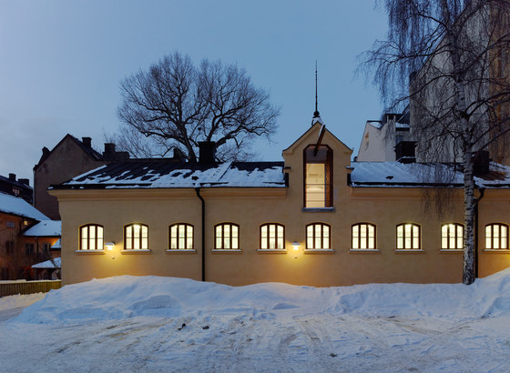
Fotograf: Åke E:son Lindman

Fotograf: Åke E:son Lindman

Fotograf: Åke E:son Lindman
No Picnic is one of the world’s largest design consultants, covering industrial design, product design, and packaging design; as well as art direction, consumer insight, and architecture. We could hardly imagine a better oriented client, and expected nothing less than an ambitious, demanding, and fun project. They wanted large, open office spaces, a prototype workshop, a prototype showroom, several project rooms, and a striking customer area, distinctly separated from the other spaces in order to maintain secrecy.
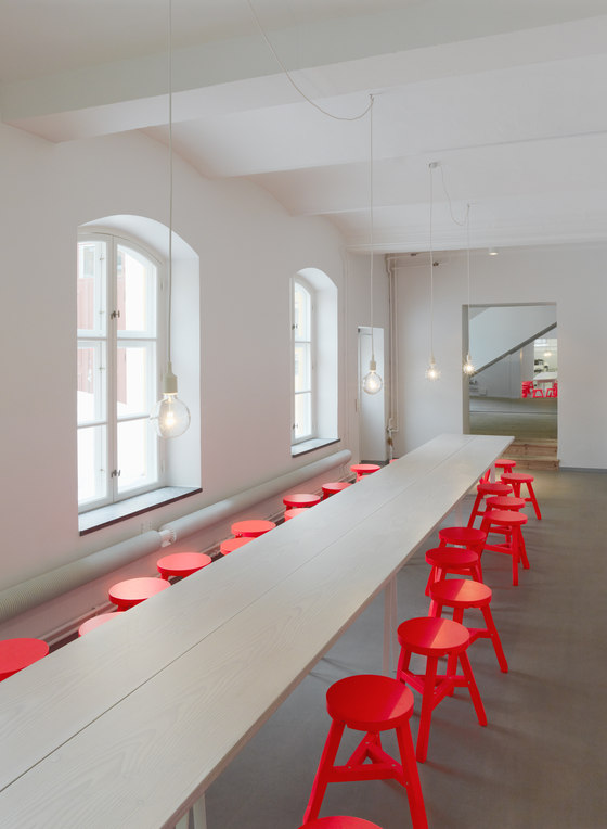
For this, the client had found a group of 19th Century buildings in central Stockholm, mainly consisting of two volumes, one originally an exercise hall for troops, and the other once a stable for police horses. They had been converted into showrooms in the 1980’s, and were in a sad state. These buildings currently enjoy the highest level of historical protection. Conversion had to be sensitive, and we have evaluated every step with an antiquarian, literally down to each new screw hole.
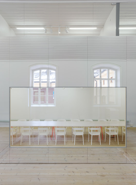
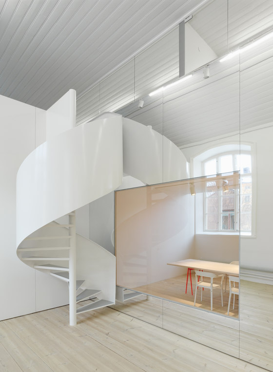
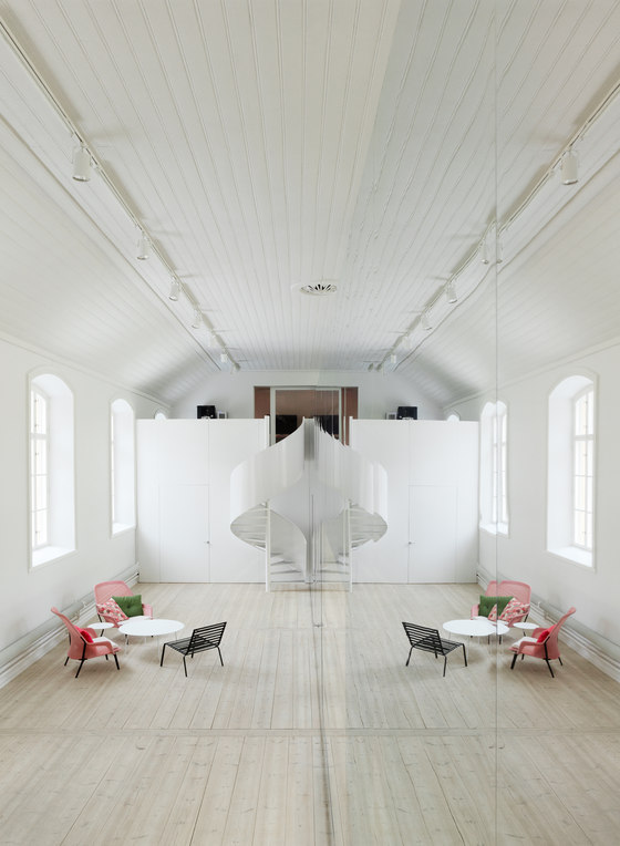
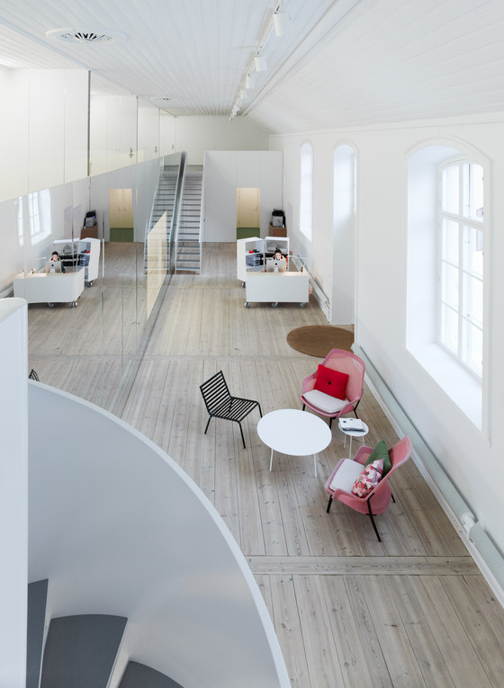
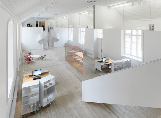
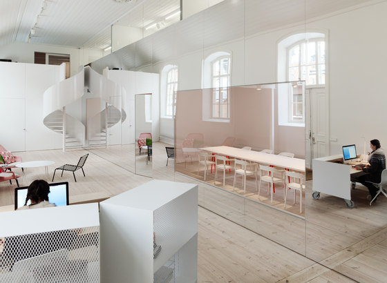
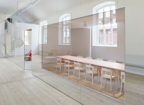
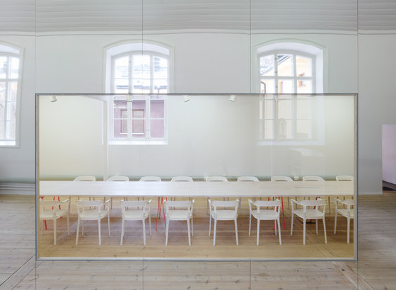
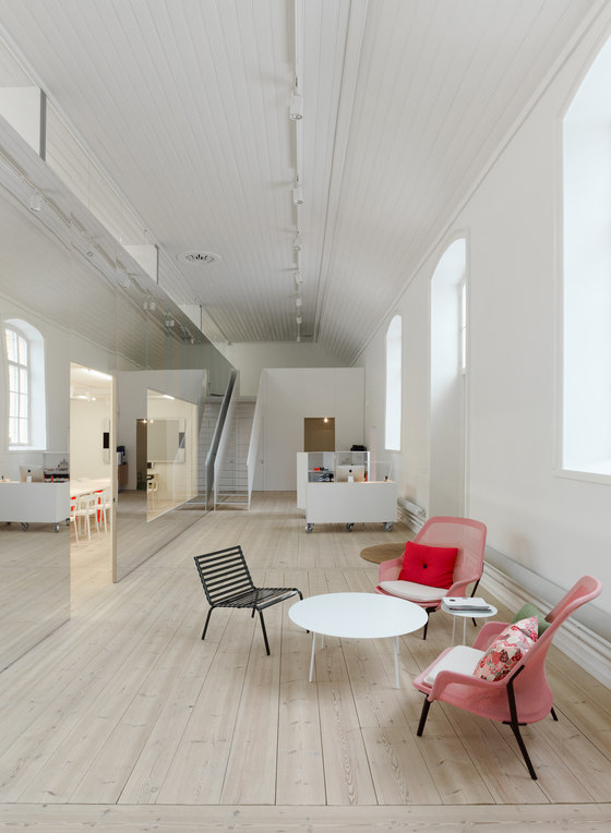
We wanted to get rid of all added layers down to the origin. In the old stable we were able to peel the room naked, and just add a custom designed acoustical treatment along the walls, but in the exercise hall, economy and function demanded that a mezzanine constructed there in the 1980’s, was kept. The mezzanine cut the hall lengthwise, and crippled the experience of the space in an unfortunate way. Its edge coincided with the center of the hall, so we opted for the industrial designer’s own method – the way arbitrary but symmetric shapes can be sculpted as half models onto a mirror, we could restore the impression of the entire exercise hall by constructing a delicate aluminum wall along its central axis.
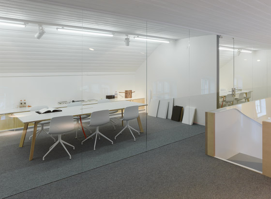
The meeting rooms inside this metal membrane, has large window panes towards the hall. The flat reflection of the glass appearing flush with the distorting metal surface, makes the glass seem like a mirror while the metal appears transparent; the wall is there, yet it disappears. It is bold, kaleidoscopic and delusive with its trompe l’oeil effects. At the same time it takes a step back for the main act: the light and space of the exercise hall, and the old building’s straightforward display of material, construction, imperfections, and time that has passed.
Client: No Picnic AB
Architect: Elding Oscarson
”Concrete floor”: Weber
Lighting fixtures, spots lights: LTS, Annell
Lighting fixtures, fluorescent lightning: Flux
Lighting, desk lamps: Flos
Glass walls: Eriksbergs Glasmästeri
Hardware: FSB, Box Beslag
Carpenter, wood workshop: Grötlingbo Möbelfabrik, Torgny Hederstedt
Steel stairs: Sigtuna smide (blacksmith)
Steel work: Gotlands svets & smide (blacksmith)
Acoustic ceiling: Gyproc Rigitone
Plywood for mirror wall: Spångbergs
Aluminium panels for mirror wall: Alu-S
Wooden planks for meeting / dining tables: Dinesen, DK
Furniture:
Vitra (lobby easy chairs)
Magis (lobby easy chairs, chairs meeting room)
HAY (chairs meeting room, sofas, work stations drawer units)
Tom Dixon (stools)
Furniture design by Elding Oscarson:
Sofa tables, white steel
Meeting tables, Douglas fir, steel trestles
Meeting tables, Birch plywood, laminate
Furniture design by No Picnic:
Work stations

Fotograf: Åke E:son Lindman

Fotograf: Åke E:son Lindman

Fotograf: Åke E:son Lindman

Fotograf: Åke E:son Lindman

Fotograf: Åke E:son Lindman

Fotograf: Åke E:son Lindman

Fotograf: Åke E:son Lindman

Fotograf: Åke E:son Lindman

Fotograf: Åke E:son Lindman

Fotograf: Åke E:son Lindman
