FRCH Designs Residential Boutiques in a New Modern Department Store Footprint
CINCINNATI, OH (November 27, 2017): Saks Fifth Avenue’s new shopping experience located in the picturesque village of Greenwich, CT, reinvigorates the luxury retailer’s commitment to engaging new audiences. Only a 40-minute train ride from NYC, this quaint and historical town is home to high-end retailers and upscale restaurants, allowing urbanites a refuge from the bustling city. This small town feel allows for a more personalized, elevated experience and creates the perfect backdrop for Saks’ newest boutique format.
The expressive new design and architectural renovation is the result of a collaboration between international retail design firm FRCH Design Worldwide and Hudson Bay Company’s global store design team.
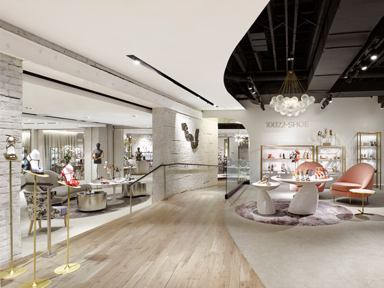
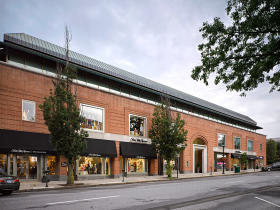
The new Greenwich location is comprised of three specialty freestanding stores including 10022 SHOE, the first women’s specialty shoe store in Saks’ history encompassing 14,000-square-feet; The Collective featuring women’s contemporary fashion spanning two floors over 14,000-square-feet; and The Vault, Saks’ first dedicated specialty jewelry store offering curated mutli-brand shop-in-shop experiences within an elegant setting spanning 6,000-square-feet.
“We looked at transforming Saks’ brand language into a localized approach that could be not only an elegant and immersive shopping experience, but a place that was comfortable, serving as an everyday social gathering place,” commented Heesun Kim, Vice President and Creative Director at FRCH. “Greenwich’s downtown is replete with historic architecture that serves as a beautiful canvas to bring a balanced design aesthetic between the voice of Saks’ brand and the local atmosphere.”
The team was inspired by the opportunity to transform the traditional department store into elevated specialty stores with a residential feel. All three stores fit into the local lifestyle by providing a neighborhood destination for shopping moments spent with friends and family.
10022 Shoe: Blurring the Line Between Art & Fashion
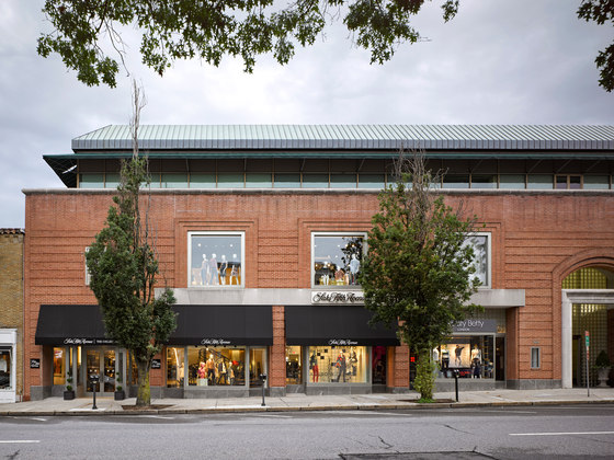
Shoppers are ushered under a new 24-foot deep and 15-foot wide glass canopy with minimalistic signage on the streetscape into a hidden gate of the existing mid-century brick building.
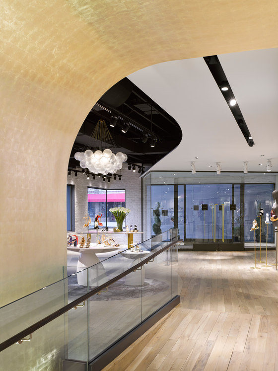
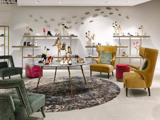
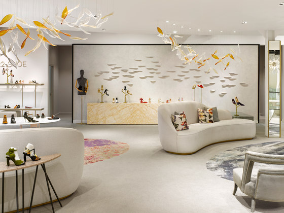
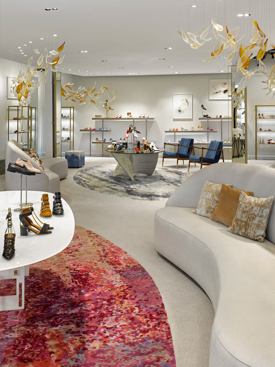
Saks’ new shoe environment reinvents the traditional department store by encouraging guests to socialize and gather with ample lounge seating that blurs the line between retail and residential. Paying homage to the existing architecture, brick walls and ceiling pipes were left exposed to animate the rustic side within a marriage of design aesthetics – between old and new, and rustic and polished. White washed brick and traditional honey oak flooring transform the existing architecture into a feminine environment that is soft and welcoming.
Custom artwork assists in blurring the line between art and fashion, while the overarching design aesthetic keeps the brand rooted within its local flavor and equity of Saks’ brand that promotes a casual atmosphere through natural light, delightful pallets, and organic expression.
10022 Shoe celebrates the four seasons with sculptural elements, and strategic color choices to evoke the feelings of home. Seasonal locality is seen throughout the store with a hint of the iconic local color of spring, the cherry blossom, expressed in the area rugs and lounge; an ice blue hue inspired by the color of the winter ocean seen in the furniture fabric in the lounge; the care-free nature of summer expressed through a wall mounted sculpture and three-dimensional objects featuring hand brushed plaster finishes; and finally, and ode to fall, with carefully arranged bubble glass sculpture with amber to represent the fall from brown golden leaves.
The Collective: ‘The Collector’s House’
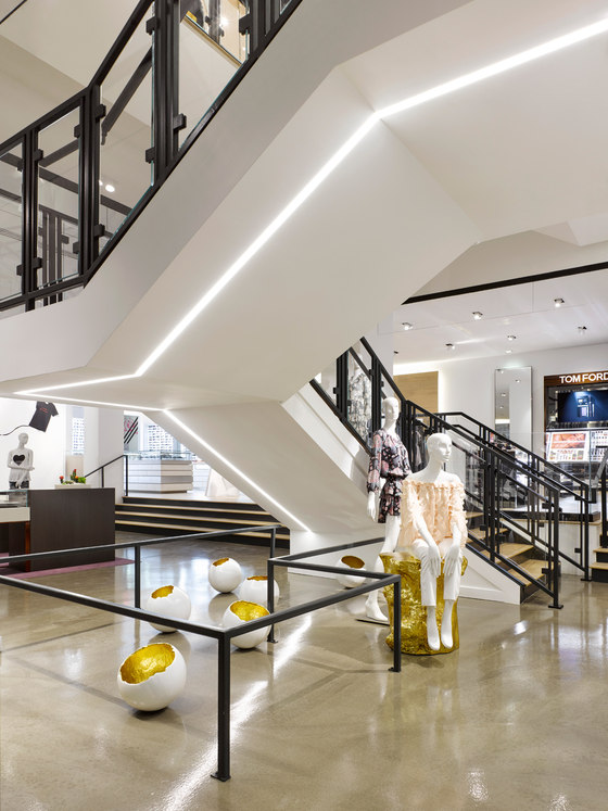
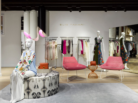
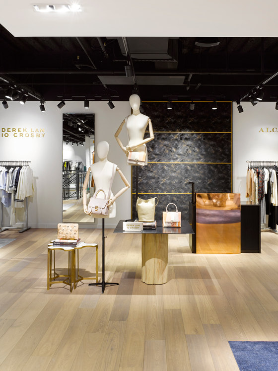
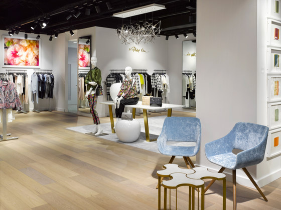
The Collective is a ‘total lifestyle shop’ within one complete look featuring 53 designer brands, jewelry, handbags, and a Tom Ford makeup bar celebrated alongside multiple boutique tenants within the historical mid-century red brick building. Shoppers are transported to a localized world where architectural details are transformed within a contemporary framework featuring rustic attitude with open ceilings and heavily brushed stained concrete floors. The design inspiration came from the idea of ‘The Collector’s House’: where beauty and elegance come together to blur the border between design, art, fashion, and lifestyle.
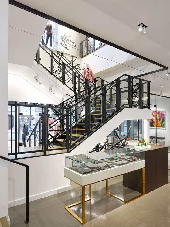
Grand architectural gestures are seen throughout the store with large-scale ceiling sculptures, underlit detailing imbedded within the staircase from the first to second floors, and artistically staged spaces with curated objects, transforming the ordinary look of the existing structure into an iconic element as backdrop for visual display. At the center of the store, a new elevator was implemented helping to maximize traffic and highlight a new center core experience wrapped with polished copper.
A comfortable open style living room environment is coupled with multiple layers of delightful energy met with contemporary finishes with unexpected, yet sophisticated pops of color seen throughout with built-in area rugs and furniture. Moments of relaxation and pause are created through visual moments and lounging opportunity between merchandising space, while metal tones including copper, bronze, and blackened metal were activated to create a fresh, energetic environment with style.
The Vault: Organic Purest
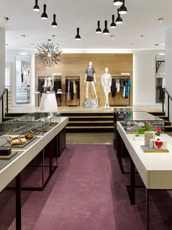
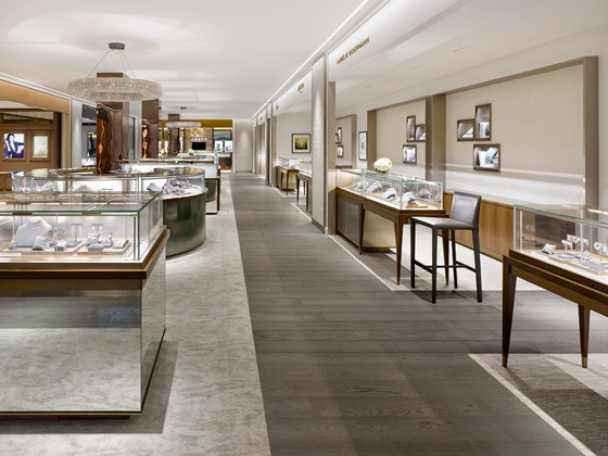
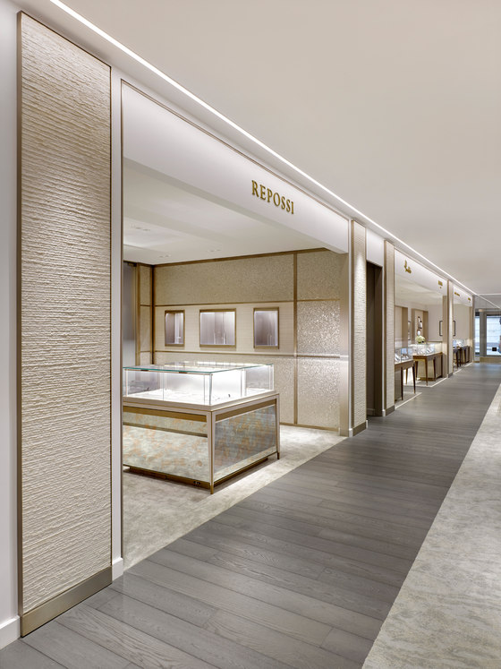
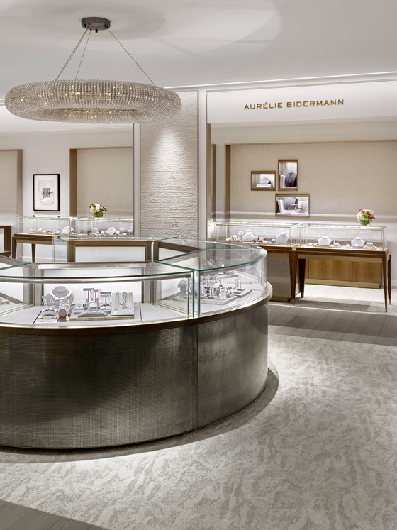
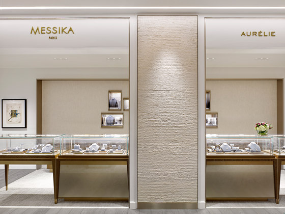
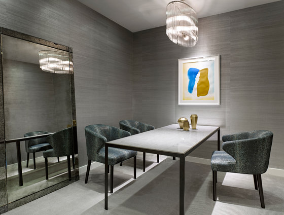
Created as a boutique, The Vault offers high-end jewelry for multiple brands within shop-in-shop environments as well as a traditional sales floor. The space highlights the balance between warm and cool tones with champagne metals and rich wood paired with crisp white monochromatic architectural elements and neutral carpet tones. The design team created the store as an everyday destination for the local Greenwich customer with elegant details avoiding an over designed heavy look and feel usually exhibited in competing jewelry brands store experiences. As a result, the store reflects the balance between minimalism and maximalism, where expression acts as ‘organic purest’.
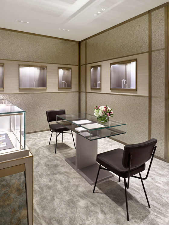
Classic crystal chandeliers highlight focal points within the room, drawing attention to central shopping moments. Created within a narrow building footprint, a wood floor perimeter guides shoppers through the store past mirrored surfaces to create a natural illusion with sparkle and reflectivity. Materials span a tightly composed patina featuring antique mirrors with modern accents, and handmade dimensional wall coverings by Maya Romanoff with dull-brushed champagne metal generating expressive moments within a humanistic context, and textural wall panels creating a focal moment between specialty boutiques.
Multiple layers of private consultation are served within various boutiques, while two private viewing rooms serve the main sales floor for guests who prefer to experience the specialty jewelry in private, which is established for custom design needs, repair, and cleaning.
FRCH Design Worldwide
