History
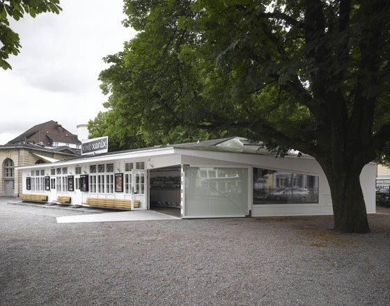
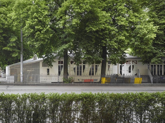
In 1904, the School Department of Zürich erected several temporary wooden pavilions in order to respond to the rising demand for classrooms.
In 1984, one of these “temporary” - and partially abandoned - structures was conquered by a young group of film enthusiasts who had the idea to setup an alternative cinema.
The concept of “Kino Xenix” was as simple as it was successful: A unique film selection ( every month a new program containing up to 30 different movies with a conceptual relation ) plus a bar that generated the necessary turnover to finance the cinema.
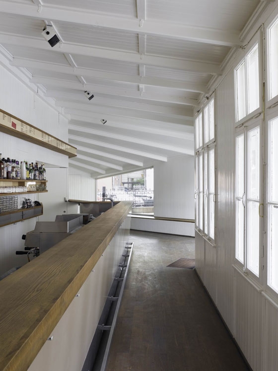
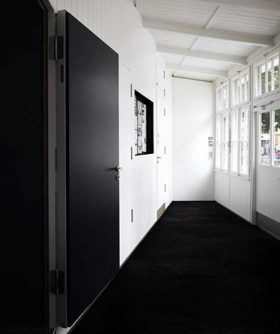
The former schoolrooms were converted into an auditorium; the three meter wide corridor into a bar.
Later, Xenix became a company. In order to run the bar on a professional level, additional sheds for storage and cooling beverages were added to the building.
Since none of the structures conformed to building laws, a final solution had to be found.
The crew did not want to leave the prime location in the centre of Zurich, so the 100-year-old wooden building was expanded according to the law, incorporating all necessary additional spaces, such as a cooling room, restrooms, a small kitchen, and storage space. Since the bar was frequently overcrowded, it too was expanded.
In developing ideas on expansion, it became clear that the opportunity should be taken to rethink and redesign the entire interior space. With this realization, the list of desires grew: more seats for spectators, a better view of the screen, a larger lobby for the cinema, a canopy above the entrance, a new air-conditioning system, full access for the disabled, a better sound system, etc.
Genesis of Form
The volume of the extension had to fulfil a number of restrictions.
Only one direction to expand was accepted by all included parties (monument conservators, garden-monument conservators, the owner, and the Xenix-crew).
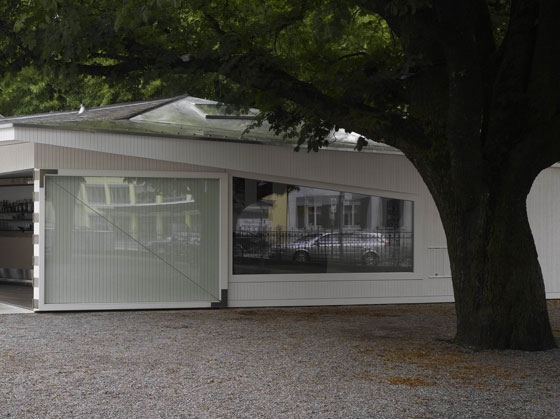
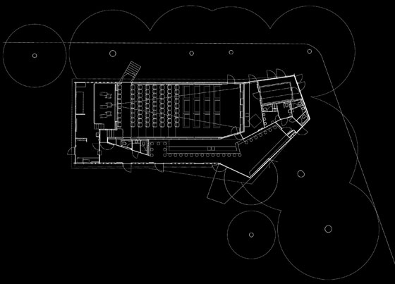
A simple linear addition would not have allowed for preservation of the impressive chestnut tree. Gardeners defined a minimum distance to be kept away from the tree.
Since the only logical geometric form for the extension looked quite different from the existing one, the question became how to make an architectonic statement: Should the new addition accentuate differences or not?
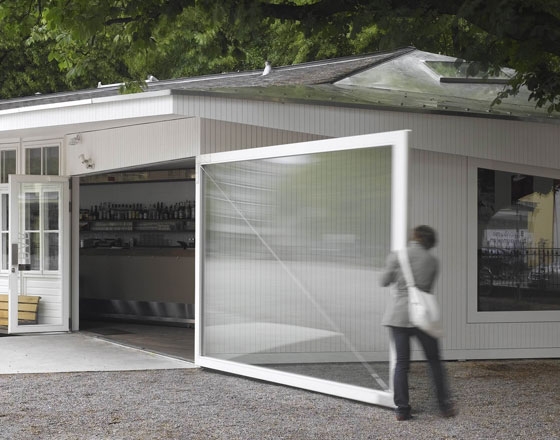
The driving idea behind the final scheme was to harness all possible formal freedoms in order to maximize new spatial qualities, such as a wide entrance covered by a triangular roof and a rich variety of different spatial conditions resulting from the various heights and widths inside.
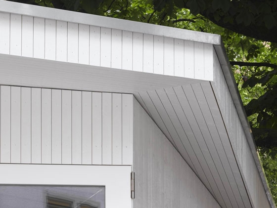
The small scale of the building made it difficult to achieve a convincing architectonic result by simply adding or contrasting old to new. It was more promising to take the opposite approach - every opportunity was taken to unify by blurring, copying, and stretching borders, materials, and structural elements.
Reorganization
The entire programmatic disposition has been changed in order to achieve a more efficient, more flexible, and more user-friendly building.
The new Xenix consists of three programmatic parts that can each be used independently: Cinema, bar, and restrooms.
Bar
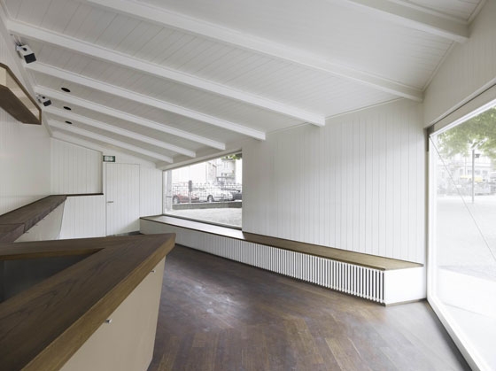
One half of the space dates from 1904, the other from 2007.
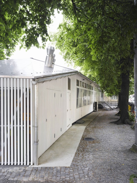
Although the geometry and size of elements such as windows are different, the bar is conceived of as one unified space. Major elements that aid in achieving this effect are the continuous ceiling, including replicas of the old beams, as well as the mimetic materialization of the extension.
Blurring, copying, and stretching were design strategies, rather than adding to or contrasting.
The most delicate questions in terms of the design were:
What is worth keeping, and what has to be replaced?
What should relate to what is there and what is not?
When is a mimetic approach interesting and when does it lead to kitsch?
Method
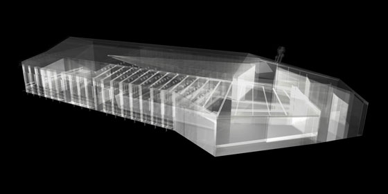
The use of a detailed 3D-model made it possible to design complex joints and to treat traditional elements in a new way: Although the beams of the extension look like exact replicas of the old ones, all cross sections vary due to their specific angle in relation to the sloping roof.
The continuity of elements - bar surface becomes wall in order to match the beam - demanded to design and to work with high precision. The combination of a computer based method of operation with a traditional carpenter turned out to be successful.
Geometrical data was derived from the virtual model and then submitted to the carpenter who manufactured the whole puzzle of elements in a traditional way. The built result deviates less than 10mm from the 3D-model.
Cinema
The cinema, including lobby and projection room, is totally redone.
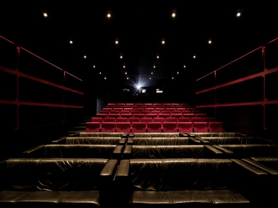
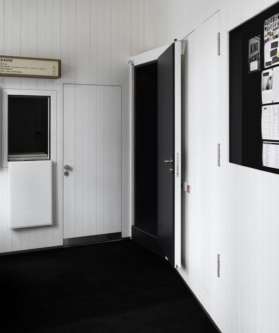
The spectators enter the new lobby (twice as big as before) and access the auditorium in a longitudinal direction after taking a small staircase. The height difference between the new tiers is doubled.
All existing sofas - a special feature of the auditorium - are re-used, except one now rolls in order to make room for wheelchairs. Disabled people enter the cinema via the bar.
All technical services are new, a necessity that caused a mentionable part of the costs.
Roof
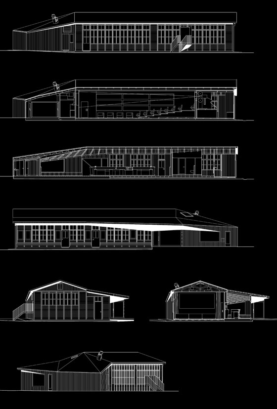
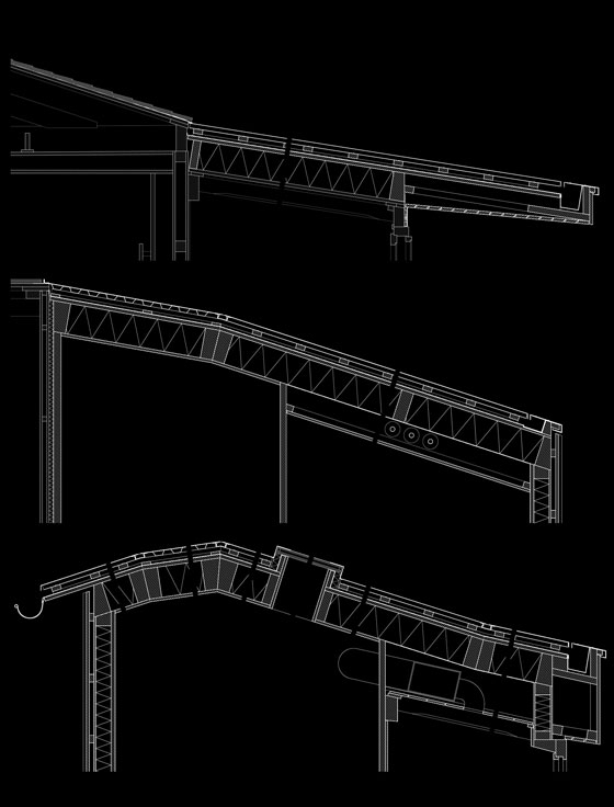
The roof of the extension is stretched over the ancient school-corridor, so it covers bar, lobby, and part of the projection room as well.
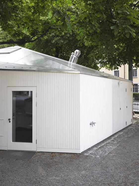
Extra-large riveted aluminum sheets accentuate the sculptural quality of the roofscape. Chimneys are concentrated at one spot; gutters are integrated in order to achieve sharp abstract expression.
Timber
It seemed logical that an extension of a wooden pavilion should be done in timber as well in order to match to the atmospheric qualities of what was already there.
Besides that, a timber construction turned out to offer a lot of advantages:
Since the maximum footprint of the extension was not negotiable, there was the question of how to minimize the area that is “lost” for bearing structures. The answer is 42mm thick bearing walls that are rigid enough and at the same time very light. Thereby a crane could be avoided and the construction period could be shortened. Another quality of timber is the precision that is only comparable with steel constructions. The maximum deviation from the plans is 10mm.
Process (Interview with Martin Saarinen)
The development of the project required taking numerous restrictions into account.
Martin Saarinen: The main thing was to treat the old fragile building with a lot of care. And it was forbidden to expand the existing footprint by more than 30 percent. The constriction of every new room made us optimize the floor scheme for days and days.
The final project does not correspond to the original scheme in every point.
Although the client chose our project, it was important to take another step in terms of the design, together with all included parties, that should mainly lead to operational improvements for the user. Fortunately, the idea of joining old and new by the roof and the bar was so convincing that it was never questioned while nearly the whole interior disposition was rearranged. This conceptual premise facilitated dealing with all influencing factors. The result of that process is a building that corresponds to the demands of the operators. From our point of view, the redevelopment of the design was successful as well.
Could you clarify that?
The project became more user-friendly and was improved even on an architectural level. It‘s a good example that shows that involvement of many people and institutions doesn‘t have to lead to a weaker design. At certain points of the design, it‘s even a positive thing when you - as an architect - are confronted with many people that you have to convince. It leads you to solutions you won‘t find without any friction.
And by that, excel yourself?
Yes. Of course, one has take care that this “collective” design approach does not lead to a compromise, an adulation of main ideas. As I mentioned before, the conceptual framework was never questioned. This gave us the freedom to play within that framework. The cinema-lobby, for example, did not exist in our original design: We proposed to enter the cinema through the bar, as it is the case in some other cinemas. Now it‘s twice as big as it was before it‘s conversion. We simply had to accept that this lobby is very important.
Why?
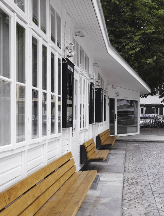
The operator wanted to separate the cinema from the bar, because they attract different types of visitors that might not be compatible in every case. Additionally, a clear separation allows one to rent the cinema for special events, even when the bar is closed. That‘s why we implemented new restrooms accessible from the lobby. An architectonic surplus of the new bigger lobby is a longer public facade towards the park.
What were primary questions in terms of the architectonic expression?
The main question was how to extend a 100-year-old building with the ambition to make one entity. Since the existing shed consists of prefabricated wooden elements, it‘s obvious that you could reproduce and just add more of them. After a couple of years nobody would notice what‘s old and what‘s new. But there is that protected chestnut tree that did not allow a simple prolongation. So we had to add a twisted structure that keeps a minimum distance from the tree. A classic approach would be to define a clear border between old and new. This rather simple way of dealing with the problem offers a lot of possibilities, because a lot of materials and shapes are suited to make a contrast. We were not interested in that approach, at all. Although it‘s clear what existed before and what‘s new, we designed the building as one whole.
Why was that so important for you?
The old barrack appeared so small since the area is surrounded by four- and five-story high buildings. So it was unthinkable for us to add an even smaller extension. We found the solution in the new roof that is stretched over the existing building (something nobody asked for) so that it works just like a brace that keeps everything together. An analogous approach was taken for the interior design, with it‘s dominant component the continuous ceiling. But I have to say that some questions were hard for us to answer: How can you add something new that does not contrast too much, if all that exists consists of innumerable bars, screws, boards, and beams? To find convincing answers to questions like that required a chary procedural method.
Immobilien-Bewirtschaftung der Stadt Zürich, represented by Amt für Hochbauten
and Filmclub Xenix, Zürich
Martin Saarinen with Barbara Frei and Christian Beerli, Luca Pestalozzi, Lydia Ramakers, Sandra Stein, David Winzeler
Construction Management
Jaeger Baumanagement, Zürich
Engineer
Aerni + Aerni, Zürich
Engineer Timber Construction
Holzbaubüro Reusser, Winterthur
Carpenters
Arbos, Dinhard
Engineers Technical Services
Herbert Hediger Haustechnik, Zürich
Construction Physicist
BWS Labor, Winterthur
Specialist Cinema Technology
Zone 33, Martin Hofer, Bern
Advisor Sound System
RS Electronic, Bözen
Advisor Artificial Lighting
Nachtaktiv, Reto Marty, Zürich
Light Beams
CG Raum, Christian Grässli, Zürich
Signage
Daniela Mirabella, Zürich
