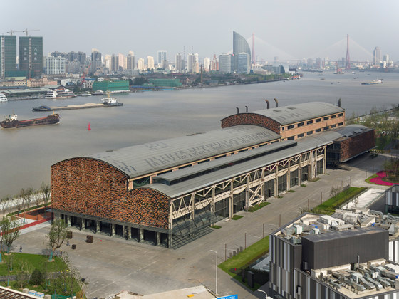
We have transformed a shipyard built in 1972 into a mixed-use complex comprised of a theatre, a multi-purpose hall and commercial spaces.
Previously a place to manufacture large-scale ships, the Shipyard’s architecture utilizes industrial scales and dimensions, thus giving it a subliminal sense of scale. It contains an enormous, uninterrupted space reaching 200 meters in length, 45 meters in depth and up to 26 meters in height. Our design challenge was to create an architecture that could preserve the original structure’s monumentality.
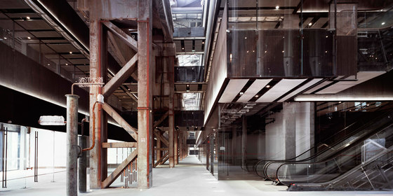
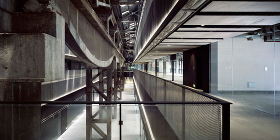
We responded by creating two atriums along the north-south direction which are then linked by another east-west facing, 5-storey tall atrium. This compressed void evokes an ascending verticality which exasperates the encounter between the human scale and that of the Shipyard’s monumental structures. Here, the void not only exhibits the original columns and girders as an impressive spectacle, but also redefines them as the building’s core from which all events gravitate towards. ‘Void’ and ‘Structure’ tend to be antithetic concepts. Generally, structure recedes into the background in order to frame the emptiness of atriums. Instead, we deliberately inverted the relationship of the two by using the void to frame the raw, load-bearing structure built in the 1970s at the forefront.
In recent years, commercial spaces tend to conceal the unsightliness of building structures with decorative surfaces, thereby redefining the visual identity of buildings. No matter what structure the architecture uses, the glamorous interiors that ultimately constructs our spatial experience bears no relationship with it. As such, the world's commercial spaces have certainly become magnificent and glamorous, but also normalized and insipid.
Our approach in Shipyard 1862 serves as a counterpoint to this phenomenon of surface-based experience in commercial spaces. By positioning this unique structure at the most prominent location, we hope to recover the sense of depth in commercial environments.
Another critical consideration in adaptive re-use architecture is the rediscovery of a building’s materiality. Every architecture bears a unique texture that identifies it. I think materiality imprints a deeper impression than form. If I were asked to describe the form of a building, my memory of it would be vague most of the time. However, the texture of the building leaves a clear impression behind. Materiality transcends beyond the visual experience, as it requires all five senses of the human body to engage it, to remember it.
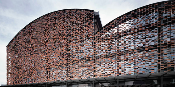
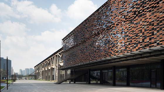
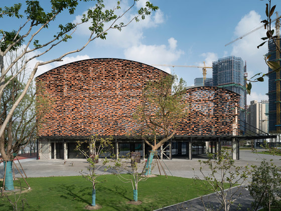
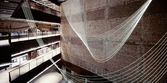
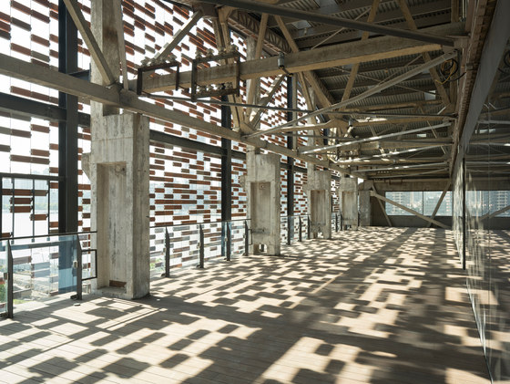
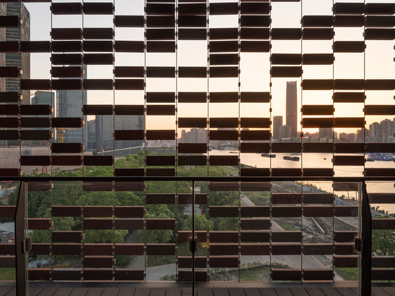
The materiality of this old shipyard bears a particularly colorful and textural character. The design challenge for this project is to capture the material essence of the original brick walls. The shades and texture of bricks manufactured today tend to be very homogeneous, which makes it hard to emulate the rough and uneven textures of the shipyard’s weathered brick walls. Our design proposal, a permeable brick wall, suspends a randomly arranged pattern using 4 types of colored bricks along stainless steel wire fixtures (Figure, Node). The porosity of the design recalls the rough, weathered and particle-like qualities of the original wall.
The process of handmade bricks in the past have inadvertently generated flaws and defects. Although there is no way to recreate those qualities with standard building technique alone, only by reconsidering what consists of imperfection means can we rediscover its essence in the contemporary world.
Floor Plan Organization:
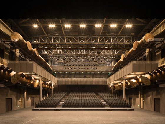
The west entry wing facing the road is retrofitted with commercial spaces, whereas the east wing with favorable views is transformed into an 800-seat theatre. We created 2 atriums along the north-south direction to directly connect the city with the Huangpu Riverfront. These two focal spaces are linked by another east-west facing, 5-storey tall atrium that frames the monumental structures of the original Shipyard.
Brick Façade:
In order to complement the Shipyard’s weathered brick façades, we suspended a pixelated gradient wall comprised of 4 different shades of red clay bricks with 8mm-thick stainless steel cables. We specified unusually large bricks (345mm x 120mm x 60mm) to be laterally spaced by a void perpend of 30mm in order to further accentuate the effect of particlization. The gradient pattern of the east and west elevations gradually fades towards the south elevation as it recalls the memory of a demolished brick façade which once stood in the past.
Materiality:
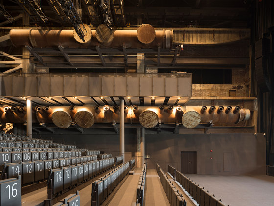
The new addition is designed with industrial materials such as oxidized steel panels, aerated concrete and stainless steel mesh to create a dialogue with the roughness of these historical structures. Conversely, the preserved ductworks are not only recycled as part of the navigational signage system, but also integrated at times with contemporary mechanical systems to become the building’s HVAC infrastructure. Other existing elements, such as the markings imprinted on the rusted iron stairways and columns, remain intact to rekindle the historical atmosphere of the place as a factory.
Kengo Kuma
CSSC Complex Property co., ltd
Architect: Kengo Kuma and Associates
Kengo Kuma, Javier Villar Ruiz, Yutaka Terasaki, Qiu Tian, Rita Topa, Chen Wei-Chih*, Shirley Woo*, Hung Renjie, Sum-ying To, Stephy*, Junki Wakuda* (* farmar staff)
Local Architect: SIADR
Structural / MEP / Curtain Wall Engineer: ARUP Shanghai
Lighting Design: Panasonic & ARUP Shanghai
Theater Consultants: China Poly Group Corporation
Retail Consultants: Life Style
Total Contractor: Shanghai Construction Group
