The Tower of London, England’s number one paid-for heritage attraction (source: Visit Britain), falls under the management of Historic Royal Palaces, an independent charity by Royal Charter, which runs and manages the six key monuments that make up the collection. From its 11th century origins as one of the great Norman palaces to the modern day, The Tower of London has always played an important historic role and been a potent symbol of English and British rule.
Kinnersley Kent Design has enjoyed a long relationship with Historic Royal Palaces, working on retail strategies and schemes for a number of the charity’s lead attractions. The leading consultancy has now completed a redesign of The White Tower gift shop, located within the oldest building in the Tower of London ensemble, The White Tower. Built shortly after the Norman conquest of 1066, and considered an outstanding example of Norman ‘keep’ architecture, its role was to impress and dominate London’s unruly citizens and those who arrived in the kingdom via the River Thames, as well as to house the new Norman King, William the Conqueror.
In modern times, it represents the most complete survival of an eleventh century fortress palace anywhere in Europe. Visitor numbers passing through The White Tower average around 7,000 per day, made up of 80% international tourists and 20% domestic UK tourists. The White Tower contains several floors of weaponry and armour and visitors exit via the 900 sq ft gift shop, which sells an incredible 370,000 pieces of merchandise per annum.
The brief for the redesign had four key aims: first, to create an exciting and engaging retail experience; secondly, to improve customer flow and circulation; thirdly, to take a sympathetic approach to enhance the natural theatre and character of the building; and fourth and finally to facilitate product merchandising, using individual or grouped product narratives. The key challenge was achieving these transformations without touching the building fabric of this Grade I Scheduled Ancient Monument in any way.
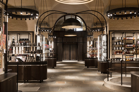
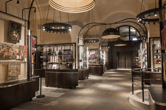
Kinnersley Kent Design’s new concept was inspired by the aesthetic of The White Tower itself and the building’s innate theatre and character, with its high vaulted ceilings and wonderful raw stonework, geologically-analysed as being made up of thirteen different types of stone from the various periods of its life. Rather than covering these natural assets, the new concept sought to reveal and celebrate the building’s structure, adding to it via a raw and honest material palette that draws inspiration from these materials, as well as from the weaponry and armour housed on public exhibition on the floors above.
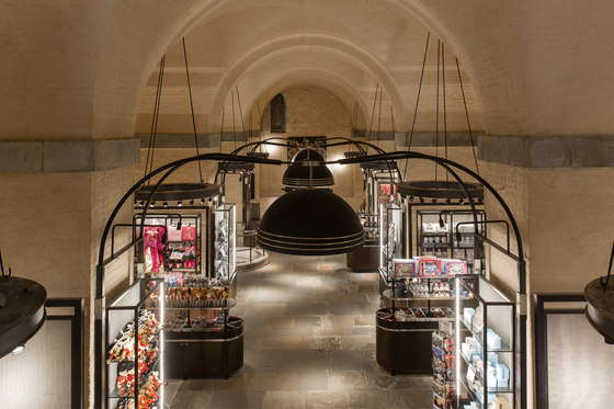
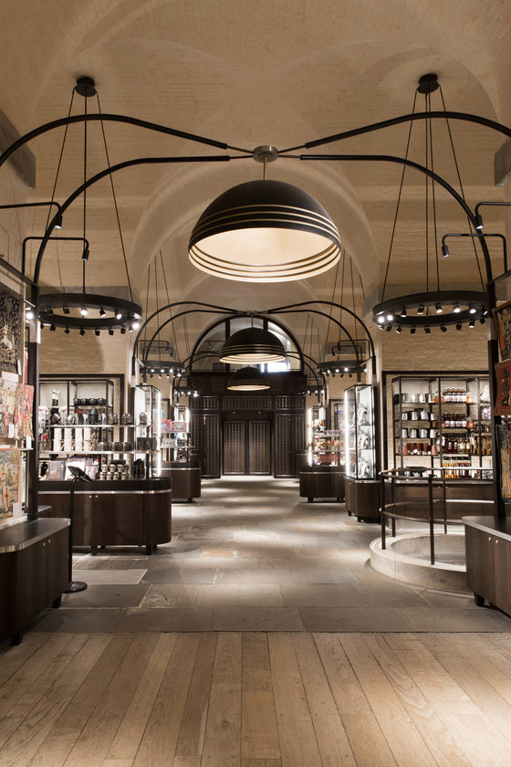
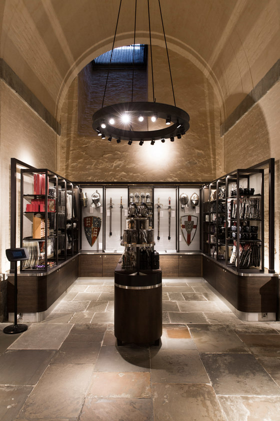
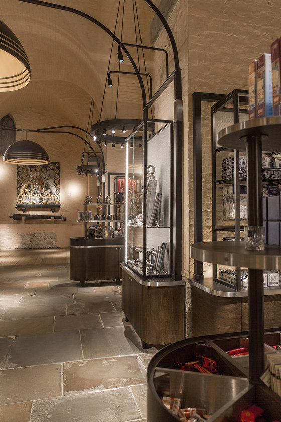
When it came to circulation, the existing floorplan had to remain untouched because of the building’s listed status and so its essential form remains: a central space with six alcoves, three to each side. The new design improved the in-store customer journey, however, by freeing up the central circulation route, replacing existing mid-floor units with new grab-and-go displays, set back slightly into the alcoves to increase the sense of space, whilst still being enticing enough to draw visitors in.
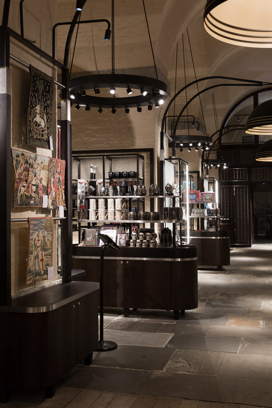
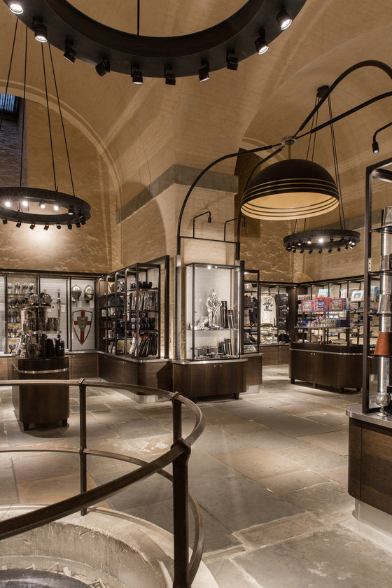
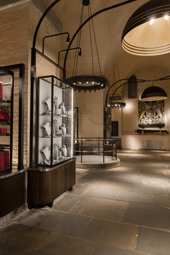
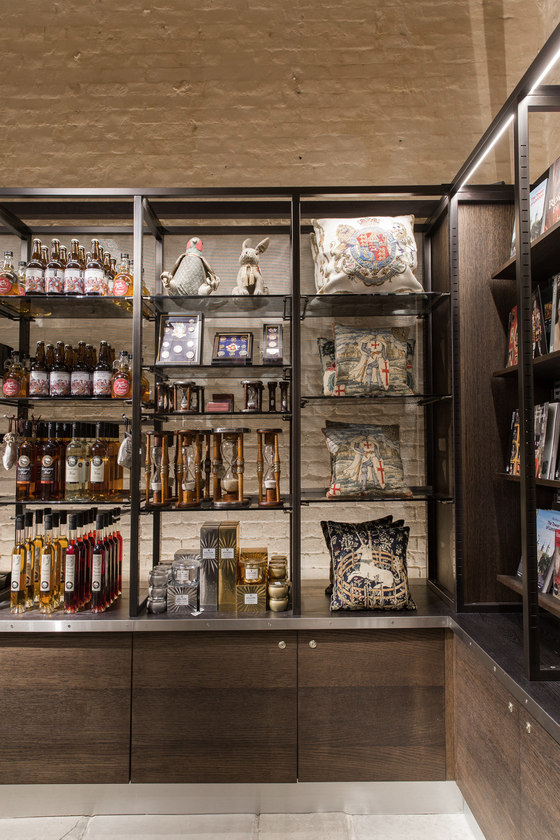
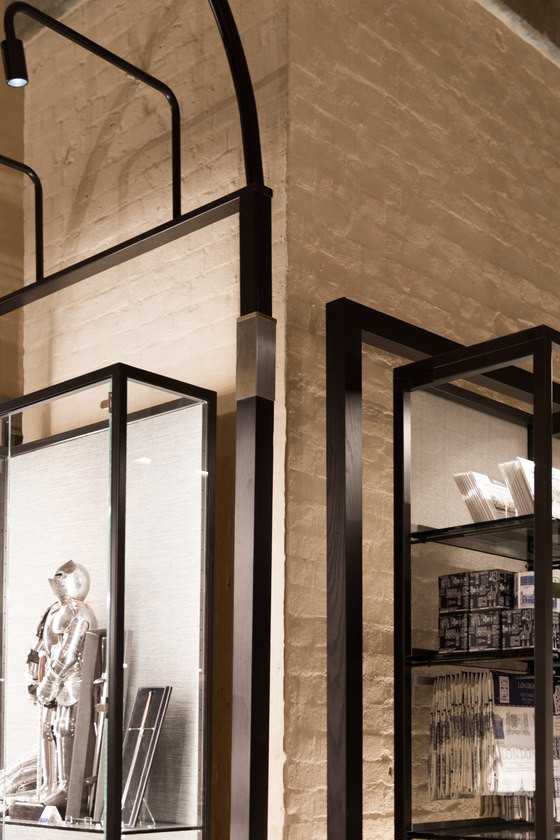
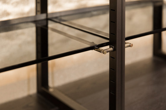
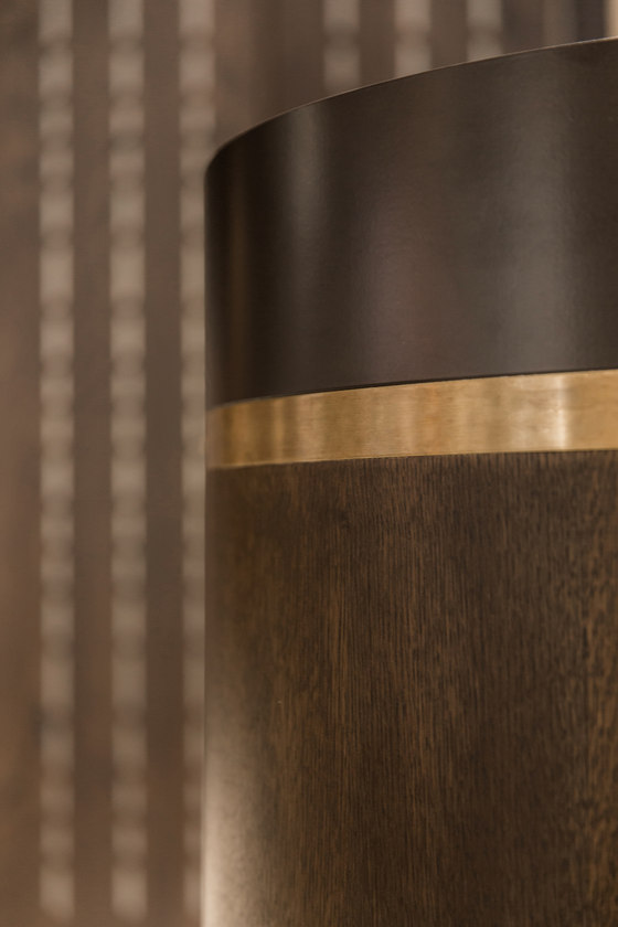
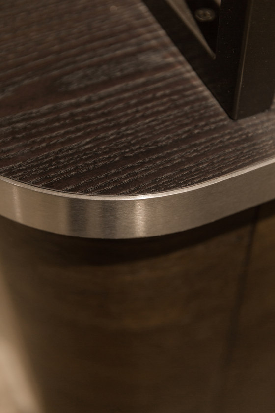
All the units and any new lighting had to be freestanding as the restrictions meant they could not be attached to the walls or ceiling. The bespoke new modular display units are made up of blackened steel structures, with oak units plus burnt larch tops and brushed brass detailing (shelf holders, handles and knobs). Rather than encasing the existing architecture as before, the units feature stainless steel mesh at the back, subtly referencing chain mail while helping to reveal and celebrate the original stone wall located behind. Backlit, the units create a glow around the products as well as highlighting the rough texture of the historic walls behind. They are also modular and can easily be adapted and adjusted.
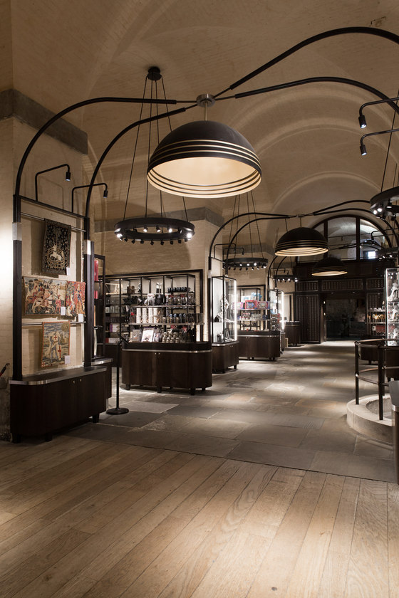
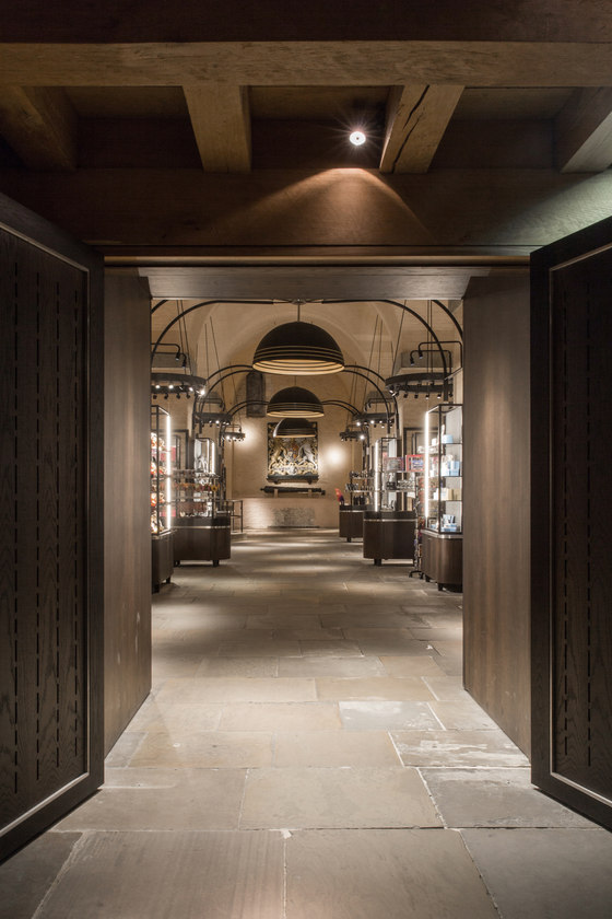
All the visual merchandising components were specifically designed for this project. The space had to be easy to re-stock throughout the day as the shop gets so busy. Therefore, the fixtures allow for maximum visual merchandising flexibility, while providing the framework and structural support for the key design feature of the new scheme: three huge, bespoke pendant lights over the central walkway. Cleverly attached to the units, the lights rise up in three arches, mirroring and accentuating the vaulted ceiling. To create a greater feeling of intimacy in the alcoves and better highlight the products on the perimeter display, Kinnersley Kent Design also lowered the existing hoop pendant lights by one metre.
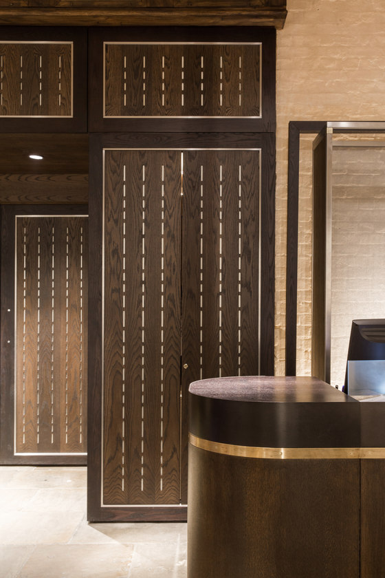
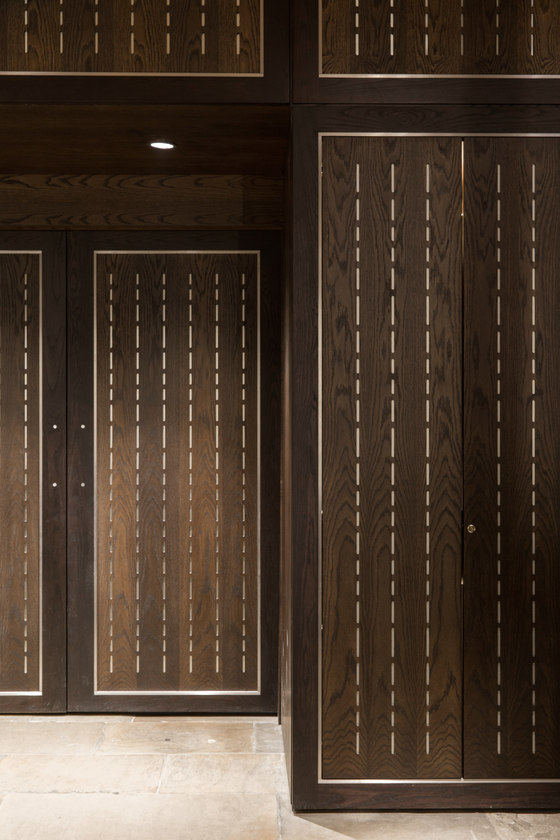
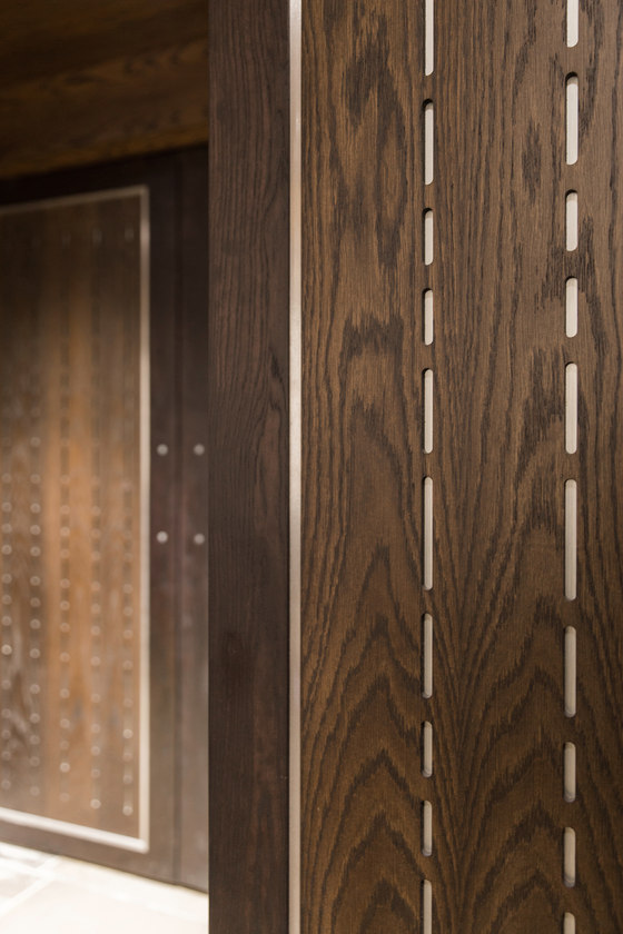
Dramatic down lighting creates a spotlight on the exit doors, signalling a clear navigational path to customers. The lighting also draws attention to the design detail of the oak doors, which are punched through to metal behind in a pattern inspired by the armour housed upstairs in the Tower. Both cash desks have been relocated closer to the exit and face each other in the rear alcoves, minimising any disruption caused by queuing.
The designers also extended the flagstones throughout to cover the alcove floors as well as those already in the central walkway, using architecturally-salvaged flagstones treated to ensure a uniform fit with the original existing flooring. This makes the space feel bigger and more streamlined. Whilst laying the new flagstoned areas, a hitherto-undiscovered Tudor wall was found. Work stopped briefly whilst the historical specialists came in, and the wall was examined before being re-sealed, with the new flooring serving to protect it for future generations.
Speaking about the impact of the new design, Historic Royal Palaces’ Head of Retail Operations Ian Cuerden commented: ‘Since the completion of the redesign of The White Tower gift shop we have seen an increase in our sales against last year, and an uplift in our average transaction value and spend per visitor. As an independent charity receiving no Government or Crown funding, retail sales make an important contribution and ensure we can continue to give these important heritage sites the care they deserve. In addition, the newly designed shop has enhanced the shopping experience for the visitor, customer flow has been improved and the presentation of our products enhanced. Our White Tower shop has received many compliments from visitors both here in the UK and from our overseas visitors.’
The overall result is a dramatic, warm and practical space with a robust and authoritative aesthetic – one that’s authentic and appropriate to the historic location. The store boasts a warm atmosphere thanks to the lighting and natural, but authoritative materials, with a premium feel that befits its royal location.
Kinnersley Kent Design
