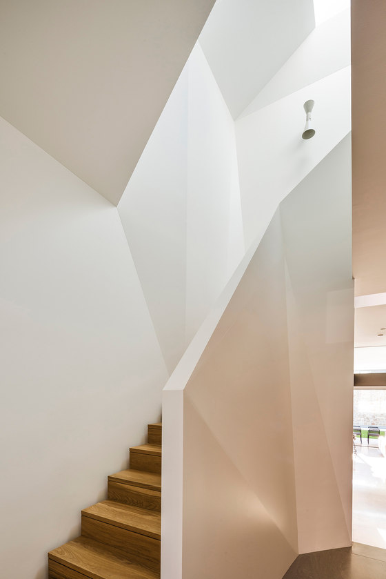
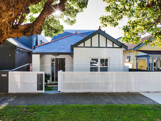
The clients approached us to design a new home in a heritage conservation area in Sydney’s East. The challenge then lay in concealing a large and contemporary two storey home behind part of a single storey federation frontage. To respect the existing building we adopted a folded roof form derived from the angles of the existing slate roof. The abstract space created is reflected inside the house as a dramatic folded stair void connecting the two levels. The remainder of the house is contemporary, light filled in contrast to the original.
What were the key challenges?
The existing house on the site was not a heritage item, however its façade was part of a consistent row of houses and exemplary as a part of this wider context.
What was the brief?
The clients approached us to design a new home in a heritage conservation area in Sydney’s East.
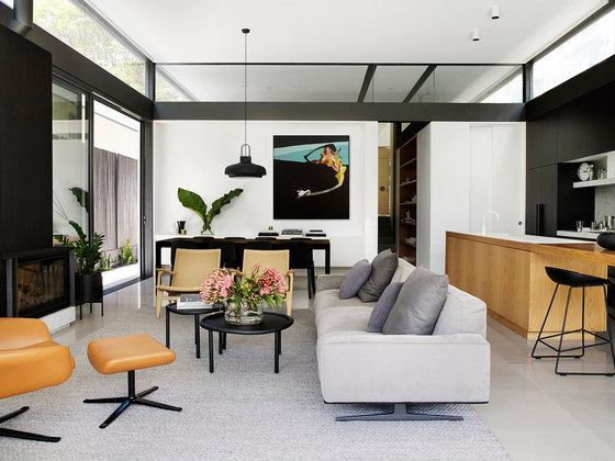
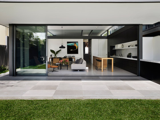
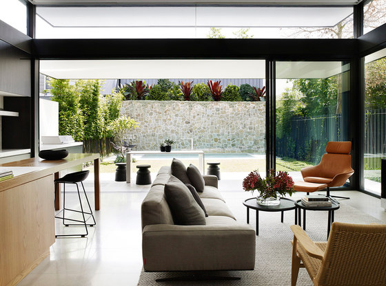
The brief was for a modern, open and airy house that had a strong connection to the garden and a sense of privacy and openness at the same time.
What materials are featured?
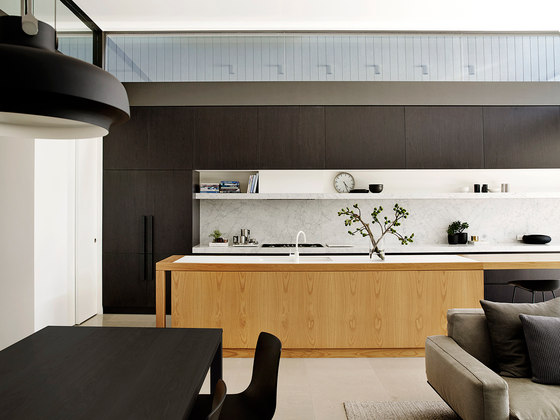
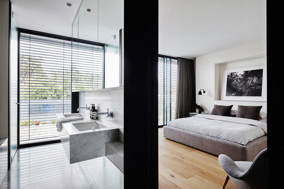
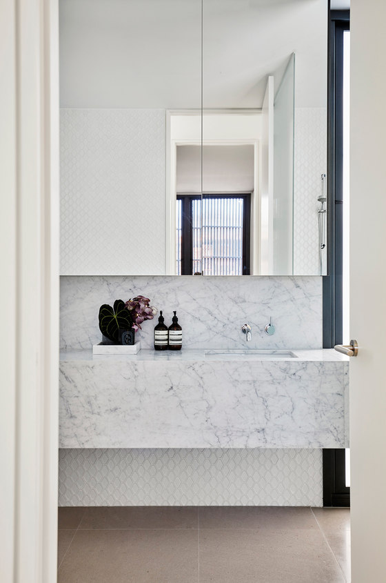
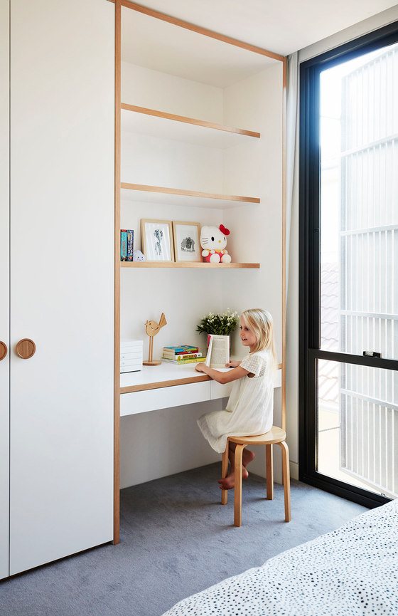
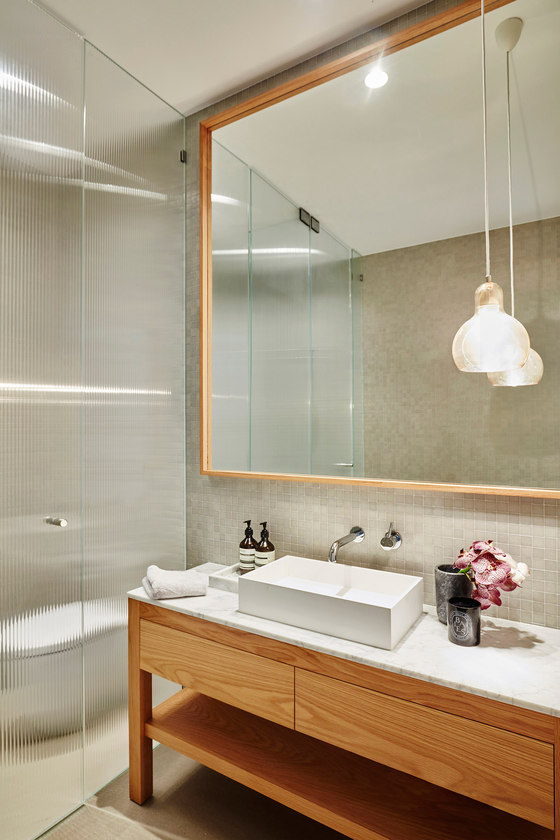
The budget for the house was not excessive. Decisions had to be made on where to concentrate spending and how to maximise impact. The material palette is simple - black, white and timber being the main elements. Painted battens are used on the upper roof form to mimic roof-like qualities while providing screening and softness to the windows and walls. Light and volume were the focus in lieu of overly expensive materials or details.
What were the solutions?
To respect the existing building we adopted a folded roof form derived from the angles of the existing slate roof. This folded form twists to become the walls and windows of the upper level of the house, blending it with the existing roof and minimising the presence of the second storey from the street. The abstract space created where the original and the new meet is reflected inside the house as a dramatic angular stair void leading to the upper level. The pragmatic brief is met by providing a light filled, edgy and contemporary home that is barely hinted at from the street. The only visible addition is subtle, gradual rather than jarring and completely submissive to the existing dwelling. Only upon entering the original, ornate room at the front of the house do the lightness and volumes of the new spaces become apparent.
Key products used:
The budget for the house was not excessive. Decisions had to be made on where to concentrate spending and how to maximise impact. The material palette is simple - black, white and timber being the main elements. Painted battens are used on the upper roof form to mimic roof-like qualities while providing screening and softness to the windows and walls. Light and volume were the focus in lieu of overly expensive materials or details.
How is the project unique?
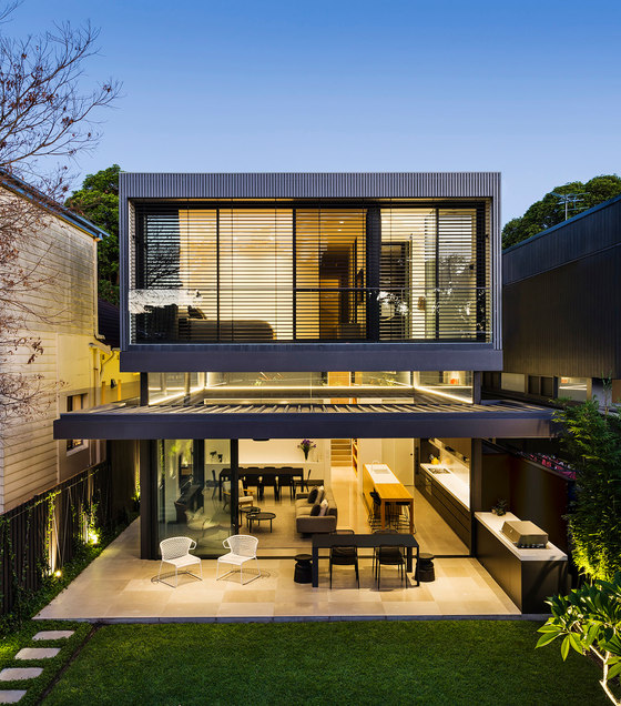
The planning is clear and simple, with living and kitchen spaces opening onto the garden on the lower level and bedrooms on the upper one. The rear of the site is lower than the front so the back room steps down to meet the garden and has a 4m high ceiling. This high ceiling allowed us to incorporate high level glazing throughout the living areas. The band of windows surrounds the house and continues between internal rooms. Combined with a large cantilevered lowered awning to reduce the impact of the afternoon sun on the west facing façade, the high-level glass gives a floating sense to the abstract roof form housing the bedrooms.
Screens for sun-shading and privacy on the bedroom level are finished in the same painted battens as the extended roof to reinforce the architectural expression of a singular roof form floating above the glassy rear pavilion.
Madeleine Blanchfield Architects
