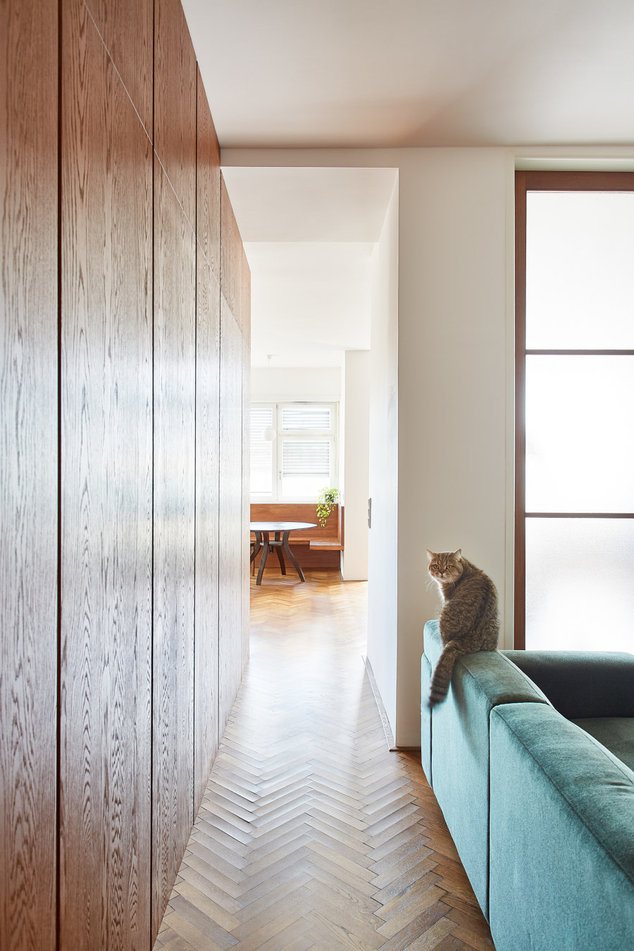
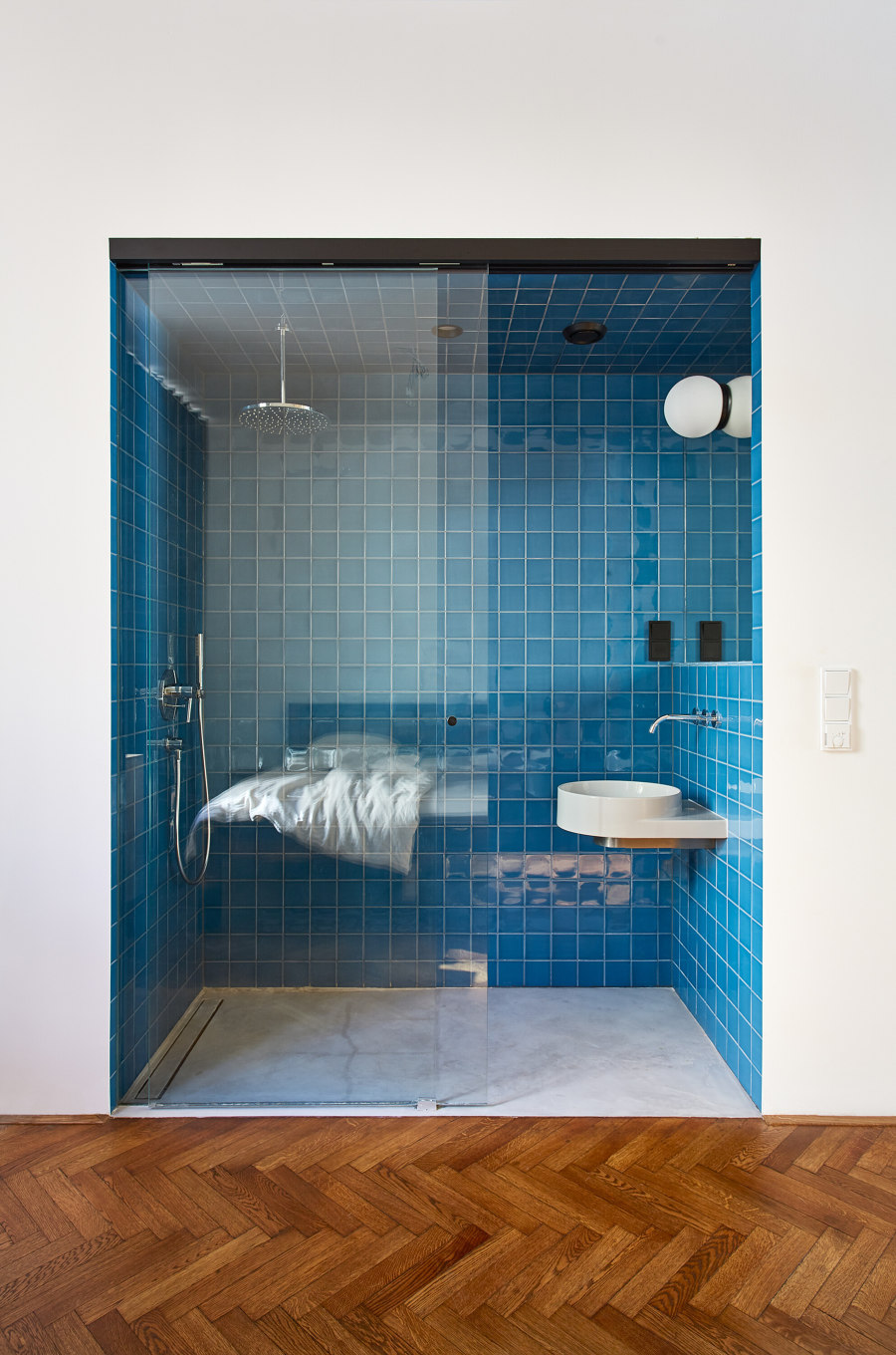
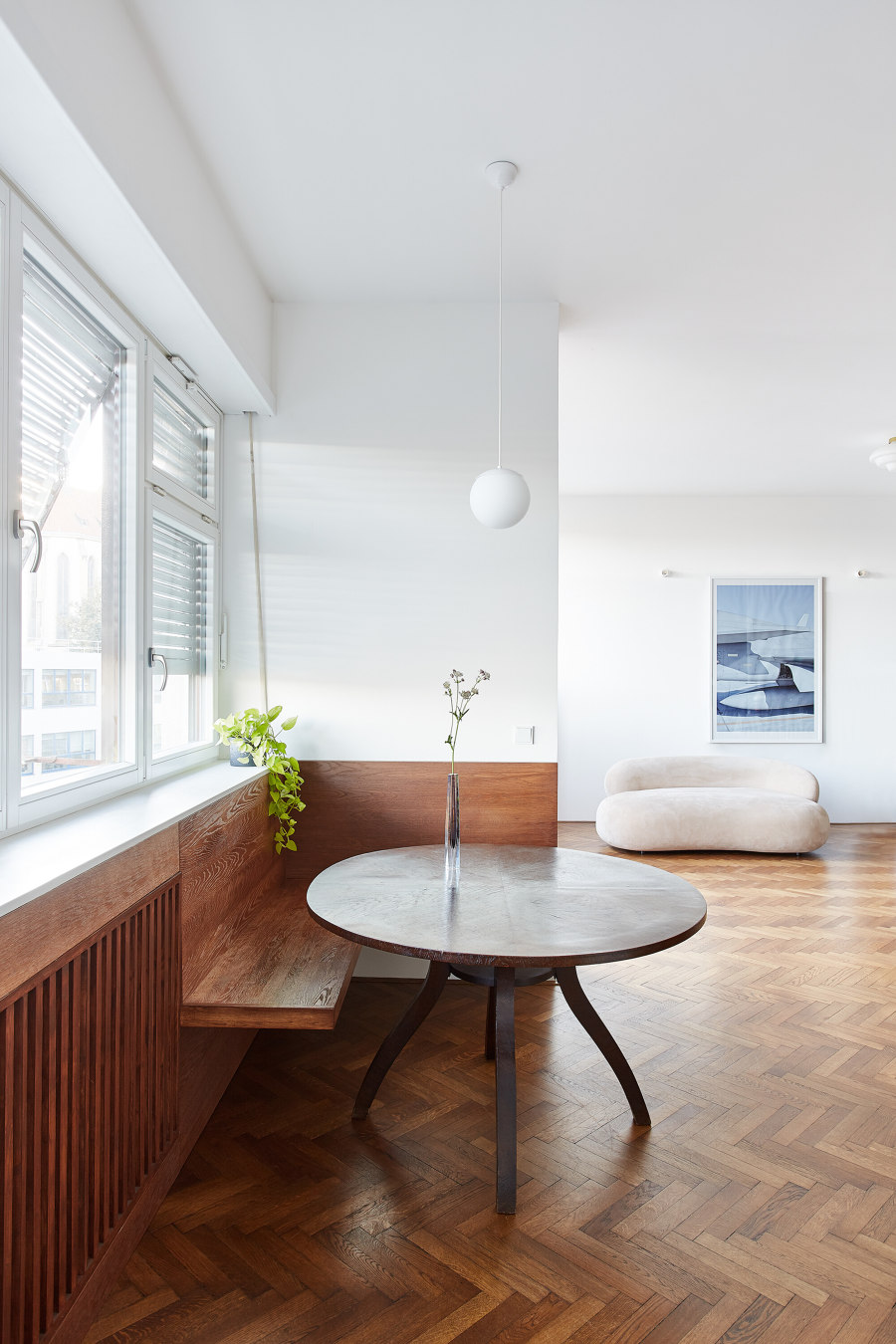
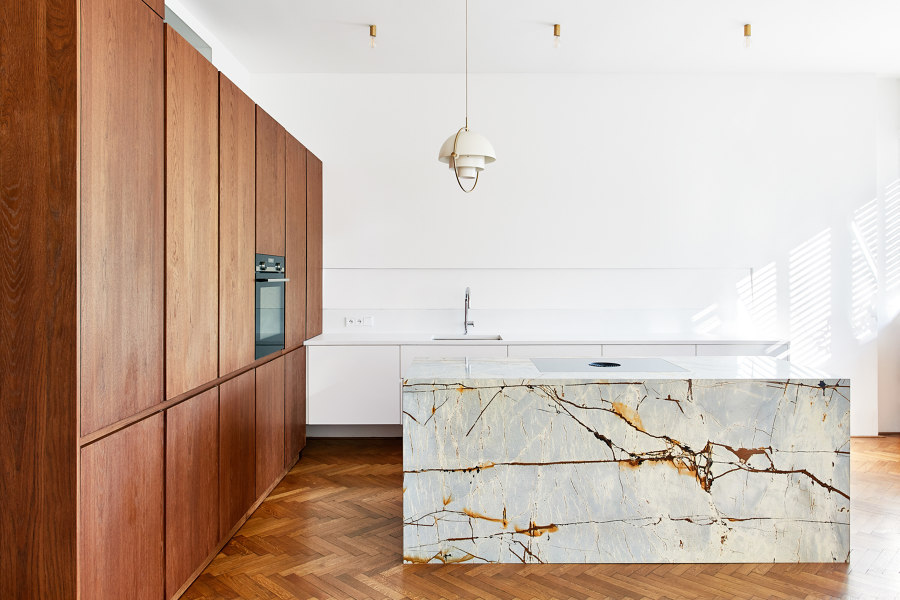
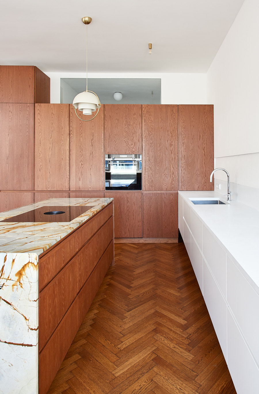
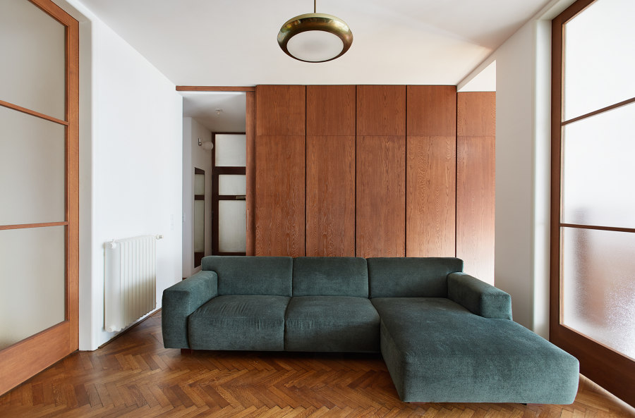
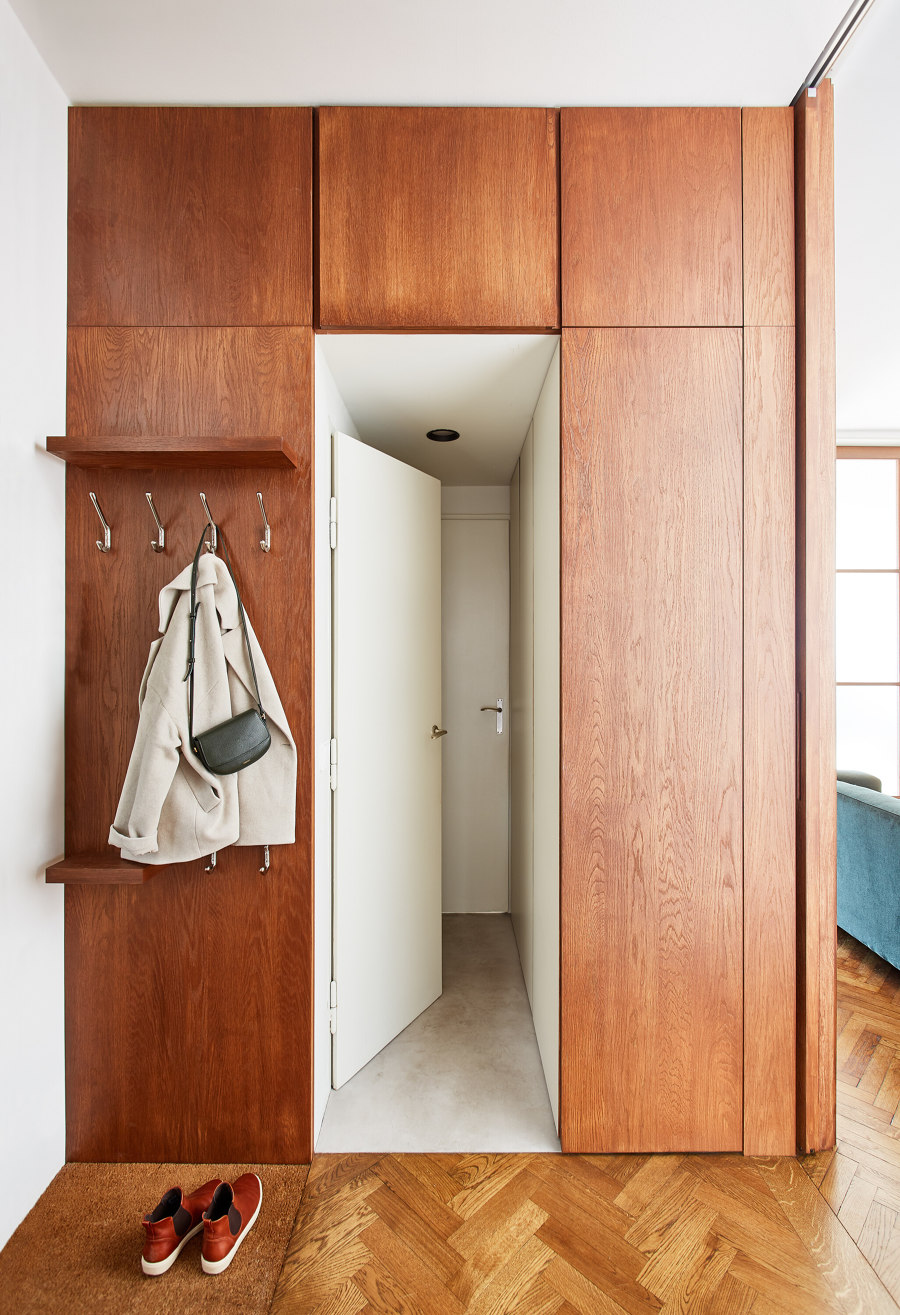
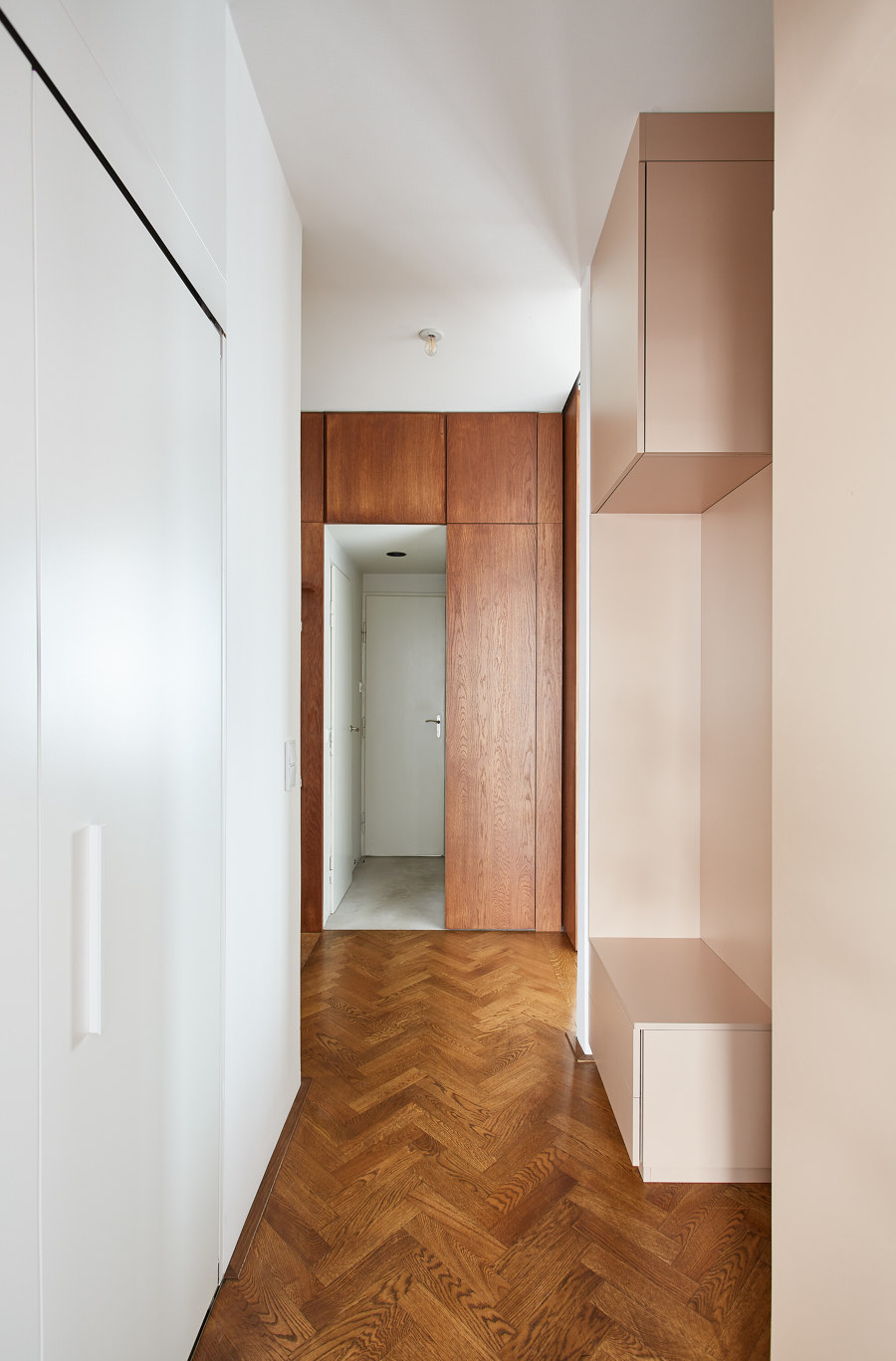
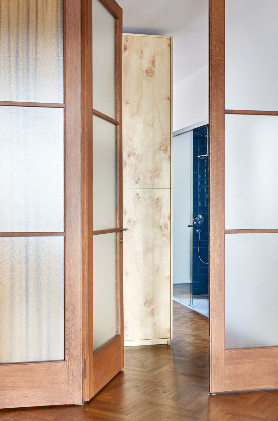
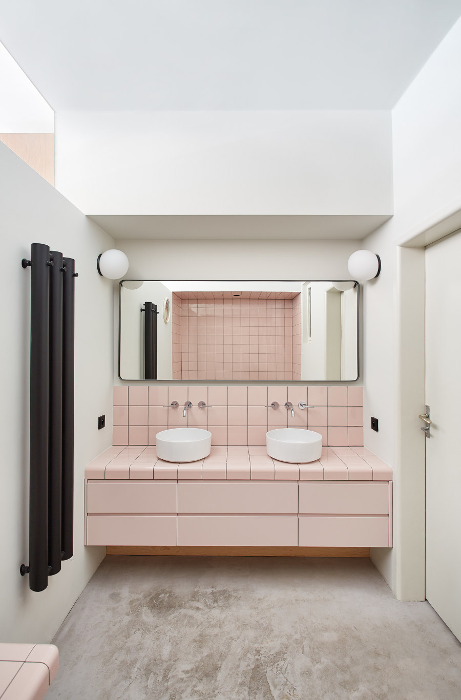
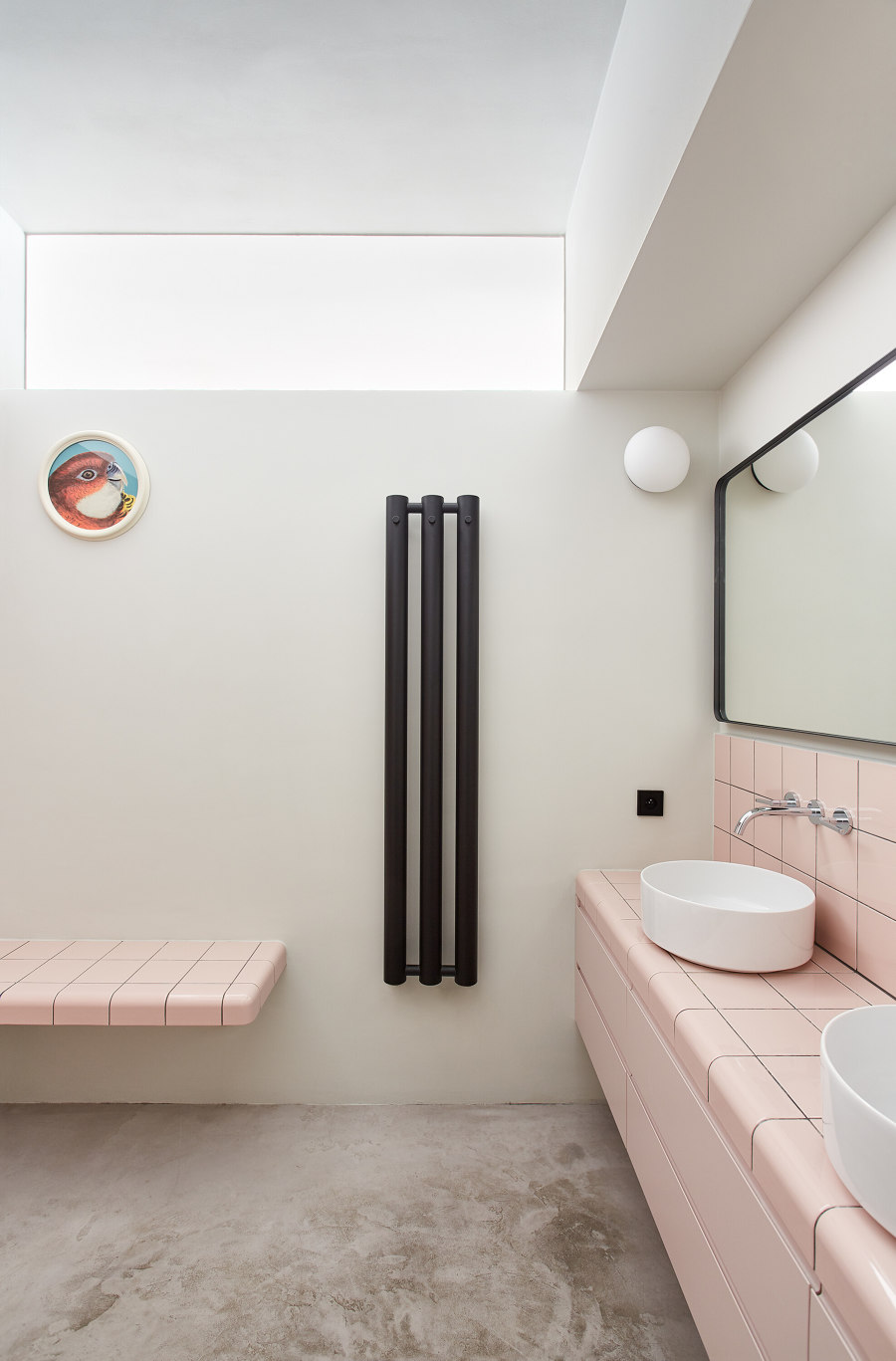
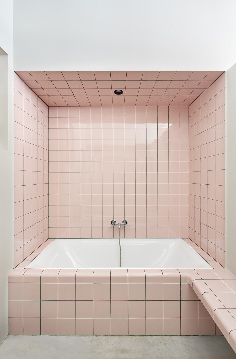
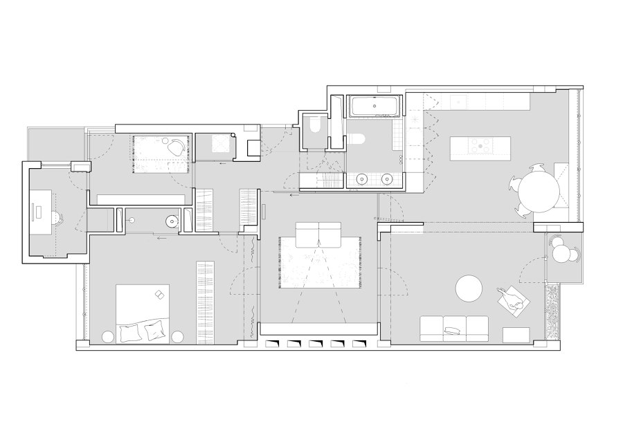
The great advantage of thinking more freely about the individual zones is undoubtedly the reinforced concrete skeleton, which allows the rooms to be connected more easily. The layout modification was only minimal from a construction point of view, but thanks to it the bedroom has its own bathroom niche hidden behind sliding glass. In the vestibule it was simply a matter of moving a part of the wall to create a walk-through wardrobe. Probably the most significant intervention was the connection of the two main rooms, the kitchen and the living room, which are situated facing the street. Upon entering the apartment in the vestibule, there is a built-in wardrobe with oak veneer panelling, which matches the colour and finish of the frames of the original folding doors, which were refurbished. The oak veneer goes around the corner as wall panelling, which hides the sliding door. The same veneer enters the main living space in the form of the high parts of the kitchen. Above these is then the skylight from the main bathroom. The entrance to the bathroom is through a wardrobe near the vestibule of the apartment. The bathroom and its layout remain in the same place as in the original layout of the apartment. The client's wish was for a seamless floor in both the bathrooms and the separate toilet. For feasibility reasons, a concrete screed was chosen which complemented the type and method of bathroom tiling well.
The reconstruction deals with a 125 m2 apartment located in a functionalist house by Eugen Rosenberg made of a reinforced concrete skeleton near Strossmayer Square in Prague. The reconstruction and adaptation of spaces that are predefined from the beginning, either by the materials used or by a certain spatial division, is always a great challenge. We try to preserve the character of the space, but on the other hand, there is always the necessity to adapt it to the current demands of living and, last but not least, to the demands of a particular owner.
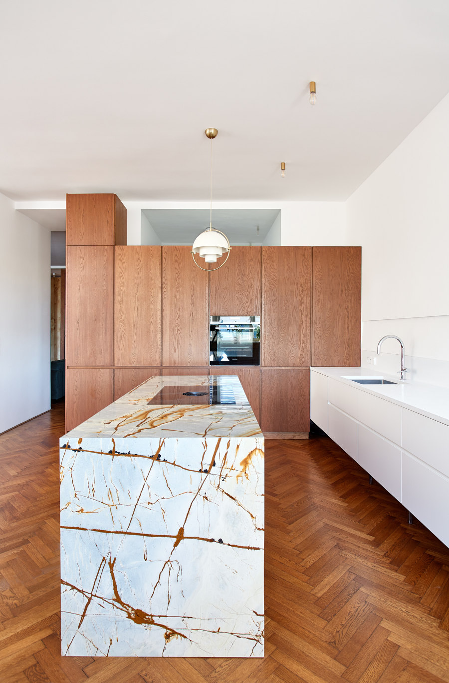
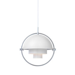
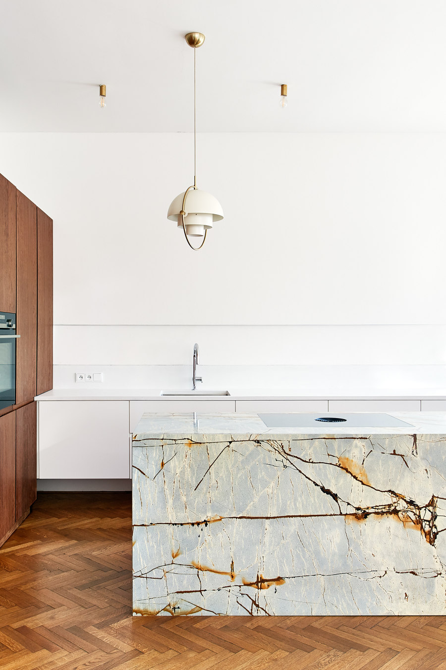
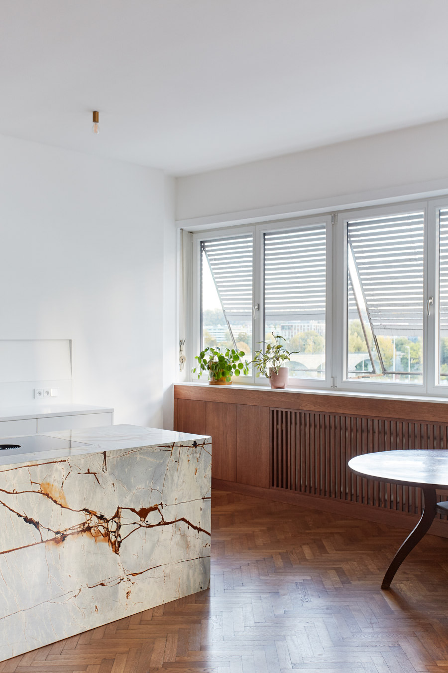
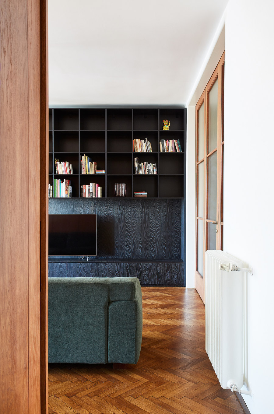
The central space of the apartment is the hall with a bookcase made of black oak veneer. The hall is connected to the main living room and bedroom by the original folding glass doors. The bedroom has its own small bathroom niche which is lined with blue tiles. From the vestibule the bedroom can be accessed through a walk-through wardrobe. The bedroom is visually separated from the hall by a root veneer wardrobe. The other room and the workroom are accessed from the walk-through wardrobe, which is in beige and pink. The jewel and probably the most expensive piece of the whole apartment is the kitchen island made of "space" quartzite. The island faces the living area of the apartment, which is situated in the alleyway. The back of the work counter is neutral in colour. The lighting of the kitchen countertop is hidden in a subtle notch above the plinth of the working concrete slab. The lighting of the island is offset from its mass. Choosing a hanging light was a tricky task and we spent a long time brainstorming different options with the client. Anyway, the client and I are happy with the final choice, the Multi Lite Small light from Gubi, which was designed back in 1972, has become an icon that has suitably complemented the esprit of the whole apartment.
Design Team:
Dominika Galandová
