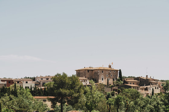
A couple, a traditional house in the Empordà and one dream. Houses should evolve along with its user. Ana María and Manuel, our clients, made the decision of spending as much time as possible in their summerhouse in Sant Mori. Located between Figueres and Girona, Sant Mori is a rural village with irregular geometry, which offers a characteristic Mediterranean landscape scenery to its inhabitants, bounded by fields and forests.
The Blasco-Nicolau family was already using the house regularly during the hottest months of the year and therefore, the swimming pool has always been an important feature to their summer lifestyle. Nevertheless, its use was mainly focused on the water area, as the adjacent space was not comfortable despite its appeal. The idea was to bring back the space’s vitality with the purpose of making it the house’s exterior heart: a meeting point, an exterior room for the family. A place under a canopy’s shade, where three generations would coexist, chat and share moments.
The pool area used to be a place of joy and gathering for the family in summer. Due to the pasing of time and to low maintenance, it ended up being a cold, uncomfortable and neglected place. Lying under the sun is one of the pleasures of open spaces and a canopy is a haven of shade if you want to get away from the sun. We should return this area the identity it had one day.
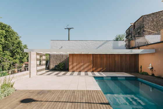
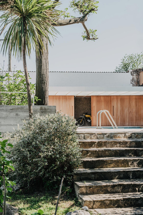
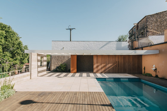
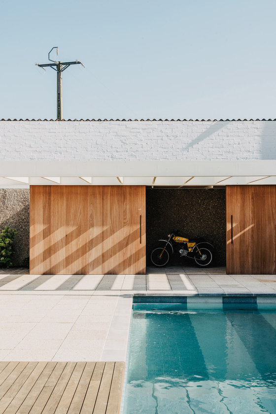
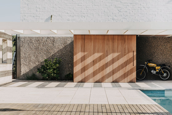
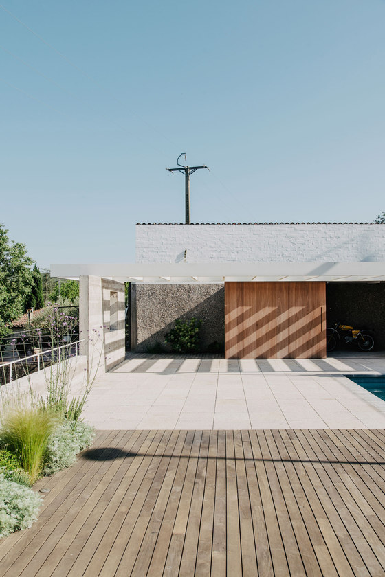
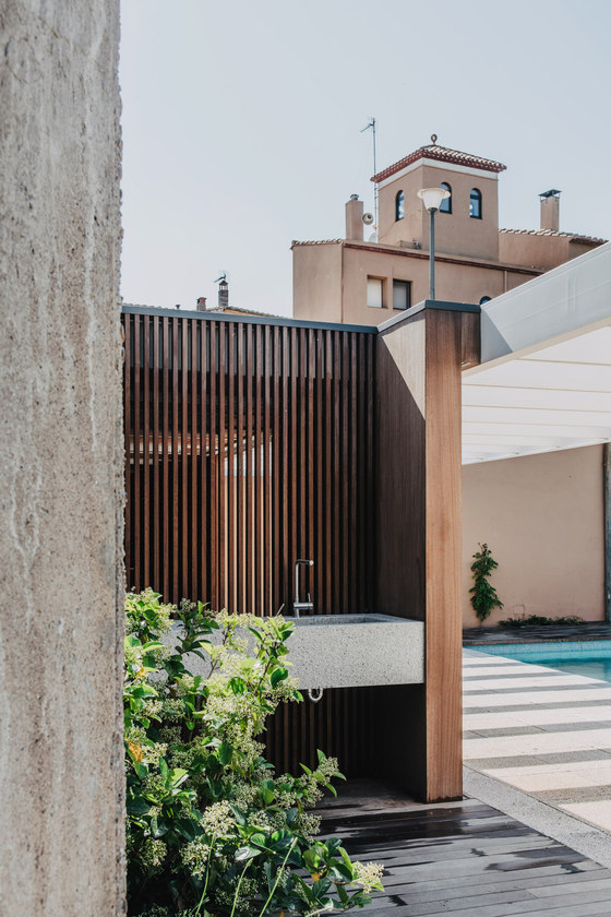
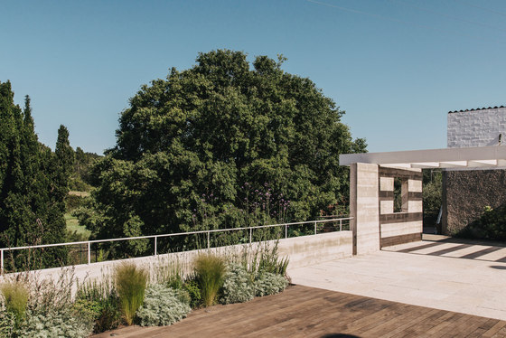
Facing east, the swimming pool was surrounded, on two of its sides, by the façade of the main room of the house and by the cold and hard neighbour’s common facade. On the contrary, the remaining sides were surrounded by vegetation with views towards Sant Mori’s fields and forests. We had a clear answer: Generate a new facade with dominant horizontality on the existing common facade, in order to give this space a sense of unity.
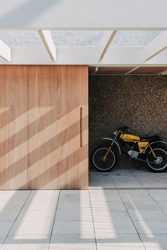
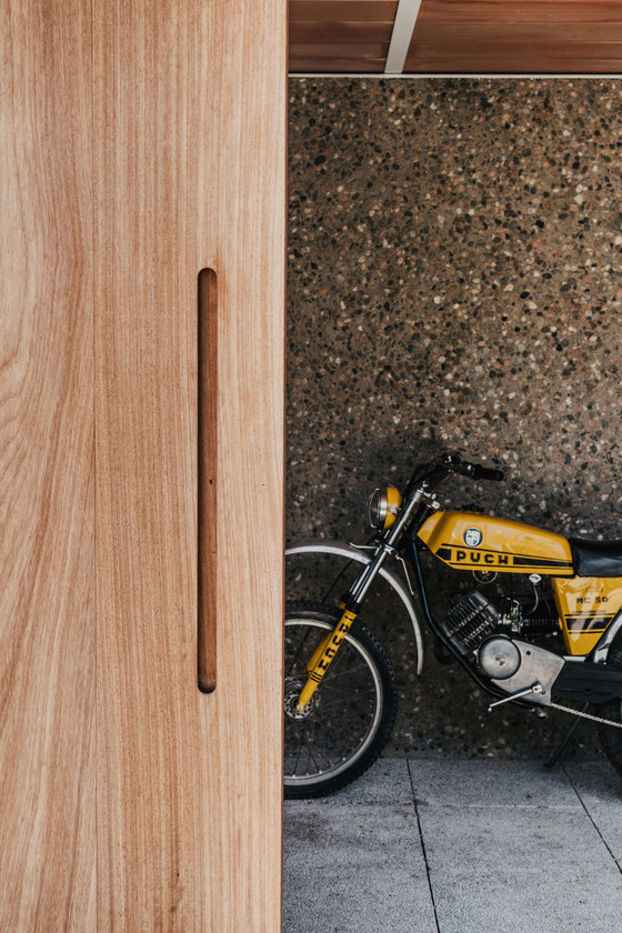
Once again, the project’s challenge was how to achieve the objectives using all resources given and reducing the visual impact as much as possible. The functional necessity to build a large storeroom with a facade to the outdoor area wasn`t going to be an obstacle but a defining elements of the project’s strategy. The recycling of some extra floor tiles from a previous project carried out by the owners was also going to sum up. Minimum investment in all resources, maximum transformation in the spaces revitalization. A contained architecture for an intense lifestyle.
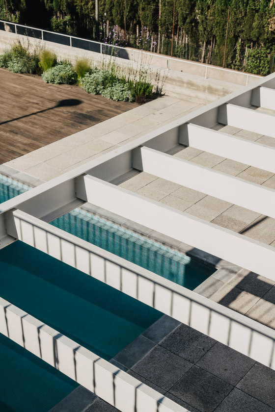
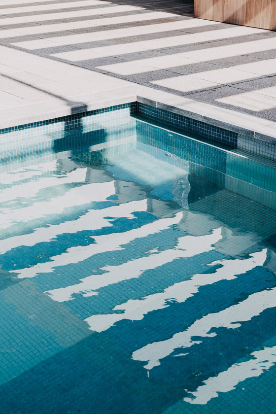
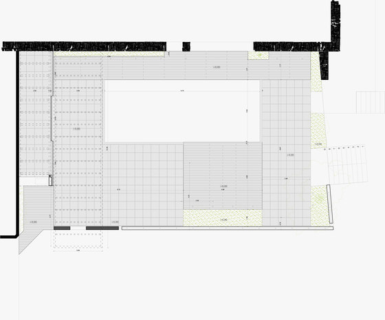
The project starts from an already existing piece (50x50 cm, with open joints) that helps to organize the project’s development, creating a very structured grid pattern where alignment lines and modular order are respected. The noblest areas, such as the solarium and the living room, contrast with a solid wood pavement, which gives the necessary warmth to the place.
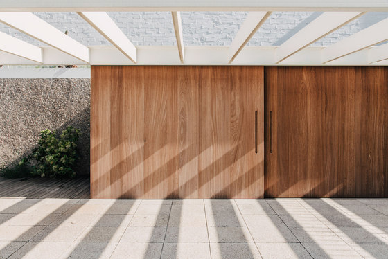
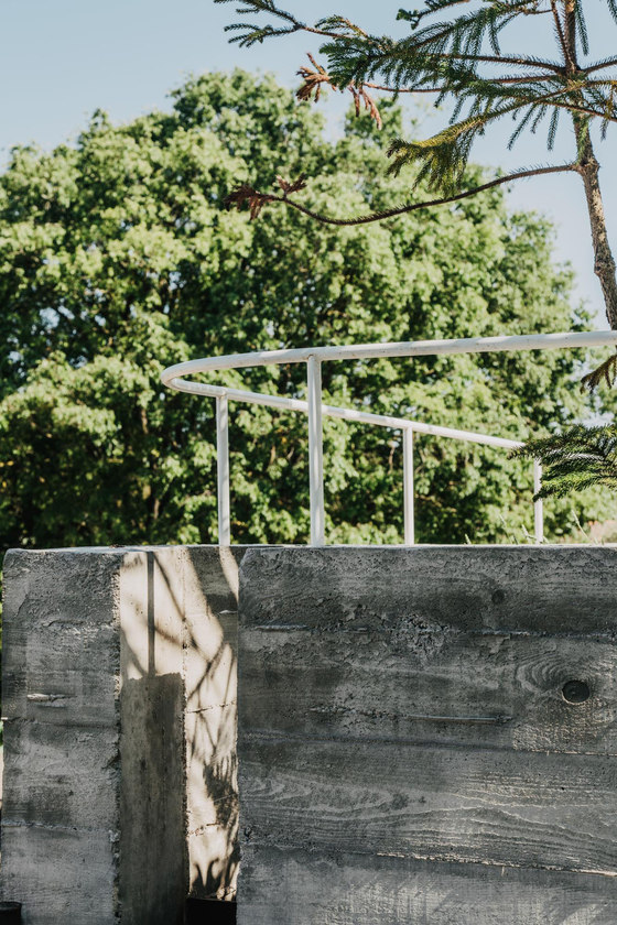
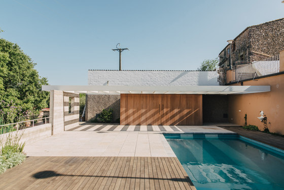
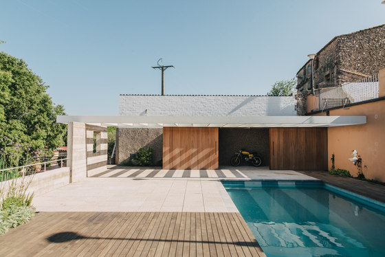
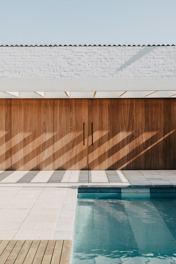
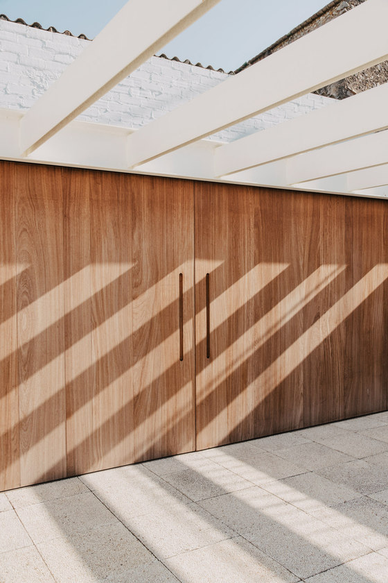
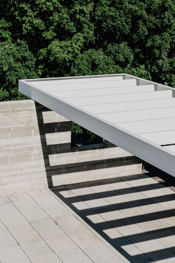
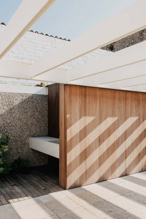
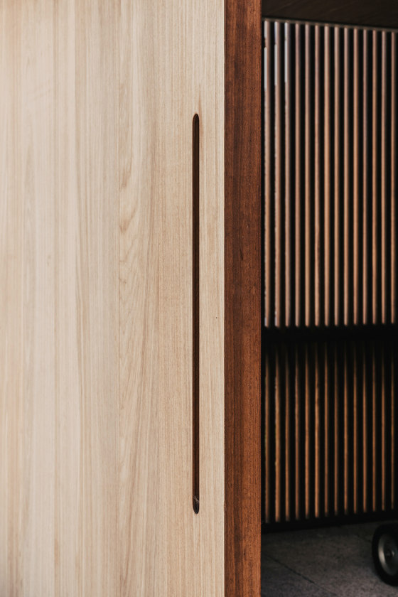
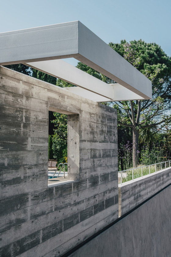
Canopy and storeroom share a common roof: a single supportive element, that rests on a concrete wall. The structure is formed by two metal rectangles and follows the project’s key principle: 8mx2m storeroom formed by UPN-240 and 12,5 mx3m canopy formed by UPN-300, joined together on one side by UPN-200. This connecting line is in charge of assuming everything the project demands: a subtle edge yet complex beam (formed by three profiles that help to reduce the sag or deflection), collects the sliding doors that compose the facade of the storeroom at its lower edge and produces the gutter at its upper profile.
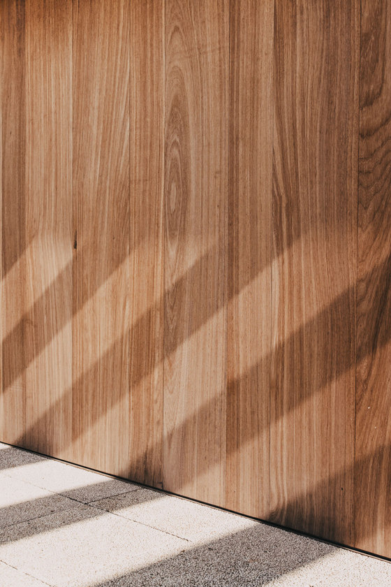
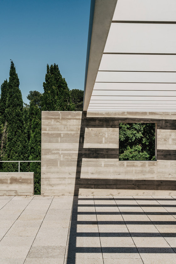
One single element with three accomplished objectives. The light belts of the canopy project a sequence of changeable shadows on the floor, which reflect the passing of time.
Proposal of minimum intervention: A simple horizontal element, which generates shade and transforms dramatically the interior/exterior perception. It is not under the sunrays where architecture is experienced, but under the shade’s shelter. Consequently, walls or openings aren’t limits but a subtle and vibrant barrier created by its own projected shadows.
The project Blasco-Nicolau is an example of Mesura of how, from a small intervention it is possible to generate an enormous impact on architecture’s use and enjoyment. An effort to reduce what is strictly functional and structural to achieve the highest quality of the space. The smart use of all available materials as well as the way in which they are carefully selected, leads to a transforming and at the same time calm and restrained intervention.
MESURA. Partners in Architecture
