A Turkish family with two young children residing in Istanbul and passionate about the lifestyle, architecture and art, bought an apartment in the Eixample, Barcelona. The owner is one of the biggest art collectors in Istanbul. He became infatuated with the Nolla mosaic floors, vaulted ceilings and the original stained glass of the building.
Location
As the same family owned the building for many years, all of the original period elements are well-preserved, providing the building with authentic elegance and beauty: Carrara and pink marble, coffered wooden doors, forged iron details and an original forged iron elevator. The house is located on Casp Street, close to Passeig de Gracia and next to Casa Calvet. The modernist building was designed by Antonio Gaudí. It was his first project that the architect designed and built in the Eixample.
Distribution
The apartment offers about 180 square metres laid over the second floor of the house. As the majority of Eixample´s apartments, it overlooks the street with main façade and the patio of the block with its rear façade and has two inner patios to provide natural light in all the spaces.
The new layout features three double suites, a master suite for the married couple and the other two for the children. The master suite faces the street and the other two are located in the middle of the apartment facing the inner patio. An open space unites an open-plan kitchen and dining and living room. The gallery was partially closed, so the team decided to close it all.
Aesthetic Criteria
The objective of the refurbishment was to preserve and restore the original elements of the building bringing back their magnificence:
~ Vaulted ceilings and mouldings
~ Original pine melis carpentry
~ Marble chimney
~ Iron trimmed stained glass
~ Nolla mosaics
Aesthetics: colours, materials, and lighting designed to highlight the original period features. The décor aims to accompany the apartment architectural highlights creating modern elegance and luxury.
Flooring
The Nolla mosaic floor is the symbol of any modernist estate and this particular one is protected by the state, so it had to be restored. Originated in England in 1850, in Spain it was popularised by Miguel Nolla ten years later (1863) in Meliana (Valencia). This was the first durable ceramics produced in the country, with the small pieces of which (usually 5x5cm or 10x10cm) complex mosaic compositions were designed. Ceramics with geometrical pattern (usually monochrome but sometimes with embedded motifs) were used to cover floors. Due to the production method, the pieces were always matt so that never caused problems with the excess of light.
Nowadays, designers and architects try to restore its value. Nolla mosaic floors with their colours and pattern have marked the design line of the whole project. The team have chosen the mink colour to highlight the colours of Nolla mosaics. It was used for walls, carpentry, cabinetry and kitchen to draw the main focus to the floors. The use of unified colour emphasise the authentic elements.
The state required that the Nolla floors were restored in their original locations: in the master suite, another suite, kitchen and dining and living room. Old damaged hydraulic floors 20x20cm white with black trim at the entrance, guest bathroom, hall and laundry room were replaced with parquet floors the colour of aged wood providing the apartment with warmth and highlighting Nolla mosaics. Terracotta brick floors were installed in the covered gallery as this type of flooring was commonly used in Eixample galleries.
Ceilings
The ceilings were recovered and restored. The ceilings in the main rooms facing Casp street and facing the patio of the block were in good condition. They feature elegant and refine vegetation motifs. Wide friezes, fine ceiling mouldings are unique in each space. Cornices were designed for spotlights. The ceilings were restored and painted off-white.
The lighting is designed to eulogise the ceilings and acquire warmth, serenity and elegance. Indirect lighting is sheltered by the cornices and is designed to highlight the moulded ceilings and spotlights illuminate the artwork in the apartment.
Stained Glass
The original stained glass is located in the hall and in the rooms that face the main staircase of the building. The house has stained glass throughout the main staircase. Trimmed with forged iron the stained glass windows area dominated by blue, terracotta and yellow colours with cut glass motifs. Gisela Bossom (restorer of Liceo, casa Burés and other significant buildings of Barcelona) had to manually remove the previous coats of paint. Broken pieces were also changed. This meticulous work brought back the splendour of this unique modernist feature.
Exterior and Interior Carpentry
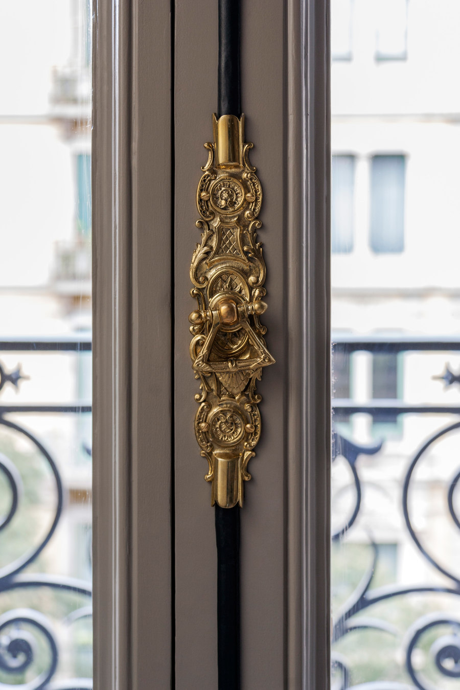
The original exterior sliding doors were an innovative solution at that time. The system was cleaned and restored as well as the iron and brass fittings. The paint from the carpentry was removed showing the pine melis base and cover with a glossy varnish the same colour with walls. Gilded brass fitting adds necessary contrast to the mink-coloured carpentry.
Almost all of the interior doors were preserved, except for a couple that were custom made to fit the rest of the apartment doors. The brass handles by Formani are simple and fit in well emphasising the original fittings of the apartment.
Kitchen, Dining and Living Room
The kitchen, dining and living room are now an open space, in the previous layout they were separated by a partition, but the Nolla floors and the original ceilings are preserved. A majestic Valencia pink marble chimney dominates the living room. To the sides, it has bespoke oak bookshelves with brass details and aged mirror. This extraordinary piece of antique is highlighted by elegant and modern interior design. The result is spectacular and permits the space to adapt to contemporary aesthetics.
The couch is from Casadesús and upholstered by the same manufacturer. The vintage armchairs from the ’50s by Gigi Radice upholstered with velvet from Rubelli. To the other side of the room, there is a kitchen area designed as integrated furniture and mostly aesthetic since its use will be occasional. Varnished in the same colour as the rest of the apartment, the only contrast is the stove and kitchen tap in black from Dornbracht. The height reaches the lintel, which allows to hide the AACC, provide for additional storage space and reach the design cohesion.
The dining room is in front of the kitchen. It is stylish, modern and contextualized. The table is designed by Mimouca, made of brushed oak,varnished in black with iron legs coated gold. Chairs Tauro from Andreu World, with black wood legs and upholstered with a spotted fabric following the hues of the Nolla mosaics. The lamp was custom made by Bronzes Bolívar, inspired by a Michael Anastassiades design.
Master Suite
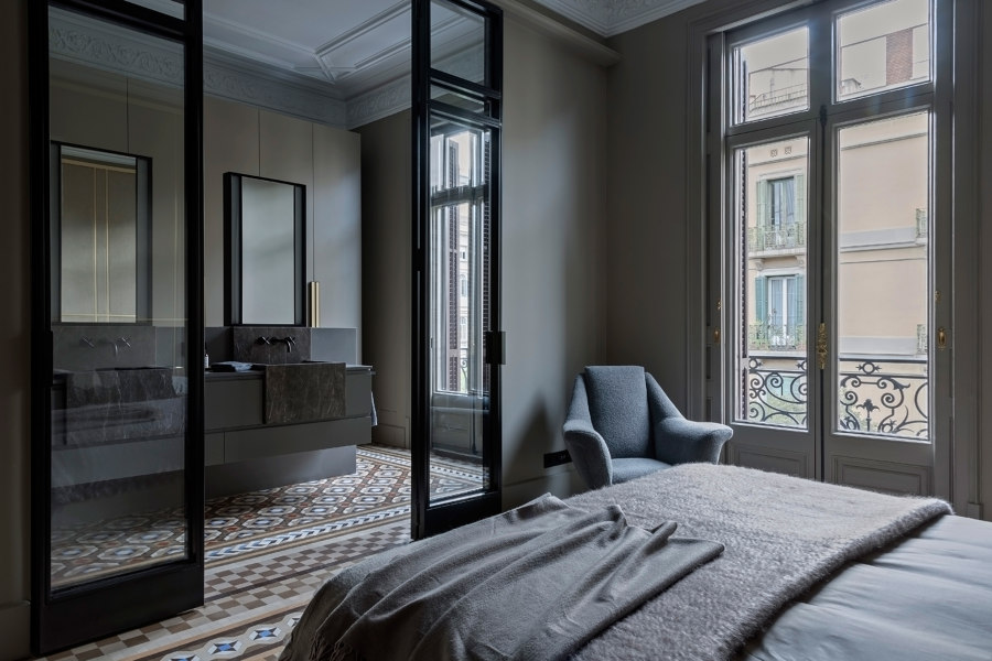
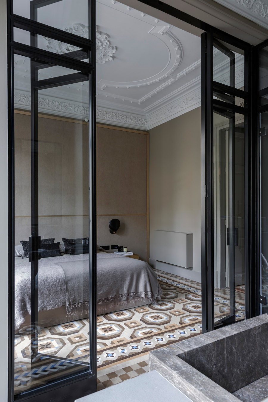
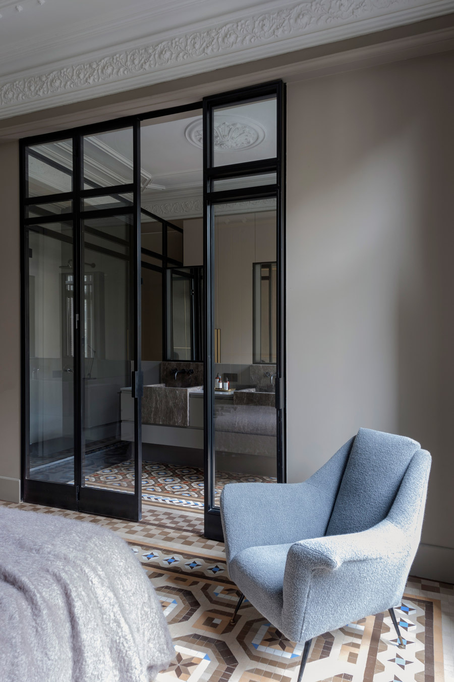
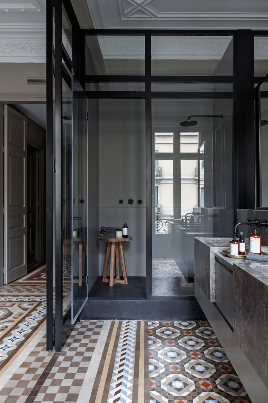
The suite overlooking Caspe Street is an open space divided by a crystal partition trimmed in black into two zones: a bedroom and a bathroom with a walk-in closet. The team had to remove the mosaic Nolla and to redo flooring as with time and building settlement the floors echoed the vaulted ceilings of the apartment below. After all the works the mosaic was placed back.
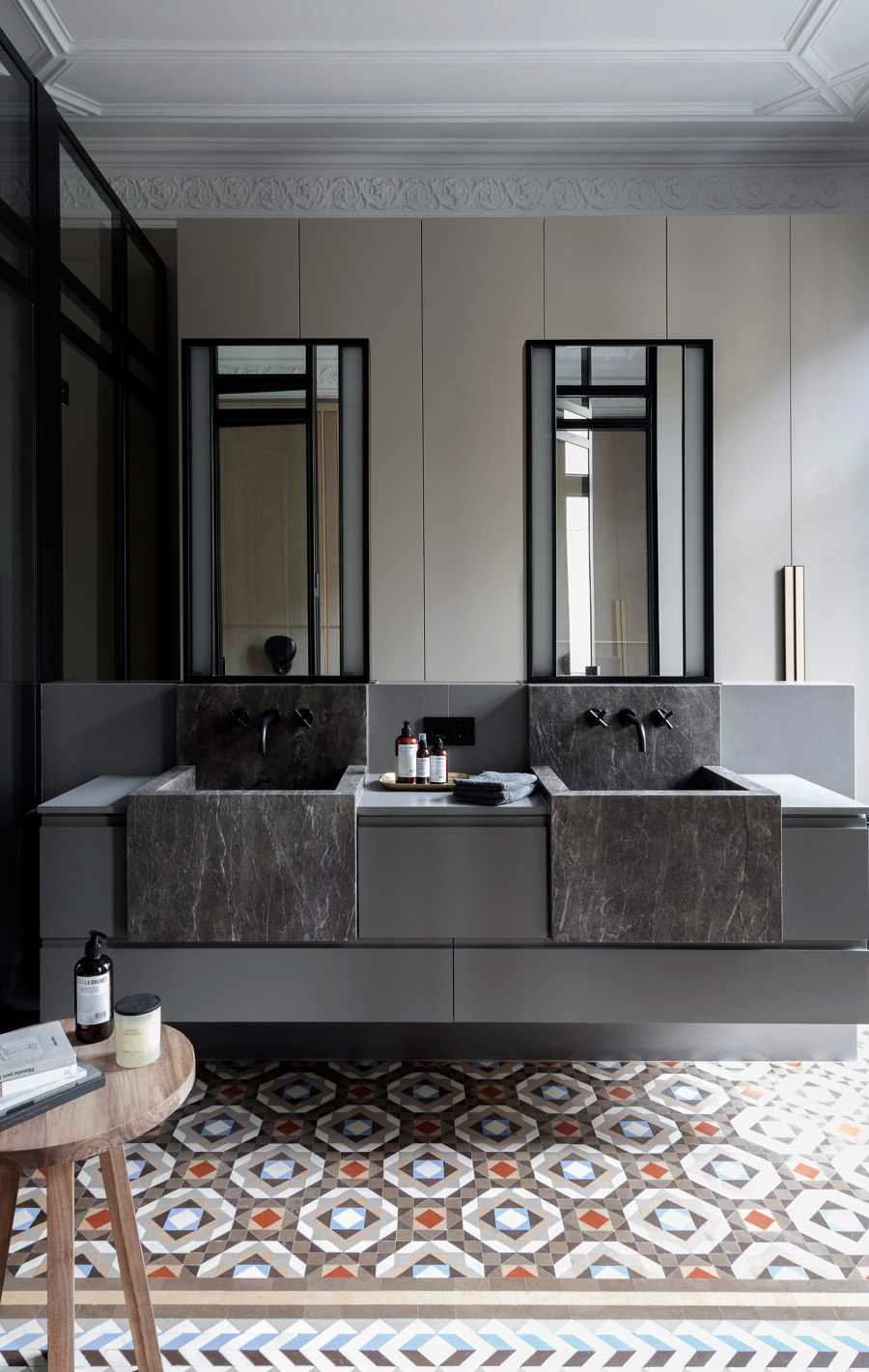
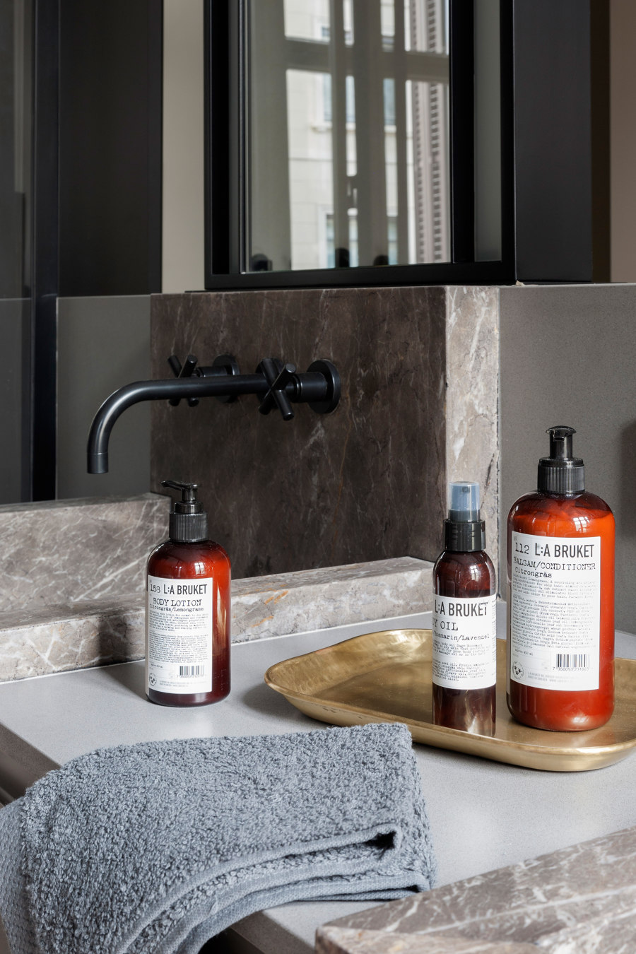
The bathroom features two sinks over the Italian stone top and the mirrors illuminated by sides. All design elements: materials, textures and colours are used to highlight Nolla mosaic floors. And achieving this balance between new design and existing elements is always a challenge. A shower and toilet partition continues the design line of the suite interior. Black added in sanitary ware, faucets, handles, wall lamps and iron elements inspired by forge iron provides a cohesive feel to the interior.
The furniture should comply with the Nolla mosaic flooring and vaulted ceilings. For this reason, the team has designed an upholstered headboard plated with brass. Gilded bedside tables with straight lines and sober design by Praddy. The closets in the bathroom area simulate doors and go almost unnoticed, providing additional storage space. The handles in black and gold add a sophisticated touch.
Design Team:
Mimouca Barcelona
