Fotograf: Gregor Ramaekers

Fotograf: Gregor Ramaekers

Fotograf: Gregor Ramaekers
Exciting contrasts
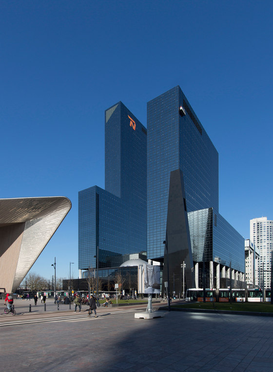
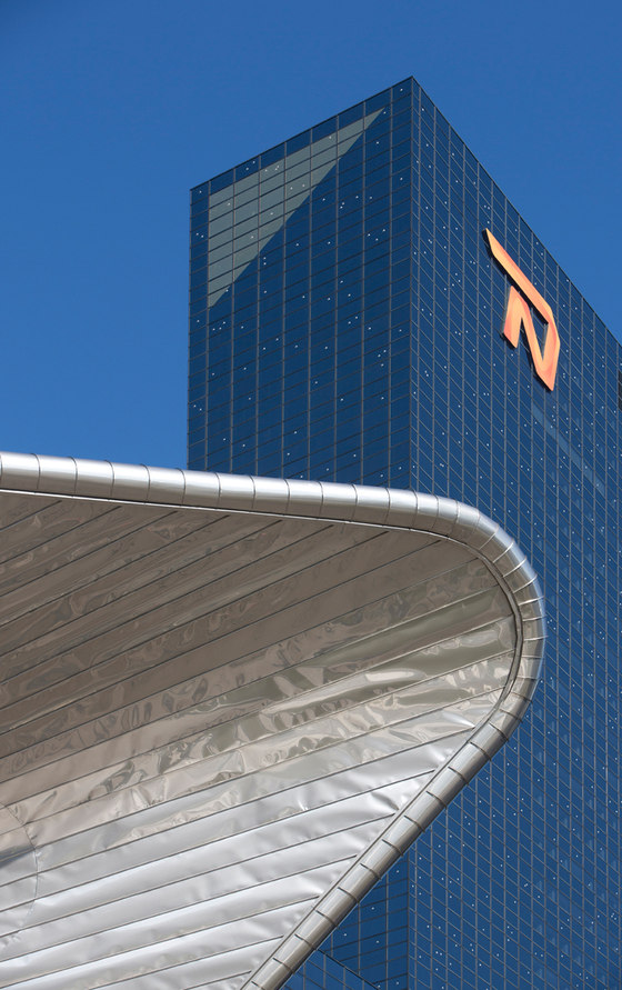
The Delftse Poort, an impressive building made of steel and mirrored glass, was erected in 1992 on the site where the city gate stood from 1764 to 1940. It is located in the commercial heart of the Rotterdam Central District. The Delftse Poort, which has 42 floors and is 151 metres high, was the tallest skyscraper in the Netherlands when it was first built.
Over the centuries, Rotterdam has built an impressive reputation thanks to its international port and its bold architecture. 'The dominant culture in Rotterdam is to "put up or shut up," which is a challenge we as owners have taken to heart,' says Vincent van den Putten, asset manager at CBRE Global Investors. 'Together with Ramon Beijen, interior designer and creative director of CBRE, and suppliers like Mosa, we have demonstrated that you can transform an interior while still respecting the existing architecture. All it takes is a little courage, a good vision, and a gung-ho attitude!'
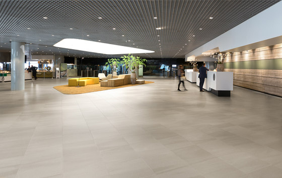
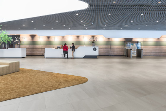
'Buildings are no longer occupied by a single tenant; those days are over,' says Van den Putten. 'The same is true of the Delftse Poort. We transformed this single-tenant building into a multi-tenant building where you can work, meet, and relax; a lively and dynamic building full of movement. We involved all parties in the development process, from the owners KanAM and the CBRE Dutch Office Fund to the designers, the tenant Nationale-Nederlanden, our contractor BAM, our real estate team, and suppliers like Mosa.' Beijen agrees.
Dynamic flooring in building full of movement
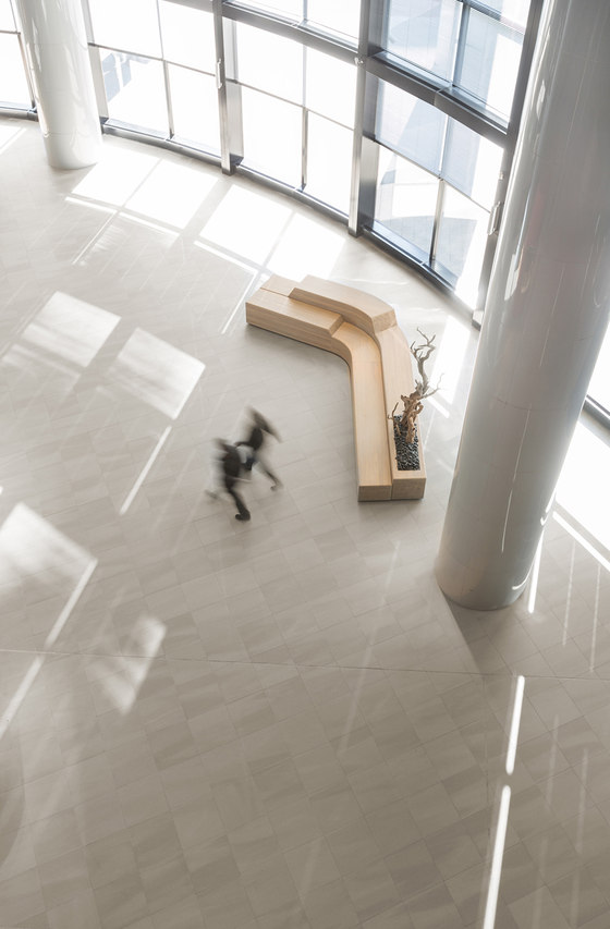
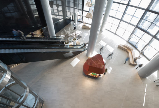
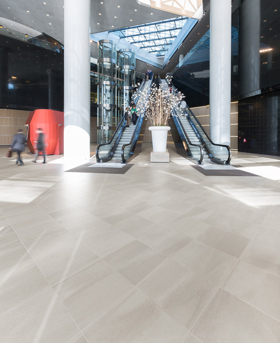
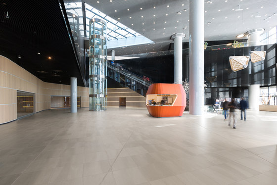
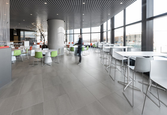
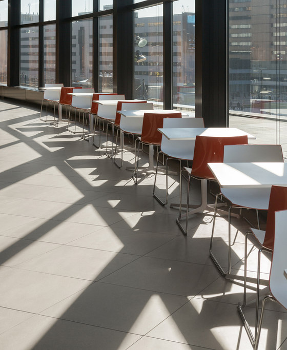
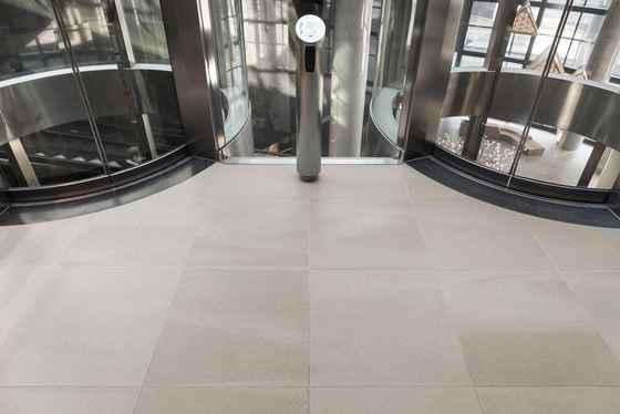
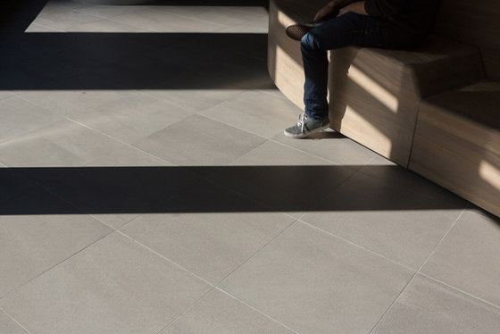
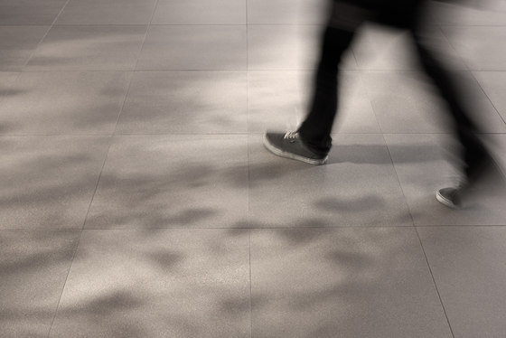
'It's hard to get a sense of what a floor that size will look like based on mood boards alone! We found the perfect tile at the Salone del Mobile furniture fair. We'd worked with Mosa before, but the Solids collection was new to us. So we called them immediately to ask about it and then visited Mosa to discuss colours, hues, and tile sizes. We initially wanted a 90x90 centimeter tile, but after discussing it and testing it at length, we finally settled on a 60x60 centimeter tile instead. What makes the Solids collection so unique is its randomness – the floor looks like an organic whole instead of individual patterned tiles,' says Beijen. 'A plain tile doesn't work on a surface area of 3,000 square metres,' explains Van den Putten. 'It lacks charisma. We wanted a tile with a subtle pattern that could bring a floor that size to life. A huge floor really defines the look of a building, which means it's just as important to support a good concept with good design.' Beijen agrees and adds that ceramic tiles also reflect light very nicely. 'They warm up the space and give it a very different look compared to granite or concrete. The warmth of Solids matched our design brief perfectly. We wanted a durable floor with a matt finish that could withstand intensive use.
CBRE Design Ramon Beijen + CBRE Global Investors Joanne Rozenburg

Fotograf: Gregor Ramaekers

Fotograf: Gregor Ramaekers

Fotograf: Gregor Ramaekers

Fotograf: Gregor Ramaekers

Fotograf: Gregor Ramaekers

Fotograf: Gregor Ramaekers

Fotograf: Gregor Ramaekers

Fotograf: Gregor Ramaekers

Fotograf: Gregor Ramaekers

Fotograf: Gregor Ramaekers

