In 2010, when Murado & Elvira Architects won the competition to design the Public Library and Historic Archive of the city of Baiona (Spain), they decided to design a place that would convey a sense of domesticity to its users: they came up with the idea of a warm wooden dress, tailor-made for the ancient building. A dress that covers the interiors of the architectural body, leaving the exterior almost unchanged. The old Sancti Spiritus Hospital thus reconquered its original role, by becoming a new home for scholars and readers. And for tourists too. The city of Baiona, located on the west coast of Spain, is located along the Camino de Santiago and is visited every year by thousands of pilgrims. In addition, the Baiona Historic Archive is one of the most relevant in the area, preserving documents dating back to the discovery of Americas. Baiona was in fact the port where La Pinta, one of the three caravels led by Christopher Columbus towards the New World, arrived on its way back in 1493.
An incipient hospitality expands into the library.
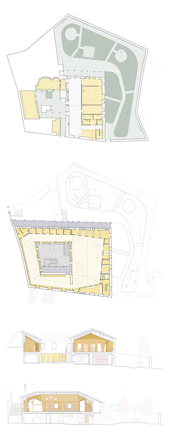
Accommodated within the former Sancti Spiritus Hospital, an existing structure built in the 17th century behind the ex-collegiate church of Santa María, the Baiona Public Library is a two-level building embedded in the sloped historic city center with a garden and an inner courtyard. The building is listed, protected as a Bien de Interés Cultural (BIC). Despite its status, it has suffered major alterations in the course of the centuries, some affecting the patio and garden, that had come to lose their significance; others heavily modifying the interiors, that due to an intervention occured in the 1970s were obliterated and deformed. The renovation project by Murado & Elvira aimed to restore the desirable role of the outdoor spaces and redefine the historical identity of the building through the careful design of a succession of rooms in which to host its new public functions.
“Whe we first visited the old building we felt the need for our project to create a new interior identity, connecting and
giving continuity to the old structures,” say Clara Murado and Juan Elvira.
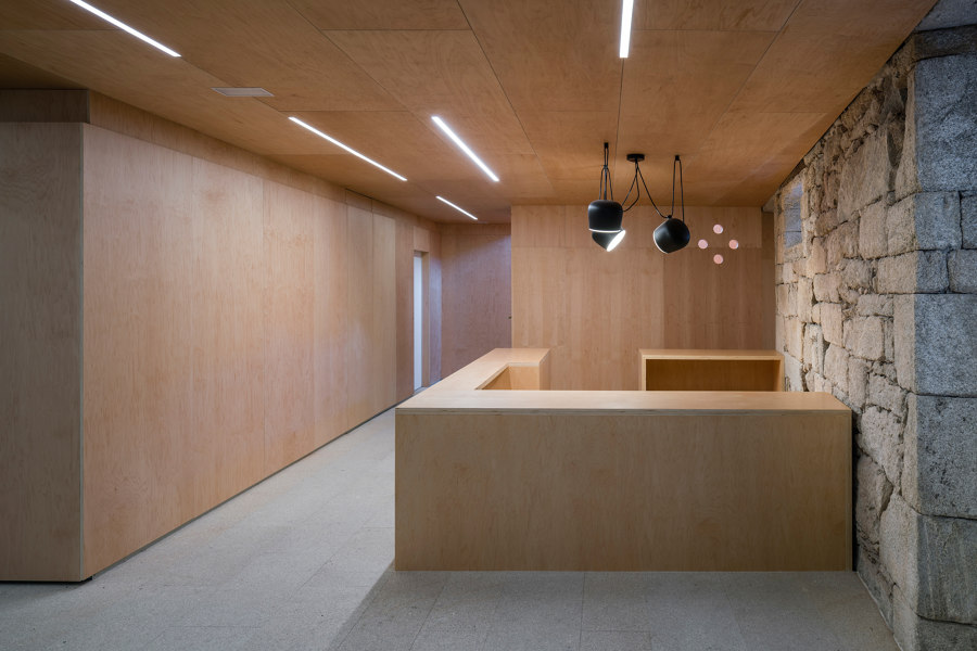
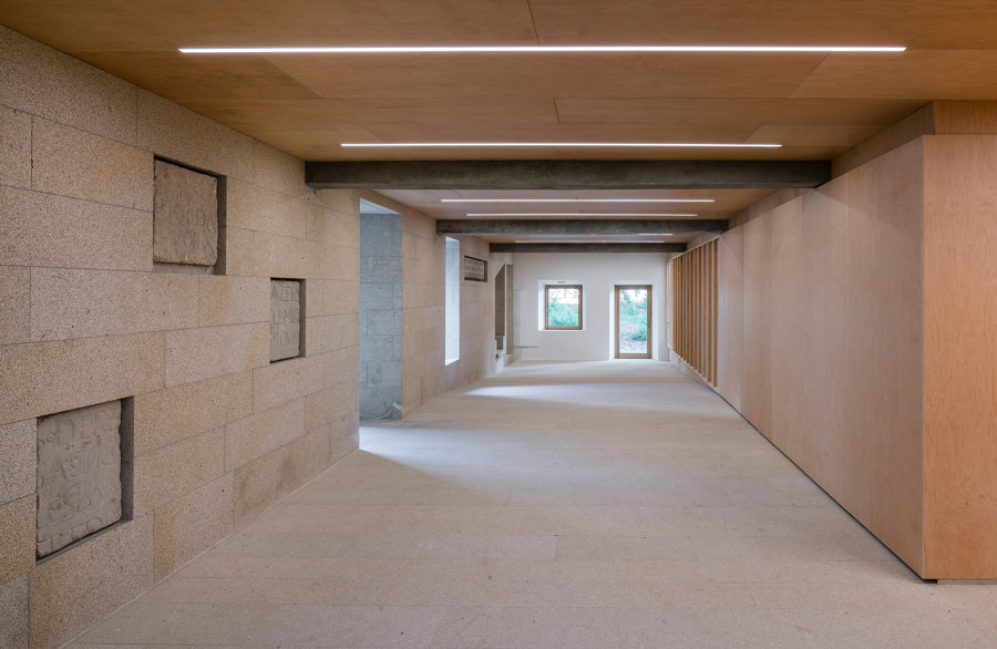
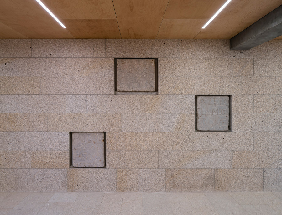
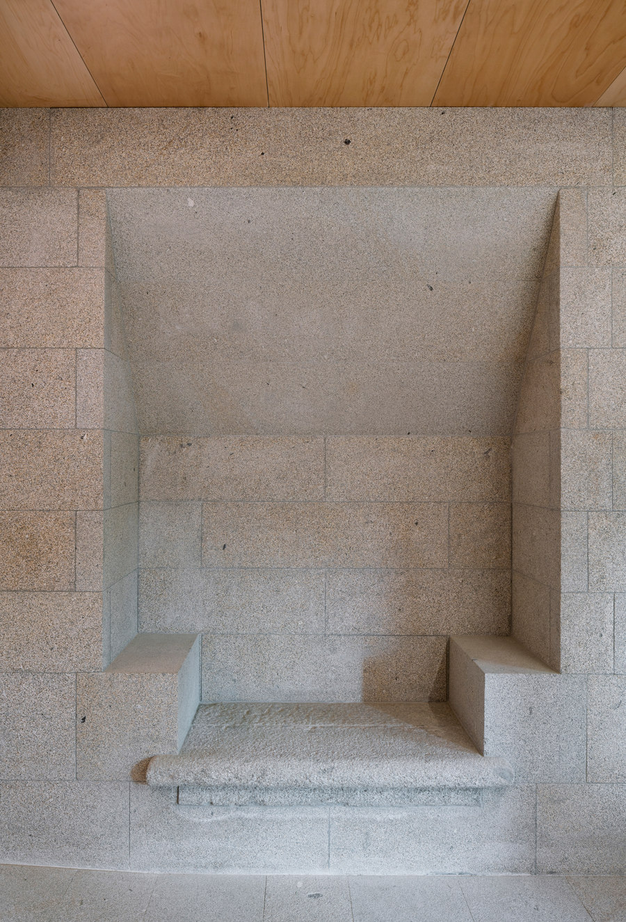
History has been carefully observed and questioned by the architects. This can be clearly perceived in the spacial sequence that guides visitors from the open spaces of the urban fabric to the most intimate condition offered by the reading rooms. On the ground floor a large hallway transverses the building like an indoor street that leads to the patio and the garden. It is a real introduction to the new nature of the building, an immediate and unexpected overview of time that passes through it. This main axis is marked by a thick stone wall, reminiscent of the old granite structure, that gathers archeological pieces from the original building, bonding memories and heritage to the new function of the building.
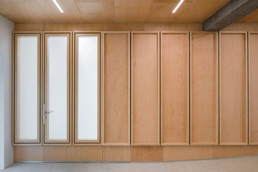
The solid and materic wall structure is counterbalanced by the soft and warm appearance of the wooden box containing the Historic Archive and all the service rooms to the right of the entrance path. The building thus immediately reveals its dual nature and its ability to reaffirm its vocation for welcoming visitors.
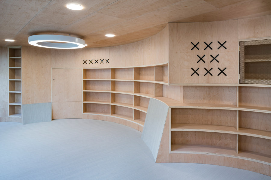
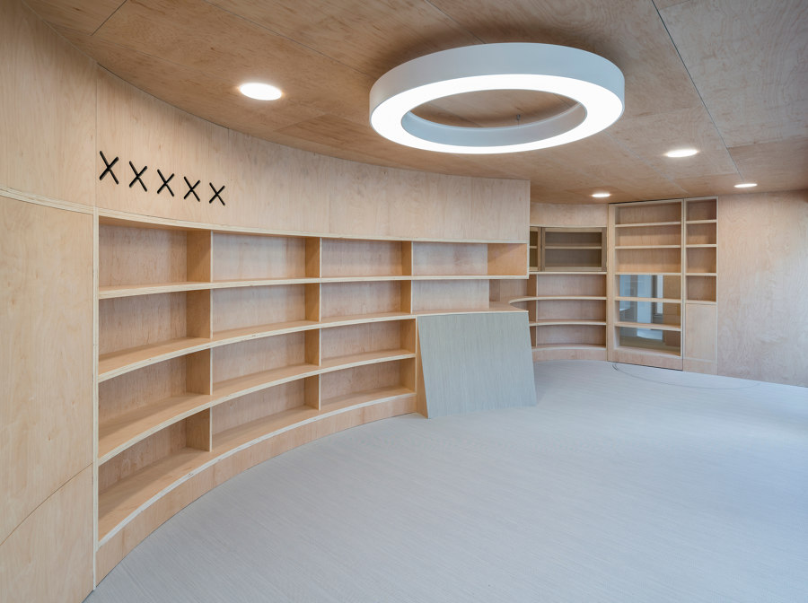
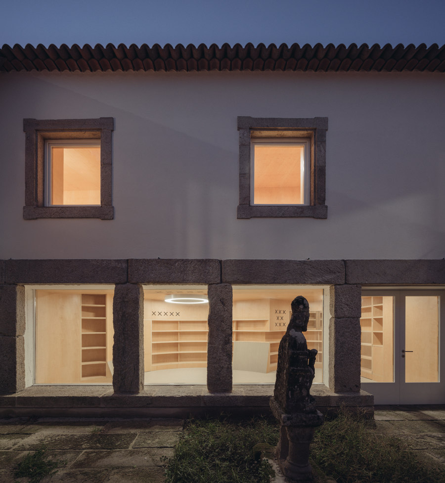
To the other side, opening towards the courtyard, is the children’s library, with a distinctive irregular shape that gives it a playful identity. Murado & Elvira used the asymmetric perimeter of the building to their advantage in order to design what may be the most characteristic room of the complex. Its position allows sunlight to come in, while giving to the kids a quiet and safe place to play inside. Textile floors offer a comfortable surface to sit on while some folding surfaces, made of the same material, give shape to inclined planes to recline upon.
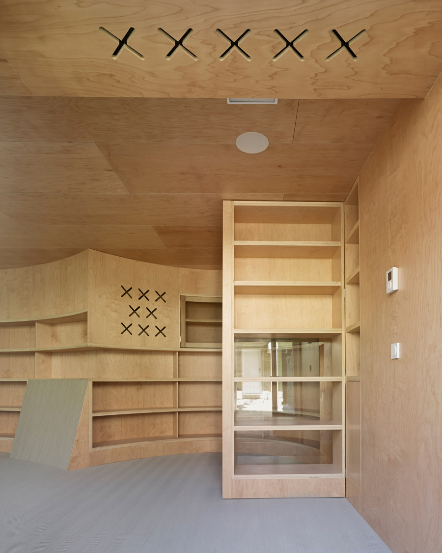
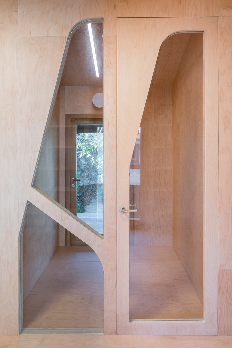
Similarly to the Historic Archive, rooms are completely wrapped in warm maple wood: the architects used curved wooden walls to integrate shelvings and some openings to hidden spaces behind, such as a wardrobe and a puppet theatre.
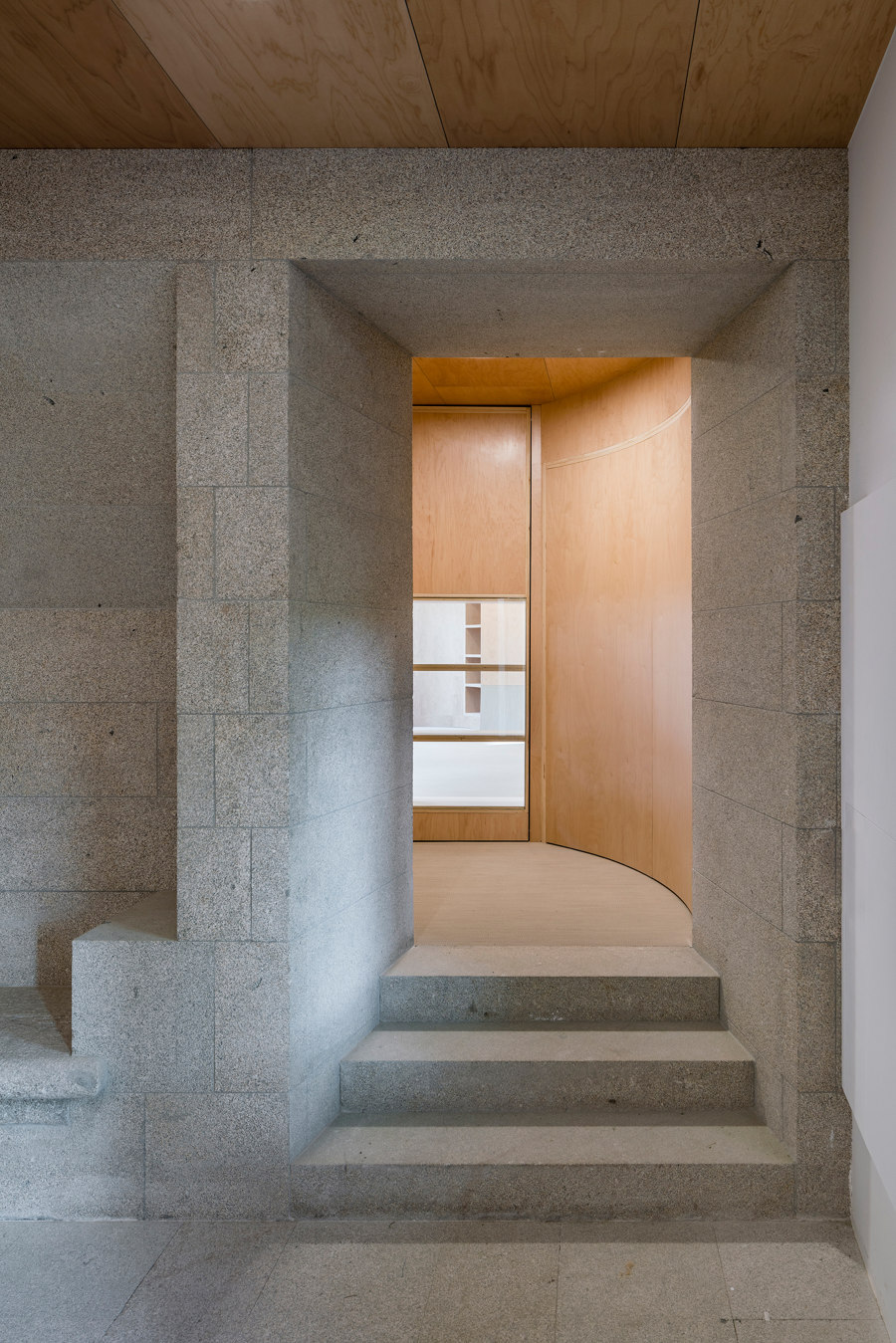
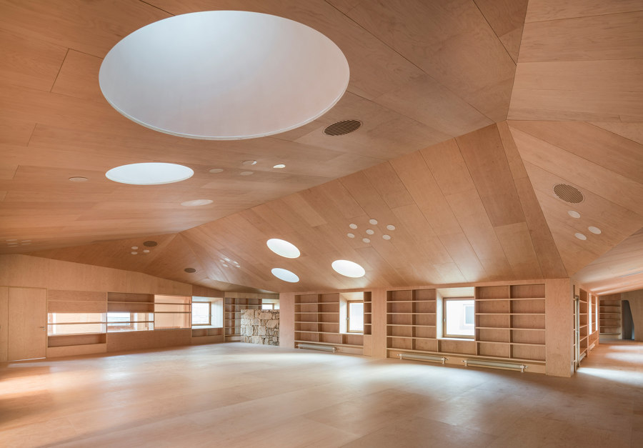
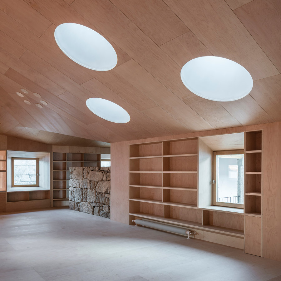
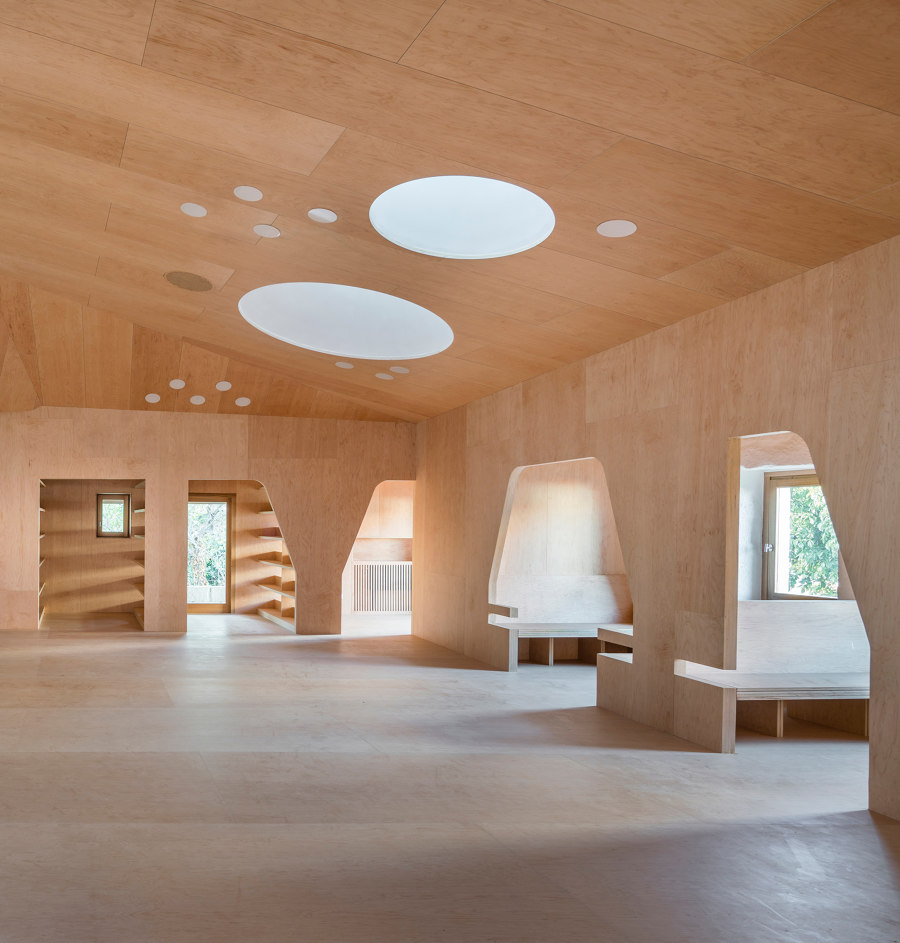
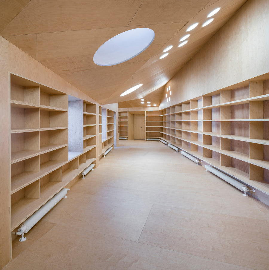
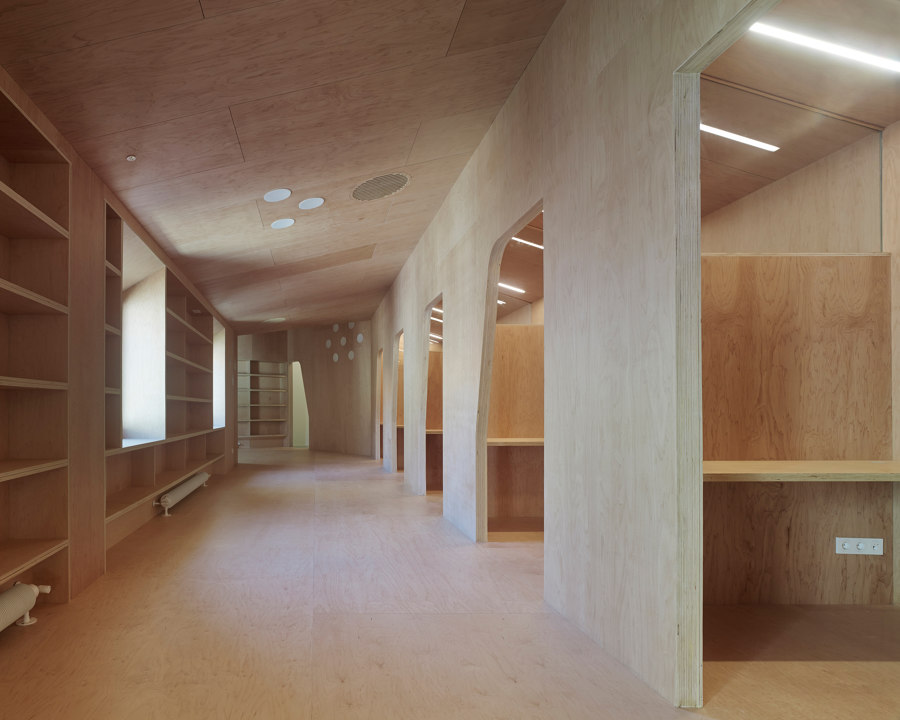
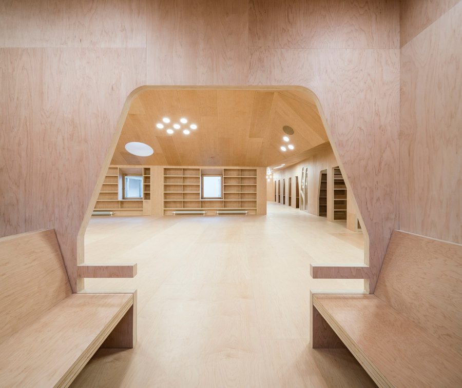
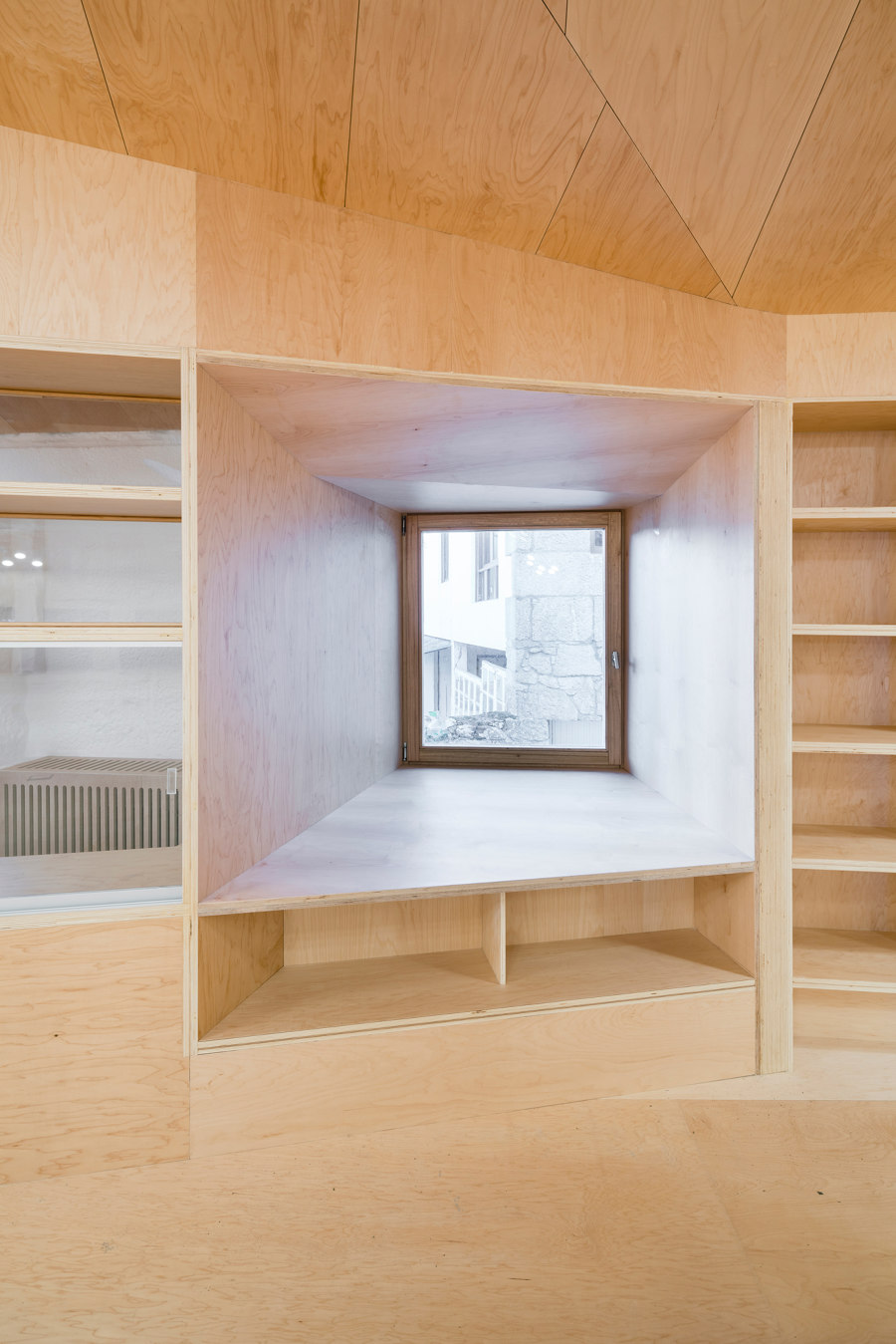
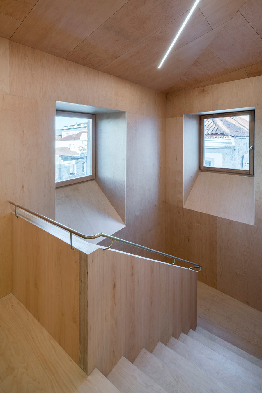
Three stairs connect the ground to the upper floor, where the main reading room is located: two outdoor stairs in the courtyard, one indoor stair directly accessible from the inner accessway. Encircling the patio, this open space, where the wooden inner envelope is celebrated, is composed of a series of interstitial rooms, individual study alcoves, bathrooms, offices and bench reading rooms. A double maple wooden skin embraces this space completely, from the floor to the vertical walls. The same maple wood has been used also for the ceiling in a triangulated surface that, while describing an ever-changing volume, adapts to the structure and to the dimensional needs of the mechanical systems. All around the reading room windows open up to the garden, surrounding the North and East sides of the facility. The garden is accessible from the main entrance through a hallway.
A warm and articulated architectural space.
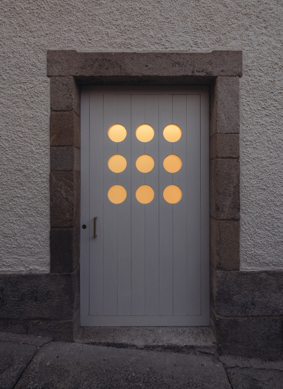
The warm and light-colored maple wood surfaces that cover progressively the inner surfaces of the architectural body, as with an epithelial tissue that can protect but also transmit emotions, convey a sense of domesticity and coziness to the spaces. They create a continuum among the various rooms of the complex, thus overturning the more conventional design strategy of providing a building with a unitary external skin. This inner envelope emerges as the most distinctive characteristic of the library designed by Murado & Elvira Architects. While from the outside the Sancti Spiritus Hospital seems to have apparently remained untouched by their renovation project, when stepping inside one is immersed in an unexpected and surprising environment. This new skin rejuvenates the building, which is for the most part mono-material, without erasing its history, making the Sancti Spiritus Hospital a place where everyone can find his own spot, a pilgrimage center for citizens and tourists.
“The building could be understood as a solid stone plinth and a wooden fitment on top of it. The library becomes a furniture to be inhabited. We always had in mind the studio of Saint Jerome in Antonello da Messina’s painting where the whole studio seems to be built around the book,” affirm the architects.
Emblematic in this sense is the ground floor, where the contrast between the maple wood and the grey of the granite stone welcomes users into a space where the past merges into the present. The archaeological finds embedded in the stones recall memories of the ancient Sancti Spiritus Hospital and are confronted with the wooden box of the Historic Archive, where the heritage is now preserved.
On the upper floor, instead, where the spatial organization recalls the historical sequence of rooms, the wooden surfaces envelope the spaces completely, from floor to ceiling, conveying a surprising condition of warmth. Here, a double maple wooden skin envelopes the entire floor, opening a concentric functional band composed by a series of interstitial rooms: individual studies, bathrooms, offices and bench reading rooms.
“The intention was to leave the reading room as open as possible. We placed all the ancillary spaces in the perimeter, in a double functional band. The thickness of this second skin is visible in these spaces and also in the ceiling, through the skylights that reveal the actual depth of the envelope.” Juan Elvira
Furniture originates from the facades.
The scale of the reading room oscillates between the affective and domestic condition of the furniture and the grandness of the big ark embracing individuals and things. The design solution adopted for the interiors contributes to making spaces homogeneous yet, at the same time, immediately recognizable. The resulting environment is both graphic and spatial. Inner facades are cut out and the cut-outs become tables, whose shapes and materiality define a continuum between the scale of the building and that of the furniture, without apparent distinction.
“While on the ground floor artificial lighting is organized in a linear way, following the steps through the hallway, rounded skylights and clusters of lamps form constellations in the reading room on the upper floor.” Clara Murado
Murado & Elvira also designed the wayfinding signage and the logo for the Baiona library. The wooden surfaces are cut and engraved with a similar technique to the one used to extract the furniture directly from the walls. They also designed unique pieces, such as the lamps for the garden, conceived as curious devices to be used by both humans and non-humans, with a fountain, a plate for birds to drink water from and a mirror.
Design Team:
Murado & Elvira Architects: Eugenia Concha, Marta Colón de Carvajal (competition phase)
Cristina Gutiérrez Chevalier, Francesco Martone (design development phase)
Project and site management, supervision during construction: Clara Murado and Juan Elvira (Murado & Elvira Architects), Óscar López Alba (OLA Arquitectos) and Manuel Cuquejo (technical architect)
Technical systems engineering: Obradoiro Enxeñeiros
Structural engineering: Ezequiel Fernández Grinda
Contractor: Orega Coviastec
Client: Municipality of Baiona
