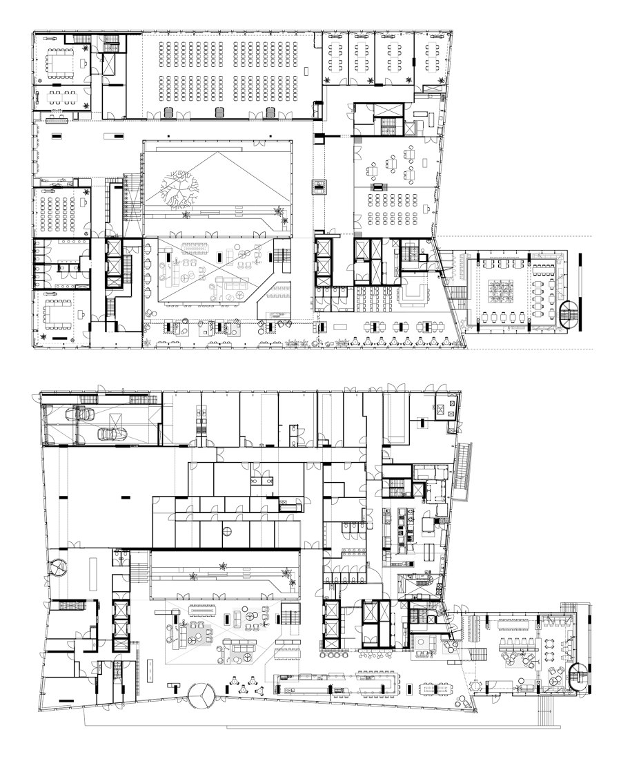
Take one imposing building, consisting of three separate areas, serving a very diverse clientele, and turn it into one giant living area that caters to the need of all. That, in a nutshell, was the challenge in renovating Amsterdam’s Hotel Casa.
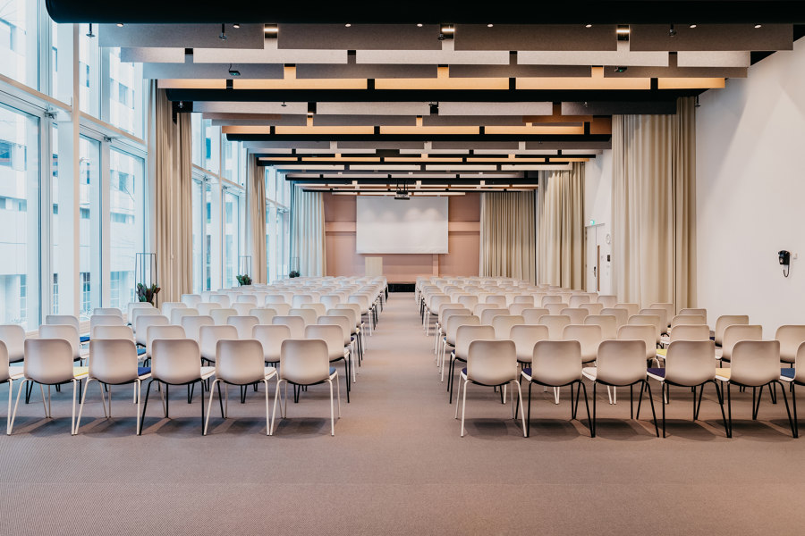
Founded in the late 1950s to help solve the housing shortage for students, Casa has always been a hybrid of sorts, serving as the (temporary) home of hotel guests, locals, student residents and people attending a board meeting or conference. In 2010 Casa moved to a new building but the concept stayed the same. Recent plans to renovate and modernise the convention center turned into a complete overhaul of both public and conference areas.
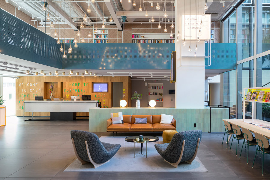
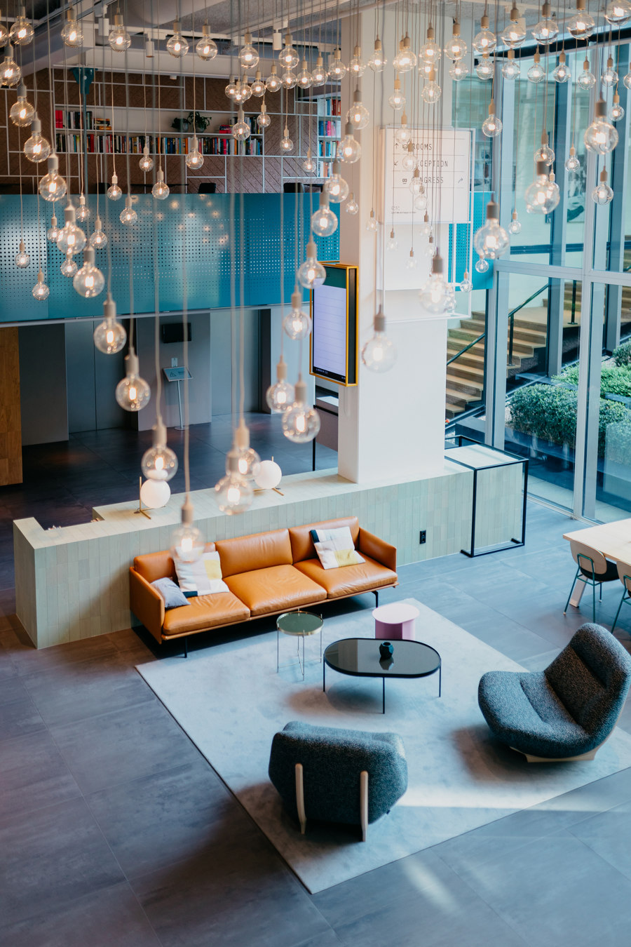
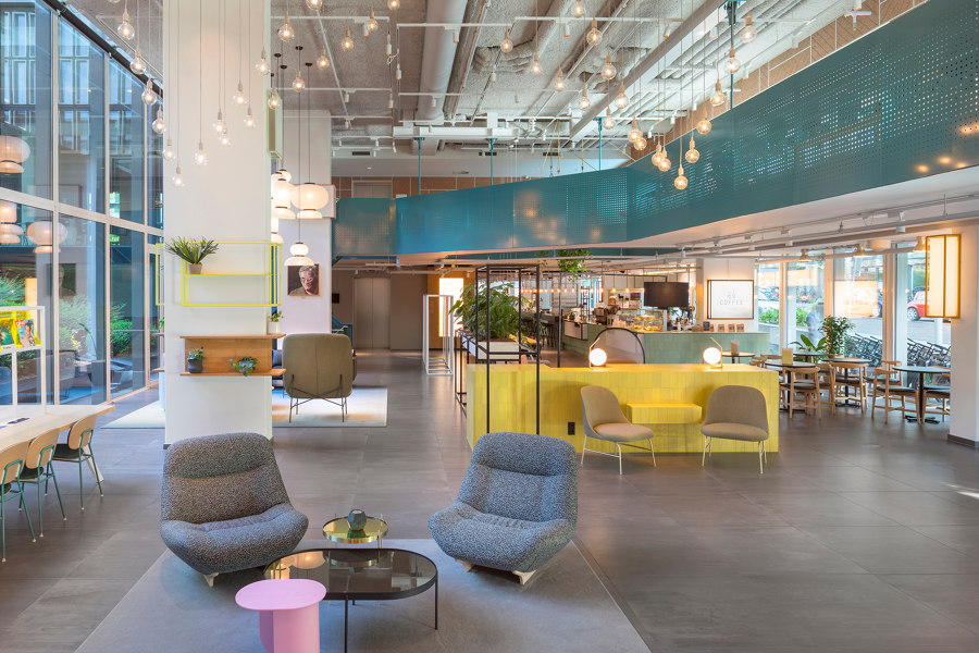
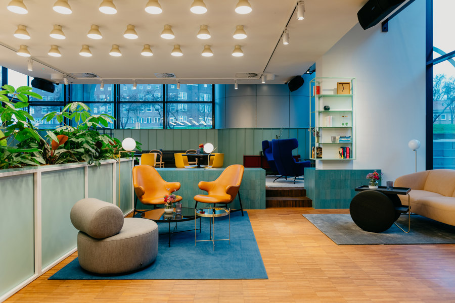
In the new design connectivity was key. There’s one central space for all visitors to enjoy. The focus lies less on specific functions like bar, restaurant or check-in area. Instead the communal area functions as a big student living room that can serve as a place to relax, work, study or eat depending on the type of visitor, their mood or time of day.
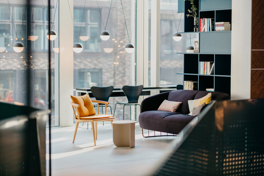
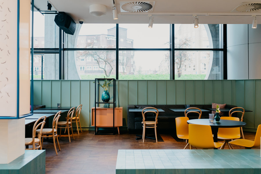
The design-concept for the space is an analogy for communal (student) housing: someone brings a chair, another a cupboard and organically the furniture combines into a living space with atmosphere and character. Although the designs consist out of new furniture the selection is an eclectic mix of styles, textures and shapes that harkens back to Casa’s Student roots.
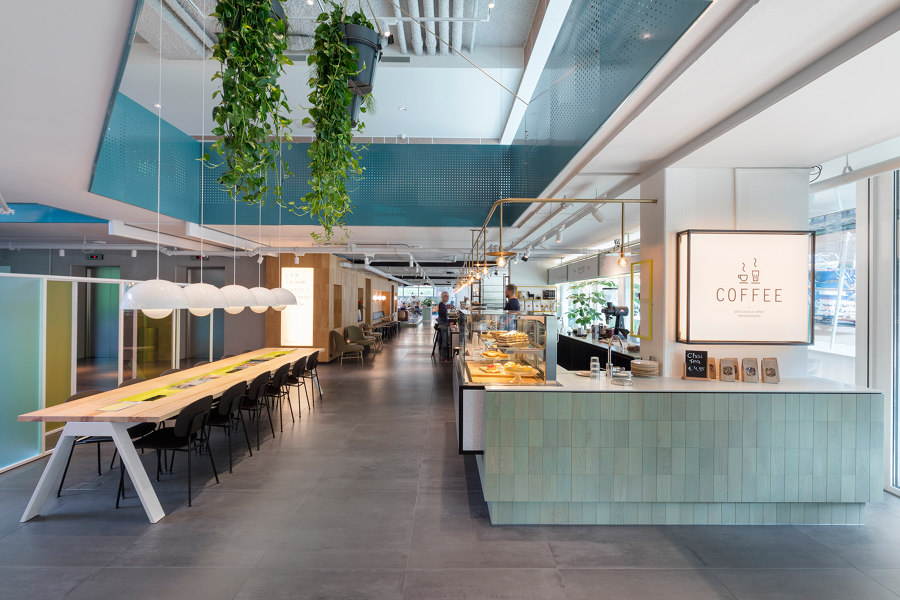
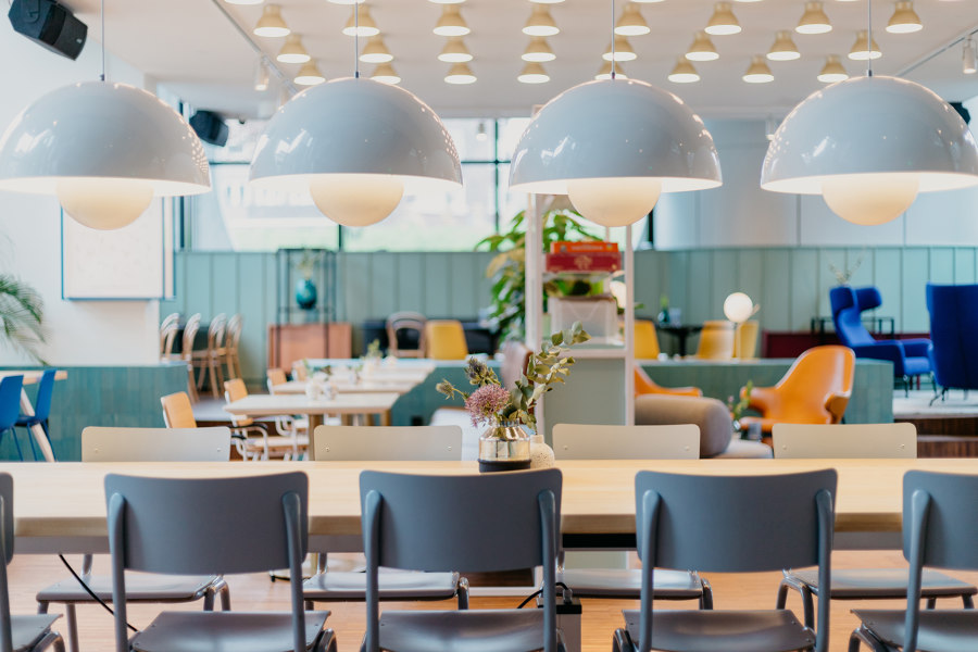
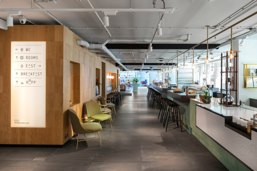
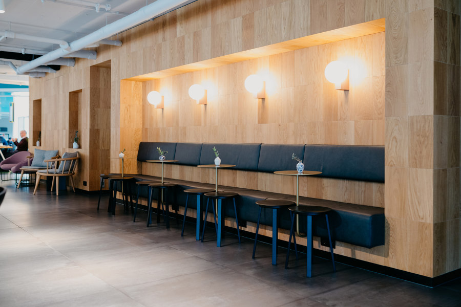
The new bar is a central and key element in the design, it connects the different areas and therefore serves as the heart of the hotel. The side facing the reception is designed as a full-fledged coffee bar, with hot coffee to go, while the other side towards the restaurant serves as a classic hotel bar with fine drinks and a seasonal dinner menu. The selection of furniture on this side is more focused on dining, with a large communal table and cozy seatings, within keeping the living room feeling as the main tone.
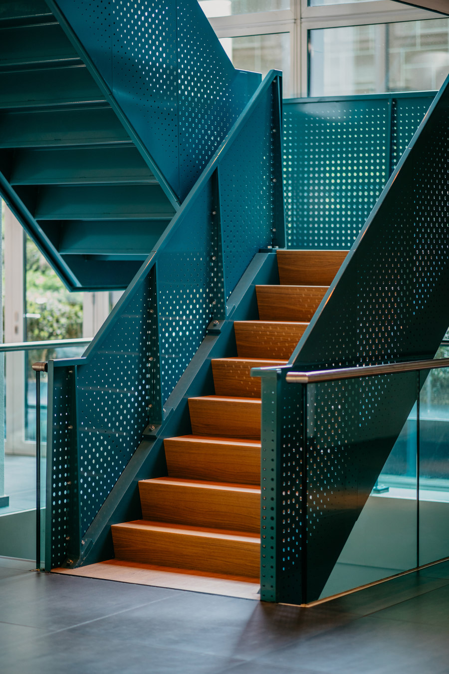
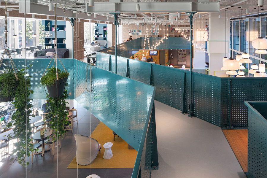
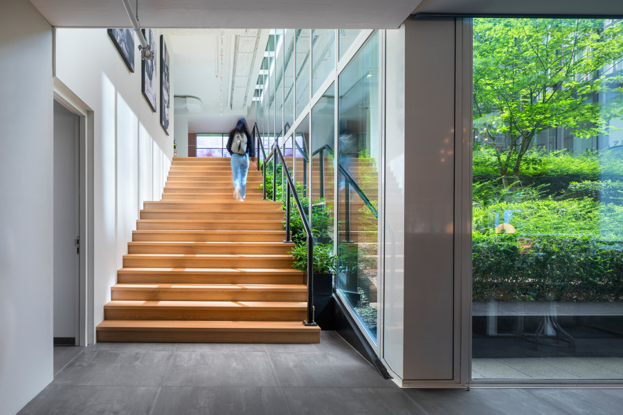
As the first floor was earlier used as a conference guest place only, the lobby has now been extended to the first floor. To increase the new connectivity between the lobby and the first floor, a staircase has been added that leads to the new mezzanine, which opens up the area easily to other visitors as well. The new oak staircase has planting along the green patio to enhances the visual connection between inside and outside. By creating a wide mezzanine, the first and ground floor are physically linked, allowing for more interaction between guests and creating even more different “moods.”
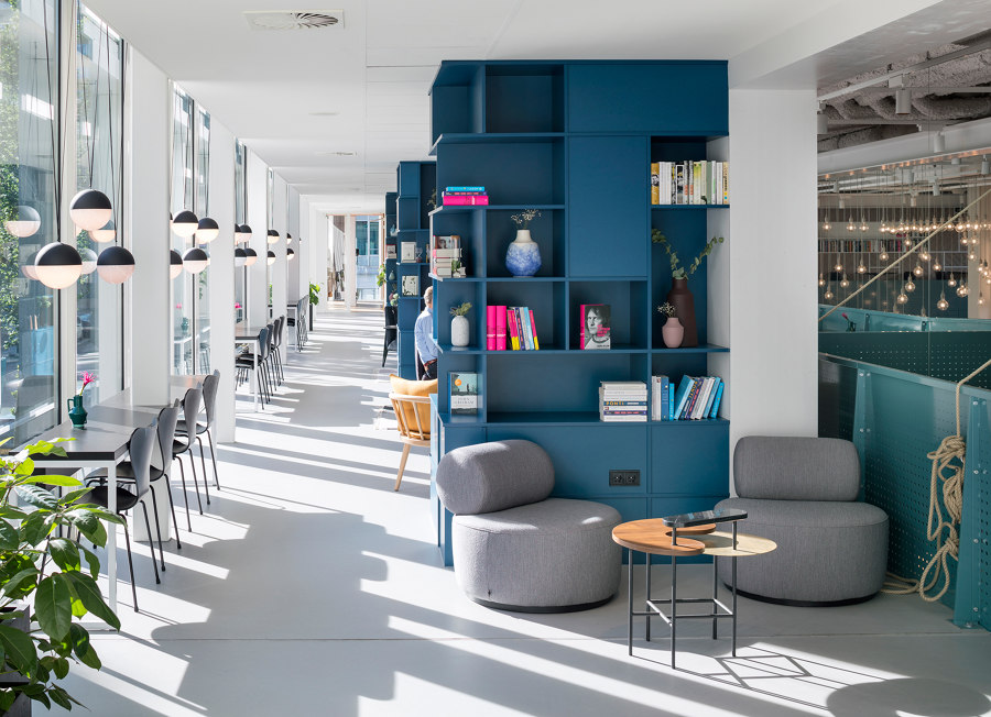
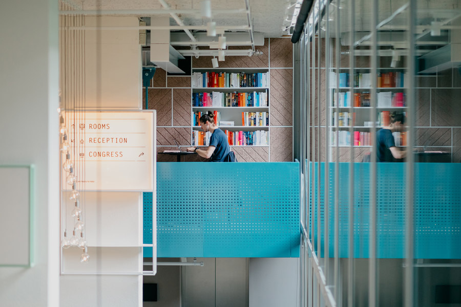
Conference participants can meet in different places during breaks and hotel guest can find a place to relax. The break-out areas are situated around the green courtyard overlooking the lobby. The facilities are adapted to the different needs of the guest; coming into contact with other guest/participants or being able to work individually or continue to meet in a small intimate group. Small sitting rooms are created between room-high bookcases made out blue mdf. Long desk tops along the glass facade and the balustrade of the mezzanine serve as workplaces.
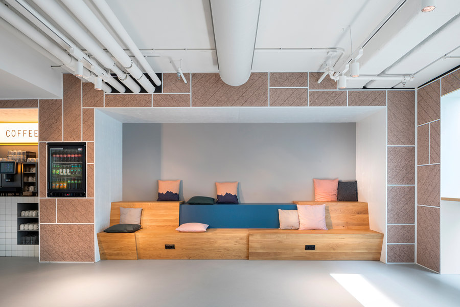
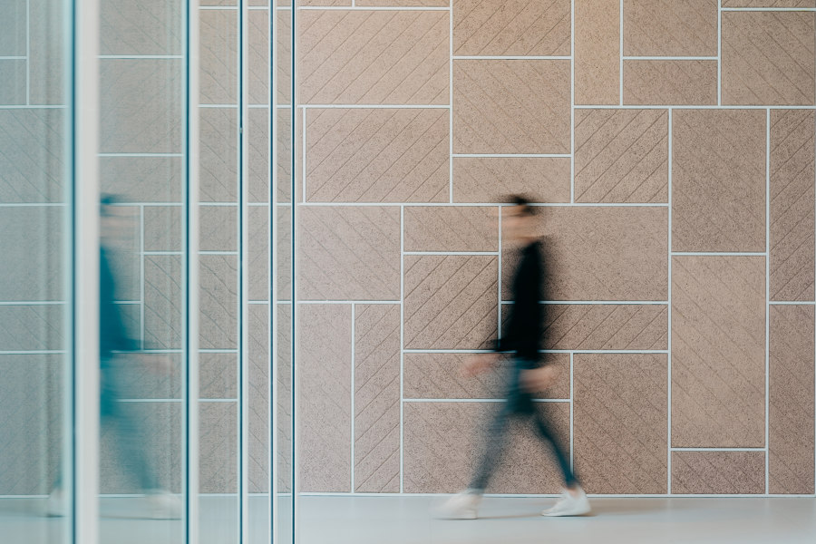
A 40-meters-long nude tinted grid wall forms the visual backbone. The wall connects the various conference areas such as meeting rooms, break-out areas, elevators and stairs. The wall is made of sound absorbing wood wall cement boards, a material used in the ceilings of many a dormitory and therefore another wink to the hotel’s student heritage.
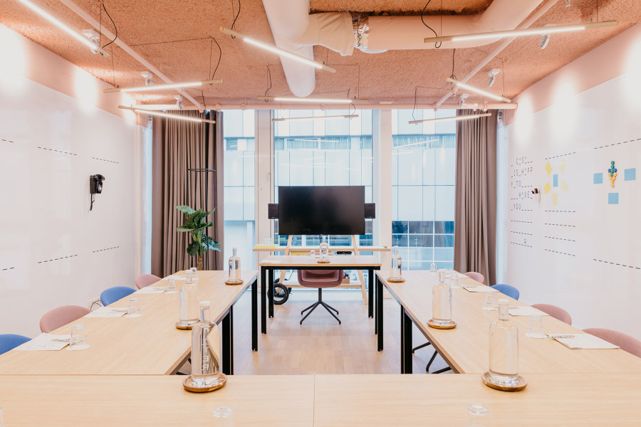
All meeting rooms are bright and airy, with floor-to-ceiling windows, and walls made of magnetic whiteboard. The rooms invite visitors to get up from the table and take action, to unleash that young and free student mentality, while also providing visitors with all the corporate necessities needed.
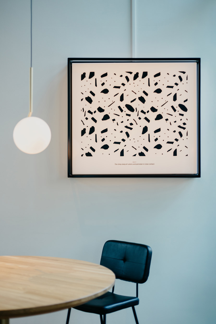
The architecture of Hotel Casa is rigid on the outside and dominated by white and grey tones. This sleek design language is also clearly legible within the building. A color- and material concept has been developed for the new interior that forms a clear counterpart to this. Oak in various applications gives warmth and a natural character. The use of a wide range of colours makes the playful character of Hotel Casa visible. The colors are reflected in fixed elements such as the bar of the half-height blocks that divide the space and also in the upholstery ad the various steel frames. In a subtle way the guest can experience a gradient from lighter tones in the lobby area to dark tones in the restaurant area.
Design Team:
Ninetynine
Lead architects: Jeroen Vester and Ulrike Lehner
Collaborators: Giulia Cosenza, Mandy Finke, Marjolein van den Elst, Roos Claessens and Paul Vester
