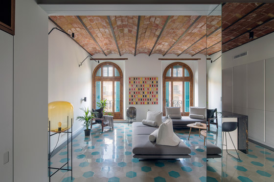
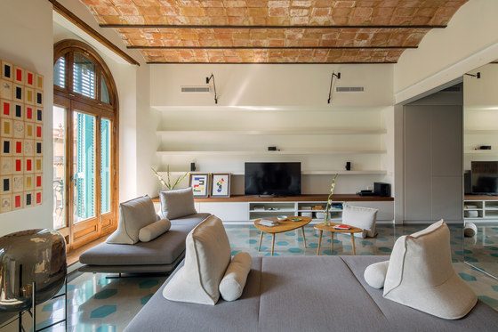
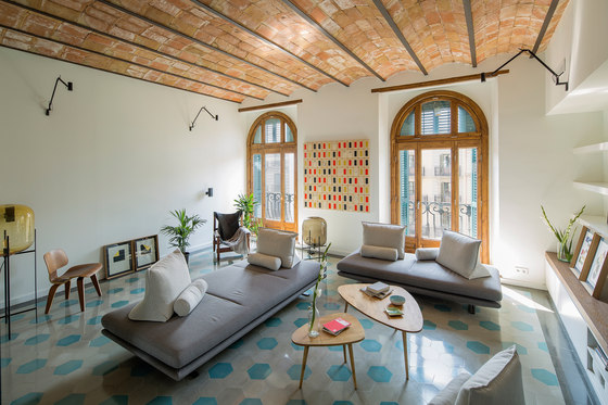
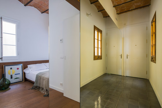
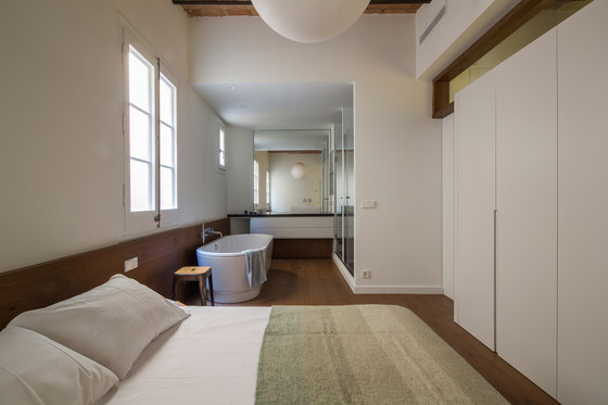
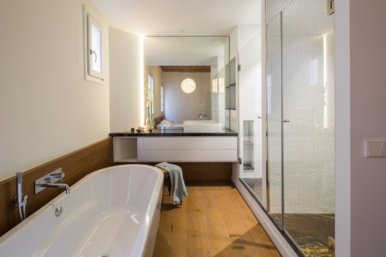
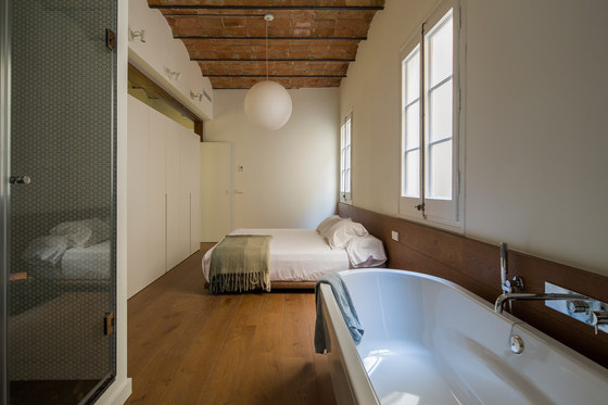
The projects we have done so far have had very centric locations within the city of Barcelona: Ciutat Vella, Eixample, Gràcia, Poble Nou… This time, however, it was at the centre of it all. Located in Plaça Catalunya, the first thing we did was to look out from the generous balcony doors to the urban sights outside, from a very privileged location on one of the building’s top floors. It was then that we knew that the day zones were to be located towards these valuable openings to the city’s frenetic rhythm.
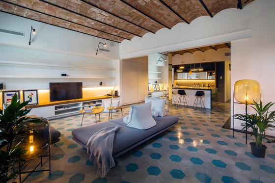
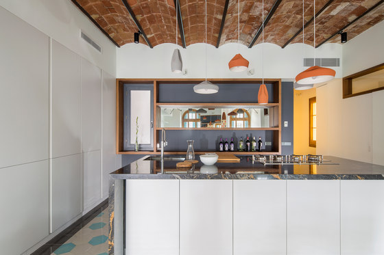
The customer, amazed by Barcelona’s centre, had a very clear distribution in mind. He wanted a spacious dwelling for him as the main occupant during his occasional visits to the city and for hosting his guests. The kitchen had to be at the centre of it all, serving as a meeting point- more of a gastro bar than a family kitchen. It also had to be complemented by wine cellar for more than 600 bottles.
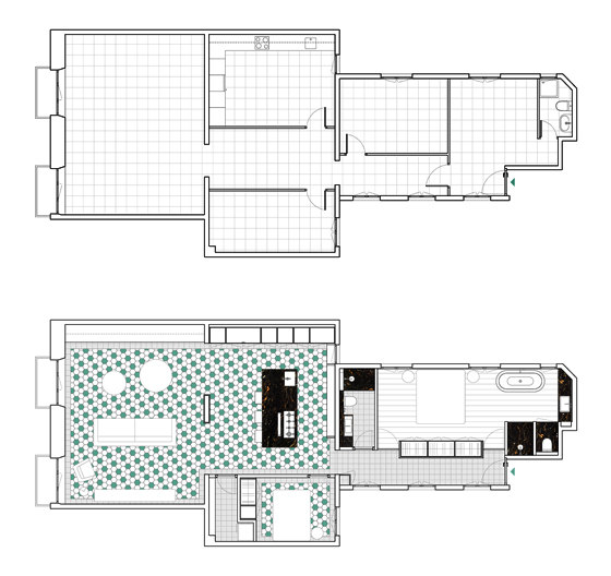
The intervention began by allocating the living room on the outermost space, between the facade and first load-bearing wall, and we blended it with the next space towards the interior. These two spaces were originally separated by a load-bearing wall, which we partially brought down to create two large openings that help bring together both spaces. All of the daytime activities occur on 61 m2 out of the total 118 m2, leaving the rest of the rooms to be adjacent to the building’s two patios.
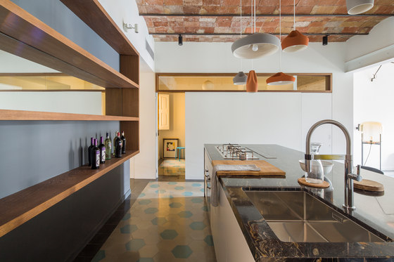
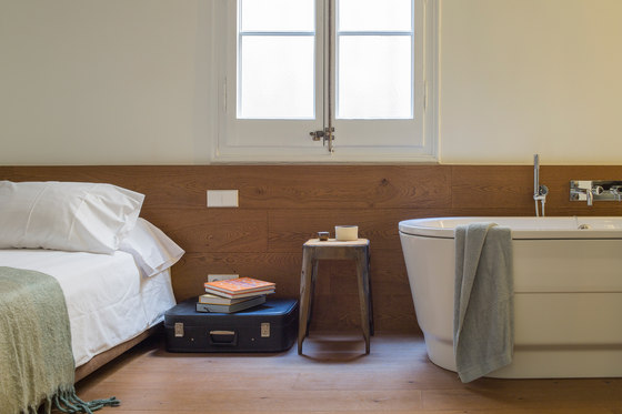
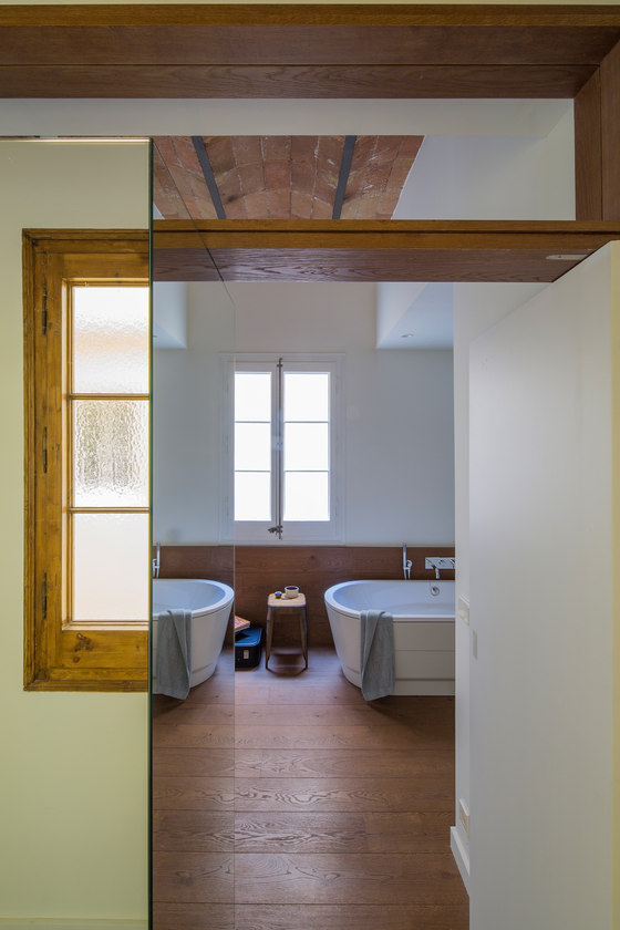
The main bedroom, with an in-suite bath, is close to the entry and opens to the more intimate patio. The bathtub and vanity blend with the bedroom and large closet separates it from the hallway. Further down the hall a guest bathroom was allocated with the guest bedroom just in front of it, which opens up to the building’s main staircase’s atrium. Adjacent to the guest bedroom and with direct access to the kitchen is the wine cellar, which includes a wooden wine rack and a wine cooler.
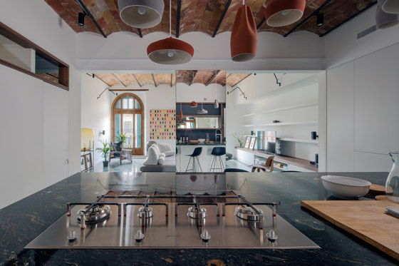
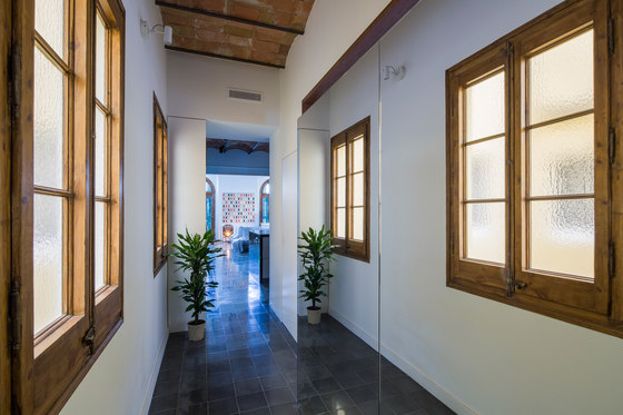
There was a great amount of windows for a distribution with such a small amount of rooms. The apartment has 10 openings to the exterior, including windows and balcony doors. To increase the presence of these openings and to multiply their presence we used mirrors to highlight the architecture of the beginning of the previous century. In the hallway, which has 3 generous windows overlooking the building’s atrium, we placed very large mirrored panels to multiply the views of these windows and to give the space a more diaphanous character. Such is the same with the remaining section of the load-bearing wall that was brought down, which disappears on single, vertical mirror. In this case, the mirror dissolves the wall, bringing the attention to the two balcony doors and allows the cook to control the shelves behind him while he entertain his guests.
The high ceilings allowed us to place horizontal windows that bring in light to the darkest areas of the apartment, making every space more airy without compromising privacy. When it comes to materials, the project recuperated the original features, such as the vaulted, ceramic slabs and iron beams in the ceilings. The rest are noble materials (wood, granite, steel and glass), all in neutral tones with the exception of the granite used in the kitchen and bathrooms. The Stromboli granite adopts a strong role within the space with its dark, black setting for its golden streaks, which contrasts heavily to the light tones of the hexagonal hydraulic pavement, typical of the Eixample.
Contemporary and warm finishes highlight the original envelope, which is only altered to bring back a spirit more honest to the building’s tectonics and to allow it to evolve to today’s standard of comfort and living style.
Nook Architects
Builder: Metric
Paintings: Esther Mir
