Fotograf: nieve | Productora Audiovisual

Fotograf: nieve | Productora Audiovisual

Fotograf: nieve | Productora Audiovisual
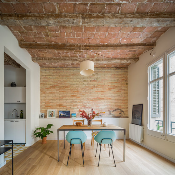
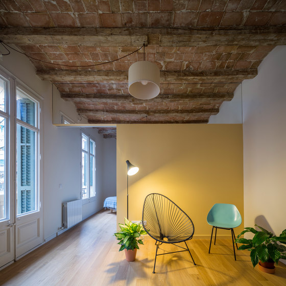
We found ourselves with a dwelling in Barcelona’s Eixample District, located in one of its iconic chamfered corners, a situation that implicated certain peculiarities in terms of distribution and structure, main points in our proposal. Its beams, perpendicular to the walls that support them, become a fan as they meet the chamfered edge in order to adapt to the typical constructive solution of turn of the century buildings in the Eixample.
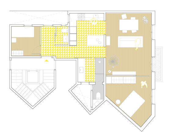
The original home had the living room towards the chamfered facade and the main bedroom on the other end. The kitchen was small and dark, and was linked to the living room by means of a narrow hallway. The bathroom, accessed through the kitchen, had the only shower of the dwelling and was situated in front of a third bedroom. This distribution generated spaces that were dark and difficult to locate fixed equipment. As such we decided to eliminate the third bedroom and switch the position of the living room to gain floor area on the day zones.
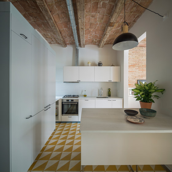
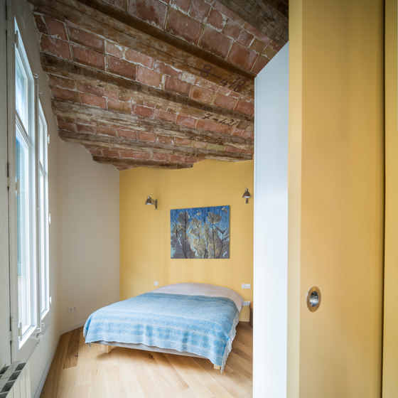
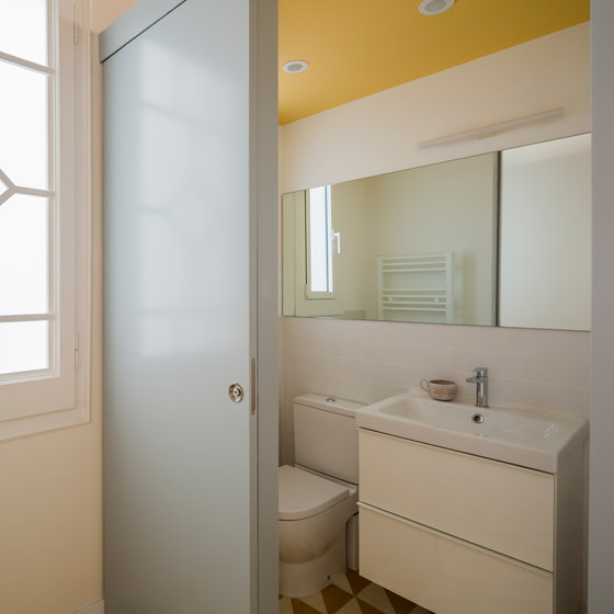
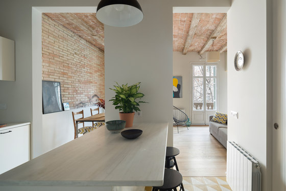
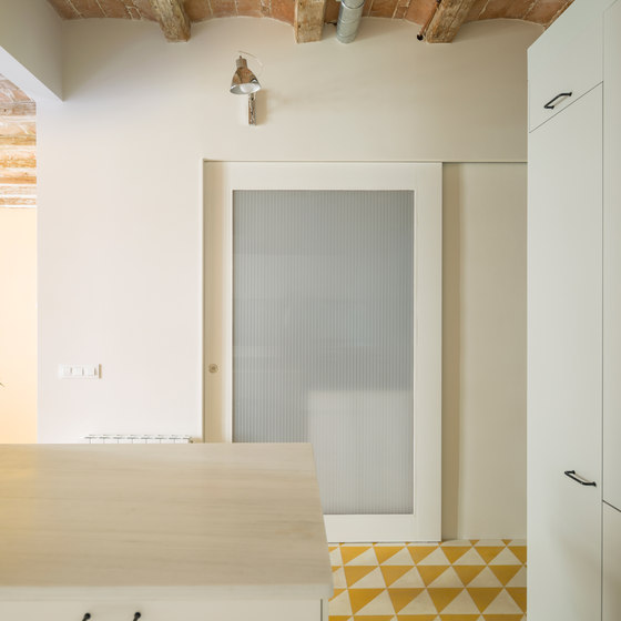
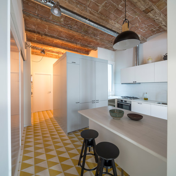
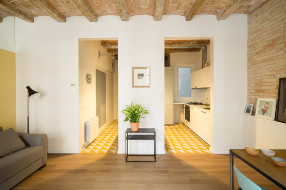
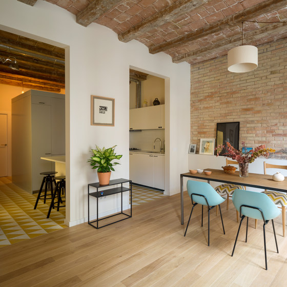
The current dwelling inverts the position of the living room and kitchen and a large, vertical opening is made on the load-bearing wall that sits between them, which improves lighting and communication. The main bedroom, now larger, is located on the chamfered edge. The main bathroom is now located where the kitchen once stood and is enclosed by a polycarbonate panel door. When the bathroom light is on, this sliding panel acts as vertical lamp widening the spatial sensation of the central part of the apartment. The only rooms that remain in their original position are the second bedroom and water closet, which has been completely renovated.
This new arrangement allows light to penetrate to the darkest areas that are farther away from the facade and improves the relationship between the spaces the comprise the day zones. The connection between the main bedroom and living room has been strengthened to create a much more open feeling. These are separated by a large sliding door that’s painted the same colour as the wall and disappears when it is open. The upper part of such wall is finished with a mirror that creates the illusion that the partition does no reach the ceiling giving the illusion that the space continues with its beams perpendicular to the facade as opposed to the radial arrangement that is really present on the bedroom’s ceiling.
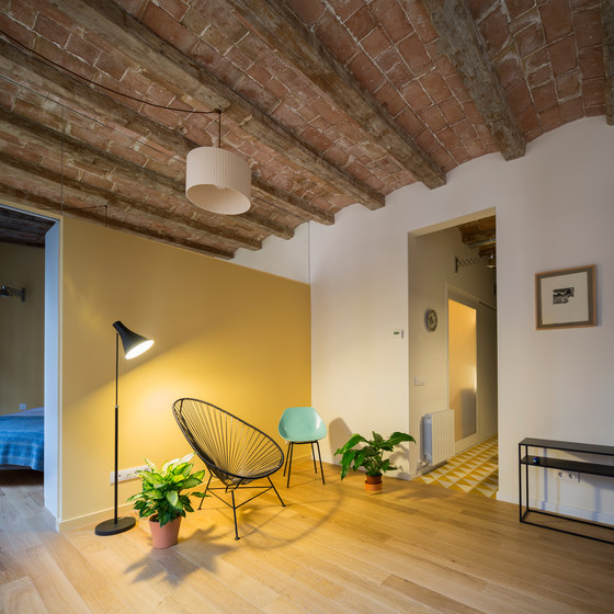
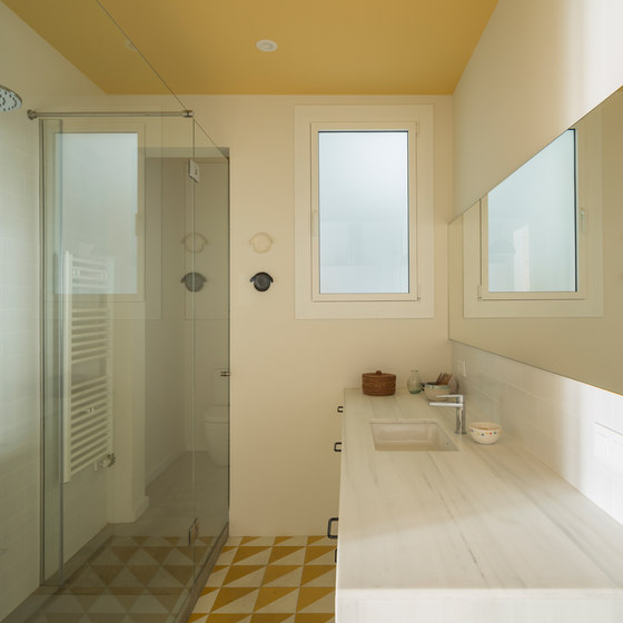
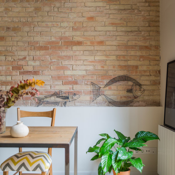
The project recuperates the original envelope with its vaulted ceiling and wooden beams. The materials and tones have a very natural appearance: untainted wood for the floor in the living room and bedrooms and hydraulic mosaic for kitchen and bathrooms. Some loadbearing walls were left with the brick exposed and painted. These used to be covered by stucco but have lately gained value due to their constructive craftsmanship. The entire apartment is treated with tones of White, ochre and greys. The original windows have been preserved, restoring them with lacquered paint, and the single glass has been substituted by double-glazed panels. This intervention seeks to recuperate the materials used on the buildings envelope and the use of traditional and warm materials that return the honesty of the constructive system and adapt to today’s way of life.
Nook Architects

Fotograf: nieve | Productora Audiovisual

Fotograf: nieve | Productora Audiovisual

Fotograf: nieve | Productora Audiovisual

Fotograf: nieve | Productora Audiovisual

Fotograf: nieve | Productora Audiovisual

Fotograf: nieve | Productora Audiovisual

Fotograf: nieve | Productora Audiovisual

Fotograf: nieve | Productora Audiovisual

Fotograf: nieve | Productora Audiovisual

Fotograf: nieve | Productora Audiovisual
