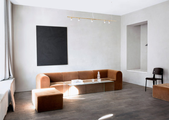
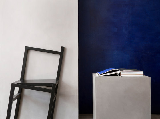
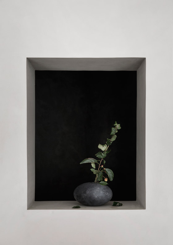
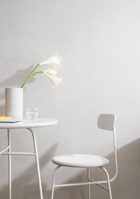
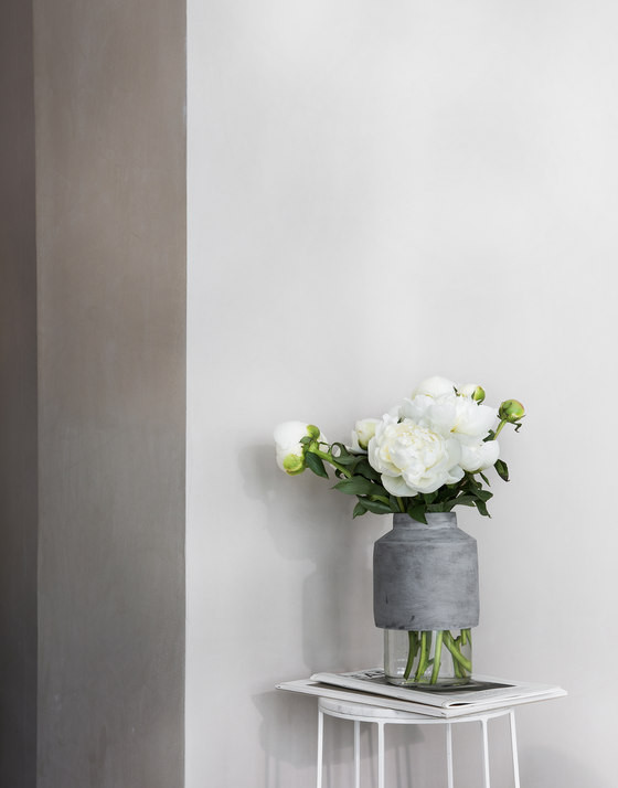
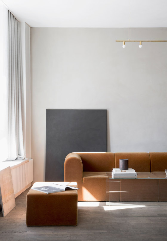
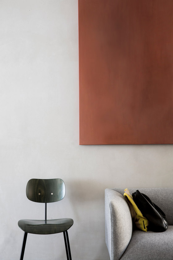
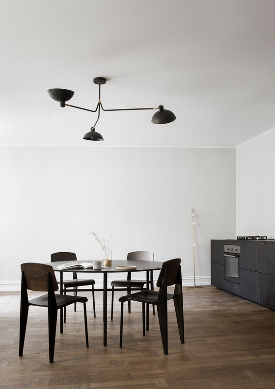
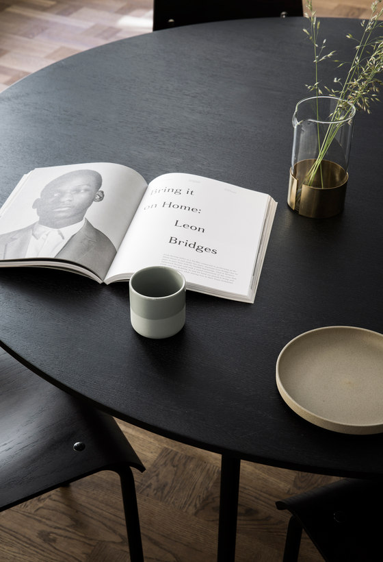
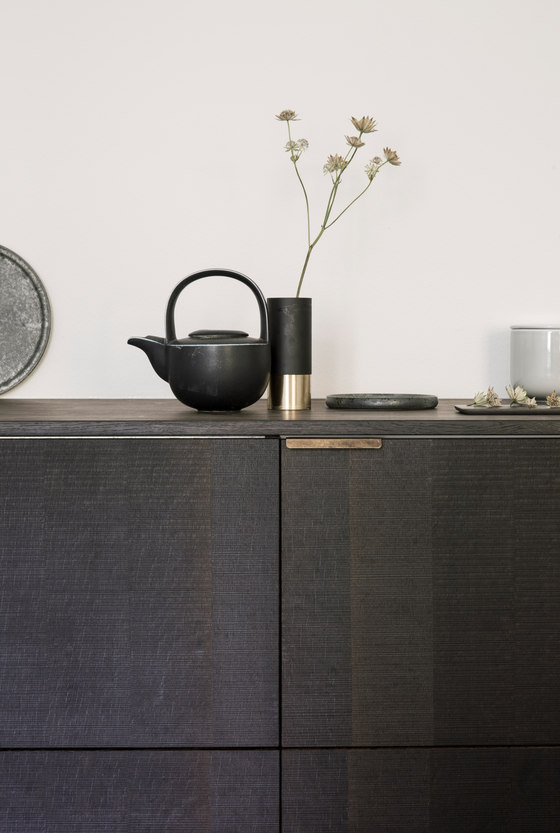
The Kinfolk Gallery and office space has been created in close dialogue with Nathan Willams and Jessica Gray from Kinfolk. This is how we work with all our clients. We try to combine our universe with theirs. Much like human well-being, the essence of our work is found in balance— between richness and restraint, between order and complexity. Our vision is to look beyond sight. We want to create spaces that feel good in every way.
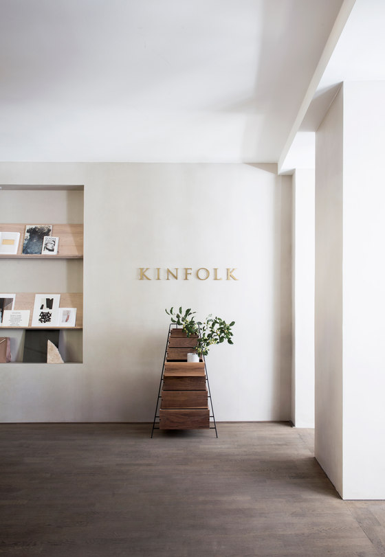
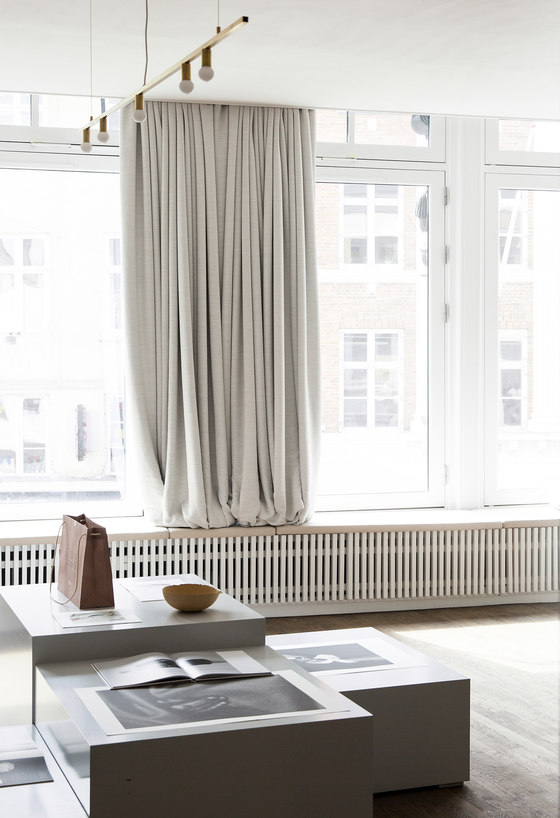
The brief for the space was to create a collaborative space where friends and partners could come together to share ideas and showcase their work and an office space that had an informal, elegant and homey atmosphere. The space consists of 3 zones. The front end of the space facing the busy Amager Torv in Central Copenhagen with a full facade of big glass windows visually inviting the streets of Copenhagen inside. This part of the space is public and functions as a gallery and space for gatherings.
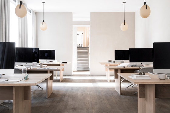
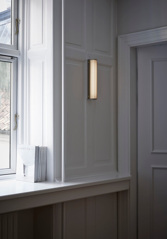
The second part of the space is the work area that is attached to the gallery. The back part of the space is more separate and private. It is disconnected from the semi-public and public areas - both stylistically and physically. While the gallery and office areas are spacious and connected into one open space plan, the back rooms are more classic Copenhagen style with small rooms and wooden moulding and millwork.
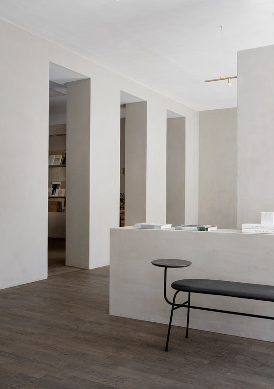
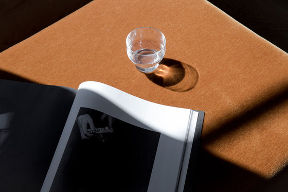
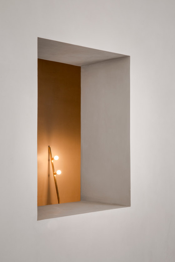
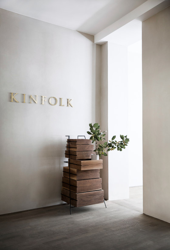
The space is designed to be bright, light and harmonized in the front area while it’s slowly getting darker and more intimate as you move through a series of narrow door openings that stretch from floor to ceiling, expanding the sense of height in the space. The interior architecture is minimalist, but thoughtful with attention to every little detail. Every single tone, nuance and material in the space has been carefully selected to create a harmonious, precise and natural feel with haptic qualities that we felt was well suited for the Kinfolk credo of slow living.
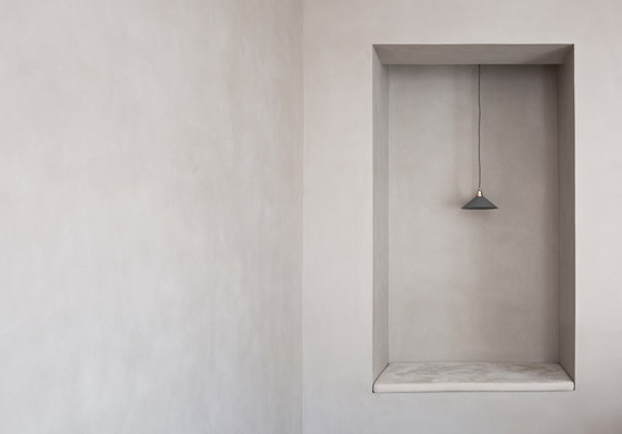
The walls are all rendered with a toned plaster called Kabe. KABE is a Japanese word describing the walls that are traditionally used in Japanese castles, temples and exclusive teahouses. While the quality of the walls has that special earthy wabi sabi quality, they also mimic the tactility and color of the exterior facades of neoclassical buildings in central Copenhagen surrounding the location of space.
Along all the glass panels of the front space a long bench with Sorensen high-end Nubuk analine leather runs from one end to the other, creating sitting areas for informal work, meetings or contemplation of the life on Amager Torv. Opposite small nooks and niches are created to clean up existing irregularities in the space and use them as an advantage to create surprising views and details in the architecture.
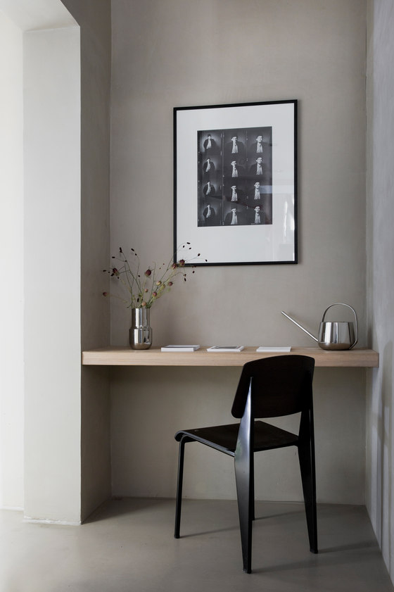
The big sitting nook in the corner is created with an inspiration from the Japanese tokonoma. In traditional Japanese architecture you don't break the rectangularity of the rhythm of tatami. Thus niches and storage is pushed out of the rectangular space as is the case here. While the tokonoma is usually for displaying important scrolls, this nook is meant as a small space where you can curl up with a book or your laptop.
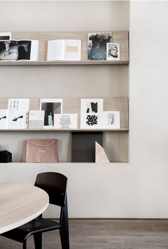
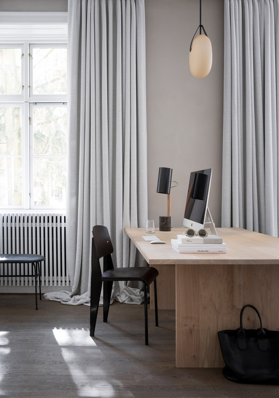
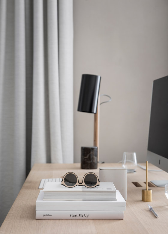
To break away from the experience of regular office spaces the reception area is designed to be more like a dining or living room with a huge round table in the middle and shelving on the wall. The space become much more welcoming in this way and can also be used for gatherings and group meetings. The office part of the space is arranged with bespoke tables that we designed with inspiration from Japanese architectural construction principles.
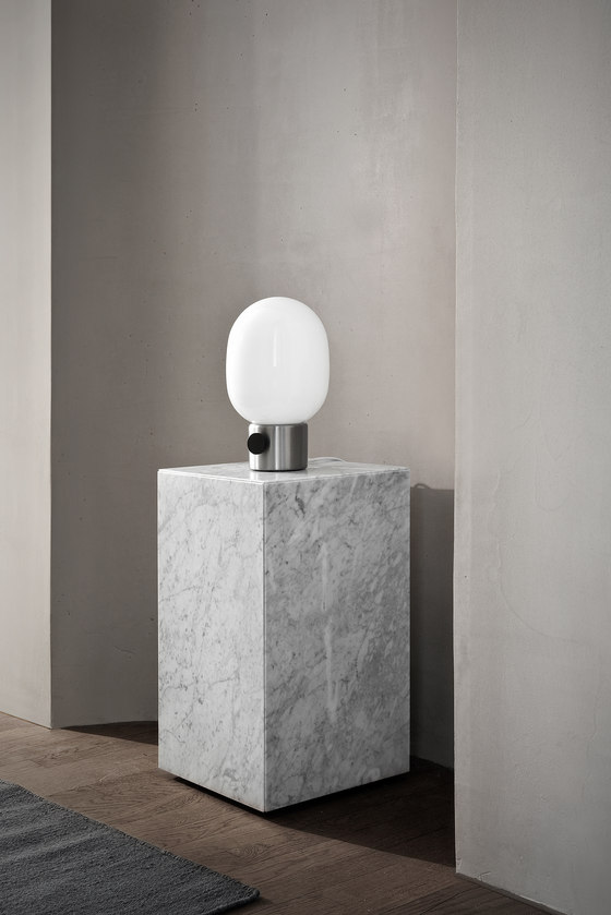
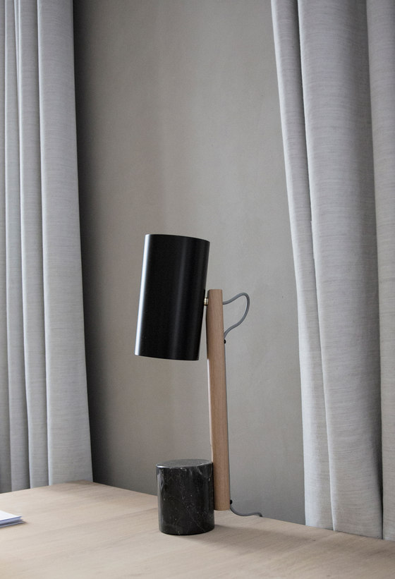
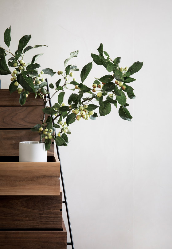
All the bespoke wooden elements in the space are made from Dinesen oak and give a natural warmth to the space. The combination of the stringent tables, the earthy walls, the original wooden moulding, soft sand colored draping and contemporary design pieces, creates a elegant, sophisticated and crisp workplace that in our opinion fits well with the Kinfolk and Ouur brands. Culture, history, Scandinavia, Japan and modernism fused in a subtle, understated way that fits the cultivated sensibility of the people working there and the young creatives that are their audience and collaborators.
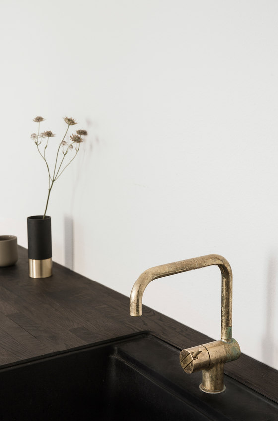
The project has been a co-creation with a lot of brands, which has been both challenging and fun. Among these are are the Danish design company Paustian that produced the tables that we designed bespoke for this project with wood by Dinesen. In addition, the space also features a smoaked oak kitchen designed by Norm Architects for Reform.
Norm Architects
Apparatus, B&O Play, Dinesen ,Fade Acoustic Ceilings, Lambert & Fils, Kabe, Kvadrat, Menu, Muuto, Norm Architects, Paustian, Reform, Rich Brilliant Willing, Sørensen Leather, Vitra, Vola 6.
