Fotograf: Simon Bevan

Fotograf: Simon Bevan

Fotograf: Simon Bevan
On February Note Design Studio and TOG (The Office Group) reveal their vision of what the office space of the future should look like – as expressed by their collaboration in reinventing Douglas House, a new six-floor office building on Great Titchfield Street. Setting out to create a workplace where people can feel stimulated by their environment and thus be truly productive, Note and TOG strived to fill every inch of Douglas House with personality.
The connection between our environments, our emotions and our productivity has become increasingly clear in recent years, and the awareness of this relationship has informed Note’s design concept for the project. In Douglas House, they aimed to create somewhere that surprises you from the moment of entry, as well as engaging the brain with touches of the unpredictable, administering what Note calls a ‘gentle punch’ to all who step in off the street.
“Our previous collaboration with Note, Summit House, was different to anything TOG had done before – it was genuinely ground-breaking – so we were confident that working together, we would inject something truly exciting and forward-thinking into Douglas House. We wanted to create somewhere that suited a variety of workspace styles, that broke with the conformity often associated with the office, and which conveyed a sense of journey and discovery.” – Nasim Koerting, Head of Design, TOG
Douglas House is a 47,000 sq ft building at 131–151 Great Titchfield Street on the Langham Estate in the West End. When TOG acquired the lease, the 1930s block was devoted to functional but uninspiring office space. TOG had previously called on Note to design the interiors of its office space Summit House in Holborn and were hugely impressed with the way the Stockholm-based practice was able to translate the art deco exterior into a high-level contemporary design that complemented and enhanced the Grade II-listed building. Douglas House’s post-war architecture offers less for both design teams to respond to creatively, so the challenge here was to give it a strong identity that would enable it to hold its own against its more dramatic neighbours in Fitzrovia.
Ahead of the curve
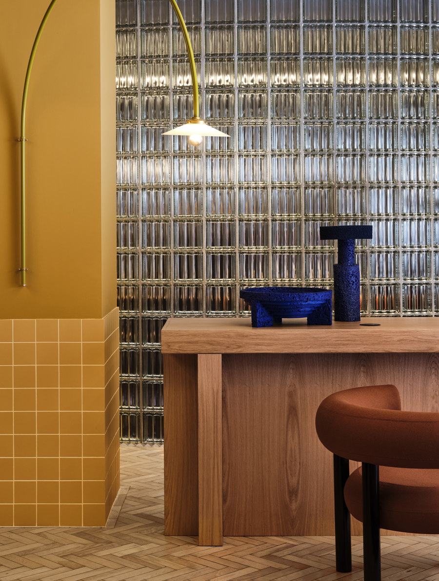
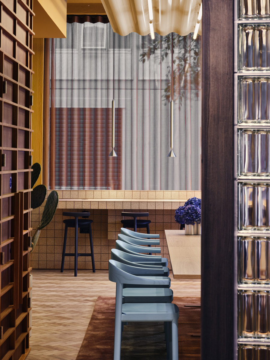
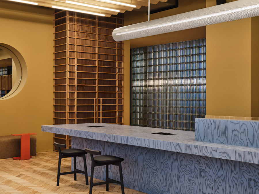
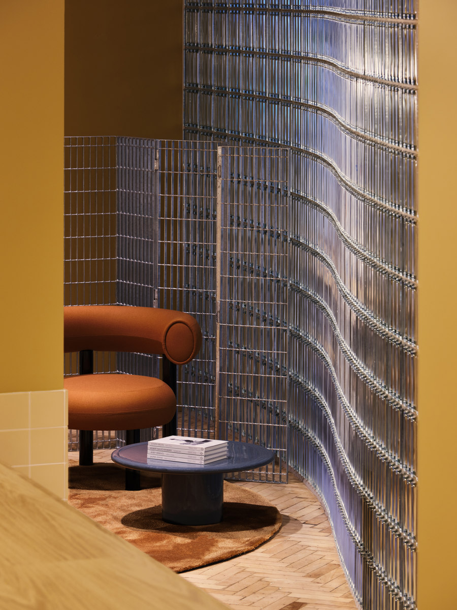
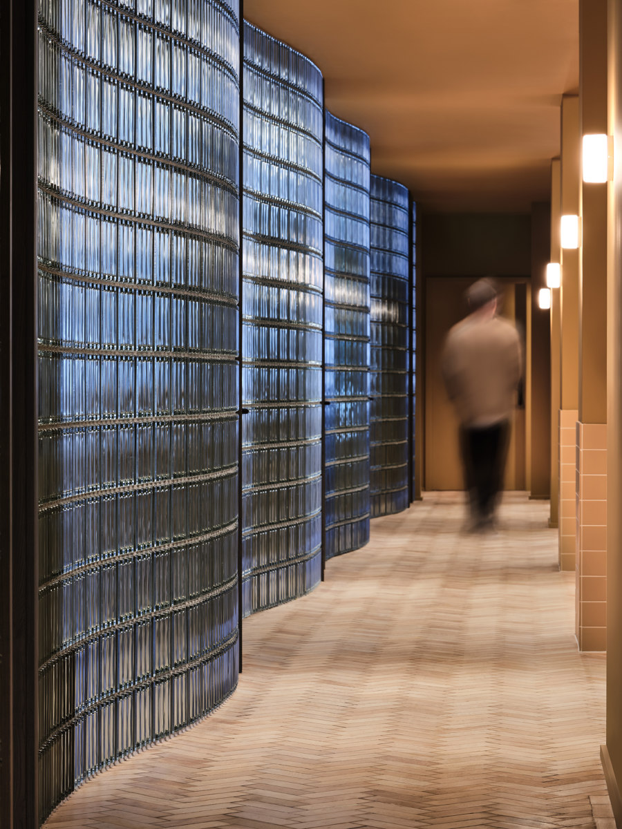
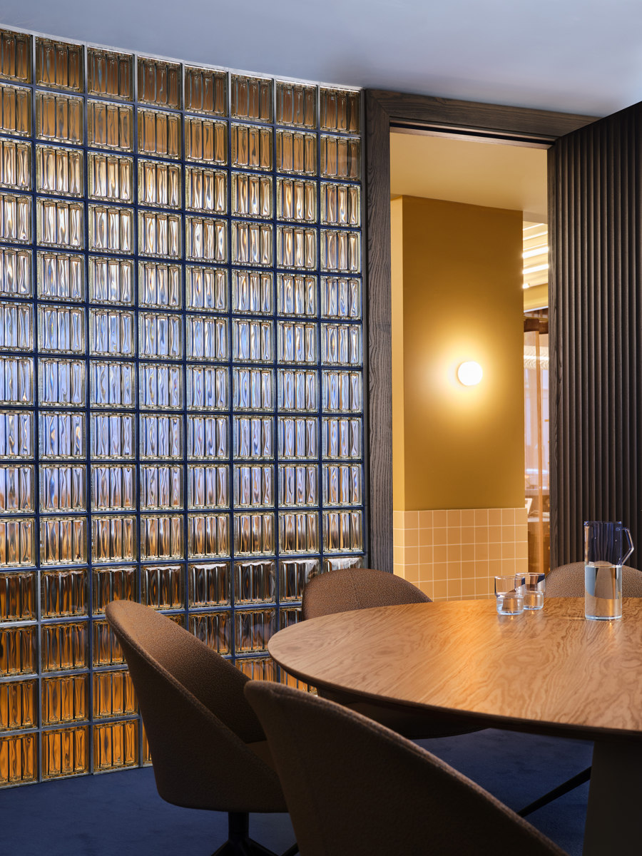
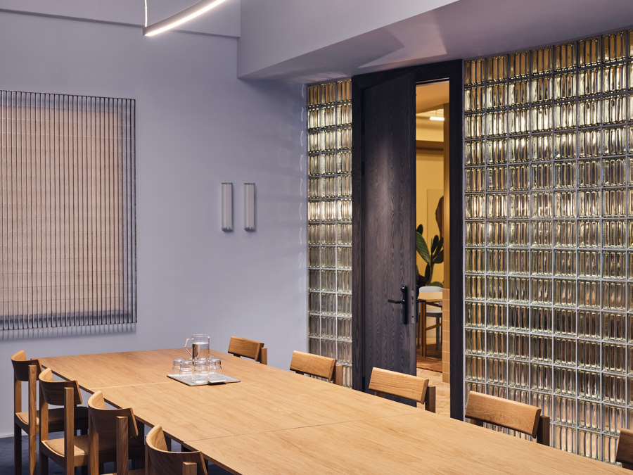
The most striking feature of the design is a curvilinear wall of glass blocks that runs the entire length of the ground floor. Based on the idea of a hand-drawn line, the wall creates a sense of light, transparency and openness throughout the space, which is split into three ‘rooms’ by the building’s two stair cores. As well as creating a passage between the rooms at the rear, the wall creates a visual connection
between them with material intensity and unexpectedly fluid wavy forms, echoed in the custom-made lighting rafts. On the other side is a bank of courtyard-style meeting rooms, each with a unique layout created by the irregularity of the wall’s shape.
“This was a way for us to be disruptive and to challenge the standards of an average refurbishment – to create a space within a space, a world of its own within the old building.” – Johannes Carlström, co-founder, Note Design Studio
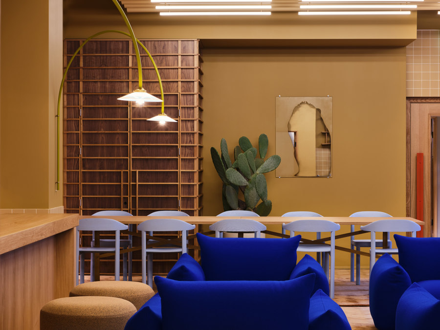
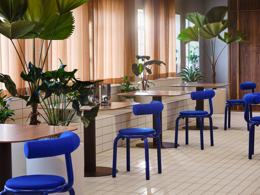
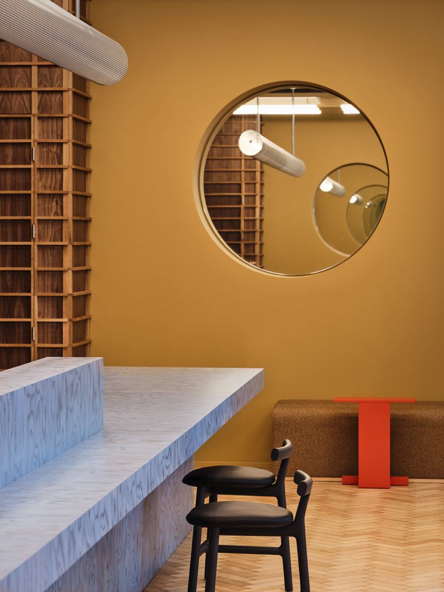
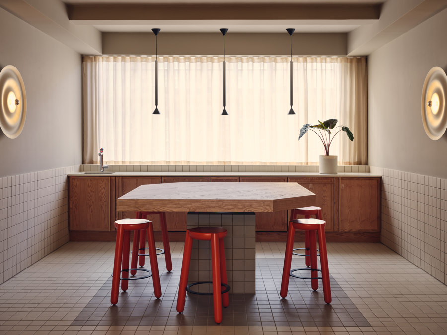
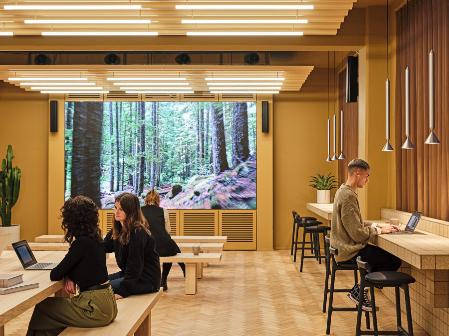
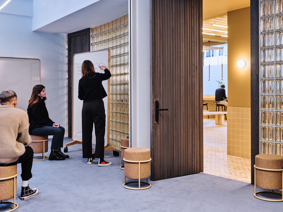
The wall also marks a shift in the interior colour palette, with warm woody neutrals and desert shades defining the communal spaces and break-out areas and cooler, softer blues used in the meeting rooms and working areas where concentration and focus are required. Pops of primary colour come in the form of vivid ultramarine Marenco armchairs and sofas by Artrex, Muller van Severen hanging lamps and powder-coated stools in bold red and blue.
“There are some fundamentals we have to address as priorities with every building, principally being natural light, volume and openness. The architecture and fabric of this building provided us with these attributes in abundance. We then looked to play on this with elements such as the feature glass wall that is so striking and runs the full length of the ground floor, allowing natural light to flood both into the reception area and lounges and back through to the meeting rooms.” – Charlie Green, co-founder and co-CEO, TOG
Naturally inspired
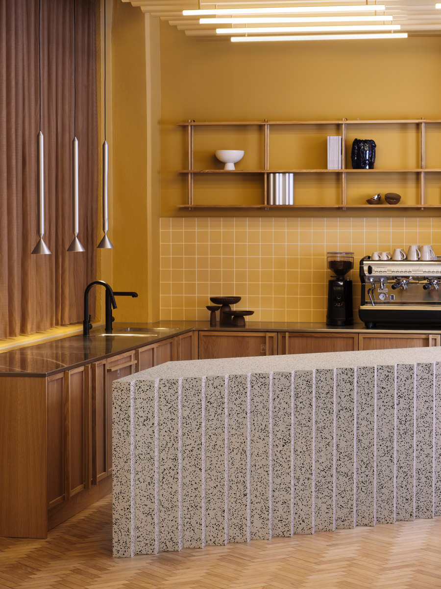
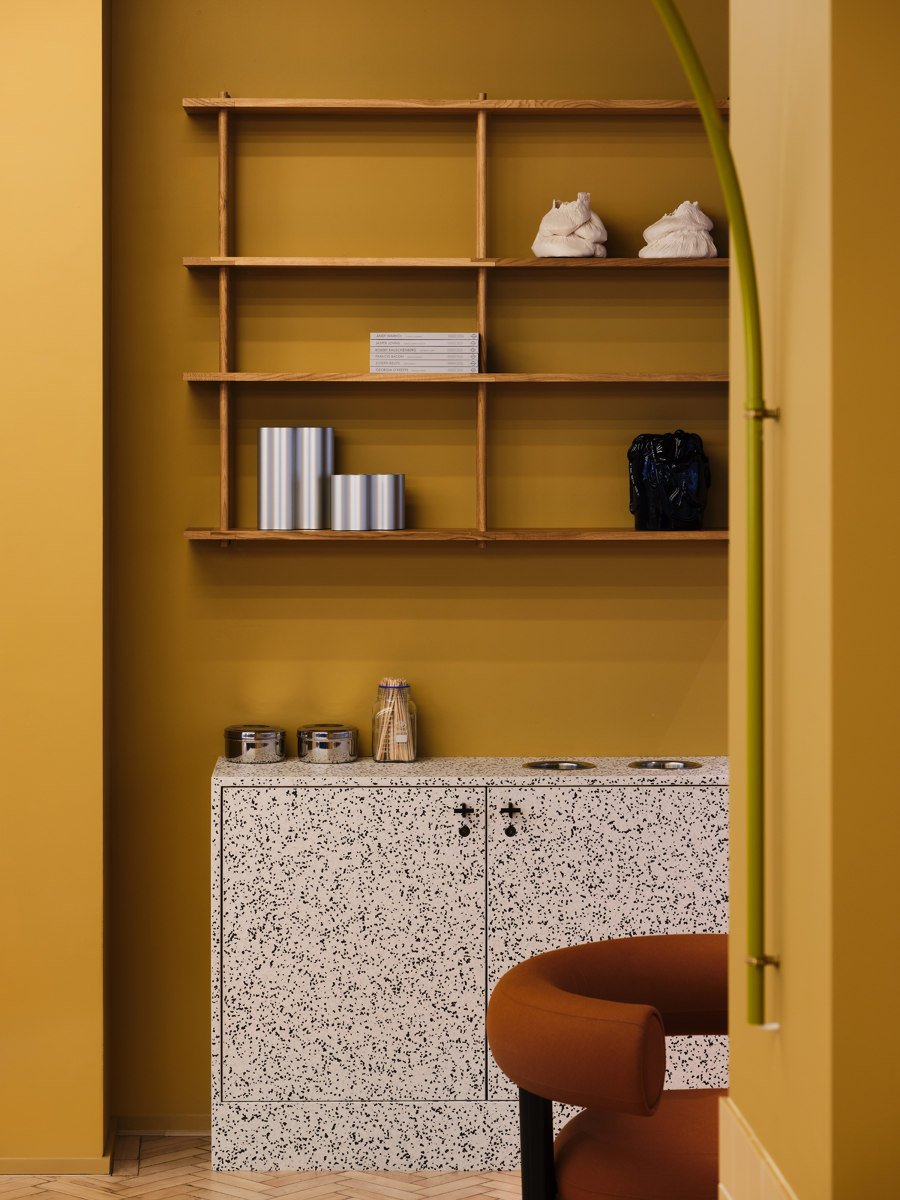
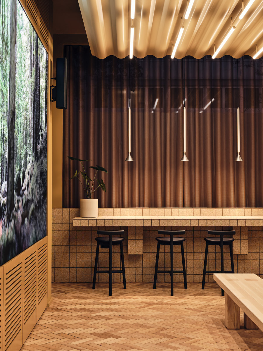
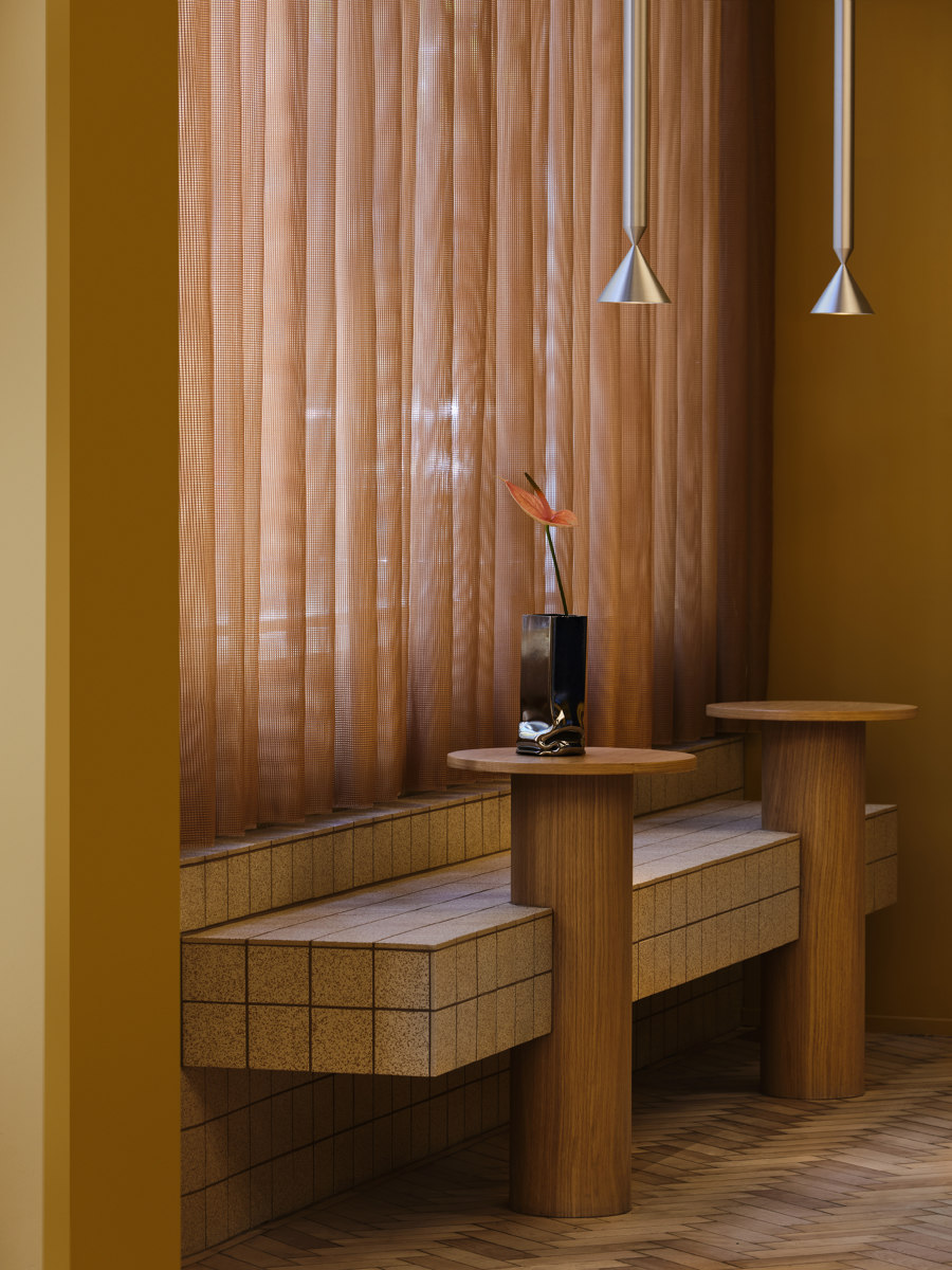
The inventive material palette draws strongly on natural finishes, incorporating ash stained in various shades, walnut and terrazzo. Designing around a building with extensive wear and tear, wherever possible, Note and TOG agreed to retain the existing materials from the original design. When this was not possible, materials that would be reusable in future (including steel, glass and ceramics) were selected. Where plastics were required, the team employed the 100% recyclable Tarkett IQ range of wall and floor coverings. Remarkably, they were able to salvage the building’s existing parquet floors in their entirety, lifting, renovating and replacing every last block. Other sustainability-led initiatives include the addition of a bank of solar panels and a green biodiverse roof.
Eye-catching contrasts
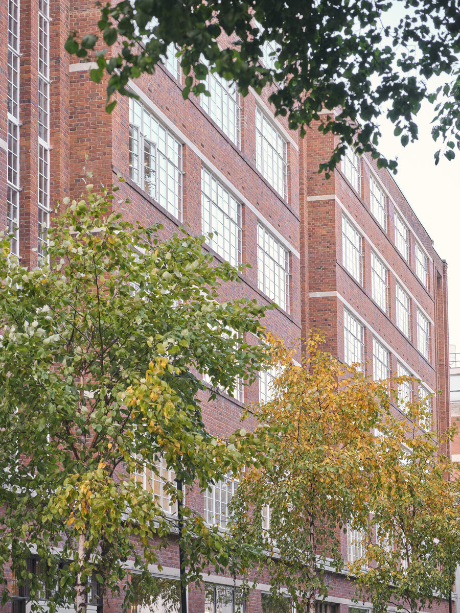
In keeping with its ‘gentle punch’ and ‘breaking the grid’ concepts, Note has ensured there is a striking contrast between the exterior and interior. Outside, the building’s facade is repetitive and grid-like; inside is an altogether richer, more fluid and less predictable experience – beginning at the moment of entry, when you’re confronted with a wide reception desk in a head-turning blue ALPI Sottsass veneer.
“It has a lot more expression than you normally see in a traditional office. Our ambition has been to make something that communicates with you intuitively, so that when you enter the space, you can feel the interior almost physically.” – Charlotte Ackemar, interior architect, Note Design Studio
It is a contrast not a clash – certain features of the façade, such as its iron detailing, acted as jumping-off points for the design of the interior, and the colour of the bricks was the springboard for developing the colour palette. TOG chose this building for its unique floor plate which allows for maximum natural light to enter the workspaces.
The overall architecture dictated the rationale for the workspace floorplan to a significant extent, which offered Note and TOG the opportunity to re-conceive the layout so that it flows on a horizontal axis rather than the previous layout that awkwardly connected the building vertically.
A number of newly commissioned artworks continue the artistic streak, including pieces from Jenny Nordberg, Jochen Holz, Wang & Söderström, Philipp Schenk Mischke, James Shaw, Mijo Studio and Studio Furthermore.
Wellbeing at work
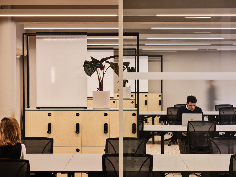
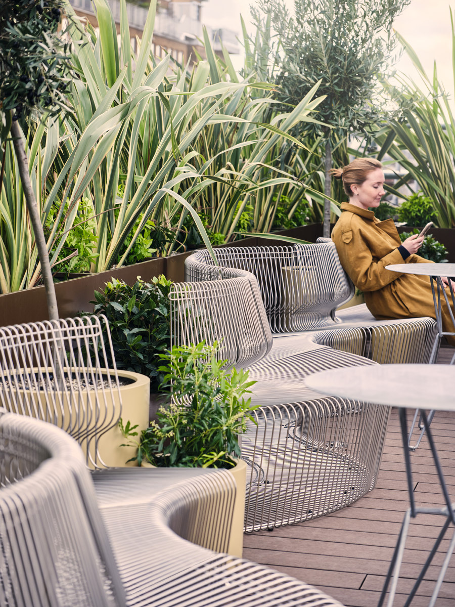
Alongside the expected features of a modern workplace – gym, roof terrace and 20 meeting rooms (including 10 informal, collaborative spaces and a traditional boardroom) – Douglas House also includes a number of more innovative additions, including a ‘recharge room' for breakout moments during the working day, a plant filled ‘oxygen room’ on the top floor in which to recharge and reconnect with nature, a flexible workspace with a café, and a dedicated room for nursing mothers.
“We have to keep pushing the design whilst making sure we are still creating space that works so well to allow people to thrive in the space. That is about pushing the aesthetic as well as continuing to explore the amenities we can add, increasingly with a focus on wellbeing, both physical and mental. With this work space, we’ve incorporated Recharge and Oxygen rooms as well as a complete fitness studio. With every building, we’re seeking to learn from our clients what they need and are looking for, as well as anticipating how we address the changing ways in which we’re all working.” – Charlie Green, co-founder and co-CEO, TOG
“Of course, the building fulfils the practical needs of a modern workplace, but our focus has been on the emotional qualities of the space to stimulate the users’ minds with a lot of different experiences when they move through the building, taking a big step away from the conformity of most office spaces.” – Jesper Mellgren, architect, Note Design Studio.
Douglas House opened on 5 November 2020. The building provides 700 desks for the team of over 1,000 employees, and the versatility of the space has made it relatively easy to render the office Covid-secure.
Design team:
Note Design Studio

Fotograf: Simon Bevan

Fotograf: Simon Bevan

Fotograf: Simon Bevan

Fotograf: Simon Bevan

Fotograf: Simon Bevan

Fotograf: Simon Bevan

Fotograf: Simon Bevan

Fotograf: Simon Bevan

Fotograf: Simon Bevan

Fotograf: Simon Bevan

Fotograf: Simon Bevan

Fotograf: Simon Bevan

Fotograf: Simon Bevan

Fotograf: Simon Bevan

Fotograf: Simon Bevan

Fotograf: Simon Bevan

Fotograf: Simon Bevan
