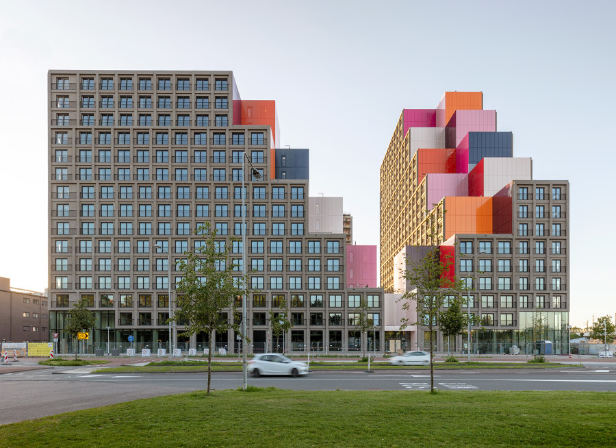
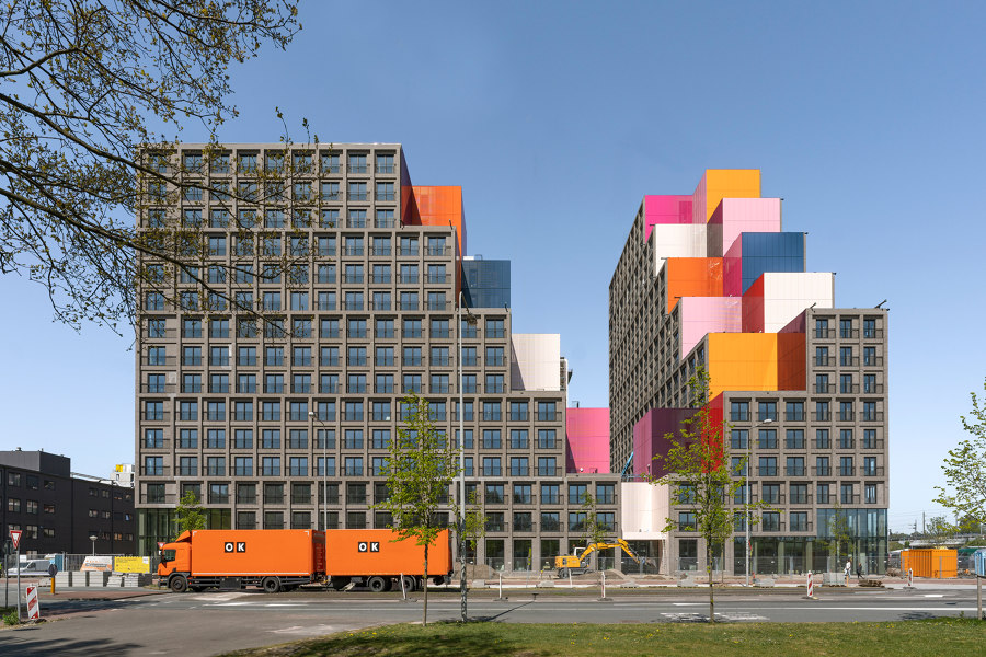
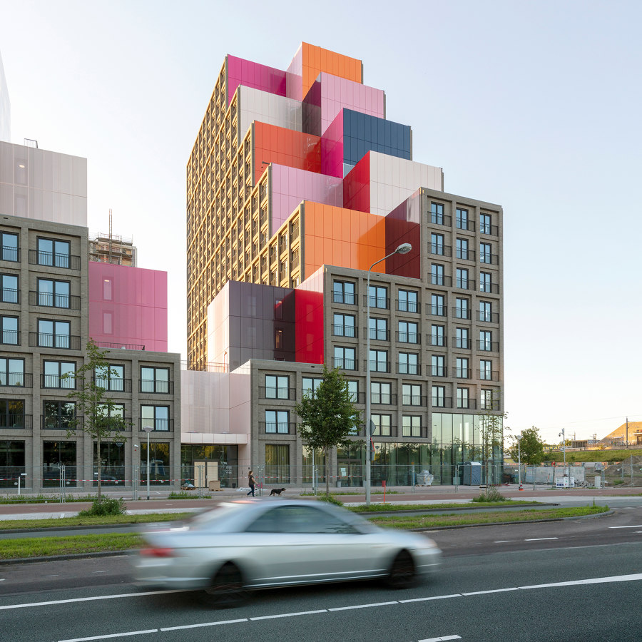
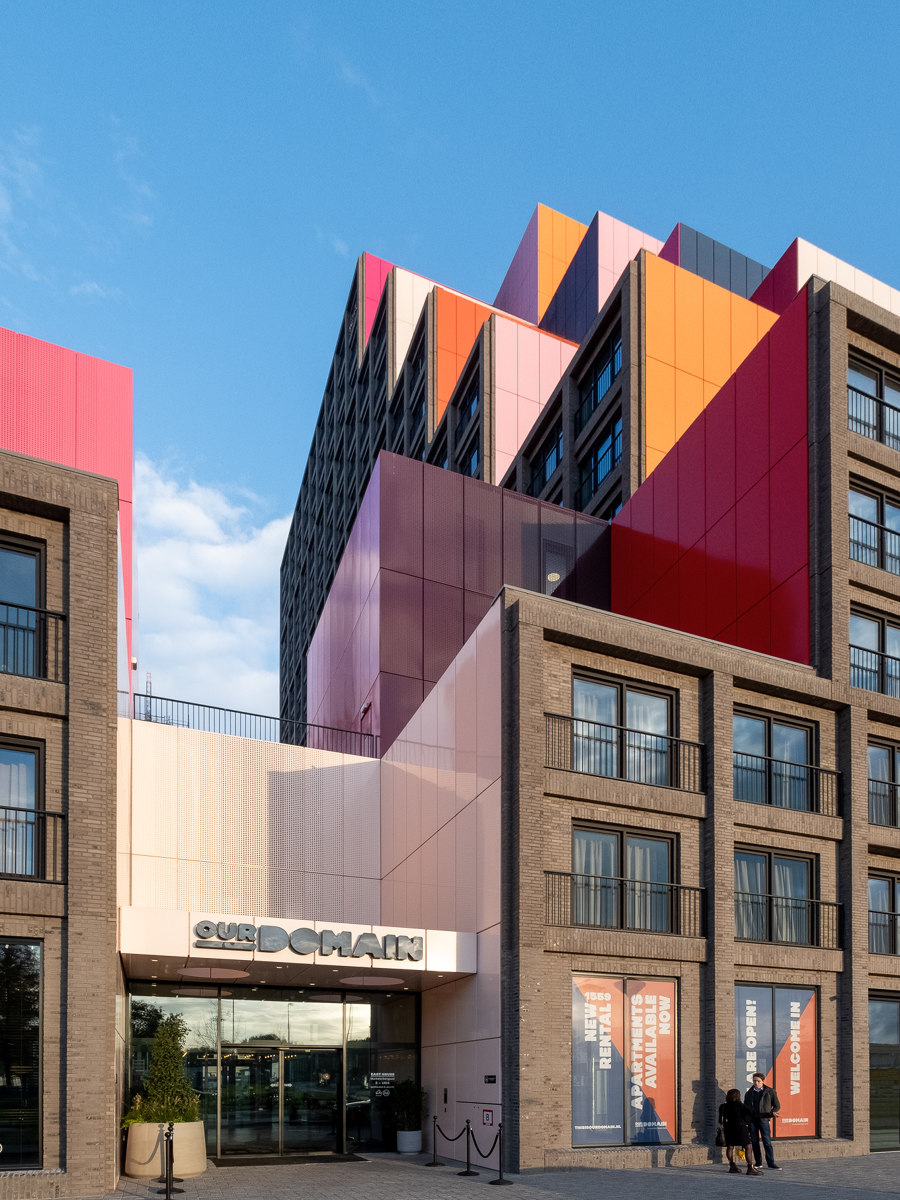
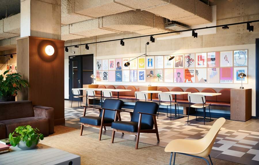
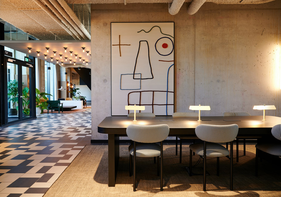
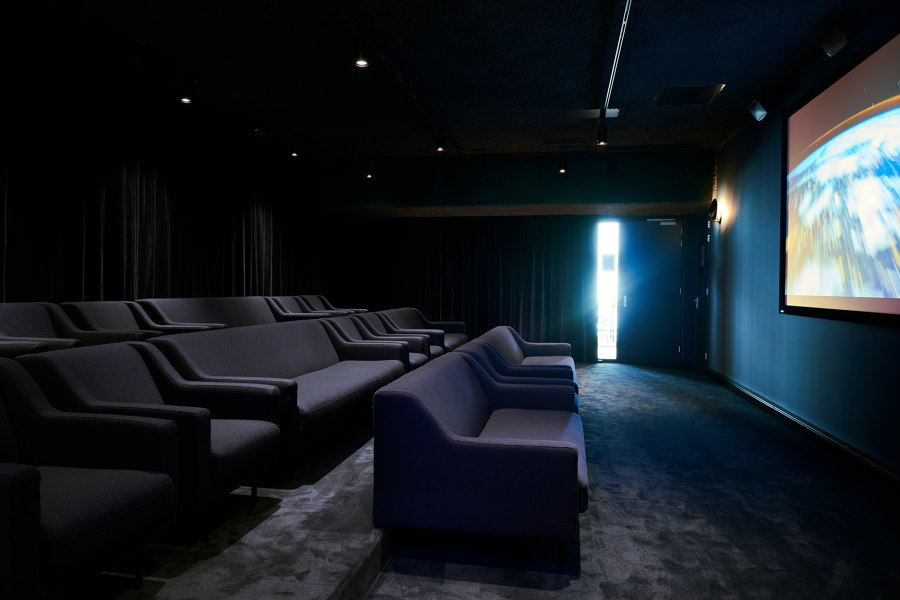
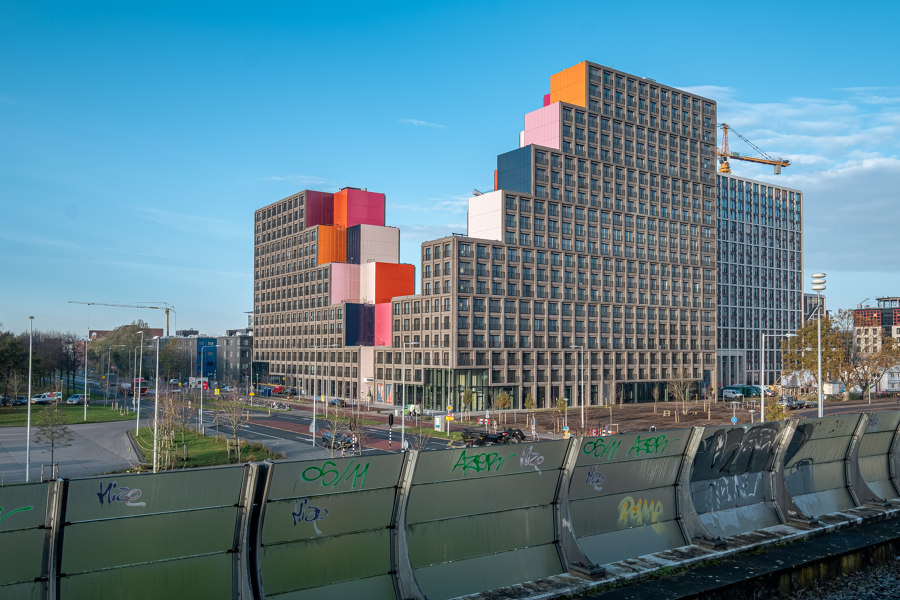
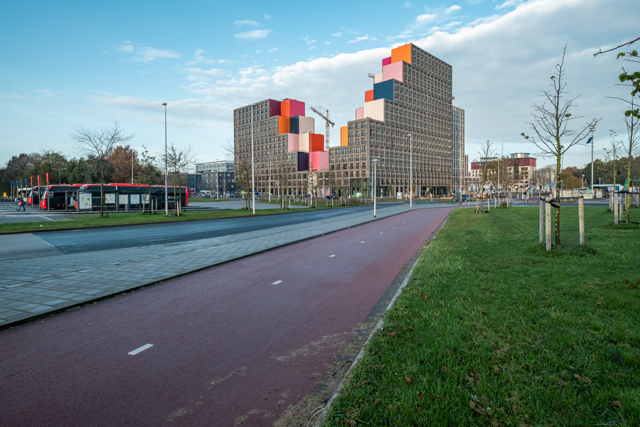
OurDomain Amsterdam Southeast, located on a knowledge axis consisting of educational institutions and student housing in Amsterdam, marks a new impulse in the area. Strategically located next to an academic hospital and train station, the campus with its critical mass of approx. 1,500 apartments and amenities introduces a first residential center in a predominantly office area. This new campus is the catalyst that ignites the long desired change from mono-functional office area into a lively, multifunctional city district. The urbanistic objective of the OurDomain campus is to introduce fundamental change, generate new connections and facilitate social space that inspires its users.
All stakeholders considered the surrounding larger transformation area (Amstel III) problematic. The location, set up as an office area, with a hospital as one of the main stakeholders, has an unattractive appearance. Social safety is a point of attention. The many current office buildings stand alone. These islands were created by the framing the buildings with water and greenery for security reasons. Meanwhile there are positive ongoing developments such as several start-up initiatives. The big question was: how to unite this divided area in such a way that it becomes a whole? With the plan for the OurDomain campus, a connection has been realized that is a first step for the further development of the transformation area as a whole.
The choice for a campus community at this location is special, because it is the first time that people can live in this part of Amsterdam. The idea for a campus ties in with a current Amsterdam housing issue: the great shortage of housing for students and young people. Conditions that made the residential function possible: in 2011, on the request of market parties, the municipality of Amsterdam amended the zoning plan to permit residential units. In 2014, OZ, together with consultant Fakton, developer Blauwhoed, real estate owner LSI and investor Greystar, researched the possibility of introducing a large amount of apartments. It was investigated whether a new campus for young adults next to the hospital responded to the demand for more youth housing. The fundamental plan for an area-oriented approach was born. Ultimately, the interest of Greystar in this project was decisive. The American investor was already working on a campus concept in a part of Amsterdam Southeast and also saw the possibility of this new campus. The municipality of Amsterdam agreed on the effectuation.
A new tenant for the empty office building and parking garage on the location of OurDomain could not be found and the area was socially unsafe. For these reasons, it was decided to demolish both buildings. The area looked cluttered with a lot of fencing, and the public space was not maintained well. A bit desolate and inaccessible. Students from a previous campus project reported a sense of anonymity and insecurity.
The main urban development objective for the area was to connect functions, routes and accessible areas with the buildings. The public space, at first an unattractive place to stay, is the basis for the campus plan. The layout of the public space ensures cohesion in the plan area, the community campus and the medical campus as a whole. A high-quality public area is essential, because of the residential function of the community campus. Since the character of the area is diverse with all its independent office buildings, this is reflected in the unique character of each of the three campus buildings. OZ has made a conscious decision to make a different architect partner responsible for each of the three individual designs.
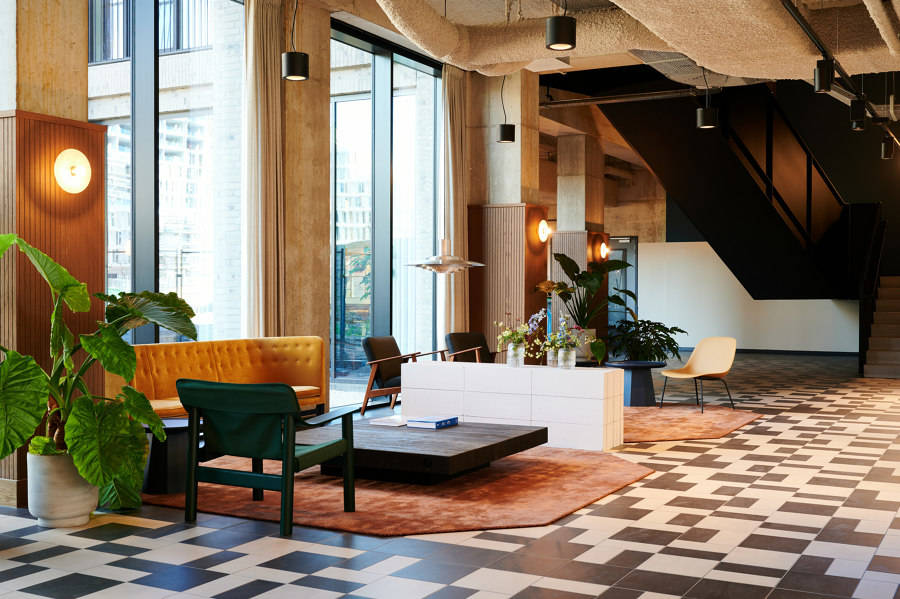
The architecture strengthens the relationship with the public area. The connection of the outdoor space with the ground levels of the 3 buildings is very important to create one community. Openness is a key word that is reflected throughout the campus. Water and greenery serve no longer as dividing elements, but have been transformed into connections. The cycling and running routes are more intricate than before. Continuous routes connecting the campus with the metro station, hospital and other surrounding buildings. The routes in the plan are connected to squares, which have various functions and activities. Residents meet here, play sports or organize a BBQ. The public functions located in the plinth are meant for the residents of the community campus.
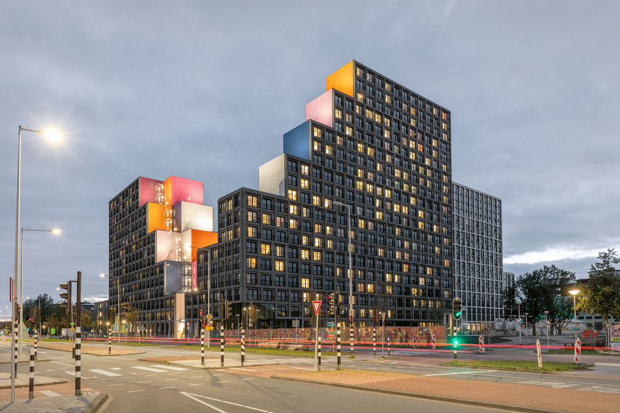
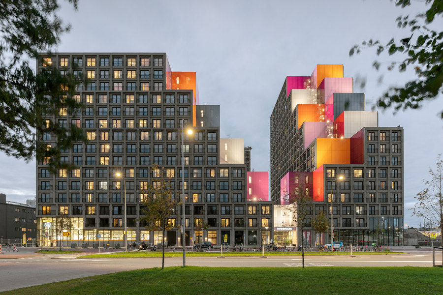
Inserting three large housing blocks (East House, North House and West House) around an articulated park allows for a recognizable residential atmosphere in a predominant office location. The three blocks, with each an independent identity, are designed to be cornerstones that mark the park boundary. Together with the two existing buildings which will be transformed into student housing and medical startups , the campus will become the pivotal center of the area. The lush, inviting landscape design by karres+brands adds articulated topography to the park. The residual soil of excavating the underground parking garage is used to make small-scale hills that render local quality, give the area a strong identity and inspire people to make use of it.
East House
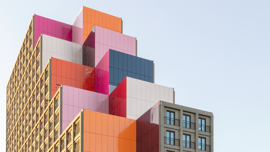
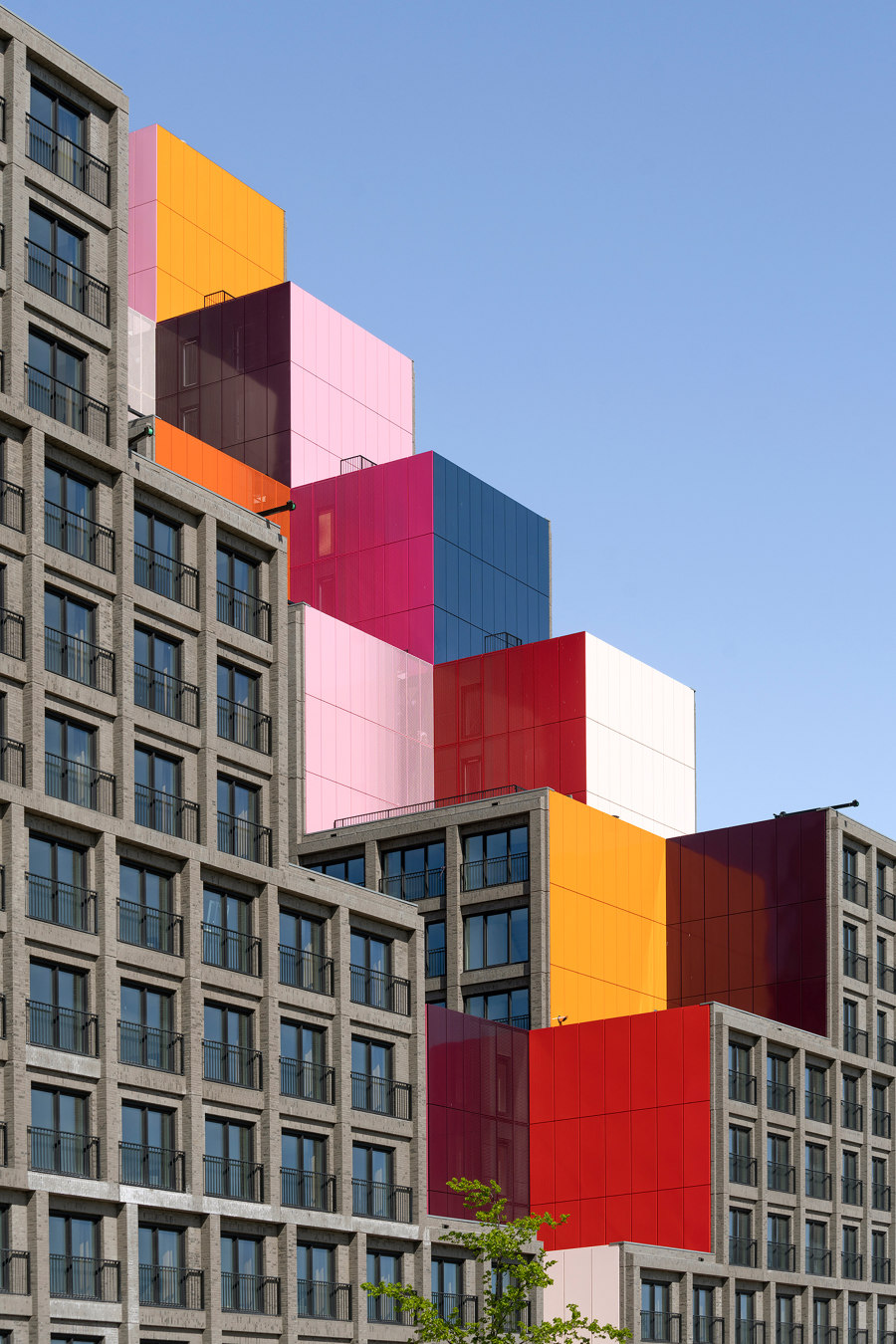
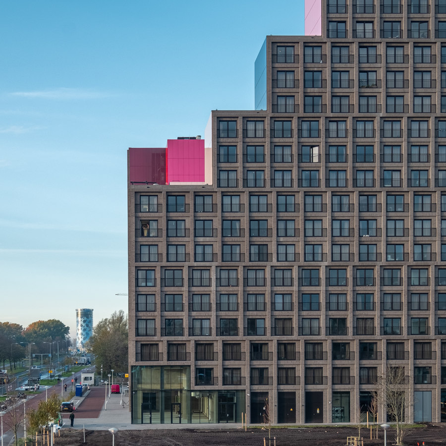
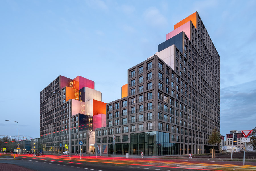
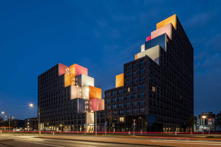
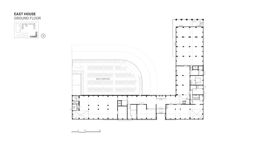
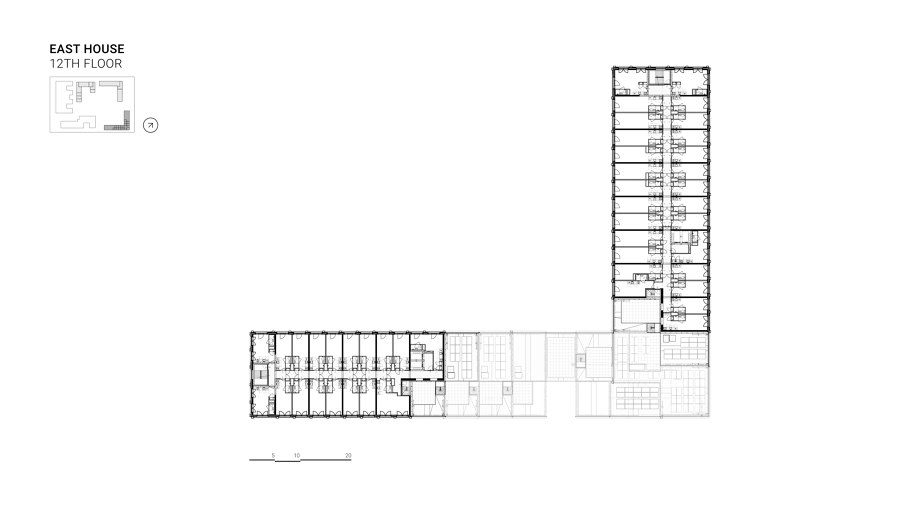
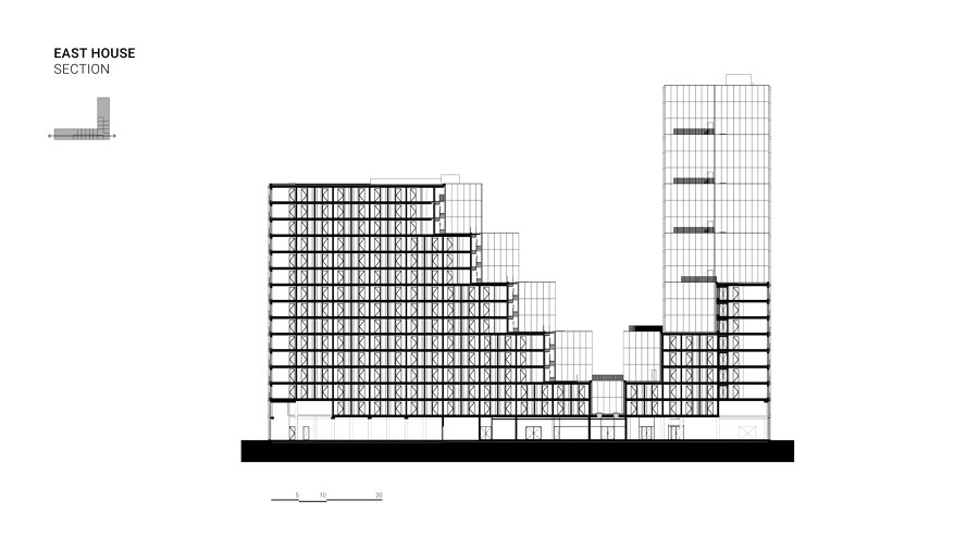
With a surface of 40,000 sqm and almost 1,000 student apartments, East House is huge in size. One of the main goals is to give this big building a clear housing expression and human scale, that is to avoid an abstract mass similar to the bigger offices already there. The program for this building, with a large number of small apartments without balconies, has little architectural elements available to give it character. Its cascading facade on two sides, therefore, immediately gives the building its own architectural expression and anchors it in its surrounding. The general idea behind this scheme is not to focus on shaping a 1,000 apartment building but rather the opposite ; to carve out parts of the initial envelope given in the urban plan to shape the volume.
North House
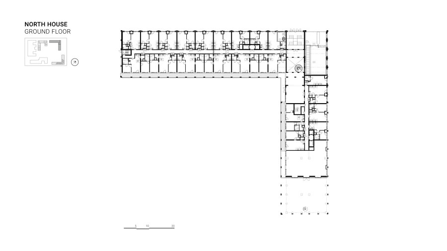
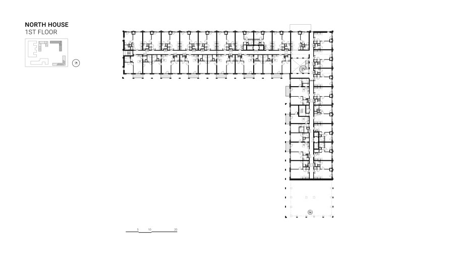
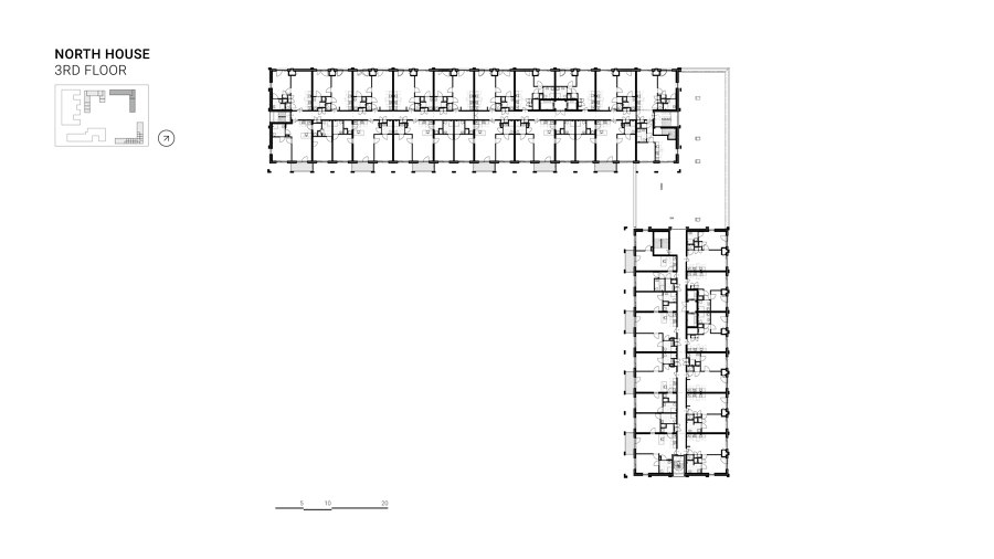
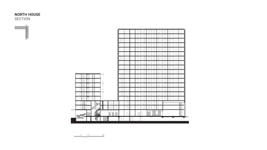
North House is designed as a cornerstone with a low wing and a high tower that marks the park entry to the metro station. It has an eloquent build up with a central corridor with the smaller apartments on the North-East façade and the larger apartments with balconies at the South-West façade. On its shackled volumetric design it has a recognizable enveloping grid pattern. This pattern introduces a human scale and is an independent statement of rhythm and measure designed as a concrete grid that envelops a copper building. This materialization is thought to unite the atmosphere of living and working. A building that is refined and not too delicate.
West House
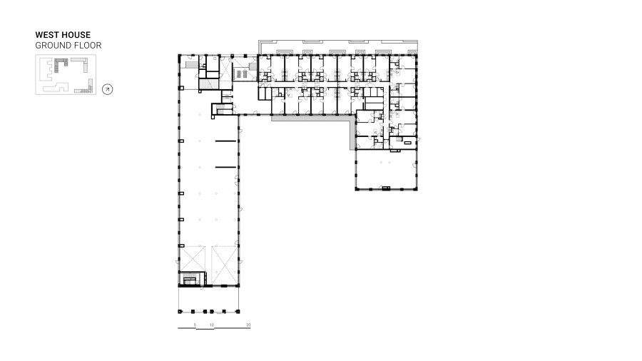
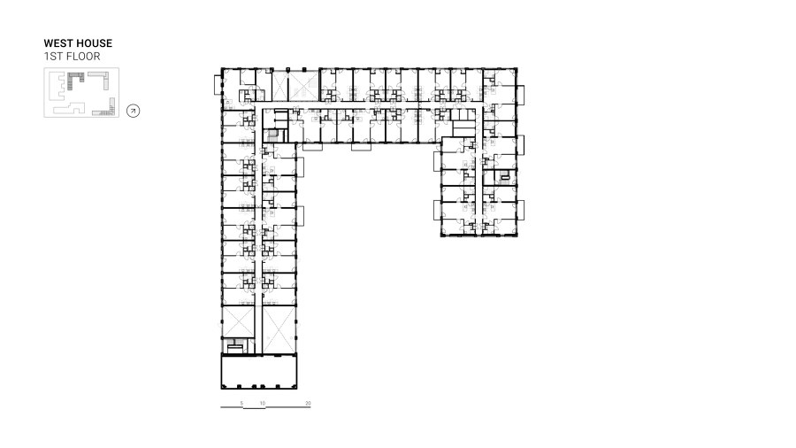
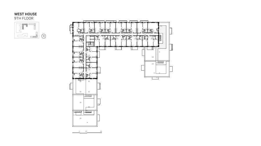
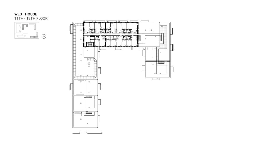
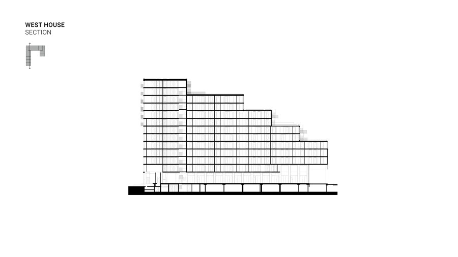
Unlike the other two buildings, the volume of west House will have to respond to neighboring existing buildings and make use of the opportunities that this setting offers. The gradual build-up of the block ensures the visibility of the neighboring buildings from the campus. Additionally, by making a passage at ground level, a physical connection is established. This ensures a direct relationship between the existing building and the new landscape. Furthermore, the shared terraces (which belong to the homes) complement the wide range of places that the park already offers and make people part of the public space within the security of their own home
Design Team:
OZ Architects
Design team: Chris Zwiers, John Bosch, Oresti Sarafopoulos, Cees den Ouden,
Ewout de Jager, Farida de Vries, Gijs Tegelberg, Hesh Fekry, Jan Hijlkema, Jaime Pérez Galindo, Javier Oyanarte Callego, Joanna Wnuk, Jorn van Popta, Maarten Verhelst, Martin de Jong, Rogier Bezuijen, Rogier Söhne, Sander Klein, Thijs Ultee, Thom Pegman, Wellae el Rowidi, Zachary Ropel-Morski
Landscape: Karres en Brands
Collaborators: Karres en Brands landschapsarchitecten BV, Z-as Maquettebouw
