Fotograf: Alexander Bogorodskiy

Fotograf: Alexander Bogorodskiy

Fotograf: Alexander Bogorodskiy
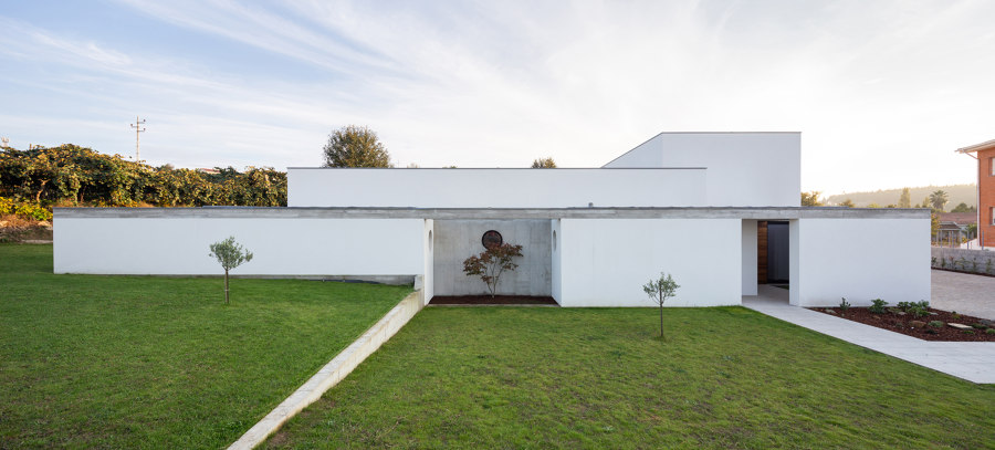
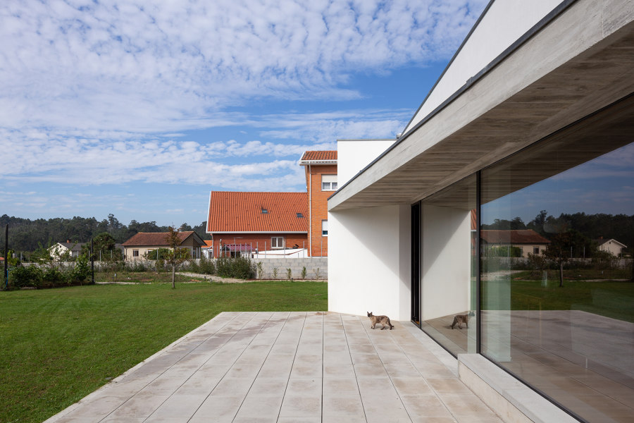
A house of dichotomies: A single-storey house that confronts 3-storey surroundings; A main facade facing North and a very busy street; Owners who receive friends regularly, but who need silence in their children's bedrooms; A spacious house, but at a reduced cost.
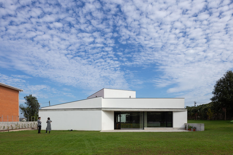
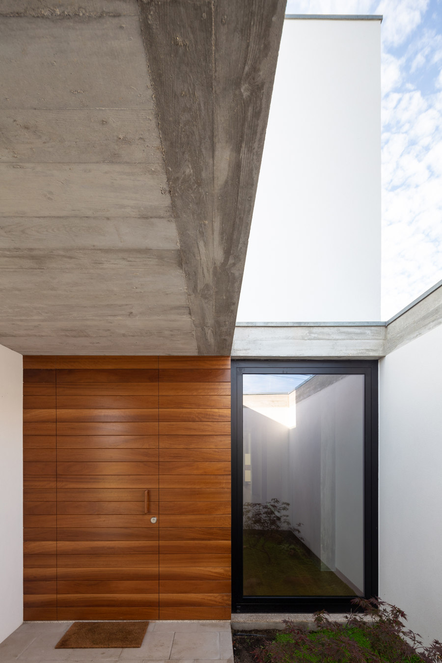
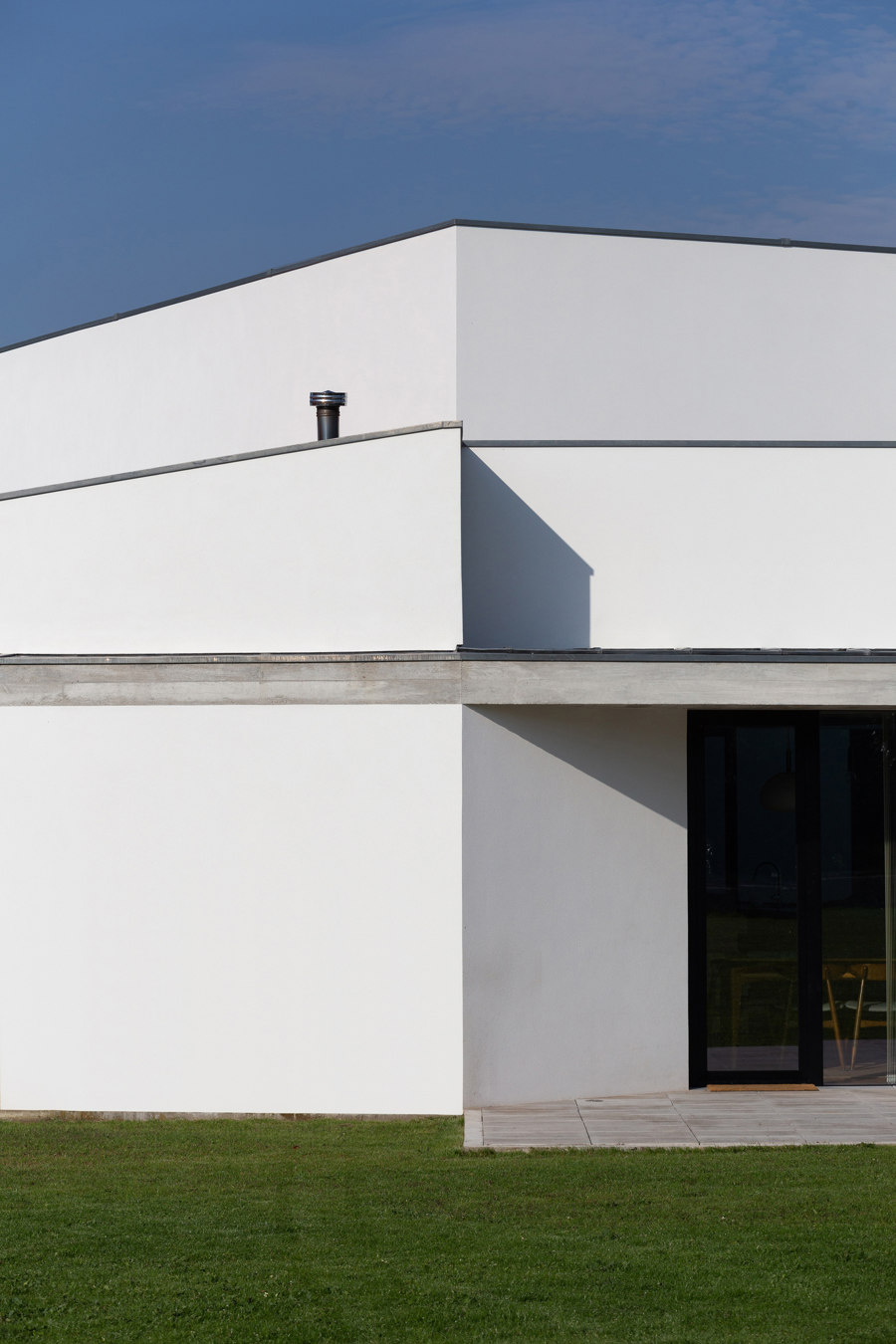
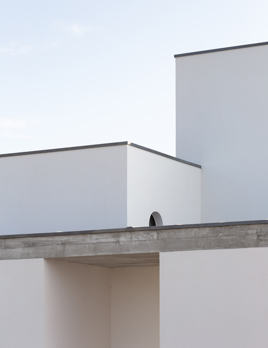
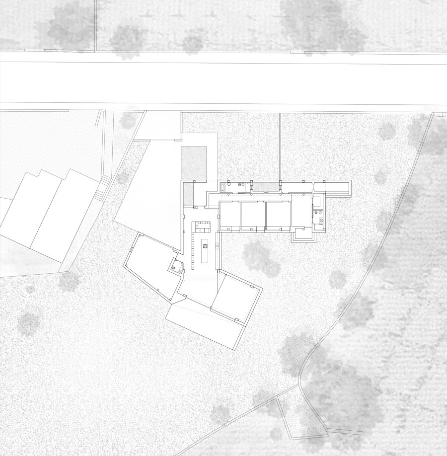
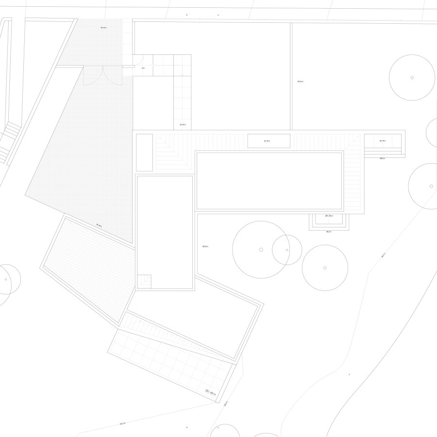
The project started from these premises and from the outside to the inside. Blind volumes of different dimensions seek to make a transition of scale to the surrounding buildings, and at the same time to create a dynamic facade, which due to the fact that it is oriented to the North and to a very busy street is characterized by the almost total absence of openings.
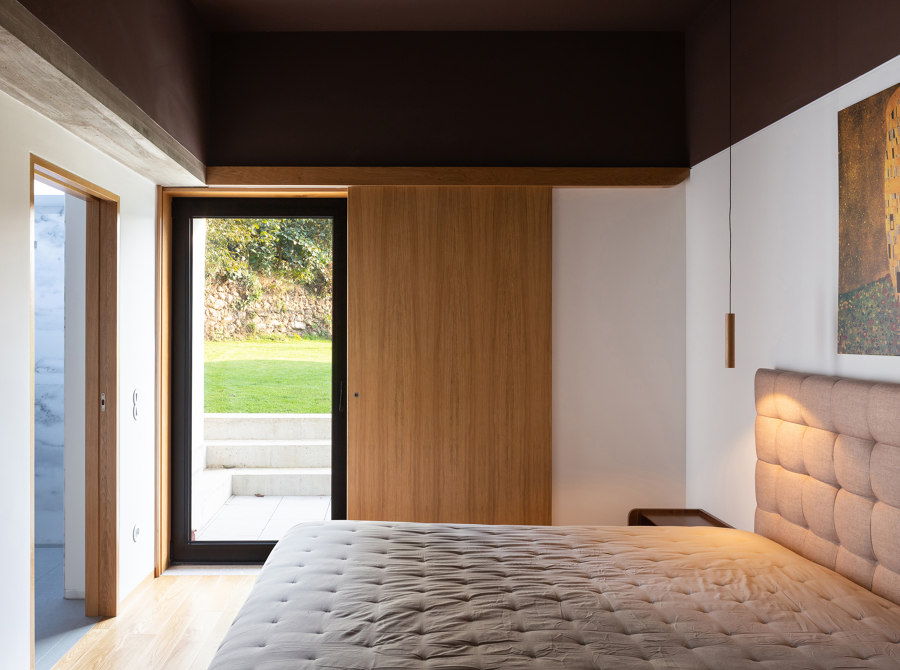
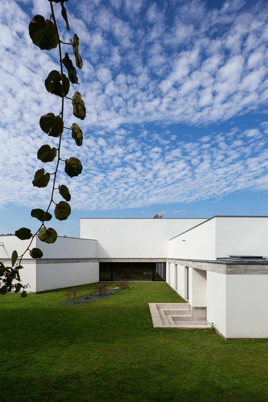
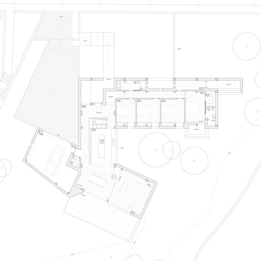
The house is organized in a U-shaped plan, thus creating an exterior patio towards which the bedrooms are oriented, in order to remain protected and away from the internal social areas, as well as the surrounding buildings. The living room is oriented to southwest to obtain natural light until the end of the day and views of the large garden in the backyard. Finally, the garage and driveway are positioned to the west, freeing the remaining façades to the surroundings that remain without neighbors.
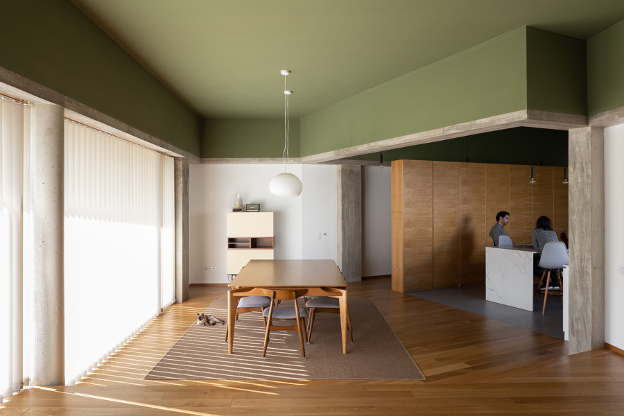
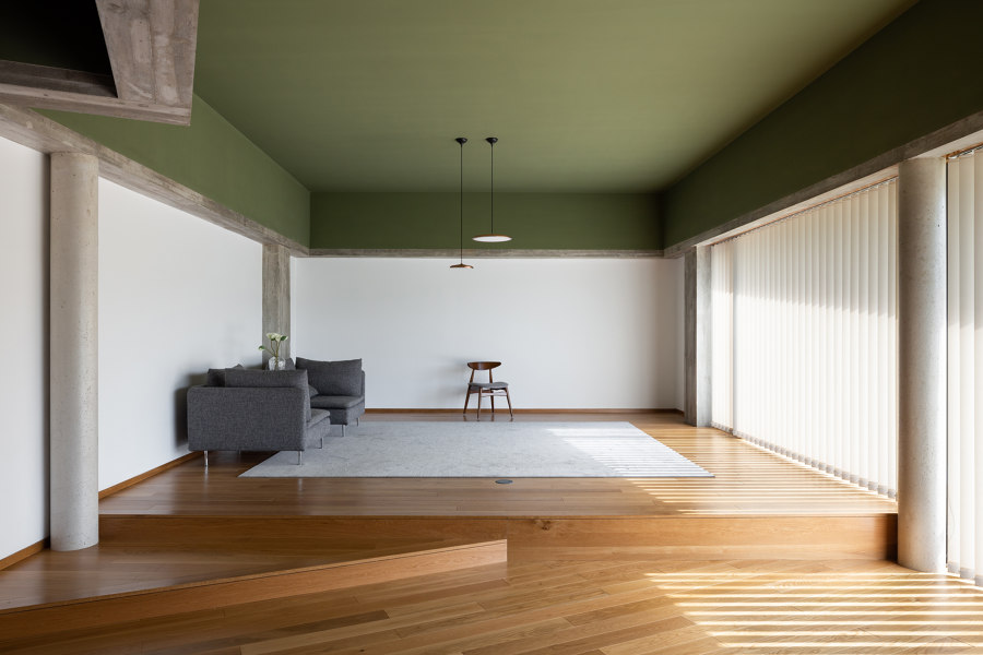
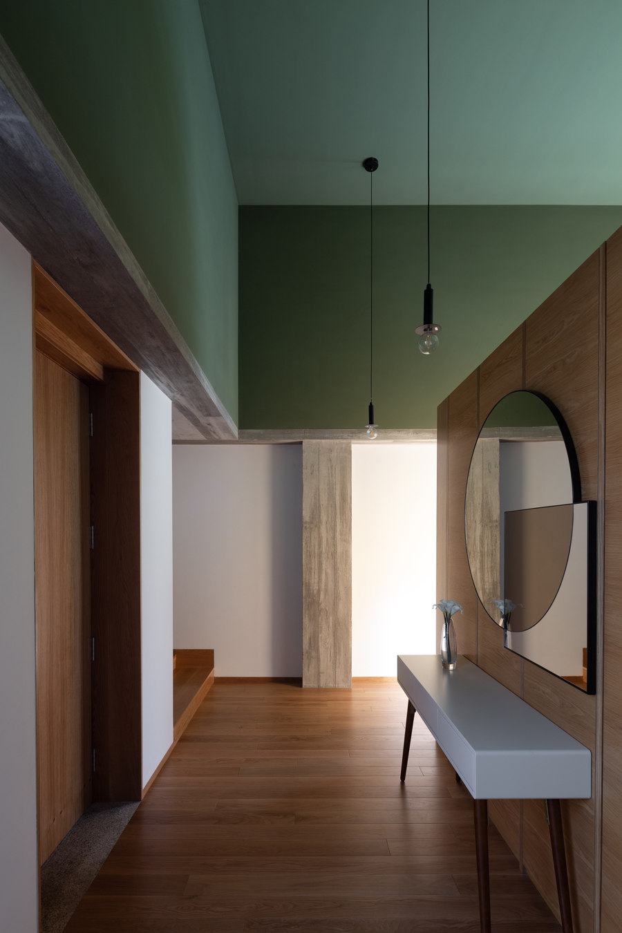
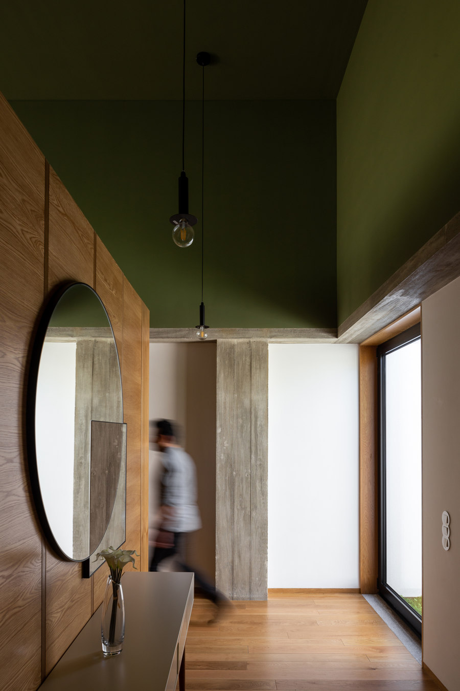
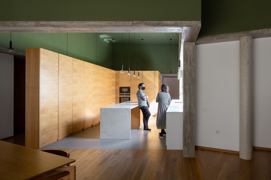
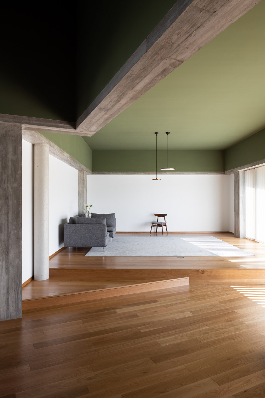
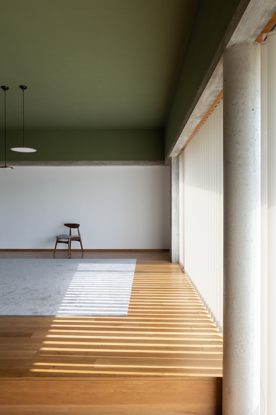
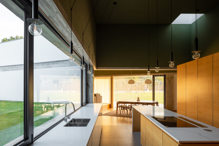
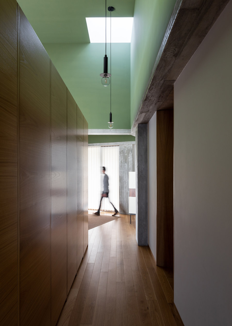
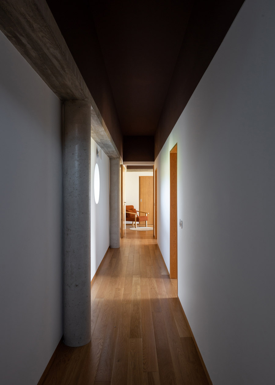
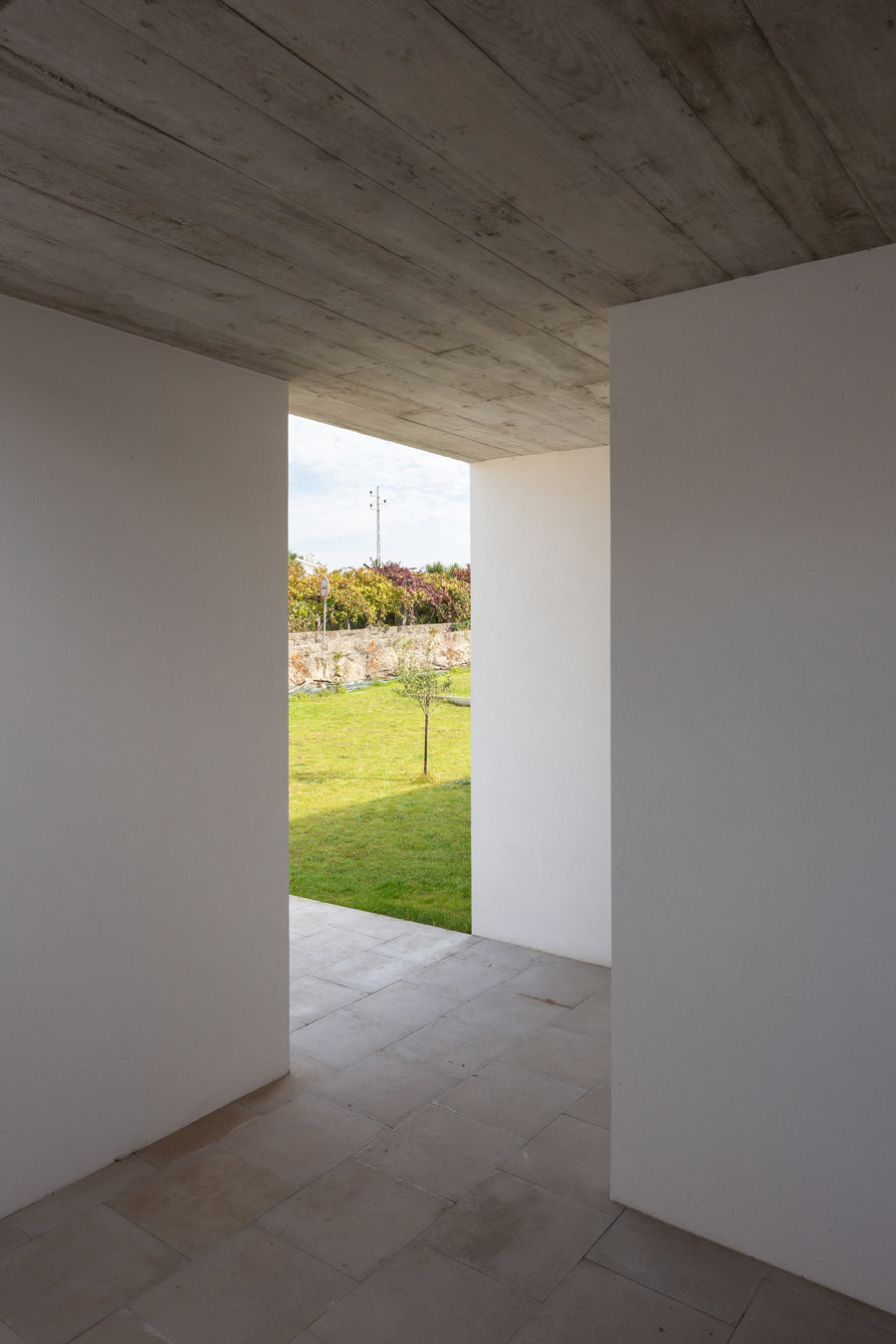
Structurally and for cost control, the house uses the most common materials in construction in Northern Portugal: masonry walls and concrete structure. The latter, which is traditionally hidden inside the walls, is fully revealed inside so as to be included in the visual and material composition of the spaces. In this way the interior took on a more complex materiality without adding costs. At the same time, the ceiling height, which varies according to the program and which is unusually high in order to support the social life of the house, is visually broken by the reinforced concrete structure that separates two different colors on the walls. Thus, the human scale remains present in all spaces, regardless of the size of the ceiling height.
The variations in floor level appear to minimize the excavation of the house's terrain (the terrain has a slight slope from West to East) and also as a second tool to control the height of the ceiling. The house is then split into two levels separated by two steps: dining / kitchen space on the lower part, and living / bedroom space on the upper part. A window over the entire length of the kitchen counter reveals this relationship of heights between indoor and outdoor, showing the garden of the outdoor patio exactly at the same level as the counter top.
Design Team:
Pedro Miguel Santos
Design Team: Rui Santos
Engineering: Francisco Gomes Santos, lda.
Contractor: Francisco Gomes Santos, lda.

Fotograf: Alexander Bogorodskiy

Fotograf: Alexander Bogorodskiy

Fotograf: Alexander Bogorodskiy

Fotograf: Alexander Bogorodskiy

Fotograf: Alexander Bogorodskiy

Fotograf: Alexander Bogorodskiy

Fotograf: Alexander Bogorodskiy

Fotograf: Alexander Bogorodskiy

Fotograf: Alexander Bogorodskiy

Fotograf: Alexander Bogorodskiy

Fotograf: Alexander Bogorodskiy

Fotograf: Alexander Bogorodskiy

Fotograf: Alexander Bogorodskiy

Fotograf: Alexander Bogorodskiy

Fotograf: Alexander Bogorodskiy

Fotograf: Alexander Bogorodskiy

Fotograf: Alexander Bogorodskiy
