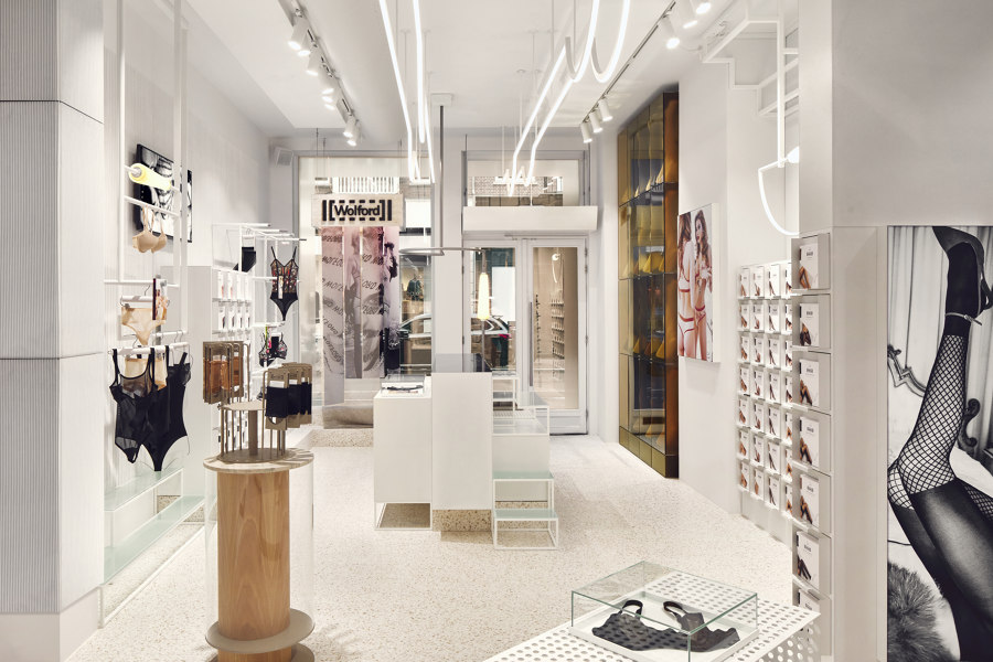
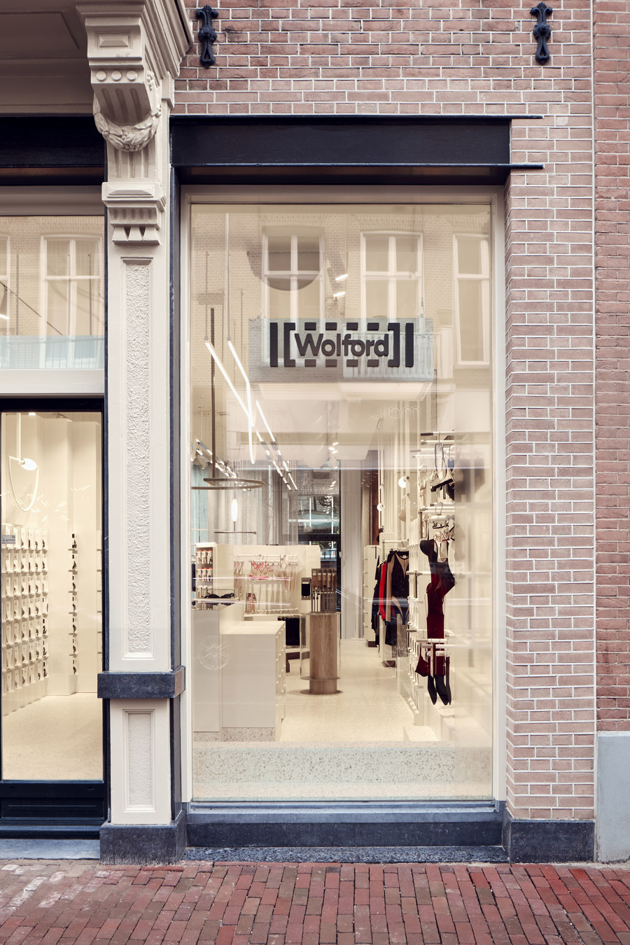
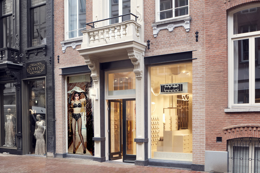
The legendary hosiery brand Wolford was always going to be one step ahead when it came to reinventing its store identity. This luxury bodywear company, specialising in tights, bodysuits and underwear, recently approached Studio Modijefsky to produce a brand-new luxurious retail concept for their shops worldwide. Wolford’s latest flagship store, located on P.C. Hooftstraat in Amsterdam, brings together their exquisite craftsmanship and outstanding attention to body and skin to produce a unique and luxurious interior design experience.
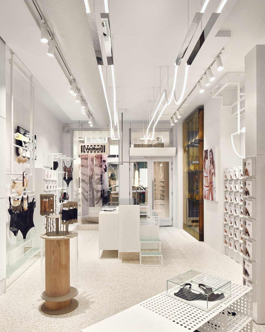
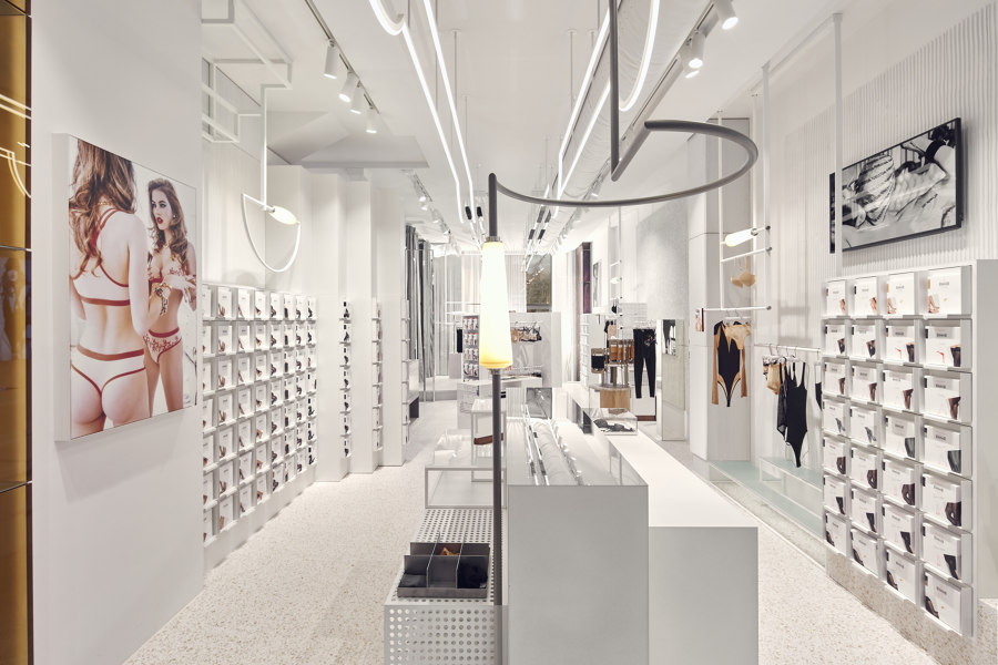
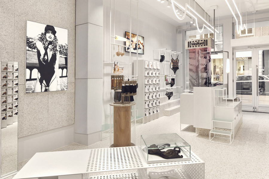
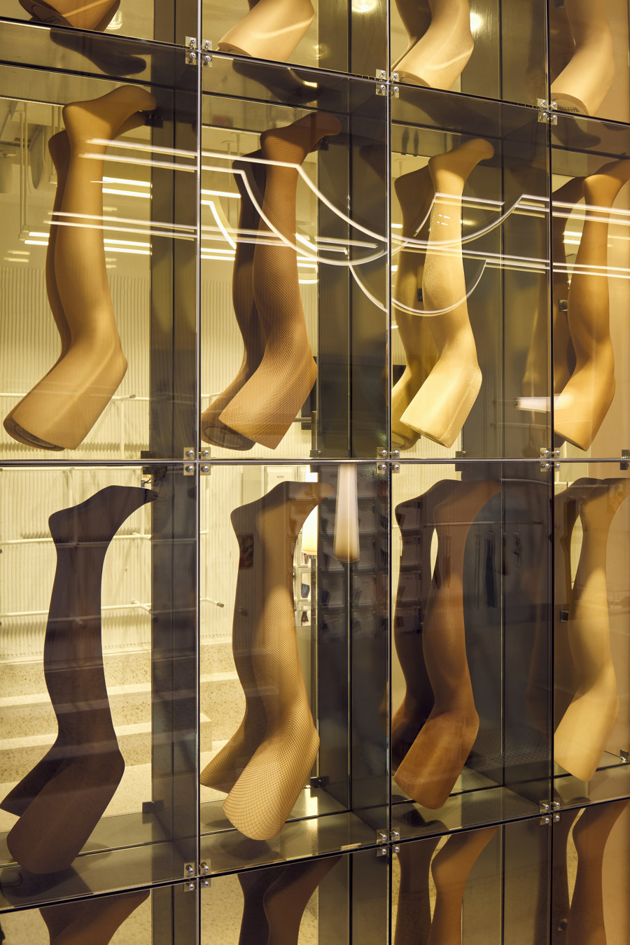
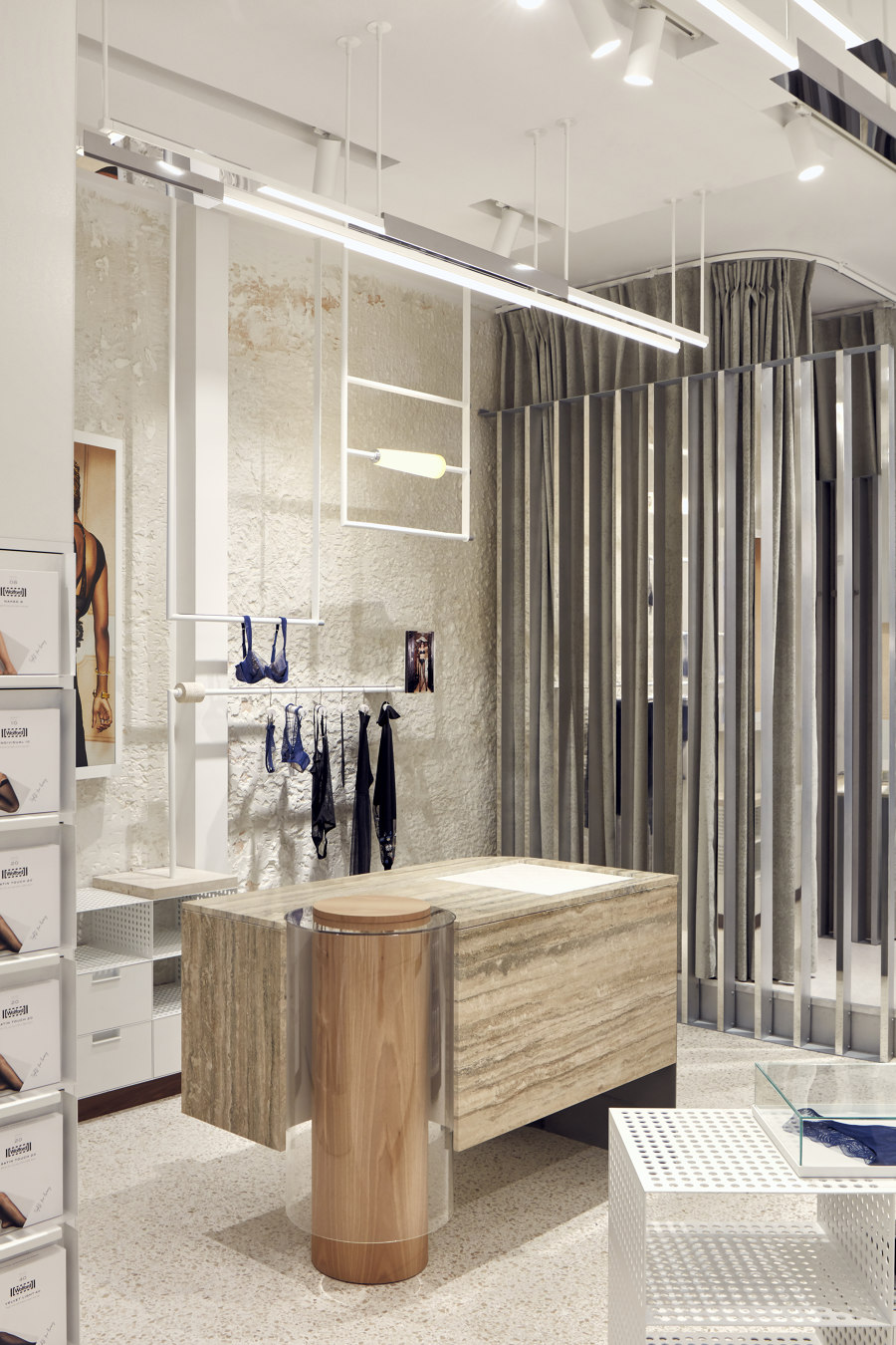
As you approach the P.C. Hooftstraat store from street level, a sleek wall of legs immediately draws you inside. This floor-to-ceiling feature is more of an art installation than a typical product display, proudly showcasing Wolford’s world-famous hosiery. Inside the store, the hardness of powder coated fixtures is complemented by the rich, tactile layering of natural stone, sheer fabric and subdued lighting of hand-blown glass. A subtle palette of muted white hues graduates from pure white metal, through creamy travertine and ribbed leather to fleshy, more feminine shades of purple and orange.
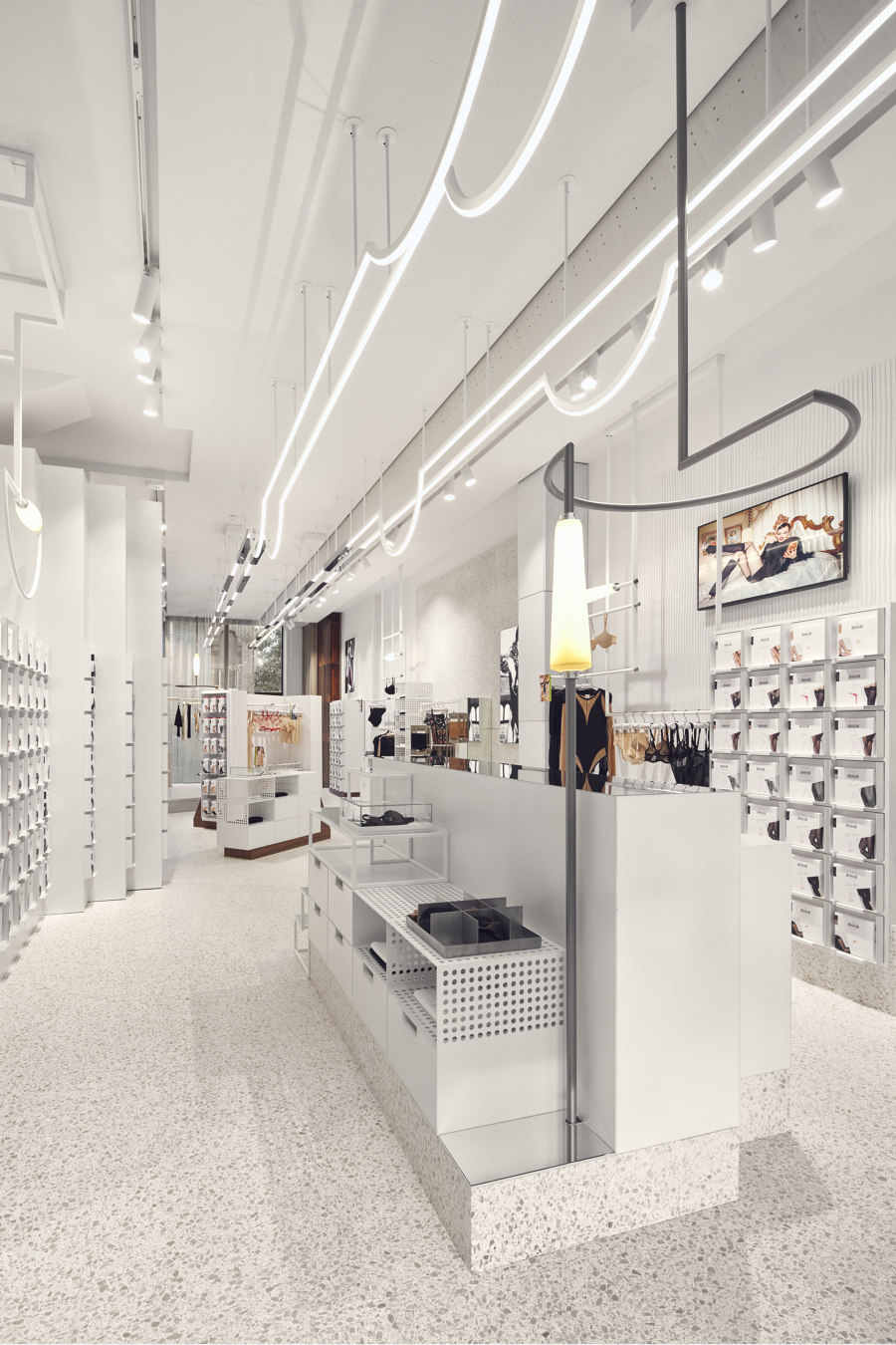
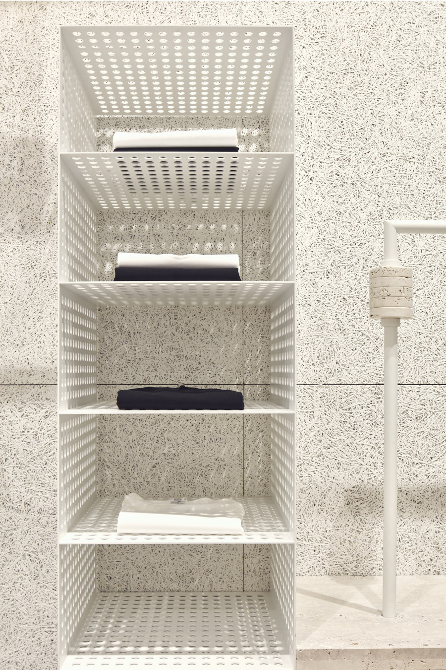
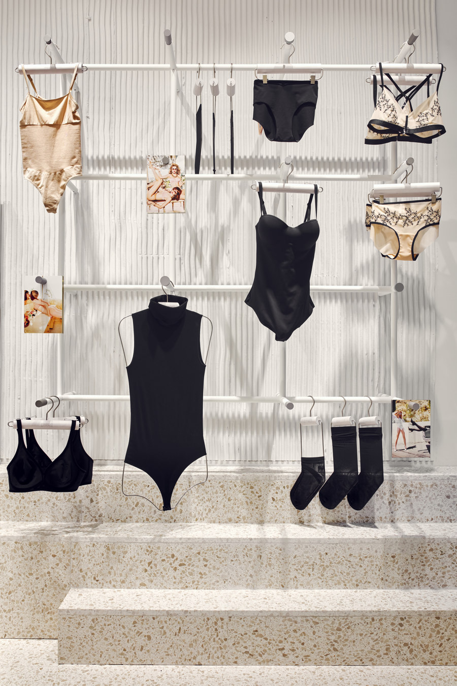
Inspired by the brand’s industrial heritage and craftsmanship, the interior is elegant and rough at the same time. Colour and material palettes replicate the dreamy feel of Wolford’s Austrian factory, where heavy machinery is always covered with soft fine netting to prevent the snagging of tights. Rails and spool-like lights bear a strong resemblance to the knitting machines, with ubiquitous powder coated steel finishes taken straight from the factory floor. The walls are raw or covered with unexpected building materials, such as acoustic wool or combed plaster with linear texture, which contrasts sharply with the refined and delicate garments on display.
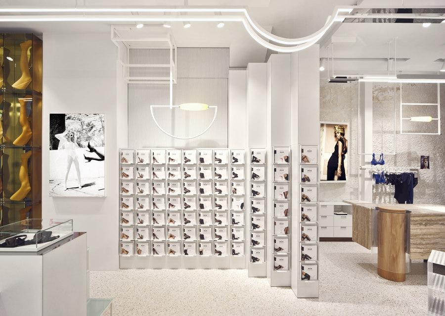
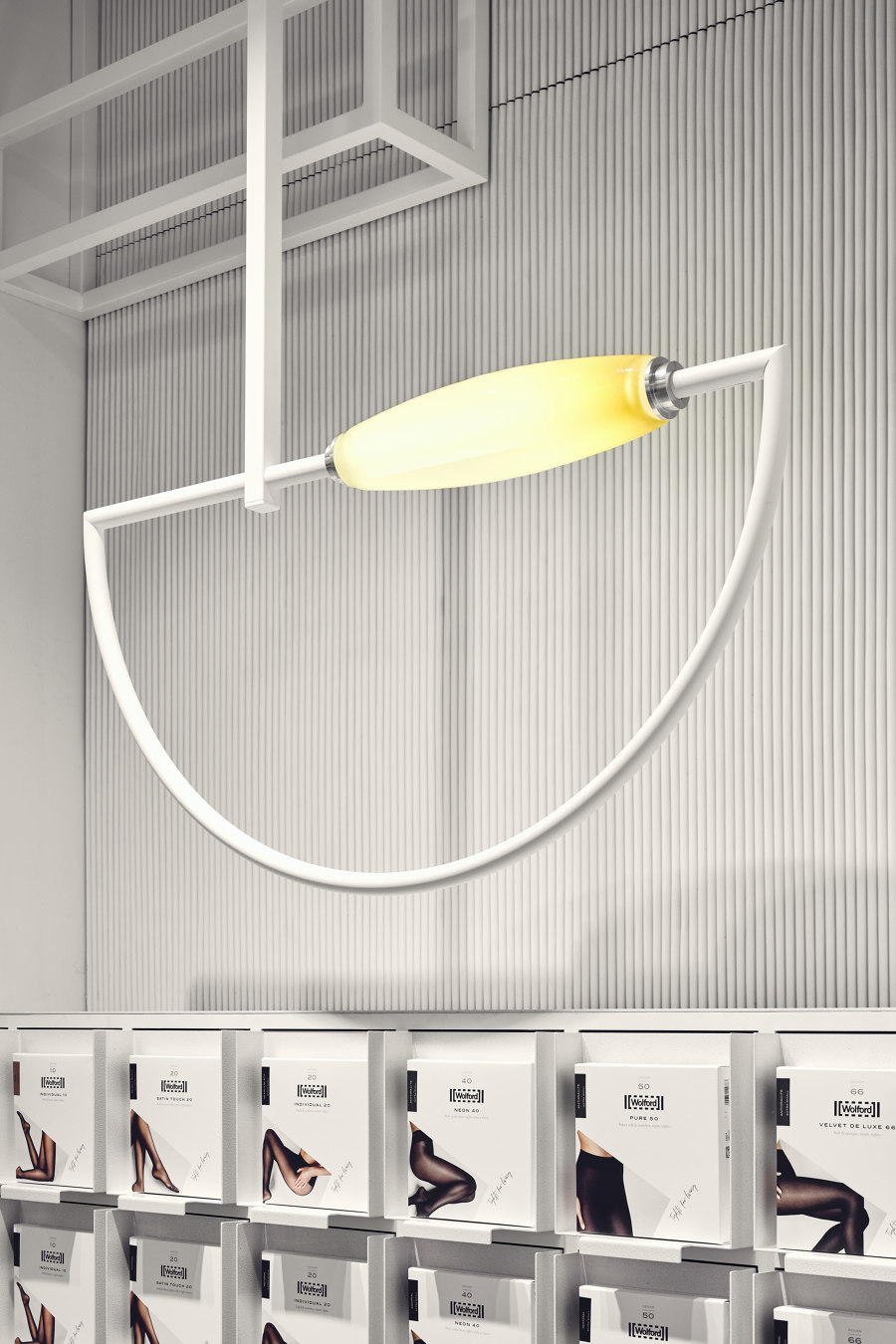
Perhaps the most recognisable elements of the interior are the bespoke lights. Continuous LED lines with L-shaped metal covers drop down into low arches, their curves softening the otherwise industrial interior. Hand-made blown glass spools replicate the design and shape of the original factory thread spools and act as a reference to the skill, innovation and craft that is all part of Wolford’s heritage. The lights attach to vertical and horizontal rails, emitting a warm inviting glow that draws the visitor to explore further.
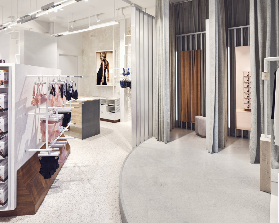
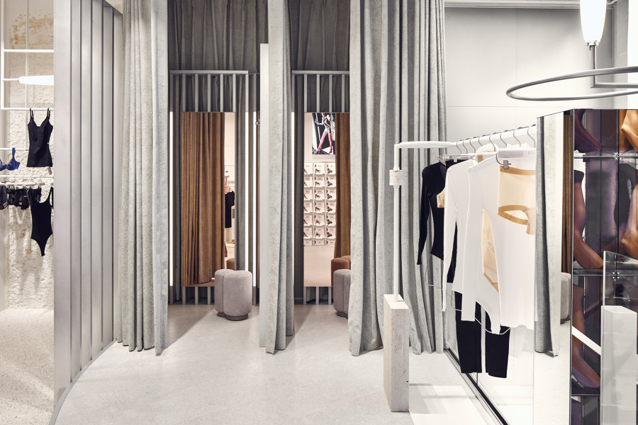
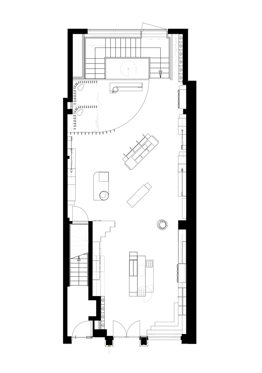
Throughout the open-plan interior there is a constant tension between the feeling of being backstage, and the glamorous feeling of being in the limelight. Spatial concept of the store was influenced by Wolford’s most natural habitat: stage, where their products are worn by celebrities and performers worldwide. Bulky and rough display elements balance out the glossy, chic entrance filled with metal and glass. Fitting rooms are placed on an elevated stage at the back of the store – a tall metal structure surrounding each cabin is interlaced with soft contemporary fabric, once again combining industrial edge with tactility. Integrated vertical lights create a luxurious atmosphere designed to celebrate and empower customers.
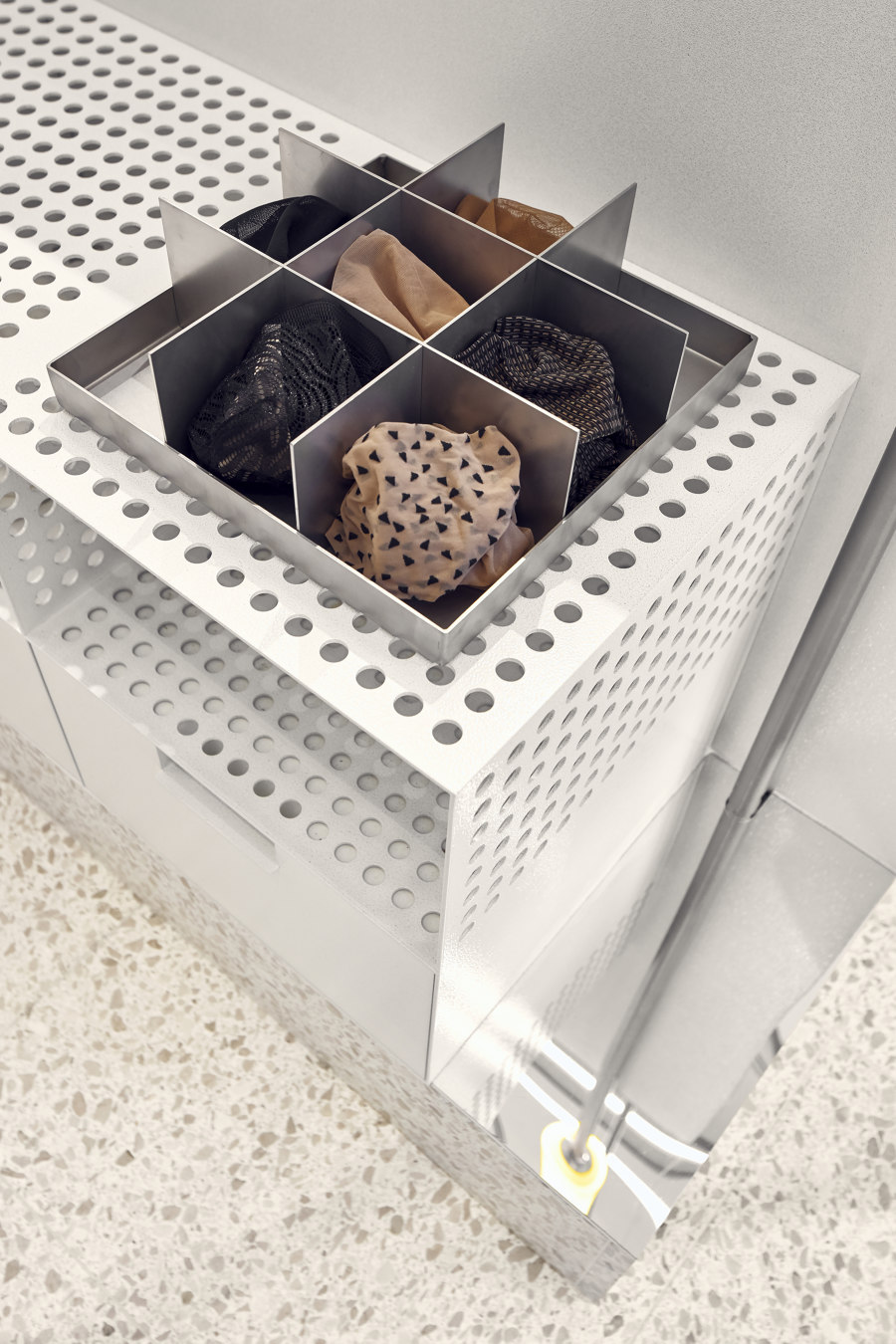
In order to display a wide range of ongoing legwear types, Studio Modijefsky designed handmade cabinets with integrated drawers to showcase the newly designed product boxes. Different depths of the boxes form sculptural pieces of furniture throughout the interior of the store. Samples of fabric, typically hidden and only presented to clients on request, are this time proudly displayed in a central totemic structure. Customers are encouraged to find their own shade of nude, experiment and feel the fabric against their skin. The shape of the fixture is then repeated in the design of the cash desk. This minimal, high-end travertine element has a special inlay for wrapping paper, turning the transactional moment of payment into a special ritual connecting customers with the brand.
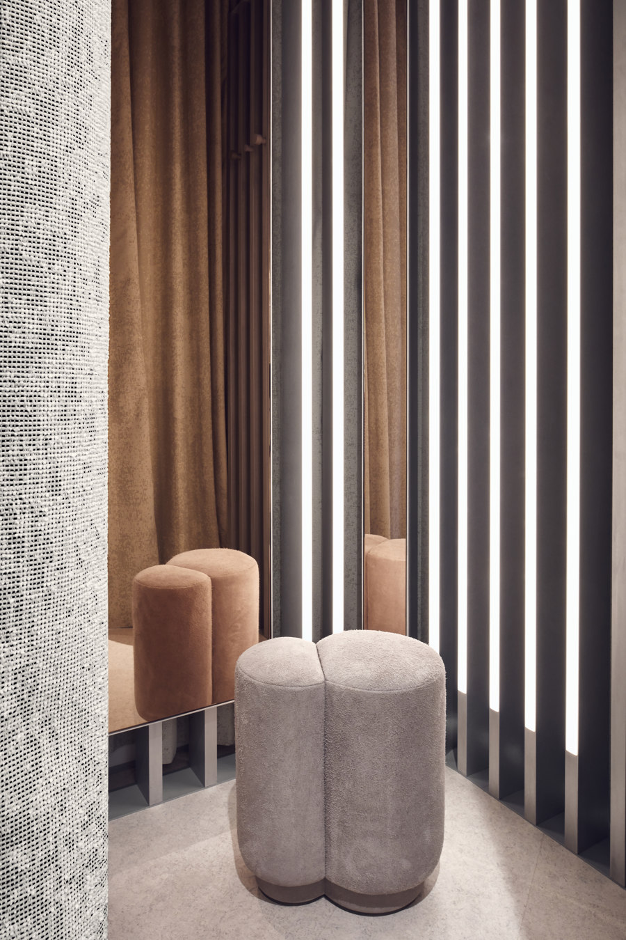
Since both tights and lingerie are closest to one’s skin, a deeper layer of ‘human touch’ was added to the design. Window display ‘blushes’, subtly changing colour, just like human skin. Traditional presentation of legs has been replaced by lightboxes, screens and editorial pictures, presenting a multitude of products on real models, rather than artificial skin shades and textures. A messy hand drawn illustration of a woman’s body by Amsterdam based Emmy-Koos Meijer is embroidered on a sheer curtain at the back of the store. Poufs resembling cropped feminine thighs hide in fitting rooms. The store is full of playful references to the human interaction, surprising customers and allowing them to experience the brand on many levels.
In the lavish surroundings of Amsterdam’s P.C. Hooftstraat, Studio Modijefsky has created a soothing, monochromatic interior, allowing Wolford’s outstanding products to takecentre stage. Their modern, distinct concept will be instantly recognisable in many stores to come, from Paris to Los Angeles.
Design Team:
Studio Modijefsky; Esther Stam, Martyna Nicolson, Moene van Werven, Natalia Nikolopoulou, Sophie van Heijningen and Ana Barbu
