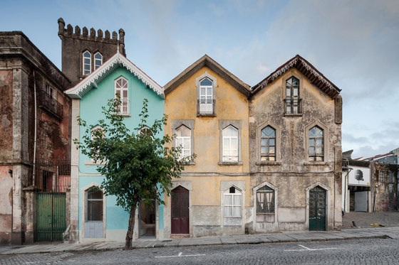
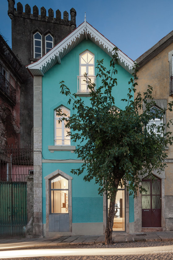
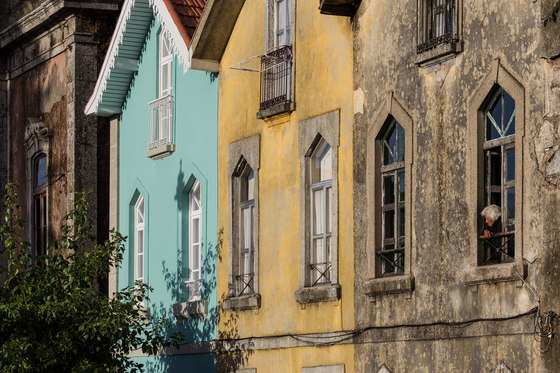
The "Three Cusps Chalet" is a very peculiar building, documenting this region’s history and diaspora, and combining typical 19th century portuguese architecture and urban design with an unexpected alpine influence, brought by an historic wave of rich portuguese returning from Brazil in the eighteen hundreds, influenced by central-europeans building Brazil’s second industrial revolution.
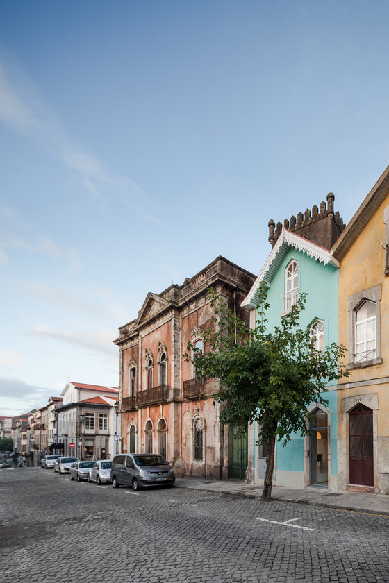
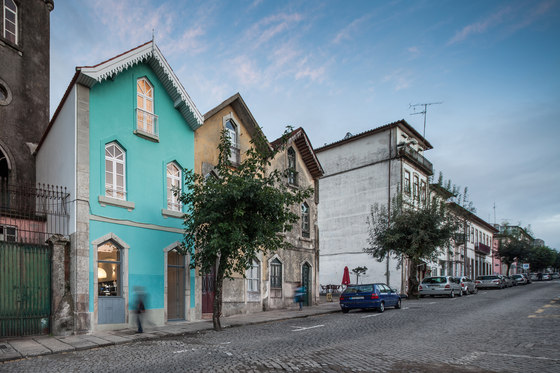
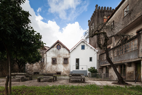
Conceived as an annex serving the small palace by its side and siting at the heart of both the roman and medieval walls of Braga, this is a particularly sunny building with two fronts, one facing the street at West and another one facing a delightful, qualified block interior plaza at East, enjoying natural light all day long. The building's identity had been lost in 120 years of small unqualified interventions, over-compartmenting it, closing it to the street and to the light.
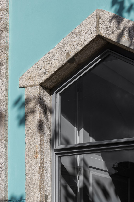
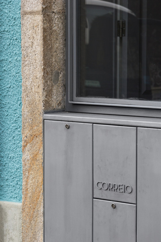
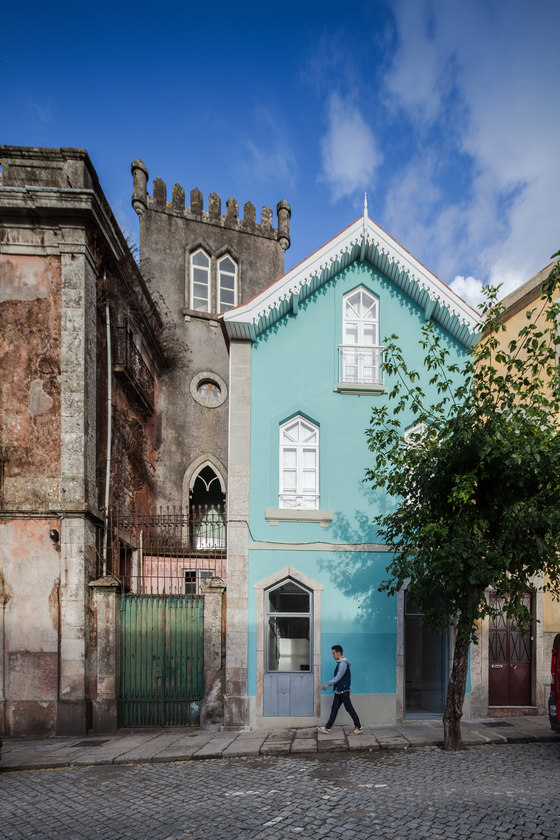
Its façade was equally adulterated: modern aluminum window frames and exterior shade head boxes changed the openings’ stereotomy, the building’s scale and detail, and disrupted the original sense of the street. So, the goal of this design was to clarify the building's spaces and functions, returning it to its original image, constructive techniques and (mainly habitational) program, while simultaneously making it fit for today's way of living, giving it back to the city and potentially constituting a model for future rehabilitation projects in the neighborhood.
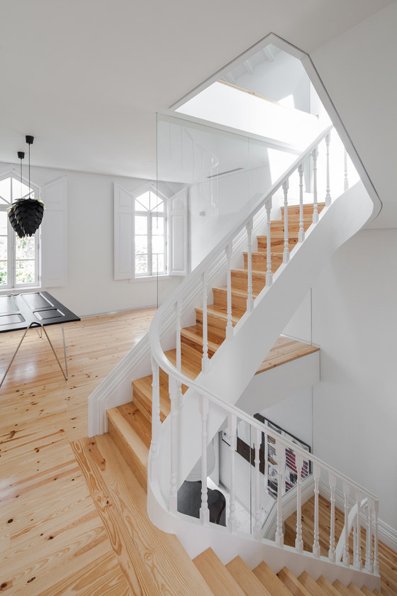
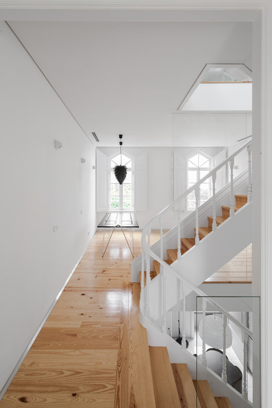
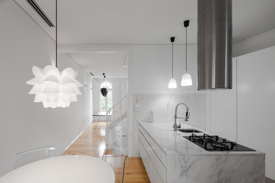
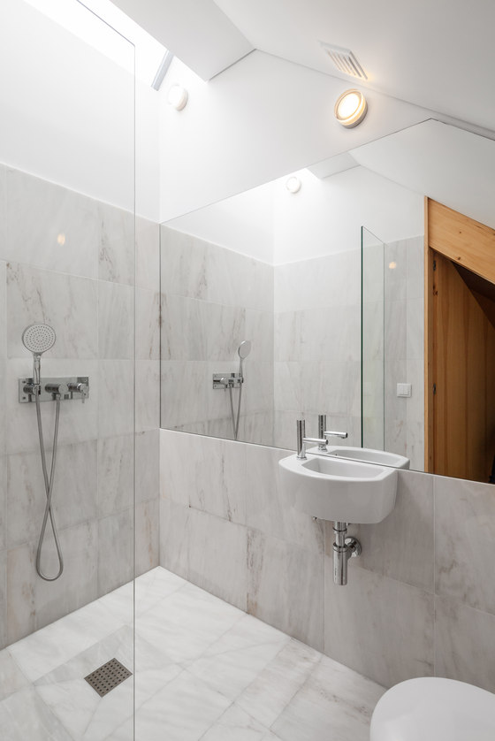
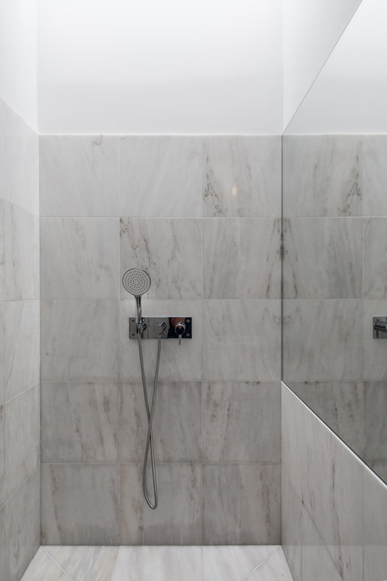
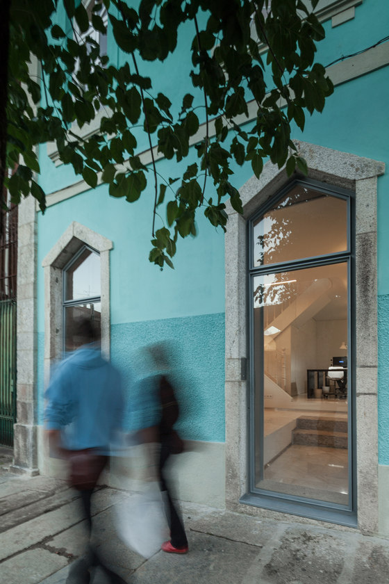
The façade was restored to its original glory, reinstating the original wooden window frames and preserving the delightfully decorated eave. The interior recuperated the original spacial and functional distribution, wooden floors and ceiling structures and the original staircase, while introducing portuguese Estremoz marble on the wet areas and ground-floor.
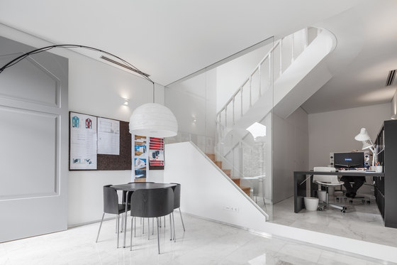
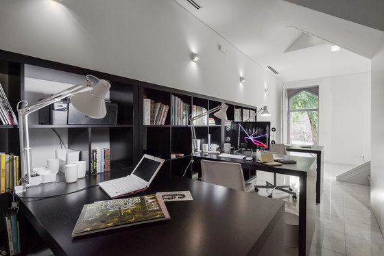
The program asked for the cohabitation of a work studio and a home program. A 1,5 m height difference between the street and the block's interior plaza allowed to place the working area on the ground level, turning it westward and relating it to the street. This façade is bathed with the afternoon light. The domestic program relates with the interior plaza and the morning light. The interior plaza is punctuated by several orange trees: these provide a delicious shadow during the summer and display a beautiful show during winter, covered with bright fruits.
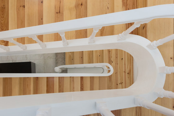
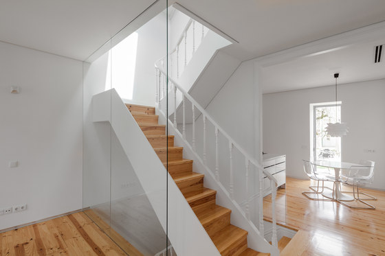
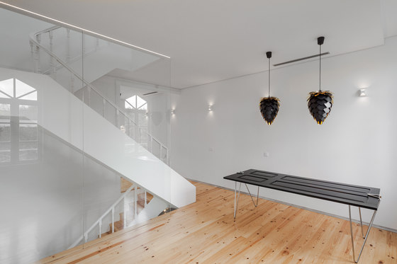
Given the reduced area of the building, the original strategy of hierarchizing spaces by floor was followed. The stairs are narrower with each flight of steps, informing the changing nature of the spaces it connects. The staircase geometry efficiently filters the visual relations between both programs while still allowing for natural light to seep down from the upper levels.
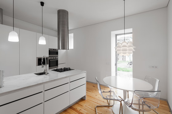
The first floor was kept for the social program of the house. Refusing the natural tendency for compartmentalizing, the staircase was allowed to define the perimeters of the kitchen and living room, creating an open floor with natural light all day long. Light enters from the kitchen in the morning, from the staircase's skylight and from the living room in the afternoon.
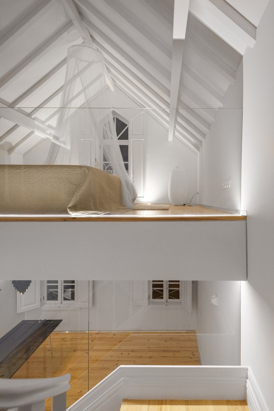
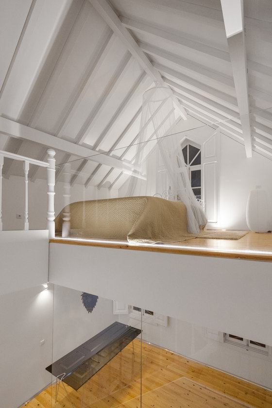
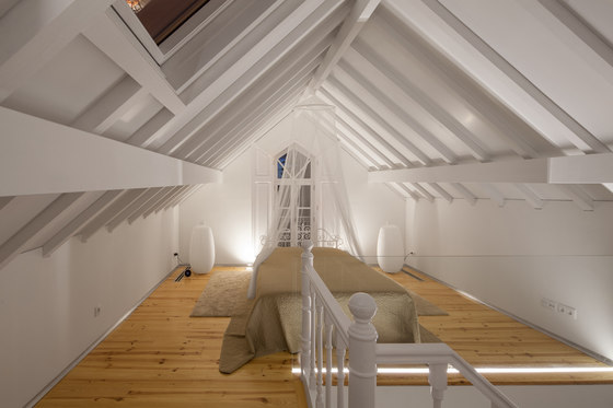
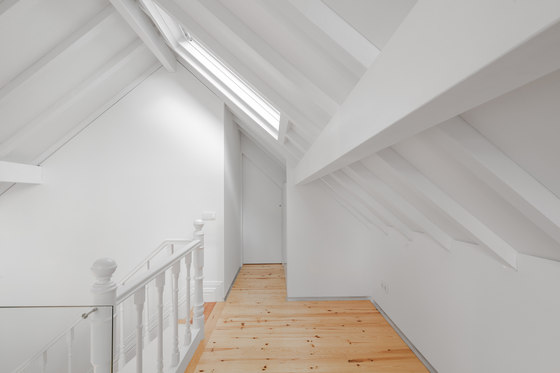
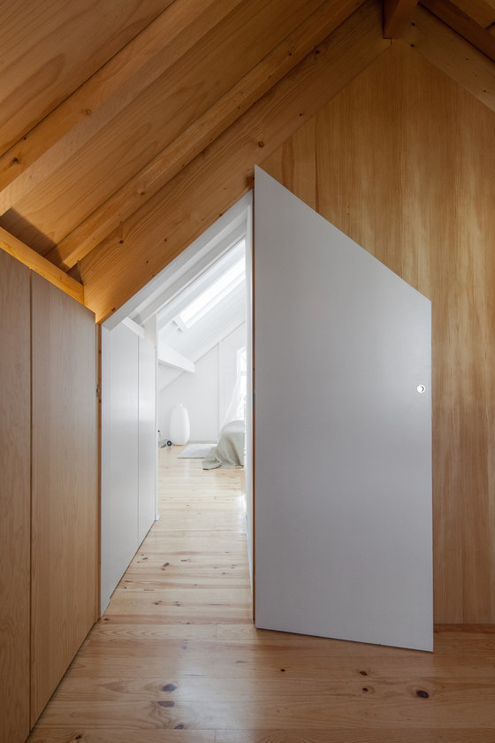
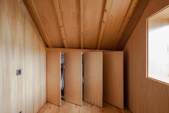
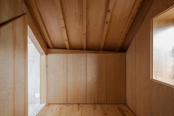
Climbing the last narrow flight of stairs we reach the sleeping quarters where the protagonist is the roof, whose structure was kept apparent, though painted white. On the other side of the staircase there's a clothing room, backed by a bathroom. The white color is methodically repeated on walls, ceilings, carpentry and marble. The clothing room is the surprise at the top of the building. Both the floor and roof structure appear in their natural colors, surrounded by closet doors constructed in the same material. It reads as a small wooden box, a counterpoint to the home's white box and to to the marble box of the bathroom.
QUOTATIONS
Tiago do Vale
"Even as we visited it for the first time it became quite apparent what this building was desperately asking for. On one hand, it had to be free from all the gratuitous add-ons that suffocated it and compromised the clarity and logic of its original spaces. And on the other hand (even if it is, in many ways, a symptom of the same malady) to allow light to permeate its spaces. Darkness ended up as the ultimate consequence of the systematic compartmentalization that the building was subjected to. We needed to maximize both transparency and light to allow it to breathe."
"The building's original typology, typical of the eight-hundreds -and considering that the building was already designed with flexibility of use in mind- is, in itself, quite permissive and open, fit to answer almost any kind or architectural program. Being so we never thought of another path besides being faithful to the building's original nature, as much on its architecture as on its technical solutions and spacial and programatic distribution. We recovered nor only the original materials but also the original uses of each space. And even when we introduced new materials such as the Estremoz marble, we did it with the criteria of it being right for the building nature and historic context."
"In this particular case, time wasn't generous with it [the building]. Sometimes an architect finds himself divided, trying to respond to the challenges of a requalification, seduced between the conceptual honesty of a strict, blind restoration and the conceptually dishonest freedom to lie a little bit about it, to make way for the project to go a bit further on any particular matter.
As always, the best compromise lay in between both extremes, informed by them both: a strict, blind restoration can produce a beautiful and interesting architectural object, but something has to give so that the building is able to respond to the requests of the contemporary way of living. The way we live has changed dramatically over the last 120 years. That response is, in the end, a building's ultimate mission (and the life it breathes).
When the passing of time is generous, it qualifies and values a building, adding to its original qualities and taking note of it's path through time. It shows how the way we relate with our homes (the way we live them) steadily changes and evolves, which is enormously enriching and a marvelous architectural experience. So, returning to this particular case, we tried to commit the tender dishonesty of offering this building a happier story, with a more generous path than the one it actually suffered. We recovered and highlighted its very interesting original characteristics while introducing elements and ideas that could transport, step by step, this home from its foundation times to the present day, perfectly adjusted to the contemporary ways of life."
"At it most basic, our option was to reclaim the original intent and conditions of the building but with the (fundamental) subtlety of providing an added something beyond a blind restoration. Something that could return the building to a function, to a use (whereby people could inhabit it and live a life of genuine quality), to present day, to the street, to the city, and with enough flexibility to keep it going for an extra 120 years. This is a delicate matter, though, as function, use, people, streets, cities are all things that relentlessly, unforgivingly, keep changing the way they relate with their built surroundings."
Tiago do Vale Architects
Construction: Constantino & Costa
