Team Picks: the architecture and design stories we loved in September
Text von Architonic
Schweiz
29.09.23
In this monthly format, we bring you the must-see projects and articles you may have missed over the last four weeks on Architonic. Featured in September: organic shapes, interiors that reflect their surroundings and playful public spaces.
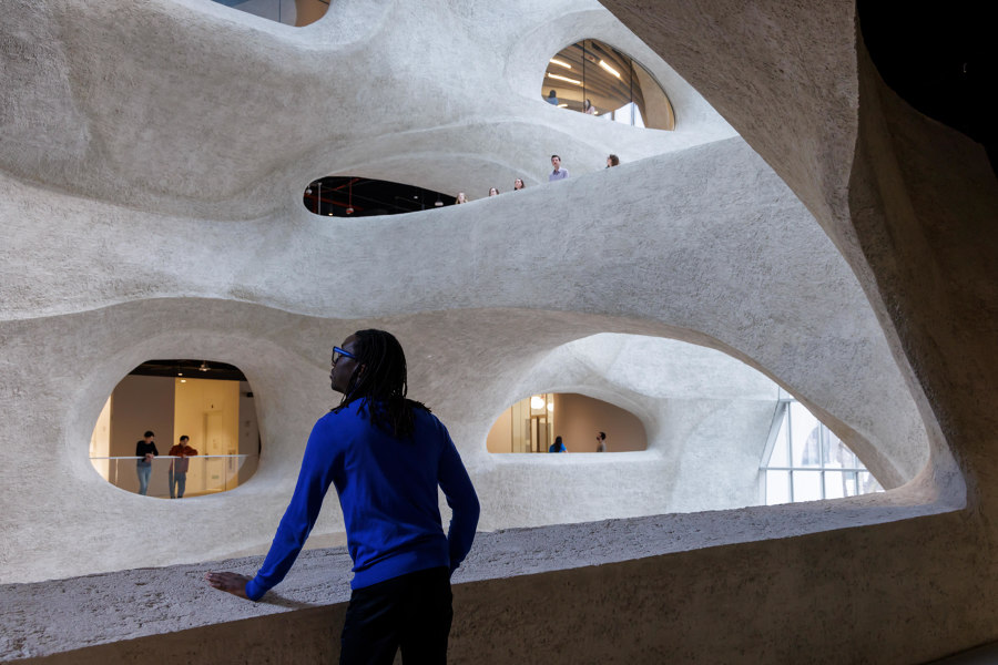
Richard Gilder Center at American Museum of Natural History by Studio Gang. Photo: Iwan Baan
PROJECTS
Upon entering the Gilder Center, visitors find themselves in the five-story Kenneth C. Griffin Exploration Atrium, a grand space illuminated with natural light admitted through large-scale skylights. The building’s design is informed by the ways in which wind and water carve out landscapes that are exciting to explore, as well as the forms that hot water etches in blocks of ice. The 230,000-square-foot $465 million project was announced in 2014 and includes six floors above ground, four of which are open to the public, and one below. It creates 33 connections among 10 Museum buildings to link the entire campus and establishes a new entrance on the Museum’s west side.
Enrique Tovar, Brands & Materials Content Editor:
'One thing I love about New York is that it always has something new to offer, and this project is no exception. This extension presents a fresh perspective on how we conceive museums, shifting towards fluidity and free-form design rather than adhering to orthodox and solemn lines. Furthermore, the use of shotcrete introduces a novel dimension to the building's materiality. Encountering proposals like these certainly inspires us to reconsider how we envision interior spaces.'
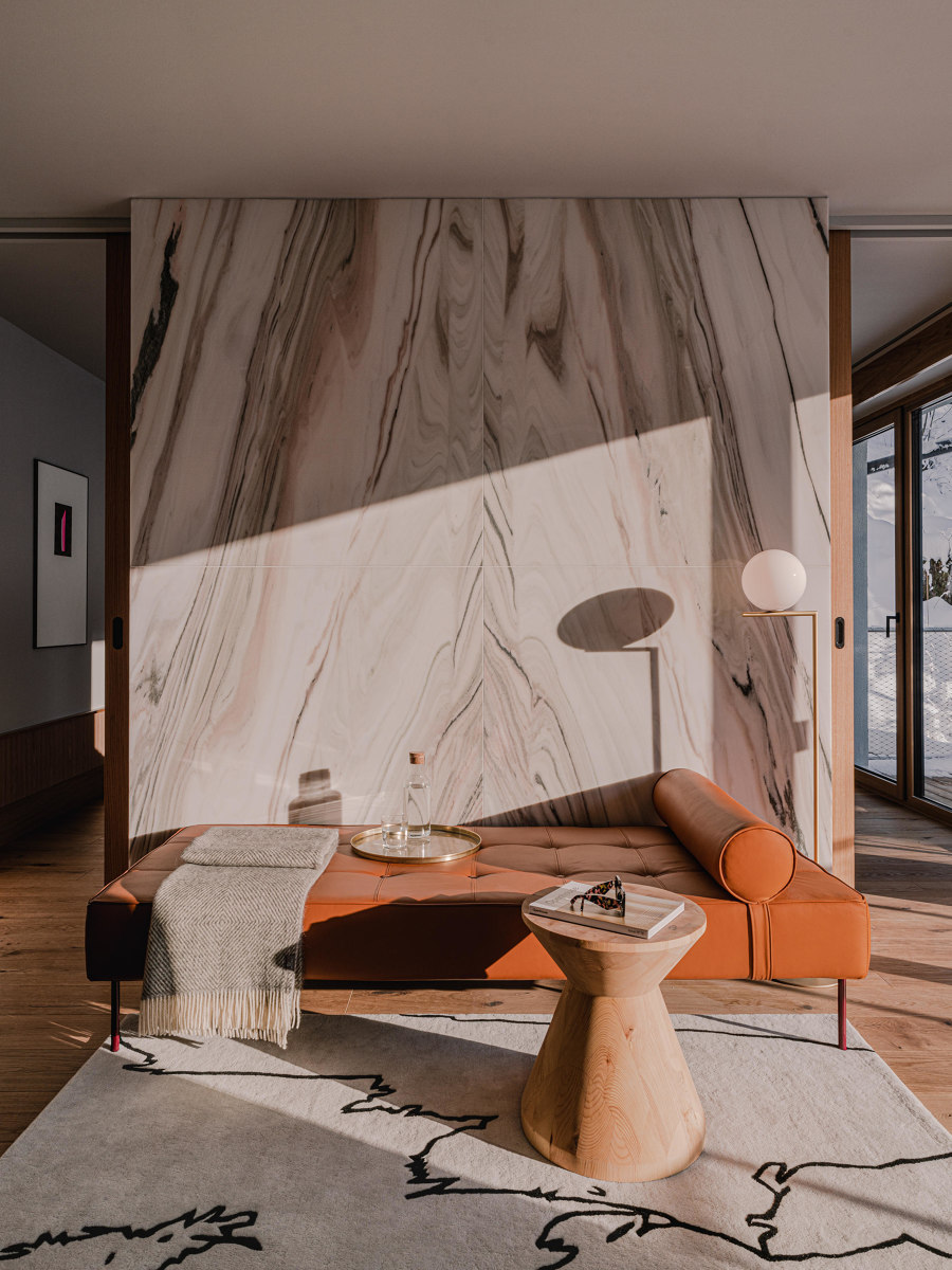
the cōmodo Bad Gastein by weStudio. Photo: Pion Studio
Reborn from the bones of a former health resort from the 1960s in the Austrian mountain-top spa town of Bad Gastein, the cōmodo translates a mid century atmosphere into a modern mountain escape. weStudio's design principle approaching the property was to merge the interior with the exterior, celebrating the sublime beauty of the natural landscape. The huge windows open up to the expansive vistas, showcasing the ever-changing weather, while the colours and contours of the Bad Gastein mountains inspired the custom designed furniture, wallpapers, rugs and artwork.
Lucila Sarasola, Content Editor:
'This project – and its stunning photographs – not only triggered my need to be teletransported to 'the cōmodo' in the middle of the Bad Gastein mountains, but to start a wishlist of lighting accessories as well. Check out my new favourites: Etna by Mawa Design, Dipping Light Suspension Lamp by Marset and IC Lights Floor 2 by Flos.'
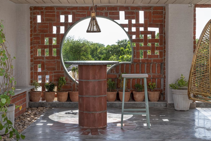
Renovation of House by Manoj Patel Design Studio. Photo: 2613 apertures
The design brief for this house in one of the central areas of Vadodara city had many memories attached from the client’s side. Now evolving over time, they wanted to experience contemporary modulations in the same space with minimum budget specifications. The house defines dialogue between existing structural grids and new different punctures infused for communication. Its design shows a thoughtful approach to addressing challenges inside a built mass, creating opportunities for visually open spaces by adding colourful graphics. As part of climatic considerations, passive design strategies and planning principles have been incorporated.
Alun Lennon, Content Editor:
'This project in Vadodara, India, featured in a recent piece by James Wormald about interior surfaces that draw inspiration from their outer shell. The humble red brick is used to powerful effect both inside and out. Beautifully utilised in the decorative rectangular facade and inside to create understated yet eye-catching details. And what a colour.'
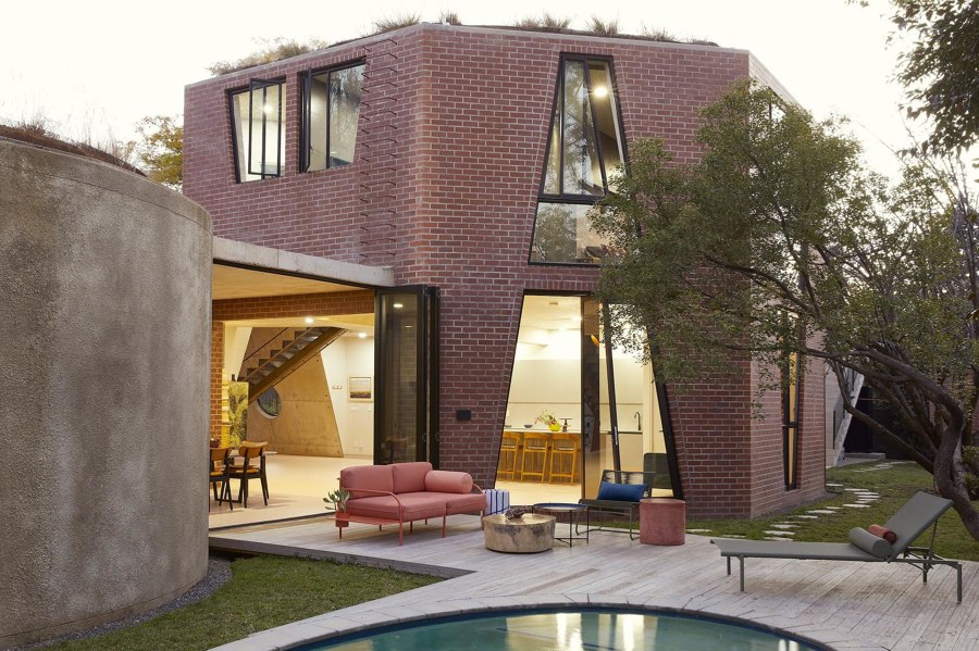
'Ten homes with weird and wonderful custom-shaped windows.' Great Primary Shapes House by Gregory Katz Architecture. Photo: Elsa Young

'Ten homes with weird and wonderful custom-shaped windows.' Great Primary Shapes House by Gregory Katz Architecture. Photo: Elsa Young
×ARTIKEL
Transporting light and ventilation through a home, the benefits of windows are clear. But the shape of a home’s windows can also play an essential role in changing how we see it. While the common rectilinear shape of a structure is often a compromise between stability and functionality – leaving personality a distant third – the shapes of its windows are far more flexible. Despite this, most windows remain confined by boundaries set by the shapes and materials of the walls they sit within.
Valeria Montjoy, Senior Content Editor:
'It seems that every day the industry introduces new technological or material breakthroughs waiting to be explored (and written about). Yet sometimes, it’s nice to revisit the basic, fundamental architectural elements – the kind even children depict in their rudimentary house drawings – with a new set of eyes. What I loved about this article is precisely that; it delves into the seemingly ordinary world of windows, but abandons the traditional rectangular models to unveil a series of unconventional, out-of-the-box designs (literally) with a myriad of sizes, materials, patterns, opening motions and stories to tell. I found it quite refreshing and entertaining…windows are not so basic after all.'
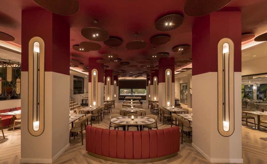
'Newly opened hotel interiors that reflect their environment.' Studio Gronda's Hard Rock Hotel Marbella. Photo: Jose Salto

'Newly opened hotel interiors that reflect their environment.' Studio Gronda's Hard Rock Hotel Marbella. Photo: Jose Salto
×Bringing the outside in isn't just one of the most prominent interior trends of the last century. For these newly opened hospitality projects, it's a way to root themselves in their local surroundings and offer guests a truly authentic stay. Wooden textures, stone accents and earthy tones come together to create an ambiance that resonates with the calm of a surrounding forest grove, snow-covered mountains or a sun-kissed beach. By harmonising organic materials with contemporary design from their respective region, these four projects create an atmosphere that not only pleases the eye, but offers an oasis of serenity to reconnect with nature in the lap of luxury.
James Wormald, Organic Content Editor:
'This article, for me, really hit the meaning of ‘luxury’ in hotel interiors on its highly-polished head. These homes away from home remind us that real comfort is derived from our sense of place, and whether on sand, mountain or monastery, those seeking to get away from their hectic lives in a relaxing environment need hospitality spaces that complement the setting.'
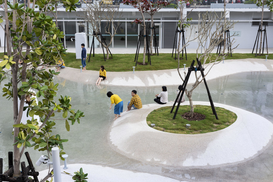
'Water in public-space architecture.' Tainan Springs by MVRDV. Photos: Daria Scagliola
Water is the focus, and also often the defining feature, of a whole host of contemporary public spaces designed today. As well as being a decorative element in itself, bodies of water can provide valuable habitat for wildlife, create a cooler microclimate and store excess rainfall during storms. It can also bring a playful element to more formal spaces, and soften the effects of hard landscaping.
Daniela Porto, Content Operations Manager:
'It is often difficult to find public spaces that truly integrate all the aspects of what a truly open, inclusive place can – and should – be. This article focuses on four water-centric public spaces around the world, all of which demonstrate a careful and extremely well-thought-out approach to what they can offer to the inhabitants of their cities (including their animals). The placement of each one near, or within, a body of water, makes them more than simple parks or plazas; they are spaces that allow people to interact with their surroundings, eliciting playfulness and wonder.'
© Architonic
Head to the Architonic Magazine for more insights on the latest products, trends and practices in architecture and design, or find inspiration in a whole world of projects from around the globe through ArchDaily's architecture catalogue.
