First base: corporate-headquarter design
Text by Stefano Sabatino
16.06.21
The communication of corporate values and identity through architecture doesn’t need to be at the expense of employee comfort and wellbeing.
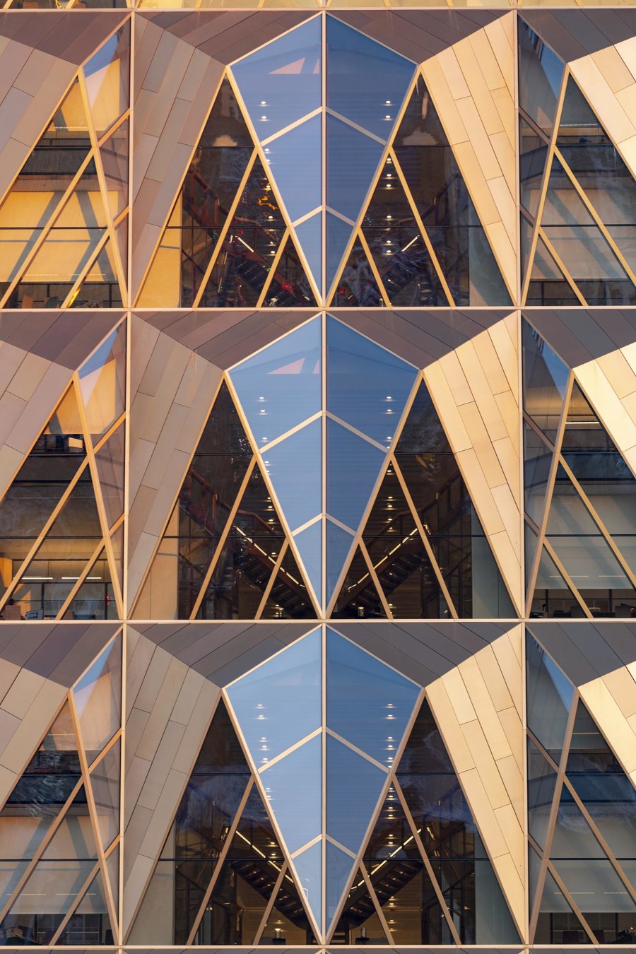
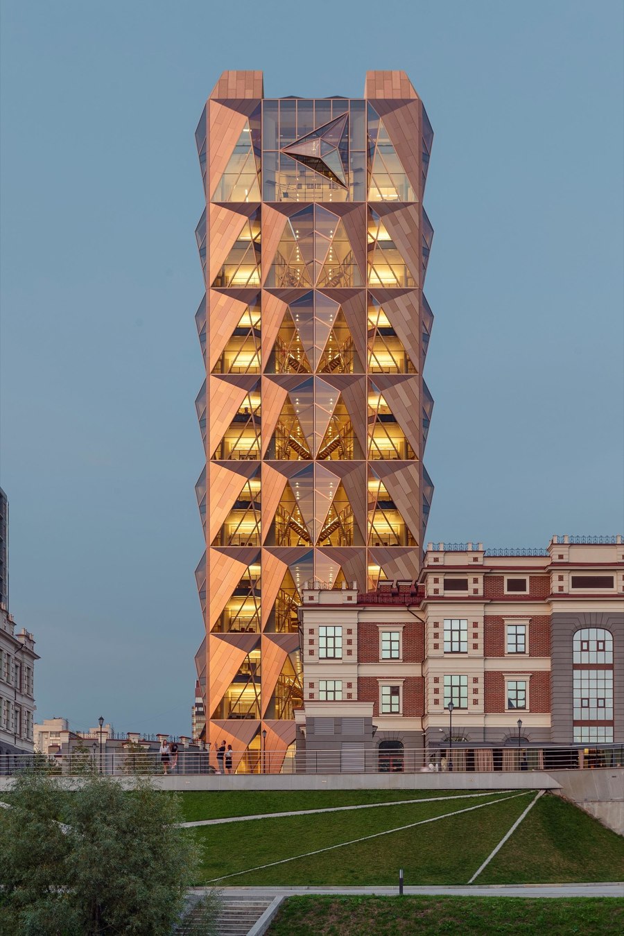
The iconic glass and copper facade of RCC Headquarters In Ekaterinburg, Russia, by Foster + Partners Photos: Oleg Kovalyuk

The iconic glass and copper facade of RCC Headquarters In Ekaterinburg, Russia, by Foster + Partners Photos: Oleg Kovalyuk
×At one time, corporate headquarters were austere, self-referential buildings, commissioned by companies to essentially celebrate themselves, with designs often based around a still formal and institutional conception of what the office environment was supposed to represent. Today, expressing brand identity is still important, whether in relation to facades or interiors, but many companies have abandoned the old paradigm and are aspiring to more appealing and welcoming architecture, whose spaces are increasingly tailored to employee’s needs and which enhance their sense of belonging.
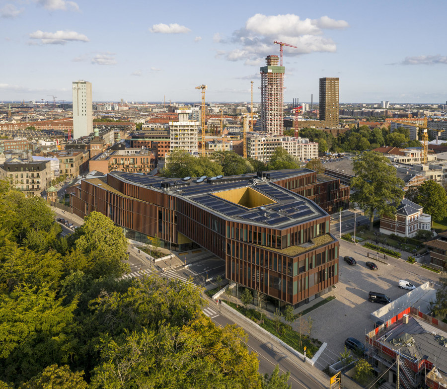
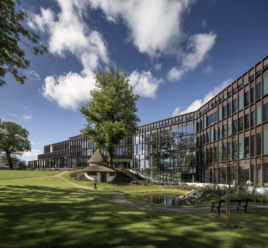
Deeply rooted within the historic Carlsberg City District, the new building designed by C.F. Møller Architects represents a contextual model of corporate headquarter design. Photos: Adam Mørk

Deeply rooted within the historic Carlsberg City District, the new building designed by C.F. Møller Architects represents a contextual model of corporate headquarter design. Photos: Adam Mørk
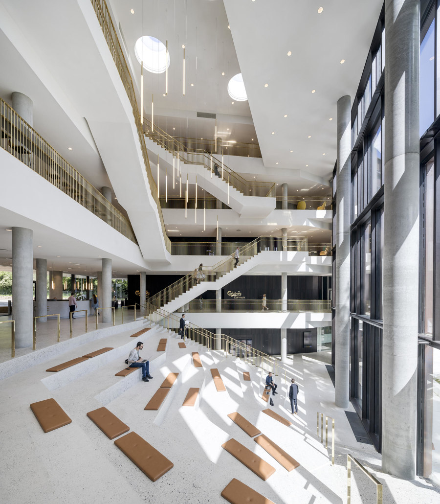
×Located in central Copenhagen, The Carlsberg Headquarters designed by C.F. Møller Architects is conceived as the new gateway of the historic Carlsberg City District. Laid-out next to founder Carl Jacobsen's villa and gardens, it comprises three wings forming a multi-faceted volume that sensitively relates to the scale of the surrounding urban context. Outside, the building features a rhythm of recycled copper slats on the glass facade, evoking both old copper brewing equipment and some roof details on neighbouring historic fabrics. Inside, the full-height central atrium looking out to the garden represents the social core of the building, a pleasant place that fosters interaction among employees and visitors.
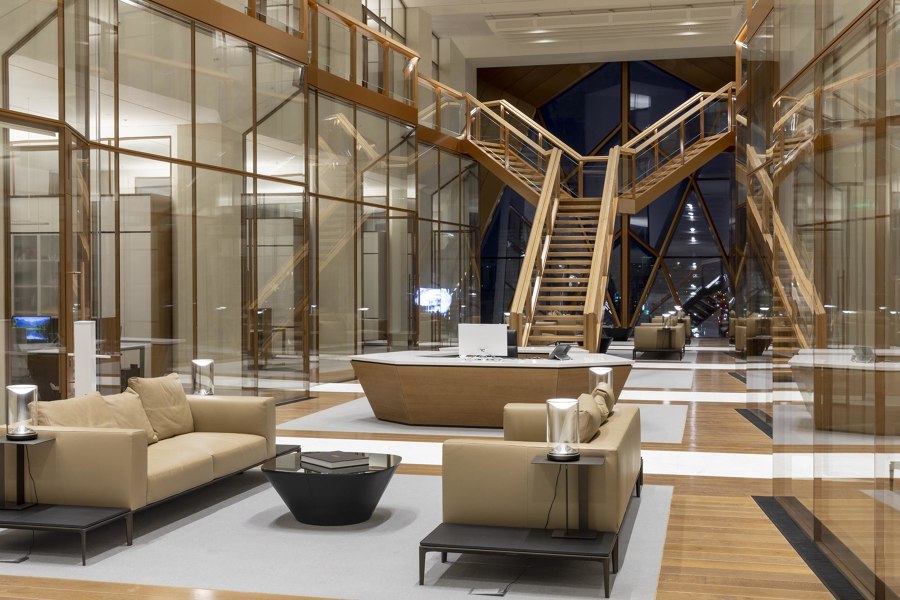
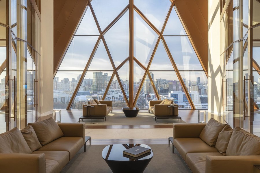
Although it’s a 15-storey tower, RCC Headquarters by Foster + Partners features surprisingly elegant and domestic workspaces. Photos: Oleg Kovalyuk

Although it’s a 15-storey tower, RCC Headquarters by Foster + Partners features surprisingly elegant and domestic workspaces. Photos: Oleg Kovalyuk
×In Ekaterinburg, Russia, Foster + Partners have developed a different spatial typology of office units for the new 15-storey building for RCC Headquarters, a leading copper-producing company. While a combination of three-dimensional glass and copper triangular shapes makes the volume iconic, the surprising aspect actually lies in the conception of the interior space, where the typical open-space configuration is replaced by a more intimate layout. Every two storeys – between two rows of office rooms stacked one on top of the other – a central hallway equipped with lounge sofas provides views of the city through the glazed lift shaft and forms a gathering place which gives the employees a sense of domestic scale.
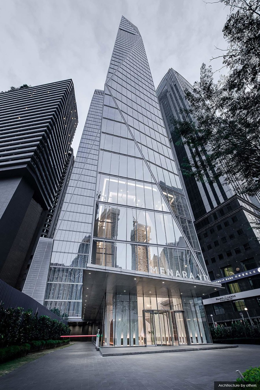
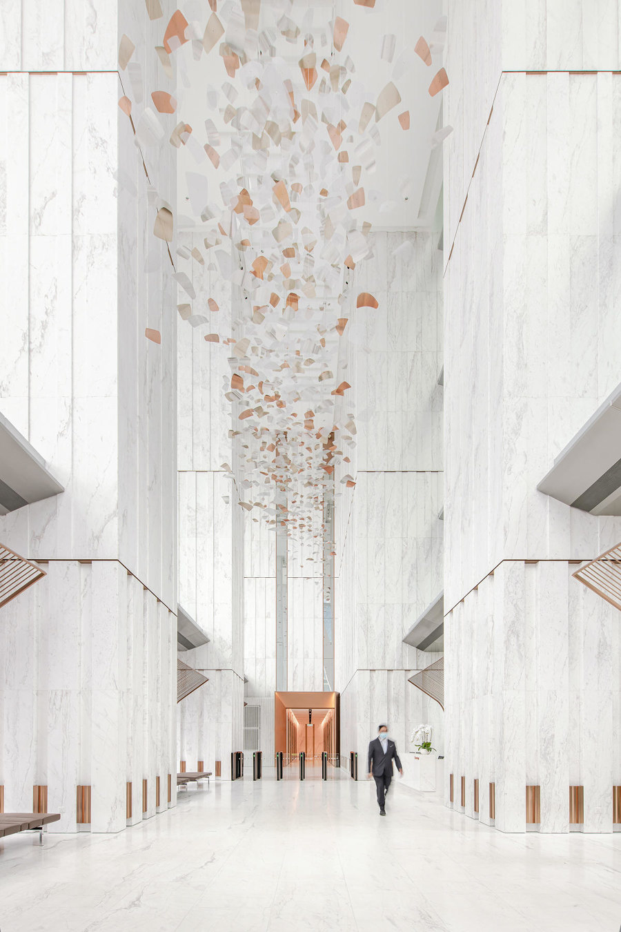
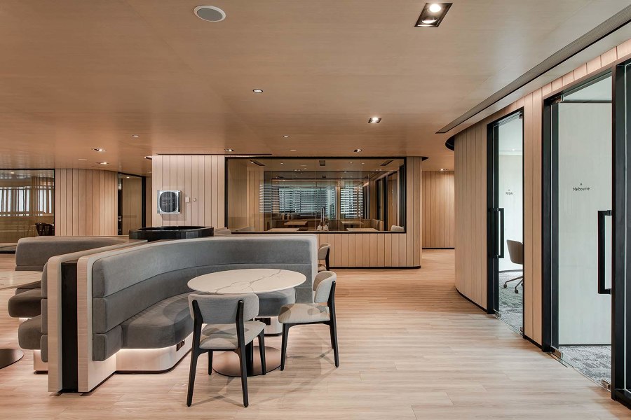
In the YTL Headquarters in Kuala Lumpur, Ministry Of Design has created welcoming and comfortable common spaces through the masterly use of materials. Photos: David Yeow

In the YTL Headquarters in Kuala Lumpur, Ministry Of Design has created welcoming and comfortable common spaces through the masterly use of materials. Photos: David Yeow
×Close attention to detail marks the YTL Headquarters in central Kuala Lumpur, whose lobby and upper public areas were designed by Singapore-based Ministry of Design. Since they were working on a building designed by a different practice, here the architects aimed to create a sort of choreography and a rich spatial experience, balancing two different scales of space. The lobby is characterised by the great verticality of the highly detailed marble-clad columns – more than 25 m high – while the upper floors (levels 8-10) house a café and various collective spaces for both small and large gatherings, designed with a warm and elegant material palette.
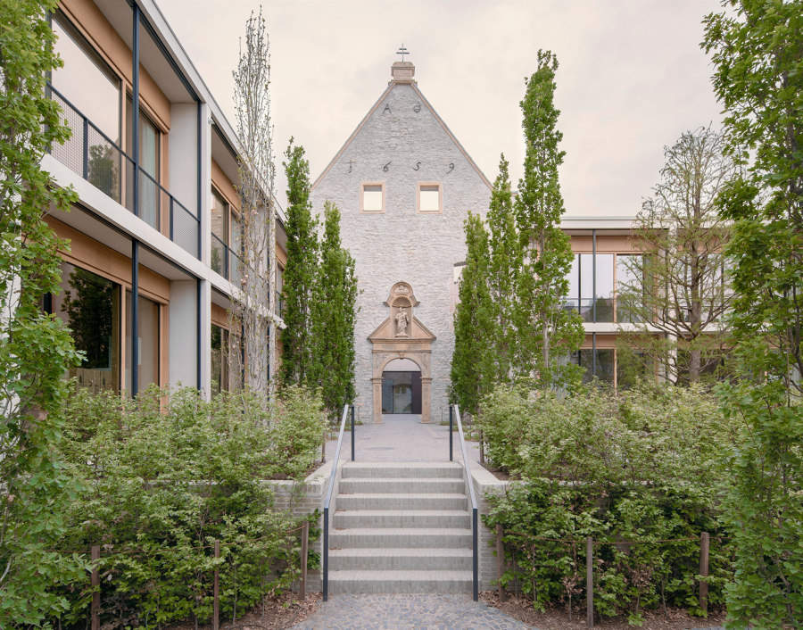
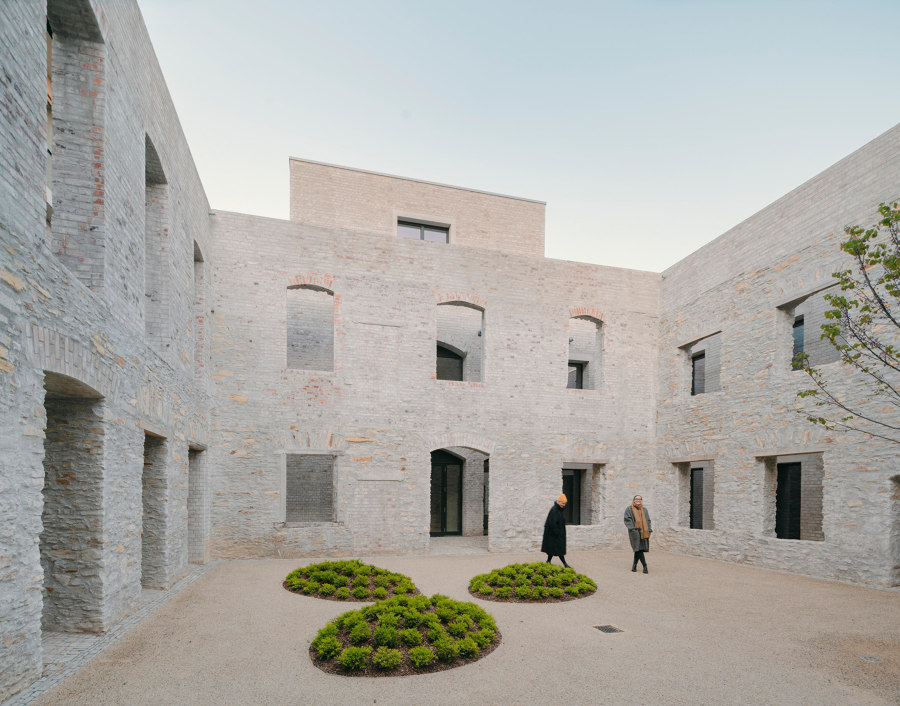
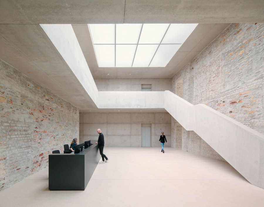
Jacoby Studios, designed by David Chipperfield Architects, shows how contemporary headquarters can integrate an existing historical ensemble into a new whole. Photos: Simon Menges

Jacoby Studios, designed by David Chipperfield Architects, shows how contemporary headquarters can integrate an existing historical ensemble into a new whole. Photos: Simon Menges
×Even a former 17-century Capuchin monastery – in this case, located in the medieval town centre of Paderborn, Germany – can become an unusual and evocative corporate location. David Chipperfield Architects converted this historic building, used as a hospital from 1841 onwards, for Jacoby Studios, a family-run company. The main parts of the monastery were restored, thus maintaining historical continuity. New rational volumes, ranging from two to three-storeys, incorporate the existing ensemble, through a sensitive approach that preserves the morphology of the former monastery, and makes the ancient cloister the heart of the new complex.
© Architonic
