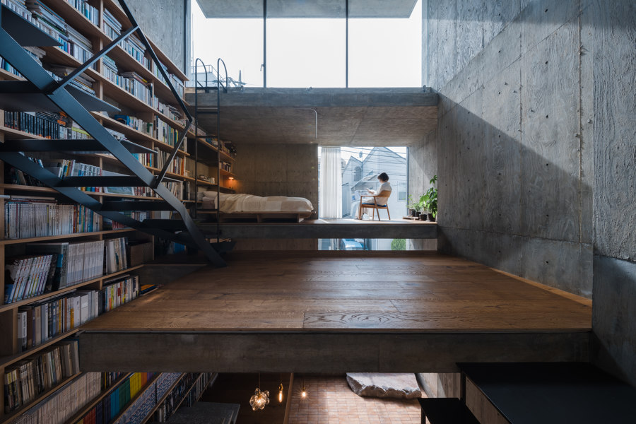
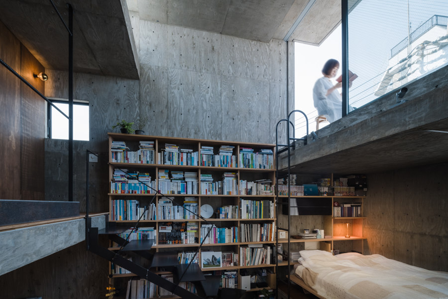
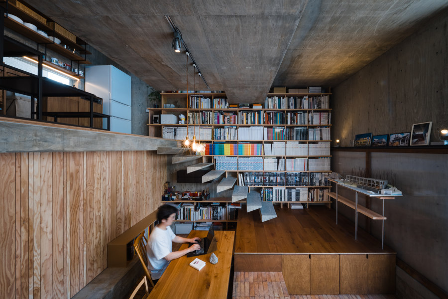
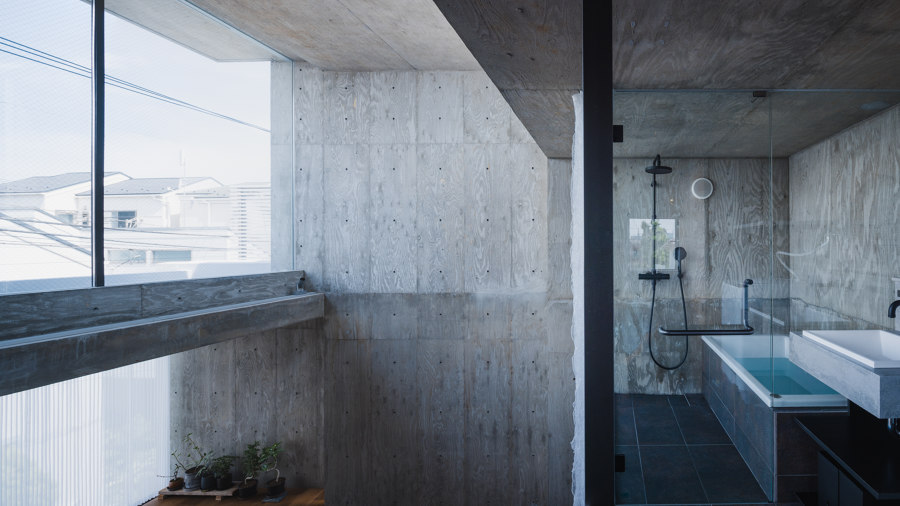
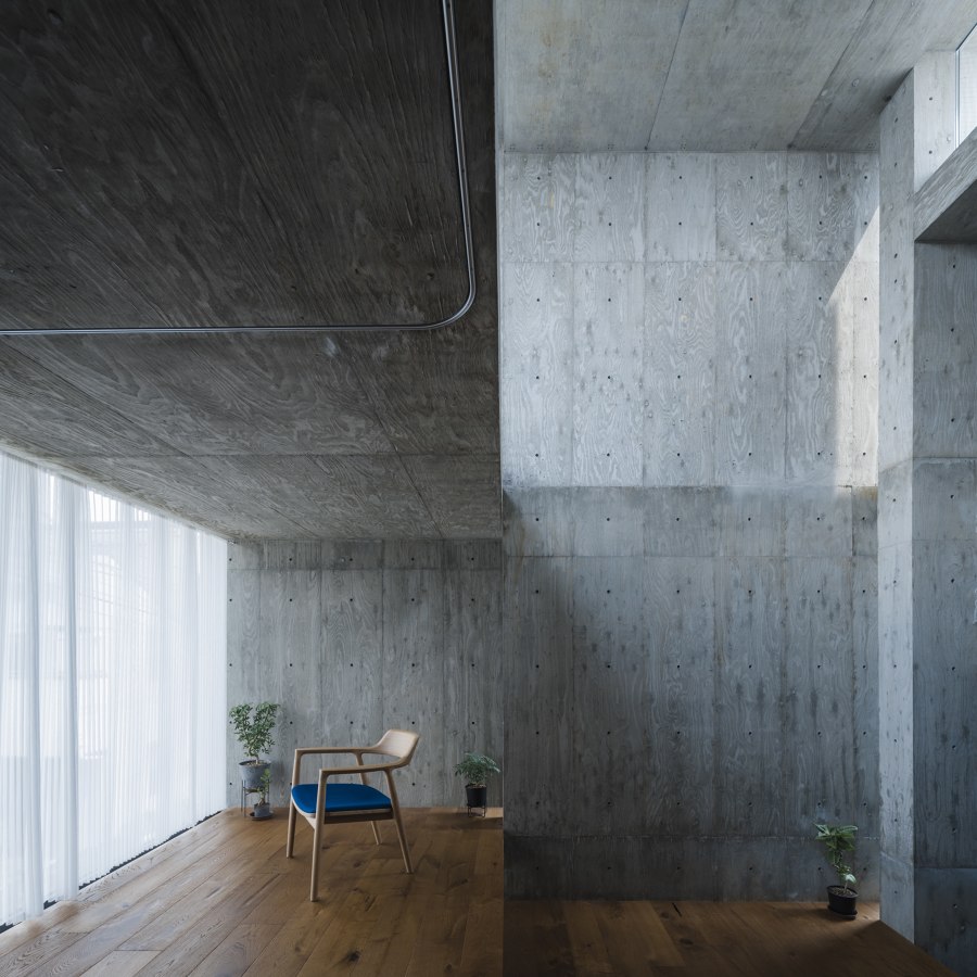
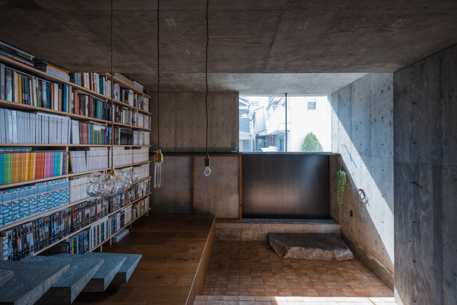
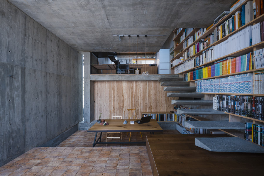
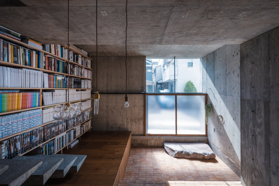
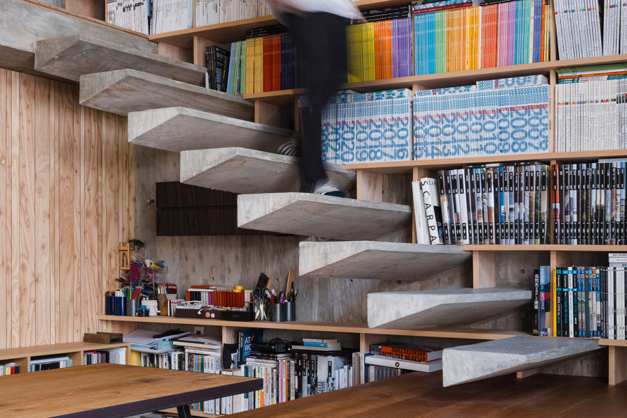
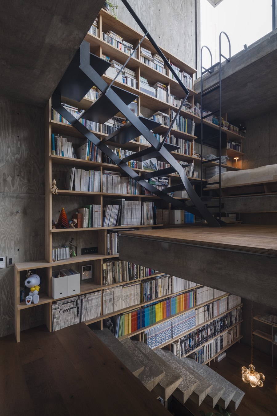
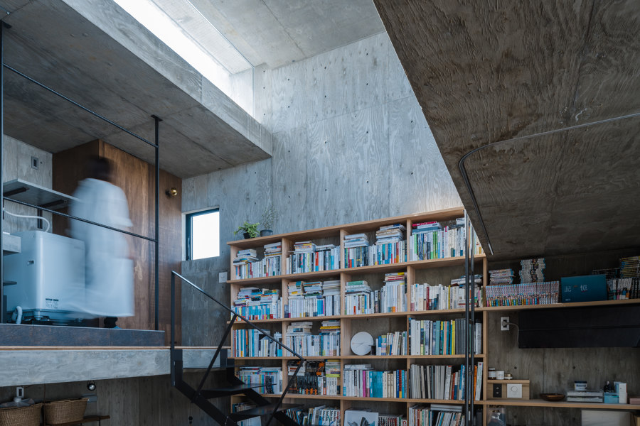
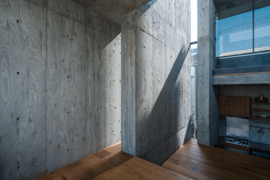
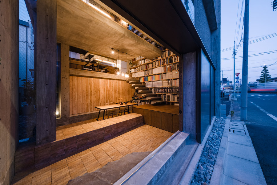
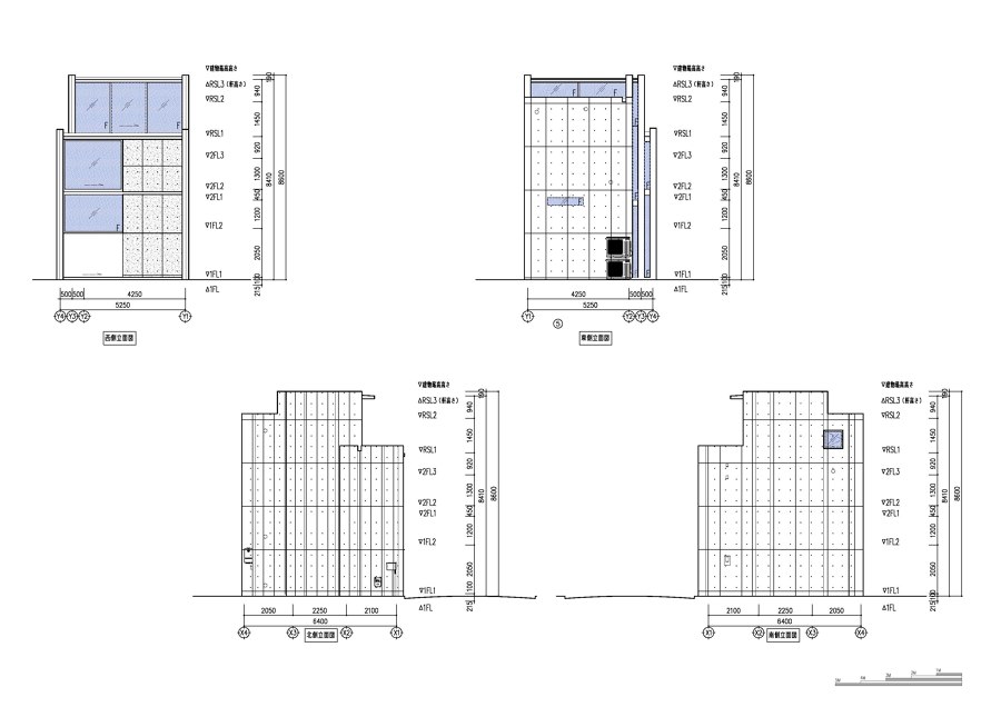
This small architecture is one big room. There is not much separation wall inside, and the floor creates the space, building frame walls and steps. The house is for a married couple. They have vague boundaries between their private and work life. Therefore, they imagine a house where they can work anywhere and where they can sense the presence of each other wherever in the house. With such a lifestyle, rather than having small spaces for compact living, the house was designed to have large air volume and scale, making various interactions of inside and outside space. This led to the idea of the house of frame, which is strong but flexible; it allows a liberal way of living.
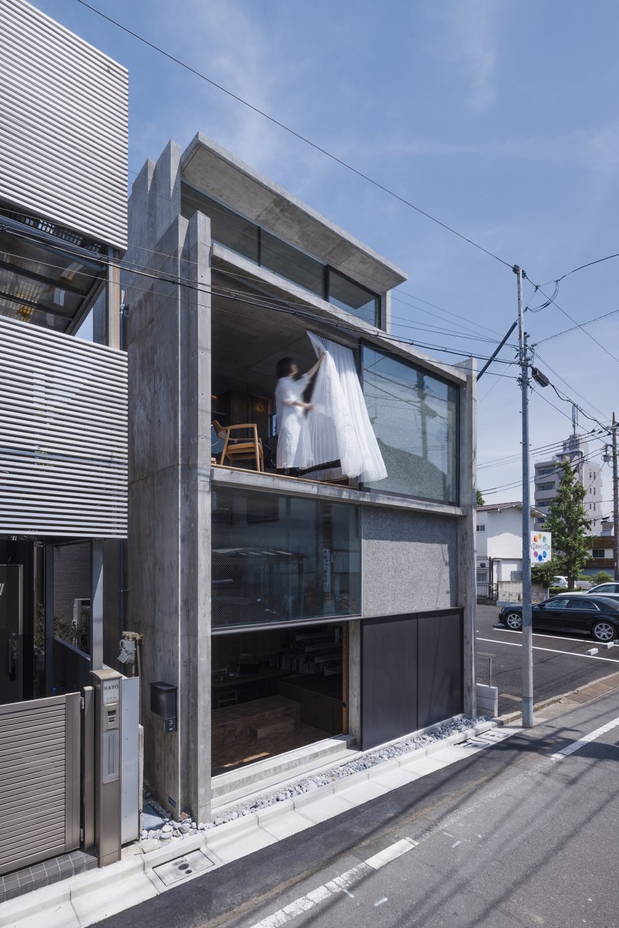
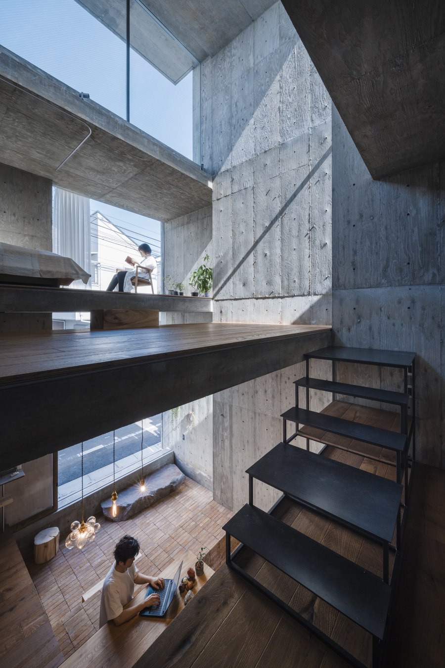
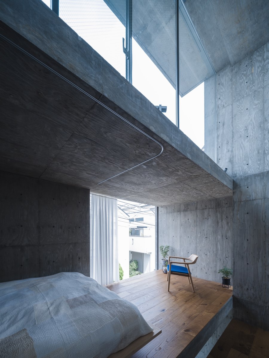
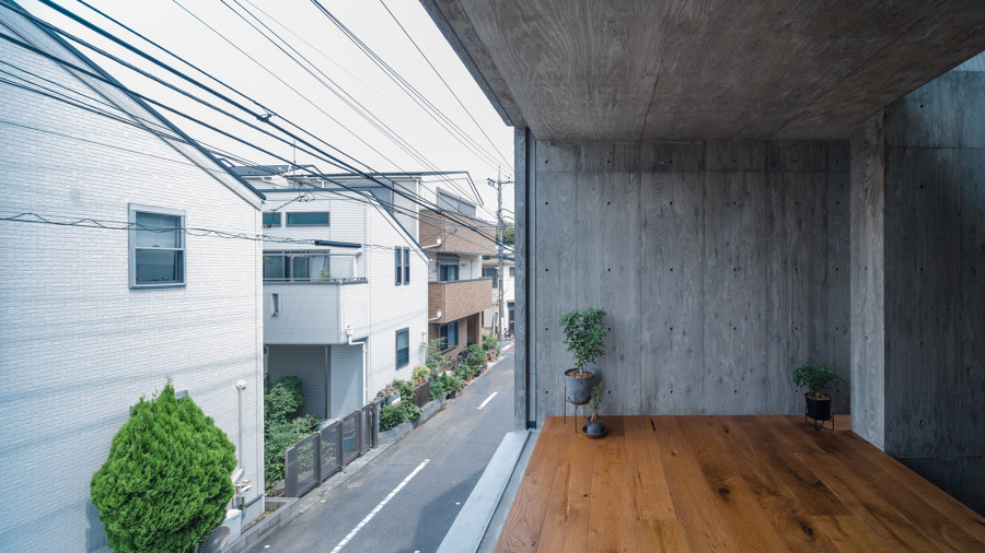
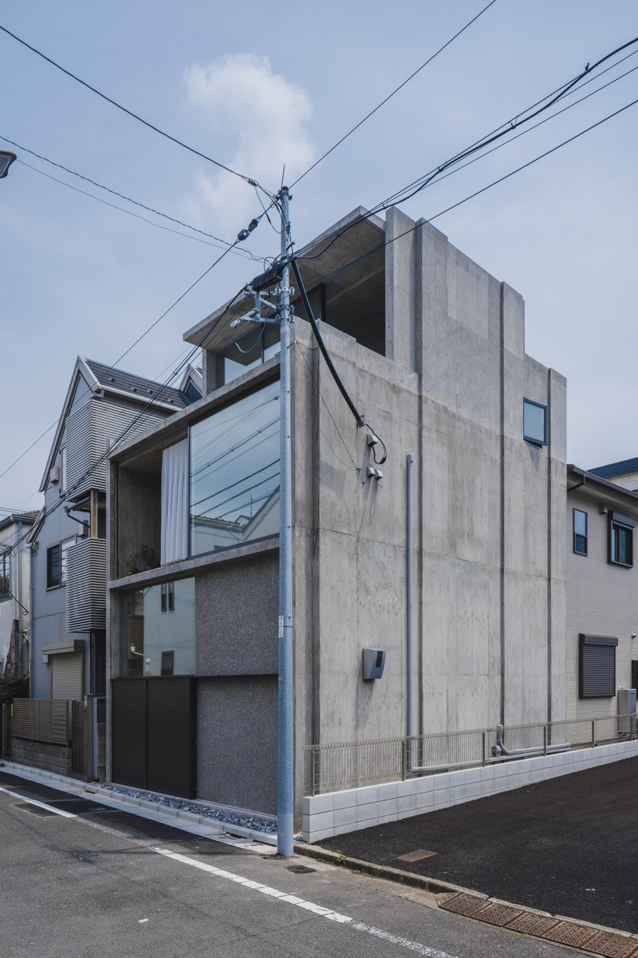
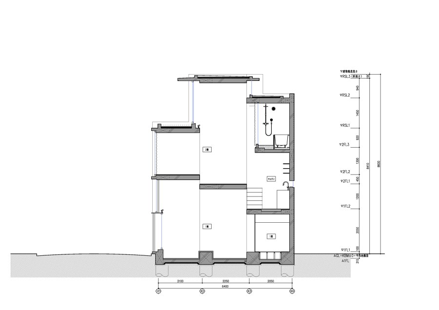
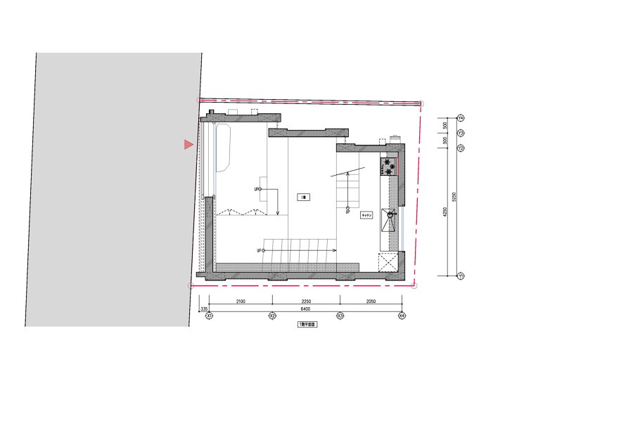
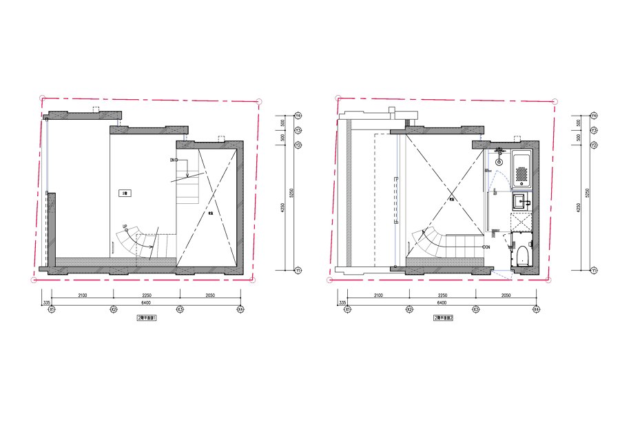
The north side wall in the building has skewed to create a space that connects to the adjacent vacant site. Along that wall, the heights and depth of each floor had adjusted throughout the building. These misaligned three walls and 7-floor slabs with different heights and depths overlap each other without breaking up their top and bottom ends. This structure creates openings that bring in natural light and breeze, but by avoiding views into other houses. There is no opening to the south side; thus, strong sunlight does not penetrate inside.
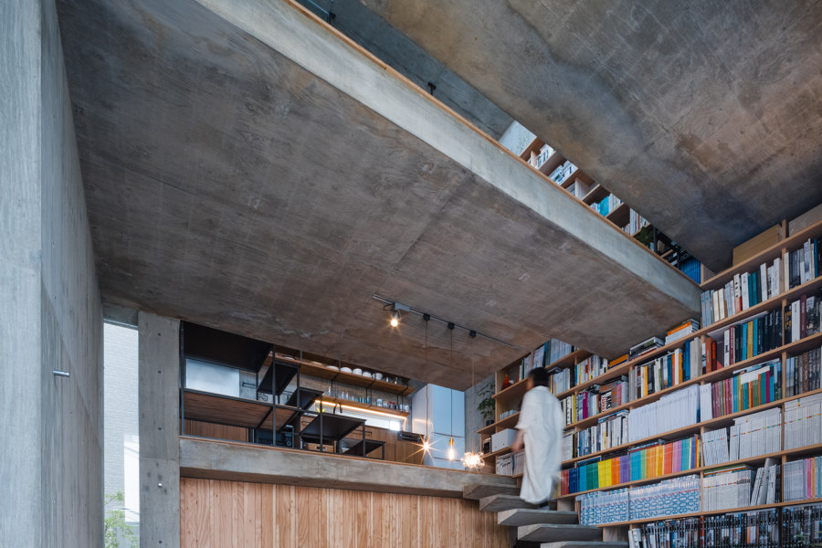
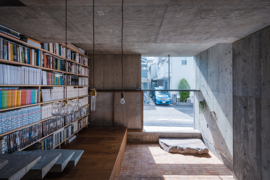
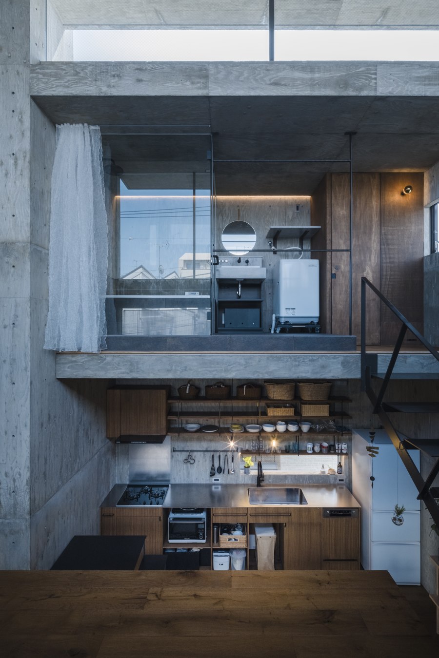
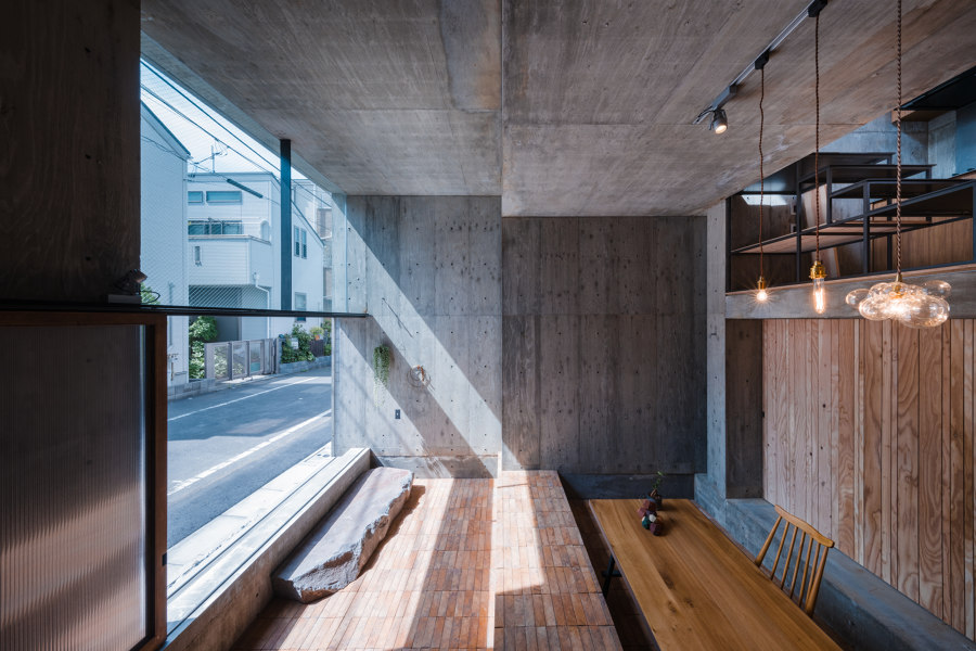
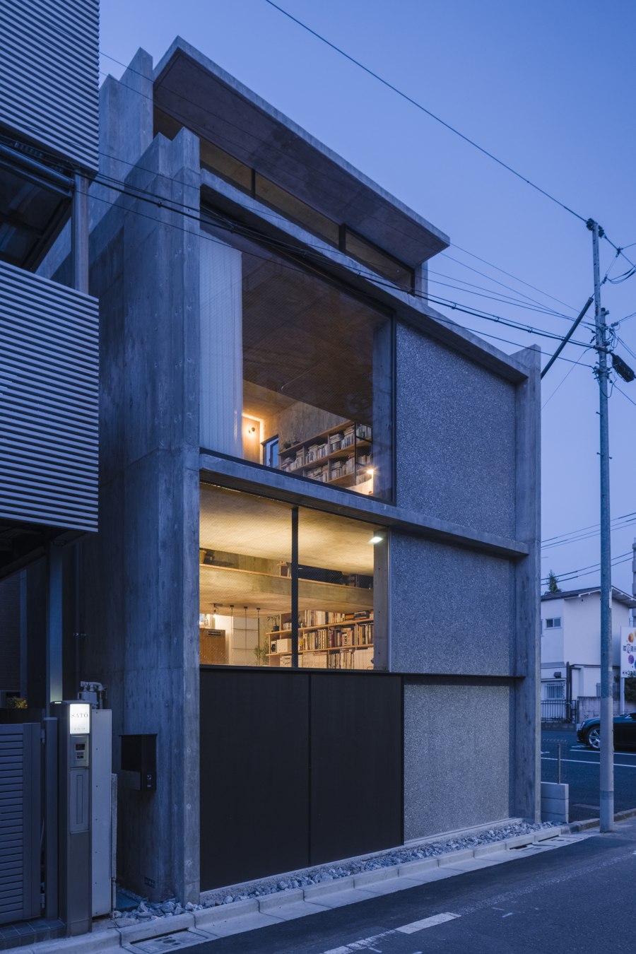
However, natural light reaches in all day from over the north side wall, allowing rich senses of time, weather, and season changes. As it goes further back in the house, which is more distanced from the openings, service functions such as kitchen and bathroom are located. In contrast, as it approaches the front road, the openings get wider and bigger, closer to the outside. In the middle of a big city, the site is not big enough to create a garden or balcony with adequate space. Instead, this house is designed to have large openings that make the inside space like a garden or balcony when it's fully opened.
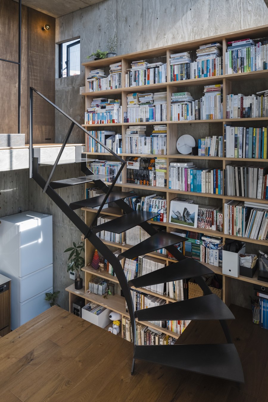
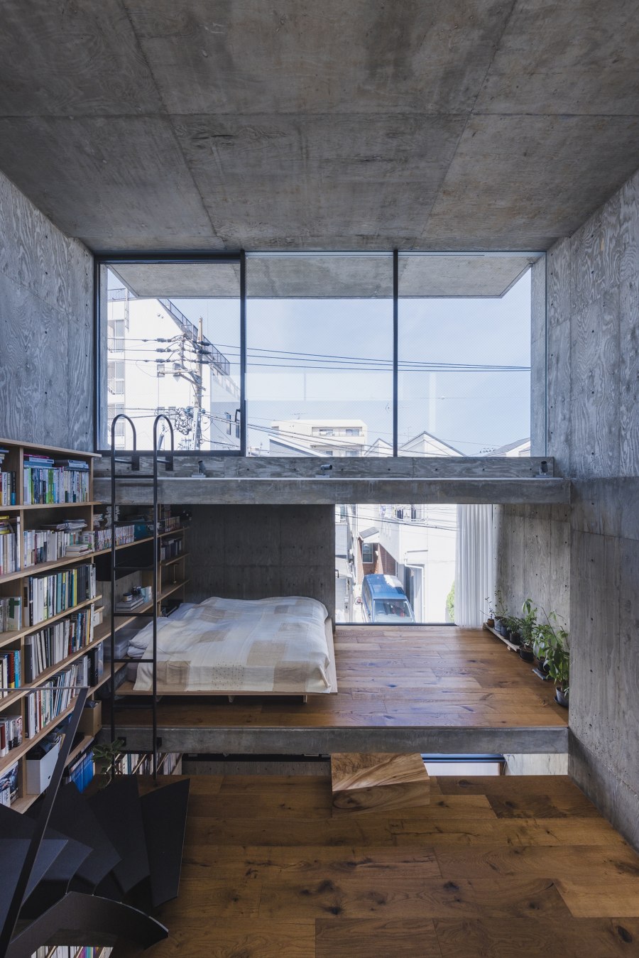
The floors do not fully function with one piece alone, as for how small each is, but it shows its complete potential when used along with other displaced floors. It turns into a seat, table, shelf, and ceiling. Almost no place has dedicated use, and the entire space in the house is made with the relationship of misaligned floors. First, entering from the front door and, as it proceeds up, gives a sense of gradational shifts in the space. By placing human-scaled stairs and furniture inside a strong and large ancient building-like structure of reinforced concrete, the building is suited for human use. Moreover, it aims to create an affluent experience that exceeds that of its functional suit alone.
This simple structure of offsetting walls and laying floors at different heights allows them to interact, making it possible to create an openness that seems much more than the actual total floor area of 60m2. This is one big room built due to the reality of living in a city center and the possibility of a small site. The things far away and close coexist, and sometimes it's separate and sometimes repetitive. This relationship is formed into a structure and a home.
Design Team:
Lead Architects: Masato Igarashi | IGArchitects
Engineering Structures: Yousuke Misaki EQSD
Steel Contractor: KAMO CRAFT, Susumu Murata | KAMO CRAFT
Construction Company: ARATA 'KENCHIKU KOBO
Clients: Tomoko Igarashi, Masato Igarashi
Fabric Consultant: Fabricscape, Kiyohiko Ymamoto | Fabricscape
Construction: Masanobu Arata | ARARA KENCHIKU KOBO
Lighting Collaborator: Eri Nagao ModuleX Incorporated
