Manchester-based architecture and interior design practice 74 has completed a major project to extend and remodel a Grade II-listed, two-storey, Victorian brick building in a semi-rural location in Englefield Green, just outside Egham. The repurposed 453 sq m building – Hox Haus – will serve as the central focus, clubhouse and social amenity for Hox Park student campus, newly-created by developers Moorfield Group for students attending Royal Holloway, University of London.
The new campus is located within a larger, 67-acre mixed-use site, owned by Royalton Group. Its Surrey location, near Runnymede, where Magna Carta was once signed, lent the site its name: Magna Carta Park. The Hox Park campus is one aspect of an overall masterplan for the site that also includes affordable and luxury housing, as well as an Audley Senior Living village.
The vision for Hox Haus was to encompass a number of important practical, social and unifying functions for its student users, including serving as a welcome point and gatehouse; parcel pick-up area; workspace for single study or group study and a downtime amenity with TV and games lounges, offering video-gaming booths, pool and table football. The building will also serve as the campus hospitality hang-out, offering free soft drinks, tea points and vended snacks and has also been flexibly designed for easy reconfiguration as a special event space, with moveable furniture and built-in bar points able to house pop-up catering.
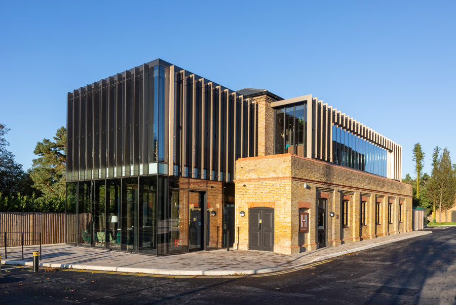
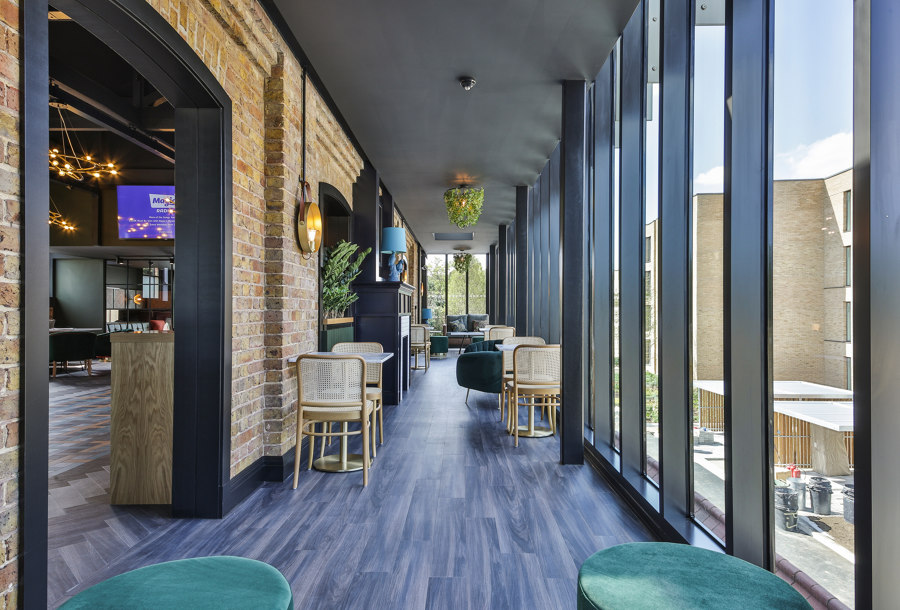
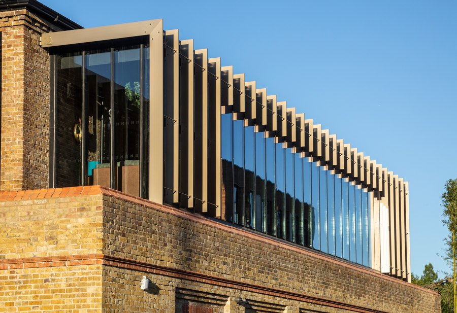
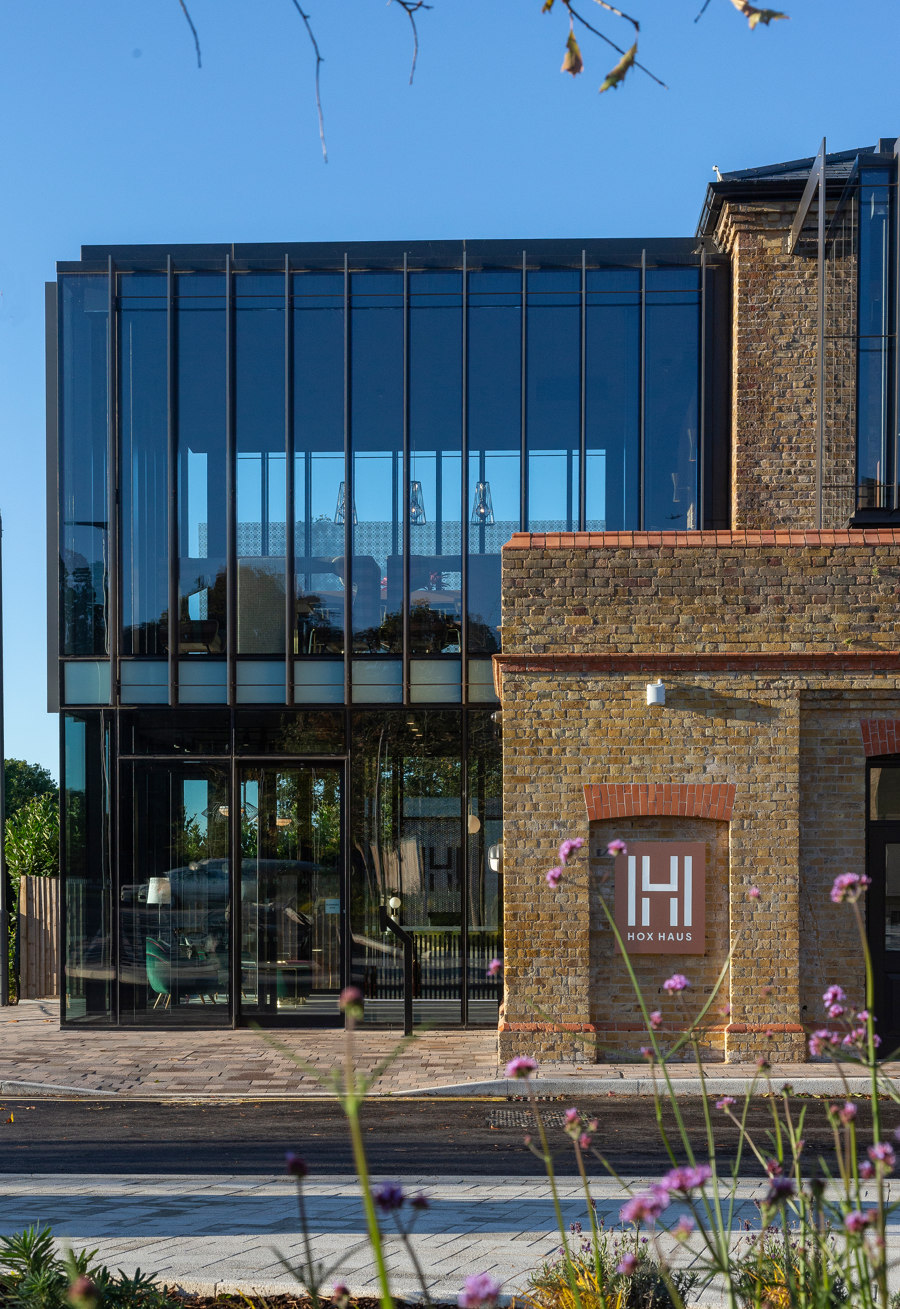
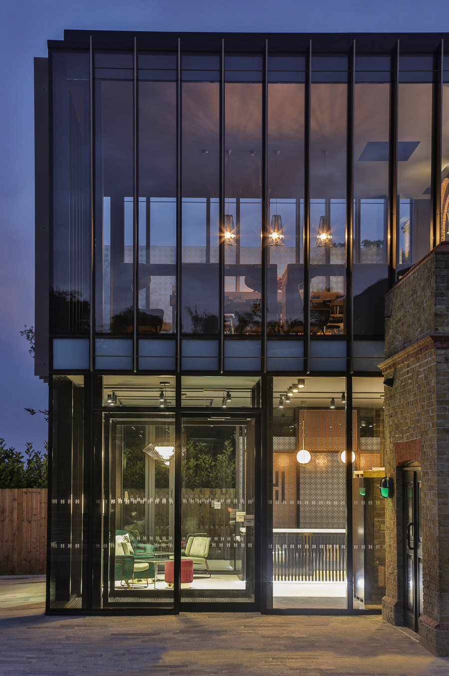
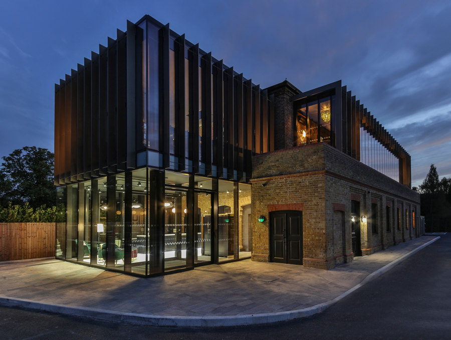
Architecturally, Hox Haus is a stylish, eye-catching and dynamic 2-storey building that seeks to blend its original Victorian brickwork with two new glazed ‘light box’ interventions, creating a light-filled and largely transparent overall space that brings the outside in, references the building’s semi-rural location and offers a warm, comfortable and relaxing home-from-home for students. The two new interventions constitute a double-height, 44 sq m gatehouse to the building’s east elevation and a 35 sq m, covered terrace section on the first storey, offering views over the whole campus. The terrace extension sits behind the parapet of an existing ground-floor extension, making it subservient to the host building. Both new interventions are clad or semi-clad (at first floor level for the gatehouse) with bronze-coloured, 4.6m-high, anodised aluminium fins. The fine, hard surfaces of the glazing and metal fins create a striking and elegant contrast to the rough-textured and robust solidity of the original structure, adding refinement and reflectivity to the building as a whole.
The Brief:
Royalton Group initially invited 74 to produce a site analysis document exploring the building’s further development potential, before private equity real estate fund manager Moorfield Group went on to commission 74 to develop an integrated vision. Moorfield Group had previously appointed the practice to create the interior look and feel of the three distinct student bedroom typologies within the student accommodation blocks - a modern 499-bed development, designed by Studio Partington Architects.
‘The brief for Hox Haus evolved gradually from the outset’, David Holt, Founder and Director of 74 explained. ‘Whilst we were initially brought in to look at the interiors of the student accommodation - a speciality of the practice - we were then engaged to explore the potential of this unloved building and, by determining the need for an appropriate amenities provision for the student body, were able to rescue it from decay and provide a much needed focal point for this large-scale, semi-rural student accommodation development.’
Site Analysis:
74’s site analysis was expansive, not only looking at the building and the site, but the wider area and national picture, including calculating distances from local transport and other amenities and comparing site provision to the on- and off-site amenities at more central or urban campuses nationwide. The analysis made a strong case for a dedicated social space on campus, but highlighted that the existing gym building was slightly undersized to provide the required functions. The decision was taken to increase the volume by 32%, which allowed for the creation of the new gatehouse and terrace structures.
The bold proposals received the whole-hearted support of Moorfield Group and subsequently passed smoothly through the local authority planning process and application for listed building consent.
The Original Building:
The original 330 sq m Grade-II listed brick building dates from the 1890s and was originally designed as a standalone gym building for the Indian Engineering College, which occupied the site between 1890 and 1905. A single-storey, north-facing extension was added in the early 20th century and another extension in the mid-century, which was subsequently removed as part of the enabling work. Whilst the building had continued to house a wide variety of sporting and social functions, it had lain empty for the last 10-15 years prior to refurbishment. ‘Our assessment showed that the building had structurally-sound walls, but was otherwise very dilapidated’, commented David Holt. The original slate roof was beyond repair, meaning a new slate roof was proposed and installed, using reclaimed slate tiles. All the floors were also beyond repair.’
Sound and Solar Gain Management:
Because of the introduction of large, new glazing elements, the building needed to be designed to minimise solar gain. The was achieved in several ways. The new gatehouse faces north and east and so benefits from early morning light, without gaining greatly in heat during the day, whilst the first-floor glazed terrace intervention faces north. The roof is heavily insulated with mechanically-openable roof windows to provide a stack effect in summer months. Slim, vertical, anodised metal fins on the first floor of both extensions behave decoratively, but also provide solar shading, with both interventions including both argon-filled glazing technology and Low E solar coatings to minimise solar gain.
With adjacency on the south-side of the building to nearby residential properties, it was important that issues of sound management and overlooking were taken on board. All windows to the south are permanently closed and a film manifestation was provided to avoid sound nuisance and prevent overlooking.
Interior Concept:
The heritage of the building was a key driver for the interior approach and, unlike many architectural projects, the interior was in fact the key driver overall, so that the architecture is subservient to both the existing host building and the functions within. The overriding concept was to create a space that felt like a country retreat or clubhouse-with-a-twist. The new gatehouse provides a sense of arrival, whilst offering a separation between the functions of ‘reception’ and the need for a comfortable student social space monitored, but not overlooked, by staff.
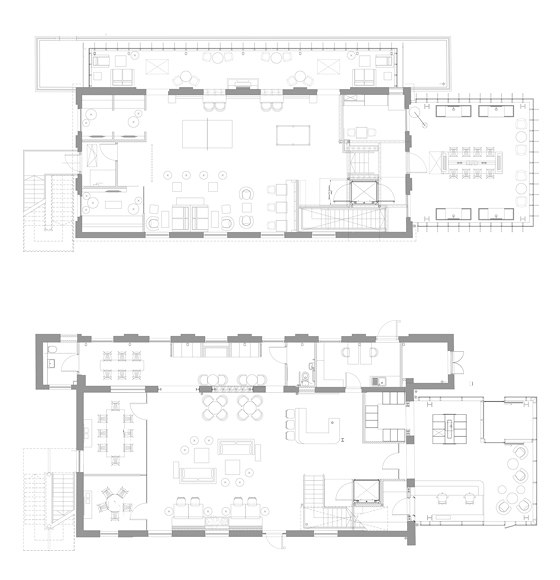
While certain areas have key functions, such as the two group study areas or the TV and gaming lounges, others are multi-functional, for students to make use of as they wish. The central zones are more obviously social, whilst quieter zones areas can be found along the edges of the two-storey space and within the first floor extension directly above the welcome area.
It was an important part of the scheme’s design that natural ‘collision points’ for interaction were encouraged, as David Holt explains: ‘We considered social psychology throughout the planning stages of the interior. Whilst students spend as much time as they wish on their own in their individual rooms, the idea here was that individual activity would always have a social aspect, so that no one feels isolated by their location. Gaming booths, for example, have been designed with glazed screens and without doors in order to retain connectivity at all times. We have introduced several planting elements within the scheme additionally to introduce a strong biophilic aspect and enhance students’ sense of wellbeing.’
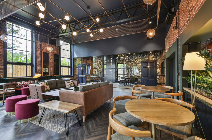
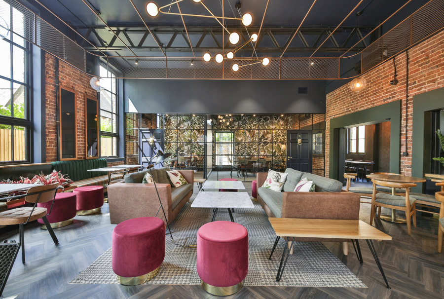
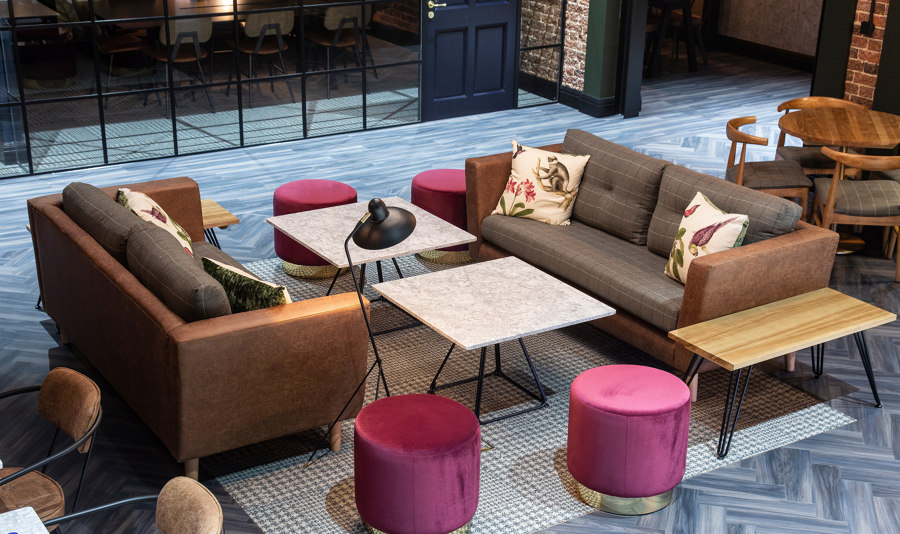
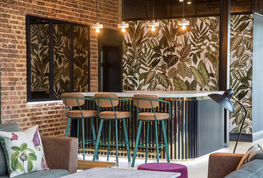
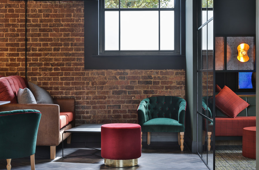
Another major design driver was the building’s rural aspect and the design therefore strives to make the most of views over the historic surrounding countryside, as well as bringing the outside in via natural references and creating a rich, textured and high-quality feel with a materials palette that includes marble-effect Hanex solid surfacing and brass detailing. Upholstery fabrics include textiles that nod to British rural tradition, such as checks and tweeds, whilst colours span a whole nature-inspired autumn-to-winter palette and feature greys, browns, rusts and moss greens, with bursts of berry brights and large-scale, nature-inspired print wallpaper on opposing feature walls at the ends of the ground floor.
‘It was important that the fabrics and colours created a warm and welcoming atmosphere’, David Holt added. ‘This is very much a walk-in-and-use environment, offering an immediate appeal and a sense of welcome and comfort’
Interiors Walk-through:
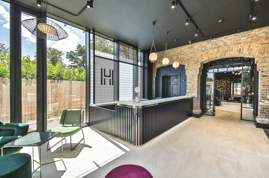
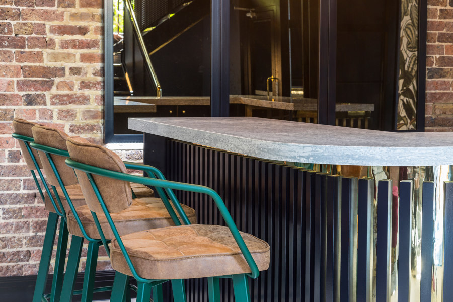
Students enter directly into the fully-glazed, gatehouse and are greeted by staff, in attendance 24-hours-a-day, at the bespoke reception desk, which features a curved marble-finished Hanex top and polished brass front with inset vertical timber blades, echoing the external architectural treatment. Three Globe Pearl Drop Ceiling Lights by Rockett St George hang above it, whilst behind and in front of the rear glazing, a metal grid features a Victorian-inspired manifestation film to obscure views out, with a large inset ‘H’ for ‘Hox’ sitting within its central, perforated metal panel. The panel forms part of a family of architectural finishes next seen on the staircase balustrade immediately inside the main ground floor space. Loose seating in the gatehouse allows for people to sit and read or wait for friends and the flooring here is a pale cream ceramic tile. Post and parcels will also be distributed from the gatehouse, ensuring the area becomes a regular part of everyday student life.
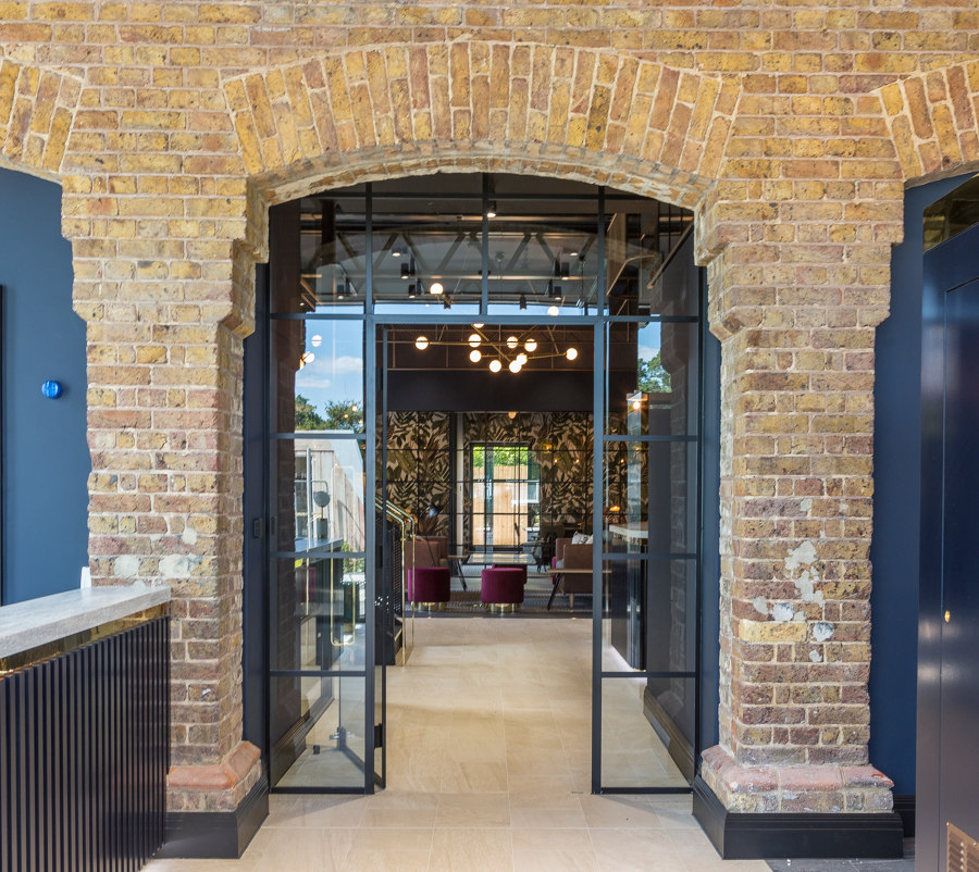
Students then pass through an archway, which was formerly the main entrance to the original building. This area and all original brickwork have been retained with minimal restoration, with interior walls stripped of plaster to reveal their much more interesting brick textured construction. The works to the existing fabric were purposely minimal, retaining age and character and celebrating the original history of the building. The large entrance archway was made more domestic-scaled via the insertion of a crittal inner framework in black metal with inset glazed panels, with the original passage through to the main ground floor space retained.
‘The proportions of the interventions are simple and elegant throughout’, David Holt added, ‘with a clear distinction between the solidity of the original structure and the fine and minimal dimensions of our interventions. We were always careful to touch the building as lightly as possible.’
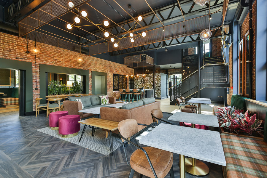
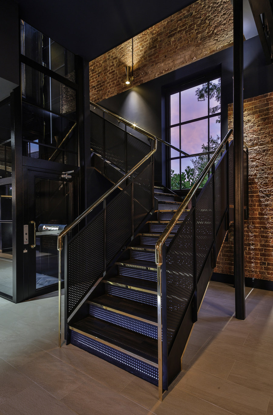
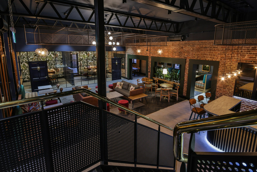
Immediately to the left of the entrance arch stands the new staircase, with a DDA-compliant lift alongside. The machined-metal staircase has a dark perforated-metal balustrade and brass hand rail and features dark non-slip treads. Vertical panels between the treads are also in perforated metal, back-lit with a brass trim. This dark palette is reinforced across the whole interior architectural treatment, including dark-painted ceilings, for example, whilst light fittings in the main spaces are arranged on metal-mesh grids suspended around the edge of the ceiling.
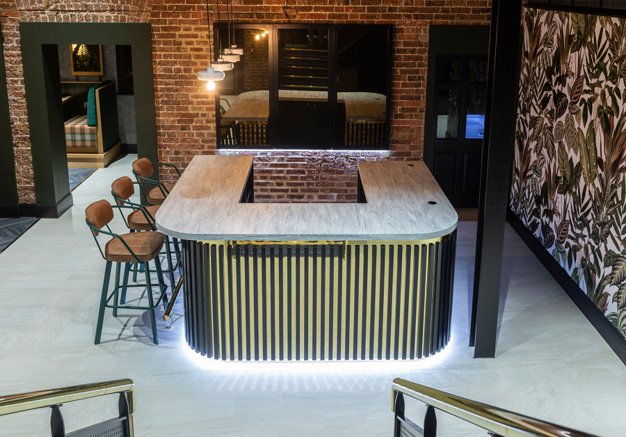
Opposite the staircase is a U-shaped, curved, open-plan beverage bar with inset fridges, a polished brass front and vertical timber fins, referencing the earlier reception desk, as well as the external intervention treatments. Four pendant lights from Belgian lighting company DARK hang above the bar and three bar stools from Telegraph Contract Furniture sit along its far side.
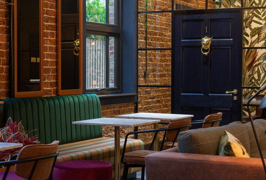
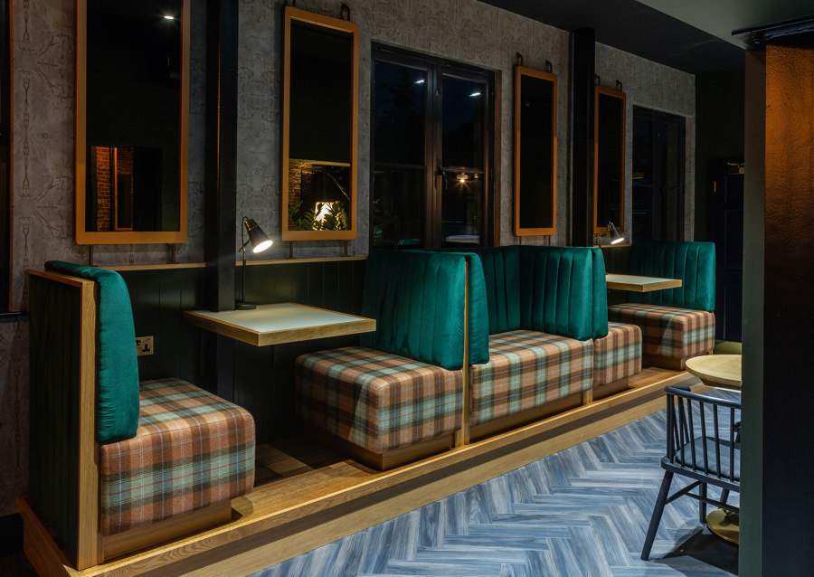
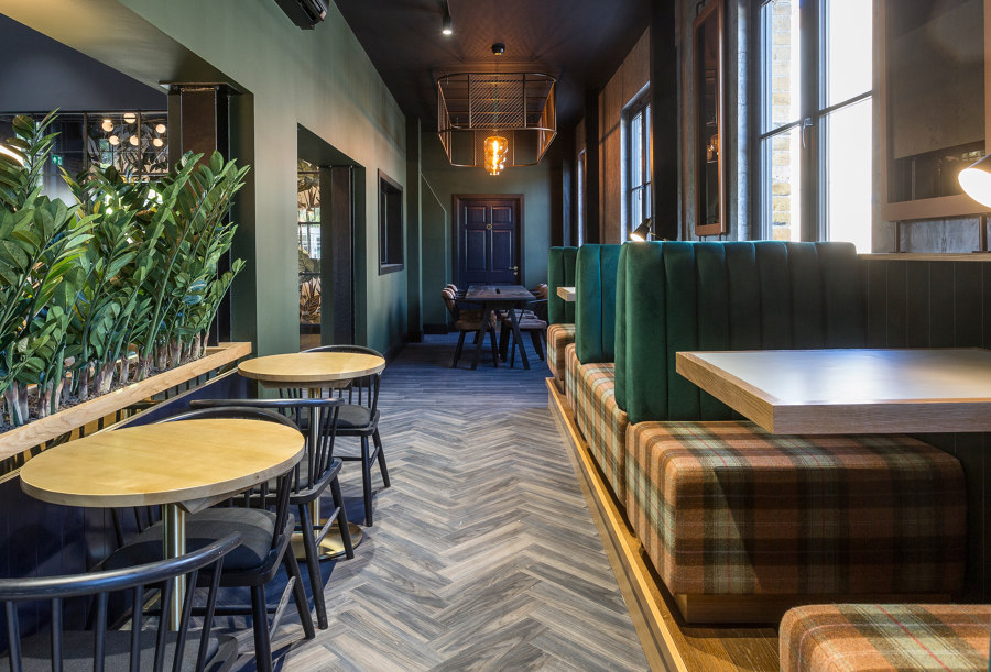
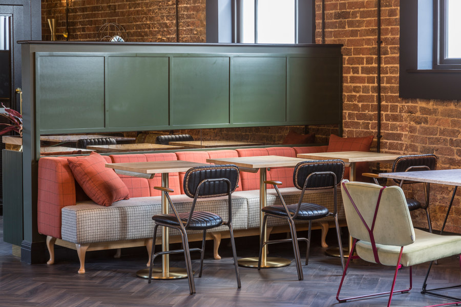
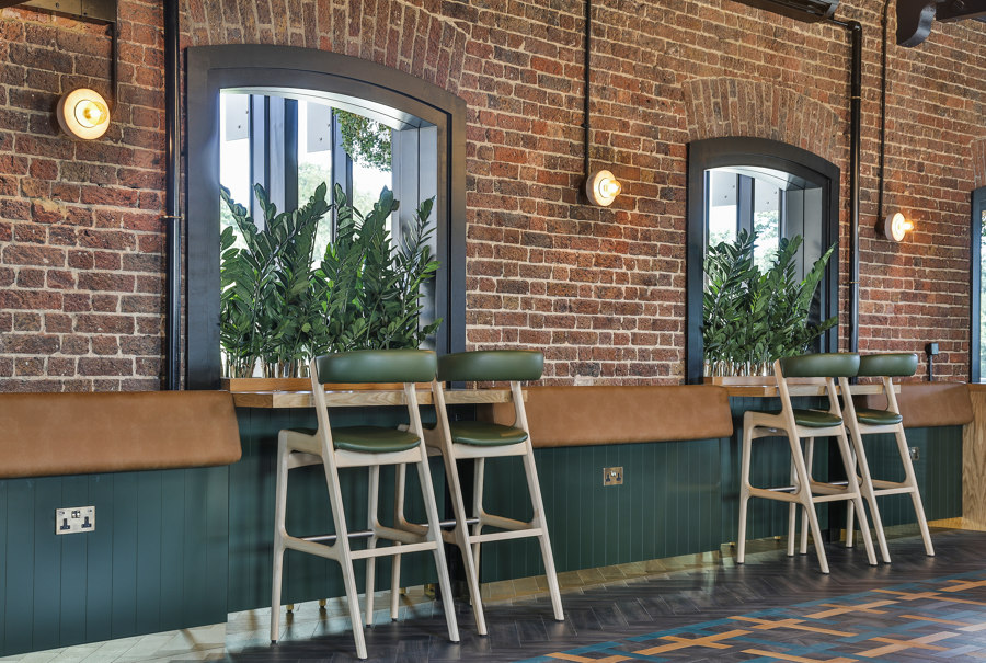
Seating and tables in the main space have been arranged for maximum variety and flexibility. These include banquette booths on a raised plinth along the right-hand side wall, directly beneath the new terrace intervention; sofas and pouffes in berry-coloured upholstery with brass-finish pedestals, along with comfortable domestic-vernacular sofas and more café-style areas with hard seating, including classic Windsor chairs. Openings in the original brick wall that divides off the ground floor terraced area of the old extension feature new, green-painted plasterwork surrounds. Former window spaces have been filled with planting, again bringing the outside in.
Flooring is varied throughout and helps create focus points and denote suggested usage, with softening rugs in more lounge areas and herringbone timber laminate in other parts of the space. Other domestic-inspired features include wooden turned legs on the lounge-area sofas and scatter cushions – Capuchins Monkey and Capuchins Parrot Cushions – which feature monkeys, parrots and other exotic flora and fauna. Loose tables range from marble-topped circular tables on brass pedestals to lower, timber-topped coffee and side tables.
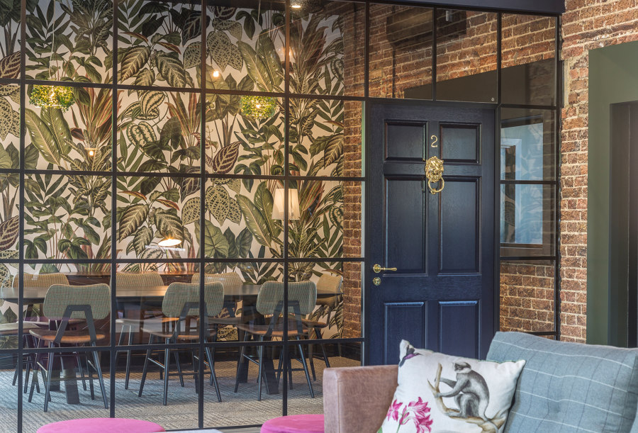
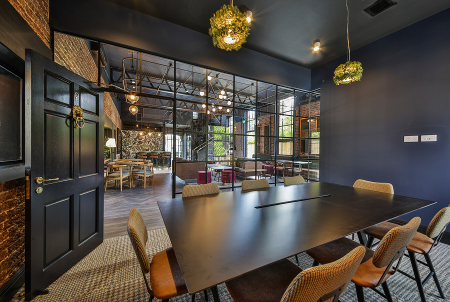
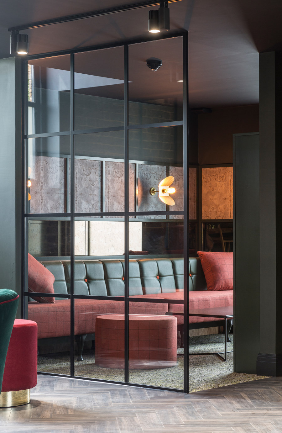
Eye-catching feature walls at both end of the ground floor space – one located behind the bar area and the other forming the back walls of the glazed group-study rooms at the far end of the ground floor – are lined in Mischevious Monkey wallpaper by Rebel Walls. The group study rooms are visible from reception onwards, divided only by a glazed wall with a crittal-style, glazed, square framework. Dark-painted external, Victorian-style doors, complete with lion’s head knockers, are used as a tongue-in-cheek play on the heritage of the building and form dramatic entrances to the group study rooms. Each study room contains a Pedrali meeting table – one seating 6 people and one for 8 – from Telegraph Contract furniture, along with seating featuring tweed-upholstered seat backs and faux leather pads. To the side is a sunburst credenza from Cult Furniture. Lighting includes spun-leaf-adorned Orland pendant shades from Di Classe, with similar but more elaborate shades also used in the first floor terrace area.
Lighting throughout, supplied by Enigma Lighting, is used to create pockets and atmosphere, with subtle up- and downlighters set within the ceiling to serve as architectural lighting and show off the structure of the brickwork. On the ground floor, the metal mesh ceiling grid, with slender brass rods reaching from one end to the other, houses globe pendants on bent arms round its edges and a minimal, geometric chandelier, supplied by Enigma Lighting, at its centre. Bar-top lamps and floor-lamps complete the varied treatment and help create zonal differentiation.
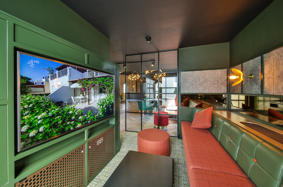
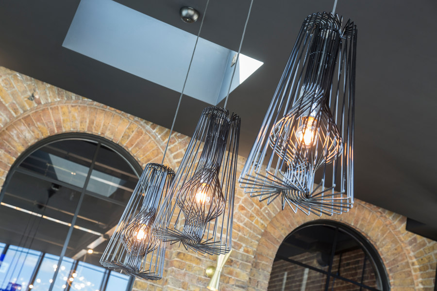
On the first floor, trusses have been left exposed, housing six eye-catching chandeliers, again supplied by Enigma Lighting. The first floor houses a series of specific-use areas, such as a TV lounge, which features button-back sofas, antiqued mirroring on the walls and a series of inset panels directly above featuring an eye-catching patterned wallcovering from the Corinth range by Tektura, punctured by flower-shaped wall-lights, bespoke-designed by 74 for the space and made to order by Mullan. There are also more secluded individual booths for gaming and a central play area, denoted by a criss-cross laminate flooring (from Amtico), housing table football and a pool table.
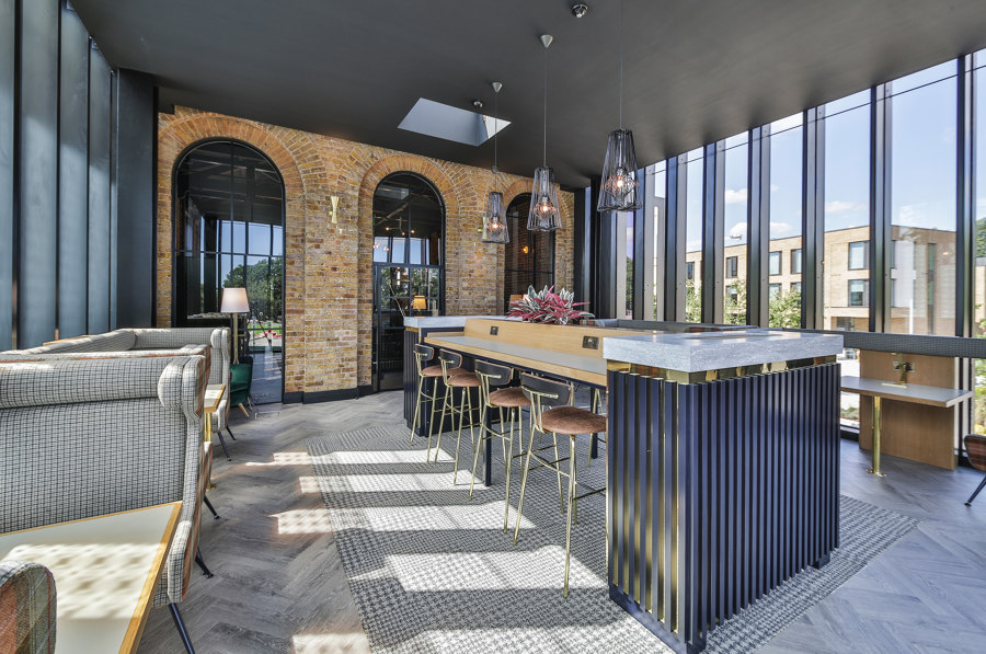
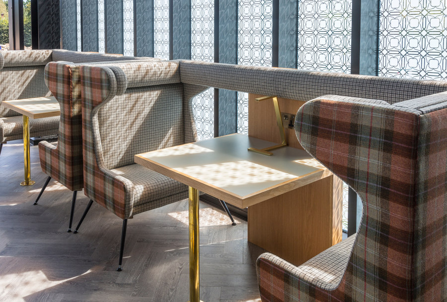
The first floor section located within the gatehouse extension features a central work island, with the same marble, brass and timber fin treatment as used for the bar area below and gatehouse desk. Seating here takes the form of eight bar-stool seats from Telegraph Contract Furniture with three pendant lights by Decode hanging directly above the island. A flooring apron around the central area is a grey and white checked inset carpet from the World Woven Collection by Interface. Furniture around the edge of the space includes single seats and mini sofas with winged headrests, upholstered in tweed, with a deliberately-clashing checked fabric to the rear of the seats and a continuous fabric buffer panel linking them, creating a feeling of continuity against the glazing. A film manifestation runs along the whole of the southern face of the space to prevent overlooking of the adjacent residential scheme.
Sadie Malim, Head of Special Projects and Legal at Moorfield Group, commented on the project, ’74 excelled themselves on the design work for Hox Haus. The combination of their devoted attention to detail and design flair resulted in a scheme that sets the new standard for student accommodation in the UK. They understood easily what we were trying to achieve and were able to deliver a knock-out scheme, which encompasses necessary practical considerations, but also delivers the wow factor.’
Design Team: 74
Architect: 74
Interior Designer: 74
Structural Engineer: Price & Myers
Lead Contractor: Royalton
