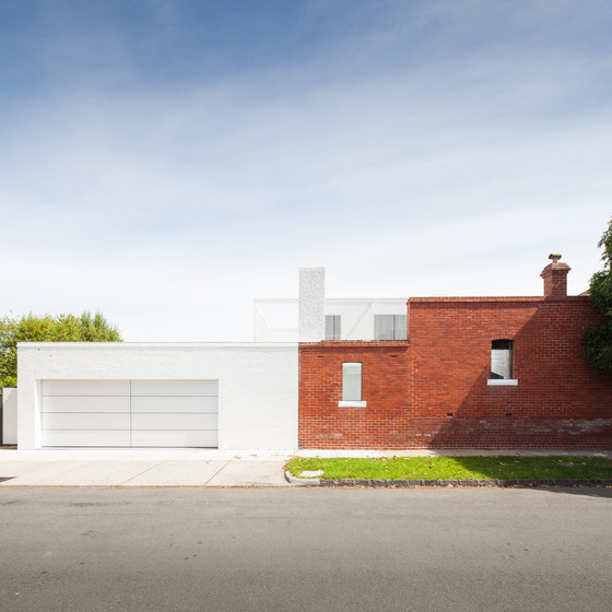
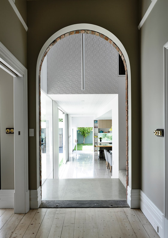
Kazoo House is an alteration and addition to an existing 1900s red brick Edwardian house, complete with weatherboard stable, originally located to the rear. Located directly opposite Caulfield's hallowed turf, the house was named “Kazoo” after the racehorse whose winnings helped fund its construction. The front of the existing house has been restored to accommodate three bedrooms and the living room. The new addition has a checkerboard-like floor plan; two built forms separated by two diagonally positioned voids to the north and east.
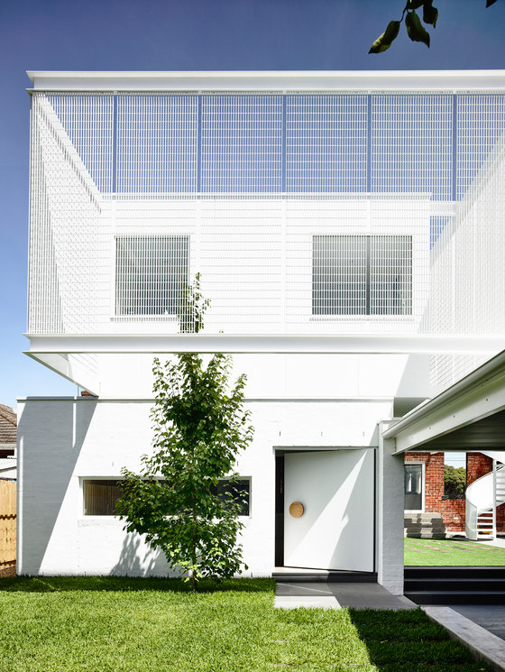
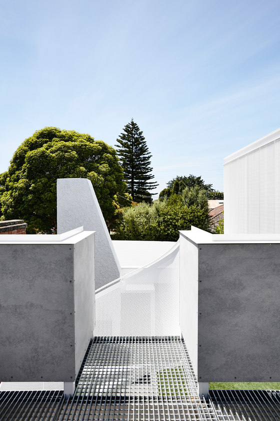
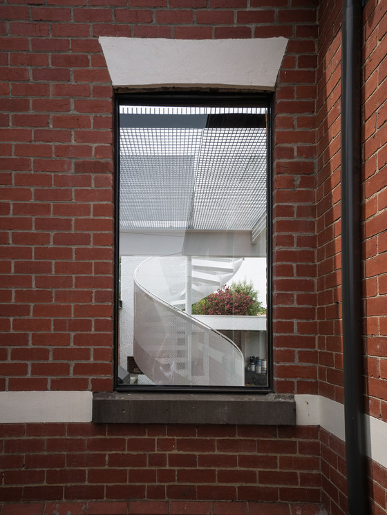
The new addition contains an open plan kitchen and dining on the lower floor and the master suite on the upper floor. Visible from the street, steel grate skin wraps around the upper floor and references the materials of the watchtowers at the nearby racecourse. A lightweight, off-the-shelf component that juxtaposes against the rich and heavy existing red bricks, the steel grate also provides the interiors with essential shading. It also acts as privacy screening from surrounding neighbours. The same material is then turned horizontally to form the floor of the viewing deck, allowing light to pass through to the under croft and into the living room below.
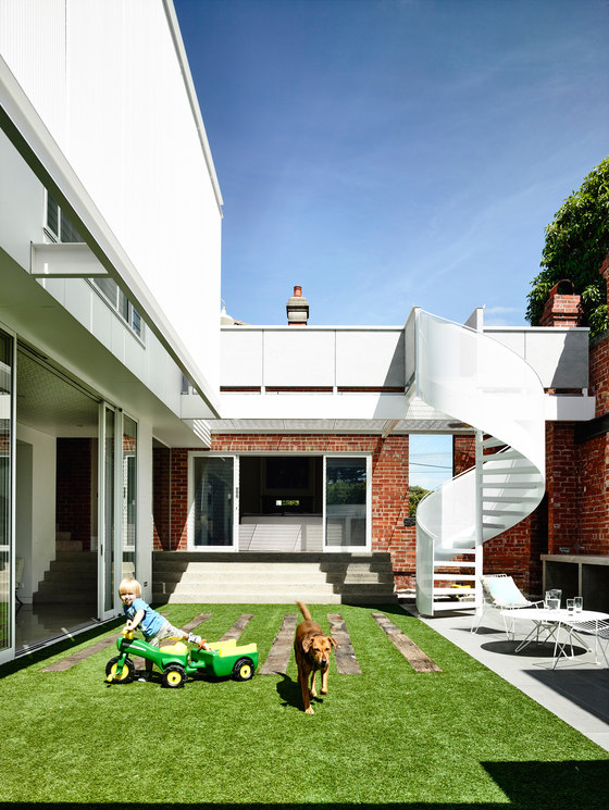
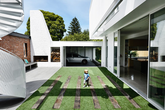
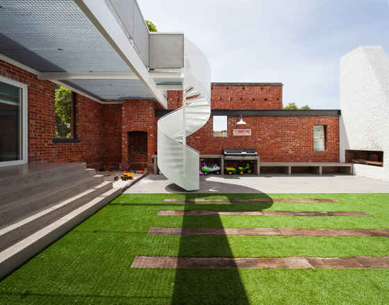
The existing house’s boundary wall to the street has been retained, stripped of its paint to expose the original ruddy brickwork. This forms the outer edge of the north facing courtyard. Accessible from the kitchen and dining area, this courtyard becomes the focal point for activities for its owners – a young family. Each element within this space is considered to support a social need; the generous concrete steps from the living double as informal seating by a sandpit, the concrete of outdoor kitchen bench gently folds to form a low slung ledge by the pizza oven, the shell-like stair leads to a platform above providing views to the racecourse beyond. The northern courtyard really is a reflection of the social highly nature of its users.
Much of the external shapes and elements are painted white - the austere, reflective quality of the colour amplifies light and shadow, solid and void, smooth and textured. These features are expressed individually and quite deliberately as basic forms: a spiral, a trapezoid prism, a square, a rectangle, ziggurat steps and planes. Together they are like building blocks in a Russian Constructivist painting – they can be read as a whole or individually. They describe the activity of the space and the voids in between.
To the east, the windowed splashback in the kitchen looks out to a lush lawned garden. This space offers quiet respite to the bustling activity of its northern counterpart. Its eastern orientation makes it an ideal and peaceful place to enjoy the morning sun.
Finally the open sides of the ‘carport’ form the final solid in the checkerboard addition. Essentially a covered outdoor room, it is an adaptive space that acts as a hinge between the three other disparate elements, allowing them to continue to be used separately or as part of one larger, more singular space.
Architects EAT
