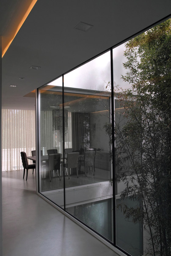
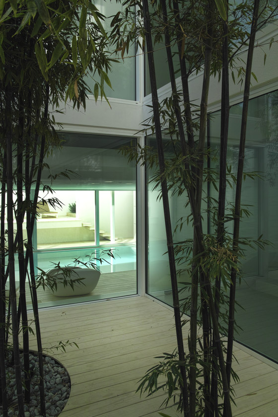
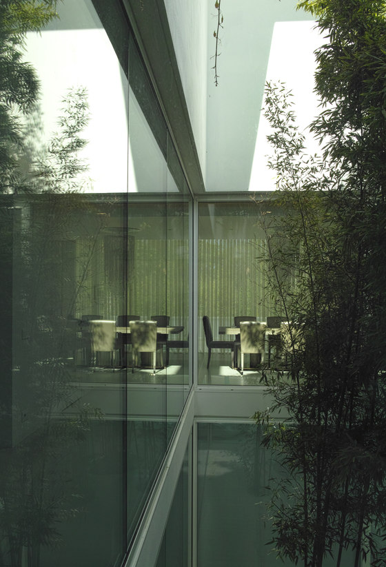
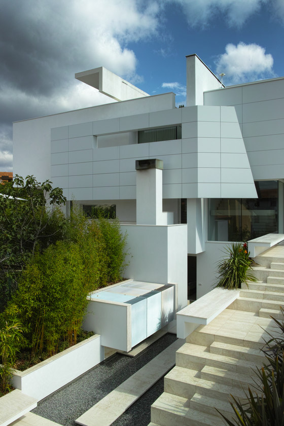
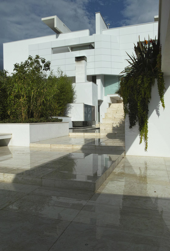
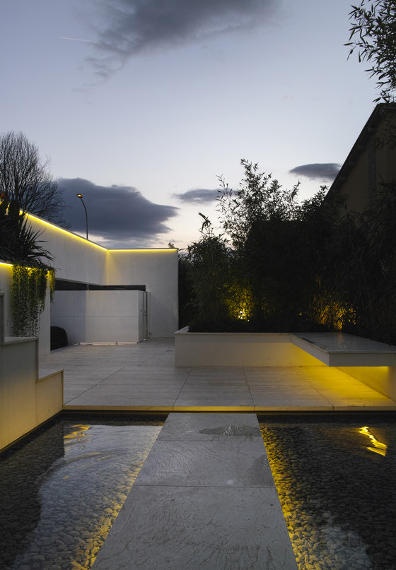
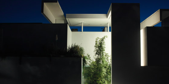
The unit has been organized around a central courtyard with the function of home life's core; this compositional logic allows a visual reciprocity between the different environments with many possible views mixing different spaces and functions. The living area and the kitchen-dining area are in direct contact with each other and with the outside by means of a remarkable visual permeability, partially filtered, from the leafs of the bamboo plants settled in the center of the patio.
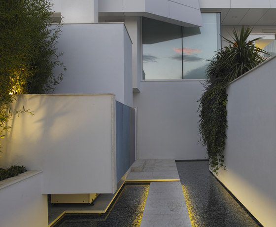
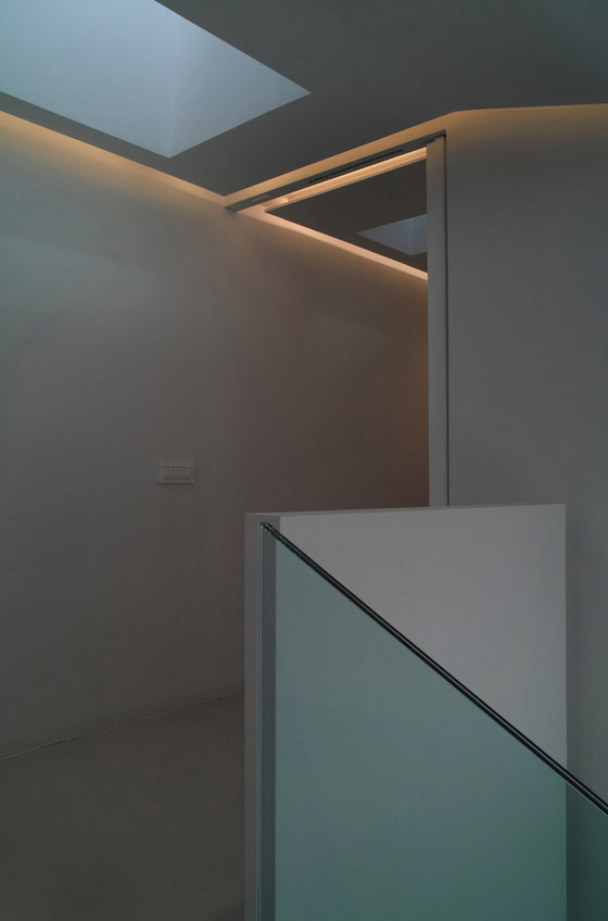
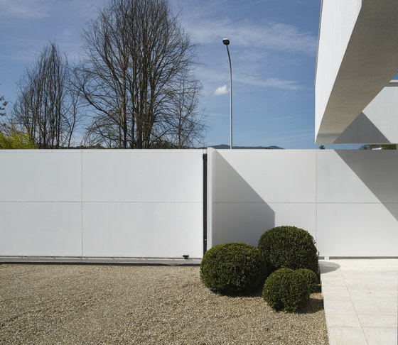
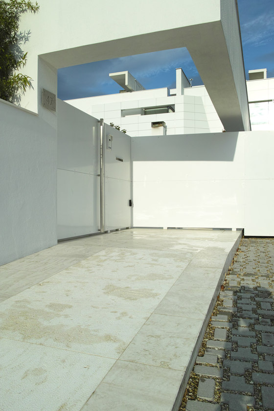
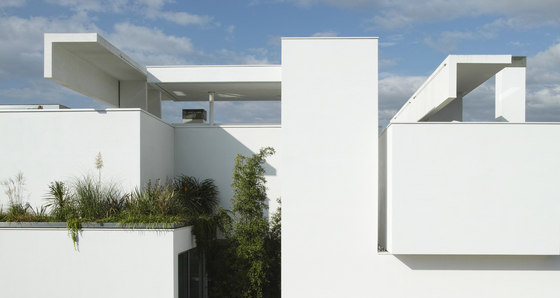
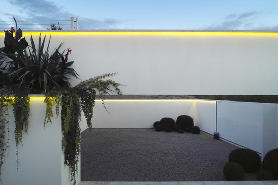
The centrality of this space is partly contradicted by the perimeter openings emphasized by the centrifugal projection of some architectural elements stretched until to the extreme edges of the available area (a surface very limited compared to the volume allowed). We gradually deconstructed the volumes and tried to get an architecture that could be slender with lighter elements towards the limits of the available area, like the wall that marks the main entrance's axis becoming the long concrete beam suspended above the pedestrian access on the street. The sleeping area on the first floor has a different attitude much more private with an "atmospheric" connotation due to its sensitivity to natural light changes and to the direct contact with the sky through the linear slots cutted in the roof. The roof gardens soften the impact of the volume in the landscape and take a part in the insulation of the home.
The structure is a concrete frame and the perimetral walls are made by a multi-layered masonry to insulate the internal space as much as possible and compensate the heat dispersion through the wide glass home’s surfaces. In general, during the design phase, the expressive language of this architecture was affected by the client’s preference for the ninety degrees angle and for the flat surfaces, which has prompted designers to overcome the static nature typical of this initial setup through the strategic volumes dislocation and the use of suspended masses and shifted surfaces. Then, during the construction, other choices of the same type have pushed decisively towards the total white option and towards the number reduction of the materials used, which have been plaster, for all vertical surfaces in combination with metal panels (ventilated walls made with aluminum panels – layered panels) and stone slabs , combined with floating wooden surfaces (accoja), for the external floorings.
From the point of view of energy, the purely technological solutions have been reduced as much as possible using only radiant systems (radiant panels) and solar systems; we wanted to use “low-tech" solutions, when possible, which could ensure the internal microclimate control in a passive manner utilising the natural flow of fresh air from the green external areas.
Architettura Matassoni


