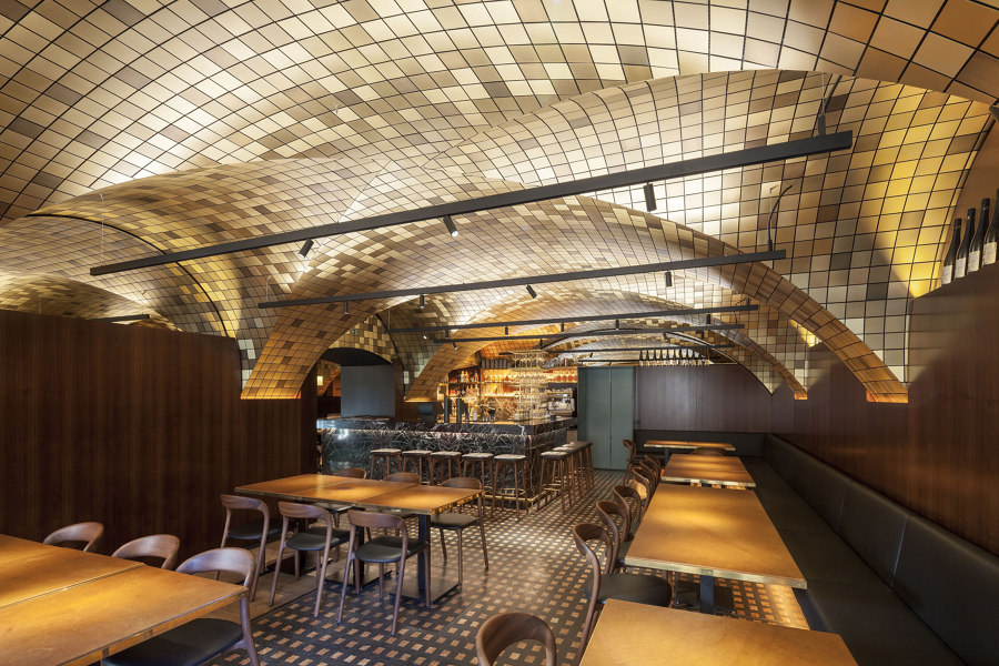
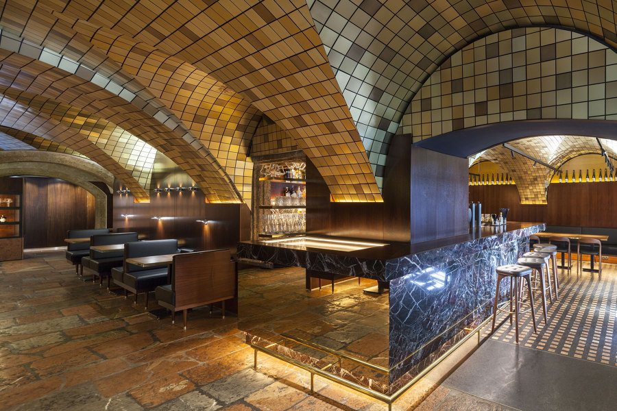
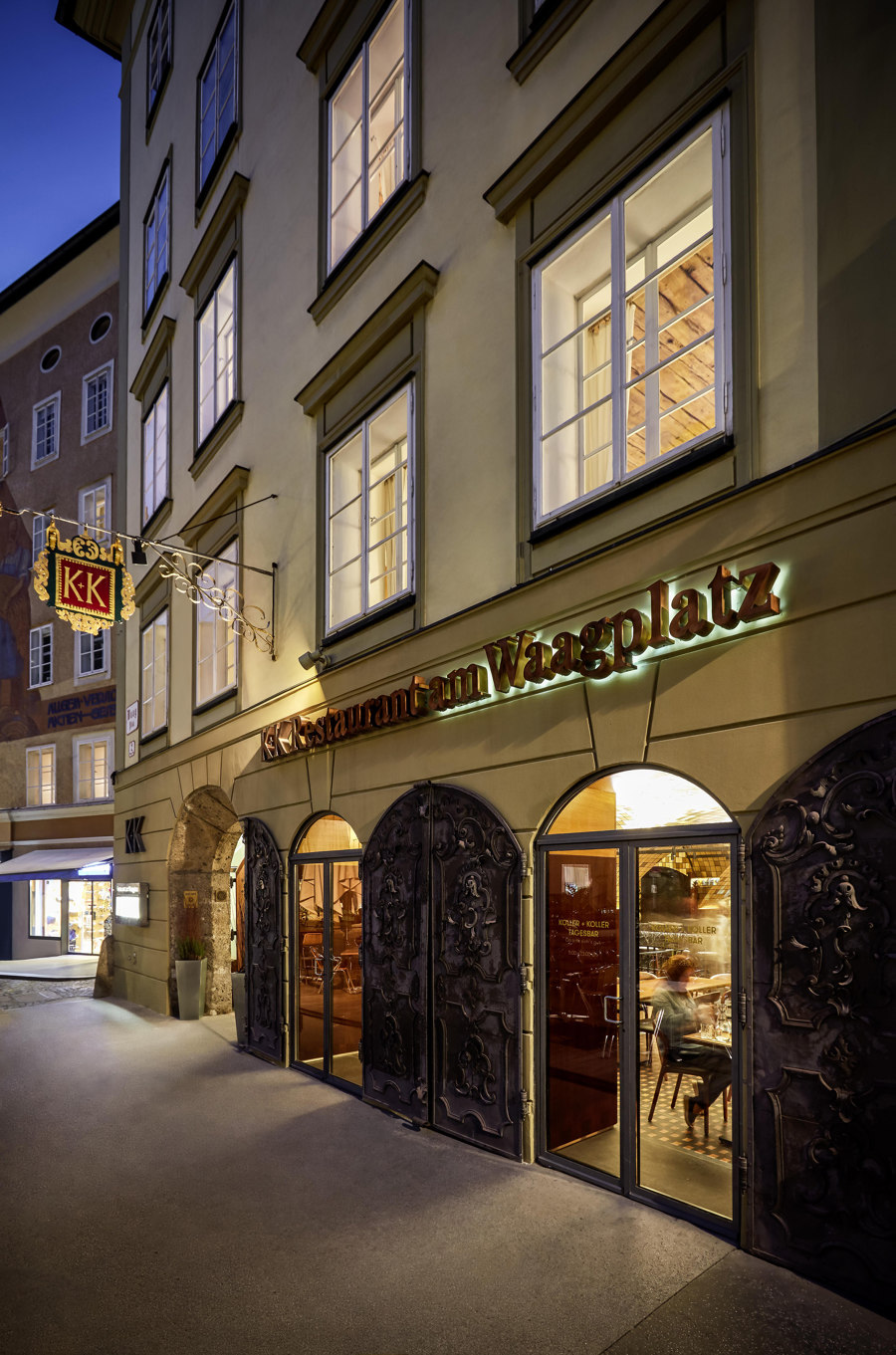
The listed Koller + Koller am Waagplatz restaurant is one of the city's most historic buildings and restaurants, while also representing an important social and cultural facility for the city of Salzburg. After undergoing a significant six-month-renovation, Koller + Koller am Waagplatz opens its doors with a brand new look.
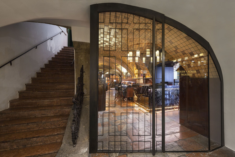
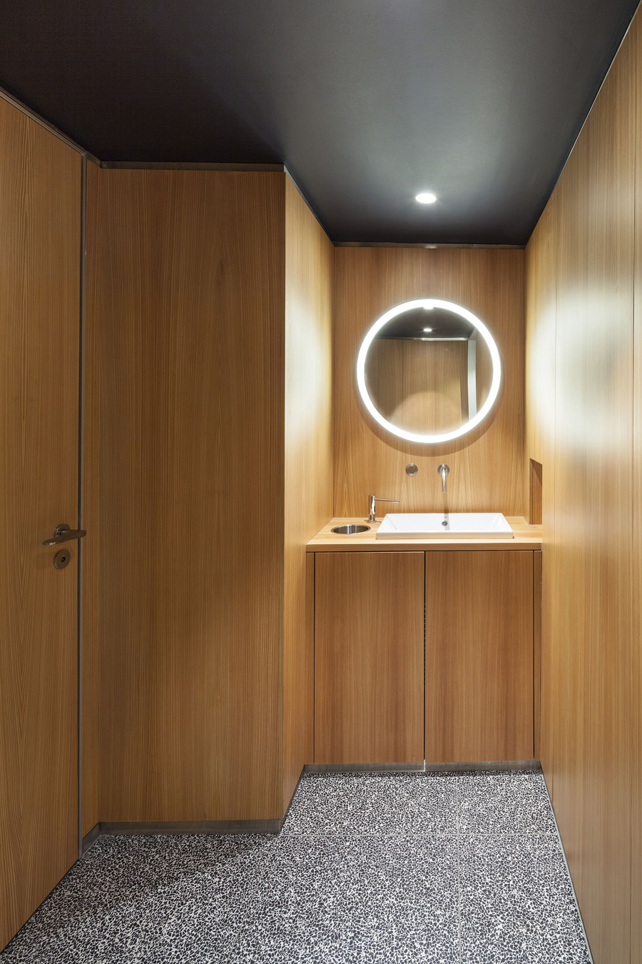
BEHF Architects has envisioned a design strategy which brings in the 21st-century to the interior’s aesthetic, giving it a refreshing and contemporary update, and at the same time highlights the historic characteristics of the city’s iconic building from the 12th century. As part of the redesign, an entrance, dining areas and sanitary facilities located on the ground floor have been renovated.
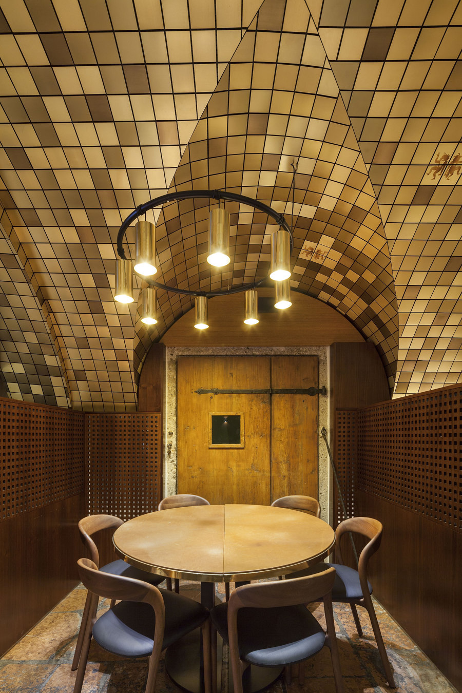
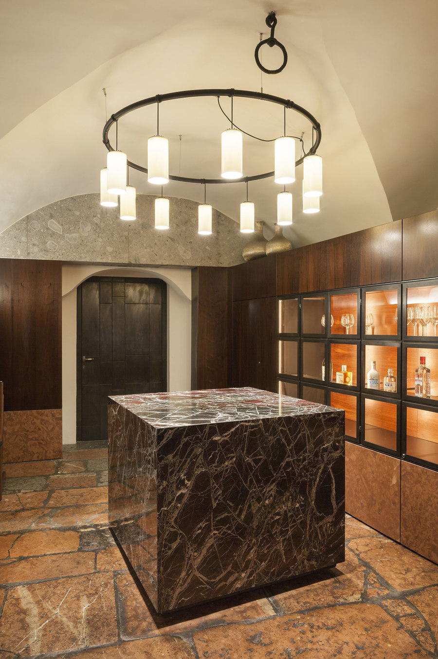
An unused second entrance has been re-opened in order to provide separate, direct access to the upper levels as well as to the Freysauff cellar, which has remained essentially unchanged since its construction. The original design of the spaces distributed over upper floors has been left intact and reflects the history of the family-owned company.
BEHF’s design concept for Koller + Koller am Waagplatz is characterised by a variety of materials and a lively, skilled craftsmanship from Salzburg, Styria and Lower Austria, incorporating metalworks and the use of high quality marble varieties and refined wooden components in traditional ways.
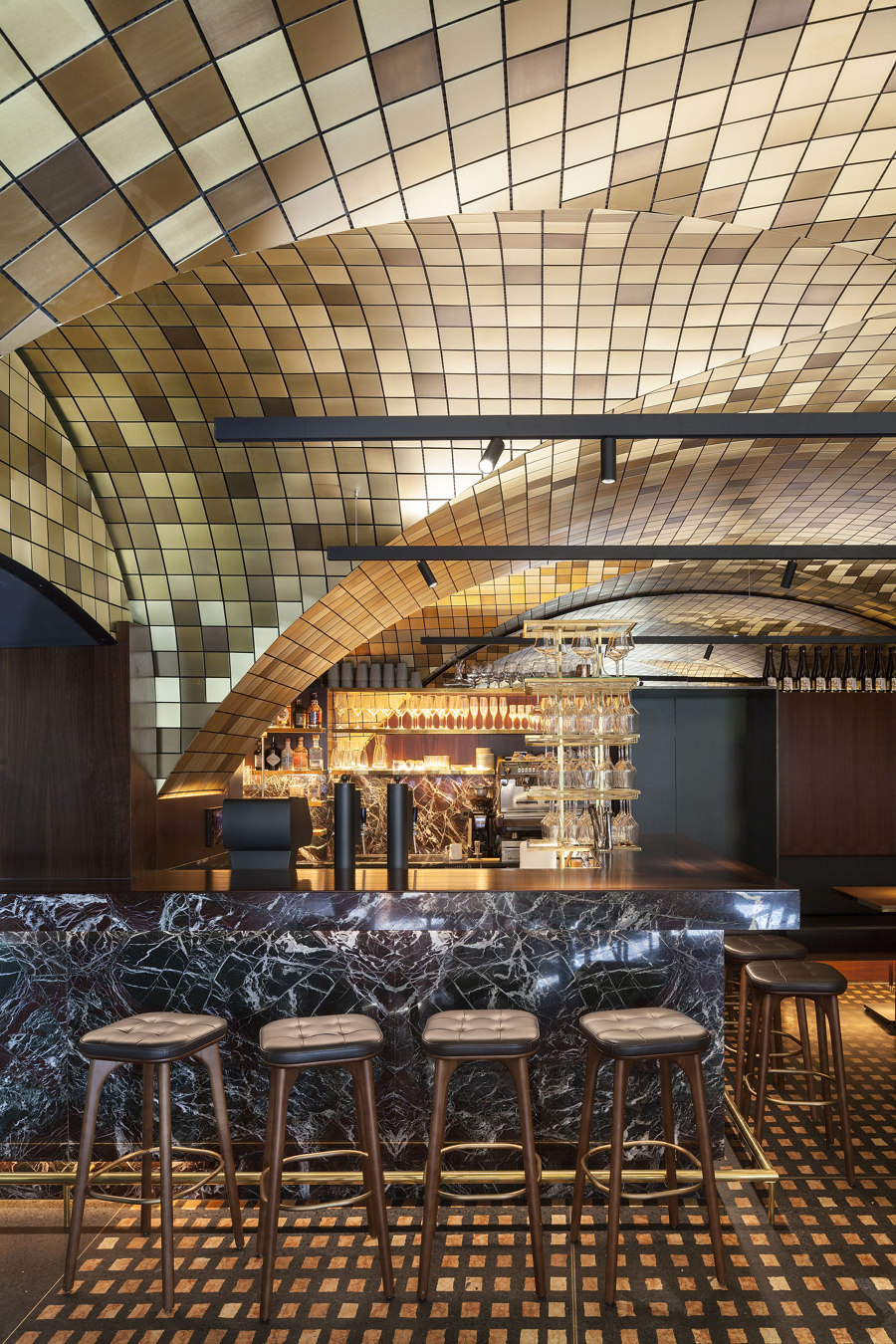
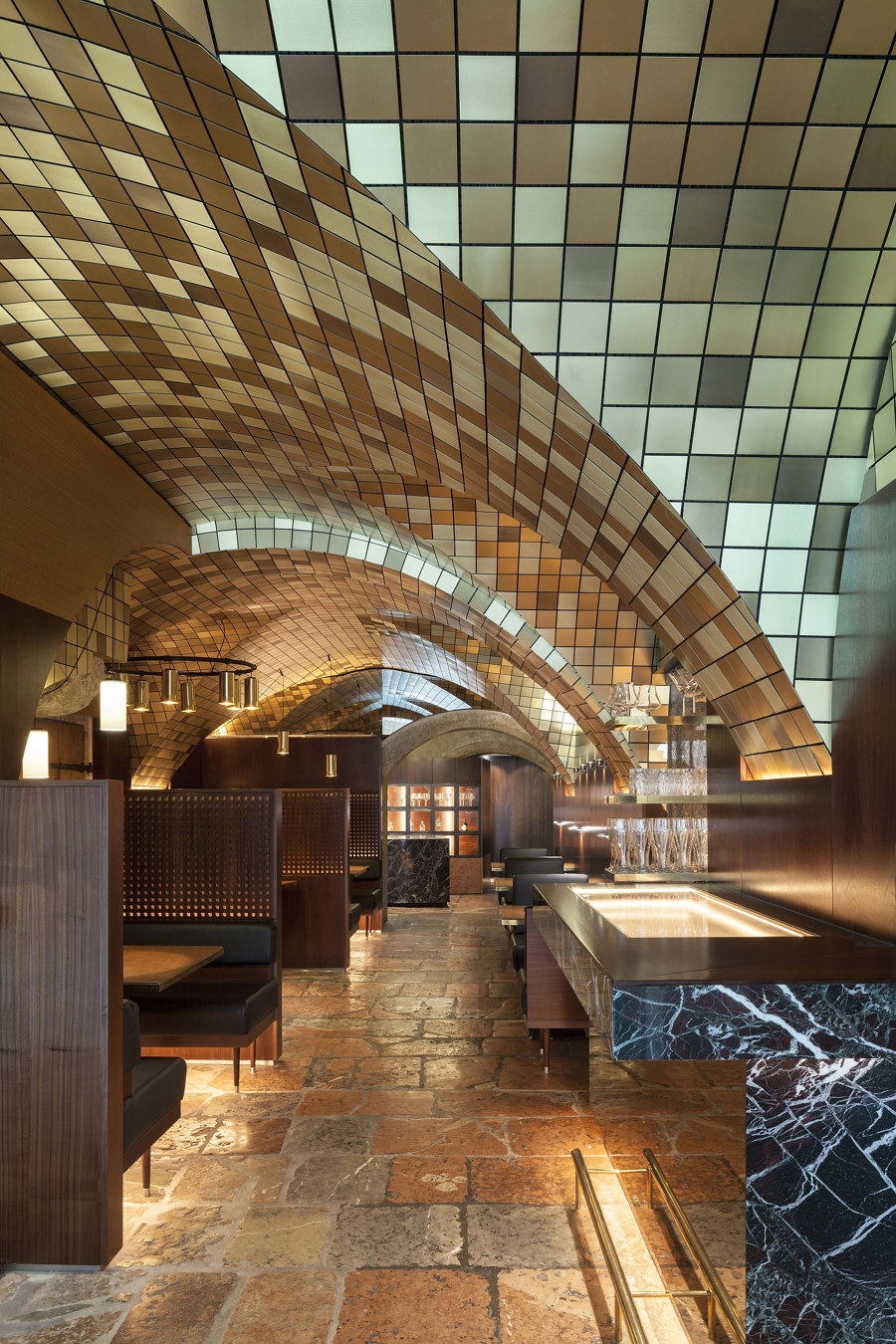
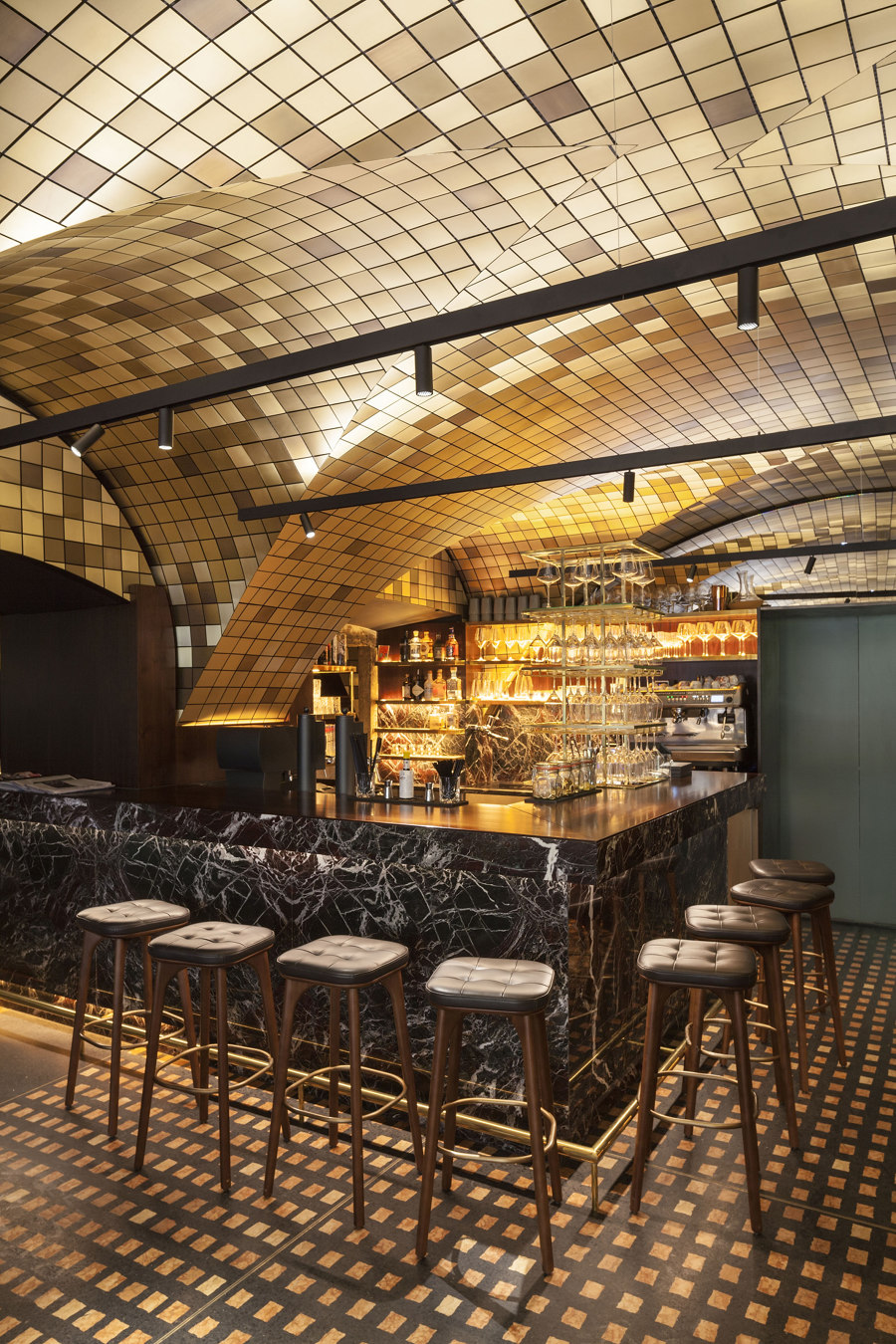
The entire vaulted ceiling of the ground floor is covered with brass mosaic tiles. In order to protect the existing baroque ceiling, the new mosaic ceiling has been installed on a light substructure. The structure is designed in such a way that it optimises the acoustic qualities of the space. Designed by Barcelona-based graphic artist Cristina Spano, the company logo, featuring a vixen and a rooster dancing together, has been randomly distributed on mosaic tiles. It adds the finishing touch to the unique ambience of the place.
The walls of the restaurant are covered by continuous wood veneer, which extends up from the dark walnut wood veneer to the tinted mirror glass and lighter oak veneer, fitting under the peak of the vaulted ceiling. This transition is marked by backlit glass bottles placed to add a touch of playfulness to the space. Depending on the colour of the glass or the contents of the bottle, the light always appears different.
An existing floor made of Adnet marble has been carefully renovated and preserved. In the main dining room, it is completed by a sophisticated yet playful marble-terrazzo flooring in the same colour, with a distinctive, elegant patterning.
All the seating, benches and chairs as well as tables are defined by simplicity and robustness. Made of high quality leather and wood in a restrained colour palette, they are designed to demonstrate their value over time.
Specific attention has been paid to the lighting design. The desired level of illumination has been achieved through the controlled lighting and various lighting configurations, but a very specific atmosphere and distribution of light in the space has been essentially created through the play with the material depths and surface textures.
Design Team:
BEHF Architects
