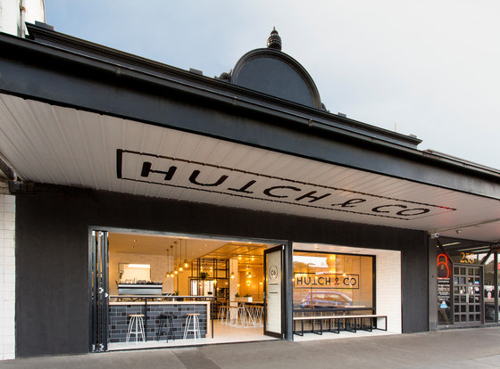
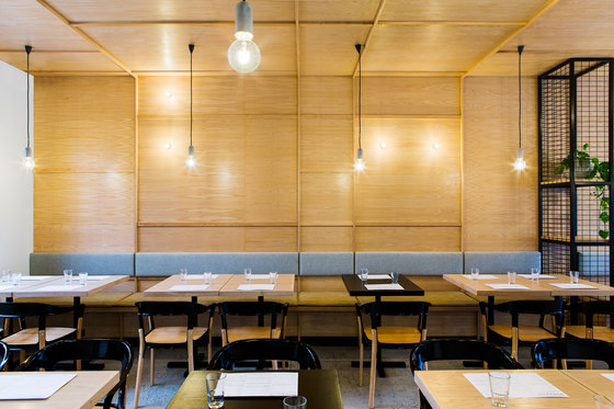
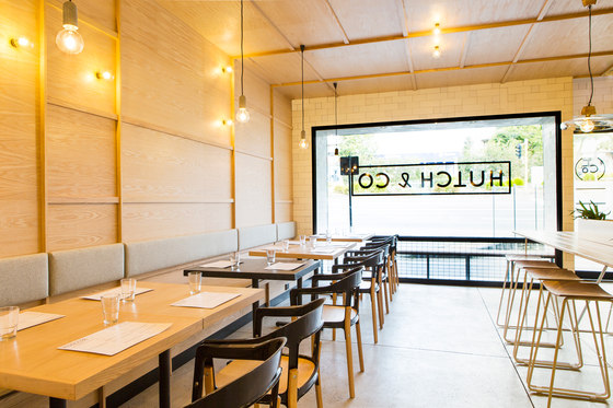
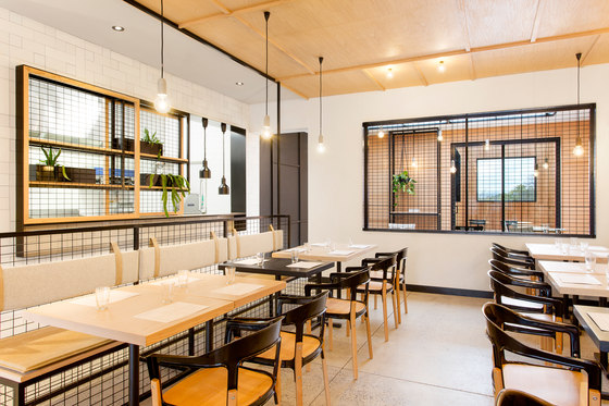
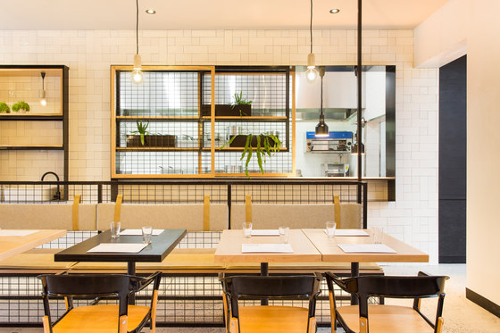
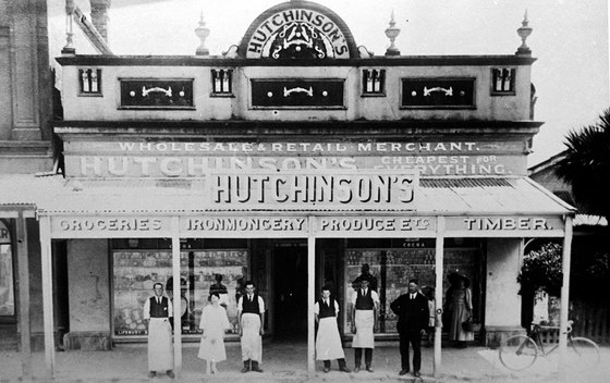
Nestled amongst the vines of Victoria’s Yarra Valley, 35km northeast of the city is Hutch & Co. From its humble beginnings as the 1800s ironmongery store formally known as Hutchinson’s, the site was transformed into a modern restaurant, cafe.
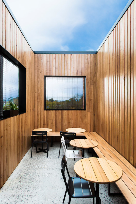
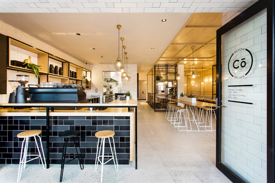
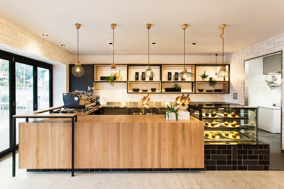
Engaging the full services of the studio, which span interior, building, product and branding design, Hutch & Co was an exercise in composition and contrast between materials, which are wrapped, extruded or intersected to playful effect. Tasked with delivering a space that considered an architectural extension to the existing building, an outdoor dining area and multi-zoning, we decided to strip back and remove all the existing internal walls and linings. With only the exposed brickwork left, we were able to introduce a refined palate of materials and finishes.
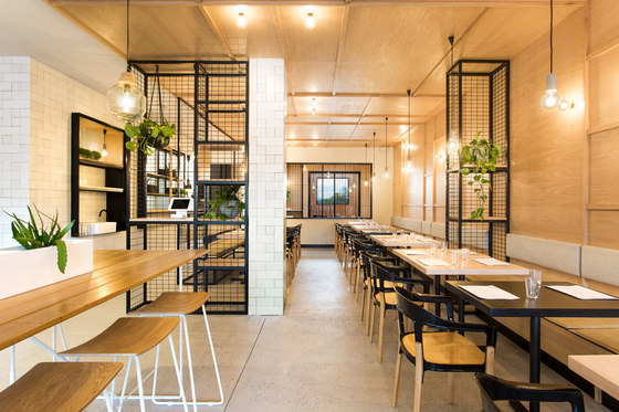
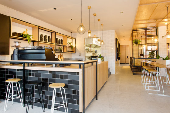
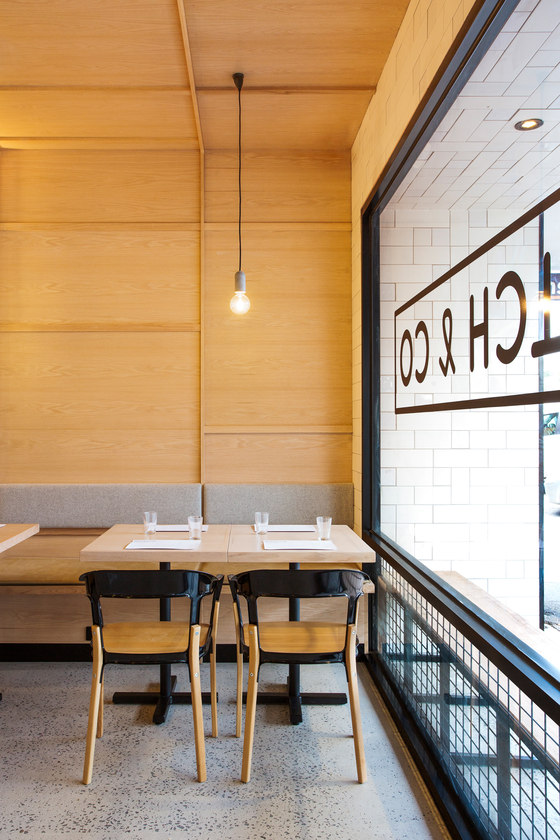
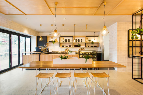
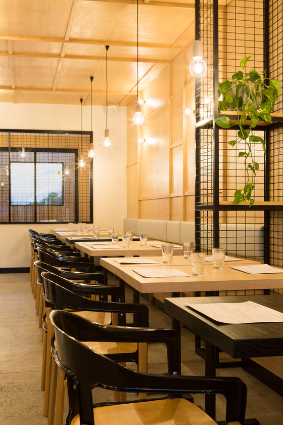
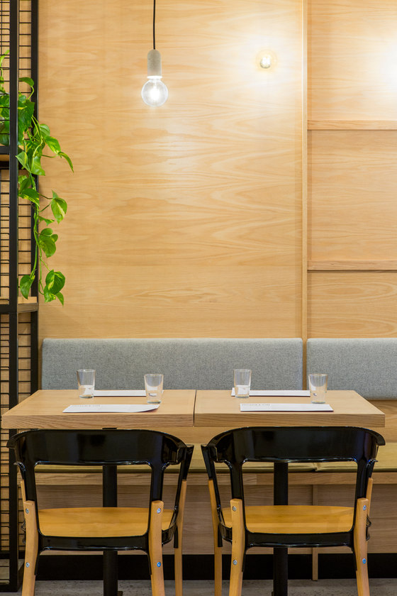
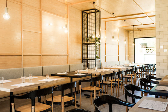
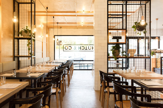
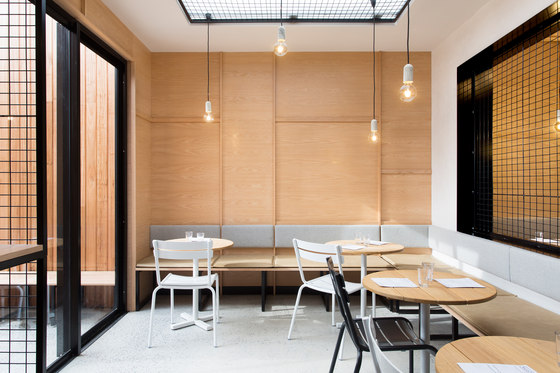
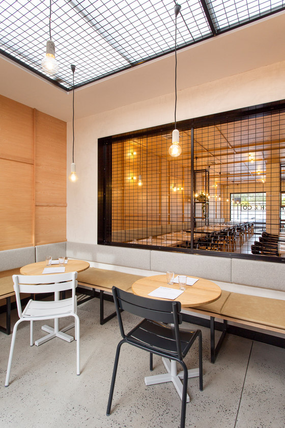
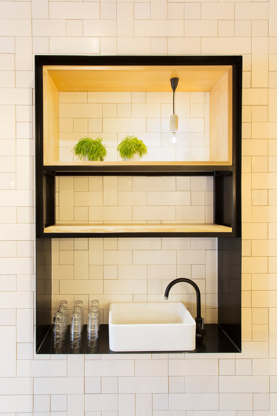
Pale American Oak timber is a signature feature at Hutch & Co. Adorning the ceiling and wall in the main dining area, the pattern articulated here carries through from the timber to the tiling, giving the venue its own unique personality. Lined in the same rhythm, the open plan kitchen encourages a dialogue between patrons and the chefs. Offset by the mix of matte and gloss tiles that coat the bar, the rawness of the wood acts in contrast to the concrete finishes and softens the space. The studio’s newly designed lighting pendants for Meizai are paired with our Silho collection and grey felted upholstery to create a sense of intimacy.
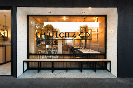
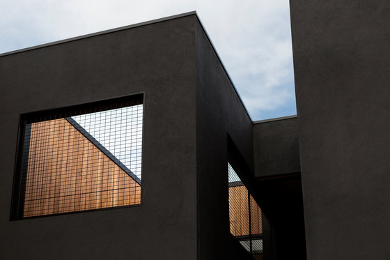
This design language extends to the branding, which is bold, recognisable and synonymous with the site’s history. Seven meters wide and stretching across the top of the black façade, is the Hutch & Co insignia. Attracting the attention of locals and those passing through the countryside, the frontage echoes the architecture of the local area and was maintained as a design consideration. Set back from the street, this extruding tiled surface area and its built in bench seating activate the frontage and invites pedestrian interaction.
Throughout the entire design process, we were always conscious of the opportunity afforded to us by the Yarra Valley and set out to design a space that continuously captured these views. White tiled walls underpinned by black steel details frame the scenery and lush country terrain, which is referenced internally with greenery from Glasshaus. In establishing this level of engagement with the site environs, we introduced an element of transparency that meant being able to stand on either side of the building and seeing through to the other side. Opening up the space in this way not only saw us gain natural light and visual access to the breathtaking surrounds, it enabled us achieve a layered effect within the venue, in which the interior and exterior blend to form a single expression.
Biasol: Design Studio
