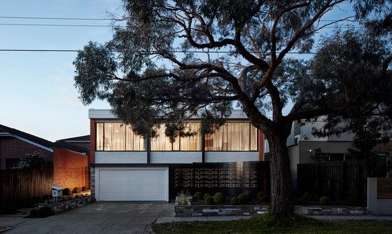
Located 10km south-east of Melbourne, Caulfield south is a suburb home to a diverse range of architectural styles from Edwardian weather-board to Californian bungalow to red & orange clinker brick. Alarmingly - it is visually evident to see an increasing trend of these original housing styles being demolished to make way for large, two storey modern housing typologies. These are often conceived as mock - neo-Georgian or rendered triple-fronted brick veneer.
Around the 1960s and 70s a number of European trained architects such as Ernest Fooks began designing a series of superb international modern style inspired houses in and around the Caulfield and wider area. A protégé of Fooks – Michael Richard Ernest Feldhagen also completed a number of exemplar international modernist style singular residences and mutli-residential flats around the same period. Writers house is an alteration and additional to an existing orange brick veneer residence that was originally designed in the late 1960s by Michael r e Feldhagen. The house was originally built for the current occupants grandparents who were Jewish holocaust survivors and immigrated to Australia a few years prior to building the house.
The house was filled with beautiful original custom joinery specifically built for the house by Jakob Rudowski - a local joiner who made quite allot of furniture around the area in the 1960s and 70s. In 2013 - the grandparents passed away and due to the distress of this event for my clients - the house lay dormant for a good part of two-and-a-half years. The first day we met with our clients was one of the few times they had come back to the house after losing their grandparents.
This was obviously an emotional but somewhat therapeutic event - knowing that they were going to extend and celebrate the life of the grandparents’ house through some extensive renovations. I may note: cigarette butts were still balancing on the side of ashtrays around the house from years prior. Surprisingly - the house did not have an eerie feeling given these types of frozen moments scattered around the house. My clients – Danielle who works in digital marketing and Adam who is a screen writer/journalist were heavily involved during the design & construction process. Adams background in writing, created a key driver in the way we approached the individual spaces within the house as chapters that were curated as a part of a whole story.
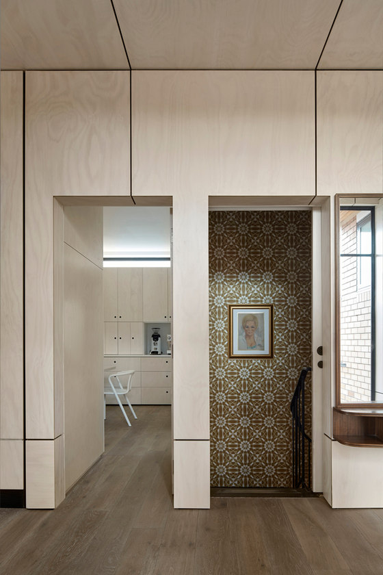
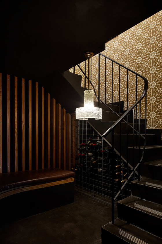
It was our joint intention that whatever new works we did to the house would not impact on the integrity of the original house and it memories. There is often a very fine line between creating a nostalgic 'museum' of something that was and removing all notion of the existing all together. Existing wallpapers, chandeliers and building fabric were kept where possible including the existing Rudowski furniture which was restored. A number of existing sofas have been reupholstered to give them a new life. This existing fabric has been very carefully set in contrast with new contemporary furniture, joinery and materials, that reside as a background palette to highlight the existing and at the same time - celebrating the new.
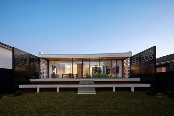
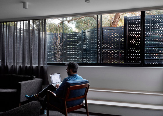
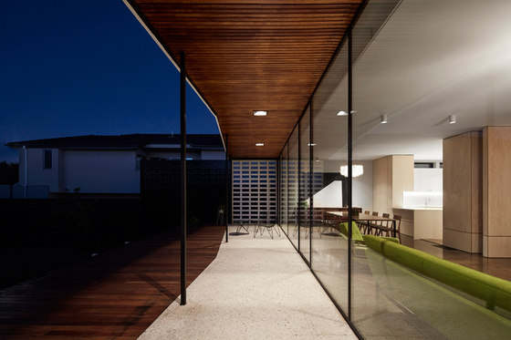
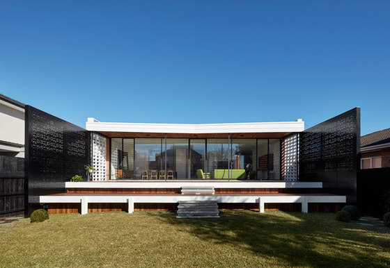
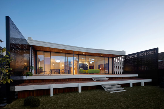
Both existing rear and front painted timber windows were replaced with full height steel windows that encompass the interior spaces with a rich warm light. The project consisted of an extensive internal renovation and some external works. A new large ‘party’ deck bounded either side by two black aluminium perforated privacy screens not only solved a practical issue of overlooking but more importantly was used to extend the internal areas to create a much more flexible internal/external cohesion of space.
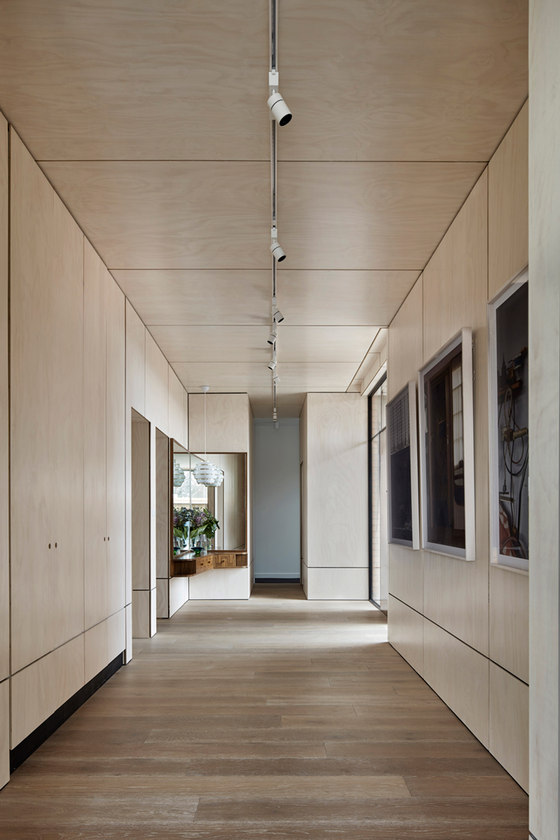
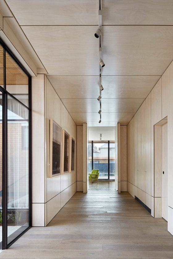
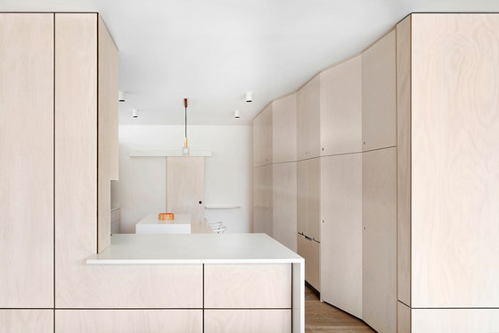
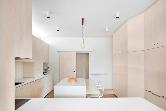
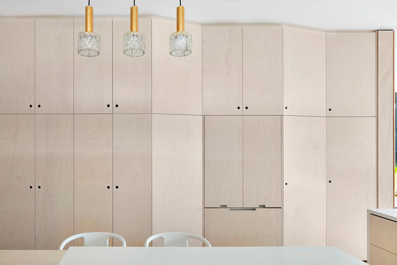
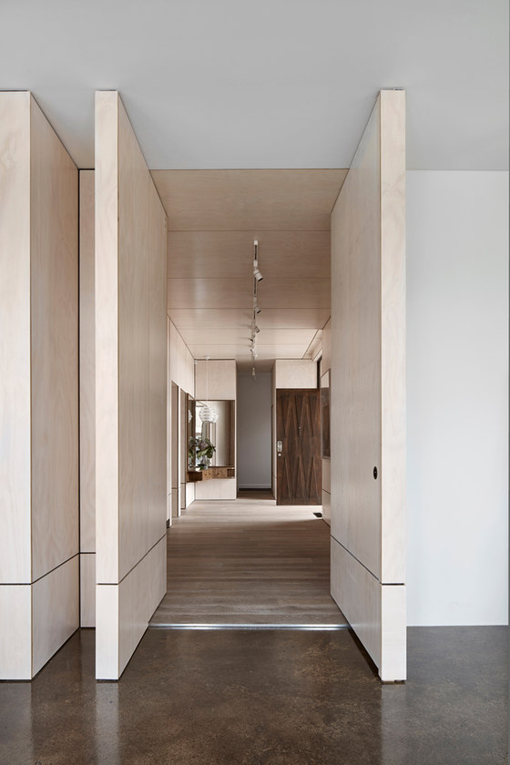
An existing dark corridor/foyer space has been re-imagined as a light filled, plywood lined gallery space to hang art and offer a surprise to the unsuspecting visitor. This space also acts as an umbilical of sorts, simultaneously linking & closing off the living, kitchen and dining spaces of the house with the more private bedroom areas when the occupants are entertaining. A section of wall was removed from the existing kitchen to submerge the dining area & yard back into the house. The kitchen itself represents a minimal yet utilitarian palette of materials & details. Set in a minimal white plaster & limewashed ply finish the configuration of cabinetry allows the kitchens mess to be hidden away through a series of bi-folding & sliding panels. Compositionally opposite to the kitchen, a cosy TV ‘snug’ space is tucked back into the house to create a more intimate area specifically for watching movies & the reading of a good book.
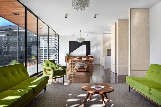
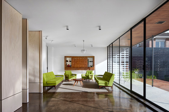
A large full-height sliding panel allows the space to become ‘a part’ of the main living area or made completely separate & hidden beyond. Both kitchen and TV snug open out to a generous living and dining area, free of a TV and instead highlighting restored memories of the past. At one end, a linear rosewood sideboard and the opposing, a wonderfully crafted pull-out bar unit, both designed and made by Jakob Rudowski in the 1960s. The existing sofas [also Rudowskis] have been bought back to life, re-imagined in a bright lime green upholstery. A new custom oak and steel dining table seamlessly tie with the rich polished concrete slab throughout the space. The reflections projected internally through external open blockwork and perforated aluminium screens add a surreal play of light through the newly installed full-height steel windows throughout the day. Operable louvres in the TV snug and main living & dining areas create opportunity for cross-ventilation to occur and create flexible control of the internal temperature throughout the day.
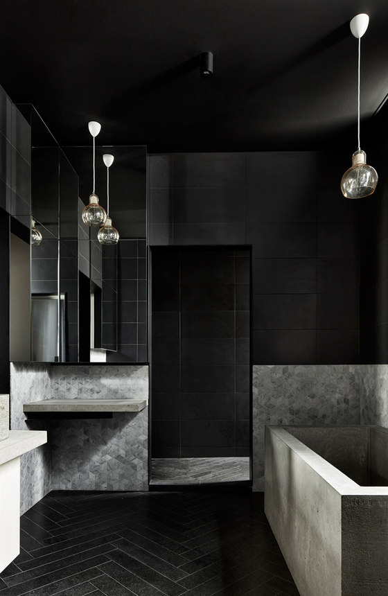
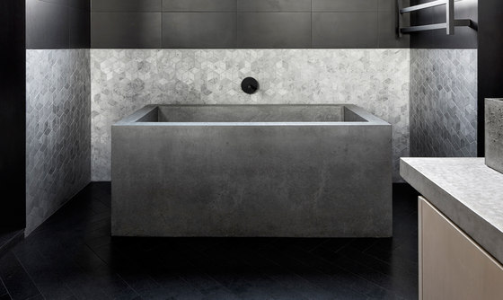
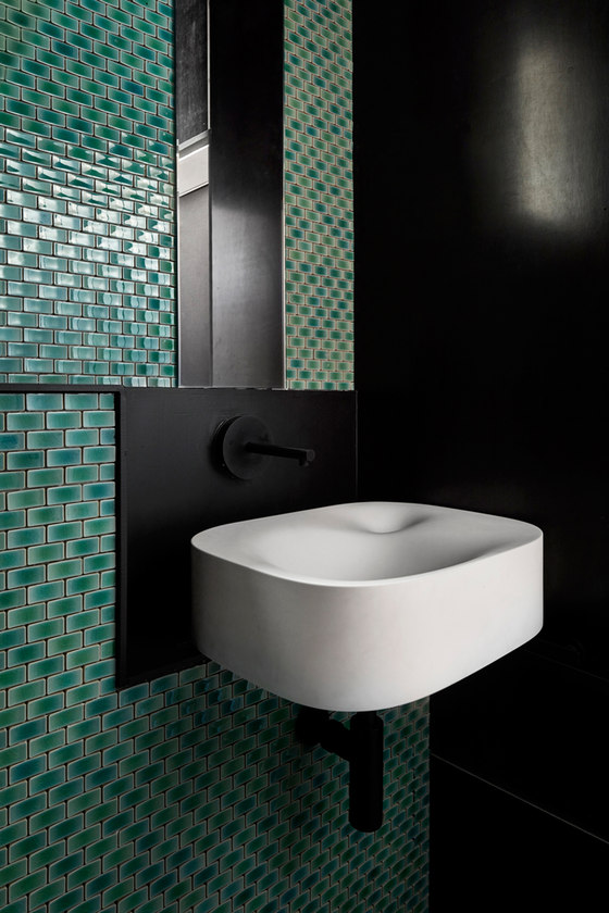
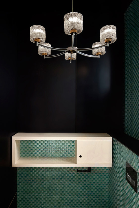
At the other end of the house – a series of bedrooms and bathrooms were Re-configured & re-imagined to accommodate the client and their growing family. Linking to the foyer/gallery – a modest powder room clad in black formply and concaved delicate green tiles, creates a bold introduction to the spaces. A series of three bedrooms and a kids bathroom spawn off a central corridor, part of which was taken up to accommodate a walk-in-robe for the master bedroom. The master bedroom is light filled and has framed view of a tree canopy within the front yard. A robust yet sleek ensuite, featuring a series of poured insitu concrete elements such as a bath, basin and vanity tops contrast with sleek black steel thresholds, mirrors and pendant lights in conjunction with a filtered natural light to create a ‘moody’ spatial thematic.
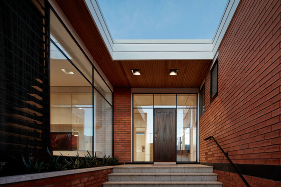
The lower [down-stairs] areas of the house have been re-configured to become a self contained unit of sorts when the clients young children grow up. For now - the spaces will host, an intimate subterranean whiskey den/wine cellar for a late night nightcap, a bathroom and a writing room, which has a direct physical link to the front courtyard. This front courtyard space was re-claimed from the previously unused- front garden to become a practical and useable space for contemplation and relaxing. The addition of this sweeping screen to formalise this area was to be the sole formal adaption to the existing identity of the house from the street. From street level, the existing front windows were replaced with thin steel, double-glazed windows. A minimal white colour scheme was applied to the existing stone and aluminium fascias. The colour black was used to celebrate existing formal structural lines. The existing orange bricks have been retained to maintain the houses history and timeless glory.
Project Cost:
$1.1 mil
Existing Floor Area:
344m2
New Floor Area:
66m2
Writer's House
Brad Wray, Rowena Henry, Simon Dinh
Builder: LJ Roberts Constructions
Structural Engineer: WSP Consulting Engineers
Custom ‘Nose Dive’ Pendant: LTNK/Orchard Design
